Friday, April 29, 2011
Weekly Indicators: Oil Price Tornado destroying growth Edition
The big news this week was first quarter GDP limping in at 1.8%. It is interesting that this GDP advance was almost exactly that of second quarter 2010 when gas prices were similar. With gas prices even higher in the last month, second quarter GDP is not likely to be pretty either. Durable goods orders, however, rose strongly, up 2.5%. While the regional manufacturing surveys have weakened month over month, they are basically going from white hot to red hot.
That manufacturing continues to look excellent is a great positive, because the high-frequency weekly indicators are almost all in retreat:
Oil was trading at $113.76 a barrel by Friday, the fifth full week it has been above $100. It remains at a level above 4% of GDP. Gas at the pump increased $.04 more to $3.88 a gallon - with the exception of 11 weeks in 2008, an all time high. Gas prices have gone up over $1 a gallon just in the last 5 months. Gasoline usage at 9148 M gallons was 1.5% lower than last year's 9290. This YoY comparison has been negative for the last seven weeks in a row, averaging -1.5% for the last five weeks. If this level of decline continues for another month, that will be equivalent to the decline near the end of 2007.
The BLS reported that Initial jobless claims last week were 429,000. The four week average has gone back over 400,000, This series has not made a new low in eight weeks, has been back over 400,000 for three weeks, and recorded the highest number in over 3 months. Not good at all.
Railfax was up only 1.4% YoY. Baseline traffic is below last year's levels. Cyclical traffic is at a low ebb for YoY advance. Waste materials sank even lower below last year's levels and shipments of motor vehicles fell. Only intermodal traffic is holding up reasonably well. Also not good.
The American Staffing Association Index remained at 92 for the fourth week in a row, after stalling at he 90-91 level for 7 weeks. If this series does not pick up significantly in the next four weeks, it will mirror its flatness in 2008. Also not good.
As expected, the Mortgage Bankers' Association reported a decrease of 13.6% in seasonally adjusted mortgage applications last week, reversing the prior week's increase of 10.0%, due to new higher FHA premiums. Refinancing decreased 0.6%, and remains near its June-July 2010 lows. The purchase series has been generally flat for close to one full year - compared with its previous relentless decline, a good thing.
The ICSC reported that same store sales for the week of April 23 rose 3.2% YoY, and increased 0.4% week over week. Shoppertrak reported a 16.1% YoY increase for the week ending April 23. It also reported a WoW increase of 12.2%. This was the week before Easter, so calendar affects continued to strongly affect these results.
Adjusting +1.07% due to the 2011 tax compromise, the Daily Treasury Statement showed that for the first 19 days in April 2011, $129.4 B was collected vs. $123.4 B a year ago, for an increase of $6.0 B YoY. For the last 20 days, $135.3 B was collected vs. $125.1 B a year ago, for an increase of $10.2 B, or 8.3%. Use this series with extra caution because the adjustment for the withholding tax compromise is only a best guess, and may be significantly incorrect.
Weekly BAA commercial bond rates decreased .09% to 5.98%. This compares with a .10% decrease in the yields of 10 year treasuries to 3.41%. There remains no sign of corporate distress here, and no sign yet of a deflationary bust.
M1 was up 0.2% w/w, up 0.5% M/M, and up 11.3% YoY, so Real M1 is up 8.6%. M2 was up 0.1% w/w, up 0.6% M/M and up 3.9% YoY, so Real M2 is up 1.2%. Although Real M1 is still strongly in the "green zone" where it has been since before the end of the "great recession," Real M2 has faded even more below its 2.5% "green zone." (In all recessions since the Great Depression, real M1 has been negative and real M2 has been below +2.5%). Not so good.
The weekly indicators are lining up on the side of a stalling economy.
My condolences to all to who sustained loss due to this week's massive outbreak of tornadoes. Have a good weekend.
Contractionary fiscal policy is contractionary.
2.) Government spending subtracted 1.09% from the final GDP total (see table 2).
3.) Contractionary fiscal policy is contractionary.
Are We At a Market Top?
The bearish argument has the following 10 signs:
S&P (SPY) profit margins are at or near historic highs. Given rising input costs, especially from energy and commodities; these will start to come down and reduce expected earnings. Witness the statements from Kimberley Clark (KMB), Wal-Mart (WMT), McDonalds (MCD), Xerox (XRX),…etc all warning of higher costs over last several weeksAnd the Bullish Side:
The continued rise of gas prices. Gas is at or approaching $4 a gallon in most states. This is eerily like the summer of 2008 and will have negative impacts on consumer sentiment, spending, Obama’s poll numbers, and high priced retailers. See UA’s ten percent plunge yesterday on rising inventory levels.
Continued and escalating tension in the Middle East. Libya, Syria, Egypt, Bahrain, Yemen, Oman, Tunisia, etc….all have seen dramatic unrest. This will continue to impact oil prices and has the potential to be a Black Swan if it spreads to a major oil producing state like Saudi Arabia.
IPO Activity is at a four year high, which is generally a good contrarian sign for the market
Seasonality as we are entering historically the worst time for the market. Sell in May and Go Away seems like an appropriate rallying cry this year.
Europe. Austerity measures are negatively impacting growth. Greece and Ireland have received bailouts, but will probably need to restructure their debt eventually. Portugal is waiting its turn and Spain is on the clock. Voters predictably are choosing parties that might reject supporting any further assistance; see Finland. This cauldron has the potential to blow up any day.
China is taking more and more measures to curb inflation and property speculation. This will eventually have negative impacts to worldwide growth.
Merger Monday is back as we have seen a large increase in M&A activity this year.
Another good contrarian sign.
The end of fiscal stimulus and state budget challenges will severely curtail job and economic growth as state and local governments enact plans to balance budgets through layoffs and other spending cutbacks.
Given the approaching end of QE2 as well as the upcoming federal budget battles, the political acrimony that will be unleashed is not likely to be good for overall health of the market environment
Let’s look at the SPY chart. It speaks for itself – i.e., bullish.And more from the bullish side:
Price broke out strongly above previous resistance at $134. RSI crossed up strongly through the neutral line last week and is headed for a date with overbought territory soon. Similarly, MACD has a bullish crossover and is pointing up. Price is well above all of its daily moving averages such that some mean reversion will be in order soon – but not necessarily much of a pullback, as the moving averages play catch-up. Volume on these strong days, however, is still disappointing.
As long as we stay above the 850 level, the Russell remains in primary uptrend/bullish mode with no remaining overhead levels of resistance to monitor.
.....Like the Russell 2000, the NASDAQ at new recovery highs breaks a “line in the sand” to the bullish camp, forcing some bears/short-sellers to buy-back positions to cover (a potential short-squeeze).
I know there are a lot of bearish commentaries out there, but price tells a different story, and it continues to do so as long as the indexes remain at new recovery (or lifetime) highs.
Unless we fall back under 850 in the Russell or 2,800 in the NASDAQ soon, then the market continues to be dominated by the primary uptrend and the buyers/bulls.
Also consider this from Marketbeat:
But for my money, the thing I’m watching is the bond market. The yield on the 10-year has been moving pretty steadily lower since it crested at a bit more than 3.70% back in February. And despite all the inflationista frothing, fiscal debt debates, Bill Gross dismissals and S&P outlook warnings, investors have kept buying Uncle Sam’s IOUs.
....
It doesn’t get as much attention as the stock market, but in the investment world the bond market is often thought to be the dog wagging the tail that is the stock market. If so, you might want to take a bit of profit off the table.
As I reaffirmed on Wednesday, I'm very suspicious of the market's current move higher, but for fundamental reasons. As several commenters above noted, you can argue the technicals are strong. However, I believe in a blended approach which coordinates fundamental and technical analysis and right now the fundamental analysis is concerning. I should also note -- I could be missing a move higher. But I'd rather be safe given the current environment.
Friday Dollar Analysis
Given the above charts, and the fact nothing has fundamentally changed in the big picture for the dollar, my assessment of the dollar market for the coming week is the exact same as it was for last week: more moves lower with rebounds into the EMAs providing upside resistance.

Taking a look at the chart, nothing has changed. Prices are below the EMAs, all the EMAs are moving lower and the shorter EMAs are below the longer EMAs.
This week, we learned that US growth for the first quarter was 1.8%, which means the Fed will be under pressure to not raise rates. In addition, we have the following Fed statement:
The Committee will maintain the target range for the federal funds rate at 0 to 1/4 percent and continues to anticipate that economic conditions, including low rates of resource utilization, subdued inflation trends, and stable inflation expectations, are likely to warrant exceptionally low levels for the federal funds rate for an extended period.The Committee will continue to monitor the economic outlook and financial developments and will employ its policy tools as necessary to support the economic recovery and to help ensure that inflation, over time, is at levels consistent with its mandate.
The EU has already raised rates, as has China and a host of other countries. Only the US remains in 0% interest rate land, which will add further downward pressure to the dollar.
Thursday, April 28, 2011
Hayek v. Keynes -- the Rap Battle
Enjoy
Durable Goods Up
Durable goods orders are a very volatile series. However, their current lack of movement is beginning to concern me regarding the big picture.
In light of that, we got some good news yesterday:
A key gauge of U.S. manufacturing rose in March and new orders in February were stronger than initially thought, indicating a vibrant factory sector even as the economy slowed in the first quarter.Here is an updated chart of the data:New orders for manufactured goods meant to last at least three years increased 2.5 percent after an upwardly revised 0.7 percent rise in February, the Commerce Department said on Wednesday.
The rise in March durable goods orders beat economists' expectations for a 2 percent advance, while orders in February had been previously reported to have dropped 0.6 percent,
Though the report -- which showed upward revisions to key categories in February -- did not change views that the economy slowed sharply in the first three months of this year, it confirmed that manufacturing continued to power the recovery.

While still below pre-recession levels, the chart does look better.
With the recent drops in three Fed region manufacturing indexes (Philadelphia, Dallas and Richmond) -- and manufacturing being a key driver of the current expansion -- these data series are disproportionately important. The durable goods chart is starting to look a little better. However, I'm going to reserve judgement for the next few months as we get more information about the manufacturing sector.
A Closer Look At Monetary Velocity

From 1959 until 1984, there is a strong relationship between M1s YOY percentage change and GDPs YOY percentage change. This relationship breaks down briefly in 1974. In the above chart notice how the two lines mirror each other's movement.

The M1/GDP YOY percentage change relationship breaks down in the 1990s but returns to a certain extent in the 2000s. In the 2000s there is a very general arcing pattern to M1s chart as with GDP -- but this is a general relationship.

For about 15 of the 25 years in the above chart, M2's YOY percentage change in velocity mirrors GDP YOY percentage change. However, notice the relationship breaks down in the 1970s -- in fact, the relationship is almost inverted during this period.

From 1985 until 2010, the correlation between M2s YOY percentage change in velocity and the YOY percentage change in GDP is fairly high. From 1990-1995 the relationship is very strong. However, the relationship breaks down during the latter half of the expansion. There is a loose relationship between the two numbers during the 2000s expansion while there is a very close relationship during the last expansion.

With the exception of the mid-1970s, MZM and GDP's YOY percentage change in velocity show a strong correlation.

From 1985 until 2000 MZM's yearly percentage change becomes very volatile relative to the GDP change. During this period there appears to be little relationship between velocity and GDP. However, the MZM/GDP correlation returns over the last 10 years.
Of all the statistics, monetary velocity appears to have the strongest correlation with GDP growth. This makes strong intuitive sense. If people are spending money more rapidly there will be more activity; whereas if people are spending money less rapidly there is less activity.
Wednesday, April 27, 2011
Thursday Oil Market Analysis
Over the last few weeks, with the exception of today, the price action has been weak. There were two strong down bars, three weaker moves higher, another strong downward bar and then a weak up bar. Today's action is the only strong bar over the last 8 trading sessions.
The overall feeling I can't shake is that with gas at $3.84/gallon on average, traders are incredibly sensitive to the effect of higher oil prices on the expansion. This is probably what led Goldman to issue its sell recommendation on commodities last week. In short, I keep thinking we already have a top built into the market caused by economic fundamentals. On that order, consider this chart from the St. Louis FRED:

Click for a larger image
Notice that over the last week, we've had one day of solid gains followed by three days of weaker price action. Additionally, prices have been contained by the 113/114 price level -- this despite the Middle East still being in pretty heavy turmoil. Also note the declining MACD and weak position of the overall MACD line, which shows a remarkable lack of momentum.

Note the remarkable lack of conviction in the overall market on the 5-minute chart. There are very few sharp rallies and prices seem to get stalled in the 113/114 area.
This week, I'm still left with the feeling that traders are sensitive to the overall price of gas. In addition, consider the fact that the oil market has not advanced due to the ongoing problems in the Middle East. And, we're starting to get word of decreased gasoline demand and a possible slowing economy in Q1.
While my feeling is not scientific, I'm still of the opinion there is not much upside room in the oil market, given gas' current price.
Richmond Fed Manufacturing Index Drops
Manufacturing activity in the central Atlantic region expanded in April for the seventh straight month but at a more temperate pace than a month ago, according to the Richmond Fed's latest survey. All broad indicators — including shipments, new orders and employment — continued to grow but at a rate below March's pace. Other indicators were mixed. Fifth District contacts reported that capacity utilization continued to grow more slowly, while backlogs turned slightly negative. Vendor delivery times edged higher and raw materials inventories grew at a somewhat higher rate.
This is the third regional manufacturing survey to show a drop in its latest reading. While this is only one month of data, the breadth of the data (the number of regions showing a drop) is concerning. I'm assuming that some of this is the result of the supply chain problems caused by Japan, but I'm also thinking we're starting to see the effects of China's continued effort to slow its economy through a combination of higher interest rates and reserve requirements, along with other rate increases from Asian and South American countries.
Manufacturing has been a driver of the current expansion, making these readings that much more concerning.
A Quick Note on the Markets
Yesterday we saw rallies in all the major indexes. However, I wrote the following on Monday:
Any move above technically important levels should be viewed with extreme caution unless accompanied by a fundamentally altering event such as a great unemployment report, a clear policy change from Washington that creates more fiscal stimulus, or a good GDP report that surprises the markets.While the press mentioned the consumer sentiment reading as a driver of the rally, this number is still low by historical standards:

In short, I don't see the release as a market mover. As such, I don't see the rally as sustainable.
Let me add -- I could be wrong here. But I don't think we currently have a good backdrop for a meaningful rally.
A Closer Look at MZM
A measure of the liquid money supply within an economy. MZM represents all money in M2 less the time deposits, plus all money market funds.So this concept lies between M1 and M2.
MZM has become one of the preferred measures of money supply because it better represents money readily available within the economy for spending and consumption. This measurement derives its name from its mixture of all the liquid and zero maturity money found within the three "M's."

The above chart is the total of MZM on a logarithmic scale. When the overall trend is up, there have been some noticeable sideways moves: the mid-1980s, the late 1980s , the mid-1990s and right after the last recession.

The above chart places total MZM and GDP on a 200 scale. Notice that -- like the other monetary aggregates, both have a general uptrend. However, MZM's overall pace of growth has been accelerating faster than GDP since the end of the last expansion.

Coming out of the early 1980s recession we see a big spike in MZM's YOY percentage change which correlates with a concurrent rise in GDP. However, MZM rose during the middle of the expansion with no rise in GDP. But, the MZM/GDP correlation returned coming out of the early 1990s recession, although the pace of MZM's YOY growth was far lower than that of the early 1980s recession.

The above chart shows MZM's and GDPs YOY percentage change for the years 1993 through 2010. In 1995 we see a dip and then rise in MZM which corresponds to the similar movement in GDP, but MZM's move is far more prounced. During the second half of the expansion MZM rises with no concurrent move in GDP.
As with the other monetary aggregates, I find it interesting that the YOY relationships are so weak; I would have expected a more solid relationship. However, the one to one relationships are still solid, which makes sense. In a $14 trillion economy, there has to be a sufficient amount of money to actually engage in transactions.
Wednesday Commodity Round-Up

The underlying technicals are extremely bullish. The A/D line is showing a ton of money moving into the market, which is confirmed by the CMF. In addition, the MACD is also showing extremely strong momentum. The EMAs are currently in the most bullish orientation possible, with the shorter above the longer and all moving higher. Also of importance is the candles are using the EMAs for technical support -- yet another bullish development on the chart.

The six month chart shows the recent bullish action in more detail. Also note the volume spike over the last week or so, indicating we may be witnessing a buy climax.

The above chart is a four year, weekly chart which I included to show two things. First, notice the volume increase over the period adding credence to the argument we're seeing a buying climax. In addition, prices are parabolic, which simply can't last.
I think the last chart says it all; prices are in a position which can't last under any conditions. I think this rally is pretty close to correcting.
Tuesday, April 26, 2011
The Depression as An Era of Innovation
Q. What were the key innovations of the 1930s?Mr. Field: What’s notable about the Depression years is the very broad range of advance. One can’t point to a single or even a few innovations that somehow defined the era. Nonetheless, notable new products included the DC-3, a plane introduced in 1936 that revolutionized commercial aviation; television, developed with venture capital funding during the 1930s and rolled out at the 1939-40 World’s Fair; and nylon stockings, introduced in May 1940, with 63 million pair sold the first year.
A number of products available in the 1920s moved from low-penetration boutique goods to mass-produced commodities. Case in point: mechanical refrigerators. Less than 3 percent of U.S. households had them in 1929, and they were expensive and unreliable, requiring extensive after-market service. In 1941, 44 percent of households had mechanical refrigeration, including 56 percent of urban households.
Automobiles saw major refinements in the 1930s. Heaters, radios, low-pressure balloon tires, and four-wheel hydraulic brakes all became standard. The decade saw the development of options we often consider standard today — power steering, automatic transmission, front-wheel drive, and V-8 engines. Aside from product innovation, significant process innovation occurred across the industrial sector.
And in contrast to the 1920s, advance was not limited almost entirely to manufacturing. Highway design in the 1930s excited engineers as much as did the information “superhighway” in the 1990s. The U.S. route system, built almost entirely during the Depression, represented a huge improvement over what had preceded it, with big benefits for transportation and distribution.
Organizational innovation also played a role. In railroads, treaties now allowed unlimited freight interchange. Rolling stock — railroad cars — from one road could move onto tracks owned by another, and while there, discharge and pick up cargo, and even be repaired in a “foreign” yard. The agreements and uniform tariff schedules that permitted this were critical in enabling U.S. railroads to carry more freight and almost as many passengers in 1941 as they did in 1929, using many fewer employees, cars, and locomotives.
I wrote about some of the basic numbers of the Depression here.
Dallas Manufacturing Index Drops
Texas factory activity continued to expand in April, according to business executives responding to the Texas Manufacturing Outlook Survey. The production index, a key measure of state manufacturing conditions, moved down from 24 to 8, suggesting slower growth in output.Other measures of current manufacturing activity remained positive but retreated from their March levels. The capacity utilization and shipments indexes declined to readings of 10 and 8, respectively. The new orders index was positive for the sixth consecutive month, although it decreased from 14 to 4 in April. Downward movement in the indexes for current activity was largely due to a rise in the share of manufacturers reporting decreases in these indicators.
Respondents noted continued improvement in the broader economy as indexes reflecting general business conditions had positive readings for the seventh month in a row. The general business activity index was largely unchanged in April, coming in at a reading of 11. The company outlook index declined from 16 to 10, with a quarter of respondents saying their outlooks were improved from the prior month compared with 15 percent saying their outlooks had worsened.
Labor market indicators showed mixed movements in April. The employment index edged up from 12 to 13, its highest reading this year. Nineteen percent of manufacturers reported hiring new workers compared with 6 percent reporting layoffs. Hours worked were essentially flat in April after increasing for five consecutive months.
This is the second regional Fed manufacturing index to slow sharply (the first was Philly's). While this is only one month of data, this is the second index to slow in a short period of time.
A Closer Look at M2
A category within the money supply that includes M1 in addition to all time-related deposits, savings deposits, and non-institutional money-market funds.In other words, M2 is liquid money (M1) plus assets consumers can readily access, but usually use as "back-up" funds like savings accounts and money market accounts. This is money that people keep in reserve.
M2 is a broader classification of money than M1. Economists use M2 when looking to quantify the amount of money in circulation and trying to explain different economic monetary conditions.

Let's begin our look at M2 with a simple logarithmic chart of M2. Notice that -- unlike M1 -- M2's rise is far more consistent over the last 25 years. While its rise was somewhat slower during the first part of the 1990s expansion, its rise continued in the mid-1990s and has moved higher at near the same pace for the last 15 years.

Above is a chart that shows M2 and GDP on a scale of 100 to better compare their relative performance. Note that unlike the M1 chart from yesterday, this chart shows a closely correlated performance of both numbers, indicating a strong relationship.

The M2/GDP YOY percentage change comparison for the 1980-1994 periods reveals little correlation. At times they move in tandem, but at over times they move in completely opposite directions. There is a general relationship for the 1980s expansion as both lines have a general downward shift, but the relationship is at best casual; no firm conclusions can be drawn from this chart.


The lack of correlation between the YOY percentage change between M2 and GDP continues in this chart that shows the relationship for 1993-2010. In fact during both recessions there is an inverse relationship between the two -- a very counter-factual development indeed.
Like M1, the the YOY charts show nothing meaningful, although the scale 100 charts show a strong overall correlation.
Treasury Tuesdays
I'm treating the current action as a consolidation range and would wait to make a trading move until after prices convincingly choose a direction. For the IEFs, that would be a move above 94-94.5 or a move below 92. For the TLTs, it would be a move above 93.5 or a move below 90.
Very little has changed to alter that opinion about the market. Let's start by looking at the IEFs:

Last week, prices clustered right about the 200 day EMA. The 10, 20 and 50 day EMAs are all moving higher, but are in a very tight range and are right below the 200 day EMA.

Looking at the underlying technicals, we see the A/D and CMF showing a slightly negative bias, but nothing to show a massive exodus from the market. The MACD has given a buy signal, but the lines are right around 0, indicating the EMAs are just crossing into a positive correlation.

At the long end of the curve, notice prices are finding strong resistance at the 200 day EMA -- they have hugged the line for the entire week.
The long end of the curve is still contained by the 200 day EMA -- a technically important development. In addition, the Treasury market is still in a trading range. Until we see a convincing move in either direction, I would not be trading this market.
Monday, April 25, 2011
Actually, Mr. President, it's Called Supply and Demand
From Bloomberg:
Crude oil gained for a fourth day in New York, the longest rising streak since December, as escalating violence in the Middle East and Africa threatens to prolong supply disruptions.Futures advanced as much as 0.7 percent after Syrian security forces detained at least 200 protesters while unrest showed no sign of ending in Yemen. U.S. Senator John McCain said rebels in Libya need more assistance in the fight against Muammar Qaddafi’s forces. Saudi Arabia, holder of the world’s largest crude reserves, has no plans to raise production capacity, an oil official said.
Political developments in the Middle East and North Africa are providing the main support for prices, according to a report from JBC Energy received by e-mail today.
“The oil market remains fraught with uncertainty,” the Vienna-based analysts said. “Most of it is related to possibilities in the future, including the developments in all the geopolitical hotspots, the inflation threat and its impact on the economy,” as well as a possible decrease in demand due to high prices.
Political unrest leads to decreased supply -- at a time of rising demand. You do the math.
And read this update from Prof. James Hamilton.
While it's nice to have someone to blame (this evil people on Wall Street and traders in general) the reality is the commodities markets are being driven by pure supply and demand right now. I realize that's a far less exciting story, but that's what the data says.
A Closer Look At M1
Let's start with M1
A category of the money supply that includes all physical money such as coins and currency; it also includes demand deposits, which are checking accounts, and Negotiable Order of Withdrawal (NOW) Accounts.
This is used as a measurement for economists trying to quantify the amount of money in circulation. The M1 is a very liquid measure of the money supply, as it contains cash and assets that can quickly be converted to currency.
M1 is basically spending money -- money we are most likely to use in daily transactions. Also note this definition includes demand deposits, which we access with debit cards -- a far more common transaction these days.

Above is a chart of M1 in logarithmic scale. Notice that it rose consistently from 1975 to the mid-1990s, then moved sideways until just after the recession of the early 2000s. It moved slightly higher again before moving sideways for the second half of the last expansion. During the recession, the Fed pumped a lot of money into the economy which explains the big move higher starting in the middle of the last recession.

The above chart fleshes out the relationship between M1 and GDP by using the scale 100. Notice their is a strong correlation between the two, but the correlation is not exact. In the mid 1990s when the economy continued to grow, M1 was near stagnant. The exact same situation played out in the expansion of the 2000s. The reason the economy continued to expand during both of these sideways moves in M1 was monetary velocity continued to increase:

In the above chart of M1 velocity, notice that velocity continued to increase in the second half of the 1990s and 2000s expansion. As the pace of money moving through the economy increases, lesser amounts of currency is needed.

Above is a comparison of the year over year percentage change in M1 and GDP. Notice there is a general relationship from 1975 - 1985. However, as the year over year rate of change in M1 becomes more extreme in the late 1980s, its relationship to GDP is oddly reversed for the years 1985-1987, although you could also argue there is a delayed effect of the monetary spike.

M1's YOY percent change was also fairly extreme in the 1990s. It bears some relationship to GDP performance, but not enough to warrant any firm conclusions. The same is true for the relationship between M1's YOY and GDP's YOY percentage change during the 2000s
What I find interesting is the one to one correlation exists, but it is not as strong as I would have expected (although the lack of strong correlation for part of the time is explained by higher monetary velocity). I'm also very interested in the YOY charts. It could be argued that flooding the economy with money during and right after a recession has an effect, but the effect is much weaker when the economy is already expanding.
Crossing the Rubicon: Obama vs. Reagan
At the end of 2007, I had an argument with democratic activist Dana Houle (a/k/a DHinMI), who argued that 2008 would likely be a fundamental turning point, a realignment of the economy and the electorate, just as the 1932 election had been.
To the contrary, I argued that 2008 would be like 1968, in which the new electoral majority began to emerge, but fundamentally reversed none of the prior paradigm. In fact President Nixon established the EPA and said "We are all Keynesians now." Barring an economic calamity that would force people to jettison long-held precious ideological beliefs, I did not see how 2008 could produce anything other than a transitional presidency.
One year later and it seemed like we were in the process of undergoing that calamity. But whereas the Great Depression saw increasing Democratic Congressional majorities in each election from 1930 through 1936, instead in 2010 the Democrats gave back most of their 2008 gains in the Senate, and all of their gains from 2006 in the House. If there was no 1932 style realignment, what about Reagan's signature 1980 victory, which produced a Republican Senate for 6 years, even though there were losses in 1982? Or was 2008 indeed more like 1968, where established party dominance of the political narrative was largely unbroken, or even extended?
In 1932 and 1980, the country "crossed the Rubicon" in its political and economic thinking. Fundamental ideological paradigms were changed. Has Obama "crossed the Rubicon" as well, for good or ill? I envision this being a periodic series, for I as a voter am also strongly considering "crossing the Rubicon" as it pertains to Barack Obama and the institutional Democratic party.
So let's begin by stacking up how Obama's economic performance compares with that of Reagan. [Note: keep in mind that in the graphs below, a 24 or 27 month period of Obama's presidency is being compared with the entire first 4 yeas of Reagan's presidency.]
GDP:
In Obama's first two years, real GDP has gone up 3%:
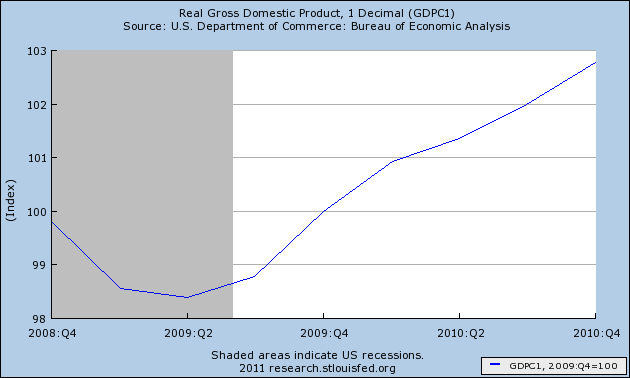
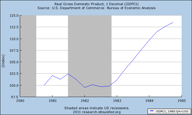
During Reagan's first two years of office, GDP had barely budged, up 1%. But it gained 12% in the next two years. Thus, for Obama to equal Reagan's record, GDP must go up 5% a year in real terms this year and next:
Industrial Production
Two years and three months into Obama's term, Industrial production is already up 7%:
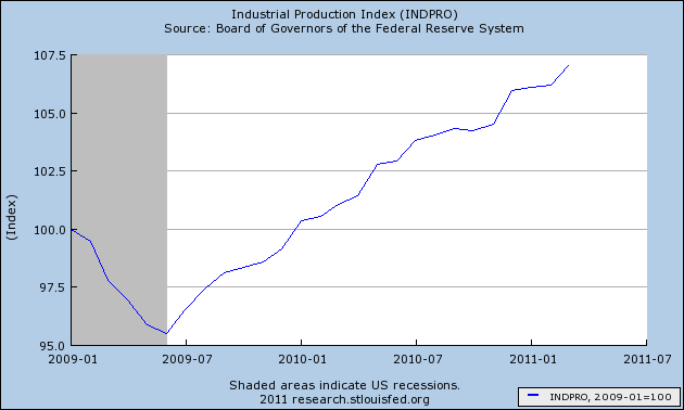
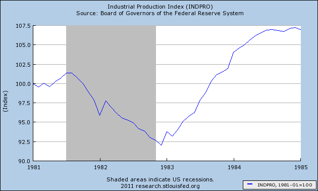
Industrial production only reached 7% growth at the end of Reagan's first term of office. At this point in Reagan's first term, Industrial production was still off about 4%:
Employment
Employment has shrunk about 2% in the first 27 months of Obama's term:
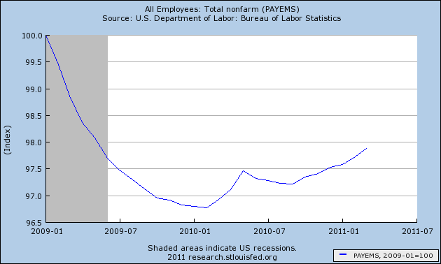
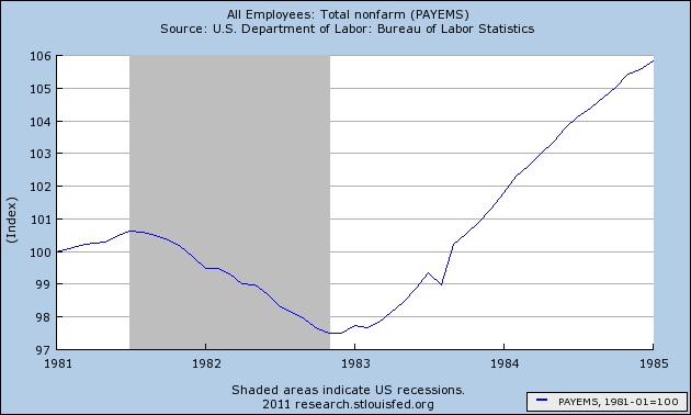
Reagan posted a similar 2% loss after 27 months, but over the next 21 months, employment grew another 8%:
Unemployment
At 8.8% unemployment is about 1% higher than when Obama took office:
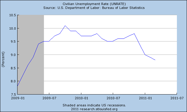
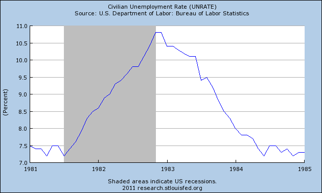
Twenty-seven months into Reagan's first term, unemployment was still over 10%, but it would shrink all the way down to under 7.5% in the next 1 3/4 years:
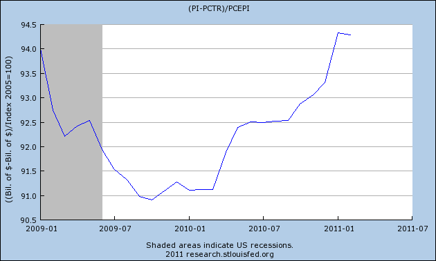
Real Income
Real income is barely higher than what it was when Obama took office:
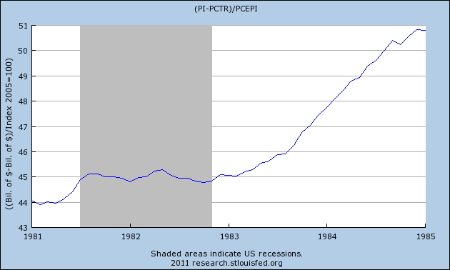
By this point in Reagan's first term, real income was up about 2%. It would go up another 12% before his first term ended:
Inflation
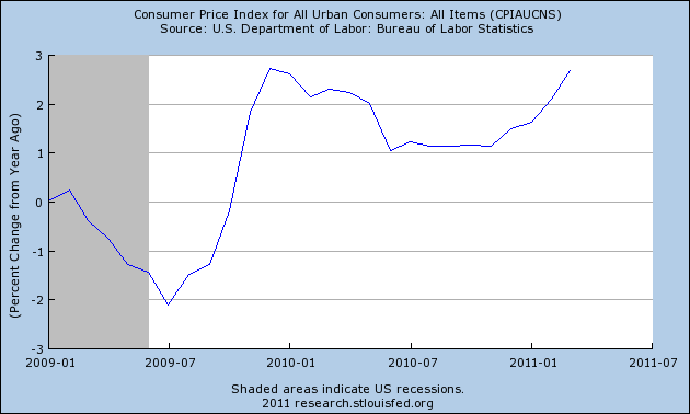
When Obama took office, the country was on the verge of a deflationary spiral. It was reversed, with inflation now running at close to 3%:
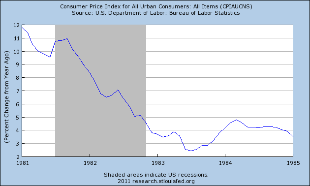
The economic Rubicon that Reagan had to cross when he entered office was that of high inflation and the wage-price spiral that had accelerated in the 1970's. Two and one quarter years into his first term, it had been conquered, going down from 12% to 3%:
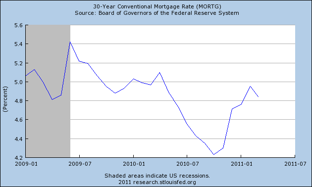
Mortgage Rates
During Obama's term, conventional mortgage rates have meandered between 4.2% and 5.4%:
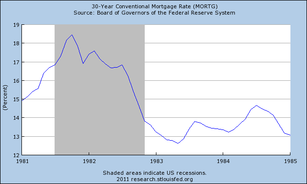
With the slaying of high inflation, mortage rates during the first 2 1/4 years of Reagan's first term declined all the way from over 18% to under 13%, a huge difference in terms of a family's income that was required to pay this most important monthly bill:
Housing starts
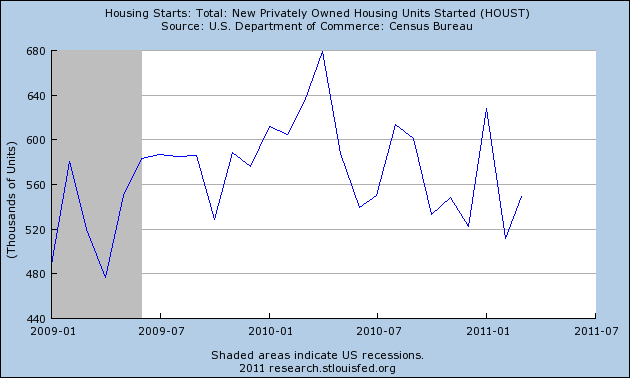
Housing starts have meandered in the 500,000-650,000 range during Obama's term:
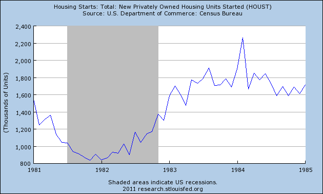
Because of the large decline in mortgage rates, 27 months into Reagan's first term, housting starts had increased nearly 900,000 from their bottom, although they were only about 100,000 annualized than when Reagan took office:
Oil prices
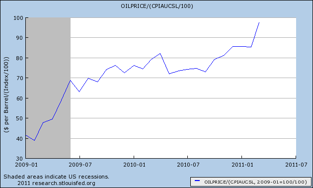
Twenty seven months into Obama's presidency, Oil prices have more than doubled:
At the same point in Reagan's presidency, Oil prices had declined by about 30%. They would fall nearly by half, by the end of his first term:
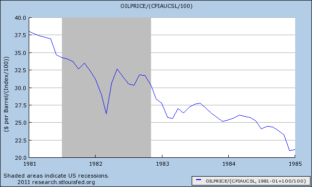
In summary, while Reagan's progress lagged Obama's in a few metrics like Industrial Production, by this point during his first term Reagan had crossed his economic Rubicon. With the assistance of a Fed-induced brutal recession, inflation had been broken. The last two years of his first term saw strong growth not just in the broad economy, but in such measures as real income, employment and unemployment, and housing starts. The Oil shocks of the 1970's receded. He was re-elected in 1984 by a landslide, and the GOP kept control of the Senate.
By contrast, while Obama has made progress against the economic declines of the great recession, unless the housing market shows real signs of a strong rebound in the next year, (contra Calculated Risk who is predicting at least 3 more years until it does so), and unless Oil miraculously goes into a long lasting decline without harming economic demand in the process, he will have failed to resolve the secular economic problems which brought him to power. 2008 will be seen as a failed turning point, or at most a 1968 style election where the next electoral majority began to emerge, but failed to fundamentally change the existing course.
