It's that time of the week again. Take a break from the markets are have yourself a weekend. See you on Monday.
Friday, May 23, 2008
We're Nowhere Near the Bottom In Housing, pt II
From Bloomberg:
This is a super-glut. Combine this with the price news from earlier today and you have big problems. Still.
The number of previously owned unsold homes on the market at the end of April jumped to 4.55 million, up from 4.12 million in March. The total represented 11.2 months' supply at the current sales pace, the highest on record and up from 10 months at the end of the prior month.
This is a super-glut. Combine this with the price news from earlier today and you have big problems. Still.
US Auto Makers -- Dumb As a Bag of Rocks
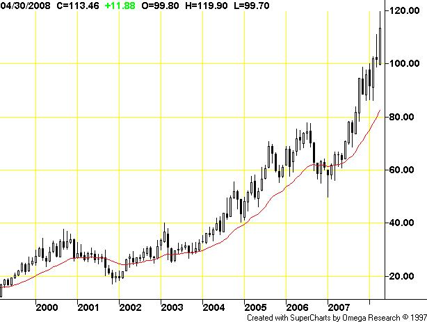
First, here is a long term chart of oil:
Does anybody see a trend here? Anybody? It sure looks to me like oil is in the middle of a multi-year bull market, intensified by the economic growth of two of the worlds largest countries India and China. For those of you in the economic forecasting department at Ford that's called "an increase in demand" and it means prices will go up. At some point prices will become so high that people might want to purchase a more fuel efficient vehicle, like say a Prius.
Yet, the US auto industry made their bed with ..... trucks and SUVs which aren't exactly the most fuel efficient models on the planet. As a result, we get stories like this:
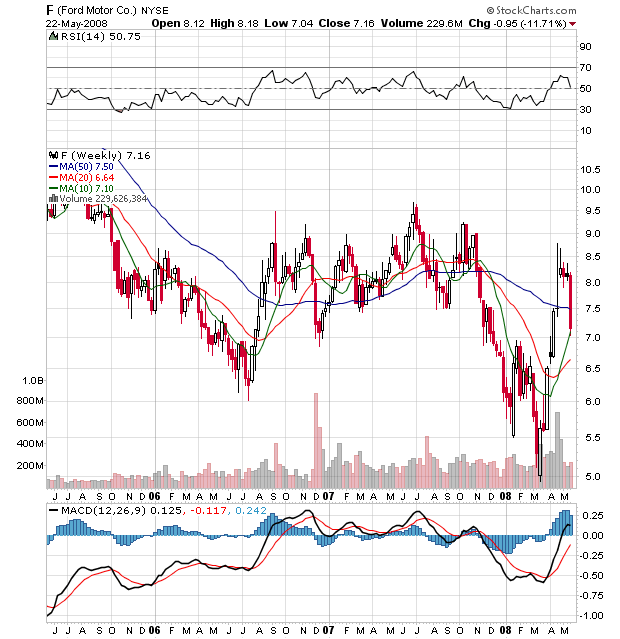
If the downfall was caused by a random catastrophe I'd have more sympathy. But this has been right in front of them for sometime now. Yet according to the article Ford was banking on a redesigned F-150 truck? At a time when Prius sales are kicking their ass? These guys deserve to fail. It also explains why Toyota's stock is at 100
And Ford is at 7.5
Does anybody see a trend here? Anybody? It sure looks to me like oil is in the middle of a multi-year bull market, intensified by the economic growth of two of the worlds largest countries India and China. For those of you in the economic forecasting department at Ford that's called "an increase in demand" and it means prices will go up. At some point prices will become so high that people might want to purchase a more fuel efficient vehicle, like say a Prius.
Toyota Motor Corp (7203.T: Quote, Profile, Research) said on Thursday that cumulative sales of its Prius hybrid car had topped 1 million units worldwide since its launch just over a decade ago.
The Prius, the world's first mass-produced gasoline-electric hybrid car, first went on sale in Japan in late 1997 and in other markets in 2000. Toyota remains the leader in hybrid sales, with Honda Motor Co (7267.T: Quote, Profile, Research) a distant second with its Civic model.
.....
By slashing production costs for the hybrid system, Toyota has said it would make the technology available across its line-up, with an aim to sell at least 1 million hybrid vehicles annually soon after 2010.
Yet, the US auto industry made their bed with ..... trucks and SUVs which aren't exactly the most fuel efficient models on the planet. As a result, we get stories like this:
Ford Motor Co.'s plan to return to profitability got run over by a truck.
The rise of gasoline prices toward $4 a gallon is causing a major shift in the U.S. auto industry that threatens to push the Big Three auto makers and some of their rivals to a new level of peril. In recent weeks, sales of pickup trucks and sport-utility vehicles -- already falling in recent years -- took an unexpectedly sharp tumble.
Those declines triggered a surprise announcement by Ford on Thursday that it's now "extremely unlikely" the company will return to profitability in 2009, as it previously predicted. Just last month, Ford was hailed by the market after it reported an unexpected $100 million in first-quarter net income.
In a Thursday conference call, Chief Executive Alan Mulally said the industry has "reached a tipping point" and that the falling truck sales represent a long-term shift in the U.S. auto market, not a short-term dip.
"We saw real change in the industry demand for pickup trucks and SUVs in the first two weeks of May," Mr. Mulally said.
On Thursday, Ford said it will cut truck and SUV production by as much as 40% in the second half of this year, compared with the year-earlier period. Previously, Ford had hoped to get a second-half lift from the launch of a redesigned F-150 pickup truck. The F-150 is the top-selling vehicle in the U.S.
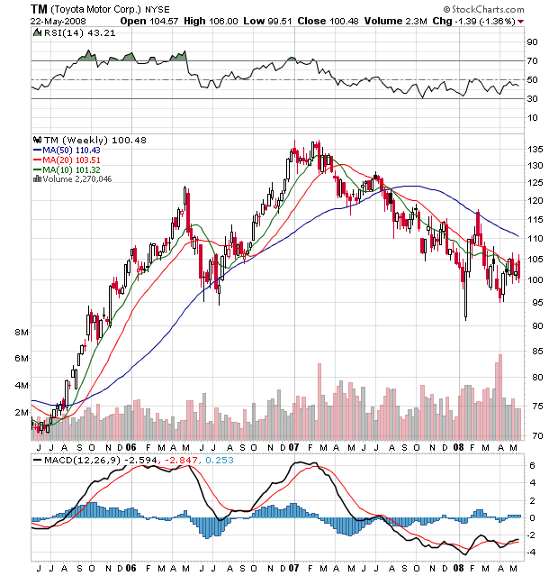
If the downfall was caused by a random catastrophe I'd have more sympathy. But this has been right in front of them for sometime now. Yet according to the article Ford was banking on a redesigned F-150 truck? At a time when Prius sales are kicking their ass? These guys deserve to fail. It also explains why Toyota's stock is at 100
And Ford is at 7.5
We're Nowhere Near the Bottom In Housing
From the WSJ:
Let's review the basic issues in the housing market.
1.) Inventory of existing homes is sky-high.
2.) Foreclosures are increasing, which is adding to a bloated inventory total.
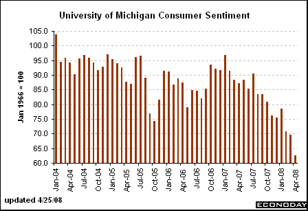
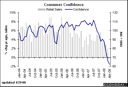
3.) The US consumer's confidence is dropping, which is lowering the possibility of more home purchases.
4.) The US consumer is already in debt up to his eyeballs, meaning the possibility of him taking on more mortgage debt is pretty low.
As a result of all these factors, we get price decline headlines like the one from today. And it's not going to end anytime soon because of the 4 above mentioned data points. The best we can hope for right now is that by the end of the year we'll actually have an idea about when the market will stabilize. Maybe.
Home prices are falling faster as the economy slows and turmoil in the mortgage markets continues.
Prices fell an average of 1.7% nationwide in the first quarter from the final three months of 2007, according to the Office of Federal Housing Enterprise Oversight. The decline was the largest in the index's 17-year history. The government index, which is seasonally adjusted and based on data for home purchases, had dropped 1.4% in the prior quarter. Compared with a year earlier, home prices dropped 3.1% in the first quarter.
.....
Other nationwide indexes show steeper declines. The S&P/Case-Shiller index, which includes a broader variety of mortgages and which showed a nationwide drop of 8.9% in the fourth quarter from a year earlier, is set to release first-quarter figures next week.
"The OFHEO report shows the weakness in the housing market, but does not, in our view, fully portray the dire state of the market," Lehman Brothers economist Michelle Meyer said in a note to clients.
Let's review the basic issues in the housing market.
1.) Inventory of existing homes is sky-high.
2.) Foreclosures are increasing, which is adding to a bloated inventory total.
3.) The US consumer's confidence is dropping, which is lowering the possibility of more home purchases.
4.) The US consumer is already in debt up to his eyeballs, meaning the possibility of him taking on more mortgage debt is pretty low.
As a result of all these factors, we get price decline headlines like the one from today. And it's not going to end anytime soon because of the 4 above mentioned data points. The best we can hope for right now is that by the end of the year we'll actually have an idea about when the market will stabilize. Maybe.
Today's Markets
Actually, this is yesterday's markets, but who's counting, right?
The big news from two days ago was the indexes dropping hard through support. Let's see how that has played out.
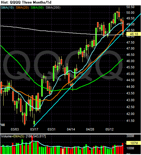
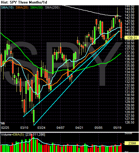
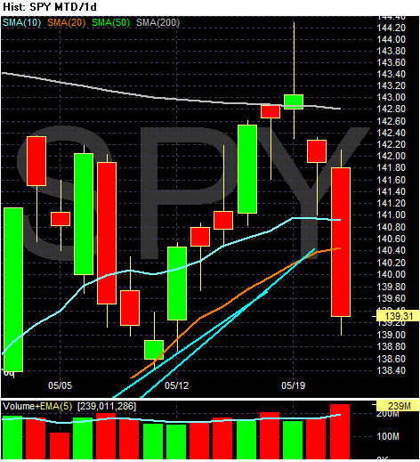
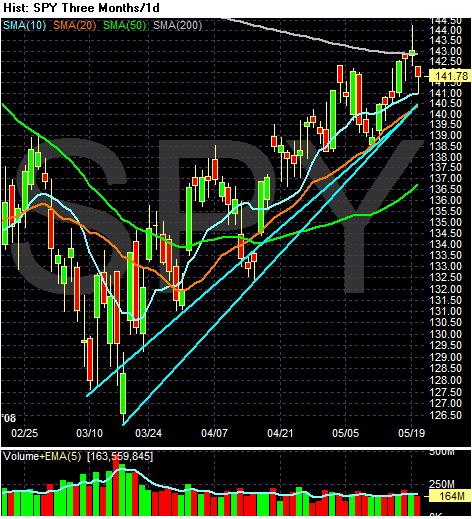
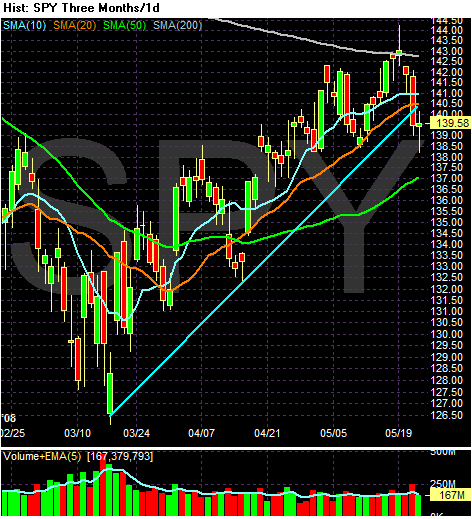
The SPYs are still through the 10 and 20 day SMA along with the support line started in mid-March. But yesterday the markets cooled off a bit, making today that much more important -- especially the close. If prices drop at the or near the close, we've got a big problem.
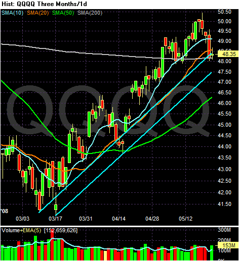
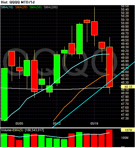
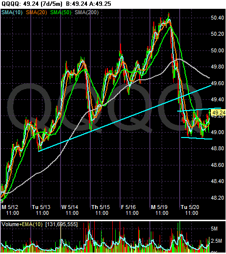
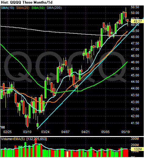
On the QQQQs, notice the average is right at the 200 day SMA -- precarious technical territory. Today's close will be very important from a technical perspective.
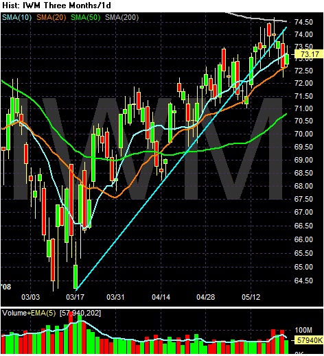
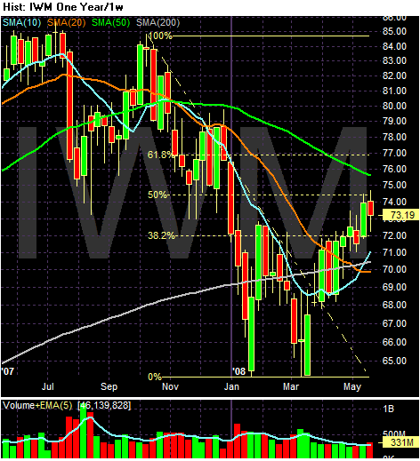
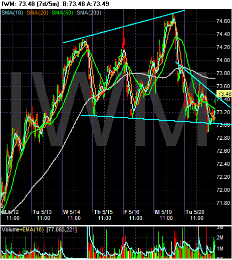
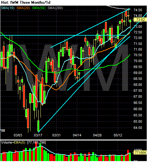
Notice the IWMS are still moving higher, using the 20 day SMA for support. However, the IWMS have broken their upside support a bit ago.
Friday's Forex Round-Up
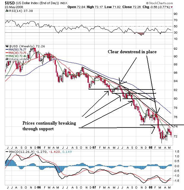
Let's start with a long-term chart of the dollar:
Remember we're dealing with an incredibly weak chart. Prices have been dropping for the better part of to years, with prices continually breaking through downside support and making new lows. This had been going on for two years -- long before the economy started to slow. That means traders saw fundamental problems with the economy long before big drops in GDP started to show up.
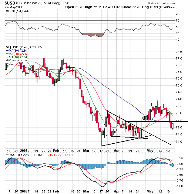
On the daily chart, notice that Prices formed a consolidation triangle from mid-March to the end of April. Then prices rallied out from that pattern. However, prices have had a hard time maintaining any upside momentum. Prices have now dropped below all the SMAs. Also note the 10 day SMA has crossed below the 20 day SMA and the 50 day SMA is at best even. A few weeks ago, the general consensus was for the dollar to rally. Now it doesn't look that hot.
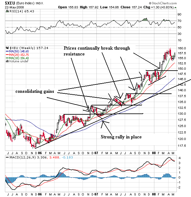
The Euro has been the direct beneficiary of the dollar's drop. Notice the euro is in the middle of a multi-year rally with a strong uptrend in place. Also notice that as prices rallied, they also consolidated their gains in several places, allowing traders to digest price action and plot their next move.
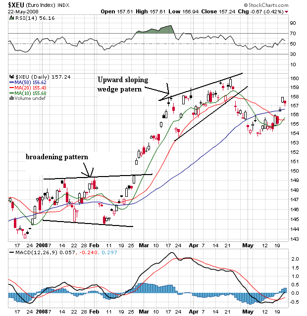
On the daily euro chart, notice the broadening pattern at the beginning of the year and the upward sloping wedge pattern from the end of March to the end of April. Prices dropped from there and fell below the SMAs. But notice how the euro has bounced back and moved through all the SMAs. Also note the 10 day SMA has moved through the 20. This chart is turning around, although it's not time to say with confidence it's completely bullish.
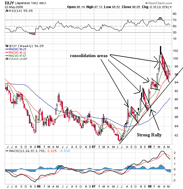
On the weekly yen chart, notice the strong rally that started in the middle of last summer -- right before the US market started to tank hard. Also notice that as prices have rallied, they have also fallen back in several triangle patterns to consolidated gains. Finally, notice how the week chart uses the 20 week SMA as support.
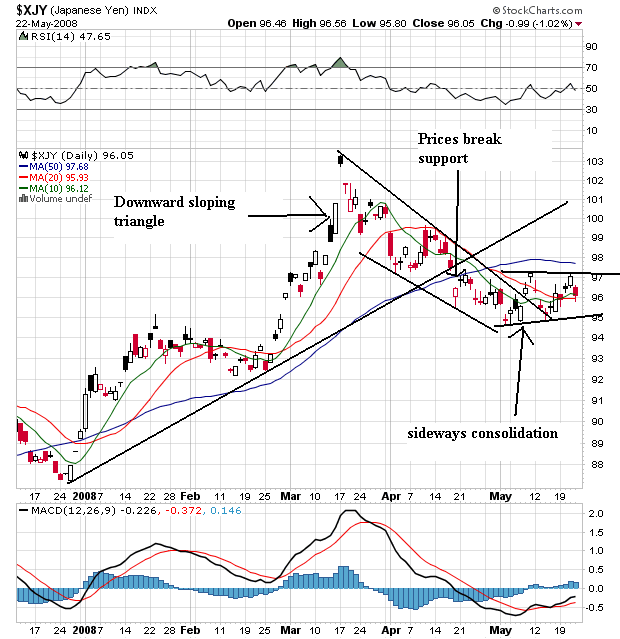
The yen broke through upside support in mid-April, but formed a solid downward sloping channel starting in mid-March. Since the beginning of May prices have been moving sideways as traders await the next big move.
So -- what can we discern from all this?
1.) The dollar's "comeback rally" isn't shaping up that well.
2.) The euro may be turning around, but we can't make a solid call yet.
3.) The yen is waiting to see what happens.
Thursday, May 22, 2008
Today's Markets
Today's markets will be posted tomorrow morning. Bonddad and Mr$. Bonddad are signing many papers as they purchase a house.
Are the Transports Forming a Double Top? or Is It Time For A Reversal?
Big kudos to Trader Mike for this catch.
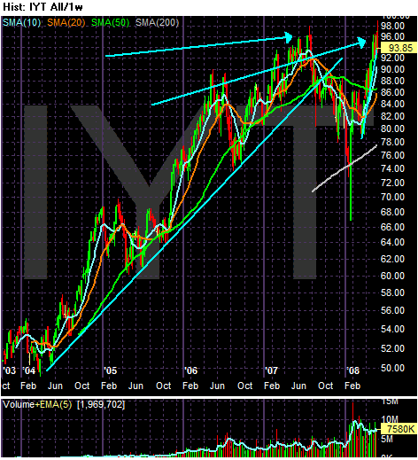
Let's start with this chart:
Each arrow is point to a possible top.
Now -- let's carry this out a bit further. Let's use Dow theory, which states the averages have to confirm each other. In other words, more than one sector of the economy has to be doing well in order for stocks to rise. So, if the economy is doing well, then transports have to rise as well.
The converse is also true -- areas of the market rise and fall with each other for various reasons.
So -- let's assume the transports are making a double top and will then drop. What does this mean for the other averages?
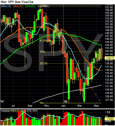
Note the SPYs have retraced about 50% of their drop from October of last year. That means the latest rally could be a solid bear market rally.
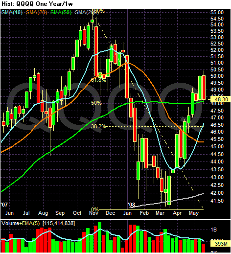
The QQQQs are at their 61.8% retracement level for another bear market rally.
The IWMS are at the 50% retracement level.
So -- let's sum this theory up.
1.) The transports are currently forming a double top.
2.) All of the other averages are at technically important levels where traders would expect things to happen.
3.) The underlying economy is not doing that well -- at least according to the Federal Reserve:
In other words, the wind in the markets sails from the rate cuts and bear bail-out might be running into trouble from a badly damaged economy.
Let's start with this chart:
Each arrow is point to a possible top.
Now -- let's carry this out a bit further. Let's use Dow theory, which states the averages have to confirm each other. In other words, more than one sector of the economy has to be doing well in order for stocks to rise. So, if the economy is doing well, then transports have to rise as well.
The converse is also true -- areas of the market rise and fall with each other for various reasons.
So -- let's assume the transports are making a double top and will then drop. What does this mean for the other averages?
Note the SPYs have retraced about 50% of their drop from October of last year. That means the latest rally could be a solid bear market rally.
The QQQQs are at their 61.8% retracement level for another bear market rally.
The IWMS are at the 50% retracement level.
So -- let's sum this theory up.
1.) The transports are currently forming a double top.
2.) All of the other averages are at technically important levels where traders would expect things to happen.
3.) The underlying economy is not doing that well -- at least according to the Federal Reserve:
The information reviewed at the April meeting, which included the advance data on the national income and product accounts for the first quarter, indicated that economic growth had remained weak so far this year. Labor market conditions had deteriorated further, and manufacturing activity was soft. Housing activity had continued its sharp descent, and business spending on both structures and equipment had turned down. Consumer spending had grown very slowly, and household sentiment had tumbled further. Core consumer price inflation had slowed in recent months, but overall inflation remained elevated.
In other words, the wind in the markets sails from the rate cuts and bear bail-out might be running into trouble from a badly damaged economy.
Retail Gas Prices Make Another Weekly Record
The following are in no particular order of importance:
From "This Week in Petroleum":
Here's a chart from the same report:
Let's combine that with the following data points:
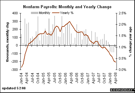
Job growth is dropping, which is leading to
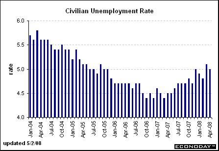
Increasing unemployment, which is leading to
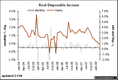
Declining income, which is leading to
Declining sentiment and
Declining Confidence
What do you think is going to happen to personal spending over the summer if gas prices keep spiking?
What do you think this is going to do to consumer spending on non-gas items?
From "This Week in Petroleum":
The U.S. average retail price for regular gasoline climbed to another all-time high, going up 6.9 cents to 379.1 cents per gallon. This was the eighth consecutive week for the national average price to increase, with the cumulative change totaling 53.2 cents. All regions recorded price hikes, with the East Coast jumping by 8.2 cents (the most of any region) to 379.5 cents per gallon. The average price in Central Atlantic portion of the East Coast surged up by 9.5 cents to 382.4 cents per gallon, 74.2 cents above the price a year ago. The average price in the Midwest went up 6.3 cents to 379.9 cents per gallon. The average price in the Gulf Coast region was 368.9 cents per gallon, a jump of 7.3 cents. Increasing by 7.7 cents to 368.6 cents per gallon, the price in the Rocky Mountain region remained the lowest in the country but only by a mere three-tenths of a cent. Once again, the average price for the West Coast was the highest in the nation, moving up by 5 cents to 388.3 cents per gallon. The average price in California rose by 3.3 cents to 395.2 cents per gallon.
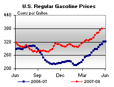
Here's a chart from the same report:
Let's combine that with the following data points:
Job growth is dropping, which is leading to
Increasing unemployment, which is leading to
Declining income, which is leading to
Declining sentiment and
Declining Confidence
What do you think is going to happen to personal spending over the summer if gas prices keep spiking?
What do you think this is going to do to consumer spending on non-gas items?
Is Peak Oil Becoming the Norm?
From Wikipedia:
Also from Wikipedia:
Let's simplify the above into classic economics. There is a limited supply of oil. Because India and China have added 2 billion people to the world's roll of active consumers demand is increasing. Put these two elements together, and you get increasing prices -- just like we are experiencing now.
I bring this up because on the front page of today's WSJ there is an article that the IEA is now focusing on the supply of oil rather than demand. As a result, people are far more pessimistic about the oil market.
Peak oil is the point in time when the maximum rate of global petroleum production is reached, after which the rate of production enters its terminal decline. If global consumption is not mitigated before the peak, an energy crisis may develop because the availability of conventional oil will drop and prices will rise, perhaps dramatically. M. King Hubbert first used the theory in 1956 to accurately predict that United States oil production would peak between 1965 and 1970. His logistic model, now called Hubbert peak theory, has since been used to predict the peak petroleum production of many other countries, and has also proved useful in other limited-resource production-domains. According to the Hubbert model, the production rate of a limited resource will follow a roughly symmetrical bell-shaped curve based on the limits of exploitability and market pressures.
Also from Wikipedia:
Oil depletion is the inescapable result of extracting and consuming oil faster than it is naturally produced, due to the fact that the formation of new natural petroleum is a continuous geologic process which takes millions of years. No one knows for sure when the long-term decline of oil reserves will begin, or what the consequences will be. The Hubbert peak is an influential theory concerning the long-term rate of conventional Petroleum (and other fossil fuel) extraction and depletion. The Hubbert peak is named for United States geophysicist M. King Hubbert, who created a model of known reserves, and proposed the theory. The concept of passing the peak-point, so that society is on the downward side of the oil supply curve, is also referred to as Peak oil or the end of cheap oil. By most projections, this point has already been passed or is about to be at some point between the years 2007 and 2010, although by United States government prediction, world consumption of oil will increase to 98.3 million barrels a day in 2015 and 118 million barrels a day in 2030. This represents more than a 25% increase in world oil production. Many predictions have been made about the potential implications of passing the peak. These estimates range from warnings of a doomsday scenario created by long term lack of growth to faith that the market economy will allow a relatively smooth transition to other energy sources through technological solutions.
Let's simplify the above into classic economics. There is a limited supply of oil. Because India and China have added 2 billion people to the world's roll of active consumers demand is increasing. Put these two elements together, and you get increasing prices -- just like we are experiencing now.
I bring this up because on the front page of today's WSJ there is an article that the IEA is now focusing on the supply of oil rather than demand. As a result, people are far more pessimistic about the oil market.
But the direction of the IEA's work echoes the gathering supply-side gloom articulated by some Big Oil executives in recent months. A growing number of people in the industry are endorsing a version of the "peak-oil" theory: that oil production will plateau in coming years, as suppliers fail to replace depleted fields with enough fresh ones to boost overall output. All of that has prompted numerous upward revisions to long-term oil-price forecasts on Wall Street.
.....
The world's premier energy monitor is preparing a sharp downward revision of its oil-supply forecast, a shift that reflects deepening pessimism over whether oil companies can keep abreast of booming demand.
The Paris-based International Energy Agency is in the middle of its first attempt to comprehensively assess the condition of the world's top 400 oil fields. Its findings won't be released until November, but the bottom line is already clear: Future crude supplies could be far tighter than previously thought.
.....
For several years, the IEA has predicted that supplies of crude and other liquid fuels will arc gently upward to keep pace with rising demand, topping 116 million barrels a day by 2030, up from around 87 million barrels a day currently. Now, the agency is worried that aging oil fields and diminished investment mean that companies could struggle to surpass 100 million barrels a day over the next two decades.
Thursday Oil Market Round-Up
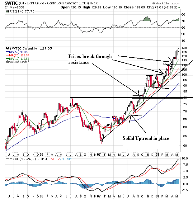
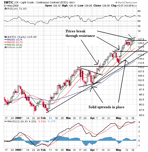
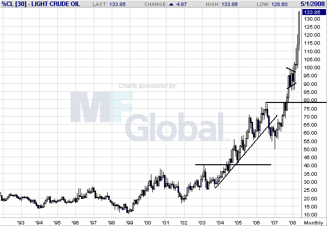
Today I'm just going to show three charts so we can look at the long, medium and short term oil markets. Short version: this is what a bull market looks like
Above is a monthly chart. Notice that prices are rising from a base established over 10 years. Here's an old trader's adage for you (which you probably don't want to hear right now). The longer the base, the stronger the run. Also note how prices have continually broken through resistance.
On the weekly chart, notice the following:
-- Prices have continually moved through resistance
-- There is a strong rally in place that started at the beginning of 2007
-- As prices have risen they have taken time to consolidate gains before moving higher
On the daily chart, notice the following:
-- Prices are above the SMAs
-- The shorter SMAs are above the longer SMAs
-- All the SMAs are moving higher
-- There are two solid uptrends in place; one that started in February and one that started in April
When you combine all of these charts you get the following:
-- A strong multi-year chart that shows a rally from a multi-year base
-- A weekly chart with an uptrend that started at the beginning of 2007
-- A daily chart with the most bullish price and SMA arrangement possible
Wednesday, May 21, 2008
Today's Markets
Guess what? Oil hit another record today. And that will probably lead to a lower number of Americans driving over memorial day weekend. American Airlines announced they would be cutting jobs and charging for the first bag. We also learned the Fed is lowering it's growth forecast for the economy.
In market land, we had some really big developments.
Notice the QQQQs have been in a rally since March 17. The QQQQs have led the market higher.
On the 1 month chart, notice the following:
-- Prices moved through the 10 and 20 day SMAs today
-- Prices dropped on heavy volume
-- Prices moved through the long-term support line started on March 17
-- Prices are right at the 200 day SMA
On the SPYS first notice there are two possible trend lines. This is because there are three data points which I think are outliers of the real trend, but to be complete I added a trend line below these points.
On the one month SPY chart, notice the following:
-- Prices moved through th 10 and 20 day SMAs
-- Prices moved through both trend lines. In other words, it doesn't matter which one you think is accurate; prices moved through them.
-- Prices were rebuffed from the 200 day SMA
Both the QQQQs and SPYs fell on heavy volume
The main thing to keep an eye on is the QQQQs. They have pulled the market higher for the last few months. If they move through the 200 day SMA, we've got a big problem.
More Agricultural Price Charts
Below I mentioned that agricultural prices have started to cool a bit. Let's look at some individual charts to see what's going on.
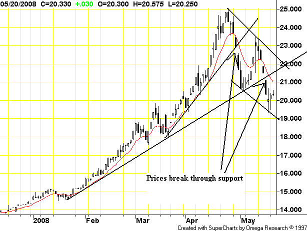
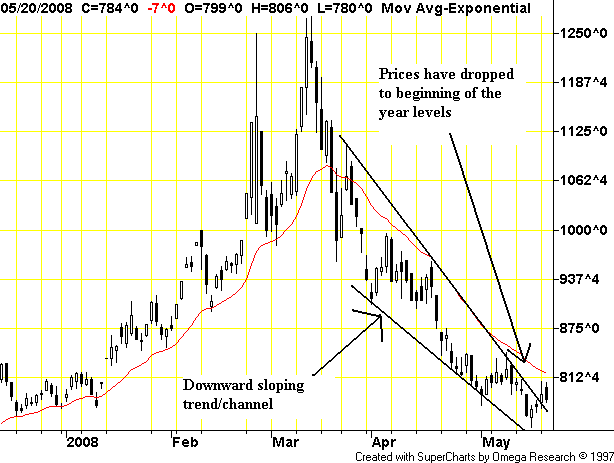
On rice's daily chart, notice that prices have clearly broken two different upward support trend lines. In addition, prices are clearly in a downward sloping trend channel
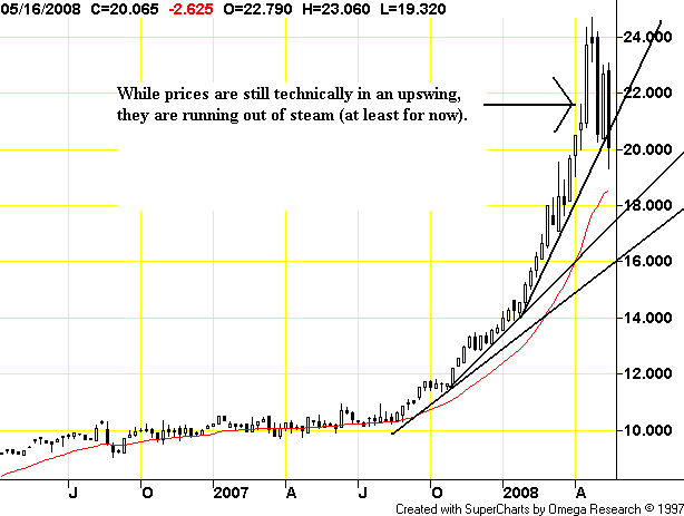
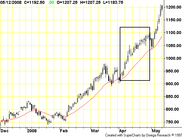
On rice's weekly chart, notice that while prices are still technically in an uptrend they are cooled. However, the weekly uptrends are still firmly in place. And while prices have technically dropped through support that could change by the end of the week. In other words, this could just as easily be a consolidation before a further move higher rather than lower.
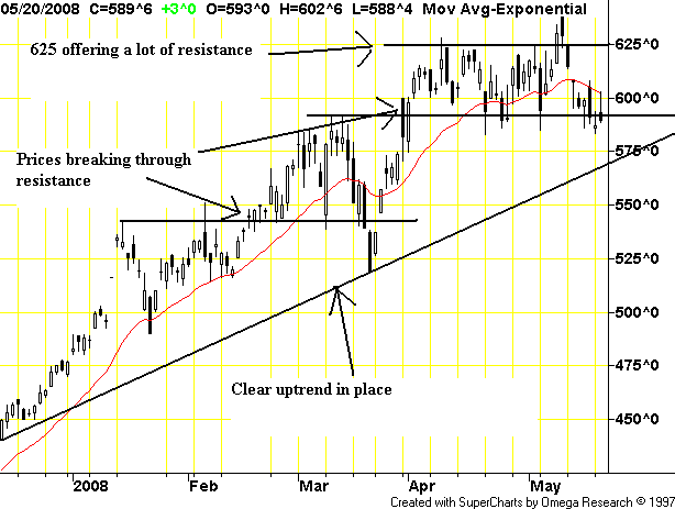
On corn's daily chart, notice tow important points.
-- There is still an uptrend in place, BUT
-- Prices are having a hard time getting over 625.
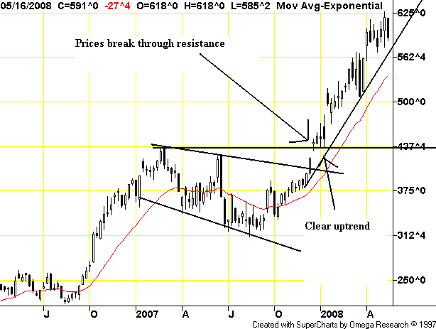
On corn's weekly chart, notice that prices are firmly in an uptrend.
On wheat's daily chart, notice that prices have retreated to beginning of the year levels.
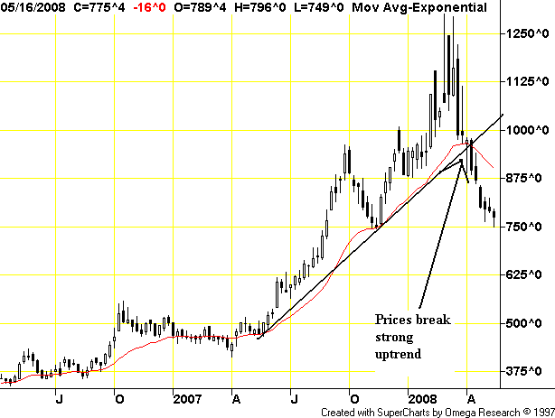
On wheat's weekly chart, note that prices have broken the uptrend started in mid-2007.
Moody's Begins Internal Probe On Ratings
Actually, I was thinking of the headline "Moody's probes self" because that's basically what's going on:
Here's what really happened.
Moody's figured out they made more money by giving AAA ratings to everything. In addition, Moody's clients probably performed a lot of "alternative negotiations". For example, client X held a "meeting" with Moody's in astrip club "gentleman's retreat" and offered "special incentives" for certain ratings. Or when a client found out they wouldn't get a AAA rating, they called the president of Moody's and threatened to pull their business at which time the president of Moody's chewed out the analyst who then magically gave the company a better rating (imagine that).
The ratings agencies are incredibly culpable regarding the current mess we're in. The idea they can objectively investigate themselves is laughable at best and criminal at worst.
Moody's Investors Service said it's conducting ``a thorough review'' after the Financial Times reported that a computer error was responsible for Aaa ratings being assigned to complex debt securities that slumped in value.
Banks obtained the highest grades in 2006 and 2007 for constant proportion debt obligations, funds sold in Europe that used borrowed money to speculate on an improvement in credit quality. The subprime crisis caused banks including UBS AG and ABN Amro Holding NV to unwind their CPDOs, triggering losses of as much as 90 percent for investors.
Some senior staff at Moody's were aware in early 2007 that CPDOs rated Aaa the previous year should have been ranked as many as four levels lower, the FT reported today, citing internal Moody's documents. The firm adjusted some assumptions to avoid having to assign lower grades, the paper said.
``If it is true, does that mean other products haven't been rated correctly?'' said Puneet Sharma, Barclays Capital's head of investment-grade credit strategy in London. ``Will they be downgraded? It could lead to turmoil.''
Here's what really happened.
Moody's figured out they made more money by giving AAA ratings to everything. In addition, Moody's clients probably performed a lot of "alternative negotiations". For example, client X held a "meeting" with Moody's in a
The ratings agencies are incredibly culpable regarding the current mess we're in. The idea they can objectively investigate themselves is laughable at best and criminal at worst.
More On Commodity Inflation
Below I mentioned that it looks as though certain commodities are now dropping in price. While we're not out of the woods, it appears things are setting up to ease. The following is from today's IBD:
I'm going to throw up some charts of individual commodities later today to see what they say.
Crude oil prices rose again Tuesday, hitting record highs near $130 a barrel and sparking a gold rally for a second straight session.
But the mixed performance in agricultural, softs and metals markets was evidence that the rest of the commodity complex was not following the dramatic rise in oil, traders said.
"All the markets have been overinflated by the fund buying in recent times, and as soon as that disappears, let alone turns in the opposite direction, there's not so much support to it," said a softs trader in Europe.
I'm going to throw up some charts of individual commodities later today to see what they say.
Bureau of Labor Statistics: Comedian
According to the latest PPI release finished energy prices -- after adjusting for seasonal factors -- decreased .2% last month.
Let's look at that again.
The prices of finished energy prices decreased .2% last month.
Here's more from the same report:
Let's debunk that line of crap. Here are two graphs/charts. The first is from "This Week in Petroleum" and it shows this year's gas prices verses last year's gas prices:
I'm still looking for the hidden price declines in retail level gas. Maybe I don't have the appropriate decoder ring.
Here's a chart of gas futures. I blocked-off April.
That's one hell of a decline, isn't it?
I realize there is probably a statistical thing going on here. But frankly, where "seasonal adjustments" fly this much in the fact of objective reality, I have to question the veracity of the actual numbers being reported.
Let's look at that again.
The prices of finished energy prices decreased .2% last month.
Here's more from the same report:
In April, the index for finished goods other than foods and energy moved up 0.4 percent and was partially offset by prices for energy goods, which fell 0.2 percent. The index for finished consumer foods was unchanged from its March level.
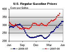
Let's debunk that line of crap. Here are two graphs/charts. The first is from "This Week in Petroleum" and it shows this year's gas prices verses last year's gas prices:
I'm still looking for the hidden price declines in retail level gas. Maybe I don't have the appropriate decoder ring.
Here's a chart of gas futures. I blocked-off April.
That's one hell of a decline, isn't it?
I realize there is probably a statistical thing going on here. But frankly, where "seasonal adjustments" fly this much in the fact of objective reality, I have to question the veracity of the actual numbers being reported.
Wednesday Commodity Round-Up
Let's take a look at the commodities charts to see how they've been behaving. After looking at some of these charts, I'm going to tie them into the recent inflation numbers.
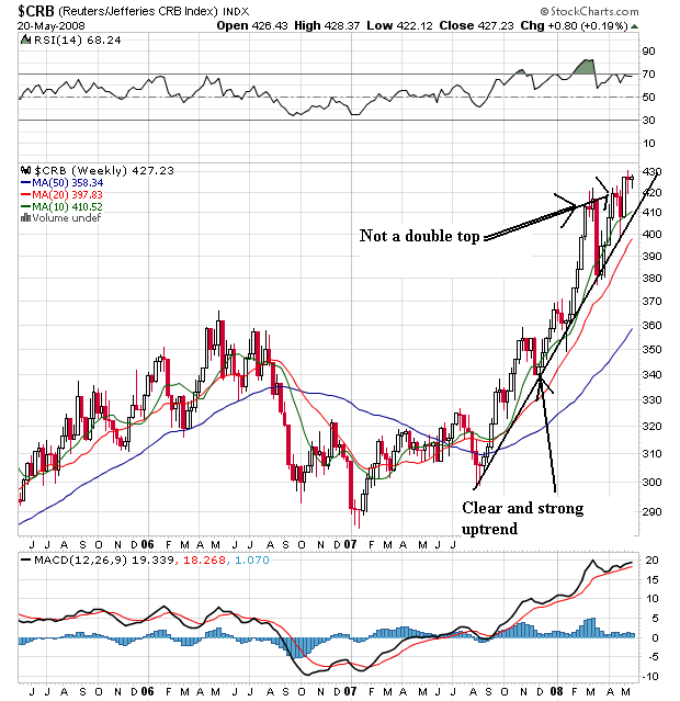
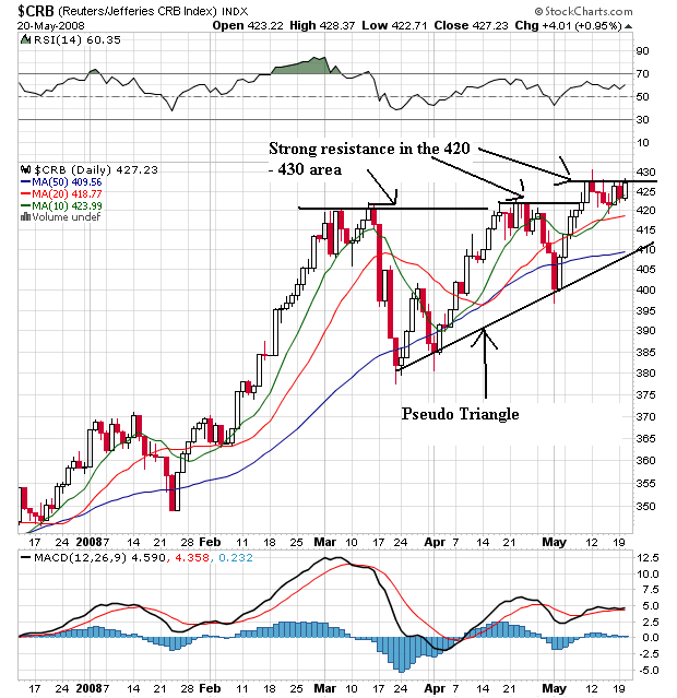
We'll start with the weekly CRB chart. Notice two points.
-- The sharp uptrend that started at the end of last summer is still in place.
-- The double top that appeared to be forming didn't.
However --
On the daily chart, notice that prices have a rising bottom (what I'm calling a pseudo triangle) but are having a hard time getting through the 420 - 430 area. That doesn't mean they won't get through this area, but they haven't yet. Also notice the following:
-- Prices have been using the 50 day SMA as support since January of this year.
-- Although the SMAs are technically in a good pattern (the smaller are above the larger), they're awfully bunched up with prices. That's not a good place for to be.
While there isn't a strong enough move in either direction to make a call as to where this chart is going, it sure looks like it is consolidating right now.
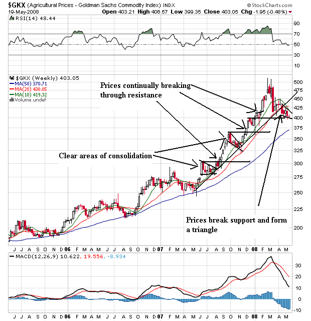
On the agricultural prices weekly chart, notice the following:
-- Prices were in a strong rally from the middle of 2Q07 to about the beginning of April. Prices continued to rise, hugged their trend line and consolidated gains along the way.
-- Prices broke that upward trend line at the beginning of April. Now prices have consolidated in a downward sloping pennant formation.
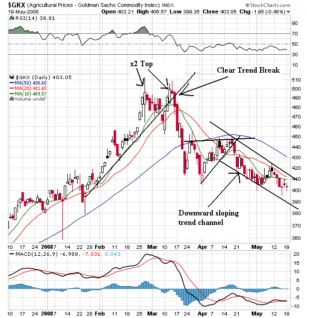
On the daily agricultural price chart, notice the following:
-- Prices rose from mid-January to early March.
-- Price formed a double top with the first top at the end of February and the second in mid-March.
-- Prices have dropped about 20% since then. They are currently in a clear downward sloping channel.
-- The shorter SMAs are below the longer SMAs
-- All the SMAs are pointing lower
-- Prices are below the SMAs
This chart says it's going to continue to move lower
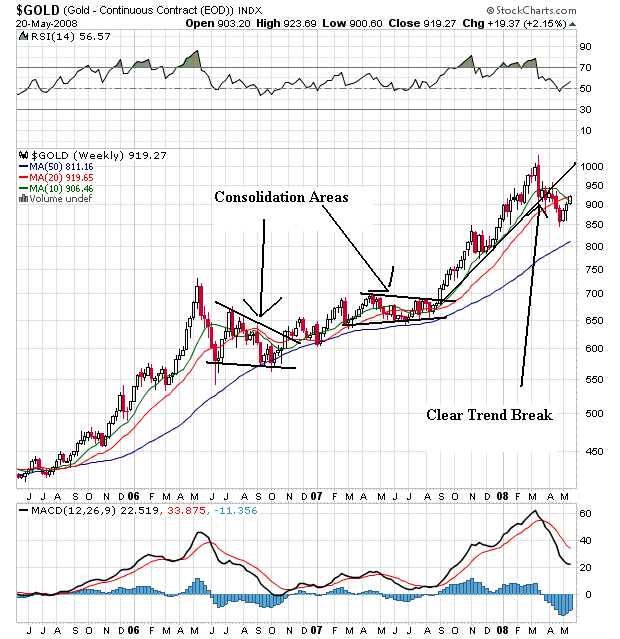
On gold's weekly chart, notice that prices have been rising for the better part of three years. They have risen and consolidated their gains along the way. However, the latest rally (which started at the end of last summer) is over as prices have broken through support.
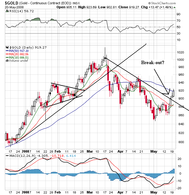
The daily chart shows a clear break occurred in mid-March. Prices have been dropping since then. However, prices may have broken through upside resistance. Notice the prices have moved through the 10 and 20 day SMA and are about to move through the 50 day SMA.
To sum up, it looks like commodity based price moves are taking an upside break -- at least for now. But there aren't firm downward moves yet. The CRB is still in an uptrend (although it is running into a great deal of upside resistance). While agricultural prices have clearly broken their uptrend, these prices have bounced off of the 50 week SMA on the weekly chart several times in the recent rally. And gold may have broken through upside resistance recently.
So, let's tie this into the latest inflation readings.
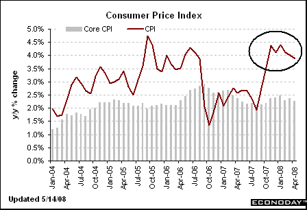
Year over year CPI has dropped a bit.
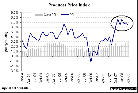
Year over year PPI is in a holding pattern
The good news is the year over year inflation numbers are at worst holding. But we're not out of the woods with these charts -- not by a long shot. For that to happen one of two things (or both) need to happen.
-- The CRB index breaks it's uptrend
-- Agricultural prices convincingly move through their 50 week SMA.
Tuesday, May 20, 2008
Today's Markets
In the "the housing market is nowhere near bottom" file, we have Home Depot's earings which dropped 66%. Oil crossed 129 a barrel (thank God it's not part of core inflation and therefore unimportant). And while Target also missed earnings, Saks and Staples saw increases (but note that Staples increase came from overseas increases rather than increases at US stores). We also saw Iceland get its credit ratings lowered.
Let's go to the chart to see what they say:
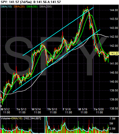
On the 5-minute daily chart, notice the clear trend break that occurred today, with prices dropping hard at the open and continuing to drift lower for the rest of the day. This shouldn't be surprising considering oil's price spike and the strong rally the SPY's have been experiencing since the beginning of last week. While a gentler sell-off is always preferred, a harsh sell-off isn't the end of the world.
On the SPY's daily chart, notice the upward trend is still intact. However, also notice the SPYs got to the 200 day SMA and couldn't cross. But also notice the positive SMA picture.
-- The shorter SMAs are higher than the longer SMAs
-- All the shorter SMAs are moving higher, and
-- Prices are still above the shorter SMAs.
Like the SPYs, the QQQQs, sold-off hard today, but would up in a trading pattern during the rest of the day.
But notice the uptrend is still very much intact on the daily chart. Also notice the following positive SMA points:
-- Prices are above all the SMAs
-- The 10 and 20 day SMA have crossed the 200 day SMA
-- The shorter SMAs are greater than the longer SMAs (10 > 20 > 50)
-- All the shorter SMAs are heading higher
The IMMs have been in the middle of a broadening pattern since last Wednesday. While they sold-off today as well, they used the established lower boundary of the broadening pattern as support.
Notice the following positive SMA points on the IWM chart:
-- Prices are above the shorter SMAs
-- The shorter SMAs are greater than the longer SMAs (10 > 20 > 50).
-- All the shorter SMAs are moving higher.
-- The longer-term trend lines are still very much in place.
Subscribe to:
Posts (Atom)