Saturday, November 16, 2013
Weekly Indicators for November 11-15 at XE.com
- by New Deal democrat
Weekly Indicators are up at XE.com.
Hopefully the link takes you directly there. If not, click on the "forum" header in the tabs at top, and then click on "Market Analysis" and it shold be the first topic.
The post-shutdown bounceback is complete, but the long leading indicators don't look so healthy ....
Friday, November 15, 2013
Yes, the decline in gas prices is a good thing
- by New Deal demorat
I have a new post up at XE.com about the shift in the secular trend in gas prices, responding to Barry Ritholtz's piece in Bloomberg wherein he speculated that the near 3 year low in gas prices was about economic weakness.
http://community.xe.com/forum/xe-market-analysis
In order to get to the article, click on "forums" and then "market analysis" and the article will turn up.
P.S. XE.com assures us that they are working on the blog format and making other improvements so that our posting abilities are easier and more thorough. It hasn't helped that "upgrading" to Apple's iOS 7.0.3, necessary for me to post at XE, has seriously degraded its ability to play well with Blogger.
Chinese Market Consolidating at Low Levels
Above is a weekly chart of the Chinese market. Prices have been moving lower for the last three years. Over the course of 2013, we've seen consolidation between 1950 and 2443.
Thursday, November 14, 2013
Japanese Market Consolidating
The weekly Japanese shows two important trends over the last year. First, we see the post-Abe rally, when the market became excited about the prospect of reforms that would finally lead Japan out of the deflationary era. Second, we see prices consolidating gains, starting in the second quarter.
Now we wait to see which way prices break before making another move.
Wednesday, November 13, 2013
Mexican ETF Breaks Support
The above chart shows that for the last 4-5 months, the Mexican ETF has been consolidating in a symmetrical triangle pattern. Momentum has been weak and volume flow has been fluctuating between positive and negative territory.
Prices has had a difficult time maintaining any momentum above the 200 day EMA. Prices broke through in August and September, but quickly retreated below this important technical line.
The weekly chart confirms the weakness in the market. Last week prices printed a long candle on fairly decent volume. The MACD is still in negative territory as well.
Tuesday, November 12, 2013
Europe ETF Is At A Buying Point
The Europe ETF has been in a good rally since the beginning of July. Prices are in a "higher high, higher low" bullish pattern. Currently, prices have fallen back to the trend line connecting the early September and early October lows. In addition, the numbers coming from the EU have been fairly positive for the last few months, adding more momentum to the chart.
Monday, November 11, 2013
The oil choke collar disengages: gas prices near 3 year low
-- by New Deal democrat
As you all know by now, I think one of the big hidden stories in the economy for the last decade has been the Oil choke collar, where growth causes energy prices to spike, causing growth to slow, causing energy prices to decline, meaning that energy prices have acted as a governor limiting US economic growth in particular.
Several years ago, I suggested that trends in exploration, efficiency, alternative fuels and conservation would finally have enough combined impact that the choke collar might start to disengage in 2013. It looks like that is happening.
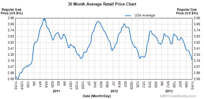
In the last few days, gas prices have declined to the point where gas is no cheaper than at any point in 2011 and 2012. It is at a near 3 year low, as shown on this graph from Gas Buddy:

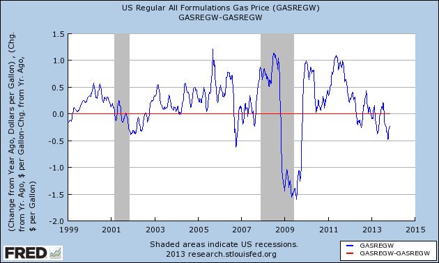
Gas prices started rising on a secular basis from less than $1/gallon in early 1999. As the below graph of YoY price changes shows, with the exception of the bottoms of the last 2 recessions, and the near recession of 2006, 2013 has marked the biggest YoY price decline since the secular bottom:

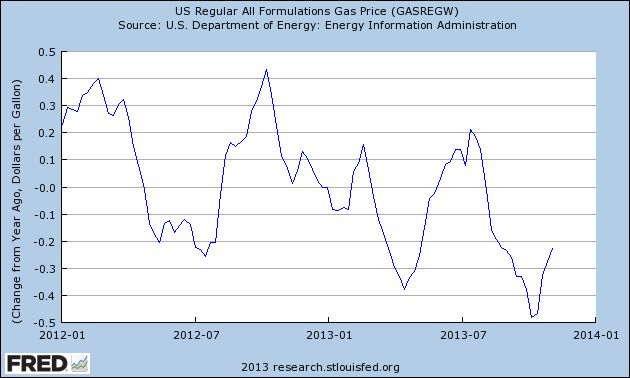
Here's a close up of the last couple of years,showing that prices have been lower most of this year than they were at the equivalent time one year ago:

As a result,YoY inflation is likely less than 1%, the lowest reading outside of the great recession in 50 years. This also means an increase in the real wages of the median American working household.
Treasuries are Looking Like A Short
The US treasury market has been slightly off for the last few years, largely because of one large buyer: the Fed. The central bank's bond purchases have put a continual bid in the market, thereby keeping prices are elevated levels. However, the charts are telling us the market thinks the Fed is a bit closer to getting out of the bond buying business, which tells us it's time to short the market. Let's take a look at the charts:
Just as importantly, the weekly charts shows that prices have broken a weekly trend line as well.
On the daily chart, we see the May-September sell-off which was caused by the Fed stating it was going to begin to taper it's bond buying program. During this sell-off, the market lost a little over 9%. But from September to the beginning of November a small rally occurred. There are two reasons for this. First, we have a natural counter-rally to the sell-off, as some traders thought the sell-off was overdone and subsequently buy at what they perceive to be as value levels. At the same time, some of the overall economic numbers were printing at weak levels, which implied the Fed wouldn't be tapering as soon as thought.
However, last week we had two important reports: GDP printed at 2.8% and the employment report printed at a little over 200,000 jobs created. This indicated the economy had withstood the shutdown in fairly decent shape, which implies the underlying economy is in fact far stronger than anticipated. As a result, the IEFs broke their short-term trend line from the September-early November rally.
These charts are all saying the same thing: if you're going to short treasuries, now's the time.
Sunday, November 10, 2013
A thought for Sunday: putting this all in perspective
- by New Deal democrat
First of all, apologies for the light posting this past week. Both Bonddad and I were up to our elbows in alligators with our day jobs, and neither of us had any spare time.
In my case, I was attending a seminar that required 12 hours+ of partipation and study in another part of the country, Rather than talk shop with other members of my own profession, I got acquainted with a guy who was in the US on his very first, 2-month, assignment outside of the third world country that is his home. I had noticed that he had breakfast and dinner by himself, so I went over and introduced myself. He told me that he stayed in touch with his wife and family by skype each night.
He also told me that the island he lived on had just one month ago been the epicenter of a magnitude 7 earthquake, and showed me photos of the damage in the town where he lived -- in the central Philippines.
On the last night of my stay, he asked me if I had heard about the approaching supertyphoon. I hadn't. We were going to say our good-byes at breakfast the next morning, but he never showed.
I can only imagine what it must have been like to skype with his young wife as Supertyphoon Yolanda bore down on their town, and the power went out.
I'll try to get back in touch this week, and I'll let you know if I hear anything.
Subscribe to:
Comments (Atom)


