Friday, October 1, 2010
Weekly Indicators: September was not the cruelest month Edition
This was a slow news week for monthly statistics. Personal income and spending both came in very well at +0.4% and +0.5% respectively, so "real" PCE's were up +0.2%. Construction spending also somewhat unexpectedly improved, although nonresidential declined -1.4% so as expected no bottom there yet (but the rate of decline is decreasing). The Chicago PMI showed a return to strong manufacturing, but regional Federal Reserve reports were mixed and generally weak, as was the ISM Manufacturing Index. The ISM employment index also declined, but not enough to signal actual job contraction. Second quarter GDP was revised very slightly higher to 1.7%. Household debt as a percentage of disposable income continued to plummet during the spring as well. Consumer confidence was awful as measured by the Conference Board, and merely very bad as measured by the University of Michigan. [UPDATE: September auto sales, at 11.76 million annualized units, were the highest all year - just slightly.]
On the other hand, we already know enough to estimate that September's Leading Indicators will almost certainly be positive. The yield curve remains positive. Initial jobless claims declined strongly from August. Money supply has increased significantly so far from last month. The stock market rallied all during the month and is at a three month high. Housing permits for August rose slightly. Orders for core capital durable goods were up strongly as well. So far, only the U Michigan consumer expectations decline and the significant ISM vendor deliveries decline are negative (the latter strongly so). Unless hours worked in manufacturing collapses in the jobs report a week from today, we are very likely to have a significantly positive LEI for September.
High frequency weekly indicators have also run well all month, and continued this week.
The Mortgage Bankers' Association reported that its Refinance Index decreased 1.6% from the previous week, and has now declined for 4 straight weeks, although demand is strong compared with the last year in general due to very low rates. The seasonally adjusted Purchase Index increased 2.4% from one week before. Purchase mortgage activity continues to remain significantly above its July lows, but the bounce is insignificant compared to declines since one year ago..
The ICSC reported same store sales for the week ending September 26 increased 0.4% week over week, and up 3.6% YoY, for the second week returning to its strong YoY performance of several months ago. Shoppertrak also reported that for the week ending September 25, YoY sales rose 2.1%.
Gas prices declined 3 cents to $2.69 a gallon, and at usage at 9.383 million gallons was /250 ahead of last year at this time. Gasoline stocks continue to be 10% above their normal range for this time of year.
The BLS reported 453,000 new jobless claims. The four week average declined to 459,000, near the bottom of its range for this year.
Railfax showed rail traffic improving again last week, and improving at a rate similar to one year ago. The only weak spot is that economically sensitive waste and scrap metal continue to run at or below last year's levels, and autos loads are weak as well.
The American Staffing Association reported that for the week ending September 19, temporary and contract employment increased to 98.0, the highest reading in over two years.
M1 remained flat last week, but increased about 2.5% month over month, and up 6.5% YoY, so “real M1” is up 5.3%. M2 increased again very slightly in the last week, +0.7% month over month, and up 3.0% YoY, so “real M2” is up 1.8%. The ultimate story remains the same: Real M1 still strongly indicates no double-dip recession, and real M2 has been generally improving in the last few months, but is still under 2.5% YoY which would get us into the green zone.
Weekly BAA commercial bond rates declined last week, down .07% to 5.66%. That rates fell while stocks rose is a good sign. the DJ Bond Average also made a new high last week. This is inconsistent with economic contraction.
Twenty days into September, the Daily Treasury Statement is up $128.1 B vs. $117.6 B a year ago, a gain of ~8.8%. September's withholding tax receipts have consistently been among the best readings in the last 6 months.
The weekly indicators have now put in a solid 4 weeks of positive readings. The only fly in the ointment is the significant decline in manufacturing growth. It seems that vendors are very leery of being caught with excess inventory, and are trimming back orders accordingly. Nevertheless, that only signifies a slowdown in manufacturing growth, not any outright double dip.
Is the Threat of Deflation Past?
Copper Climbs to Two-Year High on Chinese Manufacturing, Weakening Dollar
Gold Advances to a Record as Slumping Dollar Spurs Demand From Investors
Cocoa Rises to Six-Week High in New York on Ecuador Clash; Sugar Declines
Rubber Climbs to Five-Month High as China's Manufacturing Growth Quickens
The gold headline is particularly interesting as it is often used a a hedge against inflation. Now, part of the recent rise is the "uncertainty" trade (or maybe I should call it the Glen Beck trade). However, gold is considered a fundamental store of value and inflation hedge as well.
Let's take a look at the data:
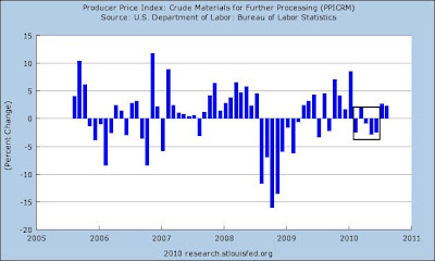
PPI for crude goods printed a series of negative month to month decreases earlier this year. But, the last two months have seen some large increases.

Intermediate goods saw two months of negative numbers, but printed an increase last month.
 Overall PPI has printed some low month to month increases the last 5 months, with one month printed a negative number.
CPI printed some very low numbers (and even went negative) for most of 2010. But the number has printed strong increases the last two months.
I don't think we're out of the woods yet. But the last few months of PPI and CPI data are very encouraging. In addition, we continue to see commodities increase. Finally, with the dollar moving lower, further commodity increases (or at least price stagnation at current levels) is high. Short version: another few months like this and we will be out of the woods.
Chicago PMI Up
From Marketwatch:
A Chicago-area economic report issued Thursday showed unexpected strength in September, giving further ammunition to the camp optimistic about prospects for the U.S. economy a day ahead of a national manufacturing report.Let's take a look at the dataThe group’s measures of orders and production rose above their six-month averages, indicating corporate investment in new equipment will remain a source of strength for the economy.
“After a soft patch, manufacturing is in a process of mustering some activity,” said Ward McCarthy, chief financial economist at Jefferies & Co. in New York. “It seems to be moving in the right direction again and that will help the economy continue to grow.” McCarthy forecast the Chicago index would rise to 58.
Automakers including Dearborn, Michigan-based Ford Motor Co. are among manufacturers seeing sales picking up while holding below pre-recession levels.
“The auto business is pretty steady and coming back up a little bit,” Ford Chief Executive Officer Alan Mulally told reporters in Ann Arbor, Michigan, on Sept. 17. The economy “is coming back slower than past recessions.”

The index made a nice jump compared to its previous reading. However, note that an expansion occurs on a reading above 50 where the index has been for some time.
 The above graphic shows the jumps in both production and new orders.
The anecdotal information was very interesting; mixing some very good statements (staff is so thin that a problem could develop due to too few employees) to concerning statements (increases in mortgage walkaways). Also note two statements about price increases indicating that the increase in commodities is starting to pass through to consumers.
Yesterday's Market

Let's start with the Treasury market. Notice that prices are still right below the long-term trend line. But it's not just the Treasury market that is absorbing would-be equity investors.

The lnvestment grade corporate bond market is also in a strong rally (note the classic advance (a), sell-off (b) advance (c) structure), as is

the junk bond market. Notice that prices have moved in an advance (a) with downward sloping consolidation channels, with a sell-off (b) and a further advance.

The SPYs have gotten right above key resistance levels (a), but notice the rally has stalled at least for now.

The DIAs are right at important resistance (a) and have been there all week.

The IWMs -- like the SPYs -- have advanced beyond important resistance, but just barely.

the one exception has been the NASDAq, which has had a strong advance. Prices are above key resistance levels (a) and during the rally we've seen some strong bars (c) and several gaps higher (b). But the advance hasn't translated to other markets.
My guess is the flow into fixed income is taking money away from the stocks market right now.

Although still in a trading range, oil has recently advanced through resistance (A), printing some very strong bars (B). Now prices are above resistance (C), and momentum has given a buy signal. But note that oil stocks are still incredibly high and will probably act as a damper on strong upward movement.

After a strong rally in reaction to the Russian wheat embargo, wheat is now selling off (A) and is now below the 50 day EMA (B). Also note the MACD is giving a strong sell-signal.
Thursday, September 30, 2010
Mish Provides Wrong Analysis Regarding The "Feels Bad Recovery"
He begins with this statement:
Inquiring minds might be interested in charts of GDP minus the effect of increased government spending. The charts are from reader Tim Wallace who writes ...
And then proffers this chart:

There is nothing wrong with his calculations; the reader simply went to the BEA, downloaded a spreadsheet of GDP and subtracted government payments from total GDP.
He then concludes:
Note that the chained GDP number less the federal spending nets out to a number less than the GDP of 2004. So basically, our economy is back where it was seven years ago.
This statement is wrong on several levels. First, any person who has been through econ 101 knows the GDP equation: Personal Consumption Expenditures + Investment + Net Exports + Government Spending = GDP. In other words, government spending is part of the GDP equation. I seriously doubt that Mish does not know this.
But more importantly, consider this chart, readily available from the CBO:

It shows federal expenditures as a percent of GDP. Notice they have fluctuated between about 18% and 25% for the last 30 years. In other words, if we did the same equation as Mish performed, we would determine that there's been no "real" growth for most of the last 30 years. Inquiring minds would have sought data for far longer periods than 10 years to see if a relationship exists -- especially when that information is readily available.
In addition, absent from his analysis is anything related to low job creation, weak wage growth, growing income inequality, a housing market with declining prices etc... There are plenty of reasons for low consumer confidence right now which more completely explain why this is a "feels bad" recovery.
But here's the biggest loss: Mish is better than this. He is capable of stunningly insightful and in-depth economic analysis. However, he is clearly more concerned with starting with a political conclusion (all government spending is bad) and finding superficial equations to prove his point. This is appropriate for think tanks of both political orientations (think Cato and EPI), but certainly not for a writer with Mish's abilities. We can only hope that Mish the thinker soon returns and says goodbye to Mish the politician.
Oil: more Hoarding in Plain Sight?
Back when Oil was over $100/barrel, I wrote an article entitled "Hoarding in Plain Sight", suggesting that part of the tightness in the Oil market was governments the world over adding to their strategic oil reserves (a program which Bush had begun at the end of 2006 and continued until the very top of the market - with his typical business acumen /snark).
It appears that the idea of Peak Oil has penetrated business decisions sufficiently that substantial amounts are being hoarded again, not by governments this time but by private energy firms.
Here is the graph of gasoline stocks published yesterday by the Department of Energy:
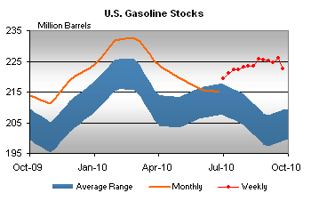
As you can see, from last autumn through this spring, stocks were running about 5% higher and outside of their normal range. In the last couple of months, this additional storage of gasoline has increased to about 10% above normal.
The reason for this appears to be the belief that the economy will expand sufficiently within the next year to justify prices about $10 higher a barrel (over $85) than they are now, as measured by futures contracts at the Chicago Mercantile Exchange. Interest rates are so low that speculators can make a profit even though they must pay for a year's worth of storage, according to Seeking Alpha:
ConocoPhillips paying $41,000 a day to keep a storage tanker capable of holding 3 million barrels of oil floating in the Gulf of Mexico .... [It] is just one of hundreds of oil tankers sitting idle in waters around the world, as energy companies and investment banks await higher prices for crude.The problem with this is, as we have seen as recently as this spring, such a price is sufficiently close to the 4% of GDP mark (now about $90/barrel) that for the last 60 years has served to choke off growth in the the US economy and caused it to stall. In other words, even if the bet is correct, it probably won't be for very long.
.... [T]raders expect prices to surge higher next year as growth solidifies. That's why contracts for crude set to be delivered six months from now are worth more than crude at its current prices - an anomaly known as "contango." Thus, speculators such as ConocoPhilips are willing to pay a premium to keep large quantities of oil idle at sea in the hopes of selling the cargo next year for a higher price.
The price advantage to buy and hold crude more than doubled to $5.76 a barrel last month from $2.60 at the end of July....
Falling tanker rates and low-cost financing also have contributed to the contango by making it less costly to store oil for long periods of time. The cost of storing a barrel of oil offshore has dropped 24% this year....
This overhang of excess stocks may paradoxically put a lid on US gasoline prices. Should the economy not grow as expected, these gasoline stocks may have to be liquidated at least in large part, thereby driving gasoline prices down.
A Closer Look at Gold
From the US Geological Survey:
Gold has been treasured since ancient times for its beauty and permanence. Most of the gold that is fabricated today goes into the manufacture of jewelry. However, because of its superior electrical conductivity and resistance to corrosion and other desirable combinations of physical and chemical properties, gold also emerged in the late 20th century as an essential industrial metal. Gold performs critical functions in computers, communications equipment, spacecraft, jet aircraft engines, and a host of other products. Although gold is important to industry and the arts, it also retains a unique status among all commodities as a long-term store of value. Until recent times, it was considered essentially a monetary metal, and most of the bullion produced each year went into the vaults of government treasuries or central banks.
According to the World Gold Council, here are the demand statistics for gold:
- Total gold demand in Q2 2010 rose by 36% to 1,050 tonnes, largely reflecting strong gold investment demand compared to the second quarter of 2009. In US$ value terms, demand increased 77% to $40.4 billion.
- Investment demand was the strongest performing segment during the second quarter, posting a rise of 118% to 534.4 tonnes compared with 245.4 tonnes in Q2 2009.
The largest contribution to this rise came from the ETF segment of investment demand, which grew by 414% to 291.3 tonnes, the second highest quarter on record.- Physical gold bar demand, which largely covers the non-western markets, rose 29% from Q2 2009 to 96.3 tonnes.
- Global jewellery demand remained robust in Q2 2010. In the face of surging price levels, consumption totalled 408.7 tonnes during the second quarter of 2010, just 5% below year-earlier levels.
- Gold jewellery demand in India, the largest jewellery market, was little changed from year-earlier levels, down just 2% at 123.0 tonnes. In local currency terms, this translates to a 20% increase in the value of demand to Rp216 billion.
- China saw demand for gold jewellery increase by 5% to 75.4 tonnes . While growth in demand in tonnage terms was hindered by extreme weather conditions, the growth in the local currency value measure of demand was 35% to RMB 19.8 billion.
- With the return of demand for consumer electronics, industrial demand grew by 14% to 107.2 tonnes, compared to Q2 2009.
Let's take a look at some of the basics, also from the World Gold Council:

Mine production is the largest source of gold and jewelry is the largest area contributor to demand.

Notice that gold -- unlike copper -- is found in many parts of the world.

Also note that the use of scrap gold as a source of supply has been increasing.

Also note that world output has been increasing for over a century.
 Investment demand is the primary reason for the increase in gold demand over the past few years.
And finally is a chart of total world gold holdigns.
Let's take a look at the charts:

The long-term chart is a massive rally. Notice there are three uptrend support lines (A, B and C) and there have also been counter-rallies that consolidated gains (D).
 On the weekly chart, there is also a strong uptrend (A) that has solid, counter-trend consolidation patterns (B).
In the last 6 months we have a standard advance (A), consolidation (B) and advance (C). Notice the EMA are very bullish and the MACD indicates there is plenty of momentum (E).
Yesterday's Market

In general, prices have been in a very tight range for the last few days.

Yesterday, prices gapped a bit lower at the open (a), fell to previous support (c) and then rallied a bit, only to fall again (d). After a brief move higher, prices formed a double top before selling off into the close (f) on higher volume (g).

Note the tight range of the last few days is also apparent on the daily chart (a).

The Russell 2000 is just below support, trying to get above key resistance -- as is

The Dow and

The Transports.
Right now, equity prices just can't get over the hump. While the NASDAQ has moved through resistance, it is not pulling the other averages through.
 Cotton continues in its uptrend (A). Notice that prices have consolidated in downward sloping pennant patterns throughout the rally (B). Prices have recently peaked (C) and are moving a bit lower to consolidate gains. Notice the EMA picture is very bullish (D) and the MACD is also pointing to further gains (E).
After forming a strong base (A) lumber prices have broken through resistance (B) and are currently at important support levels (C).
Wednesday, September 29, 2010
The Great Currency War
An “international currency war” has broken out, according to Guido Mantega, Brazil’s finance minister, as governments around the globe compete to lower their exchange rates to boost competitiveness.Mr Mantega’s comments in São Paulo on Monday follow a series of recent interventions by central banks, in Japan, South Korea and Taiwan in an effort to make their currencies cheaper. China, an export powerhouse, has continued to suppress the value of the renminbi, in spite of pressure from the US to allow it to rise, while officials from countries ranging from Singapore to Colombia have issued warnings over the strength of their currencies.
“We’re in the midst of an international currency war, a general weakening of currency. This threatens us because it takes away our competitiveness,” Mr Mantega said. By publicly asserting the existence of a “currency war”, Mr Mantega has admitted what many policymakers have been saying in private: a rising number of countries see a weaker exchange rate as a way to lift their economies.
A weaker exchange rate makes a country’s exports cheaper, potentially boosting a key source of growth for economies battling to find growth as they emerge from the global downturn.
The proliferation of countries trying to manage their exchange rates down is also making it difficult to co-ordinate the issue in global economic forums.
A Closer Look at Corn
The major feed grains are corn, sorghum, barley, and oats. Corn is the primary feed grain in the United States, accounting for more than 90 percent of total feed grain production and use.
.....
Corn acreage in the United States has increased from a government-mandated low of 60.2 million planted acres in 1983 due to provisions in the Federal Agriculture Improvement and Reform Act of 1996. The Act permitted farmers to make their own crop planting decisions based on the most profitable crop for a given year. While the number of feed grain farms (those that produce corn, sorghum, barley, and/or oats) in the United States has declined in recent years, the acreage per corn farm has risen. Moreover, the number of large corn farms (those with more than 500 acres) has increased over time, while the number of small corn farms (those with less than 500 acres) has fallen.
.....
Corn production has risen over time, as higher yields followed improvements in technology (seed varieties, fertilizers, pesticides, and machinery) and in production practices (reduced tillage, irrigation, crop rotations, and pest management systems).
.....
Strong demand for ethanol production has resulted in higher corn prices and has provided incentives to increase corn acreage. In many cases, farmers have increased corn acreage by adjusting crop rotations between corn and soybeans, which has caused soybean plantings to decrease. Other sources of land for increased corn plantings include cropland used as pasture, reduced fallow, acreage returning to production from expiring Conservation Reserve Program contracts, and shifts from other crops, such as cotton.
In other words, corn is a raw material that is processed in various ways into other goods which are then sold in some form.
Let's take a look at some data:

Corn is obviously the dominant component in feed grains.

Notice the continued increased in yield, indicating farming is becoming much more efficient.

Also note that demand and supply continue to increase.

Ethanol use is clearly one of the primary drivers for increased corn use over the last few years.
Corn is very important to agricultural exports:
The United States is the world's largest producer and exporter of corn. Corn grain exports represent a significant source of demand for U.S. producers and make the largest net contribution to the U.S. agricultural trade balance of all the agricultural commodities, indicating the importance of corn exports to the U.S. economy. On average, corn grain (excluding popcorn or sweet corn) accounted for approximately 11 percent of all U.S. agricultural exports by value during the 1990s. In 2008, due to record exports of corn and other feed grains, that share grew to over 12 percent of the U.S agricultural export value.
Here are the relevant charts regarding exports and imports:

The US is obviously the largest corn exporter by far

Notice the developing countries have continually increased their corn imports for the last 20 years. The Middle East is also a strong source of growing demand.
Let's take a look at the charts:

For the first part of the decade, corn prices were fairly subdued with the exception of an early 2004 price spike (A). Like all commodities, corn rallied in a big way in 2008, but fell with the recession (B). It consolidated in a triangle pattern (C), but has since rallied (D) in concert with wheat.

The weekly chart shows the 2008 spike (A) along with the triangle price consolidation (B) and the recent rally (C).

Prices have been in a strong uptrend since the beginning of June with two uptrends (A and B) ini place. Prices have consolidated gains during the rally in a standard downward sloping pennant pattern (C). Prices have recently topped (D) and printed three strong downward sloping bars this week. The EMA picture is still bullish (E), but the MACD has given a sell-signal (F).
Money Supply: We're DOO ... oh, wait ...
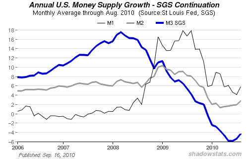
A few months ago it was fashionable, pace Zero Hedge, to note the discontinued M3 money supply series, which was "crashing" in YoY terms. We were told that this big a collapse hadn't been seen since the 1930s. (Of course, we might counter with the fact that it's a good thing that less credit has been created compared with the fog-the-mirror loans of the recent past, but why get in the way of a good story?).
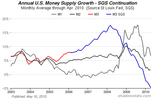
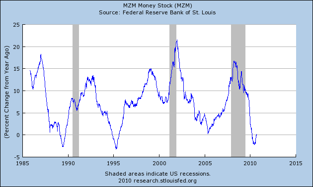
A current proxy for M3, we were told, and I agree, is MZM (total money supply from all sources). Now, one slight problem is that M3 (and MZM as well) tend to peak towards the end of or even after recessions, and bottom well into the ensuing expansion:
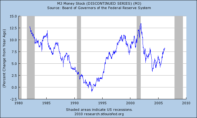
In fact, the Fed discontinued M3 because it did not believe it carried much utility, as real M1 and real M2 have a much better record forecasting economic activity in the near future, and M3's essential components are captured by MZM above. In fact, there has never been a recession, including the Great Depression, where real M1 wasn't negative YoY, and real M2 wasn't less than +2.5% YoY. That's why, as you know, I track both real M1 and real M2 weekly. Here's a graph of those two series going back 50 years (in the below graph, I subtract 2.5% from M2 so that the "danger line" for both is zero):
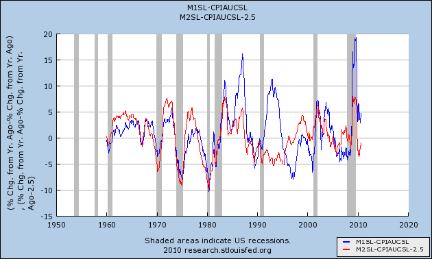
Hence my weekly report that M2 is in the danger zone but improving, and M1 is not and has not been in the danger zone all year.
So what is happening now? Sure enough, M3 looks like it may have bottomed on a YoY percentage basis:
And MZM? It is now positive again YoY:
I'm sure Zero Hedge has highlighted this fact, right?
P.S. This is a good example of what Barry Ritholtz called "intellectual jihadism" last week.