Showing posts with label consumer debt. Show all posts

Thursday, May 29, 2008

It's the Debt, Stupid

One of the first trends I noticed with the latest US expansion is the record amount of debt that was involved. Simply put -- this was a borrow and spend expansion like nobody's business. I'm not the only one who has noticed:

Is Kevin Phillips right that something funny is going on in the economy? Yes, although just how funny is less clear.

The numbers do suggest he's correct about one thing at least: public and private debt has indeed reached unprecedented levels.

Recently, we described Phillips' thesis, in his new book "Bad Money: Reckless
Finance, Failed Politics, and the Global Finance of American Capital" that the U.S. economy has been run by a Washington-Wall Street mercantilist alliance for the benefit of the finance sector. See column.

Phillips doesn't flat-out predict that the resulting distortions will result in a crash. He says it's too early to say. But he meaningfully quotes a number of authorities, such as Yale economist Robert Shiller, to the effect that it will.

Phillips relies heavily on charts, which we like.
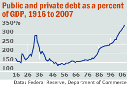
In this column, we look at one that is at the heart of his book: public and private debt as a fraction of Gross Domestic Product.

It looks like a barbell, with peak debt of 299% in 1933 falling to below 150% from the 1950-1980s, spiking again to a recent 353%. We've checked the numbers -- updating them to 2007 -- and he's right.


Let's look at a few charts to see what we're talking about.


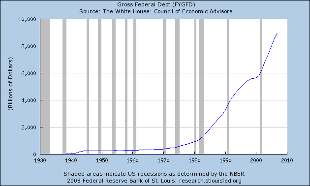
Total federal debt is huge.

Consider the following numbers from the Bureau of Public Debt:

09/30/2007 $9,007,653,372,262.48
09/30/2006 $8,506,973,899,215.23
09/30/2005 $7,932,709,661,723.50
09/30/2004 $7,379,052,696,330.32
09/30/2003 $6,783,231,062,743.62
09/30/2002 $6,228,235,965,597.16
09/30/2001 $5,807,463,412,200.06
09/30/2000 $5,674,178,209,886.86

The current total is $9,393,275,739,477.56

The the government isn't the only one borrowing.


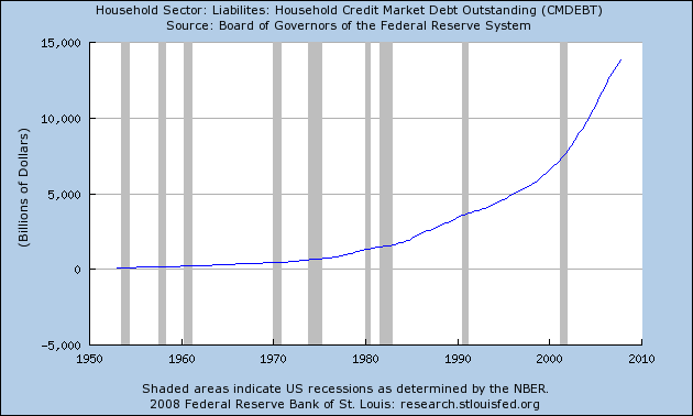
Total household debt is spiking, leading to


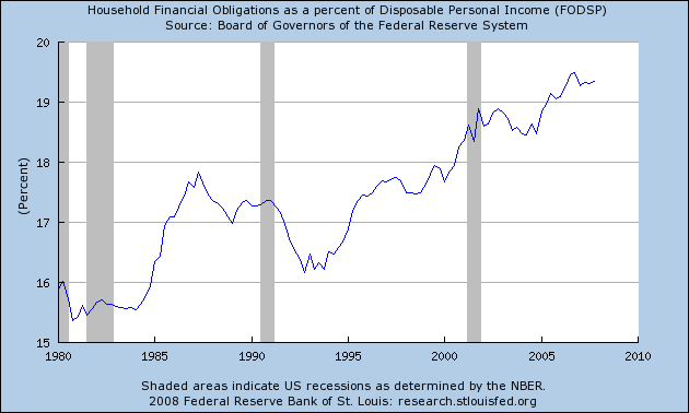
An increase in the household financial obligations ratio.

This has led to the following chart, which is from the original story above:


That can't be good.

Monday, February 25, 2008

Consumers Face Strong Headwinds

Consumer spending accounts for about 70% of overall US economic growth. Therefore, the consumer's health is vitally important to further expansion. However, the consumer is under tremendous pressure right now from a variety of fronts. Consider the following:

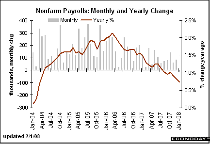
Decreasing Job Growth


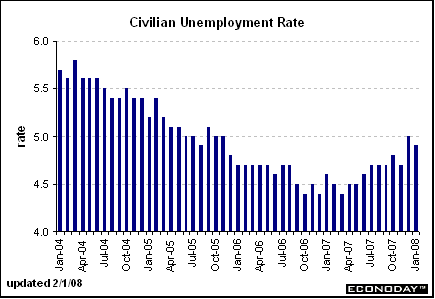
The chart above has the year over year percentage change in employment growth graphed as a line. Notice it has been dropping since the end of the 1Q2006. Also note the gray lines -- which represent the monthly payroll change -- have been decreasing in size as well, indicating the monthly change in payrolls is decreasing. As a result, the unemployment rate is ticking up (although it is still at solid levels).


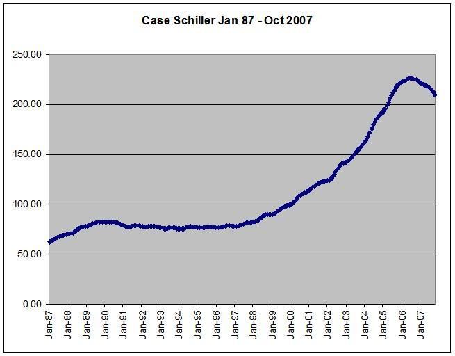
Decreasing Home Values


The chart above is the Case-Schiller home price chart. Notice the following:

-- During the last expansion home prices were very stable.

-- Home prices double in the first 6 years of the 2000s.

-- Home prices are now dropping:

That comes on top of the hit homeowners are taking from the drop in housing prices, which fell 7.7 percent in 20 metropolitan areas during November from a year earlier, according to the S&P/Case-Shiller price index.


Inflationary Pressures

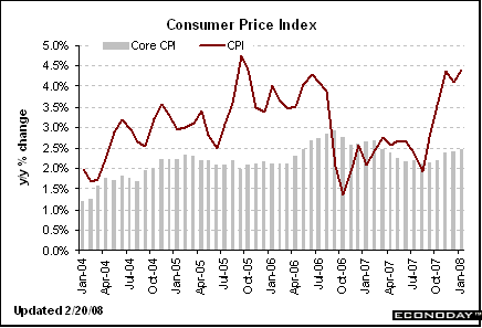
Consumers are seeing high price increases:


Above is the year over year percentage change in inflation.

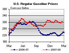
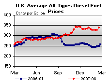
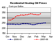
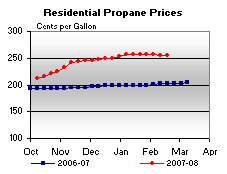
In addition, here are some charts of fuel prices from This Week in Petroleum


A Ton of Debt


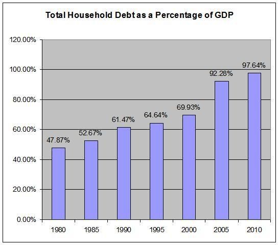
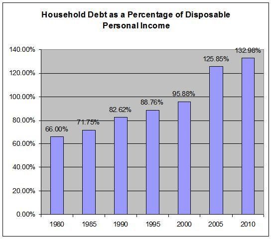
Above are two charts. They use the total outstanding household debt number for the Federal Reserve's Flow of Funds and information on GDP and disposable personal income from the Bureau of Economic Analysis.

There is no economic magic line which says, "over this line is a bad amount of total household debt and below this line is good household debt." It's really more of a sliding scale. Notice that the total household debt number has been increasing for thirty years. At some point, that will start to cause problems.

I have no idea how much stress is too much for the consumer. However, the facts above indicate he is under a tremendous amount of stress right now.

-- Job growth is dropping,

-- Home values are dropping,

-- Inflationary pressures are increasing and

-- He has a ton of debt to deal with.

Charts are from Economday

Thursday, May 10, 2007

There May Be Room For Continued US Consumption Increases

From the WSJ:

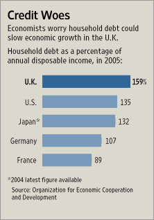
Personal debt has reached a record $2.6 trillion. According to the Organization for Economic Cooperation and Development, U.K. household debt as a percentage of annual disposable income hit 159% in 2005 -- the last year for which data is available -- compared with 135% in the U.S.


The article expresses concerns about England's consumers ability yo keep spending when their household debt levels are at 159% of disposable income.

I raise the point as one of comparison to the US. I have expressed concern about US household debt levels for some time. However, there is no magic economic line where where household debt prevents an increase in consumption expenditures. It's really just a best guess scenario.

That being said, if England's consumers can continue spending at a household debt/disposable income level of 159%, than US consumers obviously can continue to spend at 135% household debt/disposable income ratio.

The article also has this graph which shows the hh debt/disposable income ratio in other countries. The US is far from alone.

Photo Sharing and Video Hosting at Photobucket

In other words -- the US may continue shopping.

Thursday, March 1, 2007

Mortgage Defaults Increasing Among Better Credit Risk

From the WSJ:

At issue are mortgages made to people who fall in the gray area between "prime" (borrowers considered the best credit risks) and "subprime" (borrowers considered the greatest credit risks). A record $400 billion of these midlevel loans -- which are known in the industry as "Alt-A" mortgages -- were originated last year, up from $85 billion in 2003, according to Inside Mortgage Finance, a trade publication. Alt-A loans accounted for roughly 16% of mortgage originations last year and subprime loans an additional 24%.

The catch-all Alt-A category includes many of the innovative products that helped fuel the housing boom, such as mortgages that carry little, if any, documentation of income or assets, and so-called option adjustable-rate mortgages, which give borrowers multiple payment choices but can lead to a rising loan balance. Loans taken by investors buying homes they don't plan to occupy themselves can also fall into the Alt-A category.


Let's look at those totals. Notice the four-fold increase in the totla dollar amount of alt-A loans in 4 years. Simply put, that's a ton of new debt in the system. Although these people had better credit, the large increase makes me wonder whether credit standards were relaxed a bit too much to make all those loans.

In addition, notice that subprime and alt-A loans comprise 40% of the mortgage loans. That means trouble with both of these tiers of loans could lead to problems outside of the housing market.

Data from UBS AG show that the default rate for Alt-A mortgages has doubled in the past 14 months. "The credit deterioration has been almost parallel to what's been happening in the subprime market," says UBS mortgage analyst David Liu. The UBS report contrasts with testimony Federal Reserve Board Chairman Ben Bernanke gave to Congress yesterday. "Our assessment is that there's not much indication that subprime issues have spread into the broader mortgage market," Mr. Bernanke said.

To be sure, defaults have remained very low in the prime market -- and despite the uptick in bad loans, the problems in the Alt-A sector aren't as severe as those that have roiled the subprime market. Some 2.4% of Alt-A loans are at least 60 days past due, according to UBS, which looked at mortgages that were packaged into securities and sold to investors. That is well below the 10.5% delinquency rate for subprime mortgages. (During the housing boom, delinquencies were low for all types of loans because borrowers who wound up in trouble could refinance or sell.)


OK -- we're far away from serious danger levels in the Alt-A market. however, the recent vintage of subprime loans went bad very quickly. So this situation should be closely monitored.

Thomas Gorman, a bankruptcy attorney in Alexandria, Va., says he is seeing more financially strapped borrowers who "probably bought more house than they could afford and then took on more credit-card debt" to furnish the house and pay for the move. When the housing market cooled, they were "caught in the middle," unable to sell their home or refinance and make their debt load more manageable.


Easy credit has defined this expansion. Now the bill may be coming due -- and it may not be pretty.

Sunday, February 18, 2007

How Long Can This Trend Last?

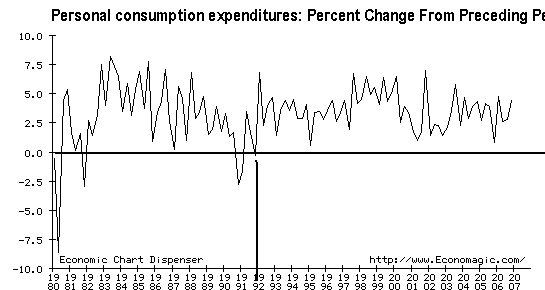
This is a chart of the percent change from the preceding quarter in personal consumption expenditures.

Photobucket - Video and Image Hosting

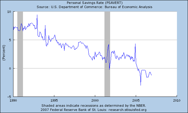
The last time this figure decreased was in 1992. That is 16 years ago. How long can this trend of positive growth continue? The US savings rate (income - expenditures) has been negative for the past 5 quarters.

Photobucket - Video and Image Hosting


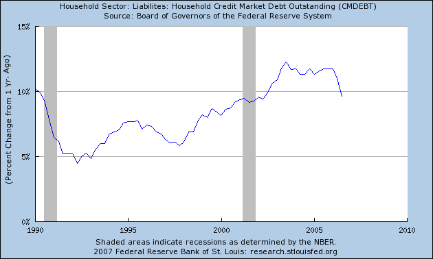
Household debt has increased to over 90% of GDP and 120% of disposable income. US households greatly increased debt acquisition over this expansion, as this chart of the year-over-year percent change in household debt indicates.

Photobucket - Video and Image Hosting

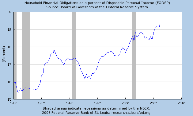
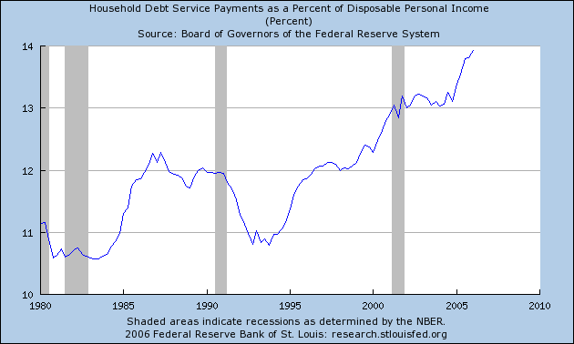
Debt payments now consume the largest amount of disposable income on record.

Photobucket - Video and Image Hosting

How much more can the US consumer purchase before he pulls in his wings?

Tuesday, January 9, 2007

Late Credit Card Payments Increase

From the Houston Chronicle:

Late payments on credit card bills climbed in the summer to their highest point in a year, suggesting that some consumers are feeling financially squeezed.

The American Bankers Association, in its quarterly survey of consumer loans, reported today that the percentage of credit card payments 30 or more days past due increased to 4.57 percent in the July-to-September quarter of last year.

That was up from 4.41 percent in the second quarter and was the highest since the third quarter of 2005, when the delinquency rate stood at 4.74 percent.


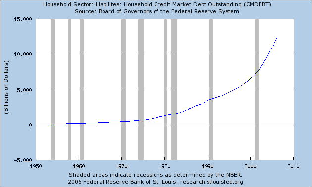
Household debt is a huge issue, especially in this recovery. Here is a chart from the St. Louis Fed of total household debt outstanding. Notice how the curve's steepness has increased during this expansion:

Photobucket - Video and Image Hosting

Also note that the household financial obligation ratio is now at record levels:

Photobucket - Video and Image Hosting

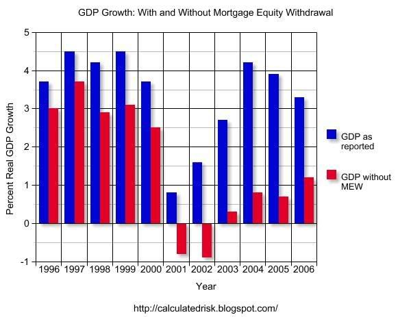
As Tula notes below, wages for this expansion have been stagnant for this expansion. The Big Picture noted that health cost increases are still eating a huge amount of pay raises in the form of higher deductibles and premiums. That leads to the question of, "where is the money for this expansion coming from?" Savings were already at low levels before this expansion began, consumer spending has increased for the duration of this expansion, yet wages for most people are still stagnant.

The answer is debt. Calculated Risk has this chart of GDP growth with and without Mortgage Equity Extraction:

Photobucket - Video and Image Hosting

That's a big difference.

As the bill continues to come due, expect this trend to continue.

Many thanks to the wonderful person who sent me the Houston Chronicle article.

Jobs and Wages Are Up. But There's More to the Story

So, the latest jobs report released Friday by the U.S. Bureau of Labor Statistics (BLS) showed more job growth than analysts anticipated, and you practically could hear the champagne corks go off at the White House. The same report that found jobs increased by 167,000 in December also reported that average hourly earnings rose 4.2 percent in December.

Must mean America’s workers are sitting pretty, right?

Unfortunately for the economy and U.S. workers, such short-term trends are misleading.

Looking at long-term wage growth, Jared Bernstein, senior economist for the nonprofit Economic Policy Institute (EPI), puts it this way:
Real wages for most workers, after rising for the first few years of the 2000s, have fallen lately, and despite 14 percent higher productivity, a typical worker’s real weekly earnings are down 3 percent over this expansion. Median family income is down about $1,500 since 2000, and more than 5 million people have been added to the poverty rolls.
Wages and salaries today account for the smallest percentage of our gross domestic product on record, while corporate profits are at their highest level since the 1960s.

In touting his economic policies in the months before the elections, Bush frequently referred to the 6.3 percent rise in the average net worth of an American family between 2001 and 2004, a statistic from the Federal Reserve Board’s Survey of Consumer Finances. But the law of averages here isn’t in favor of working families. For families at the bottom 40 percent of income, the median net worth actually fell.

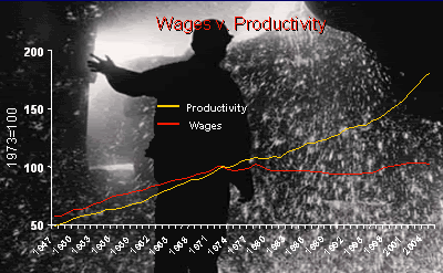
Another long-term trend is the separation of worker productivity from wage growth. Up to the early 1970s, the two grew together, with productivity 10 percent to 15 percent higher than wage growth. But since that time, workers have sped up their rates of productivity—but their employers have not similarly increased what they pay their employees. Wages now lag by more than 50 percent behind productivity.


Bob Herbert in his New York Times column yesterday highlighted the perversity of a system in which employees work harder but see no correlative increase in their paychecks—not the best incentive for long-term productivity and certainly no benefit to workers. Herbert sums it up this way:
The productivity gains in the go-go decades that followed World War II were broadly shared, and the result was a dramatic, sustained increase in the quality of life for most Americans. Nowadays workers have to be more productive just to maintain their economic status quo. Productivity gains are no longer broadly shared. They’re barely shared at all.
Now, back to job growth. While the superficial BLS stats show the quantity of jobs created, behind that data a darker picture lurks—the quality of salary and benefit levels. What counts is not just the number of jobs created but how well those jobs provide a middle-class standard of living. (There’s a lot we can do about all this—and future posts will highlight elements of a populist economic agenda spearheaded by EPI that we in the progressive movement can rally behind in coming months.)

Jobs are increasing in sectors such as service and health care that, for the most part, offer low wages and unaffordable or no health care and pension plans. Meanwhile, jobs in industries such as manufacturing are in free fall: Between 2000 and 2003, annual manufacturing employment in the United States declined by nearly 3 million jobs and has been largely flat since then. The level of manufacturing employment in 2003 was 14.3 million, the lowest since 1950. It’s easy to pooh-pooh manufacturing jobs as part of the “old economy,” but the fact is that manufacturing jobs provide solid salaries and health and retirement security rarely offered in the industries where we see rapid job growth.

And as Jacob Hacker has shown in The Great Risk Shift, the unemployment rates we hear about omit what Hacker calls “shadow unemployment,” which includes the length of time workers now are unemployed. Writes Hacker:
Statistics on the long-term unemployed tell an equally worrisome story. Despite the sunny job statistics that most of us are familiar with, the share of the labor force experiencing unemployment for a half year or more—the standard definition of long-term unemployment—has in fact grown dramatically over the last generation. Indeed, compared with the late 1960s, the share of workers who experience long-term unemployment during the peak of the business cycle has more than tripled.
Short-term upticks won’t solve these long-term problems, and they won’t go very far to help working families dig out of debt and pay their mortgages on time. As Bonddad reported in December:
The Mortgage Bankers Association, in its quarterly snapshot of the mortgage market released Wednesday, reported that the percentage of mortgage payments that were 30 or more days past due for all loans tracked jumped to 4.67 percent in the July-to-September quarter.

That marked a sharp rise from the second quarter’s delinquency rate of 4.39 percent and was the worst showing since the final quarter of last year, when delinquent payments climbed to a 2-1/2-year high in the aftermath of the devastating Gulf Coast hurricanes.
A recent Center for American Progress report showed the nation’s middle class is in worse shape than ever. Some of the report’s findings:
  • From 2001 to 2004, the proportion of middle-class families that has saved three months’ worth of income dropped to 18.3 percent from 28.8 percent.
  • To maintain day-to-day consumption, families have taken on a record amount of debt, equal to 126.4 percent of disposable income in the first quarter of 2006, according to the study.
In Election Day exit polling for the AFL-CIO, Peter D. Hart Research Associates found only 31 percent of voters felt they and their families could get ahead financially in the current economy—the rest report that they are just keeping up or falling behind. As pollster Geoff Garin summarized:
Among the total electorate, 39 percent of voters said the economy was an extremely important issue for them in this election. These voters broke solidly for the Democrats—voting for a Democratic candidate in House races by a margin of 59 percent to 39 percent.
Or, as economist Paul Krugman says:
The reason most Americans think the economy is fair to poor is simple: For most Americans, it really is fair to poor.
It’s been the pattern of the Bush administration to cherry-pick a few good stats to plump up its failed economic policies. But short-term data seldom work to describe long-term trends—and certainly don’t describe working families’ day-to-day reality of trying to pay the bills.