Let's start with a look at the overall level of unemployment:
Remember that in the 1950s, the economy was operating at a very high capacity. In addition, the economy as far less automated. As a result, we see a very low unemployment rate -- dropping from 4.9% at the beginning of the year to 4.2% by year's end.
All three sectors of the economy -- manufacturing, service and government employment -- saw increases. The manufacturing sector was growing because of the mammoth increase in consumer demand -- hence the increase of nearly 1 million jobs. As households were formed -- and as incomes increased -- the demand for services naturally increased as well. This explains the increase of over 1 million service jobs over the year. And finally, the decrease in government employment at the beginning of the year was the result of the end of the Korean War. However, by year end, the increased demand for government services (education, public works etc..) led to an increase in government employment.
The above chart from the Economic Report to the President, shows a nice slice of population, employment and unemployment.
As for wages, the level of employment led to strong wage growth:
The Federal Reserve Described the Situation Thusly:
The chart below (from the ERP) graphically depicts hours worked and wages.
Showing posts with label unemployment. Show all posts
Friday, April 13, 2012
Monday, February 6, 2012
Is job growth getting ready to accelerate?
- by New Deal democrat
Just about the only drawback in Friday's employment report is that at the rate employment has been growing since it bottomed 2 years ago, it will take possibly a decade to make up all of the jobs lost plus population growth since 2007. Even job growth of 250,000 a month would be downright tepid for the 1980s or latter part of the 1990s. To substantially accelerate real, population adjusted job growth, we need monthly improvement of 300,000+ or even 400,000+ jobs.
And there are signs that we may be on the verge of achieving at least the lower part of that range in the very near future.
First of all, let's look at updated graphs showing the relationship of the rate of initial jobless claims with the unemployment rate. Here's the long term graph:

The rate of initial jobless claims has a long history of tightly leading the unemployment rate. That means that continued improvement of the former should lead to continued improvement in the latter.
Here's the close-up of the last several years (note: rate of initial jobless claims scaled on the right) after their divergence in 2009:

Note the several month lag of the unemployment rate. The continuing decline in initial claims means that we should expect a further decline in the unemployment rate in the next few months.
But not only is there good evidence to support the argument that the unemployment rate should decline, there is also evidence that the rate of employment growth should actually increase.
Initial jobless claims peaked at the end of March 2009. Since May of that year there has been a fairly constant ratio of changes in weekly initial claims to monthly job growth of roughly 1 to 2.75. That is, for every 10,000 drop in average weekly new jobless claims in a given month, the number of jobs added to the economy has improved by 27,500.

But as Jeff Miller of A Dash of Insight points out, monthly payroll growth is a function of both the number of layoffs and also the number of hires. If hiring accelerates, there will be accelerating job growth even at the same number of layoffs.
There are three reasons to believe that relationship might be shifting for the better.
First of all, during recessions there is typically a steeper loss in hours than in the number of jobs. During recoveries, initially hours increase faster until they make up the difference, and thereafter the two series move in tandem. Here's a longer term graph showing the relationship:

In earlier post-World War 2 recessions, aggregate hours made up all of their relative lost ground quickly, and then jobs and hours grew in tandem. Not so for the 1991 and 2001 recessions: it took until 2006 before aggregate hours made up all of their relative lost ground from the 2001 recession. Only in the last year or so of the last expansion did the two measures move in tandem.
This recession and recovery have been no different:

As the above graph shows, however, at the current rate aggregate hours will make up all of their relative losses by summer. In fact, measured strictly in private jobs, the measure has fully caught up as of this month. From that point forward job growth should accelerate to match growth in hours.
As an aside, remember that long leading indicators like housing permits, bond prices, and real money growth have been improving almost relentlessly for about a year now. Shorter leading indicators like stock prices, initial jobless claims, and durable goods, have joined them in showing improvement for the last few months. Real retail sales, which I have previously described as the "holy grail" single best predictor of future job growth, have also continued to improve, albeit slowly.
Payroll growth and aggregate hours, by contrast, are coincident measures of the economy. Thus with improving leading indicators, there is every reason to expect aggregate hours to continue their trend of improvement. That means job growth should start moving in tandem within the next 3-6 months.
Secondly, the household survey has been on a tear for the last seven months, adding 2.252 million jobs, or over 320,000 a month, during that time [Note: without the census adjustment, the numbers would be slightly lower, at 2.020 million and 290,000 a month]:

The household survey has a much smaller survey sample, and so any given month's change is inherently less reliable, but there is evidence that the household survey leads the establishment survey at inflection points, as indeed it did at the end of 2009. While the surge since last June might be noise, it looks very much like an inflection point that is beginning to show up in the establishment survey.
Third, there is one specific sector in which it appears significant improvement is finally taking place: construction. As the below graph shows, while manufacturing jobs picked up almost immediately (in fact, this is the best improvement in 20 years save for the tech boom), construction jobs continued to languish, finally hitting bottom 12 months ago:

There are excellent reasons to believe that construction employment will improve, and improve at an accelerating rate.
This next graph shows the relationship between housing permits (blue), private residential construction (red), and construction jobs (green):

Note the sequential relationship: housing permits lead residential construction, which in turn leads construction employment.
Now let's look at a close-up of the last several years:

With the exception of the distortion from the $8000 housing credit, the relationship has continued. Permits bottomed in early 2009, then construction spending, and finally construction jobs. More importantly, for the last year housing permits have continued to increase. Private construction spending began to follow several months later. Construction jobs began to turn up more meaningfully several months ago (+14,000 in January). There is every reason to believe that construction spending will increase, and that jobs in construction will continue to increase, at an increasing rate, as well.
Just like the tsunami in Japan last year, there are any number of factors which could derail this analysis. But since the unemployment rate is likely to decline further, job growth is likely to accelerate to the trend of increasing aggregate hours, the household survey suggests acceleration is already occurring, and the construction sector is finally participating in meaningful job growth, there is every reason to believe that the rate of job growth is going to accelerate in the coming months.
Just about the only drawback in Friday's employment report is that at the rate employment has been growing since it bottomed 2 years ago, it will take possibly a decade to make up all of the jobs lost plus population growth since 2007. Even job growth of 250,000 a month would be downright tepid for the 1980s or latter part of the 1990s. To substantially accelerate real, population adjusted job growth, we need monthly improvement of 300,000+ or even 400,000+ jobs.
And there are signs that we may be on the verge of achieving at least the lower part of that range in the very near future.
First of all, let's look at updated graphs showing the relationship of the rate of initial jobless claims with the unemployment rate. Here's the long term graph:

The rate of initial jobless claims has a long history of tightly leading the unemployment rate. That means that continued improvement of the former should lead to continued improvement in the latter.
Here's the close-up of the last several years (note: rate of initial jobless claims scaled on the right) after their divergence in 2009:

Note the several month lag of the unemployment rate. The continuing decline in initial claims means that we should expect a further decline in the unemployment rate in the next few months.
But not only is there good evidence to support the argument that the unemployment rate should decline, there is also evidence that the rate of employment growth should actually increase.
Initial jobless claims peaked at the end of March 2009. Since May of that year there has been a fairly constant ratio of changes in weekly initial claims to monthly job growth of roughly 1 to 2.75. That is, for every 10,000 drop in average weekly new jobless claims in a given month, the number of jobs added to the economy has improved by 27,500.

But as Jeff Miller of A Dash of Insight points out, monthly payroll growth is a function of both the number of layoffs and also the number of hires. If hiring accelerates, there will be accelerating job growth even at the same number of layoffs.
There are three reasons to believe that relationship might be shifting for the better.
First of all, during recessions there is typically a steeper loss in hours than in the number of jobs. During recoveries, initially hours increase faster until they make up the difference, and thereafter the two series move in tandem. Here's a longer term graph showing the relationship:

In earlier post-World War 2 recessions, aggregate hours made up all of their relative lost ground quickly, and then jobs and hours grew in tandem. Not so for the 1991 and 2001 recessions: it took until 2006 before aggregate hours made up all of their relative lost ground from the 2001 recession. Only in the last year or so of the last expansion did the two measures move in tandem.
This recession and recovery have been no different:

As the above graph shows, however, at the current rate aggregate hours will make up all of their relative losses by summer. In fact, measured strictly in private jobs, the measure has fully caught up as of this month. From that point forward job growth should accelerate to match growth in hours.
As an aside, remember that long leading indicators like housing permits, bond prices, and real money growth have been improving almost relentlessly for about a year now. Shorter leading indicators like stock prices, initial jobless claims, and durable goods, have joined them in showing improvement for the last few months. Real retail sales, which I have previously described as the "holy grail" single best predictor of future job growth, have also continued to improve, albeit slowly.
Payroll growth and aggregate hours, by contrast, are coincident measures of the economy. Thus with improving leading indicators, there is every reason to expect aggregate hours to continue their trend of improvement. That means job growth should start moving in tandem within the next 3-6 months.
Secondly, the household survey has been on a tear for the last seven months, adding 2.252 million jobs, or over 320,000 a month, during that time [Note: without the census adjustment, the numbers would be slightly lower, at 2.020 million and 290,000 a month]:

The household survey has a much smaller survey sample, and so any given month's change is inherently less reliable, but there is evidence that the household survey leads the establishment survey at inflection points, as indeed it did at the end of 2009. While the surge since last June might be noise, it looks very much like an inflection point that is beginning to show up in the establishment survey.
Third, there is one specific sector in which it appears significant improvement is finally taking place: construction. As the below graph shows, while manufacturing jobs picked up almost immediately (in fact, this is the best improvement in 20 years save for the tech boom), construction jobs continued to languish, finally hitting bottom 12 months ago:

There are excellent reasons to believe that construction employment will improve, and improve at an accelerating rate.
This next graph shows the relationship between housing permits (blue), private residential construction (red), and construction jobs (green):

Note the sequential relationship: housing permits lead residential construction, which in turn leads construction employment.
Now let's look at a close-up of the last several years:

With the exception of the distortion from the $8000 housing credit, the relationship has continued. Permits bottomed in early 2009, then construction spending, and finally construction jobs. More importantly, for the last year housing permits have continued to increase. Private construction spending began to follow several months later. Construction jobs began to turn up more meaningfully several months ago (+14,000 in January). There is every reason to believe that construction spending will increase, and that jobs in construction will continue to increase, at an increasing rate, as well.
Just like the tsunami in Japan last year, there are any number of factors which could derail this analysis. But since the unemployment rate is likely to decline further, job growth is likely to accelerate to the trend of increasing aggregate hours, the household survey suggests acceleration is already occurring, and the construction sector is finally participating in meaningful job growth, there is every reason to believe that the rate of job growth is going to accelerate in the coming months.
Friday, January 6, 2012
1951, Employment and Income
Thanks to the economy being on a war footing, unemployment was incredibly low - coming in below the 5% most economists consider to be full employment.
Total non-farm employment grew by over 1 million jobs during the year.
However, despite the need for durable goods, total goods producing actually added less than 200,000 total jobs during the year.
The real job gains occurred in the service industries, which saw about 900,000 jobs added, and
government employment, which saw large increases (around 300,00).
Thanks to near full employment, disposable personal income increased:
On a continuously compounded annual rate of change basis,we see a slight gain in the first quarter, a big gain in the second and then more moderate increases in the third and fourth.
And on a percentage change from the previous year, we see strong increases in the second, third and fourth quarter.
The following charts are from the 1951 Economic Report to the President, and are included because I think they're really interesting.
Wednesday, August 24, 2011
Housing and the double-dip
- by New Deal democrat
Suppose my analysis is wrong, and we actually have a "double-dip" recession? How bad is it likely to be?
I wanted to put up a much longer discussion on this, but frankly I don't have the time right now. One important point, however, is to look at housing. Housing historically has been a long leading indicator ( 6 to 12 or even 15 months ahead of the economy as a whole). Bill McBride a/k/a Calculated Risk has pointed out a number of times that he did not expect the unemployment rate to drop that much, because it correlates quite well with housing starts - with a lag - and housing starts have gone more or less sideways for two years. The relationship going back 50 years is shown in this graph:
(Note: unemployment rate is inverted, right scale, better to show the relationship)
As I have previously pointed out, housing starts also correlated very well with job growth in the 1920s and 1930s as well. But if the correlation holds true, than the inverse also holds true also. That is, if housing starts have not declined, then we should not expect the unemployment rate to grow very much in any double-dip, either. A ceiling of about 10% or so in the next 6 - 12 months on the unemployment rate based on housing present status is certainly a valid estimate.
And the housing market shows no sign of any meaningful accelerated downturn. To the contrary, new home sales data for July showed that the months of supply of houses on the market has dropped to 6.6 months. With the exception of a very brief period during the artificial support to housing of the $8000 tax credit, this is the lowest months' of housing for sale since the onset of the recession almost 4 years ago:
(courtesy Calculated Risk)
With no further goverment stimulus at all, this metric has declined by 2.5 months during the last year. It is not unreasonable at all to believe it could drop below the long-term average of 6.0 months during the next year.
This week Housing Tracker reported that YoY asking prices are only down -2.3%. One quarter of all metro areas tracked are now reporting YoY increases in asking prices.
In my opinion the bottom in nominal housing prices (as opposed to inflation-adjusted prices) is much closer than almost all analysts suspect. Once we start to get an upward trend in housing, then according to the correlation with the unemployment rate, there should be good fundamental support for job growth. Housing simply does not support a substantial double-dip.
Suppose my analysis is wrong, and we actually have a "double-dip" recession? How bad is it likely to be?
I wanted to put up a much longer discussion on this, but frankly I don't have the time right now. One important point, however, is to look at housing. Housing historically has been a long leading indicator ( 6 to 12 or even 15 months ahead of the economy as a whole). Bill McBride a/k/a Calculated Risk has pointed out a number of times that he did not expect the unemployment rate to drop that much, because it correlates quite well with housing starts - with a lag - and housing starts have gone more or less sideways for two years. The relationship going back 50 years is shown in this graph:
(Note: unemployment rate is inverted, right scale, better to show the relationship)
As I have previously pointed out, housing starts also correlated very well with job growth in the 1920s and 1930s as well. But if the correlation holds true, than the inverse also holds true also. That is, if housing starts have not declined, then we should not expect the unemployment rate to grow very much in any double-dip, either. A ceiling of about 10% or so in the next 6 - 12 months on the unemployment rate based on housing present status is certainly a valid estimate.
And the housing market shows no sign of any meaningful accelerated downturn. To the contrary, new home sales data for July showed that the months of supply of houses on the market has dropped to 6.6 months. With the exception of a very brief period during the artificial support to housing of the $8000 tax credit, this is the lowest months' of housing for sale since the onset of the recession almost 4 years ago:
(courtesy Calculated Risk)
With no further goverment stimulus at all, this metric has declined by 2.5 months during the last year. It is not unreasonable at all to believe it could drop below the long-term average of 6.0 months during the next year.
This week Housing Tracker reported that YoY asking prices are only down -2.3%. One quarter of all metro areas tracked are now reporting YoY increases in asking prices.
In my opinion the bottom in nominal housing prices (as opposed to inflation-adjusted prices) is much closer than almost all analysts suspect. Once we start to get an upward trend in housing, then according to the correlation with the unemployment rate, there should be good fundamental support for job growth. Housing simply does not support a substantial double-dip.
Tuesday, June 7, 2011
Mileading sensationalism about current unemployment vs. Great Depression
- by New Deal democrat
Yesterday CBS news published an article with the sensationalist headline: "Chronic unemployment worse than Great Depression" that has been getting prominent play in all of the usual places.
It's a classic case of there being three types of lies: Lies, Damned Lies, and Statistics.
The subtitle to the CBS articles is
Fortunately, a commenter named rerutled has already done the heavy lifting for me:
Suppose you were in a hospital, bleeding from a severed artery. The doctors and nurses staunch most of the bleeding, but you are still losing a little blood.
Compare that with a situation where the bleeding hasn't been staunched at all, and you are continuing to hemorrhage unabatedly.
In the first case, most of your blood loss is "chronic" - it's old, but the blood is still lost. In the second case, it isn't, because the "old" blood loss is less of the current total.
Which situation would you rather be in?
The current unemployment situation is bad, but the discourse is not helped in the slightest by misleading headlines with statistics contorted so that the phrase "worse than the Great Depression" can be used.
Yesterday CBS news published an article with the sensationalist headline: "Chronic unemployment worse than Great Depression" that has been getting prominent play in all of the usual places.
It's a classic case of there being three types of lies: Lies, Damned Lies, and Statistics.
The subtitle to the CBS articles is
The unemployed have, on average, remained unemployed longer than in the 1930sand the text of the article gives the actual data:
About 6.2 million Americans, 45.1 percent of all unemployed workers in this country, have been jobless for more than six months - a higher percentage than during the Great Depression.In other words, it's statistic isn't the number of people who are long term unemployed, it's the percentage.
Fortunately, a commenter named rerutled has already done the heavy lifting for me:
Wait a second here: what the article says is that 45% of the unemployed (themselves, 9%) are long-term unemployed; and that the 45% is higher than during the great Depression.Exactly.
Unless the 9% unemployed is also greater than during the Great Depression, that's not a "this is worse than the Great Depression" equivalence. What's really relevant is the % of the total workforce that is long-term unemployed.
I mean: what if the unemployment rate were 3%, but 100% of that were long-term unemployed? According to that article, we should say "this is worse than the Great Depression", which, of course, is nonsense.
Watch it, when someone quotes percentages of percentages to you.
Suppose you were in a hospital, bleeding from a severed artery. The doctors and nurses staunch most of the bleeding, but you are still losing a little blood.
Compare that with a situation where the bleeding hasn't been staunched at all, and you are continuing to hemorrhage unabatedly.
In the first case, most of your blood loss is "chronic" - it's old, but the blood is still lost. In the second case, it isn't, because the "old" blood loss is less of the current total.
Which situation would you rather be in?
The current unemployment situation is bad, but the discourse is not helped in the slightest by misleading headlines with statistics contorted so that the phrase "worse than the Great Depression" can be used.
Friday, June 6, 2008
Unemployment Jumps
From the WSJ:
There is nothing good in this report. It shows a weakening employment sector in a big way.
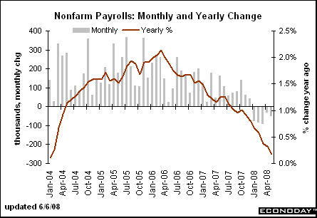
The year over year number is still dropping

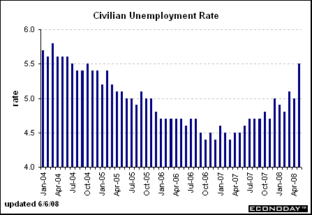
And the unemployment rate is still increasing which it has been doing since April of last year.

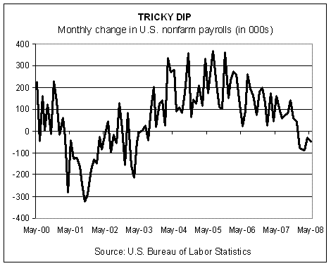
The blog Capital Spectator had the following graph which shows that this months drop was terrible -- and that the entire year so far has been bad as well.
The U.S. unemployment rate posted its sharpest one-month increase in 22 years last month, suggesting U.S. consumers already facing a housing slump and soaring gasoline prices now confront even more pressure from a weakening jobs market.
The data, which included a fifth-straight drop in nonfarm employment, should take financial-market expectations of Federal Reserve rate increases as soon as this autumn off the table.
.....
Nonfarm payrolls, which are calculated by a survey of establishments, declined 49,000 in May, the Labor Department said. The decline was broad-based, including manufacturing, construction, retail trade and business services. Payrolls fell 28,000 in April and 88,000 in March. Both were revised to show slightly larger drops.
.....
"The over-the-month jump in unemployment reflected additional workers who had lost their jobs as well as an upsurge in new and returning jobseekers," said Philip Rones, deputy commissioner of the Bureau of Labor Statistics. He cautioned that the household survey tends to be volatile between April and July due to an inflow of young people into the workforce.
There is nothing good in this report. It shows a weakening employment sector in a big way.
The year over year number is still dropping

And the unemployment rate is still increasing which it has been doing since April of last year.

The blog Capital Spectator had the following graph which shows that this months drop was terrible -- and that the entire year so far has been bad as well.
Tuesday, January 9, 2007
Jobs and Wages Are Up. But There's More to the Story
So, the latest jobs report released Friday by the U.S. Bureau of Labor Statistics (BLS) showed more job growth than analysts anticipated, and you practically could hear the champagne corks go off at the White House. The same report that found jobs increased by 167,000 in December also reported that average hourly earnings rose 4.2 percent in December.
Must mean America’s workers are sitting pretty, right?
Unfortunately for the economy and U.S. workers, such short-term trends are misleading.
Looking at long-term wage growth, Jared Bernstein, senior economist for the nonprofit Economic Policy Institute (EPI), puts it this way:
In touting his economic policies in the months before the elections, Bush frequently referred to the 6.3 percent rise in the average net worth of an American family between 2001 and 2004, a statistic from the Federal Reserve Board’s Survey of Consumer Finances. But the law of averages here isn’t in favor of working families. For families at the bottom 40 percent of income, the median net worth actually fell.
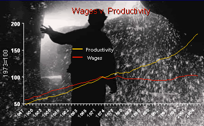
Another long-term trend is the separation of worker productivity from wage growth. Up to the early 1970s, the two grew together, with productivity 10 percent to 15 percent higher than wage growth. But since that time, workers have sped up their rates of productivity—but their employers have not similarly increased what they pay their employees. Wages now lag by more than 50 percent behind productivity.

Bob Herbert in his New York Times column yesterday highlighted the perversity of a system in which employees work harder but see no correlative increase in their paychecks—not the best incentive for long-term productivity and certainly no benefit to workers. Herbert sums it up this way:
Jobs are increasing in sectors such as service and health care that, for the most part, offer low wages and unaffordable or no health care and pension plans. Meanwhile, jobs in industries such as manufacturing are in free fall: Between 2000 and 2003, annual manufacturing employment in the United States declined by nearly 3 million jobs and has been largely flat since then. The level of manufacturing employment in 2003 was 14.3 million, the lowest since 1950. It’s easy to pooh-pooh manufacturing jobs as part of the “old economy,” but the fact is that manufacturing jobs provide solid salaries and health and retirement security rarely offered in the industries where we see rapid job growth.
And as Jacob Hacker has shown in The Great Risk Shift, the unemployment rates we hear about omit what Hacker calls “shadow unemployment,” which includes the length of time workers now are unemployed. Writes Hacker:
Must mean America’s workers are sitting pretty, right?
Unfortunately for the economy and U.S. workers, such short-term trends are misleading.
Looking at long-term wage growth, Jared Bernstein, senior economist for the nonprofit Economic Policy Institute (EPI), puts it this way:
Real wages for most workers, after rising for the first few years of the 2000s, have fallen lately, and despite 14 percent higher productivity, a typical worker’s real weekly earnings are down 3 percent over this expansion. Median family income is down about $1,500 since 2000, and more than 5 million people have been added to the poverty rolls.Wages and salaries today account for the smallest percentage of our gross domestic product on record, while corporate profits are at their highest level since the 1960s.
In touting his economic policies in the months before the elections, Bush frequently referred to the 6.3 percent rise in the average net worth of an American family between 2001 and 2004, a statistic from the Federal Reserve Board’s Survey of Consumer Finances. But the law of averages here isn’t in favor of working families. For families at the bottom 40 percent of income, the median net worth actually fell.
Another long-term trend is the separation of worker productivity from wage growth. Up to the early 1970s, the two grew together, with productivity 10 percent to 15 percent higher than wage growth. But since that time, workers have sped up their rates of productivity—but their employers have not similarly increased what they pay their employees. Wages now lag by more than 50 percent behind productivity.

Bob Herbert in his New York Times column yesterday highlighted the perversity of a system in which employees work harder but see no correlative increase in their paychecks—not the best incentive for long-term productivity and certainly no benefit to workers. Herbert sums it up this way:
The productivity gains in the go-go decades that followed World War II were broadly shared, and the result was a dramatic, sustained increase in the quality of life for most Americans. Nowadays workers have to be more productive just to maintain their economic status quo. Productivity gains are no longer broadly shared. They’re barely shared at all.Now, back to job growth. While the superficial BLS stats show the quantity of jobs created, behind that data a darker picture lurks—the quality of salary and benefit levels. What counts is not just the number of jobs created but how well those jobs provide a middle-class standard of living. (There’s a lot we can do about all this—and future posts will highlight elements of a populist economic agenda spearheaded by EPI that we in the progressive movement can rally behind in coming months.)
Jobs are increasing in sectors such as service and health care that, for the most part, offer low wages and unaffordable or no health care and pension plans. Meanwhile, jobs in industries such as manufacturing are in free fall: Between 2000 and 2003, annual manufacturing employment in the United States declined by nearly 3 million jobs and has been largely flat since then. The level of manufacturing employment in 2003 was 14.3 million, the lowest since 1950. It’s easy to pooh-pooh manufacturing jobs as part of the “old economy,” but the fact is that manufacturing jobs provide solid salaries and health and retirement security rarely offered in the industries where we see rapid job growth.
And as Jacob Hacker has shown in The Great Risk Shift, the unemployment rates we hear about omit what Hacker calls “shadow unemployment,” which includes the length of time workers now are unemployed. Writes Hacker:
Statistics on the long-term unemployed tell an equally worrisome story. Despite the sunny job statistics that most of us are familiar with, the share of the labor force experiencing unemployment for a half year or more—the standard definition of long-term unemployment—has in fact grown dramatically over the last generation. Indeed, compared with the late 1960s, the share of workers who experience long-term unemployment during the peak of the business cycle has more than tripled.Short-term upticks won’t solve these long-term problems, and they won’t go very far to help working families dig out of debt and pay their mortgages on time. As Bonddad reported in December:
The Mortgage Bankers Association, in its quarterly snapshot of the mortgage market released Wednesday, reported that the percentage of mortgage payments that were 30 or more days past due for all loans tracked jumped to 4.67 percent in the July-to-September quarter.A recent Center for American Progress report showed the nation’s middle class is in worse shape than ever. Some of the report’s findings:
That marked a sharp rise from the second quarter’s delinquency rate of 4.39 percent and was the worst showing since the final quarter of last year, when delinquent payments climbed to a 2-1/2-year high in the aftermath of the devastating Gulf Coast hurricanes.
- From 2001 to 2004, the proportion of middle-class families that has saved three months’ worth of income dropped to 18.3 percent from 28.8 percent.
- To maintain day-to-day consumption, families have taken on a record amount of debt, equal to 126.4 percent of disposable income in the first quarter of 2006, according to the study.
Among the total electorate, 39 percent of voters said the economy was an extremely important issue for them in this election. These voters broke solidly for the Democrats—voting for a Democratic candidate in House races by a margin of 59 percent to 39 percent.Or, as economist Paul Krugman says:
The reason most Americans think the economy is fair to poor is simple: For most Americans, it really is fair to poor.It’s been the pattern of the Bush administration to cherry-pick a few good stats to plump up its failed economic policies. But short-term data seldom work to describe long-term trends—and certainly don’t describe working families’ day-to-day reality of trying to pay the bills.
Labels:
consumer debt,
job growth,
labor,
productivity,
unemployment,
unions,
wage growth
Subscribe to:
Posts (Atom)