Tuesday, April 21, 2009

A Closer Look at GDP -- Domestic Investment

Yesterday I started a closer look at GDP by focusing on personal consumption expenditures. Today I'm going to look at gross private domestic investment.

First, note that GPDI currently comprise 13% of GDP. However, it has not always been that case during this expansion. Here is a chart of GDPI as a percentage of chained GDP.
Click for a larger image

Notice this number increased throughout the expansion, eventually hitting 17.35% in the 1Q06. It has since decreased from that level which tells us that people have stopped their construction binge. And here is a chart of the percentage change in overall GPDI from the previous quarter.


Click for a larger image

Starting in 2Q06, gross private domestic investment has slowed. It has only increased in three of the last 11 quarters. And one of those quarters as a .4% increase meaning it just barely increased.

And finally for this segment, here is a chart of total residential and non-residential spending.


First, at the beginning of this chart (1Q01) residential investment was 41% larger than non-residential. By 4Q05 that had increased to 143%. In other words, the US economy went house crazy especially in relation to non-residential construction. In addition notice how non-residential construction started increasing when residential construction started decreasing. This started in 1Q06 and continued until 3Q08. This means two things. First, banks slowed their lending for residential investment and increased their lending for non-residential investment. In addition, it helped to absorb some of the displaced construction workers who were hit by the slowdown in residential construction.

Leading Indicators Drop


Click for a larger image

Pay particular attention to the following points from the press release:

Three of the ten indicators that make up The Conference Board LEI for the U.S. increased in March. The positive contributors — beginning with the largest positive contributor — were real money supply*, interest rate spread, and the index of consumer expectations. The negative contributors — beginning with the largest negative contributor — were building permits, stock prices, index of supplier deliveries (vendor performance), average weekly manufacturing hours, average weekly initial claims for unemployment insurance (inverted), and manufacturers' new orders for nondefense capital goods*. Manufacturers' new orders for consumer goods and materials* held steady in March.


Let's look at these sub-categories of strength and weakness.

Strength.


Above is a chart of M2 in Logarithmic scale. Notice the chart has continually moved higher at a more or less constant pace since roughly 1996/1997. However, we do see an increase in the angle of the upswing over the last 9-12 months indicating the Fed is injecting money into the system.


The year over year rate of change in M2 popped over the last year, but has since moved lower. Also note the rate of year over year change was higher at one point in the last recession than this recession.


The yield curve is very positive. This should provide banks with a nice spread to help them out of their current problems.


Note the sharp decline in the "getting worse" number and the increase in the "getting better" number. This is an incredibly important development because it could lead to increased consumer spending -- a pretty necessary ingredient to any recovery.

Weakness


Building permits have been dropping for about two years now. The chart tells us the trend is strong. Considering the total inventory of existing homes on the market (which doesn't include about 700,000 of foreclosed properties) I don't expect this number to increase any time soon.

Do I really need to talk about stock prices?

As for supplier deliveries, I'm not sure which statistic they are using. Here is the supplier deliveries section from the latest ISM report:

The delivery performance of suppliers to manufacturing organizations was faster for the sixth consecutive month in March as the Supplier Deliveries Index registered 43.6 percent, which is 3.1 percentage points lower than the 46.7 percent registered in February. A reading above 50 percent indicates slower deliveries.

The four industries reporting slower supplier deliveries in March are: Furniture & Related Products; Transportation Equipment; Paper Products; and Computer & Electronic Products. The industries reporting faster deliveries in March are: Petroleum & Coal Products; Fabricated Metal Products; Food, Beverage & Tobacco Products; Primary Metals; Nonmetallic Mineral Products; Printing & Related Support Activities; Machinery; Miscellaneous Manufacturing; Electrical Equipment, Appliances & Components; and Chemical Products.


I'm not sure how they come up with the mixture in the index. But the above points help to flesh out the positives and the negatives that currently exist in the economy.

Treasury Tuesdays


I posted the 6 month chart to show the IEFs are still consolidating in a triangle consolidation pattern. On the upside we have the Fed buying Treasury bonds which puts a de facto floor under prices. On the negative side we have (or perhaps had) a stock market rally that provided some downside pressure.


The three months chart shows that prices and SMAs are still in a tight range with no direction in either direction. The same factors that we had in the 6 month chart we have in the 3 month chart. The main issue is the Fed's buying Treasury bonds. So long as that program is in effect we have a floor under prices.

Monday, April 20, 2009

Today's Markets

And so endeth the rally. Well, maybe

Take a close look at all of the charts below. Notice they all crossed through their upward slanting support line today. Now -- that brings us to what exactly is a trend violation. For example, if you look at each of the charts below it's possible to draw an upward sloping trend line which current price action has already violated. So -- when is a trend cross a real trend cross and when is it a simple sell-off?

Like most answers, it really depends. In his book on technical analysis, Pring uses a 3% violation as the amount of the violation in order for it to be a "real" trend break. I think that's a good rule of thumb. I would also add that the lack of volume on today's sell-off makes it a bit suspect.

But adding to the argument is today's trading was a 4% whack from the SPYs perspective which is a pretty serious chopping. And then there are strong fundamental reasons for today's sell-off -- namely that there are still some serious problems with the economy which won't be resolved anytime soon.

While one data point (today's trading) is hardly a strong enough point to hang your hat on, the lack of fundamental confirmation adds to my suspicions that we are at the beginning of a sell-off.

But let me add -- the market likes to make an ass out of me whenever possible.


More on PCEs

Let's take a look at a new set of charts -- the year over year change (YOY) in PCEs and the three sub-categories of PCEs. Please click on all images for a larger image.

Let's start with the YOY of overall PCEs


Notice that the overall rate of YOY change in PCEs is the lowest it's been in almost 50 years. That alone should tell you something about the severity of the current situation. Let's look at the subcategories from the largest to smallest (services, non-durables and durables).


Real YOY service expenditures are nearing the lowest level they have seen in 50 years. But ...


It's the year over year drop in non-durables that's really hitting PCEs right now.

People have pulled back from goods that will last less than 3 years.


Durable goods year over year percentage change is low -- but we've seen these lows before. Not that it's a good thing, mind you, just that we've seen these levels before.

So -- what have we learned?

1.) People have really cut back on spending.

2.) The big area where they have cut back is non-durable goods.

When will the consumer come back? That's a good question. As I noted in today's market recap, consumers have lost over 20% of net worth since the 2Q of 2007. That's going to keep them in the wealth building as opposed to spending more for some time.

Goldman Sachs Uses Mafia Tactics To Shut Down Blogger

From Bloomberg:

Goldman Sachs Group Inc. has been called many things over the years. Plenty of people have raged against its power and wealth. If you spend decades as the most successful investment bank, it goes with the territory.

Calling it the devil may be going a bit far, though, even for the flinty-hearted employees of the New York-based bank.

Last month, a blog called Goldmansachs666.com was set up. Goldman Sachs has taken legal action against the site, alleging it infringes a trademark in the phrase “Goldman Sachs.” The owner of the site, investment adviser Mike Morgan of Jensen Beach, Florida, has promised to contest the litigation and pursue similar campaigns against other banks.

“They might think it is just a Mickey Mouse Web site, but we’re coming after them,” Morgan said in a telephone interview. “It would be really stupid for the banks to try and stop us. But banks do stupid things all the time.”


This is complete and utter bullshit. It is nothing more then an attempt by a corporation to shut-down dissent. If Goldman doesn't like it -- tough.

I am appalled that they even think this is possible. So to the writer of Goldman666 I stand with you against this attempt to silence you.

A Closer Look At GDP

I've been very concerned about the market/fundamental relationship lately. As a result, I'm going to spend some time this week looking at GDP. First, let's look at a chart of chained GDP:


Click for a larger image.

The above chart tells us some incredibly important information. Notice there was a long period of growth from 1Q03 to 1Q06 -- three year of growth. Yet then the trajectory of growth changed from a nice continual rise to a slight stall. Notice the from the 2Q06 to 1Q07 growth was a lot slower. This was followed by growth from the 1Q07 to 3Q07 when growth again plateaued. The recession officially started in 4Q07, but the chart tells us we should have been concerned by 4Q06. In other words, actual growth was slowing before we hit the recession.

Let's break the information down into smaller parts. GDP is composed of 4 sub-categories. Here is a list of the categories along with each categories percentage of GDP

Personal Consumption expenditures (PCE): 70.91%
Gross Private Domestic Investment: 13.85%
Net Exports of Imports: 3.16%
Government consumption expenditures: 18.18%

So -- people buying and selling stuff is still the most important category of spending. Let's break that down into sub-categories and each sub-categories percentage of overall chained GDP:

Durable Goods: 9.62%
Non-Durable Goods: 20.12%
Services: 41.05%

So -- in order of importance we have, services, non-durable goods and durable goods. Here are three charts which show each category as a percentage of chained GDP:


Click on all graphs for a larger image.

Pay particular attention to the scale on the left side: each category moved at the most a few percentage points over the last expansion. In other words, people spend about the same percentage on the various items.

Market Monday's


Notice the following on the SPYs chart:

-- Prices have been in a rally since the beginning of the March

-- The 10 and 20 day SMA are moving higher

-- The 10 and 20 day SMA have moved through the 50 day SMA

-- Prices are above all the SMAs

-- Prices have moved through key resistance levels


Notice the following on the QQQQs

-- Prices have been moving higher since the beginning of March

-- Price have moved through key resistance levels

-- Prices are above all the SMAs

-- The shorter SMAs are above the longer SMAs

-- All the SMAs are moving higher


Notice the following on the IWMs chart:

-- Price have been moving higher since early March

-- Prices are above all the SMAs

-- The 10 and 20 day SMA are moving higher

-- The 10 and 20 day SMA have moved through the 50 day SMA


Technically, the market are in an upswing. In fact all three charts are moving into a technically very bullish orientation. The problem I am having is the fundamental picture is still very questionable. Over the weekend I wrote an article for the Huffington Post which I will reprint below in its entirely. The bottom line is the fundamentals are still terrible.

Several important economic people have publicly stated they see the economy getting better. Over the last several weeks, Larry Summers said he has heard anecdotal information that things are improving. President Obama made similar statements recently as did Fed Chairman Ben Bernanke. The question is, "does the data back up this assertion?"

Let's start with employment. Here is a chart from the St. Louis Federal Reserve of the year over year percentage change in establishment employment:
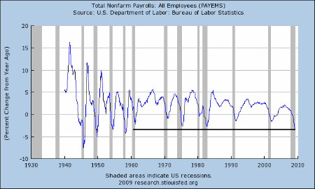


Notice the rate of job destruction is increasing. In fact, we have not seen the current rate of job destruction on a year over year basis since the last 1950s. Also note the median duration of unemployment is still increasing:
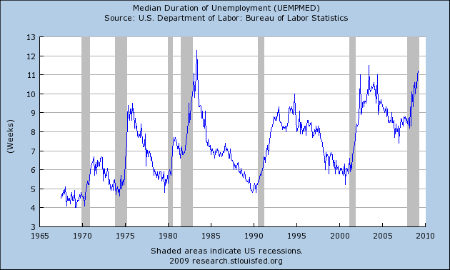


This indicates it is still incredibly hard to find a job once a job is lost. This tells us the rate of job creation is still slow -- at best. In addition,
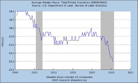


Average weekly hours is decreasing, which tells us employers are still under pressure to cut margins.

The conclusion from employment data is things are not getting better: the rate of job destruction is still high, the median duration of unemployment is increasing and the hours worked are decreasing.

Let's look at industrial production. The latest report from the Federal Reserve painted a bleak picture:

Industrial production fell 1.5 percent in March after a similar decrease in February. For the first quarter as a whole, output dropped at an annual rate of 20.0 percent, the largest quarterly decrease of the current contraction. At 97.4 percent of its 2002 average, output in March fell to its lowest level since December 1998 and was nearly 13 percent below its year-earlier level. Production in manufacturing moved down 1.7 percent in March and has registered five consecutive quarterly decreases. Broad-based declines in production continued; one exception was the output of motor vehicles and parts, which advanced slightly in March but remained well below its year-earlier level. Outside of manufacturing, the output of mines fell 3.2 percent in March, as oil and gas well drilling continued to drop. After a relatively mild February, a return to more seasonal temperatures pushed up the output of utilities. The capacity utilization rate for total industry fell further to 69.3 percent, a historical low for this series, which begins in 1967.


This report is cause for great concern. Output dropped 20% in the first quarter. While auto manufacturing is responsible for a large percentage of this, it's not the only problem. Here is a chart of the year over year percentage change in industrial production:
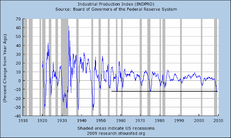


Notice the percentage year over yeare drop has not been this bad since the late 1950s. Also note the capacity utilization is now at incredibly low levels:
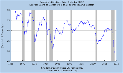


This tells us that when the economy picks up it wont' be from investment because there is already a large amount of idle capacity in the system.

Despite the recent uptick in new home sales, the housing market is still a mess. The most important metric to watch is housing prices which are still dropping at alarming rates:

Home-price declines in many of the largest U.S. cities accelerated in January, according to a closely watched index, offering a grim reminder that the housing market remains in a deep contraction despite recent glimmers of stability.


The S&P Case Shiller Index, which tracks prices in 20 metropolitan areas, fell 19% for the three-month period ended in January, compared with the year-earlier period. The decline, which follows a 18.5% decline for the three-month period ended in December, was a record annual rate of decline.


Once the year over year price declines fall to declines of 3% to 5% then we'll be able to say that housing is nearing a bottom. But until that time we're nowhere near a bottom in housing.

And the drop in housing wealth is one asset whose price drops have hit consumers hard. The other is obviously stock prices. Since the second quarter of 2007, household net worth has decreased from $64.361 trillion to $51.476 trillion -- a drop of 20%. That's leading to a drop in retail sales. Here's a chart of the year over year decline in real (inflation adjusted) retail sales:
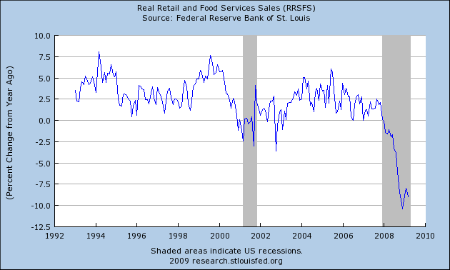


There was some excitement about the February uptick. But the latest report showed a decrease:

The U.S. Census Bureau announced today that advance estimates of U.S. retail and food services sales for March, adjusted for seasonal variation and holiday and trading-day differences, but not for price changes, were $344.4 billion, a decrease of 1.1 percent (±0.5%) from the previous month and 9.4 percent (±0.7%) below March 2008. Total sales for the January through March 2009 period were down 8.8 percent (±0.5%) from the same period a year ago. The January 2009 to February 2009 percent change was revised from -0.1 percent (±0.5%)* to +0.3 percent (±0.3%)*.


Retail trade sales were down 1.1 percent (±0.7%) from February 2009 and 10.7 percent (±0.7%) below last year. Gasoline stations sales were down 34.0 percent (±1.5%) from March 2008 and motor vehicle and parts dealers sales were down 23.5 percent (±2.3%) from last year.


While it's important to be hopeful about things overall, the underlying data does not support the conclusion that things are getting better. IN fact, I think the the best conclusion to draw comes from the latest Beige Book:

Reports from the Federal Reserve Banks indicate that overall economic activity contracted further or remained weak. However, five of the twelve Districts noted a moderation in the pace of decline, and several saw signs that activity in some sectors was stabilizing at a low level.


Traders are looking at the glimmers of hope out there rather than the actual numbers. There is nothing wrong with this: in fact, it's standard market behavior. But, it doesn't mean the rally has continued legs either.

Friday, April 17, 2009

Weekend Weimer and Beagle

It's that time of the week -- the markets are almost closed. It's time to think about anything else except the markets. I'll be back early Monday morning.


New York and Philly Fed Indexes

From Econoday. Click for a larger image.


From the NY Fed:

The Empire State Manufacturing Survey indicates that conditions for New York manufacturers continued to deteriorate in April, but at a much slower pace than in recent months. The general business conditions index climbed 24 points from its March record low, to -14.7. The new orders index shot up 41 points to a reading just below zero, and the shipments index rose 25 points, also reaching a level near zero. The inventories index continued to fall, hitting a record low -36.0. The indexes for both prices paid and prices received remained negative. The index for number of employees, while negative, improved in April, but the average workweek index fell. Future indexes were much improved, with the future general business conditions, new orders, and shipments indexes rising sharply to levels not seen since September of last year. The capital spending and technology spending indexes remained below zero, although they were considerably above last month’s levels.


Let's take this in pieces:

-- Referring to the chart above, the gray line was decreasing for 7 months, albeit not continually. That means the latest news is counter-trend. Before we get excited about the change in direction, remember we need additional data to day things are definitely better.

-- The general change is encouraging; a jump of 24 points is good news.

-- In addition, the jump in new orders and shipments is also encouraging. However it's one months worth of data.

-- The continued drop in inventories is also encouraging because it indicates people are getting more and more "down to the bone" and will be forced to by simply to have a few items in stock.

Here is the summation paragpaph from the Philly Fed report. Click for a larger image


The survey has similar points as the New York Fed's Report:

-- The overall index increased. BUT as the chart at the top of this post notes we're still at low levels. The line that represents the Philly index does appear to be bottoming, but we need more data and a strong and continued move higher to say for sure. In addition, the index has been negative for 16 of the last 17 months.

-- While the new order number rose, the shipments number decreased.

-- The future expectations index has been positive for the last 4 months. However, it's easy for people to say "things will get better". It's a good sign , but take it with a grain of salt.

There are encouraging signs. BUT -- the data points supporting that statement aren't numerous. Instead they are one or a few months worth of data. So keep that in mind when reading them.

Thank God for Trading Desks

From the WSJ:

JPMorgan Chase & Co. (JPM), bracing itself for more loan losses driven by the recession, delivered surprisingly strong first quarter results on Thursday.

Carried mainly by a recovery in securities trading that lifted JPMorgan Chase's investment banking revenue to a record, the bank said it's strong enough to pay back the U.S. Treasury Department even as it had to set more money aside for rising delinquencies and loan losses. Bond trading took away much of the pain from the recession.

JPMorgan Chase's profit for the quarter fell 10% from a year earlier, to $2.1 billion, but revenue jumped 48%, to $25.03 billion. The bank's shares rose about 1% in recent trading, to just almost $33.

Write downs related to illiquid, or so called toxic, securities and loans are "getting to be much less noteworthy," Chief Financial Officer Michael Cavanagh told investors during a conference call. However, JPMorgan Chase set aside $4.2 billion to cover future loan losses, $100 million more than in the fourth quarter - more than some analysts had expected.

JPMorgan Chase has a war chest of $28 billion to cover future loan losses, and that reserve is "staggeringly high" for some loan portfolios, Cavanagh said. Loan losses are expected to continue to rise, but not more so than previously expected, he said.


A few points:

-- Thank God for trading desks.

-- Revenue was up and profit was down. That tells us internal costs are an issue

-- Hearing the writedowns are less of a problem is good news

-- They have a huge loan loss reserve set aside

From Bloomberg:

Citigroup Inc., the U.S. bank rescued by $45 billion in U.S. taxpayer funds, ended a five- quarter losing streak with a $1.6 billion profit on trading gains and an accounting benefit for companies in distress.

Citigroup surged 17 percent in New York trading. The first- quarter profit compared with a net loss of $5.11 billion, or 34 cents, a year earlier, the New York-based bank said. On a per- share basis, the bank reported an 18-cent loss because of costs related to preferred dividends. The average estimate of 13 analysts surveyed by Bloomberg was a loss of 32 cents.

Citigroup investors hadn’t seen a profit since before Chief Executive Officer Vikram Pandit took over in 2007. While the bank cut compensation costs and took fewer writedowns, it couldn’t halt rising delinquencies on home and credit-card loans. Citigroup benefited from higher fixed-income trading revenue that also bolstered earnings at Goldman Sachs Group Inc. and JPMorgan Chase & Co.


A few points:

-- Again, thank God for trading desks

-- I am wary of any changes related to "accounting" changes. That implies there is a nice little gimmick going on rather than a real fundamental change

And finally, there is Goldman's Profits:

Goldman, which had been expected to report earnings Tuesday morning, said it earned $3.39 per share, beating the Thomson Reuters average estimate of $1.67. The company reported net revenue of $9.43 billion, also easily outpacing the $7.19 billion expected by analysts.

.....

The largest segment of Goldman's revenues came from "trading and principal investments" in its fixed-income currencies and commodities division.


Again -- thank God for trading desks.

Forex Fridays


The dollar chart formed a double top with the first top occurring late last year and the second top occurring at the end of February/beginning of March. Confirming this development is the corresponding weaker readings from the RSI and MACD on the second top. Prices are tied in with the SMAs in a tight formation signaling a lack of direction. But the recent price action looks like a triangle consolidation pattern which would be a bear market flag pattern.


The daily chart shows more clearly the bear market flag pattern. Prices started moving higher in mid-December, but broke through the trend in early March. They sold off but have since consolidated in a triangle pattern which looks an awful lot like a bear market consolidation pattern. Also note that despite prices moving higher since mid-March, neither the MACD nor the RSI are printing strong numbers. Instead they are both meandering higher. Finally, prices and the SMAs are in a tight formation, indicating a lack of conviction from traders.

Thursday, April 16, 2009

Today's Markets

The main point with all the charts below is they have all broken through key upside resistance. That is technically incredibly important. Also note that all three have done so on higher volume totals. If these levels hold tomorrow then the market will technically be in good shape.

That being said, I am still deeply concerned about the fundamental background for stocks right now. The most recent Beige Book showed extreme weakness. While there were pockets of strength, they were more like wishful thinking then actual good news. Of course, that leads me to remember an old trader's adage which is the trend will always go farther than you think....

Click on all images for a larger image


Beige Book Highlights

The Fed released the Beige Book yesterday. In general the report was negative. But there were a few glimmers of hope.

Reports from the Federal Reserve Banks indicate that overall economic activity contracted further or remained weak. However, five of the twelve Districts noted a moderation in the pace of decline, and several saw signs that activity in some sectors was stabilizing at a low level.

Manufacturing activity weakened across a broad range of industries in most Districts, with only a few exceptions. Nonfinancial service activity continued to contract across Districts. Retail spending remained sluggish, although some Districts noted a slight improvement in sales compared with the previous reporting period. Residential real estate markets continued to be weak. Home prices and construction were still falling in most areas, but better-than-expected buyer traffic led to a scattered pickup in sales in a number of Districts. Nonresidential real estate conditions continued to deteriorate. Difficulty obtaining commercial real estate financing was constraining construction and investment activity. Spending on business travel declined as corporations cut back. Reports on tourism were mixed. Bankers reported tight credit conditions, rising delinquencies, and some deterioration of loan quality.

Agricultural conditions were generally favorable across Districts, although drought conditions persisted in the Dallas and San Francisco Districts. The Districts reporting on energy said reduced demand, high inventories, and lower prices led to steep cutbacks in oil and natural gas drilling and production activity. The Minneapolis, Kansas City, and Dallas Districts noted declines in employment in the oil and gas extraction industry.

Downward pressure on prices was reported across Districts. Wage and salary pressures eased as labor markets weakened in all Districts, and many contacts continued to report job cuts and wage and hiring freezes. Employment continued to decline across a range of industries, with only scattered reports of hiring.


Assume that most of the report was terrible. However, here are some of the better data points:

The Chicago and Kansas City Districts said declines in production had slowed. The Cleveland District noted some leveling off in declines in new orders, and the New York and Dallas Districts noted that demand was beginning to bottom out following steep declines.

.....

In contrast, orders and sales of high-tech equipment firmed somewhat at very weak levels in the Dallas and San Francisco Districts. Defense firms in the Boston and Cleveland Districts reported solid activity. Food manufacturers saw sales gains in the Philadelphia and San Francisco Districts, and a food manufacturer in the St. Louis District noted plans to open a new plant. Pharmaceutical firms in the Boston and Chicago Districts continued to see solid demand; petrochemical producers in the Dallas District noted a slight turnaround in operating rates.

Manufacturers' assessments of future factory activity improved marginally over the survey period as well, with contacts in the Boston, New York, Philadelphia, Atlanta, and Kansas City Districts noting a slight upturn in the outlook for production and sales.

....

However, several Districts said sales rose slightly or declines moderated compared with the previous survey period. In particular, the Boston, Cleveland, and Chicago Districts reported an improvement in sales.

.....

.... but [car] dealers in the Cleveland District reported minimal problems with floor-plan financing. While auto dealers in the Boston, Cleveland, and Kansas City Districts noted some improvements in the outlook, those in the Philadelphia and Dallas Districts expect continued weakness.

.....

Housing markets remained depressed overall, but there were some signs that conditions may be stabilizing. Many Districts said factors such as homebuyer tax credits, low mortgage rates, and more affordable prices led to a rising number of potential buyers. The Richmond, Atlanta, Minneapolis, Kansas City, and San Francisco Districts noted a modest improvement in sales in some areas.

.....

Most Districts reported weaker loan demand overall, but the reports were mixed across loan categories. In particular, the New York, Richmond, and Kansas City Districts noted an increase in residential real estate loans. Additionally, residential refinancing activity remained brisk, although the loan process was taking longer due to more stringent appraisals and underwriting standards.

.....

In contrast, Districts including Cleveland, Chicago, and Minneapolis reported some hiring in healthcare. Contacts in the Richmond District noted solid demand for technically-skilled professionals and IT and office-support workers. The Chicago and Dallas Districts saw a slight uptick in hiring of finance personnel due to the sharp increase in mortgage refinance activity. The St. Louis District reported that a food manufacturer and some wood and plastic manufacturers planned on expanding their operations and hiring additional staff (however, conditions are still "bleak").


It's not much, but it's something.

Inside the Latest Industrial Production Numbers

From the Federal Reserve:

Industrial production fell 1.5 percent in March after a similar decrease in February. For the first quarter as a whole, output dropped at an annual rate of 20.0 percent, the largest quarterly decrease of the current contraction. At 97.4 percent of its 2002 average, output in March fell to its lowest level since December 1998 and was nearly 13 percent below its year-earlier level. Production in manufacturing moved down 1.7 percent in March and has registered five consecutive quarterly decreases. Broad-based declines in production continued; one exception was the output of motor vehicles and parts, which advanced slightly in March but remained well below its year-earlier level. Outside of manufacturing, the output of mines fell 3.2 percent in March, as oil and gas well drilling continued to drop. After a relatively mild February, a return to more seasonal temperatures pushed up the output of utilities. The capacity utilization rate for total industry fell further to 69.3 percent, a historical low for this series, which begins in 1967.


First quarter production dropped at a 20% annual rate. There is no way to spin that as good news. That is terrible news. In addition, production has dropped 13% below the same level as last year -- another terrible statistic. Finally, there have been 5 monthly drops in production. That -- again -- is terrible.

Now -- consider this chart of overall industrial production. Click on a larger image:


Above is a long-term chart of overall industrial production with a logarithmic scale. Notice the latest contraction that started in December 2007 has wiped out any production gain made during the latest expansion. That has not happened since the great depression. Here's a closer look at the last 40 years or so:


In addition:


Capacity utilization is at its lowest level in over 40 years. Let's assume we get of this recession by the end of the year. Do you think companies that are at 40+ year lows in capacity utilization are going to be purchasing new equipment? Neither do I. This does not bode well for equipment and software investment, which is about 8.4% of US chained GDP. This means we can't count on that to pull us out of the recession in any meaningful way.

Consider these charts from the report. Notice that construction and durable goods are dropping like stones.


And all of this is having a negative impact on manufacturing stocks:

Thursday Oil Market Round-Up

Click on all images for a larger image.


The weekly chart still has a bullish bias. Notice the MACD and RSI is rising and prices have broken out of a triangle consolidation pattern. While prices are still below the 50 week SMA, the 10 week SMA is moving higher and has crossed over the 20 week SMA. Also note the 20 week SMA is leveling off. Finnally, prices are above the 10 and 20 week SMAs which will pull these SMAs higher.


Prices broke out of a triangle consolidation pattern in early March. However, prices peaked from that rally in late March. Since then prices have been consolidating in a sideways move. Notice that the MACD is now drifting lower and gave a sell signal at the beginning of April. Also note that the RSI printed a lower high on the second price top in mid-April. Prices and the SMAs are jumbled together giving no clear reading of direction.

The reason for the difference between the weekly and daily charts' bias could be the difference between the technical and fundamental picture. The technical picture on the weekly chart says bull market. The daily picture was strong but is now cloudy. Consider the following fundamental issues:


Crude stocks are incredibly high


And gas stocks are above average, yet


Gas prices are still increasing slightly.

Simply put, supplies are high which should lead to lower prices, not higher. The reason is prices are rising in anticipation of recovery:

The timing and pace of the global economic recovery will determine whether the higher crude oil prices seen during March are sustainable. The prospects of limited growth in non-OPEC production and the expected start of economic recovery later this year, that should increase oil consumption and the demand for OPEC oil, are the main factors supporting the upward price path. If economic recovery begins earlier and is stronger than assumed in this Outlook, there is an upside risk of higher oil prices than currently projected. The downside risk to oil prices is a scenario of a prolonged economic downturn followed by a weak recovery, which could produce a greater decline in consumption than currently expected. This latter scenario would challenge the willingness of OPEC's members to sustain lower output levels for a longer period.


And then there is this:

Consumption. World oil consumption is expected to drop by 1.35 million barrels per day (bbl/d) in 2009 compared with year-earlier levels, due to the global economic recession. EIA assumes that the global gross domestic product (GDP), weighted by oil consumption, will fall by 0.8 percent this year. Consumption is expected to fall by 1.6 million bbl/d in the OECD countries and rise by 270,000 bbl/d in non-OECD nations. The bulk of the decline is expected to be concentrated in the first half of the year (World Liquid Fuels Consumption). World oil consumption is expected to grow by 1.1 million bbl/d in 2010, driven by a recovery of global GDP growth to 2.6 percent.


In other words, there are mixed signals in the oil market. Current prices are the result of expectations, not underlying facts. Traders are hoping that fundamentals will catch up with prices. Further complicating the mix are the continued OPEC production cuts.

Right now the daily chart says prices are going to move sideways for awhile and wait. Prices have already rallied; now traders want to see if fundamentals catch-up.