Barron's has a new feature called "Technically Speaking" which deals with --- technical analysis of the markets (go figure). This week they have two really good charts.
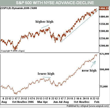
This is a comparison of the S&P 500 and the NY New High/New Low line. Here's the chart:

The market breadth -- the number of issues making new highs versus the number making new lows -- is still very positive. The chart shows we're still in a solid uptrend, adding further fuel to the bull's fire.
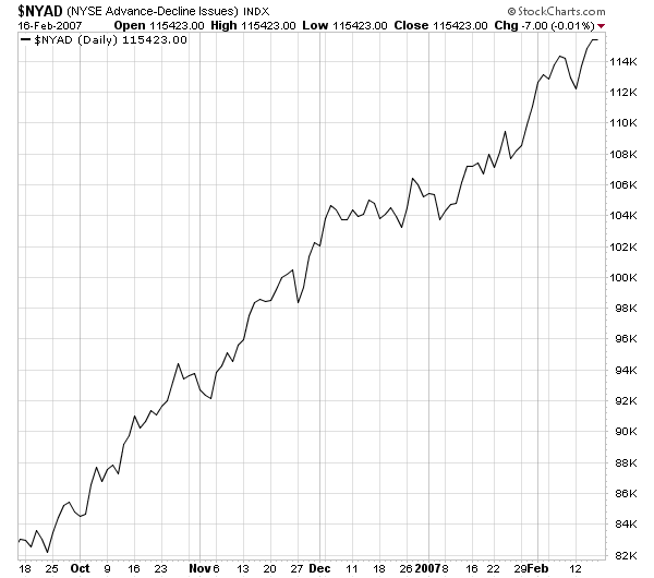
Let's add one more chart for the NYSE from Stockcharts. This is a chart of the cumulative advancing versus declining issues.

As with the new high/new low figure, this chart is still firmly in an uptrend, bolstering the bulls argument.
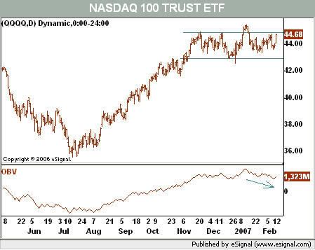
Let's move over to the NASDAQ. Here's a chart of the market combined with on balance volume.

This chart is more bearish, as the OBV is declining. However, the OBV is in a slight decline as opposed to a free-falling drop.
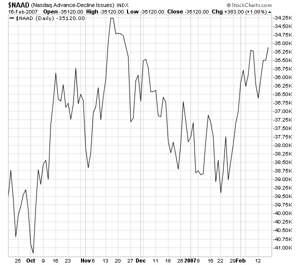
To round it out, here's another chart from Stockcharts showing the NASDAQ's advancing versus declining issues.

While this chart shows some recent gains for this breadth indicator, the give and take of this chart for the last few months signals the index is not as strong as the NYSE. Traders are obviously concerned about the market to some degree. While we aren't in bear market territory, we are in yellow alert territory (for all you Star Trek fans out there). This indicator bears watching over the next few weeks.