Saturday, June 24, 2023

Weekly Indicators for June 19 - 23 at Seeking Alpha


 - by New Deal democrat


My Weekly Indicators post is up at Seeking Alpha.

When nothing dramatic is happening, high frequency information can be like watching paint dry. That’s where we are at the moment. The positives - like improving sentiment in the stock market - are still positive; and the negatives - like interest rates and mortgage applications - are still negative. And the stuff on the cusp of changing from one to the other - is still on the cusp.

As usual, clicking over and reading will bring you up to the virtual moment on the data, and provide me with some lunch money.

Friday, June 23, 2023

Back to the basics: how do initial claims, total hours worked, aggregate real payrolls, and job growth relate?


 - by New Deal democrat


One of the most important reasons why big Fed rate hikes and big downturns in things like housing starts and credit provision haven’t translated into a recession this year (so far!) is the big decline in gas prices in the second half of last year. This big decline has translated into income and spending gains across the board for American households.


To give an idea of this impact, below I show gas prices for the past 8 years (blue, right scale) contrasted with real disposable personal income (red, left scale):


Gas prices went from $3.25/gallon to $5/gallon in the first half of last year due to Russia’s invasion of Ukraine. And then, as Europe successfully weaned itself from Putin’s gas, prices went right back down to $3/gallon last December. Since then they’ve gradually increased back up to about $3.50/gallon. Not coincidentally, real disposable personal income declined in the first half of last year, bottomed in June, and has increased ever since.

But this month will be the last month for those virtuous YoY comparisons, which will gradually become more challenging through this December. My suspicion is, this will put a damper on declining inflation. It may not start to accelerate again, but it may stall and is at least likely to decelerate at a more attenuated rate. Meaning consumer finances are likely to eat a little more challenging as well (not to mention the Fed’s apparent intention to hike interest rates once or twice more).

That’s why I have been focusing on the next shoe likely to drop, which is real spending on consumer goods. To recapitulate, typically early in recoveries real average hourly wages increase, leading to increased real spending. With more demand for goods, commodity, producer, and consumer prices increase. Ultimately they overtake wage growth, prompting consumers to cut back. A consumer recession ensures. 

Yesterday I updated the comparison of initial claims and the unemployment rate. As I again noted, initial jobless claims are a short leading indicator, and specifically lead the unemployment rate. Meanwhile, jobs are a coincident indicator, one of the most important ones. But there are several other job-related metrics, namely total hours worked and real aggregate payrolls. Today I wanted to refresh how they relate to initial claims and to job growth.

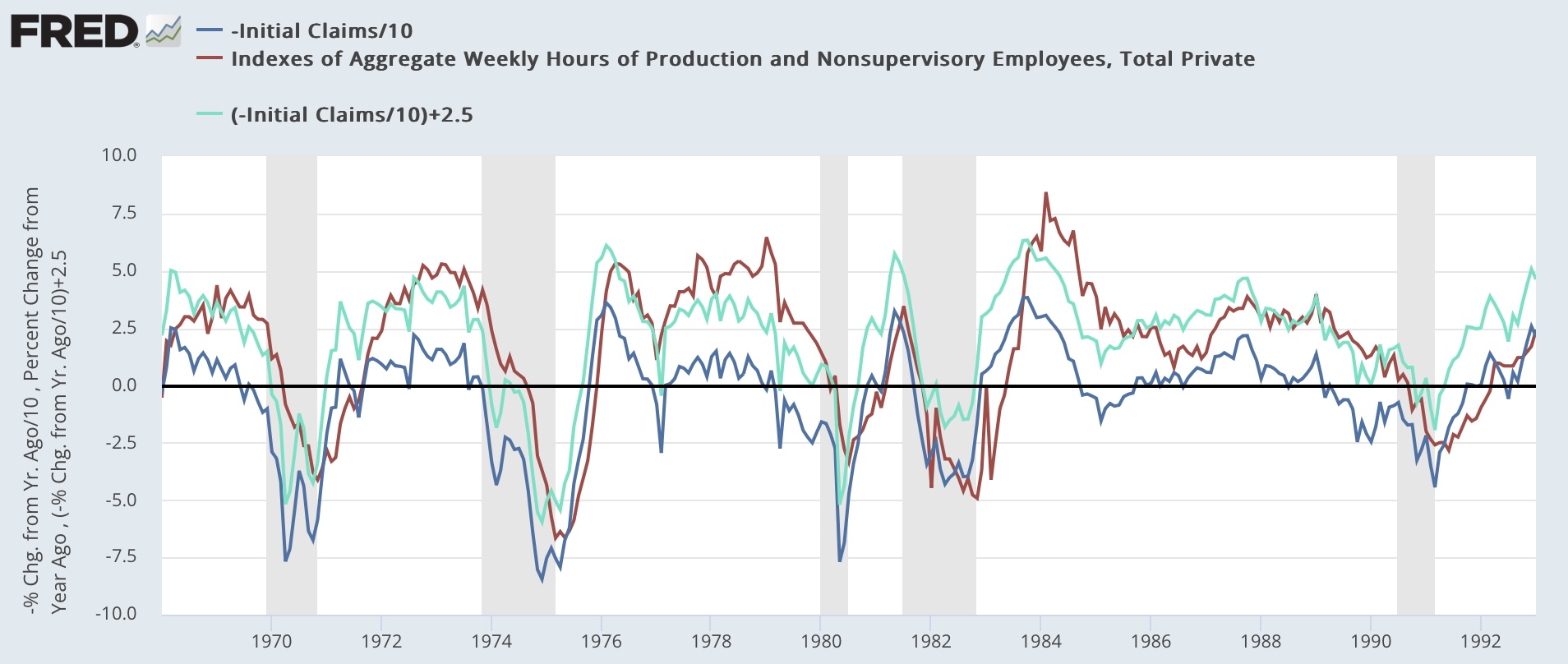
Let’s start with how initial claims (dark and light blue, inverted and /10 for scale in the graphs below) relate to aggregate real payrolls. Real aggregate payrolls turning negative YoY have been a good coincident indicator for the onset of recessions going back 50 years. Since initial claims lead, they ought to lead real aggregate payrolls, and in the below graphs, they do, as shown by the comparison of the dark blue and red lines - the dark blue line crosses 0 to the downside first.


But by how much? That’s where the light blue line comes in. What the graphs above show is that typically initial claims have had to increase YoY by between 20% and 25%, averaging up 22.5%, to coincide with when real aggregate payrolls turn negative YoY. So let’s look at the current situation:


As I indicated yesterday, there are still two more weeks of June claims reports, so the final point in the dark and light blue lines above may change. But as it stands now, real aggregate payrolls look likely to resume their decline to 0 YoY.

Next, let’s compare real aggregate payrolls with aggregate hours worked. The below graph shows that the two have typically risen and fallen coincidentally, although sometimes (the 1970s, 1990) aggregate payrolls decline YoY first:


Here is the present situation:


Again, the two declined more or less in tandem. The jury is out on whether the recent rebound in real aggregate payrolls is noise or not. As I wrote above, I expect inflation comparisons to get more challenging after June, so my bet would be on noise.

Finally, let’s look at aggregate hours vs. jobs. As shown below, historically aggregate hours have declined YoY first, before jobs:


Here is the present situation:


As per past history, so far aggregate hours have decelerated towards 0 faster than the number of jobs. This makes sense, since we would expect employers to cut hours before they actually cut employees. And indeed, note that total hours worked rises and falls much more than actual jobs gained or lost.

So, to recapitulate: if the deceleration in YoY inflation abates, after the increase in initial claims (already at the red line, although not for long enough yet to warrant a warning), next I would expect real aggregate payrolls to to resume their deceleration, and to turn negative once claims hit about 20%-25% higher YoY. Coincident with or shortly after that, I would expect aggregate hours worked to turn negative YoY. By this time we would already be in recession. Finally, well into a recession, jobs would turn negative YoY.

Thursday, June 22, 2023

Initial claims: yellow caution flag turns more orange


 - by New Deal democrat


Initial claims, which were one of the most positive indicators of all last year, have turned darker in the last several months, and are edging closer to triggering their recession warning levels.


Claims were unchanged at a revised 264,000 last week, the highest level in over 18 months. The more important 4 week average rose 8,500 to 255,750. Continuing claims, with a one week delay, fell 13,000 to 1.759 million:


On a YoY% basis, claims are up 22.2%. The more important 4 week average is up 19.5%, and continuing claims are up 30.3%:


Here’s what the history of the 4 week average and continuing claims YoY levels look like, with the present values normed to 0 for easy comparison:


With the exception of 1989, and 4 week periods in February 1977 and May 1979 (the former likely weather, and the latter due to a strike), the 4 week average has never been this much higher YoY without a recession having begun. For continuing claims, there are no exceptions at all.

Because initial claims lead the unemployment rate, here is their historical YoY comparison with claims averaged monthly (note initial claims/20 for scale):


Here is the same comparison for the past 18 months:


It is important to note that there are still 2 more weeks left of June claims, so the last value is likely to change significantly. But if it were to continue at the present level, it would imply the Sahm Rule (a reliable early nowcast confirmation of a recession; black in the graph below) being triggered or close thereto within the next few months:


Bottom line: no red flag triggered yet, but the yellow flag caution is looking more orangey..

Wednesday, June 21, 2023

Real wage growth leads spending; meaning spending seems likely to stall after an increase over the next few months


 - by New Deal democrat


No big economic news today, so I wanted to pick up on a subject I began a week ago Monday; namely, taking a detailed look at personal spending, i.e., consumption. To put it in more socially relevant terms, what allows average American households to spend more, or to cut back? And what are its ramifications for the economy as a whole?


Last week I discussed how real personal spending is a coincident indicator, but real spending on services almost never declined, even during recessions. Rather, it simply increased at a decelerated pace. Personal spending on goods, on the other hand, has been a legitimate if weak short leading indicator. And personal spending on goods, over time, has closely tracked with retail sales. The difference between the “real” measures of the two has boiled down to different inflation measures.

Many times in the past 15 years I’ve repeated the mantra that consumption leads hiring, not visa versa. It is the increase or decrease in demand that causes companies to add or lay off staff. But the reverse is not true. This week I want to focus on, “what leads consumption?” Particularly as it relates to the leading measure of spending on consumer goods.

The beginning point is that prices are more volatile than wages. To put it another way, as some economists do, wages are “stickier.” Here’s a long term graph of the YoY% change in consumer prices (red) vs. wages for nonsupervisory workers (blue) over the past 40 years:


In the 35+ years between the onset of the more modern economic era in 1983 and the pandemic, YoY prices varied between a peak of +6.4% in 1990 and a low of -2.0% at the end of the Great Recession. By contrast, wages were much less volatile, varying between a peak of +4.8% at the beginning of 1983 and a low of +1.9% in 1987. Incidentally, the same volatility holds true since the beginning of the wage series in 1964 through 1982, shown below:


In general, expansions start when inflation is significantly less than wage gains (and interest rates are generally lower). The vast mass of people who are still employed find that their money goes further. There are some compellling bargains for purchases they would like to make. This generates more demand, and so more production and more hiring. The expansion is underway.

Later, the increase in demand causes commodity, producer, and consumer prices to increase at an increasing rate, usually outpacing wage gains. Typically interest rates have also increased. Consumers cut back, and as this is noticed by producers, production and employment follow down as well. A recession begins, prices retreat, and we back to the beginning of a new cycle.

The two exceptions (the mid-1980s and right after the pandemic) were the times that a lag in wage growth was swamped by a big increase in the labor force, i..e, household earnings grew. In the former, it was women joining the workforce; in the latter, it was the opening of leisure and hospitality establishments after pandemic closures.

Which leads us to the most important leading indicator for consumption I have found: in general, real wages lead real spending on goods. Over the 50+ years leading up to the pandemic, an increase in real hourly wages (i.e., adjusted for inflation) leads to an increase a few months later in real spending on goods. Similarly, a decrease in real hourly wages has led to a decrease in real spending on goods with several months’ delay:


Not perfect (see, e.g., the early 2000s), but generally the direction (and frequently but definitely not always a similar amplitude) of real spending on consumer goods has followed the direction of real wages with some months’ delay.

Here is the same data since July 2021 (avoiding the lockdown and stimulus distortions):


In other words, we should expect YoY improvement to continue in real spending on goods over the next few months. Here’s what the absolute level of such spending looks like:


Beyond that, I am not sure at all that the increase continues. That’s because, as the superheated jobs market has cooled, average hourly wage growth has decelerated, and that can be expected to continue. But once we get past June, inflation will be measured against the steep decline in energy prices of the 2nd half of 2022:


As shown above, since the peak in energy prices last June, energy has been a bigger determinant of the direction of monthly inflation vs. shelter. If it continues to be the case, then gradually increasing energy prices are likely to at least be an equal determinant to the badly lagging almost certain deceleration in shelter prices. Stabilizing inflation vs. decelerating wage increases would mean decelerating or even declining real wages. Which, per the above, will lead to stalling or declining real spending on consumer goods; and in turn, further deceleration to, and maybe a complete stall in hiring.

Tuesday, June 20, 2023

Housing under construction increases back close to record; good economic news, but ammunition for a hawkish Fed


 - by New Deal democrat


Last month I wrote that “the Fed’s sledgehammer attempt via one of the most aggressive rate hike campaigns in its history appears to be on the verge of failure. That’s because housing construction, more than a year after the Fed started its campaign, is not meaningfully cooperating.”


This month’s report did not help the Fed, either. With the exception of single family units under construction, every other metric increased, some sharply, and most of April’s data was revised higher.

Let’s start with total, single, and multi-family permits. Both total and single family permits continued their increase from their January bottoms, while multi-family permits continued their more muted declining trend:


The trend in permits is really not that surprising, since mortgage rates peaked 8 months ago over 7%. Below I show my perennial graph of the respective YoY changes in mortgage interest rates (red, inverted, *10 for scale) and housing permits (blue):


The YoY increase in mortgage rates has been decreasing since last October, and since permits follow interest rates with roughly a 3-6 month lag, the YoY improvement is what we would expect. At the same time, if mortgage rates remain in the 6%-7% range, permits will not continue to improve very much on an absolute scale, and may even retreat somewhat towards their January lows.

Housing starts are much more noisy, and heavily revised. The one big negative revision to April was here, -61,000 downward. But May increased 300,000 annualized from that revision(!):


Both single and multi-unit dwellings participated. Again, because of the aforesaid noise and revision issues, take this with multiple grains of salt.

But where the rubber really hits the road, in terms of actual economic activity, is housing units under construction. And here, there were both upward revisions and significant monthly improvement in the total. The one divergence is that single family units under construction declined again, but were overwhelmed by the big increase in multi-family units under construction, which rose to another new all-time high of 978,000 annualized, only -1.2% down from their peak:


Here is the entire 50+ year history of housing under construction, so you can see just how record-breaking the new high in multi-family construction is:


The one big negative is that there has never been such a big (-16%) decline in single family construction (red) without it resulting in a recession. This big a divergence between single and multi-family construction has only happened twice before: in the early 1970s, and the bursting of the 2000s housing bubble.

The objective good news is that it is hard to see a recession developing with construction activity remaining so close to a record. But to the extent this buoys prices (and it almost certainly does, since the improvement in sales will tend to put a bottom on house price declines), the Fed is going to treat this firming as evidence that it needs to remain hawkish, and continue to schedule more interest rate increases.

Monday, June 19, 2023

A comment on Juneteenth; and what I’ll be looking for in tomorrow’s housing report


 - by New Deal democrat


That Juneteenth is a national holiday ought to be a full rebuttal to those who think that teaching the entirety of American history, including its worst moments, is somehow an insult to the majority. That enslavement was finally ended by the Emancipation Proclamation and the 13th Amendment is something that all present-day Americans ought to be able to look back on as worth celebrating. We are *all* better for it, not just some of us.


Needless to say, no economic news today, but tomorrow we will get the very important housing permits, starts, and construction data for May. I will be particularly paying attention to how much housing is under construction. As I’ve mentioned before, this is the measure of the *actual* current economic activity in the housing market. 

What has been most interesting is how much the original pandemic-relating bottleneck in housing construction supplies has continued to affect the market. To show you that, below is a graph of housing permits (blue) vs. housing units under construction (red). I’ve normed both to 100 as of their respective peak months during the housing bubble of almost two decades ago:


Construction follows permits, but I wanted to point out a few more details.

First of all, note that the current peak in construction is far higher relative to the equivalent peak in permits compared with any of the past peaks over the last 50+ years. Permits didn’t just surge post-pandemic, but they remained at sharply higher levels for over 18 months, in contrast with the peaks in the 1970s, 1990s, and 2000s, which lasted less than 12 months. The significant similarity, which I’ll discuss in a little more detail below, is the mid-1980s. Thus there was much more “pent-up” permitted activity in the past several years than during most of the previous housing booms since 1970.

Further, norming a peak in both metrics to the same value helps show that construction never falls quite as much as permits during the downturns. And although this is harder to make out, construction ramps up very quickly in upturns, but turns down more slowly during downturns. I show this below in the following chart:


Year 

Permits % decline

# Months

Construction 

%decline

# months 

Construction

Delay from peak


1972

-62% / 27

-50% / 36

2


1980

-59% /  22

-36% / 32

6


1981

-51% /  13

-30% / 17

4


1985

-25% /  8

-3% / 14

5


1987

-35% / 13

-9% / 12

2


1987-90

-59% / 64

-47% / 71 

11


2000

-11% / 18

-3% / 24

1


2005-09

-77% / 42

-71% / 67

4


2020

-32% / 6

-3% / 2

6


Present

-30% /13

Unknown

10


——


——


——


---


---


Construction has usually peaked 4 to 6 months after permits, with the notable exceptions of the 1980s and the present. But the downturn in construction has normally taken about 25%-40% longer than permits to reach bottom. And the total downturn in construction has typically been between 50%-75% of the downturn in permits. In the case of the 1980s, an initial downturn of about 25% in permits only resulted in a downturn of -3% in construction. As the downturn in permits gradually continued during the rest of the decade, so did the gradual downturn in construction. Only about 6 years after the initial downturn did a recession occur.(and both the resilience of the economy in the mid to late 1980s and the downturn in 1990 had very much to do with the collapse of OPEC pricing power, and the effect on oil prices of the Iraqi invasion of Kuwait). 

If mortgage rates do not make new highs, but hover in the 6%-7% range in the near future, I expect housing permits and starts to level off as well, a trend that almost certainly has already started. Like the 1980s, this will probably result is a slow continued decline in housing under construction. The current decline in permits probably means something like an ultimate 10%-20% decline in construction, which won’t be manifest until sometime in the early part of next year. Note that with the sole exception of 2001 just-barely-a-recession, and the 2 month pandemic downturn, all the other recessions in the past 50+ years featured downturns of over 50% in permits and over 30% in construction.

Tomorrow I will be looking to see if the data is consistent with this scenario.

Saturday, June 17, 2023

Weekly Indicators for June 12 - 16 at Seeking Alpha


 - by New Deal democrat


My Weekly Indicators post is up at Seeking Alpha.


Stocks are really buying the “soft landing” scenario, rising to repeated 12 month+ highs, apparently aniticipating that corporate profits will be off to the races again.


Meanwhile, when we look at consumer spending, which is 70% of the economy, restaurant reservations, which are one of the easiest things for consumers to cut back on, continue to slowly fade downward, while retail spending as measured by Redbook also continues to inch towards turning negative as well.


As usual, clicking over and reading will bring you up to the virtual moment about the economy, and reward me a little bit for my efforts.

Friday, June 16, 2023

Real total business sales estimated unchanged for both April and May, 1% below January peak


 - by New Deal democrat


A recession is a sustained and significant downturn in production, sales, income, and employment. Here’s what the monthly indicators of those look like, normed to 100 either as of January, or in two cases to their 2022 peaks:


Notice that sales (gold) are reported with a 2 month lag. We won’t know real manufacturing and trade sales for April until 2 weeks from now. 

So I’ve developed several methods for making early estimates. Based on those, we can make a good final estimate for April now, and a preliminary back of the envelope one for May as well.

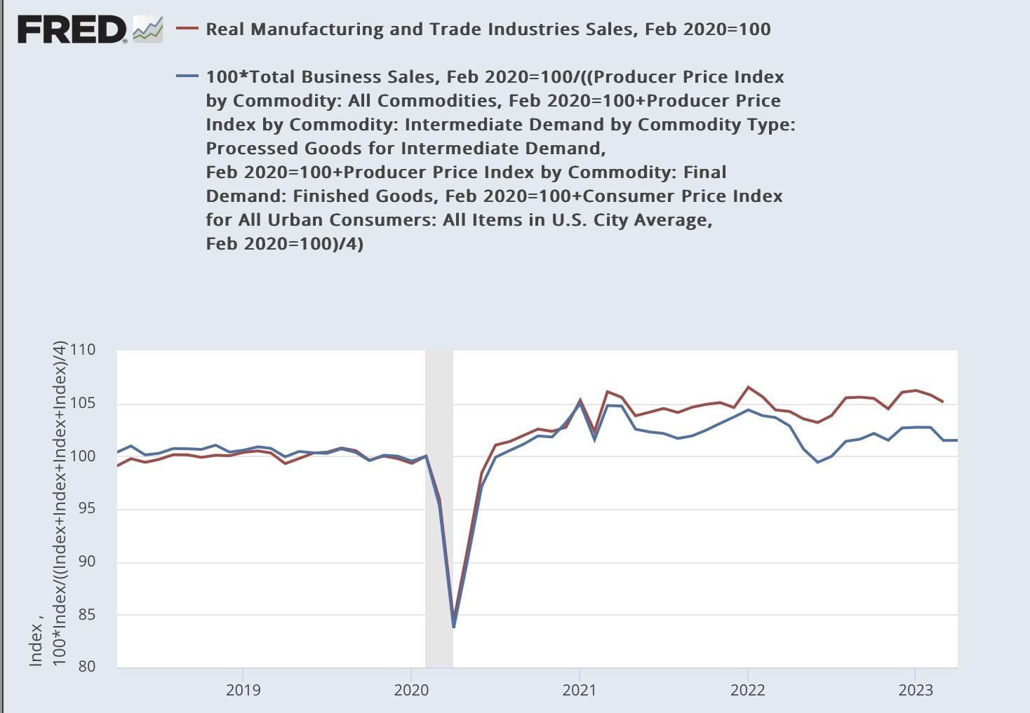
Yesterday the last component of nominal sales, for the manufacturing component, were reported. As a result, nominal total business sales increased 0.1% in April. I use an unweighted average of CPI and commodity, intermediate, and final goods from the PPI as a deflator. This gives us a very good estimate of real manufacturing and trade sales:


Since the average of the 4 inflation measures was +0.1% as well, this means that the final estimate for real manufacturing and trade sales for April is unchanged.

Turning to May, we do have real retail sales, which are about 1/3rd of the total measure, as well as industrial production, a proxy for real manufacturing sales. We don’t have inventories or wholesale sales, so this method is much less reliable, but it does capture the trend over time:


This method gives us a preliminary, back of the envelope estimate of 0.0%, or unchanged, for May as well.

This leaves both April and May 1.0% below the January peak for real sales.

The economy continues to be held up by real spending on services, and the ensuing growth in payrolls.

Thursday, June 15, 2023

Industrial production continues to falter in May


 - by New Deal democrat


My final update this morning is for industrial production, the King of Coincident Indicators, which has most frequently corresponded with peaks and troughs in economic activity as determined by the NBER.


The news for total production was not good, as it declined -0.2% in May, and March and April were revised -0.2% lower each. It remains -0.5% below its recent peak last September. Manufacturing production did increase 0.1%, and March and April were revised higher, but it also remains -0.6% below its recent peak last October:


YoY production is up 0.2%, and manufacturing production is down -0.3%. In the 80 last years of the 20th century, total production had only been this low YoY several times in the 1950s and also in 1984 without there being a recession. Manufacturing production had a similar record once it was separately recorded in 1964. But since the “China shock“ that started at the turn of the Millennium, however, there have been 3 separate downturns that were as bad or worse, without there being a recession:


To sum up the three data series I have reported on this morning, *all three* are at or close to levels which for most of their past history have been consistent with recessions. As I’ve noted several times recently, the economy is being buoyed by real personal spending or services, and by job growth that is still trying to catch up with that increased spending ignited originally by the pandemic stimulus.

Later this morning total business sales for April will be reported. I’ll take a look at those, and estimate what they mean for another important coincident indicator, tomorrow. 

Real retail sales continue to suggest recession, decelerating employment gains


 - by New Deal democrat


The second of the three important datapoints this morning was retail sales for May. This is one of my favorite indicators, because it has several leading relationships, and is also an important component of one of the main data series that the NBER looks at in dating recessions.


Nominally retail sales for May increased 0.4%. After adjusting for inflation, the increase rounds to 0.2% (blue in the graph below). This remains close to the lowest absolute levels of retail sales in the past 2 years. Because real retail sales correspond closely to real personal consumption expenditures for goods (red), I include that as well:


YoY real retail sales are down -2.4%. In the past 75 years, this has almost always been recessionary. Since it is also a short leading indicator for payroll employment (gold), it implies continuing gradual deceleration in the growth of monthly jobs as well:


Note that I have discounted the big YoY declines last spring, which were in comparison to the 2021 spring stimulus spending spree. The effects of that engorgement are waning.

I suspect that personal consumption expenditures will resolve in the direction of real retail sales, but we won’t know that for 2 more weeks at least.

Initial and continuing claims edge closer to signaling recession


 - by New Deal democrat


There’s a blizzard of data this morning. I’ll report on retail sales and Industrial production later.

But let’s start with initial jobless claims, which were unchanged this week at 262,000, the highest level in over 18 months. The 4 week average increased 9,250 to 246,750. Continuing claims, with a one week lag, increased 20,000 to 1.775 million:


Recently a similar spike over 260,000 was revised away due to a State’s reporting issue. So far it has not happened this time.

YoY initial claims are up 20.7%. The more important 4 week average is up 15.4%, the first time it has been over 12.5% since immediately after the pandemic. Continuing claims are up 30.6%:


Here is 50 year+ look at the Yoy% change in the 4 week average and continuing claims, both normed to 0 as of this week’s reading:


Except for brief spikes of only a few weeks, only once in the past 50+ years (specifically, 1989) has the 4 week average of initial claims been this higher YoY without there being an imminent recession. Continuing claims this much higher YoY has *always* signaled a recession, with no false positives or negatives.

Finally, since initial claims lead the unemployment rate, here is what the latest data implies for the YoY change in the unemployment rate in the next several months:


The unemployment rate could climb another 0.2% or 0.3% in the next few months. This would still not trigger the Sahm rule, which retrospectively reliably tells us we are in a recession after it starts.

Wednesday, June 14, 2023

Producer prices continue sharp deceleration; real average and aggregate nonsupervisory pay continues to increase


 - by New Deal democrat


Historically producer prices were more upstream of consumer prices, but since the 1990s and the employment of “just-in-time” inventories, that has been less the case. So I normally don’t pay too much attention to the monthly PPI.


But for the record, PPI continues to confirm, and amplify, what we’ve seen in CPI. That is, a steep decline in monthly readings compared with a year ago, causing the YoY comparisons to decline sharply as well.

Headline PPI is now only up 1.2% YoY, while commmodity prices are down -7.1%:


Here’s how headline PPI compares with headline CPI YoY:


And here’s how core PPI (up 5.0% YoY) compares with core CPI (up 5.3%YoY):


Since last June’s inflection point, final demand PPI is down -3.6% and commodities are down -9.4%:


In short, deceleration and even outright decline all around. Keep in mind that one big difference is that unlike CPI, PPI does not have a significant “shelter” component.

Meanwhile, yesterday’s CPI report also allows us to update several important income metrics for the American working and middle class.

Real average hourly earnings in May increased 0.3%, continuing their rise since last June’s inflection point at peak gas prices:


And aggregate payrolls for nonsupervisory workers also increased YoY:


This latter metric is an excellent “fundamentals-based” marker for recessions, which almost always occur when it goes negative. This improvement is the best argument against there being any imminent recession - in the aggregate, in real terms, average American households are bringing home more income.

Tuesday, June 13, 2023

CPI less shelter up only 0.7% in last 11 months (0.8% annualized rate)


 - by New Deal democrat


Let me cut to the chase right from the outset: except for the very lagging measures of shelter; motor vehicle parts, repairs and insurance; and to a lesser and waning extent, food; consumer inflation is now well-contained and close to the Fed’s target rate.

First, let’s look at the headlines, with the monthly and YoY rates of change:

Total CPI up 0.1% m/m and 4.0% YoY (lowest since April 2021)
Core CPI up 0.4% m/m and 5.3% YoY (lowest since November 2021)
CPI less shelter up +0.1% and 2.2% YoY (lowest since February 2021)
Core CPI less shelter up +0.3% and 3.4% YoY
Energy down -1.2% m/m and down -11.7% YoY
Food up +0.2% m/m and up 6.7% YoY (lowest since December 2021)
New cars up +0.2% m/m and 4.7% YoY (lowest since May 2021)
Transportation services (parts, insurance, repairs): up +0.8%  and up +10.3% YoY (vs. October 2022 peak of 15.3%)
Owners Equivalent Rent up 0.6% m/m and 8.0% YoY (down -0.1% from all time YoY high)

This is the same pattern as we saw last month ago, just even more amplified: “Lowest since…” for almost everything *except* shelter, which is close to its all-time YoY high set one month ago.

And let me further headline that fact right here: CPI less shelter since last June is only up 0.7%:


That’s an annualized rate of 0.8%.

Keep in mind that shelter component of official inflation, which is 1/3rd of the total, and 40% of the “core” measure, badly lags the real data - as in, by a year or more.

Next, here is the YoY% change in headline inflation (blue), core inflation (red), and inflation ex-shelter (gold)


Both have been in decelerating trends since last June (headline and ex-shelter) or last September (core).

Here are the other big drivers of inflation for the past several years outside of shelter: food (blue), new vehicles (gold), used vehicles (gray), and transportation services (red, /4 for scale!):


All of these are well off their highs, and used vehicles have been negative YoY for a number of months. Aside from food, which is weighted at 13.4% of the total, transportation services are only 5.9%, and new and used vehicles combined only 7.0%.

Next, because of the importance of shelter to my analysis, here is an updated long term YoY graph of the big culprit, Owner’s Equivalent Rent (blue), which increased another 0.5% in April, with the FHFA house price index (red, /2.5 for scale), which has been declining since last June and was up 4.0% as of its last reading for February:


Exactly as I have been saying for the past 18 months, house prices dragged OER higher and with it the CPI indexes, with about a 12 month delay. House prices on a YoY basis plateaued for a year between late spring 2021 and mid year 2022, and now OER has finally plateaued as well. The only remaining issue is how long it will remain at that plateau before it follows house prices back down.

Finally, here is “sticky” core inflation ex-shelter:


Even this measure is declining, although less than a “non-sticky” index would be.

As noted above, the FHFA index is only up 3.6% YoY as of March. If it has continued to decline in the 2 months since then at the same rate, it is only up about 2.0% YoY currently, vs. 8.0% for OER. If the FHFA index were substituted for OER, then total YoY CPI for May would only be 2.7%. Core inflation would only be up 2.9% [Note: I originally miscalculated this as 3.5%]. Neither of these warrants continued restrictive interest rate policy.

In summary, properly measured inflation is no longer a significant issue. Even if OER is a valid way to measure housing inflation, because of the serious lag the Fed should be relying on house prices, and at very least pause.