Saturday, June 27, 2020

Coronavirus dashboard for June 27: infections -> hospitalizations -> deaths


 - by New Deal democrat

Total US infections: 2,480,786,  44,373 new cases
Total US deaths: 125,120,  619 new deaths

A quandary over the past month has been why deaths declined so much more than new cases, while cases were declining; and more recently why deaths have continued to decline in the face of soaring new infections.

Is it because of better treatments? Changing demographics - e.g., fewer nursing home cases, more younger people? Or is something more even more fundamental with the nature of the virus itself going on? In short, should we expect deaths to continue to decline, or to turn up following the increase in new infections?

I am expecting deaths to begin to rise again, imminently.

Here’s why: the progression is:
- first, infections increase/decrease
-second, hospitalizations increase/decrease
-finally, deaths increase/decrease.

The problem in the US data has been that hospitalizations have been missing from almost all compilations. That’s because not all States - and most especially, Florida - track hospitalizations.

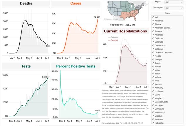
Conor Kelly, however, *does* track reported hospitalizations from all States which have reported for at least 30 days, which totals roughly 40 States. So if deaths are going to start to increase again, it should first appear in this data. Further, if this is because of the reckless reopening of some States, it should most plainly appear in those regions. With that in mind, here is the data.

Total US hospitalizations bottomed on June 14 at 26,441. In the 12 days since, they have risen by almost 14% to 30,065:

One benefit of Conor Kelly’s compilation is that it allows users to generate customized regions of States. So, for example, here is the data for the East Coast megalopolis from Maine through Virginia:
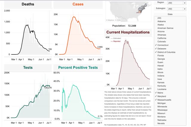

Cases have risen very slightly in the past few days, while hospitalizations have continued to fall. Deaths have flattened.

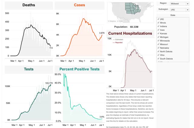
In the Midwest, cases have risen by about 25% in the past 12 days. Hospitalizations have flattened, while deaths have continued to decline:

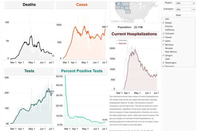
In the northern West, case started rising a month ago, after May 26. Hospitalizations bottomed two weeks later on June 7. Deaths started to creep up at the same time:

In the Southwest, cases never decreased. But there was an inflection point for increased cases on May 28, which had 3,528 new cases. By June 26, that had more than doubled to 8,758 new cases:
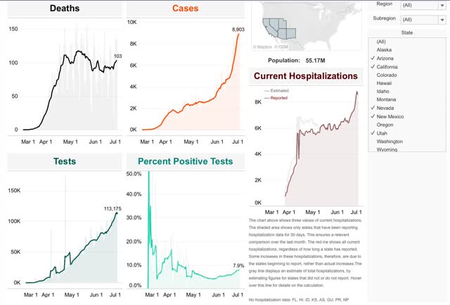

The inflection point in hospitalizations followed on June 14, since which time the number has increased by over 35%. The upward inflection in deaths followed on June 20.

Finally, in the Deep South, cases actually bottomed on April 27 at 4,337, with an upward inflection point at May 27, on which there were 5,171 new cases. Since then new cases have more than tripled to 17,748:
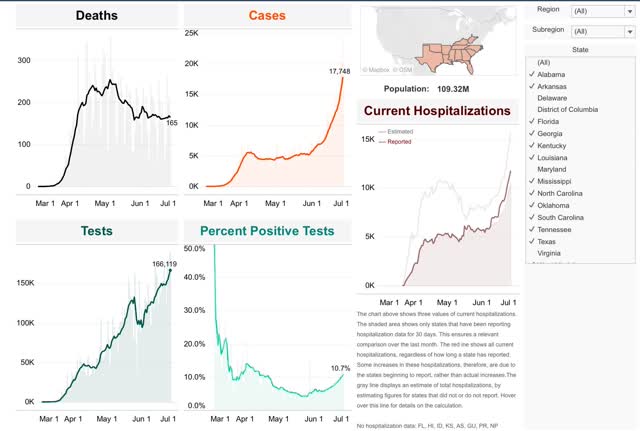


Hospitalizations reached their inflection point on June 6 at 5,791. Since then they have nearly doubled to 10,565. Deaths bottomed on June 18 at 160 and have risen slightly since then to 165.

In short, while there is considerable variation, in general deaths have lagged hospitalizations by about 1 to 2 weeks. We are now nearly 2 weeks after the bottom in hospitalizations for the US as a whole. Thus I expect deaths to start increasing, at least slowly, in the next few days.

Turning to some of the drivers of the increase in cases, here are two charts. The first is a chart of which State have increasing (red and orange) vs. decreasing (yellow) cases in the past week; the second is a chart of mask-wearing regulations by States:
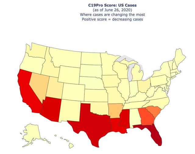
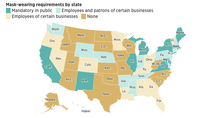
With the very notable exception of California on the one hand, and the sparsely populated States of the northern Plains and Rockies, mask-wearing, or the lack thereof, is highly correlated with increases or decreases in new cases.

Another big correlation with new cases has been restaurant reopening, as shown in the below graph comparing cases with restaurant spending:
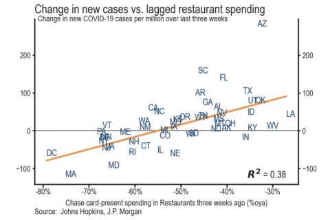


Confined indoor spaces, air-conditioned recirculating ventilation, and the necessary lack of mask-wearing in order to eat or drink sure seems to be a recipe for spreading the virus.

And if the public does not have confidence that the virus has been contained, the economy is not going to be able to sustain reopening for very long, as shown in the below graph of consumer confidence by region:
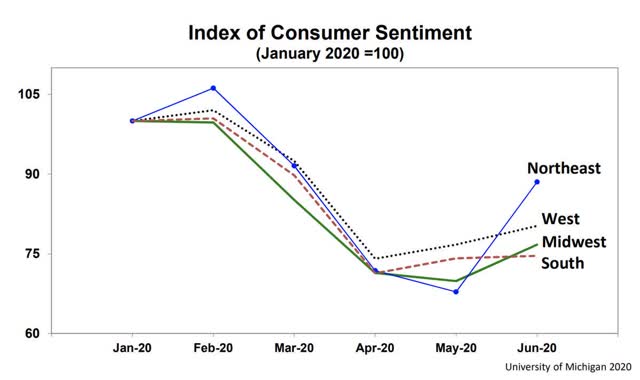

Only in the Northeast, where the virus has been very well contained (for now) has there been a big rebound in consumer confidence.

Finally, it’s worth noting that this is even showing up in the stock market:
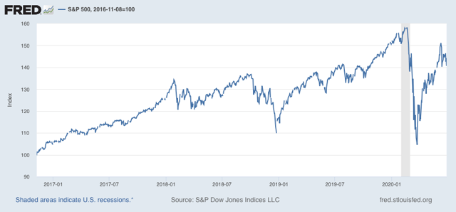

As of Friday, the S&P 500 was less than 5% above where it was at its January 2018 peak. If deaths start to rise substantially, as I believe they will, portions of the economy are going to shut right back down again, whether by law or regulation, or simply because customers stop showing up. 

Weekly Indicators for June 22 - 26 at Seeking Alpha


 - by New Deal democrat

My Weekly Indicators post is up at Seeking Alpha. The coincident indicators, as well as the short leading indicators, have continued to improve gradually each week.

But this week may be the near term peak, as the reality of renewed exponential spread of the coronavirus in recklessly reopened States starts to hit home. You cannot force people to patronize businesses if they believe it is unsafe, and when complacency leads to new outbreaks, the pain threshold will be hit at which people pull back again. Most noteworthy is that restaurant reservations did not improve in the past week - people are shying away from danger.

As usual, clicking over and reading rewards me with a little jingle in my pocket as well as bringing you right up to date with what is happening in the economy.

P.S.: I plan on putting up an extra coronavirus update later today. Stay tuned.

Friday, June 26, 2020

All 4 coincident indicators of recession improved in May vs. April


 - by New Deal democrat

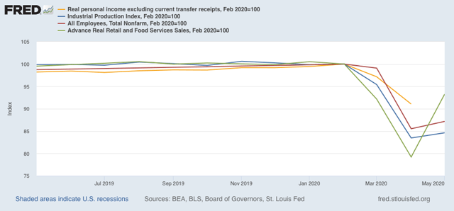
With this morning’s release of personal income and spending, we now have all 4 coincident indicators for May that the NBER uses to determine whether the economy is in recession or recovery/expansion. And all 4 improved from their “most horrible” readings in April.

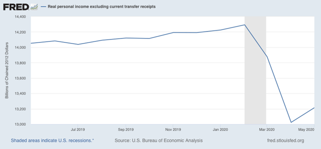
A recession is a generalized downturn in production, employment, sales, and income. The “income” metric that the NBER uses is “real personal income excluding current transfer receipts,” (basically, government program payments to individuals) and as shown in the graph below, it improved from April: 


Still a horrible decline from February, but “less horrible” compared to April.

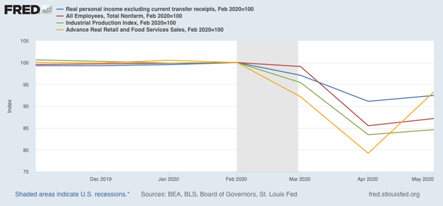
Since industrial production, nonfarm payrolls, and real retail sales also all improved in May from April, that makes it 4 for 4 among the coincident indicators:


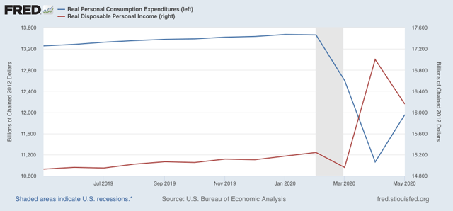
Real disposable personal income (red in the graph below) declined in May from April, but was well ahead of previous months. This probably represents the delayed receipt and cashing of some of the one-time $1200 stimulus checks distributed by Congressional Act. Real consumption expenditures (blue), however, increased significantly, probably reflecting in part spending of that stimulus money by consumers, and partly spending by those called back to work:


In short, in May the situation was still horrible, but “less horrible” than April. That would qualify for the beginning of a recovery by economists’ definitions, *provided* there is no renewed downturn. And as the coronavirus continues to wreak more havoc in the States that have recklessly reopened - or simply let their guards down - a renewed downturn is very much a possibility, and almost a certainty if Congress does not extend the enhanced unemployment program by the end of July.

Thursday, June 25, 2020

Initial jobless claims improve slightly; continuing claims resume decline


 - by New Deal democrat

Weekly initial and continuing jobless claims give us the most up-to-date  snapshot of the continuing  economic impacts of the coronavirus on employment. More than three full months after the initial shock, the overall damage remains huge, with large spreading new secondary impacts. The positive news is that the total number of claims, including continuing claims, has resumed being “less awful,” likely meaning more people have been recalled to their jobs than have newly lost them.

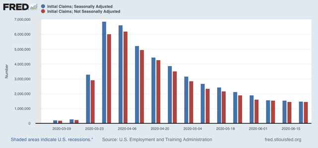
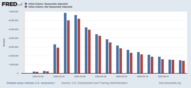
First, here are initial jobless claims both seasonally adjusted (blue) and non- seasonally adjusted (red). The non-seasonally adjusted number is of added importance since seasonal adjustments should not have more than a trivial effect on the huge real numbers:


There were 1.457 million new claims, only 6,000 less than one week ago. After seasonal adjustment this became 1.480 million, “only” 60,000 less than last week’s number. While the trend of the past 45 days of slight declines in new claims continues, this is the smallest weekly decline since the worst reading in April. Further, this objectively continues to show huge second-order impacts continuing to spread.

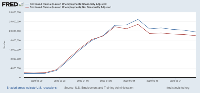
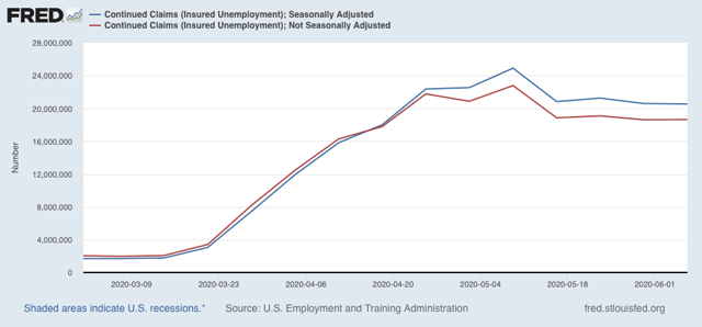
Meanwhile, after several weeks of no significant change, the “less bad” trend in continuing claims, which lag one week behind, has reappeared. In the previous four weeks, both the non-seasonally adjusted number (red), and the less important seasonally adjusted number (blue) had remained nearly stationary. This week the former declined by to 17,921 million, 4.873 million below its peak of 24.912 million five weeks ago; while the latter  declined by 767,000 to 19.522 million, 5.390 million below its peak of 24.912 million reading five weeks ago:


In other words, the spreading new damage shown by the continued huge numbers of new jobless claims is about equal to the callbacks to work from various sectors “reopening.”

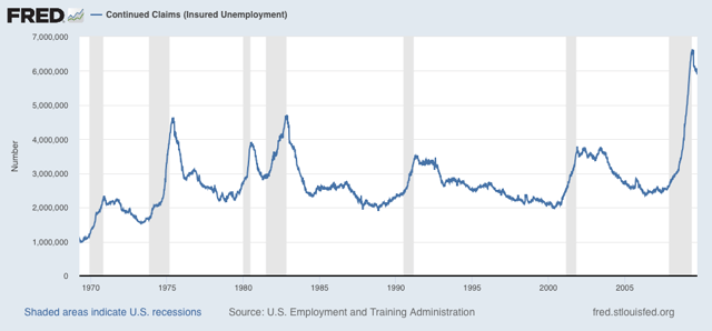
Historically initial claims have peaked several months before the end of recessions, and  continuing claims have peaked at the end of or just after the end of recessions. Here’s the graph of continuing claims showing that from the beginning of the series through 2009:


For the moment at least, this indicates that the economy - and the jobs market - was at its “most awful” in late April or early May, and has gotten “less awful” since. Thus we should expect another positive number in the June jobs report that will be released one week from today.

But because there is now overwhelming evidence of renewed exponential spread by the coronavirus in States that recklessly reopened, all of the improving economic data may come to an abrupt end in the next few weeks. For example, although he has stopped short of an order, even Texas’s Trumpist governor has now recommended that people voluntarily “shelter in place” again.

Wednesday, June 24, 2020

Housing rebounded sharply in May


 - by New Deal democrat

One aspect of the economy that is important in terms of how well things will go once the pandemic ultimately recedes (which won’t occur until after next January 20) remains housing.

And low interest rates brought housing back from the depths in May.

My look at the current state of mortgage rates, housing sales, and prices is up over at Seeking Alpha.


Tuesday, June 23, 2020

Coronavirus dashboard for June 23: focusing on deaths, and the Trumpist South and Southwest


 - by New Deal democrat

Confirmed total US infections: 2,312,302. (+31,433 in past 24 hours)
Confirmed total US deaths: 120,402 (+425 in past 24 hours)

We know that new cases are accelerating again. Is it translating into an increase in deaths? The answer appears to be: not yet, but getting close.

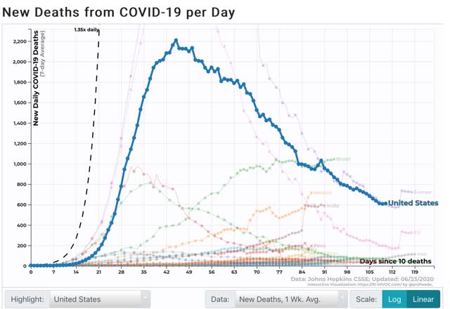
Here is the 7 day average of new deaths in the US: 


In the past 3 days, the decline has ceased at roughly 610/day.

A regional look shows that the decline in new deaths has stopped everywhere except in the Northeast.

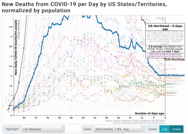
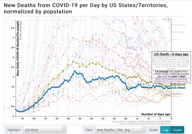
The first graph shows the 7 day average of deaths in the Northeast and Midwest; the second the South and West:


The Northeast still has the highest death rate per capita, at 2.8 deaths per day per million, with the Midwest at 2, the South at 1.6, and the West at 1.4. But the trend in the South and West has been flat for the past week, and the Midwest for the past few days. Only in the Northeast has the rate continued to decline sharply, masking the ominous trends in the other regions.

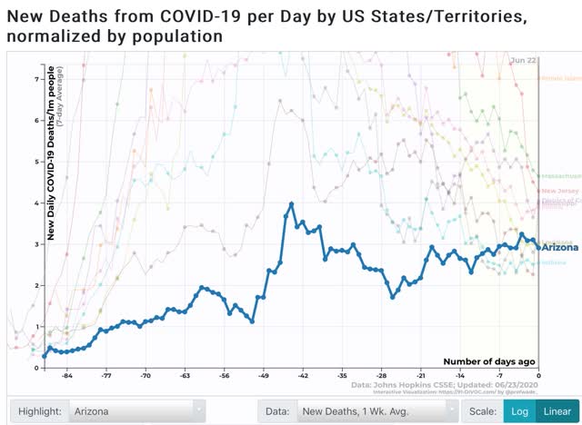
Finally, here are the 10 highest jurisdictions by 7 day average in death rates per capita:


Since the graph doesn’t show trends that well, here is the list, including whether the rate has been rising, falling, or flat over the past 7 days:

RI 7.0 (declining)
MA 4.6 (declining)
NJ 4.3 (declining)
MS 4.0 (declining)*but new high yesterday
DC 4.0 (flat)
IL 3.9 (declining)
MD 3.0 (declining)
LA 3.0 (flat)
AZ 2.9 (increasing)
IN 2.5 (flat)

The list remains dominated by States in the Northeast, plus Illinois, where the rate of deaths has continued to fall. Three States where cases have been increasing (Mississippi, Louisiana, and Arizona) have joined the list with rising death rates.

I expect this transition to continue. I expect US death rates as a whole to begin to climb in the next few days, and for States in the South and West to replace States in the Northeast over the next 10 days. Very discouraging.

The question now is, are Trumpist GOP States subject to the same pain threshold that others were earlier? I think they are, but they will arrive there kicking and screaming, and ready to relax again at the very first opportunity.

Monday, June 22, 2020

Coronavirus dashboard for June 22: a pandemic newly focused on the young appears to be changing the dynamics


 - by New Deal democrat

Confirmed US coronavirus infections: 2,280,969
Confirmed US coronavirus deaths: 119,977

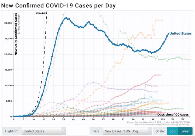
The 7 day average of new infections in the US has risen 30% from its low of 20,357 on June 9 to 26,546 yesterday:


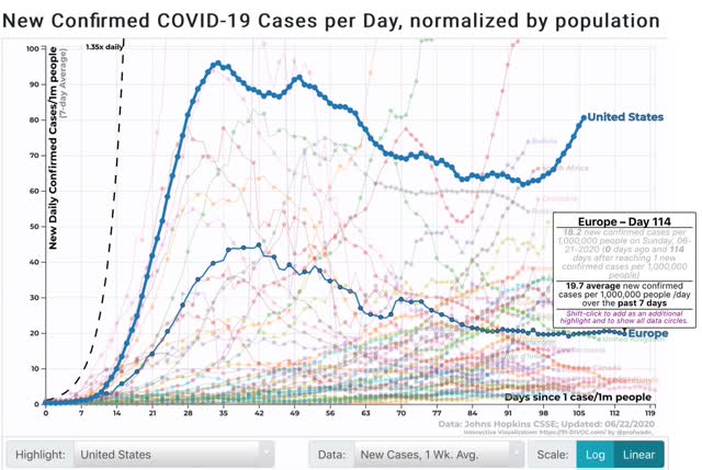
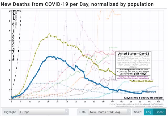
On a per capita basis, US infections are now roughly 4x those in Europe:


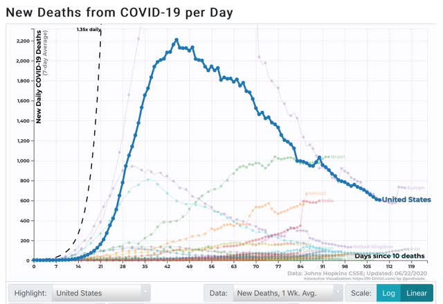
Curiously, the 7 day average of deaths has continued to decline, to 605 as of yesterday: 


On a per capita basis, US deaths from coronavirus are only 2x those in Europe:


Within the US, the per capita rate of infections has continued to fall in the Northeast megalopolis, risen slightly in the Midwest, but is rising at what may be exponential rates in the South and West:


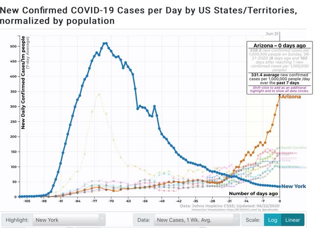
The poster child for confirmed new exponential spread remains Arizona, which now has a rate of new infections 2/3’s that of NY at its peak, and is likely to match that within a week:

 
The remaining “top 10” for new infections per capita are all from the Confederacy, plus Utah - and they are also all rising, in the 100 to 160 new cases per million per day range.

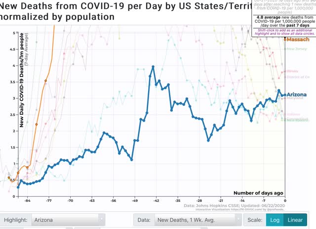
When it comes to deaths, however, the “top 10” are almost all from the Northeast megalopolis, led by Massachusetts, but they are in serious decline:


Only Arizona from the new outbreaks has risen into the “top 10” for deaths.

The continued decline in new deaths may just be a lag in the data, but there are several other possibilities as well:
- better hospital treatment
- shutting down nursing home spread (since nursing homes were responsible for over 1/3 of all deaths in the first several months of the pandemic.

Perhaps most significantly, the paradox may be explained by the average *age* of those newly infected. The evidence is, it has dropped precipitously. 

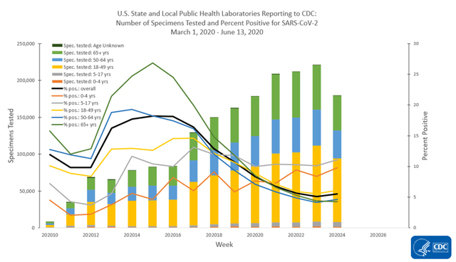
Unfortunately, I failed to copy the graph I saw of the total US statistic for that measure, but here is an age-breakdown for US testing and % positive:


Those in age group 18-49 years saw a much bigger increase in tests administered, and less of a decline in the % positive - meaning a higher rate of diagnosed infections in that age group.
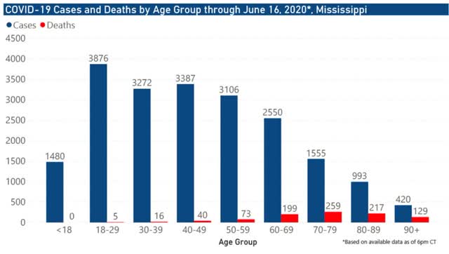
Here is the age breakdown for Mississippi:


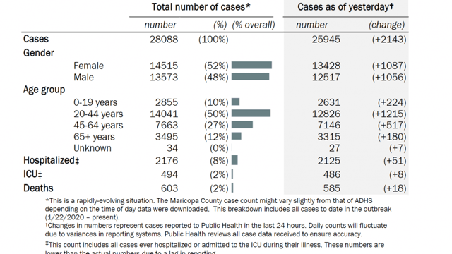
And here is a chart of the age breakdown for Maricopa County, Arizona:


Officials in states across the South and Southwest are reporting that an increasing share of coronavirus cases are among the young.
The shifts in demographics have been recorded in parts of Florida, South Carolina, Georgia, Texas and other states -- many of which were some of the first to reopen.And while some officials have pointed to more widespread testing being done, others say the new cases stem from Americans failing to social distance. 
In Mississippi, where one health officer called adherence to social distancing over the past weeks "overwhelmingly disappointing," officials attributed clusters of new cases to fraternity rush parties. 
Texas Gov. Greg Abbott said last week that people under 30 made up a majority of new coronavirus cases in several counties. He said that increase in young infected people could be related to Memorial Day parties, visits to bars or other gatherings. 
And in Florida, Gov. Ron DeSantis said Friday that the median age was 37 for newly diagnosed coronavirus cases over the last week. In the state, 62% of new cases for the week of June 7 are under 45 years old, he said. 
"That is a big change from where we were at the end of March and the beginning of April. It was skewing much older at that time," he said.
Similar news has been reported from California:
As California’s economy opens up, coronavirus cases are getting younger and younger.An analysis released this week reveals that more than 44% of new diagnoses are in people age 34 or younger, up from 29% a month ago. 
There’s a corresponding drop in cases among older people. The proportion of COVID-19 cases among Californians older than 50 has plummeted from 46% to 30.5% in the past month. 
The proportion of cases among middle-aged Californians — ages 35 to 49 — has plateaued, neither rising nor falling. 
“It is striking that there is such a strong shift. Cases are much younger now than they were earlier in the pandemic,” said infectious disease epidemiologist George Lemp, who calculated the trends using historical data from the California Department of Public Health. 
“It may reflect the opening up of California since mid-May, particularly among younger people who may have started to move away from the practices of social distancing and consistent mask use,” he said.
It appears that the de facto US policy is to allow the virus to run through the younger population, while the older part of the population voluntarily continues to self-quarantine. Even with a low fatality rate like 0.2% among the younger demographic, that would translate into roughly 300,000 deaths among that group alone. 
My take has been that the US simply lacks the political and social will to take the necessary steps to effectively contain the virus. Arizona is going to be the canary in the coal mine for whether States with Trumpist governors and GOP legislatures will ever be scared into action, and we should get that answer within the next 2 weeks.

Sunday, June 21, 2020

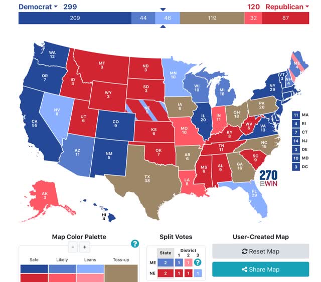
The 2020 Presidential election as forecast by State polling


 - by New Deal democrat

As we all know, in the US Presidential election national polls are of limited use, as the election is actually decided on a State by State basis.

I’ve seen lots of projections of the Electoral College vote based on national polls, but what if we go just by State polls, and in particular State polls that have been reported in the last 30 days?

That, dear reader, is what the following map looks like:


I prepared this map after a slew of State polling was reported on Wednesday. Here’s how it works:
 - States where the race is closer than 3% are shown as toss-ups.
 - States where the range is between 3% to 5% are light colors.
 - States where the range is between 5% and 10% are medium colors.
 - States where the candidate is leading by 10% plus are dark colors.

The only change since Wednesday is that there was a Minnesota poll that gave Biden a 16% lead, enough to bring the average for that State over 10% in favor of Biden.

As of now, all Biden has to do is win the States in which he leads by 3% or more in the polling, and he wins the Electoral College, even without winning a single “toss-up” State as shown on the map.
The only surprising negative for Biden is that Pennsylvania remains a toss-up. Surprisingly, little polling has been done in that State, but while Biden has a slim lead on average, there are several polls dating from May that show a slight Trump lead.
I expect some of the Confederate States to return to the Trump fold.  He always polls his worst when he appears both cruel and clueless. And that’s exactly what he has appeared between his actions on both COVID-19 and Black Lives Matter. His stands are unpopular, and his P.R. stunts (most notably the photo-op at the church) simultaneously have looked tin-eared and execrable.

Saturday, June 20, 2020

Weekly Indicators for June 15 - 19 at Seeking Alpha


 - by New Deal democrat

My Weekly Indicators post is up at Seeking Alpha.

Almost all of the metrics have improved off of their worst readings. Enough of the short leading indicators have improved so much that the short term forecast was upgraded to neutral as of this week.

As usual, clicking over and reading should bring you “up to the moment” on the economy, and it also rewards me with a penny or two for the effort I put into the endeavor.

Friday, June 19, 2020

Coronavirus dashboard for June 19: infections and hospitalizations have increased; it may be too late for Arizona


 - by New Deal democrat

Let’s start with the basics: total US coronavirus infections are 2,191,371. Total US deaths from coronavirus are 118,436. Those are official numbers; the real numbers are obviously higher.

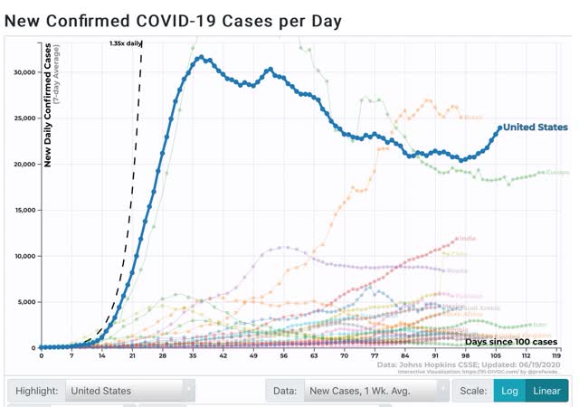
The number of daily new infections averaged over a week has started to rise decisively. After a low of 20,357 on June 9, as of the 18th it has risen to 23,923: 


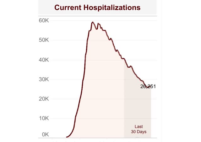
Not all States keep track of hospitalizations, so most dashboards don’t cover them. Conor Kelly does, and his measure shows that hospitalizations have also increased over the past three days as well:


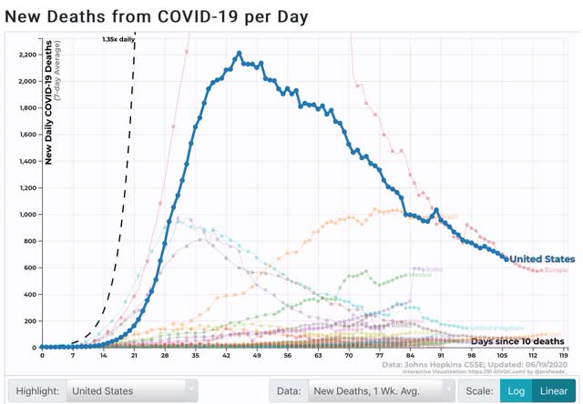
Deaths, however, have continued to decrease, down to 679 over the past 7 days vs. the peak of 2,210 on April 18:


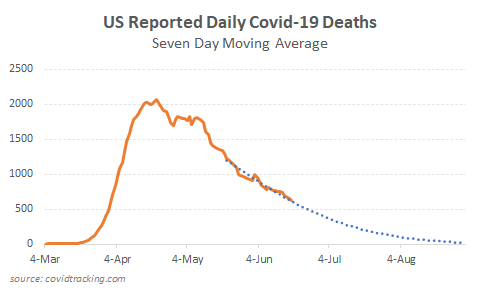
One Stanford statistician claims that COVID-19 deaths are following a “Gompertz function,” I.e., they have all but completed burning through the available victims, and that deaths will drop to zero within 60 days:


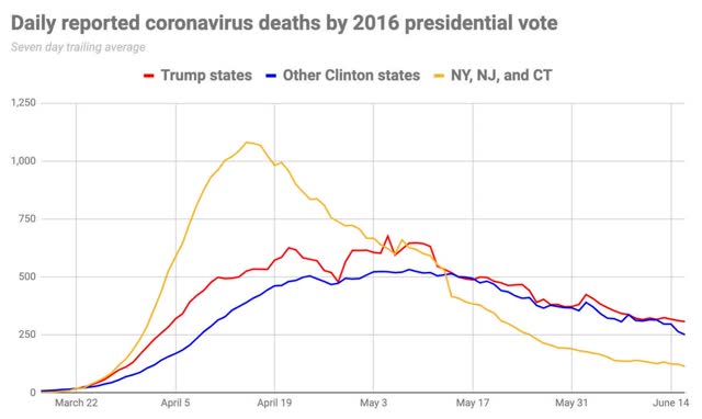
It is certainly interesting that, while new infections declined only 1/3 from peak, deaths have declined 2/3 from peak. But I suspect that the curve-fitting is skewed by the period that hospitals were overwhelmed by the NYC outbreak. When we remove the NYC metro from the data, deaths are not declining towards zero at all:


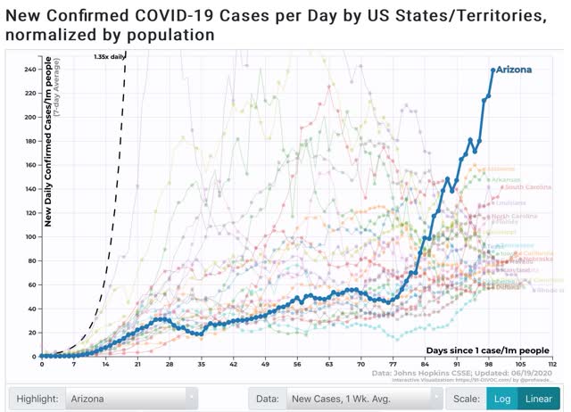
Turning to the situation in the recklessly reopened States, Arizona’s rate of new infections has gone exponential:


At this rate, within about 10 days Arizona will be as bad on a per capita basis as NY was at its peak. And remember, those who will present with symptoms in the next 5-7 days have already been infected. Aside from Utah, all of the other top 10 States are from the Confederacy, and their rates of infection have been growing. Texas has risen to #11.

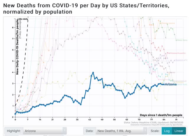
As to deaths, which lag, on a per capita basis 7 of the top 10 States are from the Northeast megalopolis. Illlinois is also included. But all 8 of these are declining. Both Georgia and Arizona have now joined, at #9 and 10, respectively, and their numbers are generally slowly growing:


It remains to be seen how brutally reality will have to hammer these States before they see the light, if ever. The governors of both Arizona and Texas have reluctantly allowed municipalities to mandate mask-wearing if they choose, and many of Arizona’s biggest municipalities have already done so.

Thursday, June 18, 2020

New and continued jobless claims level off, as spreading secondary impacts and job recalls balance


 - by New Deal democrat

Weekly initial and continuing jobless claims give us the most up-to-date  snapshot of the continuing  economic impacts of the coronavirus on employment. Three full months after the initial shock, the overall damage remains huge, with recalls to work roughly balanced with spreading new secondary impacts.

First, here are initial jobless claims both seasonally adjusted (blue) and non- seasonally adjusted (red). The non-seasonally adjusted number is of added importance since seasonal adjustments should not have more than a trivial effect on the huge real numbers: 


There were 1.433 million new claims, which after the seasonal adjustment became 1.508 million. This is “only” 58,000 less than last week’s number - the smallest weekly decline since the worst reading in April, but nevertheless is the lowest so far since the virus struck.

These new claims show objectively huge second-order impacts continuing to spread.

The “less bad” trend has leveled off in continuing claims, which lag one week behind. In the past four weeks, both the non-seasonally adjusted number (red), and the less important seasonally adjusted number (blue) have remained nearly stationary. This week the former declined by only 62,000 to 20.544 million, 4.368 below its peak of 24.912 million four weeks ago; while the latter actually rose slightly by 26,000 to 18.654 million, but still 4.140 million below its peak of 22.794 million reading four weeks ago:


In other words, the spreading new damage shown by the continued huge numbers of new jobless claims is about equal to the callbacks to work from various sectors “reopening.”

On a more long-term note, historically continuing claims have peaked at the end of or just after the end of recessions. Here’s the graph showing that from the beginning of the series through 2009:


Since this week the “King of Coincident Indicators,” industrial production was reported to have risen in May, and real retail sales also rebounded strongly, the decline in continuing claims over the past month is consistent with a determination by the NBER that a very short recession has already ended. 

Because there is increasing evidence of renewed exponential spread by the coronavirus in States that recklessly reopened, all of the improving economic data (improving from absolutely horrible levels of course) may come to an abrupt end in the next few weeks.

Wednesday, June 17, 2020

Coronavirus dashboard for June 17: the second wave of the tsunami comes ashore


 - New Deal democrat

As of yesterday, there were 2,137,731 total documented coronavirus infections in the US. Total known deaths were 116,963.

As I have stated several times in the past month, I believe that coronavirus infections and deaths will wax and wane around the April-May plateau of roughly 20-25,000 new daily infections and 500-2000 daily deaths, at least as long as Trump remains President. This is because, absent competent Federal leadership, the US lacks the political and social will to do what is necessary - distancing + mask-wearing + tracing - in order to “crush the curve” as almost every other industrialized European and Asian country has been able to do.

The current situation in the US is divided by region. In the early hard-hit areas of the Northeast and Midwest, effective measures were put in place and have been relaxed more gradually. As a result the infection rates there have continued to decline. By contrast, in the Confederacy, the High Plains, and the Southwest, lockdowns were put in place late if at all, and lifted early without any meaningful restrictions. As a result infection rates have begun to rise, in a few States at an exponential rate. 

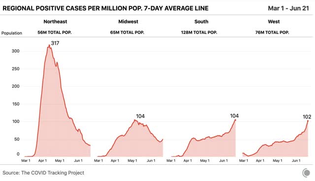
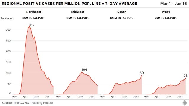
Yesterday the COVID Tracking Project finally released graphs for each region per capita, shown below:   


In the Northeast and Midwest, the 7 day moving average of new infections has fallen to roughly 40 and 45 per million, respectively. In the South and West, it has risen to 89 and 76 per million, respectively.

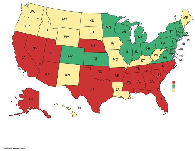
Here is a map showing which States have falling rates of new infections (green), relatively flat rates (yellow), and increased rates of new infections (red):


The regional pattern is obvious.

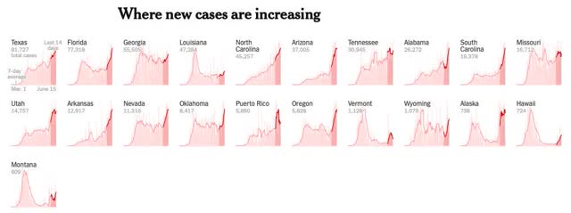
Here are the thumbnail graphs of all States with recent increases in new infections, ranked in order from highest to lowest number of *total* infections over time:


The last half dozen States shown, including, e.g., Oregon, Montana, Alaska, and Hawaii, have such small total numbers that the recent increases aren’t really significant; whereas the first shown, Texas, isn’t even in the “top 10” for the per capita rate of new infections (it’s #17. California is #14)).

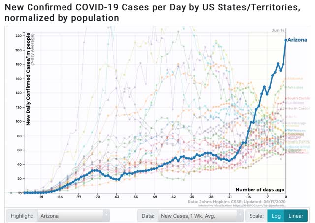
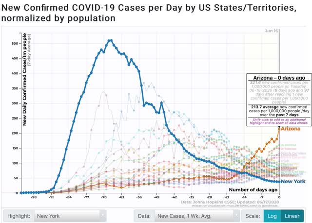
The “leader of the pack” among the recklessly reopened States is Arizona, which saw a huge increase in new cases yesterday, bringing its 7 day average up to 214 per million:

As shown in the graph above, the remaining “top 10” are all States in the Confederacy, High Plains, and Mountain West. In order, (showing rates of new infections per million as of June 15 in parentheses) they are: Alabama (156), Arizona (150), South Carolina (125), Louisiana (127), North Carolina (117), Utah (102), Mississippi (98), Florida (83), and Iowa (83).

To put this in perspective, here is the same graph but superimposing NY’s trend-line:

Even now, Arizona is not nearly as bad as NY, NJ, CT, or LA were at their peaks. But at its current rate of doubling, roughly every 9 days, if this continues I n about 2 weeks AZ will be as bad as NY was at its worst.

Tuesday, June 16, 2020

The Coronavirus Recession may already (technically) have ended: sales and production both increased in May


 - by New Deal democrat

Sales and production are two of the four things that economists look for in gauging whether the economy is in expansion or recession, and this morning both of them - retail sales and industrial production - were released for May.

So it’s true: as defined by the NBER, the Coronavirus Recession may have only lasted two months, from February through April. That’s because, just as February was the peak of economic activity before the coronavirus hit, April may well have been the trough. And recessions technically end, not when the economy becomes objectively “good” or “fair,” but simply when the level of activity is less awful than before. If the trajectory is positive, and activity goes from really awful, to slightly less really awful, the recession has ended, even if the economy is still, well, awful.

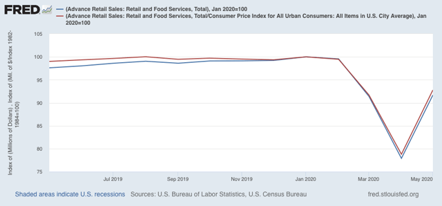
To the graphs! First, here are retail sales, both nominally and as adjusted for inflation:


Both increased 17.7% in May, after declining over 14% in April. Both are also slightly higher than their levels in March. Clearly the “reopening” of the economy in large portions of the country led to a splurge in spending.

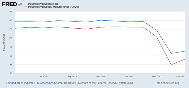
Next, here is total industrial production (blue) along with manufacturing production (red):


Both increased slightly.

Since employment also increased in May, that makes three of four sectors included in recession measurements that - as of now - are off their lows, as shown in the graph below:


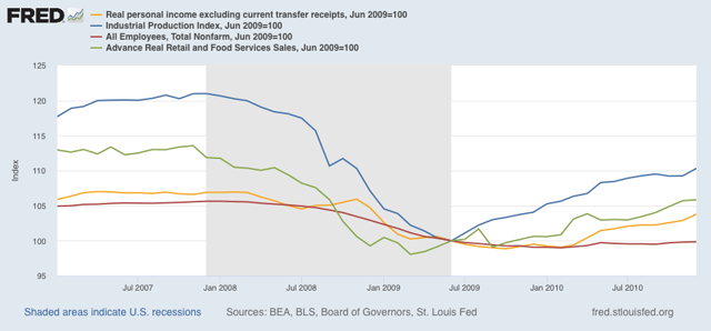
Personal income less transfer receipts for May won’t be reported for another couple of weeks, but even if it is lower, the NBER may still decide that the recession has ended. That’s because industrial productions is the King of Coincident Indicators, and carries more weight than the others in recession calls. For example, here is the period of time including the Great Recession:


The NBER determined that the recession ended in June 2009. That’s when industrial production bottomed. Real retail sales had already bottomed several months before. Both employment and real income were close to but had not yet reached their bottoms.

So, even though the economy as measured by all four sectors is still awful, it was a little less awful in May than it was in April, and that may be enough for the NBER.

Two important caveats: 

(1) I don’t expect the NBER to be so quick with this call as they were with their recession onset call, because they will want to be sure that this is not a false start; which leads even more importantly to 

(2) the virus is still in control. Those States which have recklessly opened without waiting for infections to abate, and without effective testing, tracing, and quarantining protocols - which is almost all of them, particularly in the South, High Plains, and Mountain West - are seeing new infections start to rise again, and in some cases - Arizona, Alabama, Arkansas, Texas, and South Carolina for example - the graphs are beginning to look exponential again. It would not be surprising at all if renewed panic were to set in, with new lockdowns put in place, or at very least consumers pulling back from face-to-face activity. In other words, the increases in industrial production, employment, and sales may well prove temporary.