Tuesday, April 24, 2012

People Are Finally Figuring Out: Austerity is Stupid

From the Financial Times:
“We can only win back confidence if we bring down excessive deficits and boost competitiveness,” he said. “In a such a situation, consolidation might inspire confidence and actually help the economy to grow.”
The above statement shows why austerity is simply one of the dumbest policies on the planet.  First, The EU region was already growing at a slow rate when people started to talk about austerity.  Consider the following chart:

Since the end of the recession, the best seasonally adjusted annual rate of growth (SAAR) is 2.4%.  But that figure is really an outlier; looking at the chart we see that the rate of growth can be broken down into two time periods.  The first -- the five quarters coming out of the recession -- growth was actually OK; it averaged 1.78% while the median number was 2%.  But since then -- when the continent decided to implement austerity -- the growth rate slowed.  Either way, growth was not strong enough for the economy to achieve "escape velocity" -- a rate of growth that creates a self-sustaining, private sector led growth rate over 2.5%.  As a result, unemployment hasn't dropped, but instead has risen:


Coming out of the recession, we see increased unemployment -- which is to be expected, as unemployment is a lagging indicator.  However, since then unemployment hasn't dropped, indicating that the economy hasn't hit that critical growth level where employment picks up.  In fact, we see unemployment increase overall,  

INDICATING THAT AUSTERITY IS FAILING.


So -- what was the policy response?  Cut spending in the hopes that would "inspire confidence" so that the economy would grow.  The problem with this is simple.  It completely runs counter to what is needed -- spending.  Again, consider the GDP equation

C+I+X+G=GDP

Consumer spending and investment drop in a recession and in the quarters coming out of a recession.  Exports help, but they're not the predominant component of GDP.  That leaves government spending to pick-up the slack.  And there is plenty of room to do this.  Consider the following chart of the EU debt/GDP level:

It currently stands at 85% -- hardly crisis levels.

And we haven't even mentioned the worst part yet: the overall economy is now probably in a second recession, largely caused by slowing demand, caused by (drum roll please) austerity!  And, worst of all, the economy may be entering a negative feedback loop: low demand leads to more unemployment which leads to lower demand ... you get the idea.  

As for the whole "confidence will return" argument: businesses don't invest in slow-growth environments when there is obviously slack demand.  Put another way, ask yourself this question: would you rather sell your product into a market that has 2% SAAR or 3.5% SAAR? 

Also consider this from the NY Times:
With political allies weakened or ousted, Chancellor Angela Merkel’s seat at the head of the European table has become much less comfortable, as a reckoning with Germany’s insistence on lock-step austerity appears to have begun.

“The formula is not working, and everyone is now talking about whether austerity is the only solution,” said Jordi Vaquer i Fanés, a political scientist and director of the Barcelona Center for International Affairs in Spain. “Does this mean that Merkel has lost completely? No. But it does mean that the very nature of the debate about the euro-zone crisis is changing.”

A German-inspired austerity regimen agreed to just last month as the long-term solution to Europe’s sovereign debt crisis has come under increasing strain from the growing pressures of slowing economies, gyrating financial markets and a series of electoral setbacks.

Spain officially slipped back into recession for the second time in three years on Monday, after following the German remedy of deep retrenchment in public outlays, joining Italy, Belgium, the Netherlands and the Czech Republic. In the Netherlands, Prime Minister Mark Rutte handed his resignation to Queen Beatrix on Monday after his government failed to pass new austerity measures over the weekend.

The political upheaval drove stock markets on the Continent sharply lower, with Germany’s DAX index finishing the day down 3.4 percent. The sell-off in Europe dragged American indexes down around 1 percent. A survey of European purchasing managers showed an unexpected plunge in confidence this month.

The Netherlands, a staunch supporter of the German position, became the latest European country forced into early elections by the European crisis, just one day after the first round of presidential voting in France raised the possibility that the incumbent, Nicolas Sarkozy, would be unseated by his Socialist challenger, François Hollande, in a runoff election.

 From trading floors to polling stations to the streets of cities across Europe, the message appears increasingly to be that countries cannot cut their way to fiscal health. They need growth, too. In recent months, powerful voices have joined the chorus, including those of the managing director of the International Monetary Fund, Christine Lagarde, and Italy’s prime minister, Mario Monti. Treasury Secretary Timothy F. Geithner has called repeatedly for Europe to defer budget cutting in favor of some form of stimulus spending

OK, so people have put their hand on the stove, turned the heat on an learned that its hot.  Wow -- hardly a new concept to people who read this blog, but obviously to people who haven't learned a damn thing from history.  Anyway, it's good to see sentiment changing, but we're still not out of the woods.

See also this post at Brad DeLong, which links to Professor Krugman.

To get an idea of what they should be doing, please read this primer on Keynesian policies. 

UPDATED: Case Shiller seasonally adjusted index UP, areas bottoming increase

- by New Deal democrat

I'll have a lot more to say on housing prices hopefully tomorrow, but I wanted to point out one important but overlooked detail in the Case-Shiller index: the number of cities that have hit bottom keeps increasing. UPDATE:  On a seasonally adjusted basis, both the Composite 10 and 20 city indexes rose slightly from January to February. With the exception of April 2011, this is the sole monthly increase since the end of the $8000 housing credit.

In today's report, only  7 of the 20 metropolitan areas made new lows on a seasonally adjusted basis. Six of the 13 metro areas showing seasonally adjusted gains in this month's report bounced off a low set just last month, so it could be noise. But once the price increases two or more months, there is more confidence that the corner has been turned.

Here is the number of cities that have already hit bottom in each monthly 20 city Case-Shiller report since last June:

June 2011 - 1
July 2011 - 2
Aug 2011 - 3
Sept 2011 - 3
Oct 2011 - 4
Nov 2011 - 6
Dec 2011 - 7
Jan 2012 - 13

Presumably some of the 6 cities that bounced off their January lows this month will resume their decline - but on the other hand, not all of them. In short, the trend the Case-Shiller index may have bottomed in January!  Failing that, the trend is for it to make an overall bottom within a few months. I would venture by the end of summer.

P.S.:  Here's how I counted 7, not 9, cities as indicated in the S&P release (and the cities I found were Los Angeles, Atlanta, Chicago, Boston, Detroit, New York, and Cleveland).  The link to the report is here.  Now click on "February 2012" in the "seasonally adjusted" column.

Update:  Almost everybody else is focusing on the language that "The 10- and 20-city composites were each down 0.8% in February from a month earlier, and fell 3.6% and 3.5% respectively from the year-ago period."  This is non-seasonally-adjusted data.  Today's reporting by most media is a prime example of how focusing on YoY data when there is seasonally adjusted available, misses turning points.

P.P.S.  Sorry for all the edits.  I've been re-reading the report and triple-checking my numbers, so there were a few initial errors.  Interesting how the non-seasonal-report is getting all the attention, while the seasonally adjusted report may be the most important in a long time.

Morning Market Analysis


Yesterday I noted that I believe the US markets are moving into a period of consolidation.  Today I first wanted to follow-up on that thought by looking at the longer-term Treasury markets.  Notice that, instead of falling (which you would expect in a rising equity market) the treasury market has moved sideways.  The IEIs are trading between 120-122, the IEFs between 102-105 and the TLTs between 110-121. 

Now, let's turn to four weaker foreign markets:  Italy, France, Japan and Taiwan.


All four of these markets broke technical support yesterday.  All are now below the 200 day EMA and all are in deteriorating technical positions (shorter EMAs moving lower, MACD declining).  The only good news on these charts is the fact that yesterday's price action printed small bars.  But, that is little solace. 

Monday, April 23, 2012

The China And EU Slowdown in Charts

HSBC/Markit released the latest "flash" manufacturing numbers for China.  Before looking these numbers, let's place them in context.  About this time last year, China was going through an engineered slowdown.  The central bank was raising reserve requirements as a way to slow down the lending cycle.  Their primary concern was inflation.  Now we're looking at the end result of that effort.


Remember that China is more based on manufacturing (about 45% according to the CIA World Fact Book), so these numbers are a bit more important.  I've blocked off the last year (more or less).  Notice that the numbers are now fluctuating around the 50 level, which is the line between expansion and contraction.  This really highlights what's going on in the economy pretty well.

Let's turn to the EU situation, where we see a very bad deterioration of the economy.


There is nothing good in the above report; nothing at all.

Housing overview part 1: sales, construction, employment, and effects on GDP

- by New Deal democrat

It has been over 6 years since the housing bubble began to burst, triggering the worst financial panic in three-quarters of a century, and the deepest economic contraction since then as well. Close to 10 million people lost their jobs, and for the 99%, employed or not, neither income nor wealth has come even close to being recovered. In truth, the economy won't fully recover until housing recovers.

Where do we stand now? I don't think a broad view of this fundamental part of the economy has been covered anywhere for a long time. Let's take a look. Today I'll cover sales, construction, and employment. In the second installment, I'll look at prices.

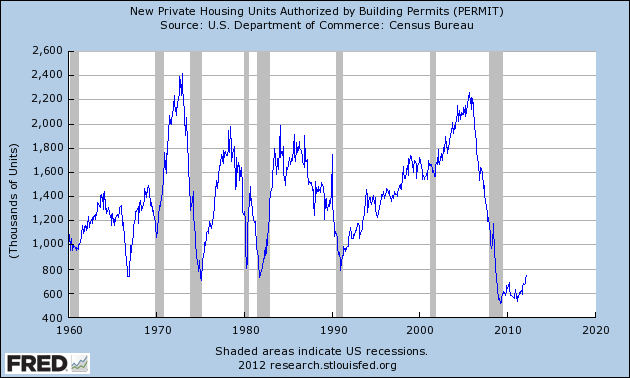
Permits are the most forward-looking data for housing. I would go so far as to say that, for forecating purposes, housing permits are the single most important economic statistic there is. Here's the long view covering over half a century. This is self-explanatory:


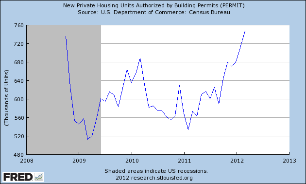
Now let's take a close-up view of the last 3.5 years. What we see is that, after the worst crash in over 50 years, permits started to trend upward a year ago and have now broken out of their 3 year range:


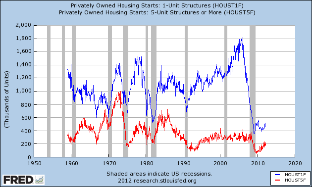
In short, the housing bottom is probably over. This doesn't mean the market will suddenly be flooded with new housing. It takes about 1 million new houses a year just to keep up with population growth and replacing demolished units. Put another way, for the first time in over 6 years, housing construction is putting some wind in the economy's sails. We can dig deeper. What we see when we divide housing starts into single family homes (blue) vs. multifamily units (red), is that most of the gains have come from the building of the latter:


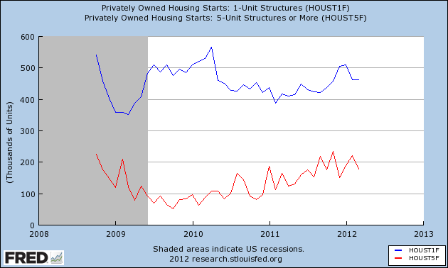
Here's the close up of the last 3 years. While both have gained from their respective bottoms in 2009, you can see that construction of multifamily units have more consistently gained, while single family home construction, while rising, isn't really out of its bottom range yet.  That being said, in the last year we have seen about a 75,000 gain in construction starts for each category:


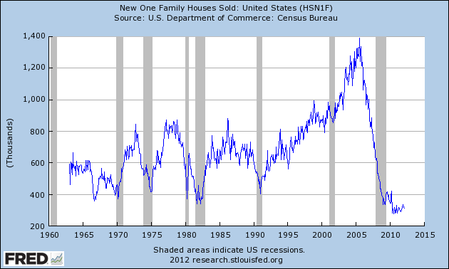
Another data series capturing the same move is the Census Bureau's measure of sales of single family homes. Like construction starts for single family homes, it really hasn't moved out of its bottom range:


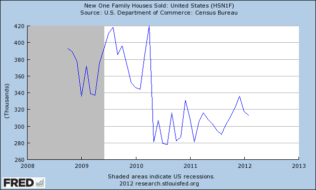
Here's a close-up of the last 3 years. As with single family construction starts, there was an initial bounce during the period of the $8000 housing credit, then a collapse back to the lows, and within the last year another uptrend without breaking out of the range (this series will be updated today):


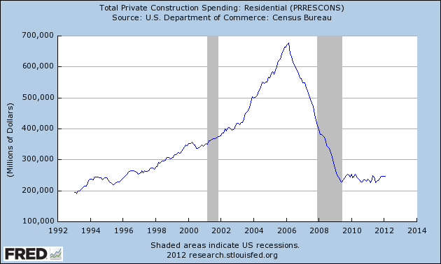
Housing is such an important part of the economy because of the construction spending and employment that comes with it, as well as the subsequent and continuing spending on appliances, furnishings, tools, and landscaping. Here is residential construction spending:


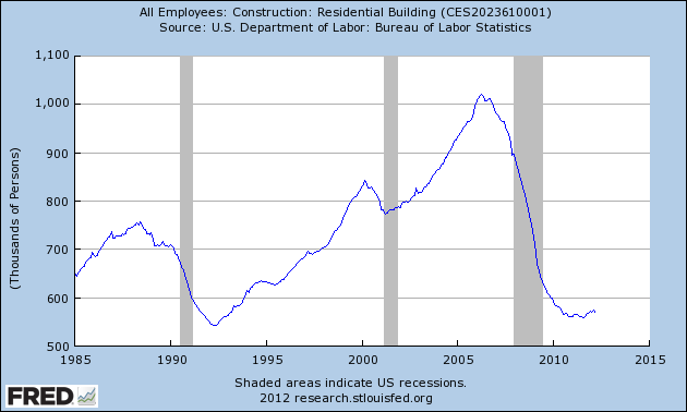
This mirrors very closely what we have seen in the housing starts data. The $8000 housing credit marked the end of the collapse, but there hasn't been an uptrend in construction spending yet. Now let's look at employment in the housing trades:


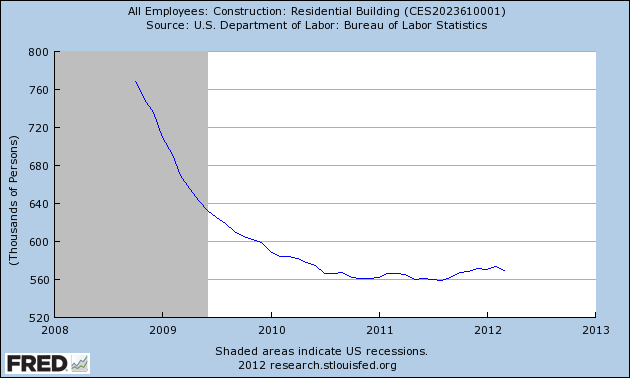
The small recent upturn is shown in more detail in this close-up:


We are talking less than 20,000 jobs, but at least housing is no longer a drag on the employment picture.

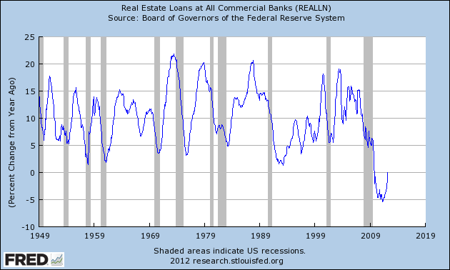
Real estate loans made by banks are also supportive (note that the Federal Reserve Bank does not break down loans between residential and non-residential, so the below graph includes both):


After 3 years of relentless decline, the YoY change in real estate loans finally broke even in March. As of last week, it is now up 1.0% YoY.
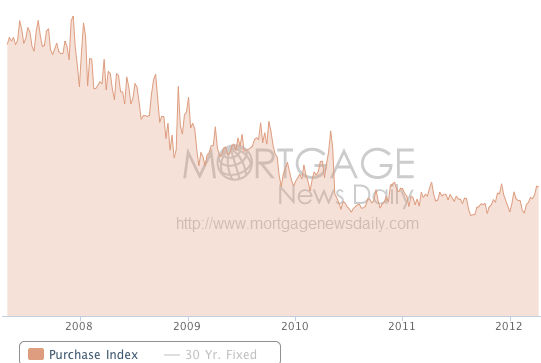
Purchase mortgage applications reported by the Mortgage Bankers Association are targeted, and show a generally flat trend within a range for the last 2 years (h/t Mortgage News Daily):


Please recall, however, that an unusually large number of houses, on the order of 33%, are being purchased with cash. Some of this may be due to speculation, but on the other hand, downsizing Boomers are also likely a large source of such sales.

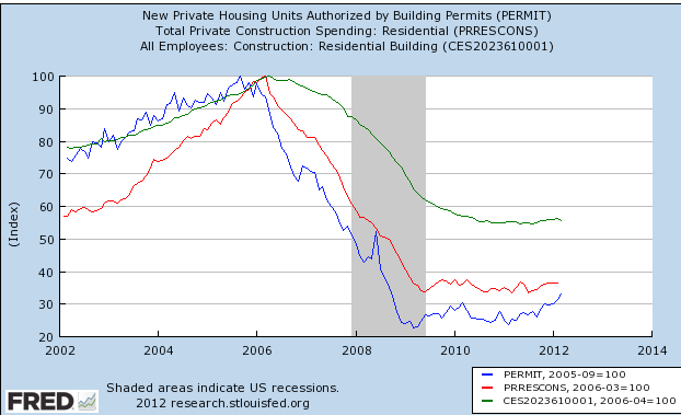
Now let's put the picture together.  In the below graph, all of the series are normed to 100 at their respective peaks.  Note that permits (blue) lead construction spending (red) which in turn leads construction employment (green) at both the top and bottom:


With permits trending upward out of their bottom range in the last year, we should expect to see increasing residential construction spending, and increasing construction employment, over the next year.

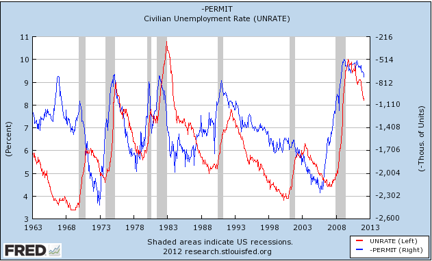
Next, let's look at the relationship between housing permits (inverted, blue, in the graph below) and the unemployment rate (red):


Permits are an excellent leading indicator for the direction, if not the range, of the unemployment rate over a year later. The increase in permits in the last year strongly suggests that the unemployment rate is going to continue to fall by at least a small percentage for the duration of 2012 and into 2013.

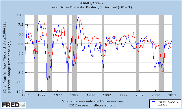
How much of an effect is the increase in housing construction likely to have on the economy? It turns out that simply by knowing the YoY change in the number of housing permits issued, we can make a close approximation of real GDP several quarters later. Take that number and add 100,000. Now divide the sum by 100,000. That will give you the YoY change in real GDP. Zero change in housing permits YoY implies +1% YoY GDP growth. Plus 100,000 permits implies 2% YoY growth, and so on, as shown in this graph below:


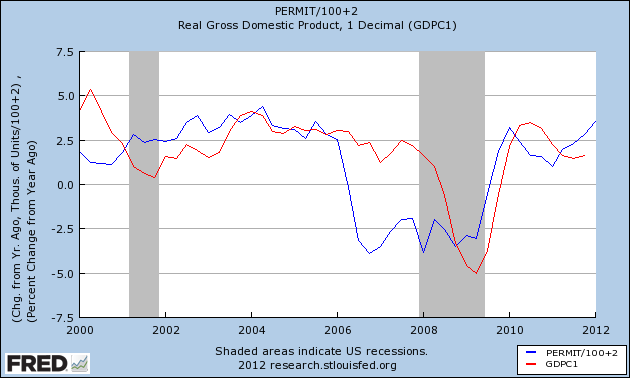
Big declines in housing permits seem to take longer, like 18-24 months, to be reflected in real GDP. Otherwise the lead time is about 2 quarters. Note specifically that every time in the last 50 years that housing permits have increased by over 200,000 in a year, YoY real GDP has increased by 3% or more shortly thereafter. Now here's the close up since the turn of the millennium:


 With an increase of over 200,000 in housing permits over the last year, YoY real GDP should be in excess of 3% at some point within the next 4 quarters.

In conclusion, when it comes to sales and construction, it looks like housing is finally breaking out of its bottom into at least a modest uptrend, thus putting wind at the economy's back for the first time in over half a decade.

Morning Market Analysis

First, my overview of the market has changed.  The market is no longer in a rally, but is moving into a period of consolidation.  At the macro economic level, we're seeing many signs of a slowdown.  EDEs are still growing, but at a slower pace.  The UK is very close to being in a recession; the EU is not far behind.  Japan is still dealing with a two decades old problem and the latest readings from the US show slower growth as well. 

The US charts all show the beginning of this process, especially on the weekly charts.


After topping out near the 142.5 area, prices have moved lower and are now at the 10 day EMA.  For the last few weeks, the chart has been printing very small candles, indicating a lack of overall momentum on the weekly price action.  The MAD is about to give a sell signal as well.  The lower graph -- the Bollinger Bank width -- tells us that overall price volatility is increasing.  Also note the volume bars for the last My price target for this chart right now is 135 -- the price level reached in the late spring of last year.


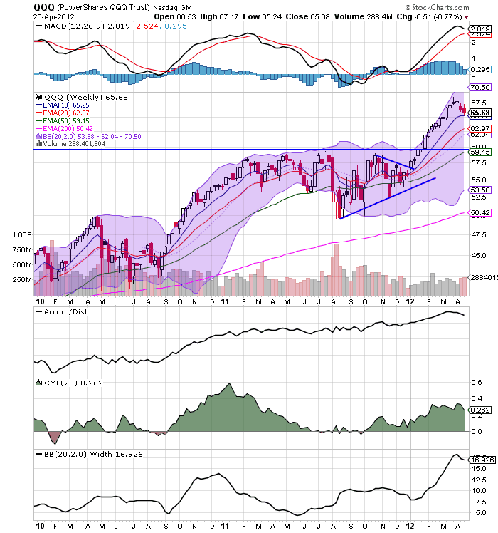
After topping at 69, the QQQs have now started to retreat and are currently standing on the 10 week EMA.  The MACD is about to give a sell signal and we see a volume increase over the last two weeks.  My price target here is 59.


This is the chart that first caught my attention.  Prices could never get above key resistance areas.  This was especially concerning as it indicated traders weren't committing capital to the riskier areas of the market.  In addition, the MACD is currently giving a sell signal with prices between the 10 and 20 week EMAs.

The above combination of all three charts tells us that traders are concerned about the overall economic direction and are, at minimum, taking some profits off the table.

Let's look a little deeper into the market, taking a look at the three largest sectors: technology financials and health care and consumer discretionary.


The technology sector broke its uptrend in the first week of April, and has been moving lower in a disciplined manner ever since.  The shorter EMAs are both moving lower, the MACD is declining and the volume indicators show profit taking.  Also note the rising BB width, indicating increasing volatility in this sector.


After cresting in lat March, financials have been in a tight trading range (15-15.50) for most of April.  The shorter EMAs are moving lower, momentum is declining as are the volume indicators.  Prices are sitting right on the 50 week EMA.


Health care benefits from catching a safety bid in a down market.  As such, we see that a shorter uptrend is still in place, but we also have declining momentum and volume indicators.


Consumer discretionary broken their uptrend at the beginning of the month and are now in a counter-trend rally.  Prices are using the 10 and 20 day EMA as technical support, but we see declining momentum and volume indicators.

Of the four largest market areas, three have broken trend.  The one that hasn't (health care) is a safety bid sector.  In short, there is nothing in the above charts to indicate further rallies and everything to indicate consolidation.  I should also add that I'm not stating a bear market is around the corner, but instead a correction.  

Sunday, April 22, 2012

Shout Out to My Co-Blogger NDD

Over the last few days, Mish posted a piece titled, "Demographics and Changing Social Trends Behind Gasoline Sales Plunge; What About Car Sales?" 


Well, NDD covered that same topic back in February in a piece titled, "Why the decline in gasoline demand doesn't mean a recession -- yet."  NDD was one of the first people to really cover the effect of gas prices and their effect on the economy and he deserves credit for it.

In fact, he deserves a ton of credit for being one of the best economic writers on the web, period.  When I first asked him to write here, I knew he was good.  But over the last few years his analysis has become sharper, more detailed, and simply better.  Bottom line: he's just damn good at this.

So, a shout out from one eco-geek to the other.  Now, it you'll excuse me, there's a central bank report I've been meaning to read .....


Saturday, April 21, 2012

Weekly Indicators show important transitions in housing and energy sectors

- by New Deal democrat

 The monthly data releases this week included a continuing if small advance in the Leading Economic Indicators of +0.2. While the Conference Board's spokesman isn't all over the cable news networks promoting its views, it is important to note that this series, after declining slightly late last summer (forecasting weakness now), has consistently increased since then. Retail sales and real retails sales both came in strongly positive. So did housing permits, rising to a 3 1/2 year high and no longer "bouncing along the bottom." Housing starts, however, did decline significantly. Industrial production remained flat. Existing home sales showed slight weakness.

The high frequency weekly indicators this week give important evidence of two areas of the economy going through fundamental transitions. Of particular interest are the H8 FRB series of real estate loans and house price indexes, and also the very important coincident indicator of rail traffic, not only for what is happening, but why it is happening.

 Let's start with the Housing reports :

The Mortgage Bankers' Association reported that the seasonally adjusted Purchase Index decreased -11.2% from the prior week, and was also off -13.9% YoY. Looking at the MBA's database, this may be a calendar quirk, as purchase mortgages declined strongly in the next week one year ago. The Refinance Index reversed course with a strong increase of +13.5% from the previous week. Because the MBA's index was substituted for the Federal Reserve Bank's weekly H8 report of real estate loans in ECRI's WLI, I've begun comparing the two. This week for the second third week in a row after 4 years of relentless decline, real estate loans held at commercial banks were up, +1.0% on a YoY basis. On a seasonally adjusted basis, these bottomed in September and are now up +1.7%.

YoY weekly median asking house prices from 54 metropolitan areas at Housing Tracker were up +3.1% from a year ago. YoY asking prices have been positive now for close to 5 months. This week Realtor.com reported that asking prices for their entire database were up 5.6% YoY in March. Further, the NAR reported that a 2.5% YoY increase in median home sale prices for March. At this point virtually the only house price indexes that haven't turned positive YoY are the repeat sales indexes like Case-Shiller.

Now let's turn to the effects of the Oil choke collar:

Gasoline prices fell slightly for the first time in months, to $3.92. Oil, however, rose slightly to $104.02. Both of these remain above the point where they can be expected to exert a constricting influence on the economy. Gasoline usage, at 8775 M gallons vs. 9062 M a year ago, was off -3.2%. The 4 week moving average is off -2.8%. These are among the best YoY comparisons in months, but on the other hand one year ago gasoline usage was beginning its big decline.

The American Association of Railroads reported a -2.9% decline in traffic YoY, or -15,300 cars. Ex-coal, overall traffic was up by 8,400 cars, or +1.6% YoY. Intermodal traffic was up 3700 carloads, or +1.6%, but other carloads decreased -19,000, or -6.4% YoY. Railfax's graph of YoY traffic continued to show that rail hauling of cyclically sensitive materials remains in strong improvement. Beyond coal, the other groups suffering declines have to do with corn-related agricultural products, and this in turn has everything to do with American consumer's single-minded quest for energy efficiency. CSX was the first railroad to report Q1 earnings, and as reported by ABC News:
CSX said the market for utility coal is likely to be even weaker in the second quarter, but the Jacksonville, Fla., company said it's on track to top 2011 earnings this year. Shipments of agricultural products dipped 1 percent as demand for ethanol, which is made from corn, dropped because motorists have been buying less gasoline. Ethanol is added to much of the gasoline used in the U.S.
Employment related indicators were mixed:

The Department of Labor reported that Initial jobless claims rose another 2,000 to 382,000 last week*, the highest report since January, thus continuing to mirror the big increase in April one year ago. The four week average also rose by 6250 to 374,750. (*In these summaries I always compare the raw number from the week prior to the raw number this week, avoiding the w/w distortion that takes place when we know that late reports will increase the prior week's number usually by 2000 to 6000).

The Daily Treasury Statement showed that for the first 14 days of April, $103.6 B was collected vs. $104.4 B a year ago, the second week in a row showing an absolute decline. In the last 20 reporting days, however (a more valid measure), $138.2 B was collected vs. $132.3 B a year ago, an increase of $5.9 B, or +4.5%.

 The American Staffing Association Index rose held steady at 90. It remains close to its pre-recession readings of 2007.

Sales remained a positive.

The ICSC reported that same store sales for the week ending April 14 fell -1.0% w/w, but rose +3.2% YoY. Johnson Redbook reported a 3.0% YoY gain. Shoppertrak reported a -1.0% YoY loss, probably having everything to do with the timing of Easter this year vs. last year. The 14 day average of Gallup daily consumer spending remained favorable at $74 vs. $68 in the equivalent period last year.

Money supply was mixed on a weekly and monthly basis: M1 fell -0.2% last week, but was up +1.0% month over month. Its YoY level increased to +18.1%, so Real M1 is up 15.5%. YoY. M2 fell -0..1% for the week, but was up +0.4% month over month. Its YoY advance rose slightly to +9.9%, so Real M2 was up 7.3%. Real money supply indicators continue slightly less strongly positive on a YoY basis.

Bond prices rose and credit spreads widened again: Weekly BAA commercial bond rates fell -.10% t0 5.19%. Yields on 10 year treasury bonds fell +.17% to 2.04%. The credit spread between the two, which had a 52 week maximum difference of 3.34% in October, rose again to 3.15%, suggesting a weakening in economic conditions.

 Turning now to high frequency indicators for the global economy:

The TED spread rose .02 to 0.400. This index remains slightly below its 2010 peak, generally steady for the last 7 weeks, and has declined from its 3 year peak of 3 months ago. The one month LIBOR remained at 0.240. It is well below its 12 month peak set 3 months ago, remains below its 2010 peak, and has returned to its typical background reading of the last 3 years.

The Baltic Dry Index at 1067 was up 95 from 928 one week ago, and up 397 from its 52 week low, although still well off its October 52 week high of 2173. The Harpex Shipping Index rose 15 to 410 in the last week, and is up 35 from its February low of 375.

Finally, the JoC ECRI industrial commodities index fell from 123.74 to 122.31. It has resumed its fade, at a pace about equal to exactly one year ago. This indicator appears to have more value as a measure of the global economy as a whole than the US economy.

This week the monthly and weekly indicators together showed an important transition in the real estate market. Housing permits are THE leading indicator for that sector, and they have broken out of a 3 year bottom to the upside, now more than 200,000 units on an annual basis above their 2009 lows. The rapid turnaround in real estate loans by banks to the upside is also a leading indicator, confirming the story told by permits. That more and more price index series have turned up lends even more credence to the (relative) firming of the real estate market.

Secondly, consumers' laser-like focus on saving on energy costs is now affecting mining, rails and utilities in addition to gasoline usage in vehicles. The decline in those indicators is a negative for the economy, but I suspect it is more than offset by the efficiency gains and the cash freed up for other spending by energy consumers, as is evident in the continuing strength of retail sales.

Friday, April 20, 2012

Weekend Weimar, Beagle and Pit Bull

It's that time of the week. I'll be back on Monday; NDD will have weekly indicators on Saturday. Until then ....


1955: Balance of Payments

This is part of the Bonddad Economic History Project.  For more information, please see the right side of the blog.


The above chart from the 1955 Federal Reserve Report shows that the US was a net exporter for the year, with total exports of about $20 billion (SAAR) and imports of about $18 billion (SAAR).  This was largely due to Europe getting back on its feet after WWII, but also due to developments in Latin America.

The above chart shows the same information, but also includes US military expenditures.  This is important to remember; by this time the cold war was heating up, so the US would spend a fair amount of money on military exports.  Total military expenditures were a little over $2.6 billion, so they accounted for about 10% of exports.


The above table gives us total imports and exports for the year on a BoP basis.

The following excerpts are from the annual Federal Reserve report and the Economic Report to the President:


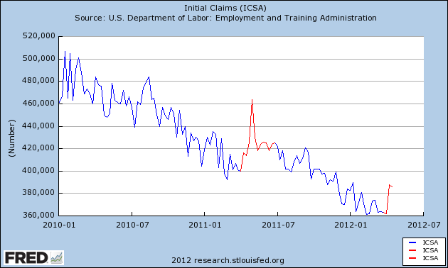
Is the Oil choke collar creating a new seasonality?

In the last two weeks there has been a sudden and significant increase in first time jobless claims. Last week Prof. Dean Baker wrote that the the increase is due to the non-winter winter distorting seasonal patterns.

Except that we had the exact same sudden and significant increase in first time jobless claims during the exact same two weeks last year, as is shown in the below graph which highlights April through June last year and claims since April 1 of this year in red:


That suggests that the our recent non-winter winter is not the reason for the difference.

Another suggestion has been that the BLS's seasonal adjustments were thrown off by the pattern during the severe recession, causing first quarter adjustments to bee too low, and second quarter too high. While that may be true, the BLS just a few weeks ago revised the entire series back several years to deal with that exact issue. Also, as the above graph shows, there was no significant increase in Q2 2010.

I propose another explanation. It may well be that the seasonal increase in gasoline prices from January through May or June of both last year and this year to nearly $4 per gallon, thereby tightening the choke collar on the economy, is reflected in an increase in layoffs. In other words, this is a new seasonal pattern that is only showing up in those years where the seasonal increase in gas prices sufficiently tightens the Oil choke collar -- as in 2008, 2011, and 2012.

If my speculation is correct, we will see a pattern very much like last year. Once gasoline prices begin to decline seasonally after midyear, the Oil choke collar will be loosened again, and layoffs will again decline.

A quick note on this week's ECRI WLI

- by New Deal democrat

I haven't had the time to post my beta testing in the last few weeks, but I did want to note before the time of its release that I expect this week's WLI to be significantly negative. Only one component - corporate bond prices - increased. Everything else - credit spreads, real M2, initial jobless claims, the JoC ECRI commodities index, the S&P 500, and purchase mortgage applications - decreased.

That being said, the WLI growth index may increase anyway, since last April the index was beginning a sharp decline, so a lesser rate of decline this week may be recorded as a net positive, and also because the general trend for the last few months in the weekly data has been positive, and this is apparently especially weighted in the growth index.

Morning Market Analysis


After breaking support over the last two weeks, the French market is not again at importance technical support levels; the EWQ ETF is trading right above the 20 handle, which has been support for a little more than a week.  Also note the declining status of the shorter EMAs, CMF and MACD.  A move through 20 would make the 19.5 level the next likely target.


The Italian market is also in technically bad shape.  The ETF has fallen nearly 18% (14 to 11.52), has bearish EMAs, A/D and CMF and has prices below the 200 day EMA.


The Italian market is now in bear market territory (it's down over 20%) and shares all of the bearish characteristics of the markets above. 

The above three markets are the weakest of the EU ETFs.  More importantly, they are bearish, and are therefore more likely to continue moving lower, dragging down the other, stronger EU economies.  This will, in turn, have a bearish impact on the US markets.


All three US treasury  ETFS -- the IEIs (5-7 years), the IEFs (7-10 years)  and TLTs (20+ years), have all rebounded and rallied, two to Fib levels (the IEIs and IEFs).  Of particular importance is the fact the TLTs bounced off the 200 day EMA -- the line between bull and bear markets.  What's also important here is the renewed safety bid.