- by New Deal democrat
The below started out as a comment somewhere else, but it is too good a “big picture” summary of where the economy is today not to post it here. I still intend also to take a more detailed look at the housing market, but since the below lays the groundwork for that, I’ll post it later (maybe later today, maybe not).
What follows is hopefully an as dispassionate as possible very, very summarized version of why there is still ample reason to see a recession ahead, while explaining why it hasn’t occurred yet.
Let me start by saying that while a few people called for a recession last year, most did not. That’s because the downturn in GDP was largely inventory driven (so very transitory) and also by the gas price spike, which was geopolitical and speculative. When the West figured ways around Russian energy, that situation abated.
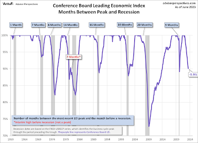
The situation this year is different. The easiest way to see it is for me to point you to the graphs of the Index of Leading Indicators. The index is the best K.I.S.S. method to forecast the economy, having the very inconvenient habit of being correct much more often than the average pundit:
[source: Conference Board via Advisor Perspectives]
The LEI is now down almost -10% - as much as it has been at the very bottom of all but the deepest recessions.
And yet we’re not in a recession, at least not yet. So something *is* different this time.
What’s different is that we are still dealing with the reverberations from the pandemic, in two ways.
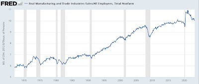
The first is the resolving disconnect between sales and employment. When sales increase, you need more employees to handle them. Typically in expansions sales have grown faster than employment by 0-5% YoY. In the first year after the recession, sales grew by over 6%, and real retail sales a whopping 20(!) (thank you, stimulus) while employment initially declined by about 15% and was still down 6% one year later, the biggest disconnect ever. Below I divide real total sales by employment, to show how even with labor-cutting efficiencies in the production and sales processes over time, the 2020-21 surge was the most extreme divergence on record:
Payrolls have been closing the gap ever since - by growing sharply - but by my best estimate are still about 1.5 million below where they would need to be to catch up to trend sales growth (this was the essence of my post Friday). My best guess is that will take another 6-12 months.
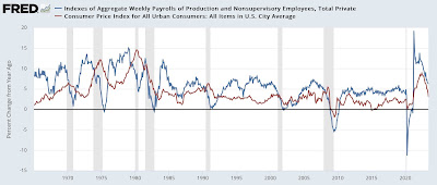
Because of this, aggregate wage growth has outpaced inflation. 60 years of history says no recession occurs until inflation (red) outpaces aggregate payrolls growth (blue), which as a “fundamentals” manner which causes households in the aggregate to start cutting back spending:
As shown above, for the past year, payrolls growth has decelerated sharply, but inflation has decelerated even more sharply. Hence the aggregate “real” buying power of the American middle/working class has increased.
Going forward, with the tailwind of declining gas prices behind us, as trend job growth catches up with trend sales growth, my best guess is that inflation will trend more sideways, while aggregate payroll growth will continue to decelerate, meaning inflation may very well outpace payrolls very soon.
The second difference is also pandemic related. If you go back to your Econ 101 supply and demand curves, stimulus spending pushed the demand line to the right, increasing the amount demanded and also increasing prices. On the flip side, there were very significant supply bottlenecks that most especially affected vehicle production and housing construction. This created shortages, which going back to your Econ 101 supply and demand curves, pushed the supply line to the left. This decreased the amount demanded, but also drove up prices.
As these supply chain kinks are being resolved, prices are becoming more stable, but both industries are taking a long time compared with previous expansions to make up the backlog, as shown by light vehicle sales (blue, left scale) and housing under construction (red, right scale):
Even though manufacturing as a whole has turned down (not shown), the vehicle production sector continues to show expansion. Similarly, even though housing permits and starts (not shown) turned down well over a year ago, it is taking an extremely long time for that to work its way through construction.
The above analysis is far from complete. It’s barely a summary of a summary. But while no method is perfect, my preference is to mechanically be on the K.I.S.S. side of the Index of Leading Indicators. Even if this time really is different in some respects, I would prefer *not* to reverse-engineer from a conclusion backwards of why they are wrong.


