- by New Deal democrat
Last Friday I debunked a Zero Hedge post that claimed that median house prices as a multiple of disposable personal income were at new highs. In this post I'll look at a few more measures.
To begin with, almost all of the opinion claiming that there is a new housing bubble are relying on new home prices. Conversely, almost all the posts taking the contrary position are relying on the Case Shiller house price index. There's no doubt that the median price for a new home has shot up in the last year, as shown in this graph:

But the above graph isn't adjusted for inflation, or income, or affordability. Beyond that, new homes represent less than 10% of the overall market. With 90%+ of the market a lot closer to its recent lows than prior highs, I see little reason to worry that we are in a new bubble.
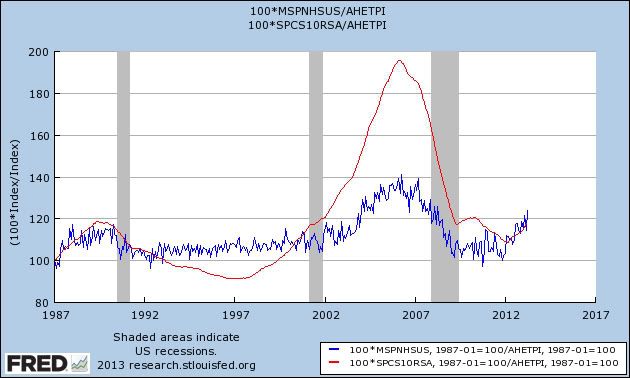
Let's look at a second measure of affordability, house prices as a multiple of average hourly wages. In the graph below, Case Shiller is in red and median new single family home prices are in blue:

While new home prices as a multiple of average wages are a little closer to their maximum than minimum values, the broader market shown by the Case Shiller index is still very inexpensive, equivalent of only 2002 values.
Next, in response to my article on Friday, I was pointed to the site Political Calculations, which claims that we are in a new bubble as measured by new home prices as a multiple of median household income. It looked to me like they were making the same mistake as Zero Hedge, but a commenter said I was wrong. To use the best data, I turned to Doug Short, who does have access to Sentier's monthly median household income data (which is the data source for Political Calculations as well). I asked Doug to do a nominal to nominal ratio, and here is what he got:

Doug also did a rolling 12 month average:

To be fair, this data does look more bubblicious, although really only two months' of data are close to the 2006 top. Keep in mind, however, that this is only the new single family home data. There is also a second issue with using the Sentier data, and that is thet the "households" whose income is being measured includes all headed by someone 16 or above - including retirees. Since the Boomer generation is retiring at the rate of 10,000 a day, and retirees have lower incomes than working households, the Sentier data is skewed in the same way that the employment-to-population data is, since we can expect that a greater share of households are retirees for the last 10 years, and that trend is going to continue.
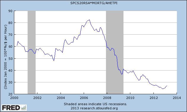
Finally, a commenter asked me to take a look at the effect of mortgage rates. So in the next graph, I've takent he Case Shiller sales data and multiplied by the 30 year mortgage rate. Thus, the higher the mortgage payment, the more unaffordable the price of the house. Here's the result:

That un-bubbly result is only amblified when we also measure the result by the average wage. First, here's the Case Shiller result:

And now, here is the result as applied to the median price of a new single family home:

Could new home prices, being very volatile on a monthly basis, retrace most of their run up in the last six months? Of course! But measured by the mortgage payment an owner earning the average wage must pay, whether we use the broad Case Shiller index, or the narrower median new home sales price index, house prices are about as far from a bubble as you can get. .