About a year ago I started keeping track of withholding tax receipts. which are reported daily by the Treasury Department. Doomers were sure that these receipts, which were still running negative YoY, spelled, well, Doom, but I was confident that the trend was bottoming and would reverse until it became positive - which is exactly what happened. Along the way, I've become convinced they are an excellent way of a real-time look at employment, since they are the total of taxes withheld by millions of actual jobholders. You don't pay withholding taxes if you don't have a job!
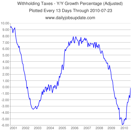
Matt Trivisonno also looks at this data, although he uses a slightly different metric. He also includes several helpful graphs (delayed 3 months for the public) that demonstrate just how useful measuring daily withholding tax data can be. (BTW, Matt's blog is a great source of technical analysis and populist-themed economic commentary). Let's compare the following two graphs. The first is from Matt Trivisonno's blog. It shows the past 12 months' vs. the 12 months previous for tax withholding as a YoY percentage for the last 10 years:

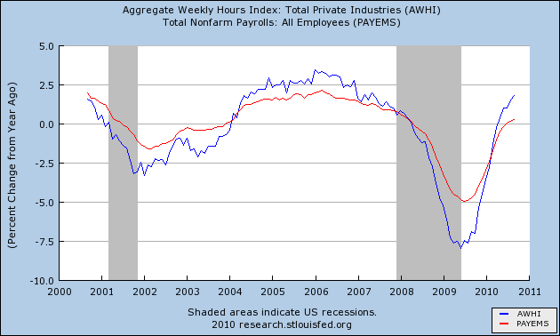
Compare that with this graph of YoY% job growth (red) and aggregate hours in private industry (blue) for the last 10 years:

The shape of the graphs is virtually identical. Only the scale of the YoY percentages is different. (Aggregate hours changes at about 1/3 the rate of tax withholding, and payrolls by about 1/4 the rate). It seems clear that comparing the sum of the the entire last 12 months of tax withholding is directly comparable in direction and rate of change to the YoY change in jobs.
Another source making use of withholding tax data is the paid subsription service TrimTabs. In the past I have pilloried TrimTabs for its method of looking at the economy, which is to look at the entire last 12 months of payroll withholding taxes, compare it with the entire 12 months previous to that, and project that trend forward for the economy as a whole. It caused them to make one of the worst calls ever when they used the metric to declare the incipient little recession "over" in April 2008!
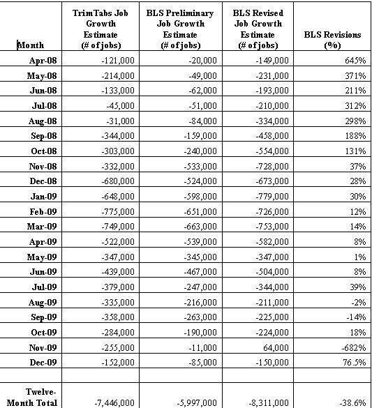
As bad as that analysis was, though, with regard to the specific bailiwick of job creation and destruction, TrimTabs' approach of using withholding taxes to estimate payrolls has been thoroughly vindicated by the Great Recession. Bonddad frequently points out that the birth/death model used by the BLS has been widely accepted by the academic community, and makes inherent theoretical sense, given their methodology of calling businesses to see if they hired or fired within the last month. At the same time, the BLS itself acknowledged in February, as it deducted nearly a million more jobs from its data for the period of March 2008-March 2009, that its birth/death metric had proven to be not properly calibrated for a decline of this magnitude, and was the primary reason for the revision. In fact, TrimTabs monthly payrolls report has proven to be much more accurate during the Great Recession than has the unmodified BLS report. Here is a chart demonstrating that fact through the end of 2009:

Month over month vs. Year over year
One problem with using 12 month sums vs. previous 12 month sums is that it lags terribly when signalling a change in trend. Ideally we would simply measure month over month. But tax withholding is seasonal. Generally May through November are "low tide" while December through March are "high tide" and April is transitional. Thus raw month over month comparisons may not be too helpful.
One way around this is to measure the YoY% change in monthly increments. This signals changes in trend early (as it did beginning a year ago). Measuring taxes withheld in any given month makes intuitive sense as well (if you have 10% more in taxes paid this year than last year during the same month, that suggests payment has gone up ~10% which after adjusting for inflation, ought to render X% more employees paying those additional taxes).
But in the last few months we have had some excellent YoY comparisons with some poor BLS (and TrimTabs - more below) results. Here is a table showing that result, by month, since April of this year, when the YoY% comparison turned positive:
| Month | 2009 Withholding receipts | 2010 Withholding receipts | YoY% change |
|---|---|---|---|
| April | 133.2 | 139.4 | +4.7% |
| May | 126.0 | 126.8 | +0.6% |
| June | 133.8 | 144.4 | +7.9% |
| July | 131.4 | 131.2 | -0.2% |
| August | 126.4 | 135.5 | +7.2% |
| September | 125.2 | 132.1 | +5.5% |
| October | 124.7 | ??? | |
| November | 127.7 | ??? |
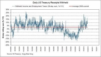
At my request, to see if a comprehensive data set would make a significant difference, Rebecca Wilder of the Angry Bear blog earlier this week published the withholding tax YoY% change for a rolling 30 day period, and it shows a similar result, of comparative gains up to about 10% punctuated by several air pockets during the summer:

The comprehensive result is in accord with the table above. YoY monthly receipts turned postive in March, and have been positive with two notable potholes (roughly the end of May and the end of July) since then.
Despite the above, every number including census workers since June has been negative. Last month even payrolls exluding census were negative. So the method of simply comparing Month A receipts now vs. one year ago has its drawbacks.
The problem, it appears, lays with using the "first derivative." Suppose the underlying number for consecutive months A and B last year were flat. If this year, month A is up 4% and month B is up 6%, those should translate into actual gains. But suppose instead last year's month B was 10% below month A. Then the same YoY% increase from month A to B still yields a decline in jobs in month B compared with month A - although it would still seem to suggest that both months should be above their respective months last year on a YoY basis. In fact both the BLS and Household Surveys showed YoY jobs to have turned positive in July, even though tax withholding went positive first in April.
Nevertheless, it is clear that YoY monthly increases do signal a change in trend. Here is a continuation of the graph of TrimTabs monthly job estimates vs. the BLS Nonfarm Payrolls numbers for this year so far (with the monthly YoY% increase included as well). TrimTabs turned positive only in March, but since then has been generally yielded higher job numbers than has the BLS:
| Month | TrimTabs estimate | BLS Nonfarm Payrolls | YoY% change |
|---|---|---|---|
| January | -104 | +14 | -6.7% |
| February | -40 | +39 | -2.3% |
| March | +280 | +208 | +5.7% |
| April | +262 | +313 | +4.7% |
| May | +475 | +432 | +0.6% |
| June | -152 | -175 | +7.9% |
| July | -5 | -66 | -0.2% |
| August | -65 | -57 | +7.2% |
| September | -65 | -95 | +5.5% |
| October | ??? | ??? | |
| November | ??? | ??? |
If the YoY% increases by month persist (not guaranteed), it certainly seems that we should be up 1% or more jobs YoY by next spring. In any event, since March the Withholding tax approach has yielded a slightly more bullish result than the BLS' method. So far, October is running more than 5% ahead of last year. Once TrimTabs comes out with their estimate for this month's payrolls, I'll report it here.