Saturday, June 22, 2024

Weekly Indicators for June 17 - 21 at Seeking Alpha


 - by New Deal democrat


My “Weekly Indicators” post is up at Seeking Alpha.

The high frequency data has not been confirming the relatively poor monthly reports. For example, mortgage applications have not declined since last autumn, contrary to the housing permit and construction report this past week. And nominal retail sales as updated weekly by Redbook have been running at about 5% YoY for the past 3 months, contrary to the lackluster monthly retail sales report.

As usual, clicking over and reading will fill you in on all the details, and put a little change in my pocket as a reward.

Friday, June 21, 2024

Snail’s pace of housing market rebalancing, as existing sales remain range bound, and inventory has not increased enough to relieve pricing pressure


 - by New Deal democrat


Existing home sales have very limited value in economic forecasting, since they are the trade of an existing product rather than indicating growth or contraction in the creation of a new product. Thus my main focus at present on this data is the extent to which it shows - or not - the rebalancing of the housing market.  That’s because, unlike existing homeowners, house builders can vary square footage, amenities, lot sizes, and offer price and/or mortgage incentives to counteract the effect of interest rate hikes.  As a result, new home sales have relatively speaking held up, while existing home sales have declined much more sharply. Conversely, the prices of new homes have moderated relative to that of existing homes, which have remained stubbornly high.

This morning’s report for May gives us very small, incremental evidence of rebalancing. In particular, seasonally adjusted sales declined a slight -3,000 to 4.11 million annualized. For the past 18 months, sales have remained range bound between 3.85 and 4.38 million annualized:


The good news, for rebalancing purposes, is that inventory has increased (note inventories and prices are not seasonally adjusted in this report, so the correct way to deduce the trend is to compare YoY). In May, inventory was higher by 18.6% YoY to 1.28 million units, vs. up 16.3% YoY in April. This also compares with May 2022’s 1.15 million and May 2021’s 1.21 million. Inventory was higher in May 2020 at 1.58 million and higher in May of all of the 5 years prior:


To reiterate, even before the pandemic, housing inventory had been falling almost relentlessly YoY since 2014, the only exception being early 2019. the pandemic exacerbated this trend, which appears to have finally bottomed out in 2022-23. There in a nutshell is most of the story about the chronic shortfall in housing in this country.

Ultimately this is good news, because we want to alleviate this shortfall in inventory, and this morning’s report means that we continue to make progress in that direction.

Unsurprisingly, in response to the longer term decline in inventory, existing home prices rose consistently since 2014, and accelerated when COVID hit and much of the market shut down. The median price for existing homes briefly turned negative in early 2023, troughing at -3.0% YoY in May. Thereafter with a brief break in March of this year, YoY comparisons have accelerated almost relentlessly. They were higher YoY by 5.7% in February, 5.6% in April, and now 5.8% in May:


In summary, COVID and Fed rate hikes conspired to exacerbate an already-existing shortfall in existing home inventory. This pre-existing shortfall has meant that prices failed to respond meaningfully to those Fed rate hikes. The continuing large YoY increases in existing home prices are gradually driving inventory higher, but not high enough yet to completely alleviate that longer term inventory shortage. New home sales, which have increased their share of the overall housing market, will continue to respond as a result. By contrast, existing home sales will likely remain range-bound at their recent levels until the Fed moves on interest rates, whenever that may be.

Thursday, June 20, 2024

Housing permits and starts the lowest since 2020, units under construciton also decline further, but no yellow caution flag yet


 - by New Deal democrat


I’ve written repeatedly in the past few months that I am paying especial attention to the manufacturing and construction sectors for signs of weakness now that the supply chain tailwind for the economy has ended. At the beginning of this month, one show appeared to have dropped, as  the ISM report on manufacturing showed contraction for the second month in a row, declining slightly to 48.7, with the more leading new orders subindex declined sharply to 45.4, the lowest reading since last May:


This morning the construction shoe at least dangled, as housing permits and starts had their most abysmal month since 2020, and units under construction their worst in two years. In fact, housing units under construction - the real economic activity in the housing construction data - are getting close to their recession caution signal.

To wit, the longest leading signal in the data - permits (dark blue in the graph below) - declined -54,000 on an annualized basis to 1.386 million. Single family permits (red, right scale) which have the most signal and least noise of any of the data series, also declined, by -28,000 to 949,000 annualized. Starts (light blue), which are slightly less leading and much more noisy, declined -75,000 to 1.277 million annualized:


As noted above, total permits and starts are both at their lowest levels since 2020. Meanwhile single family permits, which rebounded last year, declined for the fourth consecutive month.

Earlier this year, while noting that I expected to see more of a decline in the actual hard-data metric of housing units under construction, I wrote that “With permits having increased off their bottom, I am not expecting such a 10% decline in construction to materialize.” And last month I concluded that “My sense is that, while housing units under construction will decline further, unless interest rates increase further, permits and starts will stabilize, and after a period so while units under construction, without crossing into recession warning territory.”

Mortgage rates did rise through April, but have stabilized since. Here’s what they look like in comparison with single family permits:


Although total permits did - by a slight margin - make a new low, I continue to suspect that they will not drift much lower, so long as mortgage rates remain in their past 12 month range.

But let’s take a more detailed look at units under construction. These - especially multi-unit dwellings (gold in the graph below) levitated for over a year after permits and starts declined, before finally turning down definitively this year:


Single family units under construction (magenta in the graph below) did follow their typical pattern, slightly lagging single family permits (red):


But multi-family units, as noted above, seemed to levitate, lagging the downturn in multi-unit permits by a much longer time:


That’s becuase, as the close-up below shows, the newer multi-unit construction tends to be much larger complexes than were built in the 1960s through 1990s, and builders have not increased their workforce equivalently. So in the past 10 years it has taken much longer to finish these large multi-unit projects:


The above graphs suggest that single family units under construction will probably not decline much further, while multi-unit developments under construction, which are only down about 10% vs. the 40% decline in permits for them, are likely to decline much further.  

Usually it has taken more than a 10% decline in units under construction to be consistent with a recession. In 1970 and 2001, the declines were less than that. But in the late 1980s and 2000s, it took almost a 25% decline before a recession occurred. With this morning's report, the decline is -6.9%. Hence my statement in the opening paragraph above that the construction shoe “dangled” but not quite “dropped.”

To return to my opening comment, this year I am paying extra close attention to the manufacturng and construction sectors, because a significant turndown in both of those simultaneously would be a danger signal for oncoming recession. Together with the contraction in the ISM manufacturing index, and the relatively poor real retail sales report, the next items to watch are (1) whether real personal spending on goods, which tends to trend similarly to real retail sales, weakens substantially; and (2) whether employment in manufacturing and construction, neither of which has turned down, change direction in the next few jobs reports.

Jobless claims still positive for forecasting purposes; the unresolved seasonality issue should be resolved shortly


 - by New Deal democrat


This morning’s jobless claims report continued the uptrend we’ve seen for the past month. But it still looks more likely than not that it is mainly unresolved post-pandemic seasonality. We’ll probably get a more definitive answer to that issue in th next several weeks.


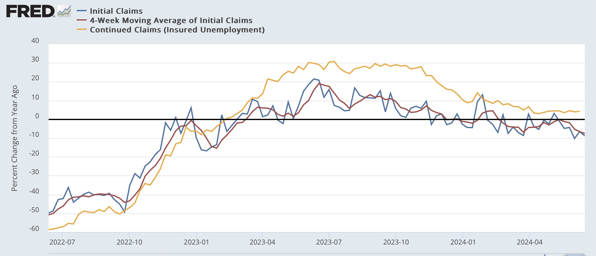
Initial claims declined 5,000 for the week to 238,000. The 4 week moving average rose 5,500 to a new 9 month high of 232,750. With the typical one week delay, continuing claims rose 15,000 to 1.828 million, a 5 month high:


Note that last year followed a very similar trajectory from lows of just over 200,000 in January, rising through early spring before more sharply increasing in late May and June. But as the below graph shows, on a YoY% basis this year’s iinitial claims have been almost uniformly lower:


In fact, on a YoY basis, initial claims this week were down -8.8%, and the four week average down -7.5%, respectively the second best, and best, comparisons in 18 months. Since the YoY figures are more reliable as recession forecasting tools, these remain very positive. Even continuing claims, which are up 4.3% YoY, remain close to their 15 month low comparison.

If hidden seasonality is the culprit, we should know shortly. That’s because as shown in the first graph above last year there was a sharp decline in claims beginning the week of June 24. Next week will be the equivalent week this year. So if claims continue at their recent elevated levels for two more weeks, that would negative the seasonality theory. We’ll see.

Meanwhile, comparing monthly initial and continuing claims to the unemployment rate does not support the most recent increase to 4.0% in the latter:


As I’ve noted many times, there is a solid 50+ year history of initial (and continuing) claims leading the unemployment rate. Aside from the last few months, the only exceptions have been during the “jobless recoveries” immediately following the 1991, 2001, and 2008 recessions. This time around it is more likely due to an increasing share of the wave of recent immigrants (who have not been previously employed and are not eligible for jobless benefits) failing to find work. In other words, the “Sahm Rule” might be signaling a relatively weakening, but still positive labor market, rather than an economy that is close to recession.

Wednesday, June 19, 2024

The economy during Biden’s tenure has not been kind to young persons looking to buy or rent property


 - by New Deal democrat


I saw a graph within the past few days (which unfortunately I did not make a copy of) indicating that Biden’s polling problems are not against Trump per se so much as they are the failure of Biden to consolidate support among young voters, especially voters of color, vs. Trump’s having already consolidated his base support.


One reason for that is the huge generational divide in how the Israel/Palestine issue is viewed. But the other is that, for all the ballyhoo about jobs created and the low unemployment rate, in the sector of the most important purchase most people will ever make - housing - the news has been awful, and still is.

Let’s take an example out of thin air with nice round numbers. Let’s say a young couple want to purchase a $200,000 home with 10% down and take a 30 year mortgage at the prevailing rate. How have they fared since January 2021?

Even taking into account the average weekly earnings of an American worker, as measured by the FHFA pushing index the price of an existing home (blue in the graph below) has increased by 18% during the Biden Administration. The median price of a new single family home (red), similarly adjusting for wages, is about 8% higher (after being about 15% higher several years ago):


Our hypothetical young couple,*even after adjusting for increased earnings,* would have to put $23,600 down vs. $20,000 down in January 2021 for an existing home, and $21,600 down for a new $200,000 single family home.

Not only has their down payment cost increased substantially, but the 30 year mortgage has increased from an average 2.74% in January 2021 to 7.06% last month - close to a new high for the entire Millennium:


That means our couple’s monthly mortgage payment has increased from $734 in January 2021 to $1,293 for the median priced single family home, and $1,422 for the average existing home!

Even renting is not such a bargain, because the CPI for rent has increased 5.8% in real terms after adjusting for the average weekly wage increase, and is also at a new high:


Simply put, for younger persons looking to move into their first apartment, or move out of an apartment into a house, or move up to a bigger sized house, the economy during Biden’s tenure has not been helpful to say the least.

Tuesday, June 18, 2024

Good news on production is overshadowed by the yellow caution flag of flagging real retail sales


 - by New Deal democrat


There was good news and not so good news in this morning’s two important data releases. 


I’ll start with the good news. Both total industrial production an its manufacturing component increased a sharp 0.9% in May. Even after downward revisions of -0.4% in March and -0.3% in April, both were still up 0.5% compared with where we thought we were one month ago:


The only fly in the ointment is that both are still down, by -0.2% and -0.8% from their respective 2022 peaks.

Total production and manufacturing production are both also up slightly YoY, after being negative YoY for most of 2023:


In the 20th century, negative YoY readings such as were had in 2023 would almost always have meant recession. Since the Great Recession, however, there were two other instances, in 2016 and 2019, where such negative comparisons were *not* coincident with recessions.

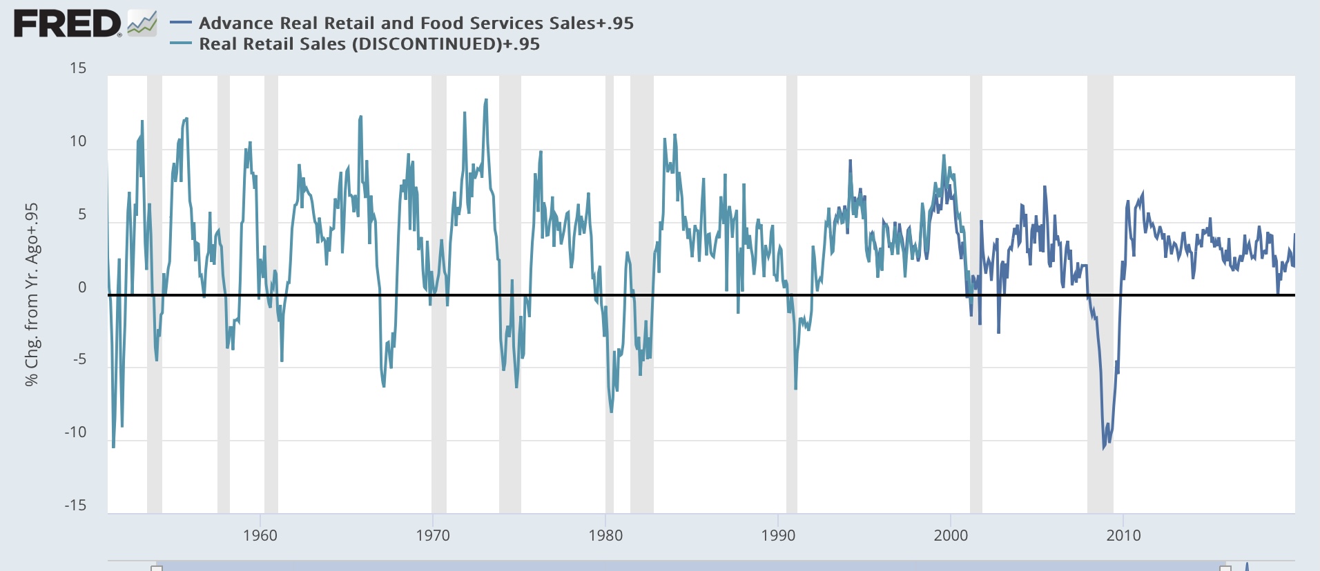
But if there was good news on the production side, on the consumption side retail sales disappointed, only up 0.1% in both nominal and real terms. And April was revised downward by -0.2%, in we are -0.1% below where we thought we were one month ago:


We are also down, by -0.95% YoY. In the entire history of real retail sales going back 75 years, there have only been 8 occasions where such downturns did not immediately foreshadow a recession:


But two of those, in December 1959 and June 1979, occurred within half a year of a recession, and two more, in September 1987 (stock market crash) and October 2002 (compared with post-9/11 sharp rebound in October 2001), were one month special circumstances. That leaves only 4 boba ride false signals before the pandemic, and even one of those, in February 2003, was only for one month.

In other words, the negative YoY retail sales for four of the first five months of this year (blue in the graph below) is now a real concern, although it has not been confirmed by the similar metric of real personal spending on goods (red):


Since we are now over three years past the last pandemic stimulus, I suspect real retail sales are also giving a more accurate signal for employment (red in the graph below) in the months ahead, as they did for decades before the pandemic:


Consumption has historically led employment, and this suggests weaker monthly employment reports in the months ahead.

In sum, the short leading indicator released today, real retail sales, was not so good, and given the past few months as well, must be regarded as raising a caution flag for the economy; while the coincident measure of production suggests the economy remains healthy right now.

Monday, June 17, 2024

Immigration and the housing market freeze are making the “last mile” of disinflation harder, not the Phillips Curve


 - by New Deal democrat


Jason Furman is out today with an article in the WSJ that the Fed should not be in any rush to lower rates, arguing that “the last mile” to 2% inflation is likely to be the hardest. While the article is behind a paywall, the illustration (and his endorsement of it) as well as his past positions indicate that he is largely relying on the Phillips Curve, which holds that there is a trade-off between inflation and unemployment:


Paul Krugman put out an immediate rejoinder on X, that “core inflation has been higher than headline. But this is NOT because volatile food and energy are drivers of disinflation. It’s because excluding food and energy raises the weight of shelter. Over the past year headline ex-shelter is 2.1[%], core ex-shelter 1.9[%].”

Krugman does not include a graph, but one is not too difficult to reconstruct on FRED, which already includes everything except core ex-shelter. Since that is roughly 45% of total core CPI, all we have to do is subtract it using an appropriate weighting (I’ve taken it out one further decimal point to 45.4%), and we find that Krugman is correct. To wit: the below graph includes YoY headline (blue), core (gold), headline ex-shelter (gray), and core ex-shelter (red) for the past two years:


While it’s true that core inflation has been falling more slowly and remains slightly higher than headline, headline and core inflation ex-shelter are lower than both of them, and core ex-shelter is the lowest of all. My calculation to one further decimal point actually rounds to 1.8% rather than Krugman’s 1.9%.

In other words, the “last mile” is difficult only because shelter costs have been so slow to disinflate. And as I argued several weeks ago (and others have argued as well), that in turn is because higher mortgage rates, caused by the Fed’s rate hikes themselves, have created a severe shortage in existing homes for sale, driving *up* their prices.

Further, as I argued last Friday, the most likely cause of the recent upturn in unemployment is not a reflection of the Phillips curve, but rather largely a function of a sharp increase in the labor force due to a similarly sharp spike in immigration. To briefly recap that argument: on average in the decade before the pandemic, the US saw something like 0.5% annual population growth. Call it 1.7 million to be generous. But after slumping during the pandemic, beginning in 2022 an additional 2 million immigrants each year entered the U.S. over their pre-pandemic average. Here’s the relevant graph from the CBO:


This has added something like an additional 3+ million prime employment age adults to the population over and above the usual previous level beginning in 2022. The US economy simply could not handle that big an influx once the initial white hot recovery of 2021-22 began to cool off. This has increased the number of unemployed, and the unemployment rate, even as the economy has continued to grow.

Since these unemployed new arrivals did not previously hold jobs, it also explains why the unemployment rate rose even as initial jobless claims declined and continuing claims remained stable. It is also supported by the fact that the unemployment rate for Hispanics fell especially fast in 2021, but has risen almost as fast as the Black unemployment rate beginning in 2023.

Further, this isn’t the first time that a sharp increase in the labor force has occurred, with similar effects on unemployment, inflation, and wages.

Beginning in the late 1960s, the roughly 75 million (out of a total US population of about 160 million) Baby Boomers first reached prime employment age. The last Boomer reached that age just before 1990. At the same time, women began to enter the labor force in massive numbers. 

This created a huge surge in the prime age labor force that peaked in the mid-1980s and finally abated in full in the 2000s (blue in the graph below). During that time, while there was cyclical waxing and waning of the unemployment rate, on a secular time scale it increased with the surging of the labor force (red), and gradually abated as the prime age population group did as well:


Not only did the unemployment rate correlate with the pace of the rise in the prime age labor force population, but real wages peaked shortly thereafter, in 1973, and declined until the surge, particular of new women entrants, ended in the mid-1990s:


Now here is an update of the prime age population and the pace of the increase in the participation rate that includes the present post-pandemic period (and note, this comes from the Household Survey, which is likely undercounting new immigrants severely):


If past is prologue, so long as the prime age labor force disproportionately increases, so will - relatively speaking - the unemployment rate. If that coincides with a further deceleration in inflation, it won’t be because of the magic of the Phillips Curve, but rather because of the lagging nature of shelter costs. And it is likely to a cooling of wage increases as well.

Saturday, June 15, 2024

Weekly Indicators for June 10 - 14 at Seeking Alpha


 - by New Deal democrat


My “Weekly Indicators” post is up at Seeking Alpha.

Ever so slowly, the “long leading” data has been improving. Credit conditions were the metric that had an improvement this past week. Slowly everything except for the inverted yield curve is moving towards at least neutrality, if not positivity.

As usual, clicking over and reading will bring you up to the virtual moment as to the state of the economy, and reward me a little bit for organizing and presenting it to you.

Friday, June 14, 2024

Post-pandemic Latin American immigration and the unemployment rate (and it’s implications for the economy)


 - by New Deal democrat


One week ago, in analyzing the jobs report, I noted the continuing severe disconnect between the Establishment Survey, which continues to show strong growth, and the Household Survey, which has been downright recessionary.


I expanded on that analysis Monday and Tuesday, noting that “ At the end of Q4 2022, the Establishment Survey showed gains of 3.0% YoY. By the end of 2023, that had declined to 2.0%. Meanwhile, over the same period the YoY gains in the Household Survey had declined from 2.0% to 1.2%.” Meanwhile, the comprehensive QCEW, showed a YoY deceleration from 2.8% in Q4 2022 to 1.5% at the end of Q4 2023.

In other words, the Establishment Survey may have been overstating growth, while the Household Survey was likely understating it.

The cause of the underestimate of growth in the Household Survey seems most likely to be a big undercount of post-pandemic immigration. Here’s the math I wrote up on Tuesday: “ In the past two years through May, according to the Census Bureau, the US population has grown by a little over 1%. But according to the Congressional Budget Office, it has grown slightly over 2%. That’s over a 3,000,000 difference!”

If we make the reasonable assumptions that this big surge of immigrants has been from Latin America, and much more closely resembles the prime working age demographic of 25-54 years than the native population, applying those adjustments yields an estimate of an additional 2,000,000 employed through May 2024 vs. official Household Survey numbers.

That left one important caveat, namely: “if the Household Survey has been underestimating prime working age population growth, adjusting for that solves most of the discrepancy with the Establishment Survey. But note that the above analysis only addresses *employment,* and not the unemployment rate.” That’s what I want to take a look at now.

Let me start by reiterating that initial jobless claims have had a 60 year history of leading the unemployment rate. Here’s the historical look from the 1960s until just before the pandemic:


In the first several years after the pandemic, that relationship held true. But over the past six months or so, the unemployment rate has continued to drift up even as initial claims declined from last summer through April, and continuing claims stabilized:


It is interesting that something similar happened during the two “jobless” recoveries following the 1991 and 2001 recessions. The unemployment rate continued to rise for an extended period after both initial and continuing jobless claims declined.

The most likely explanation for an increasing number of unemployed is that their jobless benefits expired. Thus they were no longer counted as “continuing claims” but continued to be jobless. No such lackluster recovery has been in evidence post-pandemic.

But a similar dynamic may be in play. That’s because *new* entrants to the labor force who fail to find their first job will not show up in unemployment claims; but they will show up in the unemployment rate. There is a big historical precedent for this involving the Baby Boom which I’ll save for another day. 

But for now, consider that if, properly adjusted, the unemployment rate has not risen, because Latin American immigrants are filling all the jobs that native born workers are not, then we should see that their unemployment rate will remain constant, vs. that for White or Black native born populations.

But that’s not what we see. The unemployment rates for Whites, Blacks, and Latin Americans have all risen. For Whites it has risen from 3.1% to 3.5%, for Blacks from 4.8% to 6.1%, and for Latin Americans from 3.9% to 5.0%:


Indeed the decline in the unemployment rate for Latin Americans was especially sharp in 2021 and 2022, suggesting that they were filling a disproportionate number of the openings advertised by the ubiquitous “help wanted” signs during that time.

That the unemployment rate for this ethnic group, which presumably includes the vast majority of recent immigrants, has risen much more sharply than for Whites, and almost as sharply as for Blacks, implies that a small but increasing percentage of these new immigrants are not finding employment. These unemployed recent immigrants did not previously hold a job in the US, and so do not show up in jobless claims - but do show up in the Household Survey’s unemployment rate.

This in turn has implications for whether the economy is as close as the Household Survey suggests to recession or not. Because the picture it paints is that of an economy that is still growing, perhaps even strongly, but not quite as strongly as before, and so not as able to absorb the full influx of 6,000,000 (!) immigrants in two years.

For that reason, I think it is fair to continue to put more weight on the Establishment Survey’s showing of continued growth in the economy.

Finally, here is the graph of the long term growth in the Hispanic or Latino population:


Notice the big bumps after the 1990 and 2000 Censuses? That corrected for a chronic undercount during both of those decades. Indeed it was the subject of a Fed white paper about an undercount in the Household Survey in 1999. But there was no such bump in the immediate aftermath of the “Great Recession,” which put a damper on immigration. Similarly, the post-pandemic increase in immigration did not occur until after the 2020 Census took place. In other words, the chronic undercount of recent Latin American immigrants in the workforce may continue all the way up until the 2030 Census.

Thursday, June 13, 2024

Initial jobless claims now in a clear uptrend - but is it unresolved post-pandemic seasonality?


 - by New Deal democrat


Initial jobless claims rose significantly last week, up 13,000 to 242,000, the highest level since last August. The four week moving average rose 4,750 to 227,000, the highest level since last September. And with the usual one week delay, continuing claims rose 30,000 to 1.820 million, the highest since this January:


There is no doubt at this point that jobless claims are in a significant uptrend. But note from the graph that there was a very similar increase last spring and summer, which is why as I have been reporting on these numbers for the past month that I have cautioned that there may be some unresolved post-pandemic seasonality in play.

This shows up even more clearly when we look at the YoY% changes, those most important for forecasting purposes. YoY initial claims are nevertheless *down* -10.2%, and the four week average down -6.7%. Both of these comparisons are the lowest in 16 months except for a few weeks in February and March in the case of the former, and only one week in March in the case of the latter. And while continuing claims remain higher YoY by 4.4%, that comparison remains lower than at any point in the past 15 months except this April and May:


So the bottom line is, claims are clearly in an uptrend, but it is less of an uptrend than occurred at this very same time last year - an indication that unresolved seasonality may be at work. And because initial claims are down YoY, they are not recessionary but rather consistent with a continuing expansion.

Finally, here is the update on initial and continuing claims vs. the Sahm Rule:


As I have noted many times, there is nearly a 60 year history of the former leading the latter. There have been only a few other occasions during that history when the unemployment rate drifted higher in similar circumstances. Because that is best examined in the course of the discussion I started in Monday and Tuesday’s posts about a likely large population undercount in the Household Survey having to do with immigration, I will look at this issue in more detail in that context, hopefully (if I am industrious) tomorrow.

Wednesday, June 12, 2024

May CPI continued to be all about shelter


 - by New Deal democrat


Consumer prices in May showed no inflation at all, as a decline in gas prices helped the headline number come in unchanged. YoY inflation decelerated -0.1% to 3.3% - continuing in the narrow 3.0%-3.4% range it has been in for the last year.

The bottom line remains that almost the entire inflation “problem” is with shelter, which increased 0.4% again, while the YoY rate continued its snail pace of deceleration, down -0.1% to 5.4% - still the lowest increase in 2 years. 

For the record, here is the month over month change in headline inflation (blue) vs. “core” inflation less food and energy:


More importantly, all items except shelter were unchanged for the month, and are only up 2.1% YoY - the 13th month in a row they have been up less than 2.5% YoY. Meanwhile, with the -2.0% decline in energy costs in May, CPI less energy was up less than 0.2% for the month - the lowest increase in over 3 years - and up 3.2% YoY:


Focusing on shelter, it has continued to behave as I expected. Here is an update to the 12-18 month leading relationship between house prices (as measured by the FHFA) and Owners’ Equivalent Rent in the CPI:


House prices are currently increasing a little higher than their average pre-pandemic rate (because, ironically, the Fed’s rate hikes have exacerbated a shortage in housing supply, thereby driving up its price), which has translated to OER and the other measures of shelter inflation to continue to decelerate YoY, but at a much slower pace than their initial rapid decline. I expect this trend to continue in the coming months.

Turning to our recent and former problem children; first, although I won’t bother with a graph, new and used vehicle prices continued to indicate that they have reached a new equilibrium. Used car prices rose 0.6% in May, but have declined -9.3%YoY. New car prices declined -0.5% in May, and are down -0.8% YoY.

Here’s what happened with the remaining problem areas of inflation:

  (1) food away from home (fading), which peaked at 8.8% YoY over one year ago, increased 0.4% in May, but decelerated -0.1% ona YoY basis to a 4.0% increase, gradually getting closer to its pre-pandemic average of 2.5%-3.0%;
 
 (2) electricity, which has followed gas prices higher, was unchanged for the month, but has risen from 2.2% YoY last August to an 11 month high of 5.9% in May; and 

 (3) transportation services - mainly car repairs (up 0.3% for the month, but down from 7.6% YoY in April to 7.2%) and insurance (down -0.1% for the month and up 20.3% YoY - still down from last month’s 22.6% YoY gain) - declined -0.5% for the month. It had rocketed from its pre-pandemic range of 2.5%-5.0% to as high as 15.2% in October 2022, and is now still up 10.5% YoY, a -0.7% deceleration from April.


Based on the past inflationary period of 1966-82, it is clear that transportation services lags increases in vehicle prices by 1-2 years and even more, sometimes increasing right through recessions

Finally, the CPI report enables us to update real aggregate nonsupervisory payrolls. Last Friday we saw that nominally they rose 0.9%, which with today’s unchanged prices, is their “real” gain as well:


This made a new high, showing that average American working families had significantly more to spend in May, and negativing any recession for the next few months.

To summarize: if we exclude the well-documented historically lagging sectors of shelter prices (and motor vehicle insurance), consumer inflation continues to be well behaved, up only 2.1% YoY. If gas prices continue to be well-behaved, headline inflation should go below 3%

Tuesday, June 11, 2024

What would adjusting the Household jobs Survey for immigration driven population growth do?


 - by New Deal democrat


This is a continuation of my post from yesterday discussing the large divergences between the Household and Establishment jobs surveys.


A big current issue with the Household Survey is whether, by relying on Census estimates, it has substantially underestimated population growth, and in particular immigration-driven growth, in the past two years. Here’s a graph from Wolf Street, the source material of which I have verified, that sums it up:


In the past two years through May, according to the Census Bureau, the US population has grown by a little over 1%. But according to the Congressional Budget Office, it has grown slightly over 2%. That’s over a 3,000,000 difference!

If the Household Survey data were normed to the CBO estimates, what would it look like? A couple of basic assumptions should give us a good back-of-the-envelope estimate. Those two assumptions are; (1) the immigration is from Latin America; and (2) it is younger, in the prime working age demographic, plus their children, vs. the native born population.

Here’s the difference those two assumptions make. First, here is the difference between growth in the native-born population vs. foreign born population:


The total US population is about 336,000,000. Since the beginning of 2022, the native born population has only grown by less than 1.4 million, or only 0.6%; while the foreign born population has grown by 3.7 million, or 8.3% - and remember, these are the Census Bureau numbers, which the CBO data indicates sharply underestimate immigration during that time.

Now, here’s the employment/population ratio for the US population as a whole, vs. the Hispanic or Latino segment (gold), as well as the prime working age component (red) in the past 2+ years:


Now let’s crunch some numbers based on the CBO estimates, and making use of the assumptions above.

Cumulatively since March 2022 the CBO estimates show an additional 1% growth in population, or roughly 3.36 million, vs. the Census Bureau.

Further, the overall employment/population ratio over the past two years is roughly 60%, vs. 64% for the Latin American ethnic group. (I’m being conservative here, assuming working age immigrants have been bringing their children, who obviously are not in the 25-54 demographic).

A 64% employment ratio for an additional 3.36 million people generates an additional 2 million+ employees vs. using the Census Bureau estimates.

Now let’s show that in graphs. Through the magic of algebra, here is what the adjusted Household Survey would look like if an additional 2 million jobs were gradually added over the past two years (blue) vs. the Establishment Survey (red):


And here is what the YoY% growth would look like:


There is, as per usual, additional noise, but the adjusted Household Survey would show almost as many jobs as the Establishment Survey through the end of last year, before performing poorly (so far!) this year - but still within the range of noise.

Additionally, with the adjusted Household Survey growing 1.8% YoY in 2023 (vs. 2.0% for the Establishment Survey, it is closer to the QCEW census of 1.5% growth as of its last update.

In short, if the Household Survey has been underestimating prime working age population growth, adjusting for that solves most of the discrepancy with the Establishment Survey. But note that the above analysis only addresses *employment,* and not the unemployment rate. That analysis will be the basis of yet another post.