Saturday, February 3, 2024

Weekly Indicators for January 29 - February 2 at Seeking Alpha


 - by New Deal democrat


My “Weekly Indicators” post is up at Seeking Alpha.

One week ago many of the high frequency indicators hit an “air pocket.” This week some - but not all! - resolved.

At present there is one of the more anomalous situations I have observed. Most of the data is not just positive, but frequently strongly so. On the other hand, there is a nagging minority of data which is near or flat-out recessionary, some of which (like income tax withholding) is hard to dismiss.

To get the full rundown, click on over and read. It will also reward me a little bit for my efforts in laying the data out for you in an organized format.

Friday, February 2, 2024

January jobs report: a very strong report, but with pockets of significant weakness


 - by New Deal democrat


As per usual, the Establishment and Household portions of the jobs report gave somewhat different impressions, complicated by annual revisions to each. In general, not only was January excellent of the Establishment report, but  most months in the past year were revised upward as well. The Household report mainly was “meh,” neither particularly improving nor declining. Finally, aggregate hours and payrolls were a little concerning.


My focus remains on whether jobs gains are most consistent with a “soft landing,” i.e., no further deterioration, or whether deceleration is ongoing; and more specifically: 
  • Whether there is further deceleration in jobs gains compared with the last 6 month average (Needless to say, the answer to this was a resounding “NO!”)
  • Whether the unemployment rate is neutral or decreasing; or whether there is further weakness; (As expected from the information from initial claims, there was no further weakness) and
  • Based on the leading relationship of the quits rate to average hourly earnings, weather YoY wage growth continues to decline slightly (To the contrary, it rebounded).

Here’s my in depth synopsis.


HEADLINES:
  • 353,000 jobs added. On a YoY basis, jobs rounded to up 1.9%. Due to the annual revisions, this is now tied for the lowest YoY% gain since March 2021. 
  • Both November and December were revised upward, by 9,000 and 117,000 respectively, for a total of 126,000. Almost every month last year, there was a steady drumbeat of downward revisions. This has been all but wiped away by the annual revisions, in which 9 of the last 12 months were revised higher.
  • Private sector jobs increased 317,000. Government jobs increased by 36,000.
  • The alternate, and more volatile measure in the household report, declined by -451,000 before taking into account the annual revisions. After doing so, the month over month change would have been +239,000.  More importantly, the YoY% gain in this report - which avoids issues with seasonal adjustment - declined sharply to +0.6%, the lowest since the pandemic lockdowns.
  • The U3 unemployment rate remained at 3.7%.
  • The U6 underemployment rate increased +0.1% to 7.2%, 0.7% above its low of December 2022.
  • Further out on the spectrum, those who are not in the labor force but want a job now increased 122,000 to 5.793 million, its highest level since September 2022, vs. its post-pandemic low of 4.925 million set last March

Leading employment indicators of a slowdown or recession

These are leading sectors for the economy overall, and help us gauge how much the post-pandemic employment boom is shading towards a downturn.  With one exception, these were positive.:
  • the average manufacturing workweek, one of the 10 components of the Index of Leading Indicators, declined sharply, by another -0.3 hours to 40.0, down -1.5 hours from its February 2022 peak of 41.5 hours, and the lowest level since June 2020.
  • Manufacturing jobs rose 23,000.
  • Within that sector, motor vehicle manufacturing jobs rose 3,100. 
  • Construction jobs increased by 11,000.
  • Residential construction jobs, which are even more leading, rose by 2,500. This is a yet another new post-pandemic high.
  • Goods jobs as a whole rose 11,000 to another new expansion high. These should decline before any recession occurs. After revisions, these are up 1.2% YoY, the lowest growth since early in the pandemic, but which is nevertheless average compared with most of the last 40 years.
  • Temporary jobs, which have generally been declining late 2022, rose by 3,900, and are down about -250,000 since their peak in March 2022.
  • the number of people unemployed for 5 weeks or fewer declined -51,000 to 2,140,000.

Wages of non-managerial workers
  • Average Hourly Earnings for Production and Nonsupervisory Personnel increased $.13, or +0.4%, to $29.66, a YoY gain of +4.8%. The last 3 months have seen the previous deceleration in this metric stop.

Aggregate hours and wages: 
  • the index of aggregate hours worked for non-managerial workers fell -0.2% to the lowest level in 5 months, and after revisions is only up 0.2% YoY, the lowest since March 2021.
  •  the index of aggregate payrolls for non-managerial workers rose 0.2%, and decelerated to being up 5.0% YoY. This is still 1.7% above the most recent YoY inflation rate. In the last 3 months, inflation has only averaged 0.1% monthly, so this may be a positive in real terms as well.

Other significant data:
  • Leisure and hospitality jobs, which were the most hard-hit during the pandemic, rose another 11,000, which is only -75,000, or -0.4% below their pre-pandemic peak.
  • Within the leisure and hospitality sector, food and drink establishments rose 4,600,. This sector has completely recovered from its pandemic downturn. 
  • Professional and business employment increased 74,000. These tend to be well-paying jobs, This series had been declining since last May, but after revisions, the last 2 months have both made new record highs.
  • The employment population ratio increased +0.1% to 60.2%, vs. 61.1% in February 2020.
  • The Labor Force Participation Rate was unchanged at 62.5%, vs. 63.4% in February 2020.


SUMMARY

This month’s report was complicated by extensive revisions to the Establishment side, and population adjustments to the Household side. In general, the Establishment numbers were revised downward in the early part of last year, but upward in almost all months ever since. With these revisions, almost all of the monthly deceleration which I discussed monthly last year has disappeared, although it remains on a YoY basis - but the YoY level of growth is presently to 1.9%, which historically has been perfectly normal.

As noted above, almost all of the leading (and coincident) job sectors showed gains, a number to new post-pandemic highs. Nonsupervisory wage gains appear to have leveled off (i.e., have stopped decelerating) on a real, inflation-adjusted basis.

There were some negatives. The manufacturing workweek is practically screaming “recession” in that sector. In fact, this is a decline typical at the bottom of recessions. Additionally, aggregate hours declined, and aggregate real payrolls *may* have stalled. Also, the U6 underemployment rate increased again. This series only has a 30 year history, but during that history, the level of increase we have seen has only happened early in recessions.

Overall, I interpret this as a very strong report, but with pockets of significant weakness.

Thursday, February 1, 2024

New month’s data starts out with leading indicators in both manufacturing and construction indicating expansion


 - by New Deal democrat


As usual, the new month’s data starts out with information on manufacturing and construction.


The ISM manufacturing index has been a good leading indicator in that sector for 75 years. The difference over time, especially the last 20 years, is that manufacturing makes up a smaller share of the total US economy.

With that caveat, after almost 18 months in contraction, the most leading new orders subindex in the ISM report rose from 47.0 to 52.5. Since any reading above 50 indicates expansion, this is welcome news (although I hasten to add that it is diametrically opposed to the poor regional Fed manufacturing readings for January). The Index as a whole rose from 47.1 to 49.1, still showing very slight contraction, but nevertheless a 1+ year high:


This is (relatively) good news for the manufacturing sector.

Construction spending continued its strong improvement. Total spending (light blue below) rose 0.9% in December, and the more leading residential construction sector (dark blue) increased 1.4%, both to new all-time (nominal) highs:


Since producer prices for construction materials rose 0.6% in December (red), this indicates real growth of 0.8% in residential construction spending, a strong showing.

The bottom line is that this is good news in both leading goods-producing sectors to start out the month.

Continuing claims near 2+ year high; likely the effect of Silicon Valley layoffs


 - by New Deal democrat


Initial claims rose by 9,000 to a three month high of 224,000 last week. The four week moving average also rose 5,350 to 207,750. With the usual one week lag, however, continuing claims rose sharply, by 70,000, to 1.898 million, close to a 2+ year high:


On the more important YoY% change basis, initial claims were up 12.6%, while the four week average was up 4.1%, and continuing claims were up 14.3%:


Although the one week average superficially would be a cause for concern, this comparison is against nearly all time lows set late in January 2023, as shown in the first graph above. In February 2023 claims rose to the 215-230,000 level, so we would need to see claims rise to roughly 240,000 or more for this to be a real concern.

There had been some commentary a few months ago about the elevated YoY level of continuing claims. They certainly do suggest that some people are having trouble finding new employment. In this regard, periodically I check the California Department of Revenue for their analysis of income tax withholding payments. For January, they indicated a YoY decline of -1%.

Such a decline typically means an outright decline in nonfarm payrolls, in this case, for the State. We know that the explosive growth in Silicon Valley early in the pandemic has very much faded, with layoffs being in vogue. It seems likely that this is the source for both the decline in CA withholding tax payments, and the stubborn increase in continuing claims, as this one sector may well be in a recession.

But updating the Sahm Rule analysis, January as a whole showed a continuing decline in initial claims  from last spring and summer’s more elevated levels:


and since claims lead the unemployment rate, this suggests that in tomorrow’s report, as well as the next few months, unemployment is very unlikely to increase above 3.8%, and is more likely to decline towards 3.6% or even 3.5%.

A comment on median vs. mean, and job-stratified wage growth


 - by New Deal democrat


Before today’s avalanche of data, I wanted to comment briefly on the Employment Cost Index for Q4 that was reported yesterday.


This index has the advantage of weighting for type of employment. If low wage workers gain a disproportionate number of jobs, that will tend to hold down *average* wages. But the ECI hold the weighting of low, medium, and high wage jobs constant, so that it tells us how much pay for the *same job* varies from quarter to quarter. And because it is a median vs. average measure, it isn’t skewed by disproportionate gains at the very high end.

The quarter over quarter change in the ECI is shown in red in the graph below, since the peak in wage growth in 2021, compared with average nonsupervisory wage growth (light blue) and average total private wage growth (dark blue):


All three show deceleration, and all three are currently between 4.0% and 4.5% growth YoY, as shown in the graph below:


Note that average hourly wages spiked during the pandemic lockdown period, when low wage service workers were very disproportionately laid off. When they were rehired in 2021, and seemingly every retail business had a “help wanted” sign on their front window or roadside sign, average hourly wages for lower income, nonsupervisory workers spiked far more than other wages. By contrast, the wage paid for *the same work* was not affected by the pandemic layoffs, but did increase sharply as the unemployment rate fell to historical lows.

This “game of reverse musical chairs,” as I have called it over the past couple of years, has pretty much come to an end, and more typical wage growth for an expansion has ensued. 

Tomorrow both average wage measures will be updated for January as part of the jobs report. I anticipate further deceleration.

Wednesday, January 31, 2024

December JOLTS report: while hiring has weakened, firing (and quitting) continue to show a strong labor market


 - by New Deal democrat


Yesterday’s JOLTS report for December showed a labor market that, while decelerating, remains relatively strong.


Let me start with layoffs and discharges, which increased by 85,000 to 1.616 million (blue in the graph below). This is nevertheless about average for the past year, and as usual mirrors the pattern in initial jobless claims (red):


Meanwhile, job openings (blue in the graph below), a soft statistic that is polluted by imaginary, permanent, and trolling listings, increased 101,000 to 9.026 million. Actual hires (red) increased 97,000 to 5.621 million. Voluntary quits (gold) declined -132,000 to 3.392 million. In the below graph, they are all normed to a level of 100 as of just before the pandemic:


Interestingly, while job openings are still 29% higher than just before the pandemic, both hires (-6.3%) and quits (-2.8%) are lower than that level. So is the jobs market actually weak?

Not really. 

To show you why, the below graph norms the rates of hires, quits, and layoffs and discharges to the zero line as of the average of their most recent readings, and shows you their record in the 20 years before the pandemic:


Layoffs and discharges are lower now than at any time before the pandemic. Voluntary quits are higher than at any point before the pandemic except for 3 years (2000 and 2018-19). Only hires are relatively weak, lower now than at about 60% of all years since the series began.

More often than not, hiring slows down before firing picks up. As a share of the available labor, hiring has indeed slowed down - to a slightly less than average level. But both voluntary quits as well as layoffs and discharges continue to show a very strong labor market.

ADDENDUM: Since the quits rate tends to lead average hourly earnings, I wanted to add that. The quits rate remained even compared with November, at the lowest rate since the pandemic. This implies that average hourly earnings, which will be updated as part of Friday’s employment report, will decelerate further:


Tuesday, January 30, 2024

Repeat home sale prices continue rebound; rents continue decline


 - by New Deal democrat


Since the Fed started raising interest rates almost two years ago, homebuilding has shifted away from single family houses to condos and apartments, the construction of which has made repeated all-time highs.


This has become reflected in house price vs. apartment rental indices.

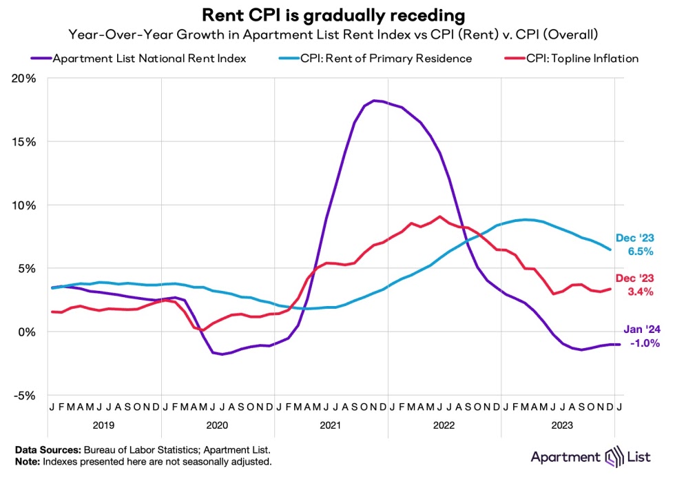
Starting with apartment rents, according to the Apartment List National Rent Report, new rental prices declined seasonally in January by -0.3%:


On a YoY basis, apartment rents are down 1%, as they have been for the last six months. As the report points out, because of this we can expect the CPI measure of “rent of primary residence” to continue to decline from its current 6.5% YoY level:


The story is more complicated with regard to single family homes, which were chronically under-built ever since the Great Recession. Needless to say, this shortage was not going to be resolved either by higher prices or higher mortgage rates. 

And that is what has shown up in both the FHFA and Case-Shiller Indexes for November which were reported this morning.

The FHFA index rose 0.3% on a monthly basis, while the Case-Shiller National index increased 0.2%. This compares with generally declining monthly prices one year ago::


On a YoY basis, the FHFA index rose further slightly to 6.6%, and the Case Shiller index also rise further slightly to 5.2%. As the below graph shows, although this seems like a major increase, it is par for the course for YoY gains in both indexes for most of the last 25 years outside of recessions. Further, because these house price indexes lead the CPI measure of Owners Equivalent Rent, it remains likely that there is going to be further deceleration in that index, although the pace of that decline may itself decelerate:


This in turn suggests that both headline and core CPI have bottomed out on a YoY basis as well.

Monday, January 29, 2024

Both production and transportation are down from 2022 peaks; why wasn’t that enough to cause a recession?


 - by New Deal democrat


While I have written about how the Index of Leading Indicators failed last year, as the loosening of and disinflation in supply chains overwhelmed the effects of Fed tightening, it wasn’t as if Fed tightening had no effect. In fact in the typical places where we would first expect to find those effects - namely, in the production and transport of goods - it did indeed show up.


To wit: total industrial production, manufacturing production, and the construction of total housing units all peaked in September or October 2022, and have not made any new highs since:


The difference between the experience since then and on earlier occasions can be seen in this longer term look at the same data:


In all other cases, construction and/or production turned down significantly, bringing about recessions, vs. 2023, when the decreases in both were very small.

And that isn’t the only typical metric that behaved in the manner we would expect in response to Fed rate hikes. Way back in the late 1800s, Charles Dow, writing about stock prices, invented the “Dow theory”, which posits very sensibly that all goods produced must be transported to market for sale. Therefore both production and transportation should turn up or down in tandem.

Indeed, heavy vehicle sales (red in the graph below) tend to turn down over 10% months before any recession begins; sooner and more decisively than light vehicle sales (blue):


Sales of heavy weight trucks have declined almost 20% since last May, a severity of decline that more often than not in the past has meant an oncoming recession.

The downturn in transportation isn’t limited to sales of trucks. The US Freight Transportation Index also has not made a new high since August 2022:


although it, like industrial and manufacturing production, has rebounded since last spring.

What has helped the economy considerably is that even though production and transportation turned down from 2022 into 2023, real sales (red in the graph below) bottomed earlier in 2022 and have increased consistently since the beginning of last spring, making new highs beginning in September:


An important reason why sales have been faring better than production or transportation is that, as I have said many times over the years, sales lead inventories.

Sales turn both up and down before inventories do. As the below graph shows, on a YoY basis sales peaked in 2021, while inventories continued to increase into 2022:


YoY sales thereafter decelerated and were even negative in the first half of 2023. Inventories have followed, although they have never turned negative. As of last month, sales were up 1.0% YoY, while inventories were up 0.4%.

What the below YoY graph of real sales, the transportation index, and industrial production shows is that transportation of goods to market turns negative as sales decelerate and inventories increase (see, e.g., 2015-16):


If sales steady with the reduction of inventory, transportation and production begin to improve as well.

That appears to be what happened in the second half of 2023. Even though Fed rate hikes had their traditional effect on goods production and transportation, the sharp deflation in producer costs and disinflation in consumer prices, including fuel, allowed sales to increase sufficiently for production to take only a minor hit.

Saturday, January 27, 2024

Weekly Indicators for January 22 - 26 at Seeking Alpha


 - by New Deal democrat


My Weekly Indicators post is up at Seeking Alpha.

Every now and then the data has a particularly noisy week, and this past week seems to have been one, as a number of - especially coincident - indicators hit an air pocket.

Perhaps more concerning is that the 4 week total of tax withholding YoY has gone negative again. But consumer spending, in both nominal and real terms, remains very robust.

In any event, clicking over and reading will bring you up to the virtual moment as to the economy, and reward me a little bit for my efforts in organizing and digesting the data.

Friday, January 26, 2024

December 2023 personal income and spending: Goldilocks is in the house UPDATED


 - by New Deal democrat


[Note: The St. Louis FRED site is down for maintenance, which means unfortunately there are no graphs available to accompany this post at present. As soon as FRED is back up and adds the data, I will update with graphs. Additionally, one metric - real manufacturing and trade sales - also cannot be calculated until FRED updates.

UPDATED: The problem is now fixed.]


Personal income and spending has become one of the two most important monthly reports I follow, because it nets out the impacts of higher interest rates and abating inflation due to the unlinking of the supply chain.

Nominally income rose 0.3% in December. Nominal spending rose 0.7%. Prices as measured by the PCE deflator increased 0.2% for the month, meaning that in real terms income rose 0.1% and spending rose a strong 0.5%. Since just before the pandemic real incomes are up 6.3%, and spending is up 10.5% (NOTE: Data in all graphs below except for YoY comparisons is normed to 100 as of just before the pandemic):


On a YoY basis, the PCE price index is up 2.6% for the second month in a row, the lowest since February 2021, and almost back to the Fed’s target of 2.0%:


Perhaps most importantly, for the last 11 months this price index is only up 1.7% - under the Fed’s 2% target. Last January this index rose 1.0%. If in next month’s report it only rises 0.3% or less, the Fed’s target will have been fully met:


For the past 50+ years, real spending on services has generally increased even during recessions. It is real spending on goods which declines. Last month real services spending rose 0.3%, and real goods spending rose a strong 1.1%:


As per form, real services spending has risen consistently since the pandemic, while goods spending have been somewhat of a mirror image of gas prices, which peaked in June 2022.

Real durable goods spending tends to turn before non-durable goods spending. The former increased a very strong 1.5% for the month, while the latter increased 0.9%:


Durable goods spending had been very much affected over the past several years by the shortage of new vehicle inventory, which has largely abated as this year has progressed.

The one significant blemish on this report is that another important metric for the near future of the economy is the personal savings rate, which declined -0.4% to 3.7%:


As I’ve noted for the past few months, this remains among the lowest rates of savings ever. Only the record lows of 2005-07, and 2022 were lower in the entire history of the series.

On the positive side, this indicates a lot of consumer confidence. But it also indicates vulnerability to an adverse shock.

The NBER pays particular attention to several other aspects of this release. Real income excluding government transfers (like the 2020 and 2021 stimulus payments) continued to increase, up 0.1% for the month, to a new record high:


Once again, this has been something of a mirror image of gas prices, rising consistently since June 2022.

Finally, the deflator in this morning’s report is used to calculated real manufacturing and trade sales, another metric relied upon by the NBER. This increased a strong 0.9%,also to a new record high:


In summary, this month’s report continued to reflect a consumer economy that is doing very well. Inflation has returned to the Fed’s preferred baseline rate, and both incomes and spending are up substantially. You would be well within your rights to call this a “Goldilocks” economy.

Core capital goods orders, three month average of manufacturers’ new orders both make new all-time highs


 - by New Deal democrat


Before I update this morning’s personal income and spending data, I wanted to briefly note some significant news in yesterday’s report on manufacturers new orders. (I’ll discuss the important leading metrics from the GDP report next week.)


New orders are one of the long-time components of the index of leading indicators. Typically (but not always!) they peak 3 to 9 months before a recession:


Because they are noisy, I usually don’t pay a lot of attention.

But yesterday was significant, because the manufacturing sector of the economy has been flat to mildly recessionary for over a year. For example (not shown), industrial production has not made a new high in 16 months, and the ISM manufacturing index has shown contraction for over a year as well.

But yesterday core capital goods orders (red in the graph below) made a new all time high. Total new orders were flat for the month, but were one of the three highest readings ever, and the three month average (not shown) also made a new all time high:


One of the big issues for this year is whether, with the resolution of supply chain disruptions in the rear view mirror, the effects of higher interest rates for the past 2 years finally bite manufacturing, construction, and general goods consumption at the same time. Yesterday’s report on new orders suggests that the impact on manufacturing may be  abating. If so, this is very good news.

Thursday, January 25, 2024

New home sales: if you lower prices, they (buyers) will come


 - by New Deal democrat


New home sales are the most leading of all the housing metrics, but suffer from being heavily revised as well as extreme volatility. 


With that caveat out of the way, in December new single family home sales (blue in the graph below)rose 49,000 on an annualized basis to 664,000, just about in the middle of their last year’s range:


Because the much less volatile new single family home permits tend to follow the trend with a slight lag, I show them as well. Today’s report suggests permits will probably level off near current levels.

The median price for a new home, meanwhile, declined to $413,200, the lowest in two years (blue, right scale). Since this isn’t seasonally adjusted, the YoY metric (red, left scale) is more important, and that declined -13.8%, the second worst point in the past year:


and the 3rd worst comparison in over 50 years:


To give a more complete picture, since mortgage rates (gold, inverted in the graph below) lead sales (blue): which in turn lead prices (red), below I show all of them YoY:


The above graph shows not only the impact of increased mortgage rates, but how homebuilders’ strategy of coping by lowering prices by the biggest percent in 50 years, has affected the market. All thins being equal, continued higher mortgage rates should have led to continued negative YoY sales. But by lowering prices aggressively (as seen on the red line), as well as mortgage adjustment programs, homebuilders have managed to turn sales higher YoY.

Should the Fed start lowering interest rates, as widely expected, sales should continue higher YoY, while pricing discounts will start to vanish.

Initial claims suggest the unemployment rate will drift back close to 50 year lows


 - by New Deal democrat


Initial claims increased 25,000 last week from their near all-time lows to 214,000. The four week moving average declined 1,500 to 202,250, only about 12,000 above its 50 year low set in 2022. Finally, with the usual one week delay, continuing claims rose 27,000 to 1.833 million:


The relative upward stickiness of continuing claims appears to be a result of laid off Silicon Valley workers having difficulty finding suitable new employment.

On the more important YoY% basis for forecasting, claims we up 10.3%, but the more important four week average was only up 0.5%. The four week average has been running very close to unchanged YoY for 1.5 months.  Continuing claims were up 10.6%:


Since initial claims lead the unemployment rate, the 4 week average suggests no further weakening for the jobs market. Here’s a look at initial claims averaged monthly (blue) compared with the unemployment rate (red):


This suggests that we won’t see higher than 3.8% unemployment in the next few months, and are more likely to drift down towards 3.5%, close to its 50 year low of 3.4%

The jobs market remains positive.

Wednesday, January 24, 2024

Attacks on Red Sea shipping, and its tie to US energy consumption


 - by New Deal democrat

The drought in economic data continues today. So let me continue on the issue of energy, tying into yesterday’s note on hybrid and electric vehicles.


Here’s an eye-opening graph from JP Morgan via Carl Quintanilla’s social media feed, showing an 80% decline in shipping through the Suez Canal following Houthi attacks on commercial vessels at the entrance of the Red Sea:


That’s a much bigger decline than can be explained by the alleged limitation of Houthi attacks on shipping tied to Israel and the US.

There is some financial media speculation that this is leading to a big increase in shipping costs, which could create another inflationary push due to supply line constriction. Well, yes and no. Here are container ship rates from Harpex for the past year:


Shipping rates *declined* in the first two months after the Israeli-Hamas conflict started, and only rose in the past month. While that increase may appear sharp, had I taken the graph back two years instead of one, it would show the index at 4500! So a move from 800 to 950 is pretty tame.

On the other hand, the attacks on shipping in the Red Sea highlight for the umpteenth time the economic and social cost of dependency on energy sources from the Middle East. Here’s another graph from Quintanilla’s social media feed, showing how much energy is consumed in the US by source:


Over the past 50 years, the US has become much more energy efficient, cutting its energy needs per unit of GDP by about 70%, in particular by coal and oil.

But as the above graph shows, this is not by shifting away from fossil fuels so much as it has been a shift towards natural gas. It also doesn’t show the trend in renewable energy sources, such as solar and wind. Here’s what the trend in those look like compared with other energy sources since the onset of the pandemic (h/t Kevin Drum):


On a percentage increase basis, solar and wind energy are both making great strides. But this is because of the small number base. 

And indeed, renewables as a share of US energy generation have now surpassed coal:


On the longer term time frame, gains in energy efficiency have been offset by population growth. Hence the growth in the total amount of energy used up until 2005:


The big decline in the use of coal only takes it back to 1960s levels. Fossil fuels in total still make up 80% of US energy usage. And the big growth in renewables still only takes them to less than 15% of total usage. 

Taking this back to the effects of turmoil in the Middle East, phasing out oil fueled power plants as well as internal combustion engines is a must. Coal should continue to be phased out as quickly as possible, and ultimately nuclear power (at least as a bridge) and renewables, together with switching to battery powered consumer appliances, should be the way forward.
.

Tuesday, January 23, 2024

A discussion: EV sales have been stalling, while hybrids are flying off dealer lots


 - by New Deal democrat


In addition to housing, the other big area where supply shock inflation has not completely resolved is vehicles. Basically almost the entirety of 2020 production was lost, leading to roughly a 10 million vehicle shortfall in the amount necessary to replace old vehicles. As the below graph shows, while new vehicles cost no more in “real” terms compared with average hourly supervisory wages, used vehicles continue to command a substantial premium:


Until both new and used vehicles normalize compared with wages, the supply crunch is not completely resolved.

While the latest data is three months old, and rates have probably come down somewhat since then (like all other interest rates), the interest rate on auto loans has gone up considerably since before the pandemic:


This is a good introduction to a discussion of why EV sales are waning somewhat, as indicated in the below graph (via Kevin Drum):


Here’s the snapshot. As of November,

“Car dealers across the country say they had a 114-day supply of new EVs … , compared to a 71-day supply of inventory for the auto industry overall. Historically, a 60 day supply across the auto industry was considered ideal.”


“New hybrids … are the quickest to sell, spending an average of 37.2 days on the lot.”

PBS had a very good discussion of why buyers have been turning more to hybrids than to EV’s. I recommend that you read it in its entirety, but here is a bullet point summary:

So far in 2023, Americans have bought a record 1 million-plus hybrids — up 76 percent from the same period last year, according to Edmunds.com….[plus] 148,000 plug-in hybrids, which drive a short distance on battery power before a gas-electric system kicks in.

Though electric vehicle sales are nearing an annual record of over 1 million this year, their year over year growth rate has begun to stall.

The reasons why hybrids have quickly become the preferred choice for many buyers vary. They range from the higher prices of comparable EVs to concern about the scarcity of charging stations to a recognition that hybrids provide many of the same advantages without the hassles of EVs. 


Here are snapshots of the issues discussed in the article:

  • Prices: “EV prices have being dropping, mainly a consequence of federal tax credits and price cuts by Tesla, the market leader. Yet they’re still pricier than hybrids or gas vehicles”
  • Range issues: customers do not want to have to stop frequently for lengthy recharging of EV batteries, and worry that charging stations may not be available on long trips where they need them.
  • Cold weather issues: “hybrid buyers appear to have done research and know that cold weather reduces the range of an EV battery. Tests conducted in Norway, … found that EVs lose between 10 percent and 36 percent of their range during winter.” The widely publicized debacle this past week in Chicago, where many EV’s were bricked because charging stations’ speed slowed to a crawl, and vehicles died while waiting in line, isn’t going to help.
  • Reliability: “ Consumer Reports found that hybrids were the industry’s most reliable type of power system. Electric vehicles were least reliable.”

Two things the article did not mention: the necessity to pay for the installation of a 240 volt line in your garage to charge an EV, if you don’t want to rely on the public stations. And the fact that most hybrids now accelerate nearly as fast as, and sometimes even faster than, their internal combustion engine counterparts.

In the long run, if there is improvement in the range of EV batteries, the speed of recharging, and if prices decline to a level competitive to gas powered models, they will be an excellent improvement, both in terms of global climate and geopolitically ending the power of petrosheikhdoms.

In the meantime, as I noted in an earlier post, recently I had no choice but to get a new vehicle. Ultimately I chose a hybrid over an EV for almost all of the reasons discussed in the article above.