Saturday, August 20, 2022

Weekly Indicators for August 15 - 19 at Seeking Alpha


 - by New Deal democrat

My Weekly Indicators post is up at Seeking Alpha.

The continued decline in gas prices has been doing some nice things to other indicators as well. Meanwhile, manufacturing as measured by the regional Feds is getting worse.

As usual, clicking over and reading will bring you fully up to date, and reward me just a little bit for my efforts.

Thursday, August 18, 2022

Prices of existing homes have probably peaked


 - by New Deal democrat

By now you may already know that existing home sales declined further in July, to an 8 year low (excluding the pandemic lockdown months:


This is roughly a 30% decline from their peak, and is certainly a recessionary level.

But perhaps more importantly at the moment, it appears that the prices of existing homes have now peaked.  Here is the one year graph from FRED:


Since there is no seasonal adjustment for prices, YoY is the only real way to measure, and YoY prices are up 10.7%.

Here is a longer term look at the YoY% change in prices (excluding this month), via Mortgage News Daily:


My rule of thumb is that when a metric that can’t be seasonally adjusted declines by more than 1/2 of its YoY peak in the past 12 months, it has probably peaked. One year ago, prices increased over 23% YoY. Since 10.7% is less than half of that, prices have probably passed their peak.

I have frequently pointed out that the sequence in the housing market is that sales peak first, and prices peak afterward. Since new home prices declined on a seasonally adjusted basis beginning last month, if existing home prices have now joined them, that means that the pattern has now been fulfilled. We should expect inventory to continue to increase from here, adding to the pressure of price declines.


New jobless claims decline for a (recent) change


 - by New Deal democrat

For the last several months, there has has been nearly a relentless slow increase in new jobless claims. That trend broke, at least for this week. 


Initial jobless claims declined by 2,000 to 250,000. More importantly, the 4 week average also declined by 2,750 to 246,750.  Continuing claims rose 7,000 to 1,437,000, the highest since April:


Claims have been on track to turn higher YoY in November, which would signal an imminent recession; but with this week’s report that trend *may* be breaking - to the good side.

Wednesday, August 17, 2022

July real retail sales show more stagnation, but slightly positive YoY


 - by New Deal democrat

Consumption leads employment. Increasing demand for goods and services leads employers to hire more people to fulfill that demand. That, in a nutshell, is the biggest reason why real retail sales is one of my favorite economic indicators.


In July, nominal retail sales increased by less than 0.1%, rounding to 0. Consumer prices declined by less than -0.1%, also rounding to 0. But the combination was just enough to push real retail sales to round to +0.1%:


Still, real retail sales remain -1.1% below their April peak:


Interestingly, while as noted above nominal total retail sales were unchanged, retail sales excluding motor vehicles increased 0.4%, and retail sales excluding both vehicles and gas increased 0.7%. Since March 2021, total nominal retail sales are up 9.6%, and ex-vehicles and gas up 9.4%, but excluding vehicles only up 13.4%:


[Note: retail ex gas and vehicles has not updated yet on FRED, so June and July of that series are not shown]

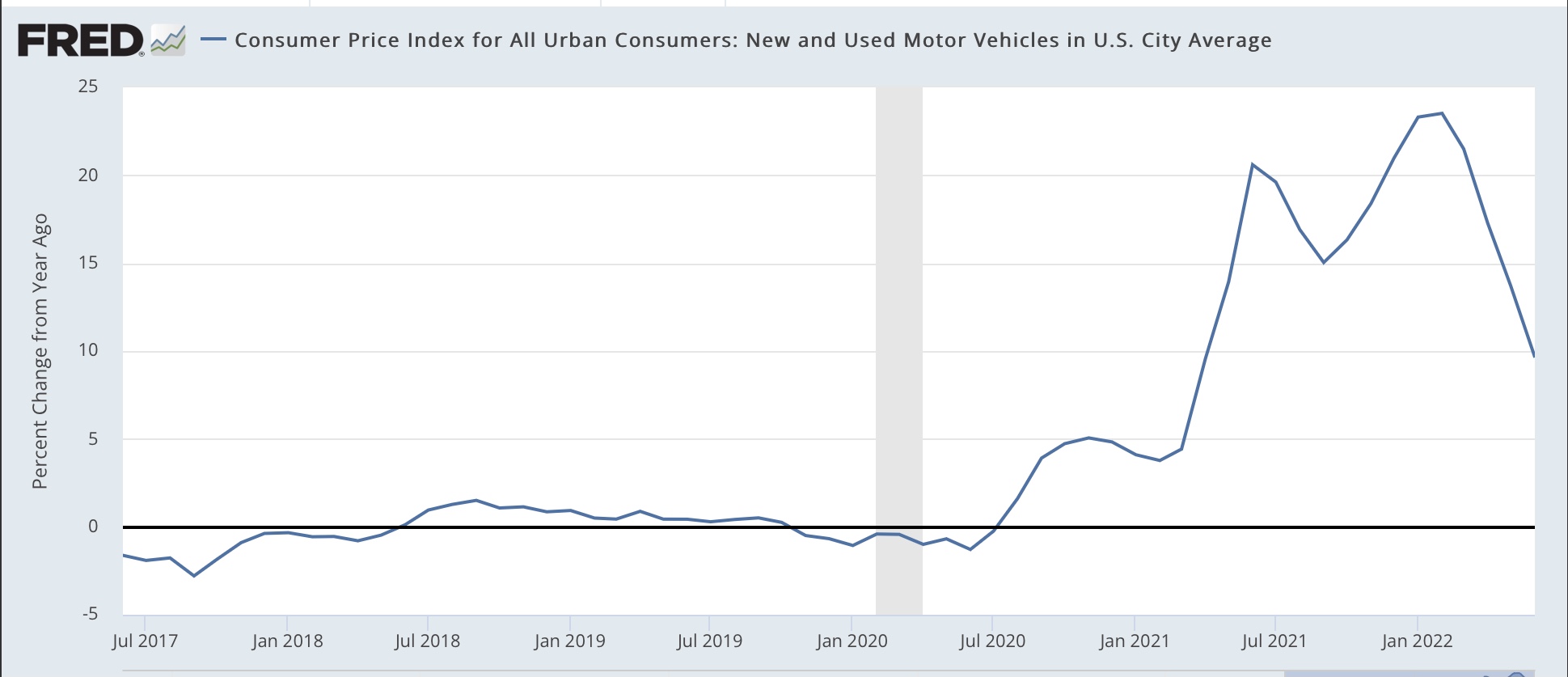
This indicates that consumers are avoiding the purchase of motor vehicles, given their big price increases as shown in this graph which I ran when CPI was updated earlier:


And it further suggests that a big reason for the dampened consumer spending this year is the big increase in car and SUV prices. In other words, the chip shortage is a Big Economic Deal.

That being said, YoY real retail sales, which were negative for the past several months, are now up 1.7%:


This is a good sign, since negative YoY real retail sales typically have been a recession marker, but positive YoY real retail sales have historically only happened either in expansions or late in recessions (i.e., a short leading indicator of an incipient recovery). In other words, yet another sign that the US economy is not currently in a recession.

Finally, as noted above, real retail sales is a good short leading indicator for employment. Here’s the long term view from 1993-2019:


And here is the last year:


Even with the blowout July employment gains, on a YoY basis job growth has continued to decelerate, and I expect it to decelerate further, perhaps sharply.


Tuesday, August 16, 2022

Industrial production heats up in July


 - by New Deal democrat

If the news in the housing sector this morning was bad, the news from the King of Coincident Indicators, industrial production, was quite good.


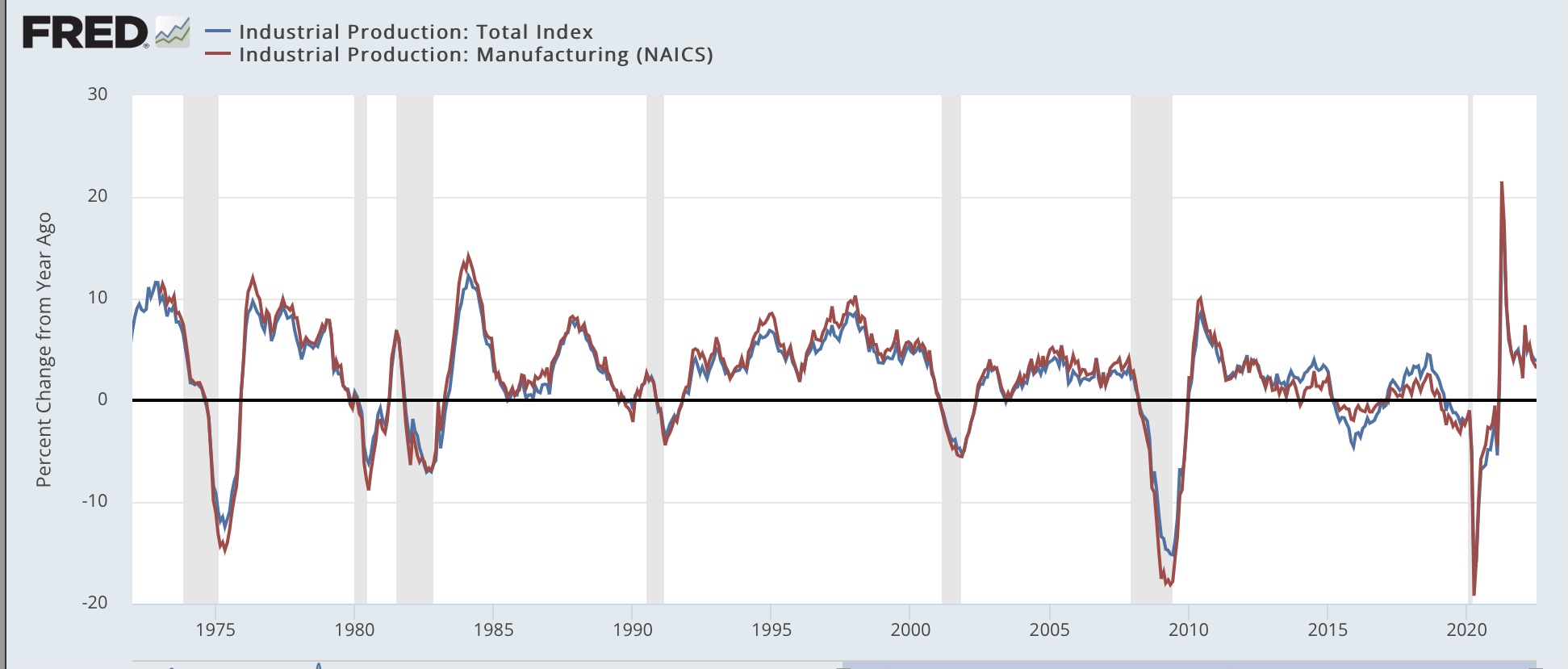
Total production rose 0.6% to a new all-time high. Manufacturing production rose 0.7%, and is below its April peak by only -0.1%:


Barring downward revisions, this, together with the latest blockbuster employment report, makes it *very* unlikely that the US was in recession as of July.

This is further shown by the YoY% changes in each. Currently total production is up 3.9%, and manufacturing production up 3.2%. Typically recessions have started from much weaker comparisons, although 1973 (oil embargo) and 2008 (housing collapse) did start from similar YoY comparisons:


With oil and gas prices having continued to decline in the past few weeks, I do not see any such sudden downdraft in the immediate present.

Housing permits, starts, and units under construction telegraph a deeper economic decline ahead


 - by New Deal democrat

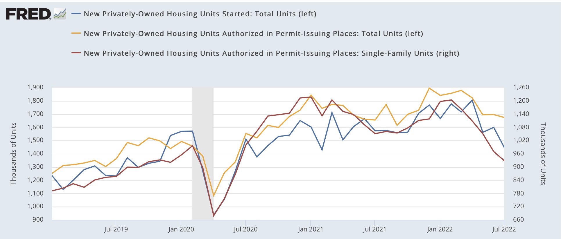
Housing had another negative month in July. Permits (gold in the graph below) declined -1.3% to 1.674 units annualized, an 8 month low. Single family permits (red, right scale) declined -4.3% to 928,000 units annualized, the lowest since January 2020 except for the pandemic lockdown months. And the three month average of starts (blue) declined to 1.536 units annualized, the lowest since the September-November 2020 period:


Total permits are still slightly higher YoY, +1.1%, but single family permits are down -11.7%:


Earlier this year, I highlighted the record number of housing units that had permits, but had not yet been started, pointing out that it distorts the economic signal, noting that “The conundrum is whether the 50 year high backlog in units not yet started will delay the downturn until it clears …. Since starts are the actual economic activity, until I see an unequivocal downturn there, the massive negative signal from permits, mortgage rates, and mortgage applications remains open to question.”

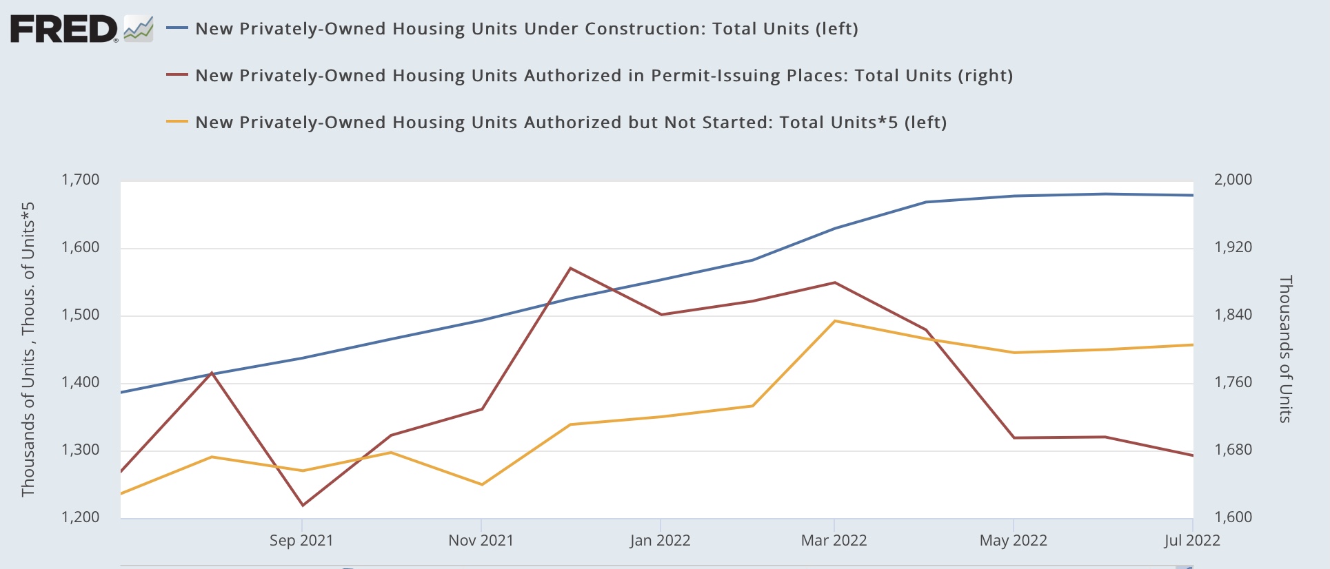
Last month permits continued to fall, and starts fell as well, verifying that signal. This month the signal became even clearer, and has also clearly spread to housing permitted but not started (gold in the graph below), and housing under construction (blue):


Here is the long term perspective going back 50 years:


At peaks, housing not yet started follows permits with only a short delay, with a longer delay until housing under construction peaks. Although we aren’t concerned about this at the present, note that at troughs, housing not yet started bottoms with a much greater delay compared with permits, almost as long as housing under construction.

Last month I wrote: “ Housing under construction is the ultimate coincident marker of housing economic activity. Once that begins going down, housing’s contribution to the economy is negative in real time. We are probably only a month or two from that point. In other words, the leading indicators will be joined by the coincident indicator.”

As shown above, housing under construction has been flat at its peak for the last 3 months. While housing’s contribution to the economy is not significantly negative yet, it is on the cusp of becoming so.

In the past declines of this magnitude have either corresponded with recessions, or else with near-recessions in 1966-67, 1984-85, and 1994-95. The more housing declines, and as I repeated yesterday, I am expecting further declines, the more certain a recession becomes and the deeper the trough of that recession.


Monday, August 15, 2022

Housing affordability: at or near the worst this Millennium


 - by New Deal democrat

The NAR calculates a monthly “housing affordability index,” which estimates the median mortgage payment for the median priced existing home based on an estimate of median household income. For June that came in at 98.5:


Not only has affordability deteriorated sharply this year, but the June reading was the lowest in over 20 years, i.e., even worse than at the peak of the housing bubble:


[note above graph stops in May].

From time to time I have looked at other measures of housing affordability, by calculating separately for down payments and monthly mortgage payments, for different housing indexes, and making use of the more timely data on average hourly wages. I last did this in April and May. Given the NAR’s new 20 year record low in June, let’s take another updated look.

The first graph below compares 4 measures of house prices: the FHFA purchase index (blue), the Case Shiller national index (red), the Census Bureau’s measure of median prices for new houses (gold), and the NAR’s measure of median prices for existing homes (for the last year only)(purple). The best way to get to the “real” inflation adjusted cost of housing would be to divide by median household income, but since that is only officially calculated once a year, a good monthly proxy is average hourly wages, which is what I use below. All 4 measures are normed to 100 as of January 2006, at or close to the peak of the housing bubble for all of them:


Although the data is compressed, all 4 exceeded their bubble peaks as of May (the last data for FHFA (up 8.9% compared with January 2006) and Case Shiller (up 1.7%)). For existing homes that continued in June (up 6.5%), while for new homes there was a slight decline (down -1.7% compared with an increase of 9.1% in May).

The Census Bureau also publishes quarterly updates on all home prices, and in Q2 of this year house prices deflated by average hourly wages were up 7.2% compared with their bubble peak:


The story remains a little different with mortgage rates. In 2006, they got as high as 6.8% in July. By contrast, the most recent weekly update pegs a 30 year fixed rate mortgage at 5.22% (the highest since 2009); at their recent peak in late June the rate was 5.81%:


Since on average “real” house prices are about 5% higher than they were at their peak in 2006, let’s compare a $250,000 mortgage then and a $262,500 mortgage now at the prevailing mortgage rates. Here’s the monthly payment for each:

April 2006: $1865.
July 2006: $1913.
June 2022: $1840
Aug 2022 $1742.

The bottom line is that the average monthly mortgage payment at its June peak was a little over 95% in real, wage-adjusted terms, of what it was at the peak of the bubble. As of last week, it was still over 90%.

When I last examined this in April, I wrote that: “I do not expect prices and mortgage rate to continue to rise together, as they did up until the peak of the bubble [because lending was completely reckless then]…. So if mortgage rates increase, I expect sales to tumble, followed in pretty quick succession by prices.”

We have seen prices of new homes decline. We haven’t seen that for existing homes yet, because while *new* inventory has been increasing to levels only a little below that of 2019 (red, right scale), *total* inventory (blue, left scale) remains well below its 2019 and 2020 levels:


But I still expect the turn to come very shortly.

Let me close by updating one of my favorite housing graphs, comparing the YoY change in mortgage rates, (inverted, *10 for scale) with the YoY% change in housing permits and starts:


The YoY change in mortgage interest rates this year was only matched by the 1994 change. In response, in 1995 housing permits were down -10% YoY, and 15% from peak to trough. But as of June of this year, permits were still slightly *higher* on a YoY basis.

In an update in May, I wrote as to a 10% decline in new housing that “The question, of course, is a 10% YoY decline from where. From the recent 1.9M high, the 1.6M low last summer, or somewhere in between? If the decline is 15%, as in 1994, that would take us back down to 1.7M permits…. I suspect it will be worse. And that would almost certainly have enough impact on the economy next year to put us close to if not in a recession, all by itself.”

And in the June and July reports for May and June, permits were indeed slightly below 1.7M both times. 

As the graph below shows, permits in the Third Quarter of last year averaged a little under 1.7M units annualized:


A 10% decline from that would be  about 1.5M units annualized.

Tomorrow July housing permits and starts will be reported. We will see then if there has been further deterioration.

Sunday, August 14, 2022

Weekly Indicators for August 8 - 12 at Seeking Alpha


 - by New Deal democrat

My Weekly Indicators post is up at Seeking Alpha.

Gas prices continue to be the dominant driver of changes in the current situation.

As usual, clicking over and reading will bring you fully up to date on the economic nowcast and forecast, and also reward me a little bit for my efforts.

Friday, August 12, 2022

The long leading outlook through mid year 2023 at Seeking Alpha


 - by New Deal democrat

I posted this last week at Seeking Alpha, and seeing as there is no big economic news today, this might be a good day to bring you up to speed.

My long leading outlook for 12 months from now can be found by clicking here.

These indicators have been sufficiently negative that I am actually looking to see when they begin to forecast a positive outlook again.

Thursday, August 11, 2022

Jobless claims: once again, a relentless uptrend


 - by New Deal democrat

I feel like a broken record at this point, as every week the trend seems more and more relentless.


Initial jobless claims rose once again, by 14,000 (seriously revised down by 12,000 from last week’s reading of 260,000) to 262,000. More importantly, the 4 week average rose another 4,500 as well to 252,000, a (revised) 8 month high.  Continuing claims also rose 8,000 to 1,428,000, the highest since April:


Claims remain on track to turn higher YoY in November, which would signal an imminent recession.

Wednesday, August 10, 2022

July consumer inflation: a tale of two disparate trends


 - by New Deal democrat

Consumer prices were unchanged in July, as two very disparate trends canceled out one another. YoY prices increased 8.5%, below June’s multi-decade record of 9.0%:


The two disparate trends are shown in the below bar graph of monthly changes since the end of last year. On the one hand, energy prices (red) declined -4.6% in July; but owner’s equivalent rent (gold) - which is 1/4 of the entire index - increased 0.6%. Motor vehicle prices (purple) were unchanged, as was total inflation (blue):


July’s decline in energy prices was the steepest since 2015-16, with the exception of the pandemic lockdown months:


But YoY energy prices are still up 32.9%:


But as indicated above, that was completely counterbalanced by housing, as shown below by the YoY% changes in the FHFA house price index (blue) vs. owner’s equivalent rent (red):


OER has continued to accelerate on a YoY basis, up 5.8% in the last 12 months, the highest since September 1990, clearly following house prices with roughly a 12 month lag. Since house prices had not meaningfully decelerated through May, the last month measured in the index, it is still likely that OER has not hit its YoY peak. We are likely to see the highest YoY% increase for OER ever before this episode is over.
 

While vehicle prices were unchanged overall, the situation was slightly different for new cars, which increased 0.6% in July, and are up 10.4% YoY, vs. used cars, which declined -0.4% for the month, and are up 6.6% YoY:


Finally, since average hourly earnings for nonsupervisory employees increased 0.4% in July, after rounding real average hourly wages increased 0.3% for the month. Real wages are nevertheless down 3.0% from December 2020:


While so far energy prices are continuing to decline in August, they will almost certainly not decline by as much as they did in July. Meanwhile OER, as indicated above, is likely to continue to increase. So I am not expecting an abrupt cooling off of consumer inflation.


Tuesday, August 9, 2022

Coronavirus dashboard for August 9: BA.5 dominant, with a slow waning; a model for endemicity


 - by New Deal democrat


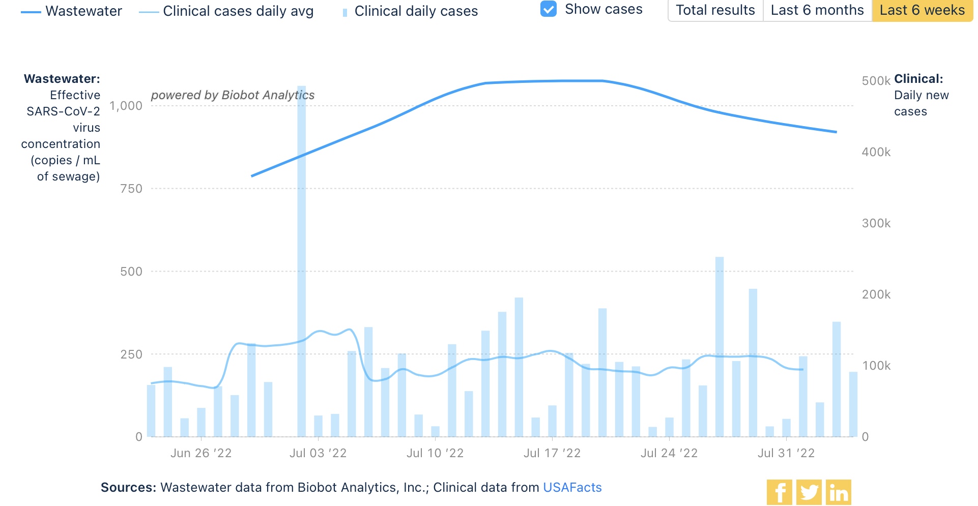
BIobot’s most recent update, through last week, shows a decline of 15% of COVID in wastewater, consistent with about 460,000 “real” new infections per day:


All 4 Census regions (not shown) are participating in the decline.

Confirmed cases (dotted line below) have declined by a roughly similar percent, to 105,500. Deaths (solid line) are close to a 4 month peak at 489:


Hospitalizations have plateaued for the past 3 weeks at about 44-47,000, and were 44,800 yesterday (the last year is shown for comparison purposes):


Meanwhile, the CDC has updated its variant information. BA.4,4.6, and 5 now account for 98% of all infections. BA.5 has slightly increased its share from 84.5% to 87%. BA.4.6 has not meaningfully increased its share:


It does not appear that BA.4 or BA.4.6 are going to make substantial inroads into BA.5’s dominance, although BA.4.6 makes up over 10% of infections in the High Plains (regional map not shown). BA.2.75 does not appear at all.

With no new variant ready to overtake BA.5, I continue to suspect in the immediate future there is further slow waning in cases, that will show up shortly in lower hospitalizations, and then lower deaths.

Finally, Trevor Bedford has a very informative thread about what endemic COVID is likely to look like, based on the rate of mutations and the period of time that previous infection makes a recovered person resistant to re-infection.

Here are a few highlights:

“Based on the experience in winter 2020/2021, seasonal influence on SARS-CoV-2 transmission is quite clear …

“we can gain some intuition from simple epidemiological models…

“In particular, we can use an SIRS system in which individuals go from Susceptible to Infected to Recovered, and then return to the Susceptible class due to immune waning / antigenic drift of the virus…

“ with flu-like ~5 year rate of waning (in blue), we get winter epidemics and summer troughs, while with faster waning we see greater levels of circulation and less variation between winter and summer (in yellow and red)…


“If what we've seen with Omicron evolution in 2022 becomes largely the norm, then this result would imply waning of ~24% in the span of ~6 months, or very roughly waning from R→S on a ~1.8 year time horizon, ie close to the yellow curve in the above SIRS model.”

He indicates he is not making a prediction, but rather to

“illustrate a scenario where we end up in a regime of year-round variant-driven circulation with more circulation in the winter than summer, but not flu-like winter seasons and summer troughs.”

Monday, August 8, 2022

Previewing July CPI: good news and bad news about gas, housing, and vehicle prices


 - by New Deal democrat

While July’s consumer inflation is likely to be less intense than in recent months, I don’t see it coming back down to more “normal” levels. The good news is gas; the bad news is vehicles and housing.


To begin with, gas prices have fallen about 25% from their peak at the end of June to this past weekend. To get to their “real” price, I divide by average hourly wages of nonsupervisory workers. Here’s what that looks like, with the peak of June 2008 set at 100:


In June of this year, gas prices divided by average hourly nonsupervisory wages were 79.8% of their peak. By the end of July, that had fallen to 73.5%. This is more typical of the 2005-07 period, and also the 2010-14 period of the “oil choke collar,” where gas prices backed off every time they hit a threshold that threatened to cause a consumer recession. It looks like that has happened again.

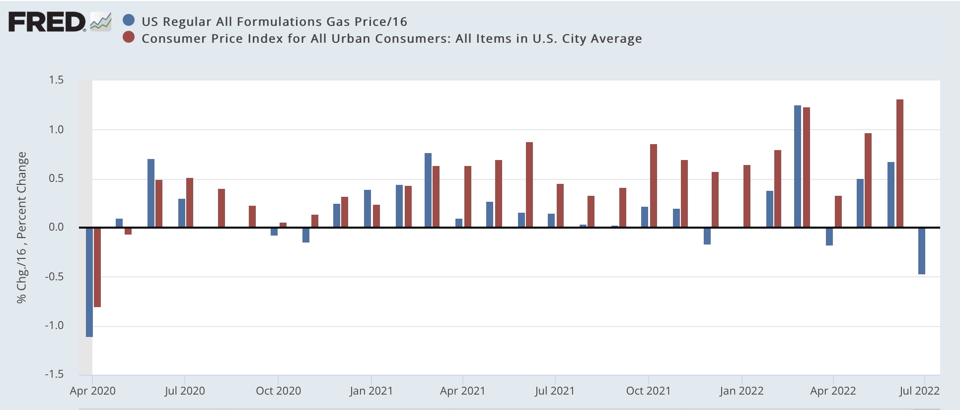
Turning to the CPI, in usual times, the price of gas is the biggest component of CPI volatility. And that is likely to be the case with this Wednesday’s report as well. My rule of thumb is to take the change in the price of gas, and divide it by about 16, and add .15% for normal background “core” inflation, to figure the most likely monthly inflation reading.  Here’s what that looked in the 10 years before the pandemic:


Now here is the past 2+ years since the onset of the pandemic:


If this were “normal” times, gas would drag July consumer prices down by roughly 0.5%. Add in the background “core” inflation, and I’d expect a reading of -0.3% or -0.4%.

But these aren’t normal times, and the biggest culprit is housing inflation. A number of times in the past year I’ve run YoY% comparisons of the FHFA and Case Shiller house price indexes vs. Owners’ Equivalent Rent, the official CPI measure. Below I’ve instead used month over month changes to show how house prices have gradually fed into owners’ equivalent rent in the past two years:


Additionally, let me re-up this graph from Bill McBride, showing that measures of apartment lease inflation have a similar issue:


Since rents are typically increased only once a year for each tenant, it takes a full year for rent increases to filter through to the total metric.

For July, owners’ equivalent rent is likely to clock it at about +0.7%, and since it is almost 1/3rd of the entire CPI index, this is going to dwarf the impact of lower gas prices.

Finally, because of microchip production issues out of China, vehicle prices have also been a significant component of inflation, as shown in the YoY graph below:


But unfortunately in the past few months there’s been no sign of further deceleration in the monthly readings:


This suggests that increases in vehicle prices are likely to persist.

So, while I expect July inflation to back off from its most recent 1%+ monthly increase, an increase in the 0.5%-0.9% ballpark seems likely.

Saturday, August 6, 2022

Weekly Indicators for August 1 - 5 at Seeking Alpha


 - by New Deal democrat

My Weekly Indicators post is up at Seeking Alpha.

Several important metrics have reversed course in the past month. Interest rates, especially mortgage rates, have declined (in the case of mortgages, by 1 full % from their peak. As many have pointed out, gas prices have fallen by about $1/gallon from their peak as well. That is putting more money into consumers’ pockets for other things. And stock prices have also reversed, nearing a 3 month high.

While that doesn’t negative the message of the long or short leading indicators in the past, it certainly can change their forecasting meaning going forward. In other words, even if we have a recession - which looks nearly certain by now - it *might* be short and shallow.

As usual, clicking over and reading will bring you fully up to date, and reward me with a penny or two for my efforts.

Friday, August 5, 2022

July jobs report: in which an absolute positive blowout make me happily wrong; all pandemic job losses now recovered


 -  by New Deal democrat

As I wrote earlier this week, the short leading indicators for both jobs (real retail sales) and the unemployment rate (initial jobless claims) have each signaled that we should expect weaker monthly employment reports, with both fewer new jobs and a higher unemployment rate. I have been noting this ever since February, when consumption growth started to flag, It already had shown up by last month, as the 3 month average in new jobs decelerated from over 500,000 to 383,000.

Secondarily, as of last month we were only 550,000 jobs shy of the pre-pandemic level. Would we finally get there?

The complete opposite happened in July, as job gains surged and the unemployment rate declined further. Together with the upward revisions to the last two months, as of now there are 22,000 MORE jobs than there were just before the pandemic. Further, the skew of those jobs is away from lower paying sectors towards higher paying ones. Here’s my in depth synopsis:

HEADLINES:
  • 528,000 jobs added. Private sector jobs increased 471,000. Government jobs increase by 57,000. 
  • The alternate, and more volatile measure in the household report indicated a  gain of 179,000 jobs. The above household number factors into the unemployment and underemployment rates below.
  • U3 unemployment rate declined 0.1% to 3.5%, equal to the January 2020 low.
  • U6 underemployment rate was unchanged at 6.7%, tied for its all-time low.
  • Those not in the labor force at all, but who want a job now, rose 254,000 to 5.910 million, compared with 4.996 million in February 2020.
  • Those on temporary layoff declined -36,000 to 791,000.
  • Permanent job losers declined -107,000 to 1,166,000.
  • May was revised upward by 2,000, and June was also revised upward by 26,000, for a net increase of 28,000 jobs compared with previous reports.
Leading employment indicators of a slowdown or recession

These are leading sectors for the economy overall, and will help us gauge whether the strong rebound from the pandemic will continue.  These were completely positive:
  • the average manufacturing workweek, one of the 10 components of the Index of Leading Indicators, rose 0.1 hour to 41.1 hours.
  • Manufacturing jobs increased 30,000, and is at a level higher than it was before the pandemic.
  • Construction jobs increased 32,000. All of the jobs lost during the pandemic  have also been made up in this sector. 
  • Residential construction jobs, which are even more leading, rose by 2,900.
  • Temporary jobs rose by 9,800. Since the beginning of the pandemic, over 250,000 such jobs have been gained.
  • the number of people unemployed for 5 weeks or less declined by -182,000 to 2,080,000, which is also below its pre-pandemic level.

Wages of non-managerial workers
  • Average Hourly Earnings for Production and Nonsupervisory Personnel: rose $0.11 to $27.75, which is a 6.2% YoY gain, a further decline of -0.2% from last month and its 6.7% peak at the beginning of this year.

Aggregate hours and wages:
  • the index of aggregate hours worked for non-managerial workers rose by 0.3%, which is above its level just before the pandemic.
  •  the index of aggregate payrolls for non-managerial workers rose by 0.8%, which is below the average inflation gain of 0.9% in the past 3 months.

Other significant data:
  • Leisure and hospitality jobs, which were the most hard-hit during the pandemic, rose 96000, but are still -7.1% below their pre-pandemic peak.
  • Within the leisure and hospitality sector, food and drink establishments added 74,100 jobs, but are still about 635,000, or -5.1% below their pre-pandemic peak.
  • Professional and business employment increased by 89,000, which is about 1,000,000 above its pre-pandemic peak.
  • Full time jobs declined -71,000 in the household report.
  • Part time jobs increased 384,000 in the household report.
  • The number of job holders who were part time for economic reasons increased 308,000 to 3,924,000, above last month’s 20 year low.
  • The Labor Force Participation Rate declined another -0.1% to 62.1%, vs. 63.4% in February 2020.

SUMMARY

This report was an unexpected blowout, plain and simple. All of the pandemic job losses have been made up. We are near or at all-time lows in both the unemployment and underemployment rates. *All* of the leading indicators in the report were positive, meaning we should not expect the jobs sector to roll over anytime in the immediate future. Temporary layoffs declined. The only area still lagging is in the lower-paying leisure and hospitality sector, while there are almost 1,000,000 *more* higher paying jobs in the professional and business sector.

There were a few warts. Average hourly earnings once again did not keep up with inflation, a significant negative. The decline in unemployment was helped by a *lower* labor force participation rate. The number of full time jobs actually declined.

The strength of the jobs market has been the best reason why the US is not currently in a recession. This report added to that argument.

On the other hand, I want to caution that some of the great news in this report may be due to comparisons with the distortions of the last two summers, particularly with regard to temporary and education jobs. In other words, we might give this back come September. Leading indicators are still leading, and unless consumers use their new gas savings to spend on other stuff, I still expect job gains to flag in coming months. But for this month, I was very happily wrong.

Thursday, August 4, 2022

Jobless claims continue their relentless climb


 - by New Deal democrat

Initial jobless claims rose 6,000 to 260,000 last week. More importantly, the 4 week average, which has been rising relentlessly, rose another 6,000 as well to 254,750, an 8 month high.  Continuing claims also rose 48,000 to 1,417,000, the highest since April:


Initial claims have usually risen by 15% or more over its low, and turned higher YoY before a recession has begun.  There is a clear uptrend in all the numbers, with the 4 week average of initial claims over 50% higher than its low. Claims remain on track to turn higher YoY in November, which would signal an imminent recession.

To reiterate what I’ve said several times in the past two weeks, I anticipate (more likely than not) a slight upturn in the unemployment rate in tomorrow’s jobs report.

Wednesday, August 3, 2022

Coronavirus dashboard for August 3: is this what endemicity looks like?


 - by New Deal democrat

Confirmed cases nationwide (dotted line below) declined to 121,700, still within their recent 120-130,000 range. Deaths (solid line) are also steady at 431, within their recent 400-450 range as well:


Hospitalizations have plateaued in the past 10 days reported in the 45-47,000 range, and as of July 30 were 46,100. A commenter at Seeking Alpha who works in a hospital wrote to me that the big increase in the past several months has been people showing up with unrelated issues testing positive for COVID, I.e., “patients with COVID:”


Biobot has not updated since one week ago, showing as of then a 10% drop in COVID virus in wastewater, consistent with a “real” case count of about 360,000.

The CDC updated its variant tracker yesterday, showing BA.4&5 making up 97% of all cases. They also included a new subvariant, BA.4.6, in their analysis, indicating it constituted 4% of all cases, or 1/3rd of the BA.4 total:


It is primarily a factor in the northern Great Plains, where it makes up 9% of all cases.


But it has not been particularly growing in the past month, nor does it seem to be replacing BA.5. Similarly, while a few cases of BA.2.75 are showing up in most States, they are not showing up in the CDC data at all. I have not seen any medical commentary on either subvariant in the past week. 

Regionally there has been a small decline of confirmed cases in the West, while the other three regions are steady:


In fact, the only noteworthy changes in any State are that NY and NJ both show small declines:


Unless a new variant shows up imminently, I suspect we are entering a period of decline in cases and deaths.