- by New Deal democrat
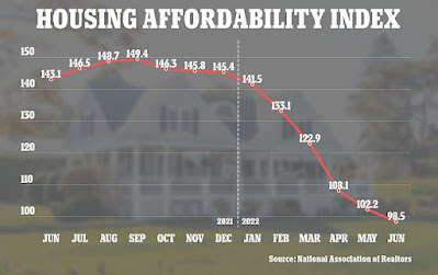
The NAR calculates a monthly “housing affordability index,” which estimates the median mortgage payment for the median priced existing home based on an estimate of median household income. For June that came in at 98.5:
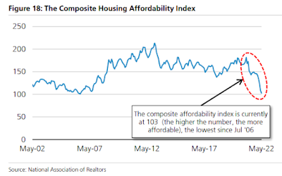
Not only has affordability deteriorated sharply this year, but the June reading was the lowest in over 20 years, i.e., even worse than at the peak of the housing bubble:
[note above graph stops in May].
From time to time I have looked at other measures of housing affordability, by calculating separately for down payments and monthly mortgage payments, for different housing indexes, and making use of the more timely data on average hourly wages. I last did this in April and May. Given the NAR’s new 20 year record low in June, let’s take another updated look.
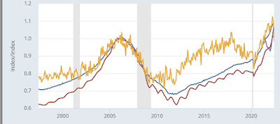
The first graph below compares 4 measures of house prices: the FHFA purchase index (blue), the Case Shiller national index (red), the Census Bureau’s measure of median prices for new houses (gold), and the NAR’s measure of median prices for existing homes (for the last year only)(purple). The best way to get to the “real” inflation adjusted cost of housing would be to divide by median household income, but since that is only officially calculated once a year, a good monthly proxy is average hourly wages, which is what I use below. All 4 measures are normed to 100 as of January 2006, at or close to the peak of the housing bubble for all of them:
Although the data is compressed, all 4 exceeded their bubble peaks as of May (the last data for FHFA (up 8.9% compared with January 2006) and Case Shiller (up 1.7%)). For existing homes that continued in June (up 6.5%), while for new homes there was a slight decline (down -1.7% compared with an increase of 9.1% in May).
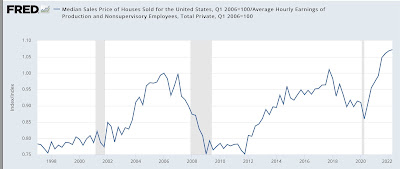
The Census Bureau also publishes quarterly updates on all home prices, and in Q2 of this year house prices deflated by average hourly wages were up 7.2% compared with their bubble peak:
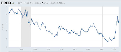
The story remains a little different with mortgage rates. In 2006, they got as high as 6.8% in July. By contrast, the most recent weekly update pegs a 30 year fixed rate mortgage at 5.22% (the highest since 2009); at their recent peak in late June the rate was 5.81%:
Since on average “real” house prices are about 5% higher than they were at their peak in 2006, let’s compare a $250,000 mortgage then and a $262,500 mortgage now at the prevailing mortgage rates. Here’s the monthly payment for each:
April 2006: $1865.
July 2006: $1913.
June 2022: $1840
Aug 2022 $1742.
The bottom line is that the average monthly mortgage payment at its June peak was a little over 95% in real, wage-adjusted terms, of what it was at the peak of the bubble. As of last week, it was still over 90%.
When I last examined this in April, I wrote that: “I do not expect prices and mortgage rate to continue to rise together, as they did up until the peak of the bubble [because lending was completely reckless then]…. So if mortgage rates increase, I expect sales to tumble, followed in pretty quick succession by prices.”
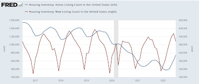
We have seen prices of new homes decline. We haven’t seen that for existing homes yet, because while *new* inventory has been increasing to levels only a little below that of 2019 (red, right scale), *total* inventory (blue, left scale) remains well below its 2019 and 2020 levels:
But I still expect the turn to come very shortly.
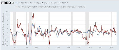
Let me close by updating one of my favorite housing graphs, comparing the YoY change in mortgage rates, (inverted, *10 for scale) with the YoY% change in housing permits and starts:
The YoY change in mortgage interest rates this year was only matched by the 1994 change. In response, in 1995 housing permits were down -10% YoY, and 15% from peak to trough. But as of June of this year, permits were still slightly *higher* on a YoY basis.
In an update in May, I wrote as to a 10% decline in new housing that “The question, of course, is a 10% YoY decline from where. From the recent 1.9M high, the 1.6M low last summer, or somewhere in between? If the decline is 15%, as in 1994, that would take us back down to 1.7M permits…. I suspect it will be worse. And that would almost certainly have enough impact on the economy next year to put us close to if not in a recession, all by itself.”
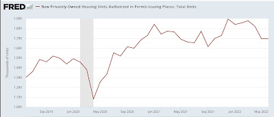
And in the June and July reports for May and June, permits were indeed slightly below 1.7M both times.
As the graph below shows, permits in the Third Quarter of last year averaged a little under 1.7M units annualized:
A 10% decline from that would be about 1.5M units annualized.
Tomorrow July housing permits and starts will be reported. We will see then if there has been further deterioration.
