Saturday, February 5, 2022

Weekly Indicators for January 31 - February 4 at Seeking Alpha


 - by New Deal democrat

My Weekly Indicators post is up at Seeking Alpha.

There is an old market saying that “the cure for high prices is, high prices.” Well, commodity prices, and in particular industrial commodities and oil, are at new multi-year highs. The latter is going to feed right through into higher gas prices that will be very much noticed by consumers.

And if there is one thing the Fed knows how to do, it is how to bring down (with lots of attendant discomfort) high consumer prices.

For the details on where we are in all of the relevant timeframes, click on through. Which will also reward me a little bit for bringing you all the detailed information.

Friday, February 4, 2022

January jobs report: huge gain in wages, huge upward revisions to past few months, limited Omicron impact


 - by New Deal democrat

Here are the three issues I was looking to see addressed in this jobs report: 
1. Would last month’s “poor” 199,000 number of new jobs be revised higher? 
2. Is wage growth holding up? Is it accelerating?
3. In December, big decreases in the number of initial jobless claims were not reflected in a better jobs number. Would the big increase in initial jobless claims in the past month due to Omicron similarly not be reflected? Or would they show up as an actual decline in hiring, as indicated in ADP’s -301,000 decline reported earlier this week?

The answers were:
1. The 6 month average of monthly gains which declined significantly in December from about 600,000 to 500,000, increased to 547,000, . We still have 2.9 million jobs to go to equal the number of employees in February 2020 just before the pandemic hit. At the current average rate for the past 6 months, that’s about 5 more months.
2. Wage growth exploded even higher than before, now up 6.9% YoY! Aside from April 2020, this is the highest wage growth in *40 years.*
3. There were *huge* upward revisions (included as part of the annual revisions) to the last 2 months. November increased 398,000 to 647,000, and December increased 311,000 to 510,000. So much for those poor numbers!

Here’s my in depth synopsis of the report:

HEADLINES:
  • 467,000 jobs added. Private sector jobs increased 444,000. Government jobs increased by 23,000 jobs. The alternate, and more volatile measure in the household report indicated a gain of 1,199,000 jobs(!), which factors into the unemployment and underemployment rates below.
  • The total number of employed is still 2,875,000, or -1.9% below its pre-pandemic peak. 
  • U3 unemployment rate rose 0.1% to 4.0%, compared with the January 2020 low of 3.5%.
  • U6 underemployment rate fell -0.2% to 7.1%, compared with the January 2020 low of 6.9%.
  • Those not in the labor force at all, but who want a job now, declined -9,000 to 5.704 million, compared with 5.010 million in February 2020.
  • Those on temporary layoff increased 147,000 to 959,000.
  • Permanent job losers declined -73,000 to 1,630,000.
  • November was revised upward by 398,000, and December was also revised upward by 311,000, for a net gain of 709,000 jobs compared with previous reports.
Leading employment indicators of a slowdown or recession

These are leading sectors for the economy overall, and will help us gauge how strong the rebound from the pandemic will be.  These were mixed:
  • the average manufacturing workweek, one of the 10 components of the Index of Leading Indicators, declined -0.1 hour to 40.2 hours.
  • Manufacturing jobs increased 13,000. Since the beginning of the pandemic, manufacturing has still lost -240,000 jobs, or -1.9% of the total.
  • Construction jobs decreased -5,000. Since the beginning of the pandemic, -125,000 construction jobs have been lost, or -1.6% of the total.
  • Residential construction jobs, which are even more leading, rose by 3,600. Since the beginning of the pandemic, 43,500 jobs have been *gained* in this sector, or +5.2%.
  • temporary jobs rose by 26,300. Since the beginning of the pandemic, 156,400 jobs have been gained.
  • the number of people unemployed for 5 weeks or less increased by 440,000 to 2,888,000, which is 949,000 higher than just before the pandemic hit.
  • Professional and business employment increased by 86,000, which is 511,000 *above* its pre-pandemic peak.

Wages of non-managerial workers
  • Average Hourly Earnings for Production and Nonsupervisory Personnel: rose $0.17to $27.91, which is a 6.9% YoY gain. This continues to be excellent news, especially considering that a huge number of low-wage workers have finally been recalled to work.

Aggregate hours and wages:
  • the index of aggregate hours worked for non-managerial workers fell by -0.3%, which is a  loss of -1.9% since just before the pandemic.
  •  the index of aggregate payrolls for non-managerial workers rose by 0.3%, which is a gain of 9.9% (before inflation) since just before the pandemic.

Other significant data:
  • Leisure and hospitality jobs, which were the most hard-hit during the pandemic, gained 151,000 jobs, but are still 1,750,000, or -10.3% below their pre-pandemic peak.
  • Within the leisure and hospitality sector, food and drink establishments increased 108,000 jobs, and is still -984,700, or -8.0% below their pre-pandemic peak.
  • Full time jobs increased 973,000 in the household report.
  • Part time jobs increased 136,000 in the household report.
  • The number of job holders who were part time for economic reasons decreased by -212,000 to 3,717,000, which is a decrease of -673,000 since before the pandemic began.
  • Health care employment rose by 18,000, a YoY gain of  174,900, or 1.1%, despite being the most critical sector during the pandemic.
  • State and local education jobs, another hard hit sector by the pandemic, increased 28,500.

SUMMARY

With the exception of some short term negative numbers caused by Omicron layoffs, and a further decline in average manufacturing hours, which is getting to the level of concern, this was an excellent report, buoyed in part by annual benchmark revisions. 

Monthly gains continue at a clip in excess of 500,000. At the current rate, we will have regained all jobs lost due to the pandemic by the 4th of July. The slight increase in the unemployment rate was because so many people entered the labor force. There was also some welcome news on education jobs. Only the leisure and hospitality sector remains really hard hit by the pandemic.

Perhaps the biggest news of all was the even bigger increase in average hourly wages by non-supervisory workers. A month ago I described the JOLTS report as being analogous to a reverse game of musical chairs, with jobs being the chairs and potential employees those wanting to sit in them. With a chronic shortage of people being willing to sit in the chairs on offer due to the pandemic, jobs are going unfilled, while virtually nobody is getting laid off. As a result, wages haven’t just increased, but they *continue* to increase and that rate of increase is even accelerating. Workers haven’t had it this good in decades.

So, a few clouds on the horizon (manufacturing), but another excellent jobs report.

Thursday, February 3, 2022

Jobless claims: Omicron still rules the roost, but effects abating


 - by New Deal democrat

It is clear that Omicron has continued to result in increased layoffs, but the effect is probably abating.

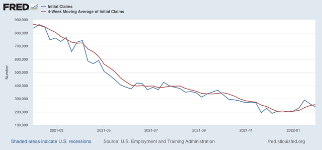
New claims declined 23,000 last week to 238,000 - still well above its pandemic low of 188,000 set early in December, but also a big retreat from 290,000 two weeks ago. The 4 week average of new claims increased 7,750 to 255,000:


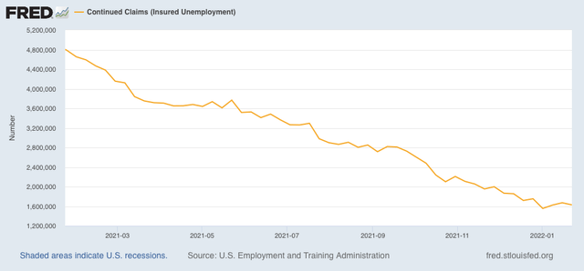
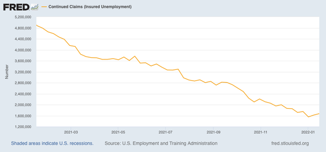
Continuing claims for jobless benefits declined by 44,000 from 1,672,000 to 1,628,000, an increase of 73,000 from its 50 year low of 1,555,000 three weeks ago:


As I have written for several weeks, the effects of Omicron are going to continue for at least a few more weeks. At this point it’s pretty clear that Omicron has had a significant impact, and may even result in a negative jobs number for January in tomorrow’s nonfarm payrolls report. 


But with cases nationwide down by over 50% from peak as of today, I still suspect Omicron will be mainly behind us by the end of February. So I still do not see a big reason to overreact to the recent increase in claims. After all, in comparison with the past few decades or even past 5 years, 238,000 is a darn good number.

Wednesday, February 2, 2022

December JOLTS report: with Omicron raging, the pool of potential employees refuses to fill, meaning more record wage gains


 - by New Deal democrat

The Census Bureau has started to release the JOLTS report earlier in the month. So we got December’s report yesterday as opposed to in a week or two.  

Last month I introduced the idea of a game of musical chairs, where employers added or took away chairs, and employees tried to best allocate themselves among the chairs. Because of the pandemic, there are several million fewer players trying to sit in those chairs. As a result, wages have continued to increase sharply, as employers attempt to attract potential employees to sit in the empty chairs.

This pattern continued in December.

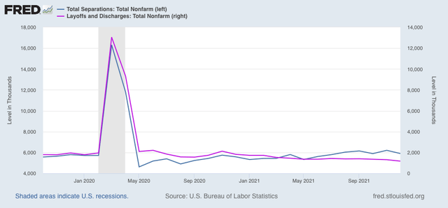
Layoffs and discharges (violet, right scale in the graph below) decreased 140,000 to 1.169 million, yet another new record low. Total separations (blue) declined 305,000 to 5.900 million:


Essentially, nobody is getting laid off.

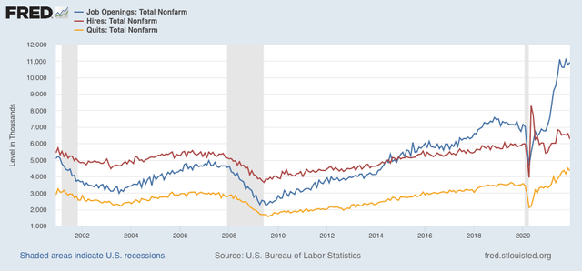
Meanwhile, job openings (blue in the graph below) increased 150,000 to 10.925 million, a little below the July peak of 11.098 million. Openings have been basically steady for the past 6 months at record high levels. Voluntary quits (the “great resignation,” gold, right scale) declined -161,000 from November’s record high, to 4.338 million. Actual hires (red) declined -333,000 to 6.263 million, significantly below the June high of 6.827 million:


Hires and quits are in line with the relatively modest employment gains in the past few months compared with earlier in the year.

In summary, we continue to have near-record high job openings and quits, record low layoffs, with still-strong total separations, and slightly fading hires. Once again, little progress is being made towards establishing a new equilibrium.

As a result, wages continue to soar. Let me debut a new graph which I think shows the dynamic better than I have before. 

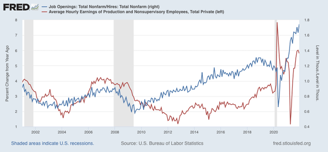
Below I show job openings divided by actual hires (blue, right scale). This gives me the rate at which openings are above or below hires, where 1.0 represents the level at which the number of openings and hires are equal. As you can see, this rate increases as expansions go on, and in the last 18 months has repeatedly made new all-time highs.

YoY wage gains for non-managerial workers (red, left scale) are a “long lagging” indicator, typically turning up well after an expansion is underway, and typically when the U-6 underemployment rate falls below about 9.0% (we’re at 7.3% now, the lowest except for the late 1990s tech boom and during 2019):

The result is that, as the rate of job openings for each hire has completely blown through prior highs almost every month in the past year, wage growth has responded by similarly spiking to the upside, to nearly 6% YoY. 

 So long as the shortfall in available workers to fill openings persists, potential employers will have to continually offer more compensation to attract applicants.In other words, wages will continue to rise until the potential employer can no longer make any profit off the potential employee for that job.

For the past several months, I have speculated that, in order for the situation to resolve, the first thing I want or expect to see is a further increase in monthly hiring. At the same time, or shortly thereafter, I would expect to see a significant decline in voluntary quits.

But this increase in hiring is only going to occur if potential employees feel safe returning to work. And that hasn’t happened with Omicron raging; and it won’t happen until more people feel the pandemic is abating. Until then, no dice.

Tuesday, February 1, 2022

Manufacturing continues strong in January; construction continued to sag in December


 - by New Deal democrat

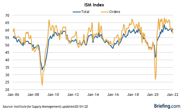
As usual, the first data for last month starts out with the ISM manufacturing report. This index, especially its new orders subindex, is an important short leading indicator for the production sector. 

In January the index declined from 58.8 to 57.6, as did the more leading new orders subindex, which declined from 61.0 to 57.9 (note the breakeven point between expansion and contraction is 50):


Both the total index and the new orders subindex ran extremely hot throughout 2021, typically with readings over 60. In the past several months these have cooled a little bit, but are still very positive. This continues to forecast a strong production side of the economy through mid year 2022, if not so ‘red hot’ as before.

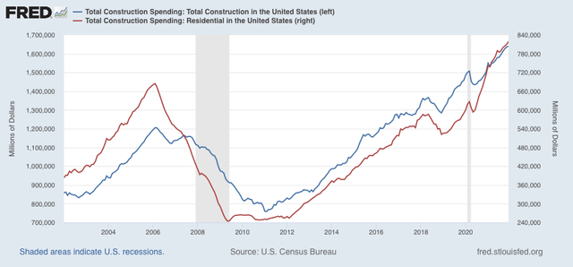
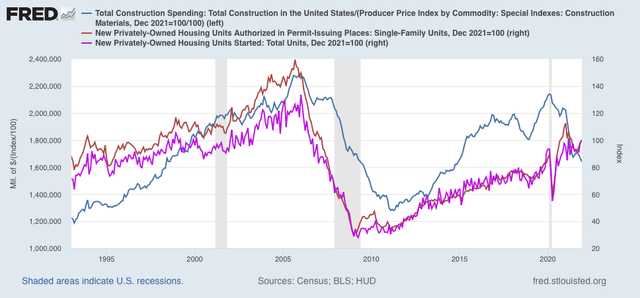
The second release that typically begins the month, construction spending for two months ago (December), rose 0.2% in nominal terms for overall spending including all types of construction, while spending on the leading residential sector rose 1.1%. Nominally, both made new all-time highs:


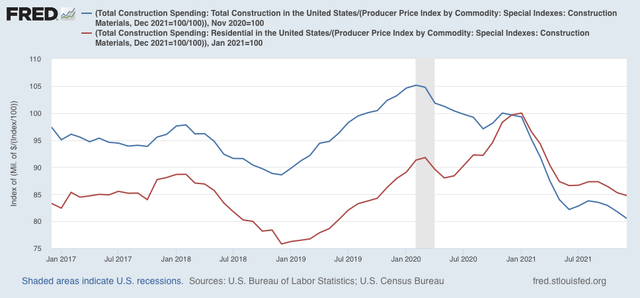
Adjusting for price changes in construction materials, which jumped another 1.7%, “real” construction spending declined -1.5% m/m, and “real” residential construction spending declined -0.6%. In absolute terms, “real” construction spending has declined sharply - by -20.5% - since its peak in November 2020,  while “real” residential construction spending has declined -15.7% since its post-recession peak in January of this year:


While total construction spending declined by more than it had before the Great Recession, the decline in residential construction spending, while increasingly substantial, remains nowhere near the big decline it suffered before the end of 2007, in this series that only dates from 1993. Comparing it with single family permits (gold), and housing starts (violet) below:


confirms that residential construction spending is not yet a recession level decline. This is important, since as my long term forecast yesterday indicated, housing is an important such indicator, and as of now is one of the negative inputs.

Monday, January 31, 2022

My long leading forecast through the end of 2022


 - by New Deal democrat

My long leading forecast that goes 12 months out is now up at Seeking Alpha.

I am as nerdy as can be, and follow the same indicators over and over, no matter what their message. And their message has been changing over the past 6 months. To find out what that means for the latter half of this year, click on over and read the article.

As usual, this will equip you to see ahead for a year to come; and it will reward me a little bit for getting you that information so early.

Sunday, January 30, 2022

On the retirement of Justice Breyer: is this any way to run a country?


- by New Deal democrat


Long long ago I remember reading that Justices William Brennan and Thurgood Marshall, both about 70 years old at the time, decided not to retire during the Presidency of Jimmy Carter, because he was not liberal enough, preferring to wait for the next, more left-wing Democratic President. Heh!  

Liberals got lucky when, upon Brennan’s retirement in 1990, David Souter was named to replace him. They weren’t lucky when Marshall retired due to badly declining health in 1991 and was replaced by Clarence Thomas. Marshall died only 4 days after Bill Clinton became President; and Thomas, the first GOP Justice selected explicitly for his young age at the time (he was only 43 years old when confirmed to the Supreme Court) still sits upon the Court over 30 years later.

Of course, that same scenario played out less than two years ago when Justice Ruth Bader Ginsburg, having refused to retire during Obama’s Presidency (allegedly even after a direct appeal from Obama in 2013 when he correctly feared losing the Senate in 2014), died and was immediately replaced by the 48 year old Justice Amy Barrett.

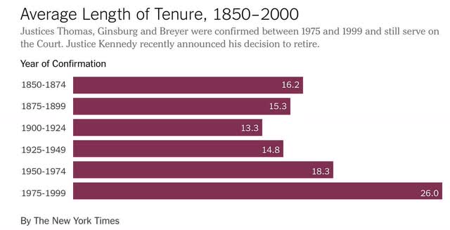
A few years ago I calculated  that, during the 19th Century, the median tenure for a Supreme Court Justice was 14 years. With immense gains in longevity during the late 20th Century, and the explicit practice of selecting young candidates in their 40s in order to maximize their partisan impact with lifetime appointments, since 1950 that median had increased to 20 years; and I calculated that by 2018, it would be 30 years.

The New York Times, writing two years after me, discussed the same phenomenon and included the following helpful graph:


Further, as I wrote several months ago, the anti-Federalist Brutus correctly predicted that Supreme Court Justices, once they realized that their power was almost completely unchecked under the Constitution, would enact their partisan preferences into Supreme Law. As we watch a radically reactionary majority on the Court systematically dismantle the 20th Century, there are deeper questions to be asked than just focusing on the current personnel. 

Namely, since the US Constitution enshrines judicial supremacy: is this any way to run a country? Why should the whims and egos of 9 individuals, deciding whether and when they want to retire, or whether they intend to serve until they drop dead, absolutely determine the rights and obligations of over 300 million people; and the fundamental structure of the government that shapes those rights and obligations?

Simply, had Brennan and Marshall retired during Jimmy Carter’s Presidency, or had Ginsburg resigned during Obama’s, the fundamental supreme law of the United States would be drastically different than it is now (and even more so than it is likely to be in a couple of years). Why on earth should that be the case? Why should the idiosyncrasies of a few philosopher kings and queens absolutely govern our lives?

Over the years my position on the Supreme Court has become more radicalized. It has changed from the need to convince elderly Justices like Breyer to retire, to the more fundamental position that we should not have to engage - sometime futilely, viz., Ginsburg - in this persuasion. 

Even if the size of the Court were expanded now, that would only cause the GOP to expand it further when they returned to power, leading to a further expansion by Democrats later, etc. For the good of the Republic, the very structure of the Court must be reformed.

First and foremost, that means term limits. With 9 Justices, one Justice’s position should expire every 2 years (essentially, an 18 year term). After serving on the Court, to fulfill a lifetime appointment, they should continue to serve as “Justices emeritus” on one of the regional Courts of Appeal.

Beyond that, there is the problem that the Court is not “overtly” a political branch. They are a bunch of lawyers who are not required to have any political sense. In other words, they can be utterly tin-eared. In 1857, believing that they were settling the slavery issue permanently, Chief Justice Roger Taney and a majority of the Court essentially ruled that slavery must be permitted everywhere. It was a decisive turning point igniting the fuse that led to the Civil War, and 700,000 deaths, less than 4 years later. When the Court overturns abortion rights a few months from now, I suspect the reaction by the clear majority of Americans who vehemently disagree will be on par with the reaction of the North to Dred Scott. Say what you will about politicians, they are sufficiently calculating that they collectively have a sense of how far they can go without provoking a violent counter-reaction. No such political sense restrains the Philosopher Kings and Queens on the Supreme Court.

When such tin-eared opinions are issued, there needs to be a mechanism to temper them without the need to have 2/3’s of both Houses of Congress and 3/4’s of all States approve first. For example, Canada’s Constitution has a “Notwithstanding” clause that permits provinces to overrule their Supreme Court. Allowing the Congress and the Presidency to stay a majority opinion of less than 2/3’s of the Court at least long enough for the next Congressional and Senate elections to determine whether or not to accept the ruling - or at least some similar check on the Court - is needed.

Saturday, January 29, 2022

Weekly Indicators for January 24 - 28 at Seeking Alpha


 - by New Deal democrat

My Weekly Indicators post is up at Seeking Alpha.

While most of the chatter this past week was about inflation and the Fed raising interest rates, commodities got hot again, with oil making another 7 year high.

This is both good and bad. It’s good because it shows that the global economy is really running hot. And it’s bad because, well, the global economy is really running hot - and the steps taken to cool it off are not going to be good for ordinary workers.

As usual, clicking over and reading will bring you up to the virtual moment on the state of the economy, and will reward me just a little bit for the effort I put in.

Friday, January 28, 2022

Real personal income and spending both decline in December; no imminent worry but evidence of softening


 - by New Deal democrat

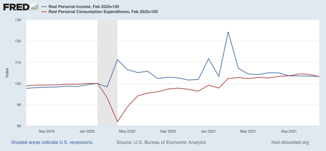
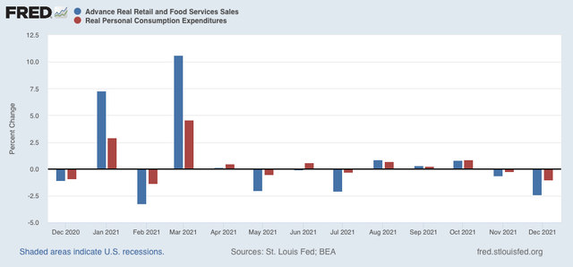
Nominal personal income rose 0.3% in December, while spending declined -0.6%. In real terms after inflation, personal income declined -0.1%, and personal consumption expenditures declined -1.0%. Nevertheless both remain well above their pre-pandemic levels: 


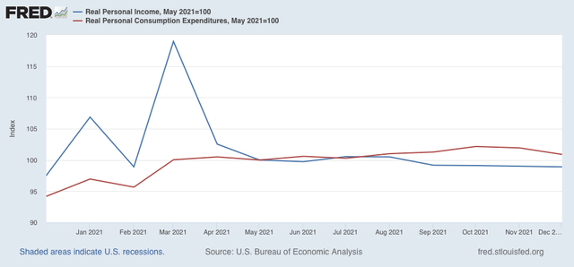
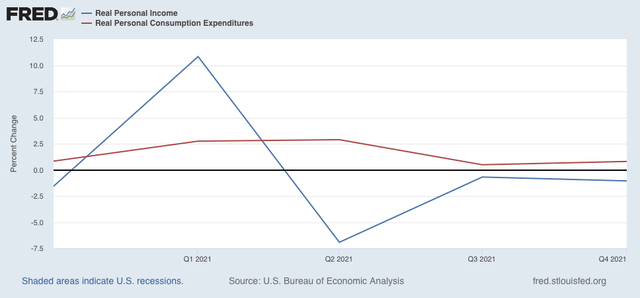
Here is what the same information looks like using May 2021 as a baseline, after all the stimulus money had been expended:


Since then spending is up 0.9%, while income has declined -1.1%.

Comparing real personal consumption expenditures with real retail sales for December (essentially, both sides of the consumption coin) reveals both faltered for the second month in a row:


Because so many people front-loaded their Christmas spending into October, the subsequent decline is not too concerning. On the other hand, the quarterly graph below shows that real personal income declined in each of the last three quarters of 2021. I think this decline (along with COVID) explains most of the decline in the approval for Joe Biden and Congressional Democrats in general:


I have been expecting the economy to soften (although no recession at least through the middle of this year), and this morning’s income and spending data adds to the evidence.

Thursday, January 27, 2022

Real Q4 GDP completes the Boom of 2021, while long leading components warn of weaker 2022 to come


 - by New Deal democrat

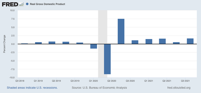
Nominal GDP increased 6.9% in the 4th Quarter of 2021. After taking into account inflation, it increased 1.7%:


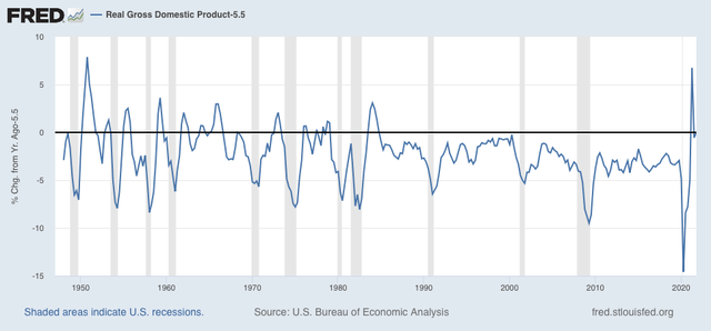
The last six economic quarters together have been the biggest economic Boom since 1983-84, as shown in the below graph showing YoY real GDP growth, minus the 5.5% of 2021, going all the way back to 1948:


That’s pretty impressive. But it is also the rear view mirror.

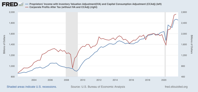
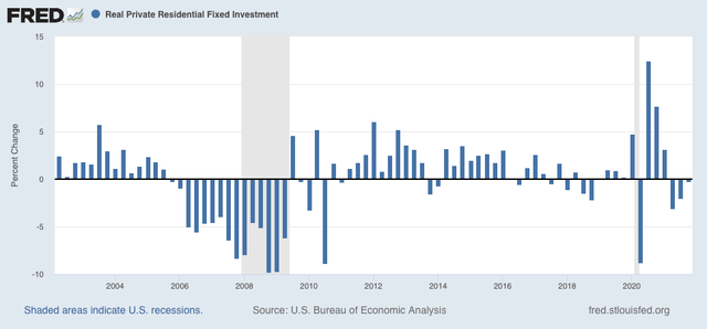
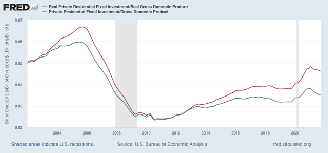
To see what lies ahead, there are two components of GDP which are helpful: real residential fixed investment (housing) and proprietors income (a proxy for business profits). Both of these have long and good track records as helping forecast the economy one year in advance. And here, the news is not so good.

Proprietors income (blue in the graph below) declined -0.9%, even before taking into account any inflation adjustment. Note that this generally rises and falls with corporate profits (red), although it is not quite so leading. But since the latter won’t be reported for at least another month, it is a good placeholder:


The news is also bad in housing, as real residential fixed investment declined for the 3rd quarter in a row:


Both nominal and real residential fixed investment as a share of GDP (the actual measurement that is part of the long leading indicators) also declined:


The decline in the housing component is not surprising. Monthly data in housing permits and starts declined by recessionary margins all the way through October of 2021. That business profits may have topped out as well is not a good sign, although this is only the first quarter of decline, and obviously may be a false signal.

Both of these long leading indicators are among the array I track. I plan on posting my forecast for year end 2022 shortly at Seeking Alpha, and will reference it here.

With seasonality over, it is clear that Omicron is responsible for increased layoffs


 - by New Deal democrat

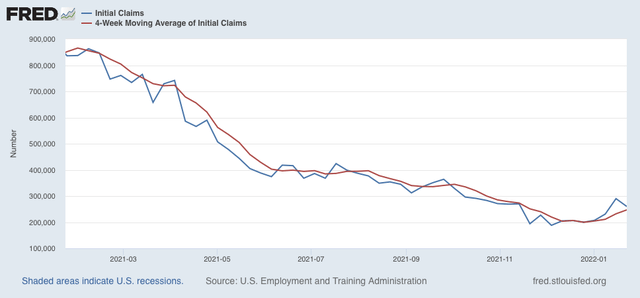
With seasonality behind us, it is apparent that Omicron has resulted in increased layoffs.

New claims declined 30,000 last week to 260,000 - still well above its pandemic low of 188,000 set early in December. The 4 week average of new claims increased 15,000 to 247,000:


Continuing claims for jobless benefits rose for the second week in a row, by 51,000 to 1,575,000, 120,000 above its 50 year low set two weeks ago:


Last week I wrote that “The effects of Omicron are going to continue for at least a few more weeks. The quirks of seasonality should resolve after another week. Until I see more going on, I do not see any reason to overreact to the last two weeks’ big increase in claims.” At this point it seems clear that Omicron has had a significant impact. At the same time, with cases nationwide down 20% from peak as of today, I still suspect Omicron will be behind us by the end of February. So I still do not see a big reason to overreact to this increase in claims, to what is still in the long run an excellent number.
 

Wednesday, January 26, 2022

New home sales surge, while house price measures decelerate; expect deceleration or even downturns in each


 - by New Deal democrat

Since I didn’t post yesterday, let me catch up today with a note on both new home sales and prices.


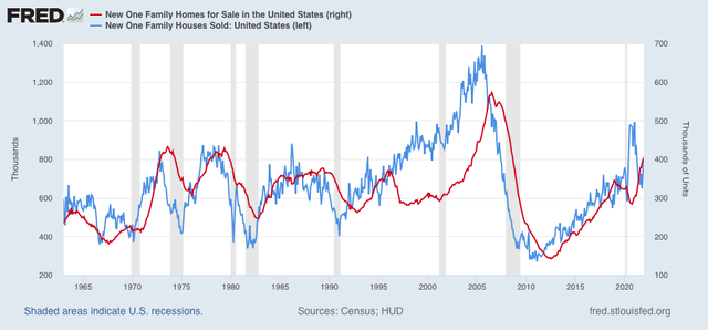
New home sales (blue in the graph below) for December rose sharply to 811,000 on an annualized basis. This is the higher monthly number since March, and while it is well above the trend since the Great Recession, it is still well below its levels from late 2020:


The red line is inventory. When it comes to new homes, inventory lags not only sales but also prices, so it is not surprising that inventory has increased sharply to a 10 year+ high.

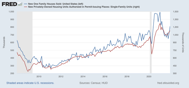
While new home sales are the most leading of all housing metrics, they are very noisy and heavily revised. So in the below graph I compare them with single family permits (red), which have also increased in the last few months, but also are not at 2020 levels:


Because mortgage rates have increased significantly in the past several months, I do not expect this surge in new home buying to last much longer.

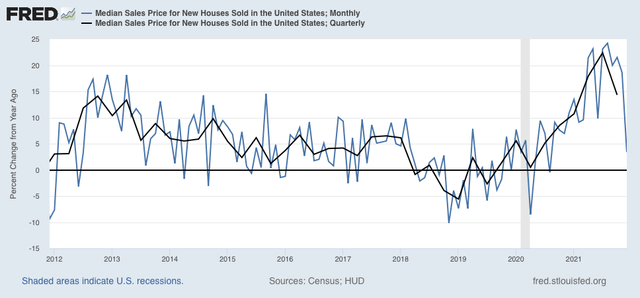
Sales lead prices, and for most of 2021 sales were down. So it should not be a surprise that on a YoY basis, price increases are at last abating, shown both monthly (blue) and quarterly (black) in the graph below:


In December, prices were only up 3.4% from one year prior. Since the data is noisy on a monthly basis, the quarterly number, still high at just under 15%, but well below the sharp gains earlier in the year, is more telling.

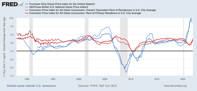
The deceleration in YoY price gains, which nevertheless are still very high, was also the story yesterday in both the Case Shiller and FHFA house price indexes (light and dark blue in the graph below, /2 for scale). Also shown are the YoY% gains in rent of primary residence and owner’s equivalent rent (how the CPI measures housing inflation)(light and dark red):


My purpose in the above graph is to show that both house price indexes track one another closely, as do both “official” measures of housing inflation. Additionally, as I’ve previously pointed out, house price increases tend to bleed over into the official inflation measures with about a 12 to 18 month lag. Thus on a YoY basis price increases bottomed in 2019, but did not bottom in the official measures of rent until the beginning of 2021. Since the YoY% increase in house prices peaked in mid year 2021, we can expect the “official” CPI housing measure to continue to increase on a YoY basis through roughly late 2022.

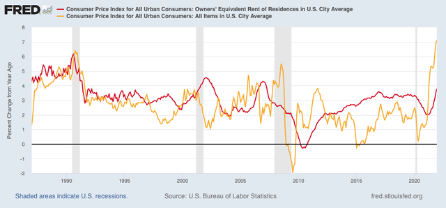
This doesn’t necessarily mean that the *total* inflation measure will continue to increase throughout this year. Below I again show the YoY% change in owners’ equivalent rent as above, but also the total inflation index (gold). Most importantly, note that sometimes they track in tandem, but also that generally during the entire house price boom, bubble, and bust from 1995 to 2015 they tended to move in opposite directions:


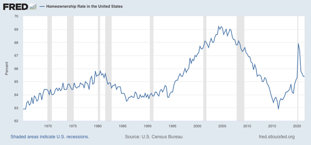
Why did this happen? Sometimes, as during 1995-2015, home ownership and apartment renting are alternative goods. When more people decide to leave apartments and move into houses, house prices increase while rents flatten. This is generally what happened during the boom and bubble. Then during the bust people were forced to abandon houses and move back into apartments. This is shown in the below graph of homeownership:


Note the huge upward surge until the housing bubble popped, followed by the equally sharp deflation.

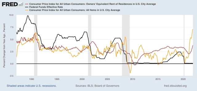
Finally, let’s factor in interest rates set by the Fed, shown in black below:


As CPI increases, the Fed typically increases interest rates. By the time the fully effect in owners’ equivalent rent is felt, Fed rate hikes have typically cooled the economy, meaning that the remaining majority of the overall consumer inflation index declines.

Bringing our discussion back to the present, we see that total inflation has been rising sharply since just after the pandemic hit. Owners’ equivalent rent started to rise about 9 months ago. Part of the delay was the big increase in the homeownership rate during that time, driving rents and house prices in opposite directions. The consensus is that the Fed will raise rates several times this year, perhaps starting as early as this spring. If they indeed do so, they will probably continue to embark on hiking rates until the economy slows or even reverses, enough so that price increases - other than rents - decelerate considerably. But while rent measures will continue to accelerate this year, house price increases themselves are likely to continue to decelerate, or even stall in the months ahead.


Monday, January 24, 2022

A historical note on US Treasury interest rates and stock prices


 - by New Deal democrat

Over the weekend I was asked by two people what is going on in the markets. That’s usually a sign that there has been a sudden downside move, and people are getting emotional.


Back 5 and 10 years ago, when I was doing perpetual battle with the DOOOMers, several times I was able to call a market bottom to the day - and once within an hour in real time - by how triumphantly the DOOOMers were trumpeting. Most of them have long since disappeared, but it’s well to keep in mind that while emotional moves in the stock market may be brutal, they are typically very short, and reverse quickly. That’s because there are always some cold-blooded sharks in the water, and at some point they see values as compelling and pile in buying.

As I draft this, the market is down 10%, which is “officially” a “correction.” (Most people define a bear market as requiring a 20% down move). I’m not interested in insta-calling a turning point, or speculating on “why” a particular daily move has taken place. In particular I don’t see any reason why anything having to do with the crypto-currency crazed would have a significant effect on the US’s $20 Trillion economy as a whole. Rather, let’s take a look at a few longer-term relationships that are fact-based and have been reliable.

Corporate profits are a long leading indicator, typically turning over 12 months before the economy as a whole. The stock market is a short leading indicator, typically turning 3-8 months before the economy as a whole. Which means corporate profits turn first; the stock market only reacts later. On Thursday the first estimate of Q4 2021 will be reported, and that will include “proprietors’ income,” a proxy for corporate profits, which won’t be reported until the “final” GDP report in two more months. That will give me what I need to make a long term forecast of the US economy through the end of this year. Last week I noted that the short leading indicators forecast the expansion would continue through mid year. 

In the meantime, because it is widely believed that the Fed is going to start raising interest rates in a few months in order to deal with inflation, let’s examine the yield curve in the US Treasury market, also a long leading indicator, and the Fed funds rates themselves, for their relationship to stock prices.

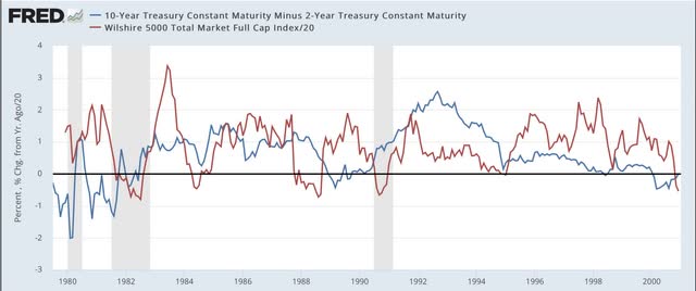
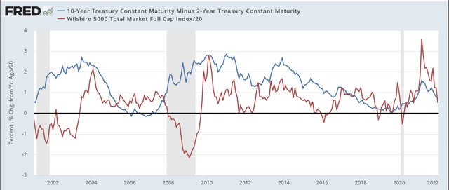
Since the 1960s, an inversion in the US Treasury yield curve, where 2 year interest rates are higher than 10 year interest rates, has preceded every single recession, typically by 12 to 18 months. The first two graphs below show that yield curve in blue, and compare it with the YoY% change in stock prices (red, /20 for scale), for the past 40+ years:


Again, notice that the yield curve has inverted roughly a year or more in advance of every single recession during that period. It even did so briefly in August 2019, although the 2020 recession was an anomaly caused by the near complete stoppage of the economy in the first several months of the pandemic. Further, aside from one month in 1998, it never inverted without a recession following. In other words, it has a near perfect record.

Now look at the red line. Stock prices turned lower YoY during every recession except for the brief 1980 one. But they also turned down a number of times when traders expected an economic slowdown (1984, 1994, 2002, 2016) - but these downturns were very brief. The only more extended YoY decline was the exact 1 year period following the crash of 1987. Also, note that stock prices typically continued higher YoY even after there was a yield curve inversion - each and every time believing “it’s different this time.” Only after an oncoming recession was obvious did stocks turn lower YoY.

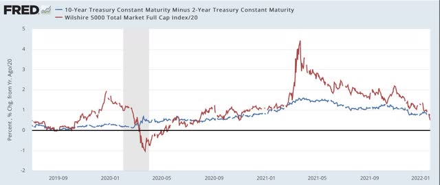
Now let’s take a look at the same information zoomed in over the past 2 years:


The yield curve is not as positive as it was 1 year ago. But on the other hand, it has certainly not inverted. At roughly +0.8%, it is more or less in the middle of its range for the last 40 years. Quite simply the yield curve is not forecasting any imminent economic downturn.

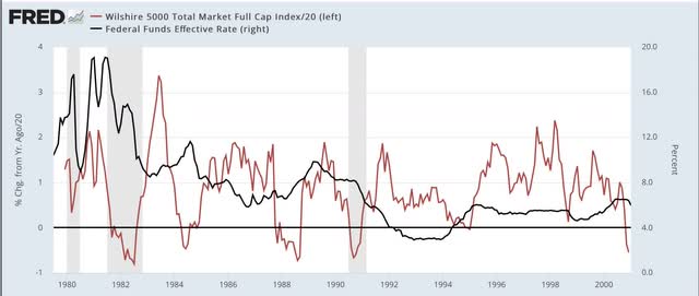
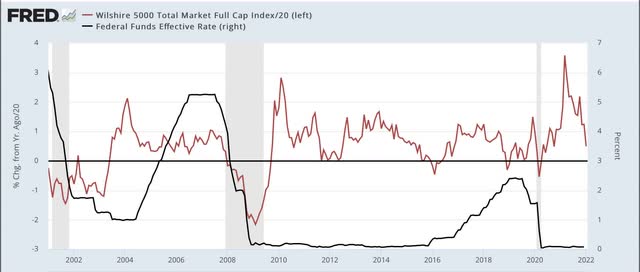
But what about the Fed raising rates. Below are two graphs showing the same 40 year period, with the same YoY% change in stocks represented; this time being contrasted with the actual Fed funds rate (black, right scale):


Don’t squint too hard, because the point is that there is no strong relationship between the two. In the 1980s and 1990s, YoY stock prices moved somewhat opposite to Fed funds, i.e., an increase/decrease in the funds rate correlated with a downturn/upturn in the YoY% change in stock prices. Since 2000, in the era of zero or near zero Fed funds rates, there has been very little correlation at all, and indeed during most of the time that the Fed funds rate was increasing in 2005-07 and 2016-19, there were continued YoY gains for stock prices.

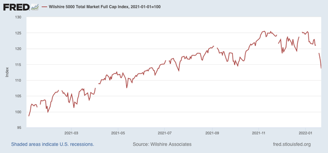
The bottom line is, there is nothing fundamental happening that justifies a major revaluation downward in stock prices for any extended period. A brief emotional - and emotionally jarring - move to negative YoY comparisons, with a swift rebound would hardly be surprising. And it would be emotionally jarring, because stock prices increased 25% last year:


So a YoY decline would mean giving that all back. But it would likely be the kind of move that the late St. Jack Bogle of Vanguard Funds fame would categorize as almost certainly being “V” shaped. Of course, it could always “be different this time.” But that has historically been the wrong conclusion.

Saturday, January 22, 2022

Weekly Indicators for January 17 - 21 at Seeking Alpha


 - by New Deal democrat

My Weekly Indicators post is up at Seeking Alpha.

A few months ago, in the midst of the Boom, virtually every indicator across all time spectrums was positive. In the past months, we have begun to see the deterioration in that situation, as every week one or two more indicators in one or another part of the time spectrum have shifted to neutral or negative.

This doesn’t mean that the situation is negative; more like that it is normal, with some negatives and neutrals, put still a majority of positives.

As usual, clicking over and reading will bring you up to the moment on the relevant leading and coincident economic data, and will bring me a little cash for my grocery shopping.

Friday, January 21, 2022

Coronavirus dashboard: Omicron has peaked; now what?


 - by New Deal democrat

Let’s start out with the good, or at least less catastrophic news: it’s almost certain that the Omicron wave has peaked in the US. In fact, the only Census region it is still up week over week is in the Midwest:


In almost all of the areas hit hard early - Puerto Rico, and the NYC and DC metro areas - cases are down sharply since peaking. Additionally cases are down substantially in California, Florida, and Illinois:
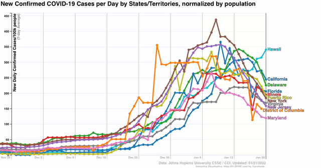

Only Hawaii, anomalously, has continued to increase.

This follows the pattern set in South Africa, where cases are now down over 80% from their peak, and deaths have plateaued after a 5 week lag:
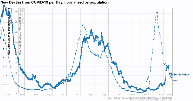

Note that deaths have increased less than cases in each of the last two waves, and only increased about 30% as much as cases during Omicron.

The situation is similar in the UK:
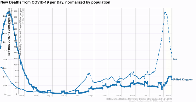

It appears the US will follow a similar trajectory with deaths, which probably will peak at under 2500 per day in late February:
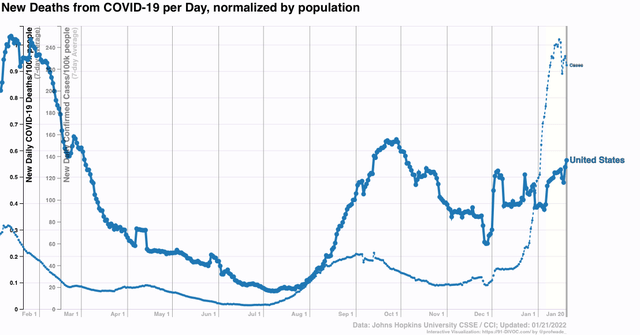


Returning to the US, although I won’t bother with a graph, cases are only up 10% or more in the past week in the States of AK, AL, AZ, HI, ID, KS, MT, KY, LA, NE, NV, NM, ND, OK, SC, TN, UT, WV, and WY. Hospitalizations have peaked simultaneously with cases, which suggests either a capacity or triage issue, and/or people are reluctant to seek treatment there. ICU admissions are still slowly increasing:
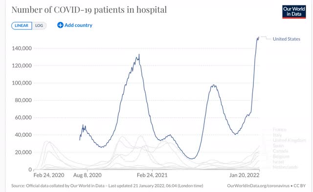

Because of the capacity/triage/reluctance issue, it is unclear the extent to which hospitalizations rose less steeply than cases,  Hospitals will remain under severe strain for several more weeks.

If cases in the US decline roughly as a mirror image of how they rose during Omicron, what next?

Trevor Bedford, the biostatistician whose work has been invaluable throughout the pandemic, has a guess: 


“We estimate that as of Jan 17 the US as whole has had a cumulative ~15M confirmed cases of Omicron, or approximately 4.5% of the population recorded as confirmed cases. The large majority (>90%) of these accumulated since Dec 14

Assuming between a 1 in 4 and 1 in 5 case reporting rate suggests that between 18% and 23% of the country was infected by Omicron by Jan 17, with the large majority infected in a span of just ~4 weeks.

“There may be a longer tail of circulation after the peak (as seen in South Africa), but a rough expectation would have an equivalent number of cases in the next 4 weeks on the other side of the peak. This would suggest 36-46% of the US infected by Omicron by mid-Feb. 

“My big question now is to what extent will Omicron-like emergence events characterize "endemic" circulation of SARS-CoV-2? Given it occurred once, having it occur again would not be at all surprising, but I don't know whether to expect this every year or every ten.”

Note the big assumption that only 20% to 25% of all COVID cases under Omicron have been “confirmed,” with the rest flying under the radar.

My own rule of thumb has been a ratio of 2:1 or 2.2:1. The reason for this is the experience of North and South Dakota one year ago, where there were massive outbreaks - the biggest of any States before Omicron - one year ago, with 60% of all tests being positive. That hasn’t prevented both States from having Omicron outbreaks more than 50% higher than the worst of that wave:
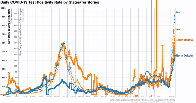

If North and South Dakota’s previous wave, with 10% of their populations having *confirmed* cases and 60% test positivity strongly suggesting a huge number of unconfirmed cases, didn’t lead to sustained resistance to reinfection, is a 10% *confirmed* outbreak in the US as a whole, with 45%+ test positivity, going to have a different result?

In other words, the situation going forward very much depends on whether and when the next unusual variant hits, and how much resistance has been obtained by the vast unvaccinated idiot population in the US. As the below graph shows, only 15% more of the US population got vaccinated in the past 7 months, despite both the Delta and Omicron waves:
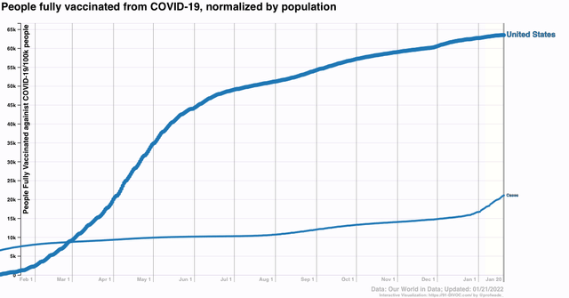

If “real” cases are 2.2x confirmed cases, then about 45% of the US population has had COVID since the pandemic started, with the distribution presumably skewed with a greater percent among the unvaccinated during the past 7 months.

With COVID circulating freely among wild mammal populations (and domesticated cats as well), there are going to be more variants. Our best hope is that Trevor Bedford is right, and in general most succeeding waves of COVID from here on exact less and less of a toll, with occasional bigger spikes. For my part, I continue to be hopeful that there will be a big respite in spring.

Thursday, January 20, 2022

Omicron and seasonality bedevil new jobless claims


 - by New Deal democrat

It is likely that the effects of Omicron as well as quirks of seasonality were behind this week’s big jump in new jobless claims.

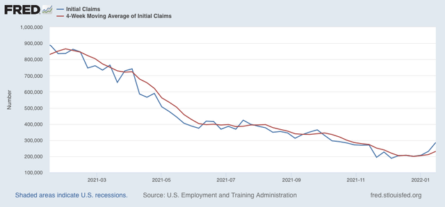
New claims jumped 55,000 on a seasonally adjusted basis last week to 286,000. The 4 week average of new claims increased 20,000 to 231,000:


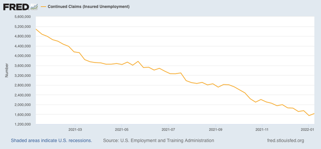
Continuing claims for jobless benefits rose 84,000, to 1,635,000, which is still very close to a 50 year low (not shown):


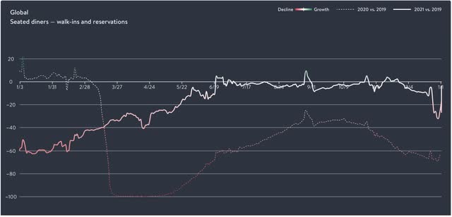
There are probably two reasons for the big jump in new claims. The first is Omicron. We won’t have the State by State breakdown for one more week, but it would hardly be surprising if the big increases were most profound in those States hardest hit by Omicron in the previous weeks (generally, the NYC and DC metro areas). Certainly in the last several weeks Omicron has hit restaurant reservations, which have declined by 25% or more compared with a year ago (graph shows global reservations, but US reservations are nearly identical):


Layoffs in the service industries as a result of gigantic rises in infections would not be a surprise at all.

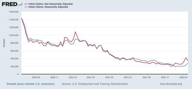
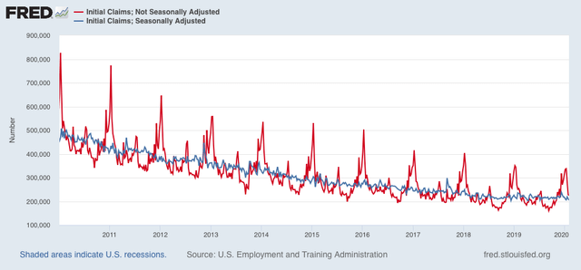
Secondly, here is a comparison of seasonally adjusted (blue) vs. not seasonally adjusted (red) claims in the past 18 months:


Note that in the corresponding week last year non-seasonally adjusted claims were no higher than seasonally adjusted. This year they failed to decline to that level. More generally, non-seasonally adjusted claims typically are below the seasonally adjusted number from August through November, and then rise to a peak in the second full week of January, as shown above, and also below in this graph of the 10 years just before the pandemic:


The past 6 months have resulted in levels of new claims equivalent to the range of those  during 2016 and 2017, except that typically claims rise slowly during autumn from a low point in August, and in 2021 they declined slowly through autumn. Because of the typically sharp declines from peak in new claims in mid-January, something as simple as the creep of the days of the week for equivalent dates can make a big difference. In other words, next week there may be a much bigger drop than there was for the equivalent week in 2016 and 2017.

The effects of Omicron are going to continue for at least a few more weeks. The quirks of seasonality should resolve after another week. Until I see more going on, I do not see any reason to overreact to the last two weeks’ big increase in claims.

Wednesday, January 19, 2022

Housing ends 2021 with a bang


 - by New Deal democrat

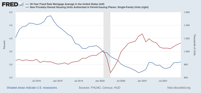
Housing ended 2021 with a bang, as housing starts (blue in the graph below, left scale) increased to 1.702 million annualized, and permits (gold) to 1.873 million annualized, in both cases the highest level since 2006 with the sole exception of last March / January, respectively. Single family permits (red, right scale), which are the least noisy, increased to 1.128 million annualized, the highest reading since May, but well below the 8 months previous to that:


Because this is December data, even though it is seasonally adjusted, it may still be affected by Christmas seasonality, as exacerbated by the pandemic (right scale below). To some extent it may also be a reaction to the recent increase in mortgage rates (blue, left scale) off their bottom:


We have seen this dynamic before, where prospective homeowners, seeing an increase in mortgage rates and expecting more, “lock in” purchases before they become more expensive. 

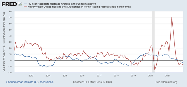
Below is the same data on mortgages and single family permits, but presented YoY:


This makes it easier to see that housing permits have historically followed mortgage rates (inverted), with a 3 to 6 month lag. Mortgage rates have turned higher than they were 1 year ago, and permits have turned lower than one year ago.
According to Mortgage News Daily, mortgage rates yesterday averaged 3.7%, the highest in over a year. Should these higher rates continue, we can expect a significant decline in new housing permits and starts in the next few months.

In the meantime, because housing permits and starts are an important component of the long leading indicators, this data will play an important role in my long term forecast, which will be determined after data for Q4 GDP is reported next week.