Saturday, November 14, 2020

Weekly Indicators for November 9 - 13 at Seeking Alpha


 - by New Deal democrat

My Weekly Indicators post is up at Seeking Alpha.

With Joe Biden assuming the Presidency on January 20, and a announcement of a successful vaccine by Pfizer that should be available by next spring or summer, the short and long leading indicators should once again be giving their usual signals for next year. And we have a pretty good idea what that means....

As usual, clicking over and reading should bring you virtually up to the moment about the economy, and also reward me a little bit for my efforts.

Friday, November 13, 2020

Lack of inflation in September consistent with weak demand; real wages increase, but will the pandemic derail the gains?


 - by New Deal democrat

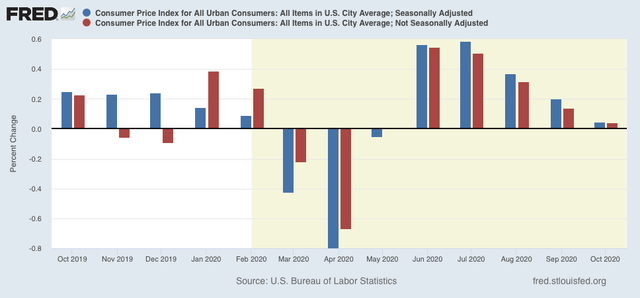
Consumer prices were unchanged in October, both on a seasonally adjusted and unadjusted basis:


But while the lack of inflation is good news in isolation, the last two months can also be viewed as a sign of economic weakness - lack of demand - from a recession.

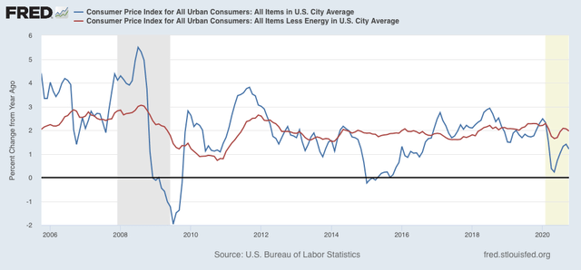
Digging a little deeper, for the past 40 years, recessions had typically happened when CPI less energy costs (red) had risen to close to or over 3%/year. We are nowhere near that now (last 15 years shown in graph):


Again,  note that the YoY% change in inflation has decelerated since the outset of the pandemic, potentially another sign of weakness.

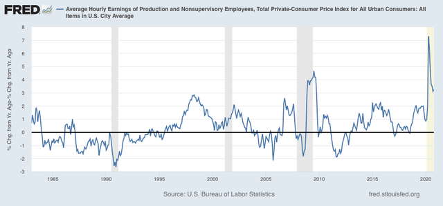
On the bright side, because wages are “stickier” than prices, typically as recessions beat down prices (or at least price increases), in real terms wages rise. That has been the case for the coronavirus recession as well:


It is the “real” buying power of wages among those still securely employed during a recession that is one of the engines that usually restarts growth.

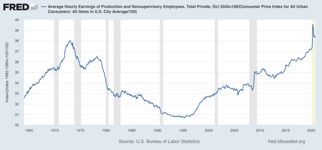
Also as a result, as I’ve noted for the past several months, real hourly wages for non-supervisory workers have finally exceeded their previous 1973 peak, although part of that has been the asymmetric loss of jobs among some of the lower paid occupations:


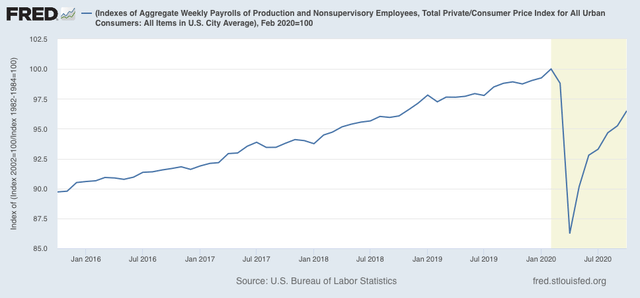
Finally, one of the most telling metrics of the overall health of the middle/working class is that of real aggregate wages. After declining -13.8% from February through April, they have now recovered to a point -3.5% below their peak, approximately at the same level as they were in autumn 2018:


If the rate of gains over the past 4 months were to continue - a *very* open question - aggregate real wages would exceed their February level in about 6 months.

Of course, this data like almost all other economic data, remains at the mercy of the course of the pandemic - which is basically out of control in much of the US. It is also very much subject to the public policy that has been stalled in Washington for the past half a year, and is going to continue to be stalled until at least January 20.

Thursday, November 12, 2020

New and continued jobless claims: best week of the pandemic; can it survive a new emergency?


 - by New Deal democrat

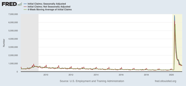
This week’s new and continued jobless claims, both seasonally adjusted and unadjusted, declined to new pandemic lows - but at levels roughly equivalent to their worst readings during the Great Recession.

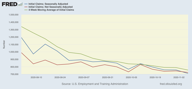
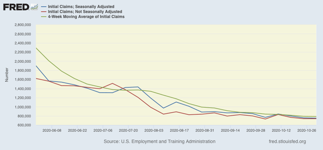
On a unadjusted basis, new jobless claims declined by 20,799 to 723,105. Seasonally adjusted claims declined by 48,000 to 709,000. The 4 week moving average also declined by 33,250 to 755,250. Here is the close up since the end of July (for comparison, remember that these numbers were in the range of 5 to 7 million at their worst in early April): 


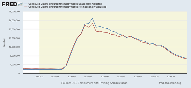
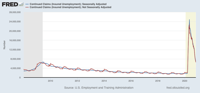
Unadjusted continuing claims (which lag initial claims typically by a few weeks to several months) declined by 402,298 to 6,486,000. With seasonal adjustment they declined by 436,000 to 6,786,000, both also new pandemic lows:


New jobless claims have declined almost 90% from their March and April pandemic highs! But the seasonally adjusted numbers are still about 50,000 to 100,000 higher than their worst readings of the Great Recession:


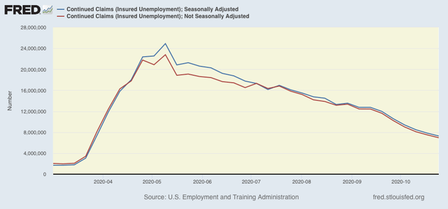
Meanwhile, continued claims are about 72.5% below their May pandemic highs:


But these are also 150,000 (adjusted, weekly) and 35,000  (adjusted, 4 week average) higher than their worst levels of the Great Recession.

Directionally this week was very good news, but on an absolute level the level of layoffs continues to be very bad - just nowhere near like it was 7 months ago. This is a part of the slow continued improvement in most of the “weekly indicators” I update each Saturday.  

As the pandemic is once again out of control in the majority of the country, and near emergency levels in parts of the upper Midwest and Mountain States, with no signs of new infections abating at this point, I have to think this is going to reverse, and reverse badly. But it hasn’t yet.

Wednesday, November 11, 2020

Semptember JOLTS report shows jobs recovery has been real - but will it continue?


 - by New Deal democrat

Yesterday’s JOLTS report for September showed a jobs market that continues to be, ever so slowly, on the mend. Openings and quits were up (good), and layoffs and discharges were down (also good). The only negative was that hires actually declined, although slightly.

We are far enough  past the worst of the pandemic jobs losses that it is worthwhile to compare the state of the various JOLTS components with the 2 previous recoveries from recession bottoms in the series’ histories (this because the JOLTS data only dates from 2001. 

In the two past recoveries:
  • first, layoffs declined
  • second, hiring rose
  • third, job openings rose and voluntary quits increased, close to simultaneously

Let’s examine each of those in turn. In each case, I break out 2001-19 in a first graph and then this year in a second.

What appears below is that, although there has been some variation, the past several months have recapitulated the pattern from the last two early recoveries: the first two data series to turn - layoffs and hires - have indeed turned, while the last two - job openings and voluntary quits - have appeared to bottom but have had a much less dramatic rise.

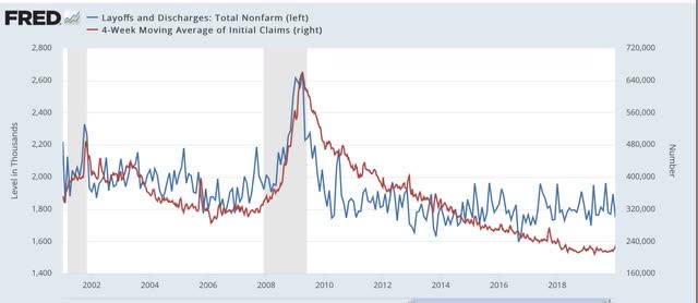
This first graph compares layoffs and discharges (blue) with the 4 week average of initial jobless claims (red):


You can see that, by the end of the recessions, layoffs were already declining, and continued to decline steeply over the next 3-8 months before reaching a “normal” expansion level. The turning point coincides exactly with the much less volatile, but more slowly declining, level of initial jobless claims.

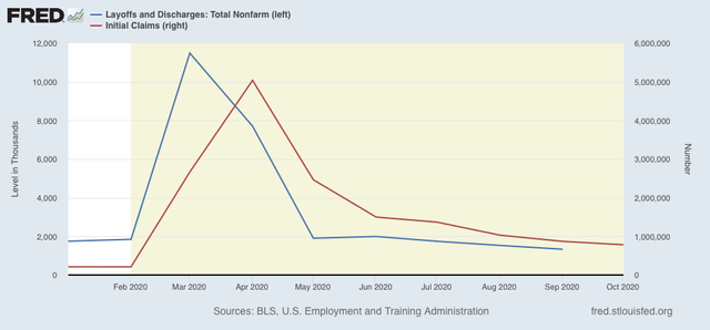
The same has been the case this year, as layoffs and discharges already declined to their “normal” level in May, while initial jobless claims peaked one to two months later, and have been declining (slowly) ever since - a pattern that continued in September.

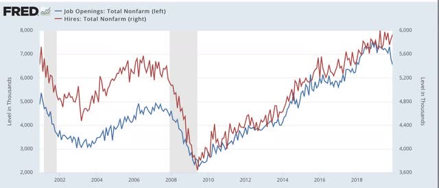
Next, here are hires (red) and job openings (blue):


In the past two recoveries, actual hires started to increase one to two months before job openings.

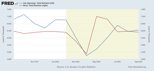
This year, both made troughs in April, but hires rebounded sharply in May and June compared with job openings:


Since then both have essentially leveled off.


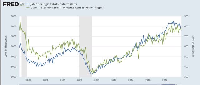
Next, here are quits (green) vs. job openings (blue): 


In the past two recoveries, actual hiring started to rise slightly before quits made a bottom. After that, both rose more or less together (suggesting it is openings that leads to the increase in voluntary quits).

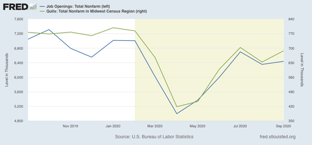
This year, both have moved together, both making a trough in April, and rising   equivalently since:


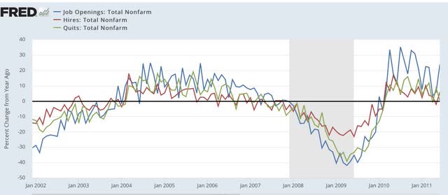
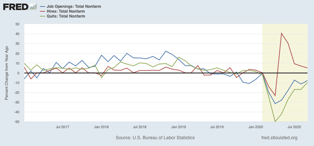
Finally, because seasonal adjustments might not be giving us a true picture because of the enormous moves during this pandemic year, here are job openings (blue), hires (red), and voluntary quits (green), measured YoY without seasonal adjustments for the recoveries after the 2001 and 2007-09 recessions:


Nte that, even taking out the seasonal adjustments, hires rebounded first following the 2001 and 2008-09 recessions. Quits and openings have moved generally in tandem with a slight lag.

The same pattern appears this year:


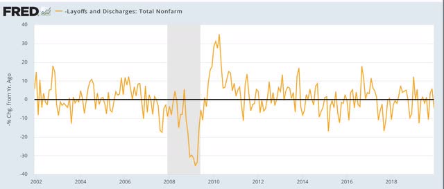
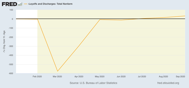
I have broken out layoffs and discharges separately below, because the their level in April and May of this year would obliterate all other variations (note: inverted so that fewer layoffs shows as positive):


This metric returned to normal almost immediately after both of the past two recessions, and did so again by July of this year, and is improving slightly measured YoY.

In short, the JOLTS report shows that the recovery in the jobs market from the pandemic lows is real, and as of September was continuing. 

With the pandemic largely once again out of control, and approaching emergency levels in many parts of the country, it is an open question to say the least whether this will continue. I have to think that responsible State governments are going to reinstitute lockdowns for at least long enough to bring the pandemic back under some semblance of control.

Monday, November 9, 2020

Coronavirus dashboard for November 9: Wow (and not in a good way)


 - by New Deal democrat

US total infections: 9,968,155*

US average last 7 days: 108,737

US total deaths: 237,570

US average last 7 days: 939

*I suspect that the real number is about 16 million, or about 5% of the total US population
Source: COVID Tracking Project

While we have been riveted by the 2020 election, the pandemic has continued to rage out of control in parts of the US, particularly in parts of the upper Midwest and northern Mountain States.

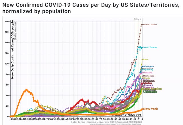
At its peak, NY had an average daily rate of 51 infections per 100,000 people. Now,  17 States have infections rates higher than that:


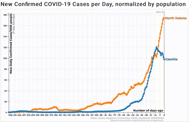
The worst is North Dakota, at 174 infections per 100,000 people. By contrast, the worst country on the planet, Czechia, had 117 infections per 100,000 people at its recent peak:


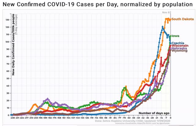
In addition to North Dakota, 5 other States have infection rates equal to or surpassing that of Czechia:


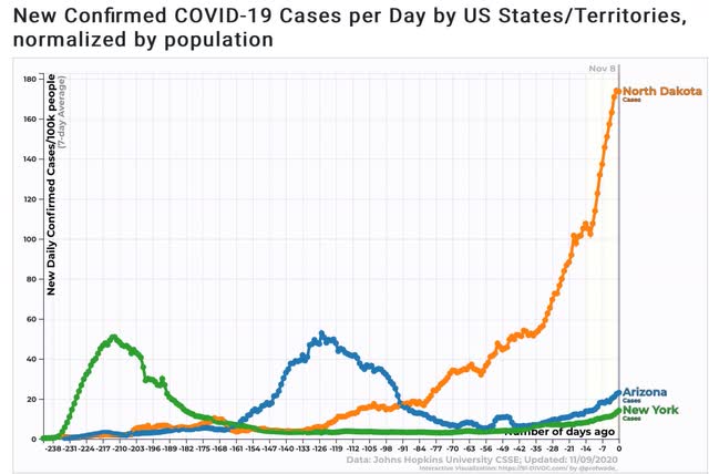
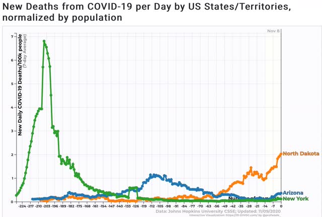
Next, here is the infection rate in 3 US States with large outbreaks: NY, AZ, and ND:


Whether due to a demographic shift in those who are getting sick (the early death rate in the US was largely a factor of so many cases in nursing homes), or due to better treatments in hospitals, the rate of deaths in the summer outbreaks (as shown by Arizona below) and *so far* in the recent outbreaks, has not come anywhere near the lethality in the early outbreak in NY:


At the same time, the current outbreak in ND is roughly 3x as bad as the summer outbreak in AZ. At its worst, the death rate in AZ was 1.14 per 100,000 people, vs. 3.93 in NY in April.

But, if the death rate now proves similar to that in the summer outbreak in AZ, which peaked at a 7 days average of 52.8 infections per 100,000 people daily, then ND, which currently has  a 7 day average of 173.6 infections per 100,000 people, can expect a death rate of 3.75 per 100,000 people daily, very close to the death rate of 3.93 per 100,000 in NY at its peak.

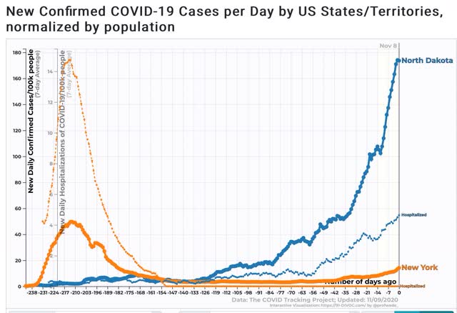
Another way of looking at this is to compare the infection and hospitalization rates for NY and ND, below:


So far, the hospitalization rate in ND is less than 1/3 of that of NY at its worst.

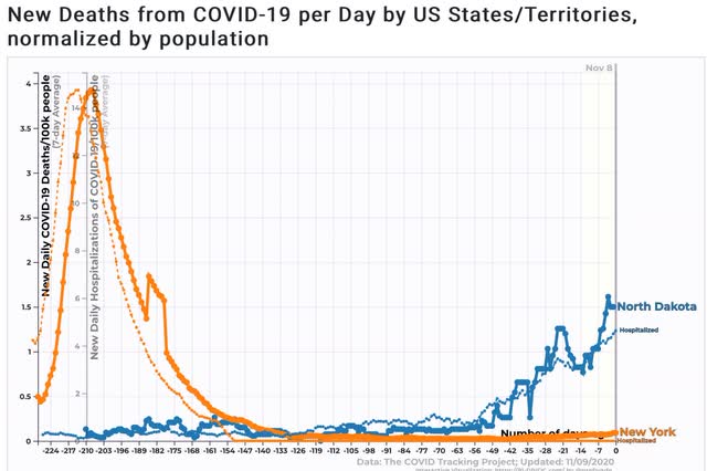
Comparing hospitalizations with deaths, below:


We see that deaths in ND are about 40% of those of NY at its peak.

But hospitalizations lag infections by roughly 3 weeks, and deaths lag hospitalizations by about another 2 weeks. Infections in ND have almost doubled in the past 3 weeks. A doubling of ND hospitalizations would put it at roughly 2/3 of the NY peak, with deaths expected to follow suit.

And of course there is no indication yet that ND’s infection rate has peaked. Nor, with he possible exception of South Dakota, is there any such indication for any of the other 16 States with infection rates similar to Czechia.

Sadly, it appears likely that by Thanksgiving there is going to be a full-scale emergency in parts of the upper Midwest and Mountain States similar to the one that engulfed NYC in April. And as the reality of his defeat slowly sinks in, it is highly unlikely that Donald Trump or anyone in his Administration will give a damn.

Sunday, November 8, 2020

The 2020 Presidential and Senate races: a postmortem


 - by New Deal democrat

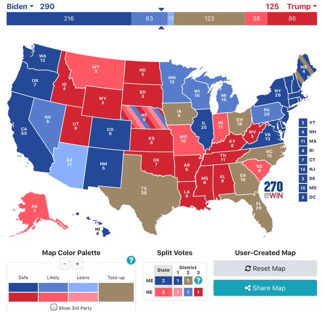
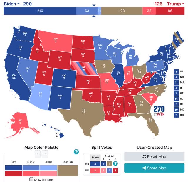
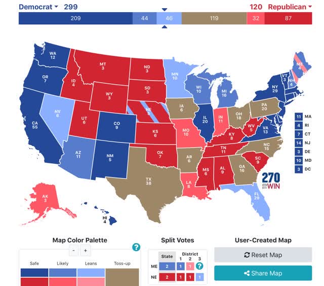
Way back in June I started writing nowcasts for the 2020 elections. Here’s what my very first map looked like: 

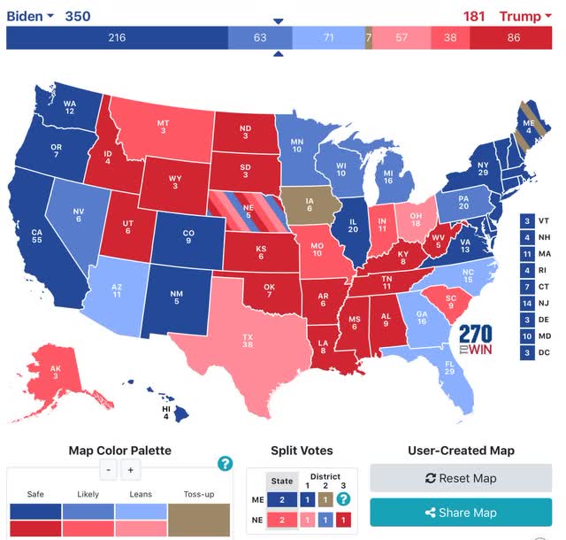
And here’s what the last one looked like:
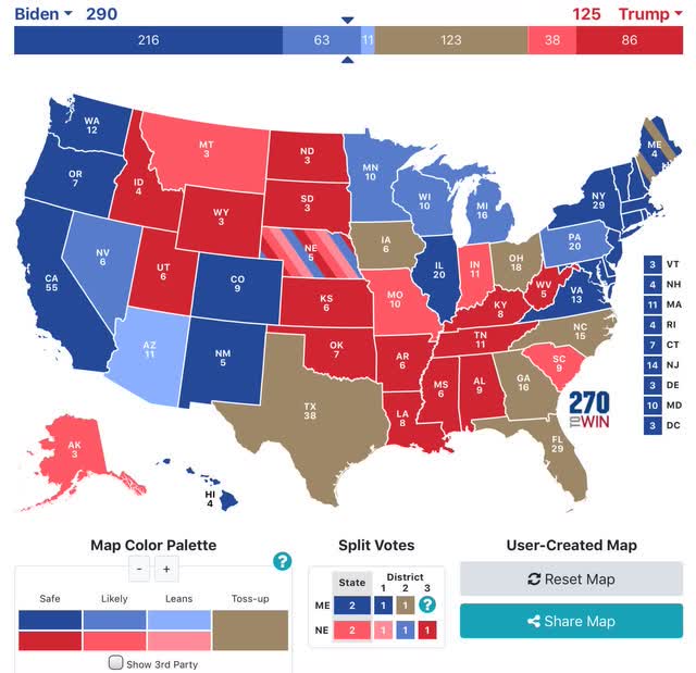

When I pushed the “toss-ups”, by lowering the threshold from 3% to 1%, NC, GA, and FL also became “lean Biden” States.

Here’s how the election actually turned out, based on results through today (note: Alaska has only counted 50% of its votes, so the outcome there is still unknown):
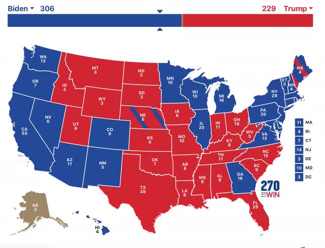


The “blue wall” is extremely likely to hold. And if it does, Trump’s chances of victory are foreclosed.”

That turned out to be right on point.

Further, last week, and almost every week beforehand, I included a sentence like this:

Even so, Biden still has 279 “solid” or “likely” Electoral votes, enough to win without any “leaning” or toss-up States.”

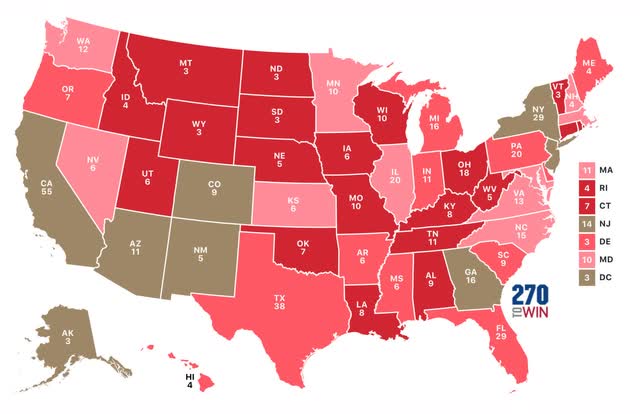
That turned out to be the most prudent caution, as on average the polls missed very badly this year. The below 2 maps contrast the actual results with Nate Silver’s polling average for each State, 1st for the Presidency and 2nd for the Senate races, using the following color code:

0 - 1.9% deviation - no color
2% - 3.9% deviation - light color 
4% - 5.9% deviation - medium color
6% or more deviation - dark color

Here’s the deviations from Nate’s numbers for the Presidency:

And here they are for the Senate:
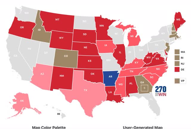

The median deviation in his percentages for Biden was -5.2%. In not even a single State was the deviation 2% or more in favor of Biden. The median deviation in his percentages for Democrats running for the Senate was even worse, at -6.6%.
 
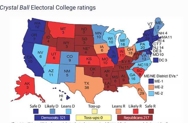
By contrast, Larry Sabato’s final Presidential forecast only missed on North Carolina:

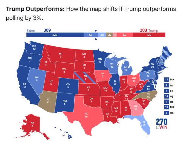
The median forecast in Sam Wang’s model at the Princeton Election Consortium was also too optimistic, but he correctly always included a map of what would happen if Trump outperformed the polls by 3%:


And yet another alternative approach that was much better was the Cook Political Report’s “Swingometer,” which was explained thusly:

“How it Works: Start with the results of the previous election, adjusted for demographic change since 2016. Then, adjust the sliders below to see how shifts in turn out and support among five demographic groups could swing the Electoral College.”

Using their turn-out assumptions, this is the map they generated:
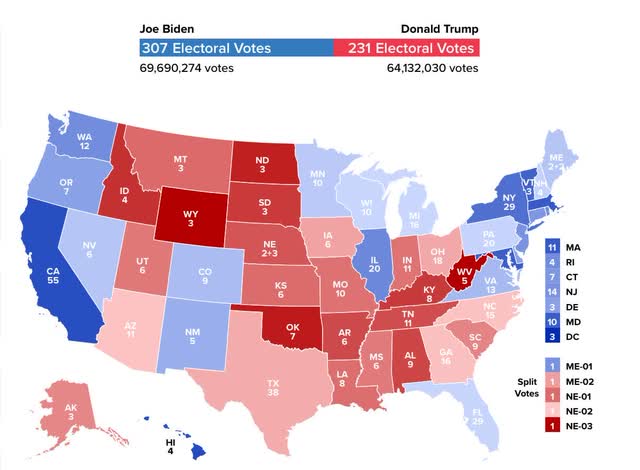

The map only misses Arizona, Florida and Georgia. Further, note that it correctly shows the “blue wall” holding, but being very close. Using the same criteria as I used for Nate Silver’s projections, here’s how close the “Swingometer” came in each State:
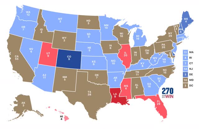

The median deviation from the actual 2020 results known so far is only 2.0% in favor of Biden. In other words, simply projecting the same demographics 4 years forward, and estimating increased (or decreased) turnout based on past turnout for each age, on average only 2% of voters either changed their mind  in favor of Biden, or groups favorable to Biden turned out an average of 2% more of the total.

Finally, to see how closely Trump’s results matched results in the Senate races, I applied the same metrics to the actual  Presidential and Senate results. Blue (Red) means a result more favorable to, or less unfavorable to (less favorable to, or more unfavorable to), Biden than the Democratic Senate candidate:
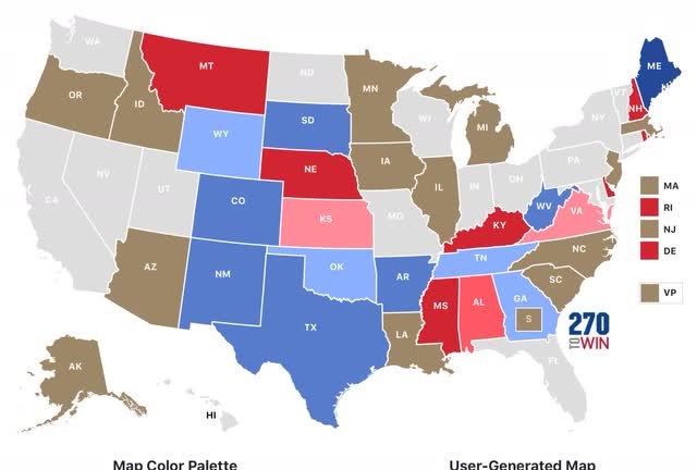

The median deviation between the Senate and Presidential results was only +0.3% overall. When we ignore the direction of the deviation, it is about 3.5%.

To summarize: there are some very serious shortcomings in Nate Silver’s model. Both he and the Economist (G. Elliott Morris) would be well advised to pick up Sam Wang’s approach and create maps for significant poll deviations. Further, the “Swingometer” looks like a very promising tool. 

In terms of the 2020 election, it looks like very few voters actually changed their minds in the past 4 years in their opinion of Trump. It appears that new voters, or increased turnout among some demographics were the biggest factor in the different outcome this year. And a significant percentage of “never Trump” GOP voters split their ticket, voting the the GOP Senate candidate downballot.

Saturday, November 7, 2020

Weekly Indicators for November 2 - 6 at Seeking Alpha


 - by New Deal democrat

My Weekly Indicators post is up at Seeking Alpha.


With the almost certain election of Joe Biden to the Presidency, we can expect a much more organized and effective Federal response to the pandemic beginning on January 20. If the pandemic is brought under control by spring sometime (and maybe a vaccine becomes available), the ordinary function of the leading economic indicators will be resumed - which means they start to have extra importance right about now.

As usual, clicking over and reading will bring you up to the virtual moment in terms of what those indicators forecast, and reward me a little bit for giving you that information.


P.S.: Because I am in much better frame of mind for some reason over the past few days, I will probably put up an edition of the Coronavirus Dashboard later today or tomorrow, as well as a post-mortem of the election nowcasts. 

Friday, November 6, 2020

October jobs report: extremely strong monthly gains overall, but at this rate still another 18 months from full jobs recovery


 - by New Deal democrat


HEADLINES:
  • 638,000 million jobs gained. The gains since May total about 55% of the 22.1 million job losses in March and April. The alternate, and more volatile measure in the household report was 2,243,000 jobs gained, which factors into the unemployment and underemployment rates below.
  • U3 unemployment rate declined -1.0% from 7.9% to 6.9%, compared with the January low of 3.5%.
  • U6 underemployment rate declined -0.7% from 12.8% to 12.1%, compared with the January low of 6.9%.
  • Those on temporary layoff decreased -1,432,000 to 3,205,000.
  • Permanent job losers decreased by 72,000 to 3,684,000.
  • August was revised upward by 4,000. September was also revised upward by 11,000 respectively, for a net gain of 15,000 jobs compared with previous reports.
Leading employment indicators of a slowdown or recession

I am still highlighting these because of their leading nature for the economy overall.  These were positive: 
  • the average manufacturing workweek rose  0.3 hours from 40.2 hours to 40.5 hours. This is one of the 10 components of the LEI and will be a strong positive.
  • Manufacturing jobs rose by 38,000. Manufacturing has still lost -621,000  jobs in the past 8 months, or 4.8% of the total. 55% of the total loss of 10.6% has been regained.
  • Construction jobs rose by 84,000. Even so, in the past 7 months -294,000 construction jobs have been lost, 3.8% of the total. About 75% of the worst loss of 15.2% loss has been regained.
  • Residential construction jobs, which are even more leading, rose by 18,000. In the past 8 months there have still been -6,400 lost jobs, or about 0.8% of the total.
  • temporary jobs rose by 108,700. Since February, there have still been -342,700 jobs lost, or 11.7% of all temporary help jobs.
  • the number of people unemployed for 5 weeks or less declined by -52,000 to 2.5 million, compared with April’s total of 14.283 million.
  • Professional and business employment rose by 208,000, which is still -1,149,000, or about 5.3% below its February peak.

Wages of non-managerial workers
  • Average Hourly Earnings for Production and Nonsupervisory Personnel: rose $0.05 from $24.77 to $24.82, which is a gain of 3.6% in the 8 months since the pandemic began. Gains had previously reflected that job losses were primarily among lower wage earners, who have been disproportionately recalled to work. That we have increased employment and increased wages as well is a very positive development.
Aggregate hours and wages:
  • the index of aggregate hours worked for non-managerial workers rose by 1.2%. In the past 8 months combined this has nevertheless fallen by about -6.3%.
  •  the index of aggregate payrolls for non-managerial workers rose by 1.4%. In the past 8 months combined this has nevertheless fallen by about -3.0%. Close to 80% of the loss from February to April has been made back up.

Other significant data:
  • Full time jobs were responsible for 1.0 million of the gain in the household report.
  • Part time jobs were responsible for 1.2 million of the gain in the household report.
  • The number of job holders who were part time for economic reasons increased by 383,000 to 6.683 million. This is still an increase since February of 2,365,000.

Important note: There was a decline of 268,000 in government jobs. This included -147,000 census workers and -159,000 teachers!

SUMMARY

This was an extremely strong report. About the only negative was the big decline in education jobs, which may have been a quirk of seasonality.  Everything else was positive.

The household report’s gain of over 2 million jobs was responsible for most of the good news, including the decline in the un- and under-employment rates, and gains in both full and part-time jobs, as well as gains in aggregate hours and payrolls.

Further, all of the leading jobs sectors showed gains. This bodes well for the months ahead.

Nevertheless, only a little over half of all of the jobs lost due to the pandemic have come back, and the rate of increase since June has slowed to a *relative* crawl. It would take another 18 months, at the rate of this month’s job gains, to get back to the number of jobs that existed in February.

Thursday, November 5, 2020

Slow pace of improvement in jobless claims continues


 - by New Deal democrat

This week’s new jobless claims were essentially unchanged (but at their pandemic low), while continued claims continued their decline, also to a new pandemic low.

On a non-seasonally adjusted basis, new jobless claims declined by only 543 to 738,166, just above October 3’s revised pandemic low 731,249. Seasonally adjusted claims declined by 7,000 to 751,000, a new pandemic low (which was also last week’s number before revision this week). The 4 week moving average also decreased by 4,000 to 787,000, also a new pandemic low. Here is the close up since the end of July - for comparison, remember that these numbers were in the range of 5 to 7 million at their worst in early April: 


Continuing claims (which lag initial claims typically by a few weeks to several months) on a non-adjusted basis declined by 537,898 to 6,951,731. With seasonal adjustment they declined by 538,000 to 7,285,000. Both of these are new pandemic lows:


Continuing claims are now about 70% below their worst level from the beginning of May, but are still about 900,000 - 1,300,000 higher than their worst levels of the Great Recession.

The very slow improvement in layoffs has generally continued, similar to the same slow continued improvement in most of the “weekly indicators” I update each Saturday.  I continue to harbor serious doubts whether that will continue to be the case as cold weather forces some venues like outdoor dining to close again, and the pandemic continues to surge yet again, albeit with lower levels of deaths than last spring.

Wednesday, November 4, 2020

The Morning After


 - by New Deal democrat

Last night was truly a dark night of the soul. The rule of law in an American Republic simply will not withstand the re-election of Donald Trump, together with a continuing GOP majority in the Senate. Not to mention the prospect of continuing to shelter in  place for perhaps years as the COVID pandemic is allowed to run free.


As of this morning, absentee and mail-in ballots are still being counted in many swing States. As a result, as of when I type this, Biden has carried Arizona, assumed a slight lead in Wisconsin, maintains a slight lead in Nevada, is only ~13,500 away from taking the lead in Michigan with about 10% of ballots still to be counted, and the NYT says that Georgia is back in play and slightly leading towards Biden. And for what it’s worth, once California counts all its ballots, Biden is likely to have won something like 52.5% of the popular vote.

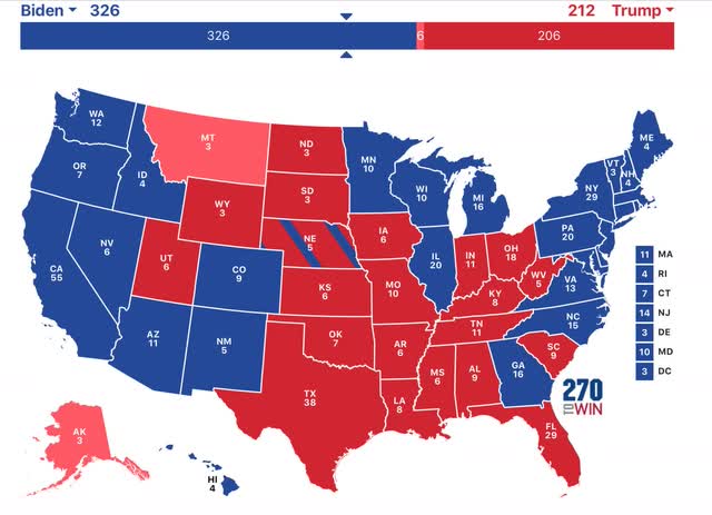
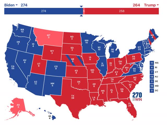
In other words, as of right now, the most likely outcome is somewhere between the two below possibilities:

If Biden were to take all of those, plus PA, which may not finish counting ballots until Friday, and NC (which still has not counted some ballots), here’s what the Electoral Map will look like:


If he simply maintains his leads, and takes the lead in Michigan, here is what the Electoral Map will look like:


Note that even in more pessimistic second map, Biden will wins a majority of 274 Electoral votes.

Put another way, basically the Presidential map looks very much like my final forecast map with the 3% error band, where we give Trump all of the toss-ups, but Biden still wins:


Still, the fact remains that under the above scenarios there appears to have been roughly a 3%-4% “hidden” Trump vote. That also was apparent in the Senate races, where the two Democrats with under 4% leads - Gideon in Maine and Cunningham in NC - lost. As of now, the Democrats have 48 seats, and the GOP 50. If Perdue continues to lead in Georgia, the GOP will retain its majority, although it is possible the Democrats could pick up the other Georgia seat in a runoff election (but don’t bet on it). Also, it appears that the Democrats also lost some Congressional seats, although they will most likely maintain their majority. 

A President Biden with a GOP Senate is going to be foreclosed from filling any judicial vacancies, and may not even be allowed to fill cabinet positions. Needless to say, budget hardball would continue. In short, he will be completely hamstrung in his first two years.

The bottom line: nearly 50% of your fellow Americans are perfectly happy with the idea of turning this country into a full-on herrenvolk banana republic.

Sent from my iPad

Monday, November 2, 2020

September housing construction and October manufacturing both on a tear


 - by New Deal democrat

It’s the first of the month, so we get the last laggard for September (construction spending) and the first read on October (ISM manufacturing). Both were very positive in their important components.


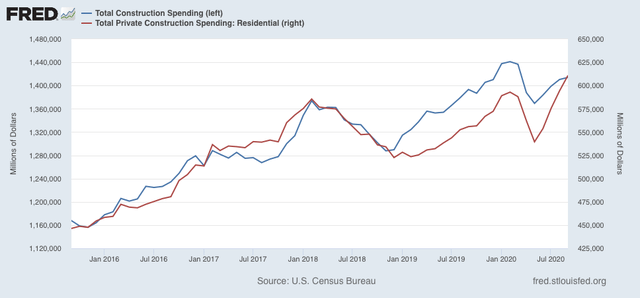
While total construction spending was only up 0.3% from a downwardly revised August, private residential construction spending (i.e., non-public housing construction) increased 2.8%:


This is yet more evidence of a very strong housing rebound brought about by record low mortgage rates.

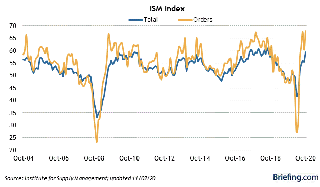
The ISM manufacturing index, including its new orders component, was even more positive. The total index increased 3.9 to 59.3, the highest reading since 2018. The new orders component was even stronger, up 7.7 to 67.9, also the highest since 2018:


Manufacturing is on a tear.

Housing and manufacturing together are the most positive components of the entire economy right now. The former is a long leading indicator, the latter a short leading indicator.  Bring the pandemic under control and the US economy is going to do extremely well in 2021.

Sunday, November 1, 2020

The final 2020 Presidential Electoral College forecast: Biden 350, Trump 181, 7 toss-ups


 - by New Deal democrat

Here is my final nowcast for the Presidential 2020 election, based on State rather than national polling in the past 30 days, since that directly reflects what is likely to happen in the Electoral College. For this final installment, I am also including forecasts from 3 “fundamentals” models, including the one based on the Index of Leading Indicators that already forecast a result over half a year ago.

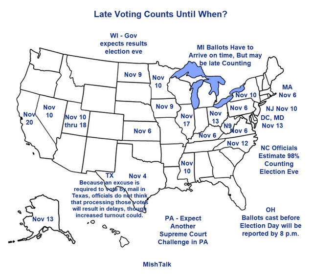
At only 2 days from Election Day, the polls are probably less than 1.5% off the final result. All of the fundamentals are known, and Trump’s attempt at an “October surprise” fizzled. There is some evidence of previously undecided partisan voters “coming home” in the past week or two. Aside from that, all that is left are brazen judicial shenanigans. In this last regard, here is a really helpful map of what days we can expect the ballot counting to be complete in various States, courtesy of Mike Sherlock a/k/a Mish:


By November 6, unless the Supreme Court wants to end the American Republic in the next 5 days, we should have results from Pennsylvania and enough other States to know definitively who the victor is, if we don’t know already.

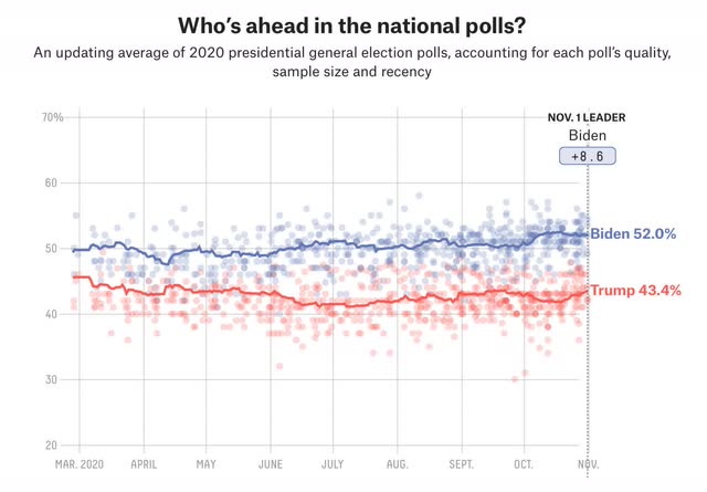
Once again, unlike 2016, Biden’s lead been at very least steady for nearly 5 full months:


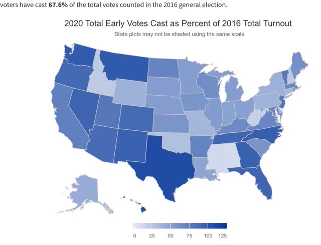
Not only that, but as of yesterday about 67% (about 94 million!) of the total number of ballots compared with 2016 have already been cast:


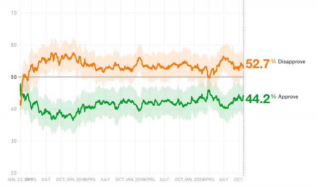
Trump has not made any extraordinarily incompetent and cruel mistakes since early  October, and as it has always done in the past, his approval ratings have recovered to their normal range. This week his approval declined by -0.4% to 42.2%, while his disapproval rate also declined -0.9% to 52.7% — again, well within the normal range of approval going back over 3.5 years: 


So, here are the final two maps through October 31 for the Presidential election. To refresh, in the first map:

- States where the race is closer than 3% are shown as toss-ups.
- States where the range is between 3% to 5% are light colors.
- States where the range is between 5% and 10% are medium colors.
- States where the candidate is leading by 10% plus are dark colors.


This week New Hampshire improved to “solid Biden,” and Nevada to “likely Biden.” Meanwhile Florida decline back to “toss-up,” Alaska to “likely Trump,” and Utah to “solid Trump.”
    
Even so, Biden still has 279 “solid” or “likely” Electoral votes, enough to win without any “leaning” or toss-up States. 
  
This final week I am also including a map that includes any State with a 1%+ differential to “lean Democrat/GOP” category:
   
      
In perhaps the biggest shock of the 2020 race, Georgia looks likely to join North Carolina as a Blue State, following Virginia as the 3rd east coast State of the old Confederacy to do so. Ohio and Texas are slightly likely to remain Trump States. The only true remaining toss- ups are  Iowa and Maine’s 2nd Congressional District.
     
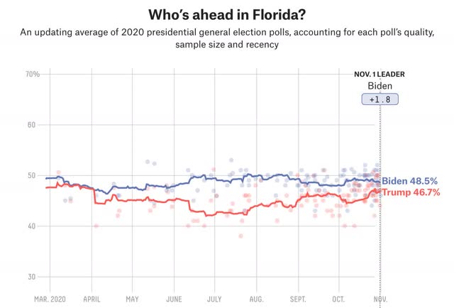
Biden’s support remained at 50%+ in Michigan, Minnesota, Nevada, and Wisconsin. But P en. nsylvania and Nevada declined below 50%, although above 49%. North Carolina also remained at 49%+. Florida declined below 49%, joining Arizona. Florida is the only State I am really worried about “flipping” from Biden to Trump, as it appears enough Cuban  Americans and elderly retirees have been “coming home” to the GOP:


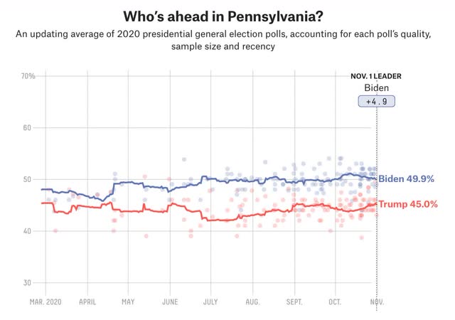
But perhaps more importantly, here is Pennsylvania, hanging tough for Biden. Although I won’t post the graphs, Minnesota, Wisconsin, and Michigan are similar:
   
 Biden’s lead in these States has been durable, and he has an actual majority in all but Pennsylvania. In short, this year the “blue wall” is extremely likely to hold. And if it does, Trump’s chances of victory are foreclosed.
Before I close out this exercise, I want to reiterate forecasts from several other good “fundamental” models.  
 
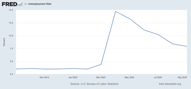
The first focuses on whether there has been an increase in the unemployment rate during  the election year by more than +0.3%.  Needless to say, the increase from 3.5% in February to 7.9% in September bodes ill from Trump:
 

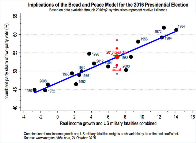
Secondly, Douglas Hibbs’ “Bread and Peace” model, which relies on the Q2 and Q3 ch ange in real disposable income and then subtracts for military casualties, gives contradictory signals depending on whether or not you include pandemic fatalities as being similar to military fatalities. Here’s the model’s performance through 2016:


  Hibbs, who is still alive, has not updated his model for 2020.
   
The Congressional stimulus earlier this year strongly boosted personal income. Since there have been negligible military casualties, another researcher duplicating Hibbs’   methodology recently estimated that the model would predict a roughly 52% vote share victory for Trump. But in 1952 and 1968, military casualties of roughly 35,000 out of a roughly 175 million US population subtracted 7% to 8% from the incumbent share. If one  plugged the pandemic casualties adjusted for current US population, the model would subtract almost 4x that number, or roughly 30%, from Trump’s share!

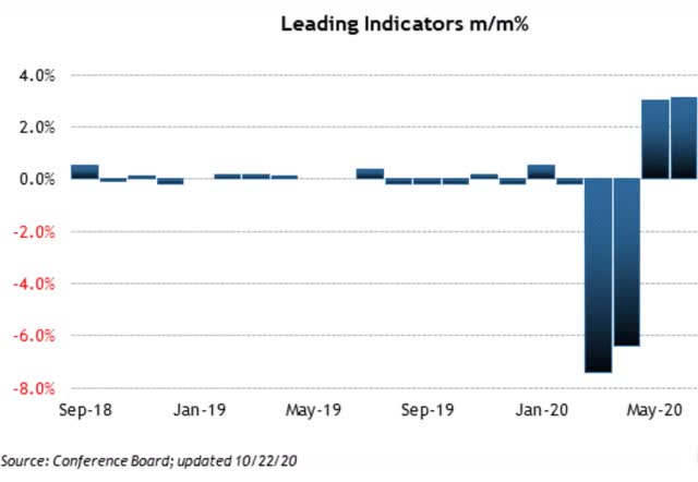
Finally, my favorite “fundamentals” model takes the candidates’ Q1 polling results and a. djusts for the reading of the index of leading indicators through that point. In Q1, Biden already had a slim lead over Trump in national polls, and then the pandemic did this to the Index of Leading Indicators:


I’ve included the graph through June just for comparison purposes.

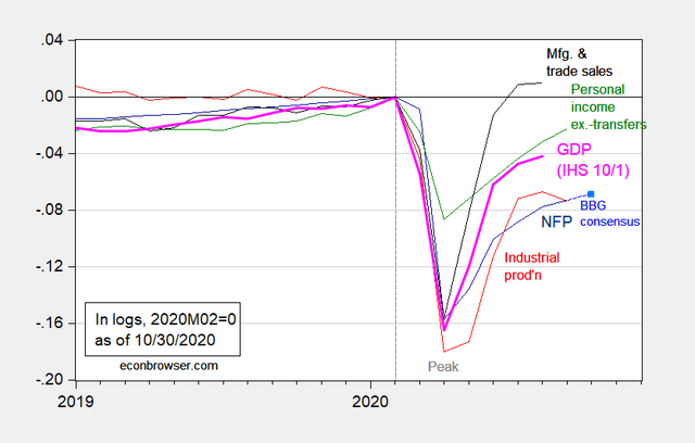
In short, the Index of Leading Indicators forecast a very dramatic drop in the economy,    which did happen and from which the economy has only partially recovered. Here is Prof. Menzie Chinn’s graph of the 4 big coincident indicators through October:


In short, with the unusual exception of one that focuses on personal disposable income,    the “fundamentals” models strongly indicate a big Trump loss.  Further, the model that is based no the Index of Leading Indicators foretold this over half a year ago, as I wrote here LINK.
 
In sum, I am increasingly confident of a Biden victory, perhaps a decisive one, with the final Electoral College tally of Biden 350, Trump 181, with 7 toss-ups.