Saturday, June 20, 2020
Weekly Indicators for June 15 - 19 at Seeking Alpha
- by New Deal democrat
My Weekly Indicators post is up at Seeking Alpha.
Almost all of the metrics have improved off of their worst readings. Enough of the short leading indicators have improved so much that the short term forecast was upgraded to neutral as of this week.
As usual, clicking over and reading should bring you “up to the moment” on the economy, and it also rewards me with a penny or two for the effort I put into the endeavor.


Friday, June 19, 2020
Coronavirus dashboard for June 19: infections and hospitalizations have increased; it may be too late for Arizona
- by New Deal democrat
Let’s start with the basics: total US coronavirus infections are 2,191,371. Total US deaths from coronavirus are 118,436. Those are official numbers; the real numbers are obviously higher.
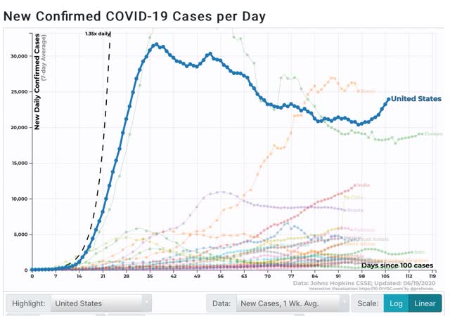
The number of daily new infections averaged over a week has started to rise decisively. After a low of 20,357 on June 9, as of the 18th it has risen to 23,923:
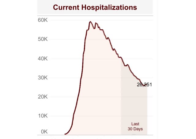
Not all States keep track of hospitalizations, so most dashboards don’t cover them. Conor Kelly does, and his measure shows that hospitalizations have also increased over the past three days as well:
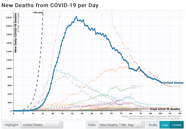
Deaths, however, have continued to decrease, down to 679 over the past 7 days vs. the peak of 2,210 on April 18:
One Stanford statistician claims that COVID-19 deaths are following a “Gompertz function,” I.e., they have all but completed burning through the available victims, and that deaths will drop to zero within 60 days:
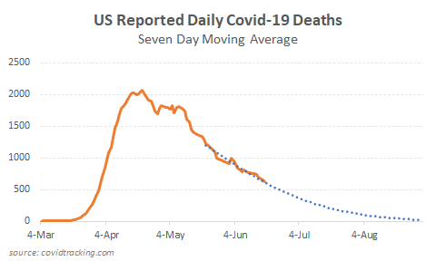
It is certainly interesting that, while new infections declined only 1/3 from peak, deaths have declined 2/3 from peak. But I suspect that the curve-fitting is skewed by the period that hospitals were overwhelmed by the NYC outbreak. When we remove the NYC metro from the data, deaths are not declining towards zero at all:
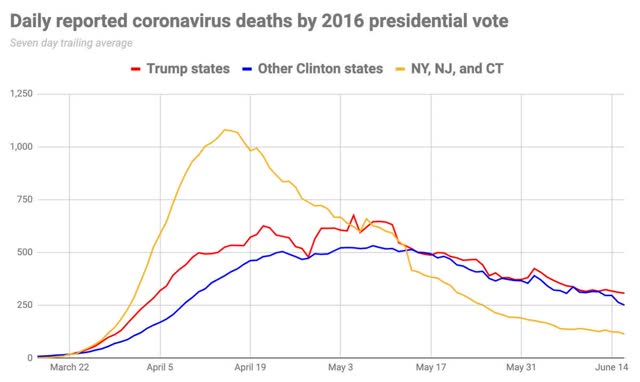
Turning to the situation in the recklessly reopened States, Arizona’s rate of new infections has gone exponential:
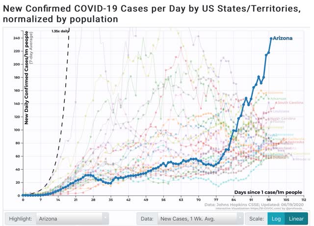
At this rate, within about 10 days Arizona will be as bad on a per capita basis as NY was at its peak. And remember, those who will present with symptoms in the next 5-7 days have already been infected. Aside from Utah, all of the other top 10 States are from the Confederacy, and their rates of infection have been growing. Texas has risen to #11.
As to deaths, which lag, on a per capita basis 7 of the top 10 States are from the Northeast megalopolis. Illlinois is also included. But all 8 of these are declining. Both Georgia and Arizona have now joined, at #9 and 10, respectively, and their numbers are generally slowly growing:
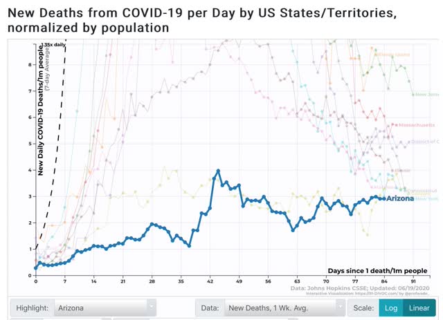
It remains to be seen how brutally reality will have to hammer these States before they see the light, if ever. The governors of both Arizona and Texas have reluctantly allowed municipalities to mandate mask-wearing if they choose, and many of Arizona’s biggest municipalities have already done so.
Thursday, June 18, 2020
New and continued jobless claims level off, as spreading secondary impacts and job recalls balance
- by New Deal democrat
Weekly initial and continuing jobless claims give us the most up-to-date snapshot of the continuing economic impacts of the coronavirus on employment. Three full months after the initial shock, the overall damage remains huge, with recalls to work roughly balanced with spreading new secondary impacts.
First, here are initial jobless claims both seasonally adjusted (blue) and non- seasonally adjusted (red). The non-seasonally adjusted number is of added importance since seasonal adjustments should not have more than a trivial effect on the huge real numbers:
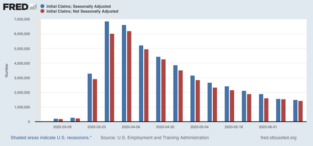
There were 1.433 million new claims, which after the seasonal adjustment became 1.508 million. This is “only” 58,000 less than last week’s number - the smallest weekly decline since the worst reading in April, but nevertheless is the lowest so far since the virus struck.
These new claims show objectively huge second-order impacts continuing to spread.
The “less bad” trend has leveled off in continuing claims, which lag one week behind. In the past four weeks, both the non-seasonally adjusted number (red), and the less important seasonally adjusted number (blue) have remained nearly stationary. This week the former declined by only 62,000 to 20.544 million, 4.368 below its peak of 24.912 million four weeks ago; while the latter actually rose slightly by 26,000 to 18.654 million, but still 4.140 million below its peak of 22.794 million reading four weeks ago:
These new claims show objectively huge second-order impacts continuing to spread.
The “less bad” trend has leveled off in continuing claims, which lag one week behind. In the past four weeks, both the non-seasonally adjusted number (red), and the less important seasonally adjusted number (blue) have remained nearly stationary. This week the former declined by only 62,000 to 20.544 million, 4.368 below its peak of 24.912 million four weeks ago; while the latter actually rose slightly by 26,000 to 18.654 million, but still 4.140 million below its peak of 22.794 million reading four weeks ago:
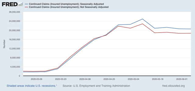
In other words, the spreading new damage shown by the continued huge numbers of new jobless claims is about equal to the callbacks to work from various sectors “reopening.”
On a more long-term note, historically continuing claims have peaked at the end of or just after the end of recessions. Here’s the graph showing that from the beginning of the series through 2009:
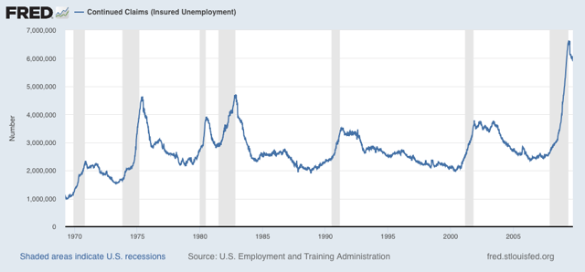
Since this week the “King of Coincident Indicators,” industrial production was reported to have risen in May, and real retail sales also rebounded strongly, the decline in continuing claims over the past month is consistent with a determination by the NBER that a very short recession has already ended.
Because there is increasing evidence of renewed exponential spread by the coronavirus in States that recklessly reopened, all of the improving economic data (improving from absolutely horrible levels of course) may come to an abrupt end in the next few weeks.
Wednesday, June 17, 2020
Coronavirus dashboard for June 17: the second wave of the tsunami comes ashore
- New Deal democrat
As of yesterday, there were 2,137,731 total documented coronavirus infections in the US. Total known deaths were 116,963.
As I have stated several times in the past month, I believe that coronavirus infections and deaths will wax and wane around the April-May plateau of roughly 20-25,000 new daily infections and 500-2000 daily deaths, at least as long as Trump remains President. This is because, absent competent Federal leadership, the US lacks the political and social will to do what is necessary - distancing + mask-wearing + tracing - in order to “crush the curve” as almost every other industrialized European and Asian country has been able to do.
The current situation in the US is divided by region. In the early hard-hit areas of the Northeast and Midwest, effective measures were put in place and have been relaxed more gradually. As a result the infection rates there have continued to decline. By contrast, in the Confederacy, the High Plains, and the Southwest, lockdowns were put in place late if at all, and lifted early without any meaningful restrictions. As a result infection rates have begun to rise, in a few States at an exponential rate.
Yesterday the COVID Tracking Project finally released graphs for each region per capita, shown below:
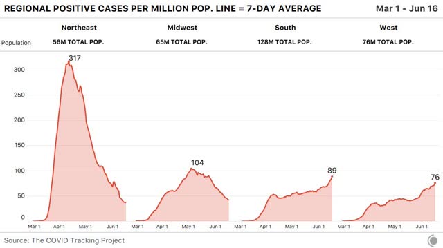
In the Northeast and Midwest, the 7 day moving average of new infections has fallen to roughly 40 and 45 per million, respectively. In the South and West, it has risen to 89 and 76 per million, respectively.
Here is a map showing which States have falling rates of new infections (green), relatively flat rates (yellow), and increased rates of new infections (red):
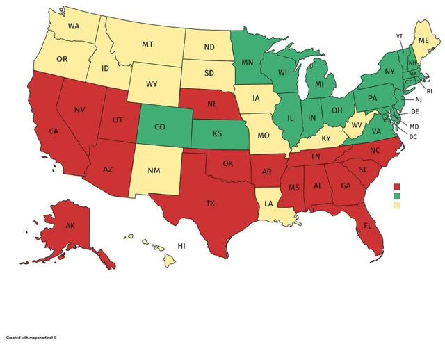
The regional pattern is obvious.
Here are the thumbnail graphs of all States with recent increases in new infections, ranked in order from highest to lowest number of *total* infections over time:
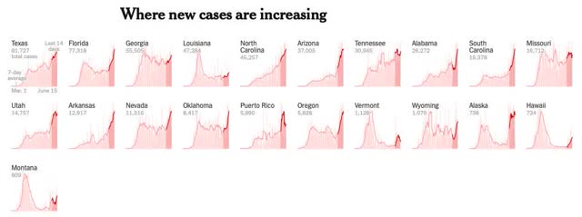
The last half dozen States shown, including, e.g., Oregon, Montana, Alaska, and Hawaii, have such small total numbers that the recent increases aren’t really significant; whereas the first shown, Texas, isn’t even in the “top 10” for the per capita rate of new infections (it’s #17. California is #14)).
The “leader of the pack” among the recklessly reopened States is Arizona, which saw a huge increase in new cases yesterday, bringing its 7 day average up to 214 per million:
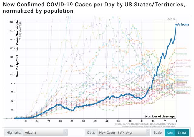
As shown in the graph above, the remaining “top 10” are all States in the Confederacy, High Plains, and Mountain West. In order, (showing rates of new infections per million as of June 15 in parentheses) they are: Alabama (156), Arizona (150), South Carolina (125), Louisiana (127), North Carolina (117), Utah (102), Mississippi (98), Florida (83), and Iowa (83).
To put this in perspective, here is the same graph but superimposing NY’s trend-line:
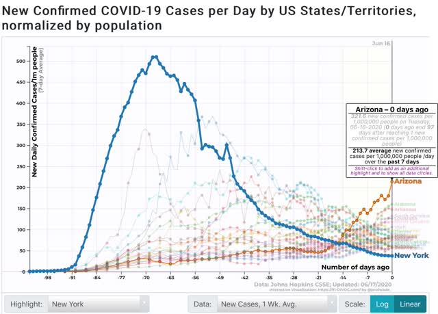
Even now, Arizona is not nearly as bad as NY, NJ, CT, or LA were at their peaks. But at its current rate of doubling, roughly every 9 days, if this continues I n about 2 weeks AZ will be as bad as NY was at its worst.
Tuesday, June 16, 2020
The Coronavirus Recession may already (technically) have ended: sales and production both increased in May
- by New Deal democrat
Sales and production are two of the four things that economists look for in gauging whether the economy is in expansion or recession, and this morning both of them - retail sales and industrial production - were released for May.
So it’s true: as defined by the NBER, the Coronavirus Recession may have only lasted two months, from February through April. That’s because, just as February was the peak of economic activity before the coronavirus hit, April may well have been the trough. And recessions technically end, not when the economy becomes objectively “good” or “fair,” but simply when the level of activity is less awful than before. If the trajectory is positive, and activity goes from really awful, to slightly less really awful, the recession has ended, even if the economy is still, well, awful.
To the graphs! First, here are retail sales, both nominally and as adjusted for inflation:
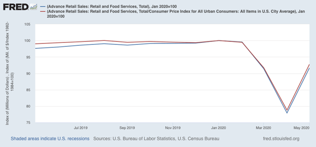
Both increased 17.7% in May, after declining over 14% in April. Both are also slightly higher than their levels in March. Clearly the “reopening” of the economy in large portions of the country led to a splurge in spending.
Next, here is total industrial production (blue) along with manufacturing production (red):
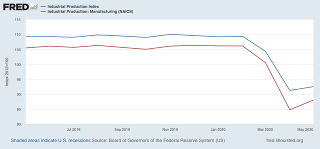
Both increased slightly.
Since employment also increased in May, that makes three of four sectors included in recession measurements that - as of now - are off their lows, as shown in the graph below:
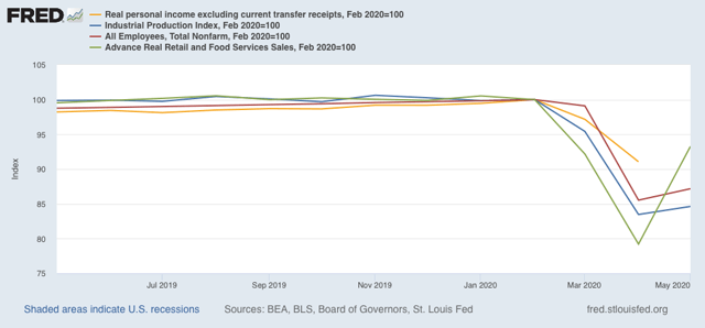
Personal income less transfer receipts for May won’t be reported for another couple of weeks, but even if it is lower, the NBER may still decide that the recession has ended. That’s because industrial productions is the King of Coincident Indicators, and carries more weight than the others in recession calls. For example, here is the period of time including the Great Recession:
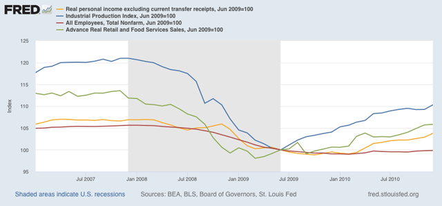
The NBER determined that the recession ended in June 2009. That’s when industrial production bottomed. Real retail sales had already bottomed several months before. Both employment and real income were close to but had not yet reached their bottoms.
So, even though the economy as measured by all four sectors is still awful, it was a little less awful in May than it was in April, and that may be enough for the NBER.
Two important caveats:
(1) I don’t expect the NBER to be so quick with this call as they were with their recession onset call, because they will want to be sure that this is not a false start; which leads even more importantly to
(2) the virus is still in control. Those States which have recklessly opened without waiting for infections to abate, and without effective testing, tracing, and quarantining protocols - which is almost all of them, particularly in the South, High Plains, and Mountain West - are seeing new infections start to rise again, and in some cases - Arizona, Alabama, Arkansas, Texas, and South Carolina for example - the graphs are beginning to look exponential again. It would not be surprising at all if renewed panic were to set in, with new lockdowns put in place, or at very least consumers pulling back from face-to-face activity. In other words, the increases in industrial production, employment, and sales may well prove temporary.
Monday, June 15, 2020
Abbreviated Coronavirus dashboard for June 15: tracking the four horsemen of the reopening apocalypse
- by New Deal democrat
There’s no big economic news out today. So let me follow up on my post Friday about the cost of reopening recklessly coming due.
Here is the graph from 91.divoc.com of the 10 States with the highest per capita infection rate over the past 7 days ending Saturday:
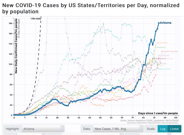
With the exception of rapidly declining Maryland, the focus has almost entirely shifted away from the Northeast and Midwest and instead to the Confederacy plus Iowa, Utah, and Arizona. The 4 “leading” States are Arizona, Alabama, Arkansas, and South Carolina.
I’m having problems with the 91-divoc site this morning, but the raw data through Sunday shows a slight decline for Arizona, but a 12% increase for Alabama and a whopping 25% increase for Arkansas, bringing it up to Arizona’s level. South Carolina is steady.
Among the other States with recent big increases, North Carolina saw a 6% further increase as of Sunday. Utah and Iowa had slight increases. Mississippi had a 13% decrease in the 7 day average.
Finally, although they aren’t among the 10 States with the highest per capita new infections, both Florida and Texas have also seen big increases in cases in the past two weeks (both have had about 60 cases per million per day as of several days ago). Through Sunday, Florida’s rate increased another 8%, while Texas saw another 3% increase.
Bear in mind that, at its worst, NY had over 500 new infections per day per million population, so even Arizona and Arkansas are less than 40% of that rate. It remains to be seen how much pain these States can take before they decide to change their ways - if ever.
Saturday, June 13, 2020
Weekly Indicators for June 8 - 12 at Seeking Alpha
- by New Deal democrat
My Weekly Indicators post is up at Seeking Alpha.
The short leading indicators have continued to improve, from awful, to less awful, to merely really bad.
But that the NASDAQ briefly made a new high last week, while the S&P was only 5% from one, while the coronavirus pandemic rages on, was simply insane.
As usual, clicking over and reading should bring you up to the moment on the economy, and reward me a little bit for my efforts.
Friday, June 12, 2020
Coronavirus dashboard for June 12: the costs of recklessly reopening begin to come due
- by New Deal democrat
It is pretty clear now that in general those States (but not all) which left lockdowns the earliest and with the most lax continuing restrictions are suffering renewed outbreaks of the coronavirus, *possibly* in several cases verging on exponential spread.
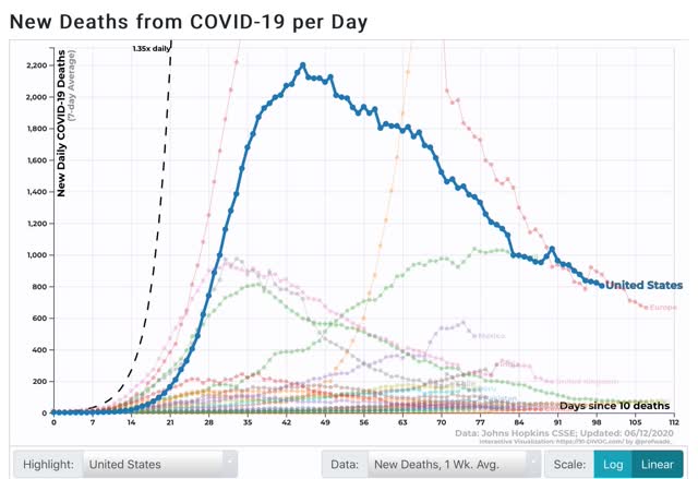
For the US in total, the 7 day average of deaths has continued to decline, now at 803 per day vs. 2,201 on the April 18 peak:
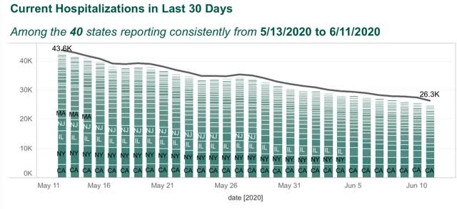
Among the 40 States that consistently report hospitalizations, the number has still also declined:
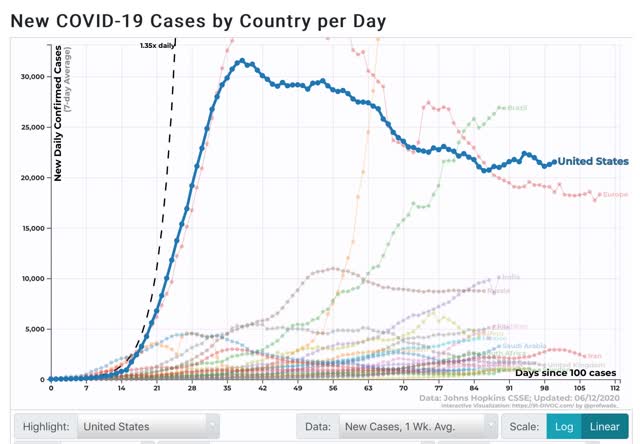
But new cases averaged over the past 7 days have started to rise again, now at 21,527 vs. the low of 20,658 on May 28:
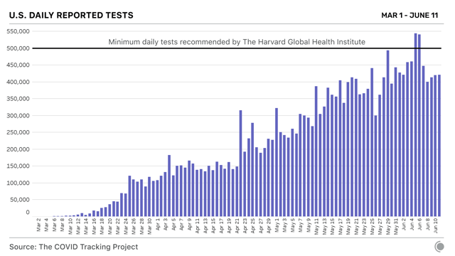
The increase cannot be put down to increased testing, as the 7 day average has leveled off in the past week:
Here is the breakdown of new infections by region:
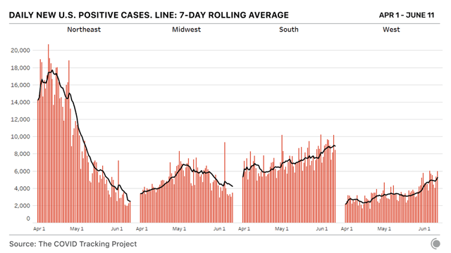
Note, however, that the above graphs are not per capita. The below chart of the last 7 days, however, is:
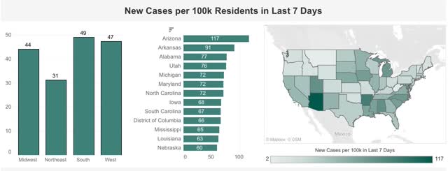
It is crystal clear that the new hot spots are in those States which recklessly relaxed restrictions.
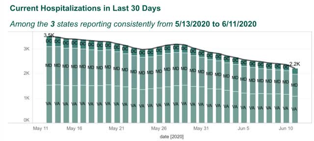
The Washington DC area, including MD and VA, has been a hot spot, but that is abating somewhat:
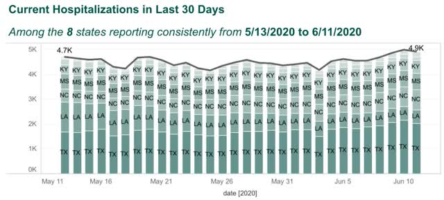
But the other States of the Confederacy (plus OK and KY), are clearly seeing an increase in cases:
NY, which had the worst outbreak by far, is down to 42 new daily infections per million:
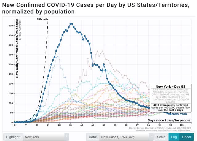
At its peak, NY had 509 infections per million per day. NJ peaked at 409, RI at 369, LA at 340, and CT at 309. No other State has exceeded 300 to date.
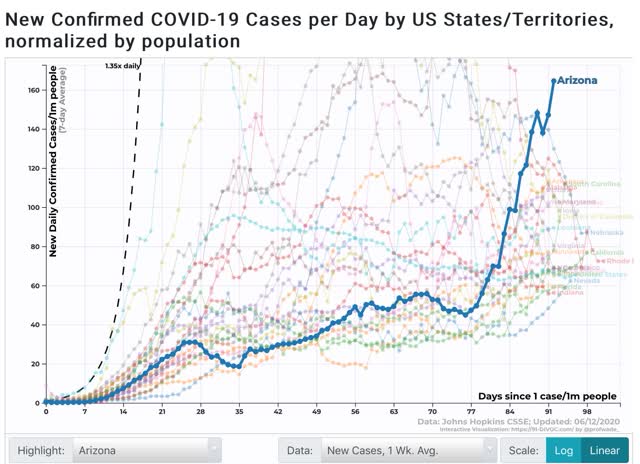
I call the above to your attention, because among States that are seeing new outbreaks, here in particular are Arizona, as of yesterday at 167 per million:
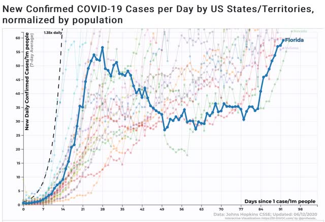
And here is Florida:
And Texas:
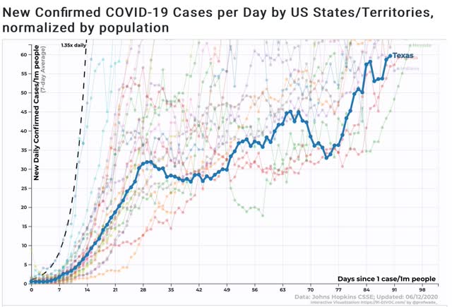
All three have new infection rates of over 50 per million population, above NY’s current number.
There is no certainty that the sudden increases in these three (and other) States will continue, but in the aggregate there is no doubt that the virus is spreading again. It remains to be seen if outbreaks approaching the prevalence formerly in the NYC area will lead to renewed lockdowns in any of the affected States.
Thursday, June 11, 2020
Initial jobless claims decline further, but continuing claims fail to make meaningful progress
- by New Deal democrat
Weekly initial and continuing jobless claims give us the most up-to-date snapshot of the continuing economic impacts of the coronavirus to the average worker. Twelve weeks after calamity first struck, the theme remains “less awful.”
First, here are initial jobless claims both seasonally adjusted (blue) and non- seasonally adjusted (red). The non-seasonally adjusted number is of added importance since seasonal adjustments should not have more than a trivial effect on the huge real numbers:
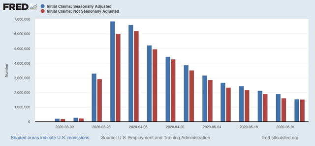
There were 1.542 million new claims , which after the seasonal adjustment became 1.537 million. This is a -355,000 decline from last week’s number, and the lowest so far since the virus struck - but still almost twice as bad as the worst week during the “Great Recession.”
Since we are more than a month after some States “reopened,” these new claims primarily represent spreading second-order impacts.
Unfortunately, the “less bad” trend has not continued in continuing claims, which lag one week behind. In the past three weeks, both the non-seasonally adjusted number (red), and the less important seasonally adjusted number (blue) have remained nearly stationary. This week the former declined by 339,000 to 20.929 million, but was 88,000 above the 20.841 reading of two weeks ago; while the latter declined by 179,000 to 18.920 million, 58,000 above its 18.861 reading two weeks ago:
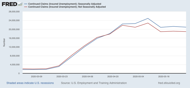
This tells us that the spreading new damage is about equal to the callbacks to work from various sectors “reopening.”
On a more long-term note, historically continuing claims have peaked at the end of or just after the end of recessions. Here’s the graph showing that from the beginning of the series through 2009:
Depending on what happens with the King of Coincident Indicators, industrial production, when it is reported next week, it is possible that the NBER could call an end to a very short recession. But since the virus has not gone away, and indeed new cases are increasing again, I suspect we may see renewed restrictions implemented in many parts of the country in the next few months.
Wednesday, June 10, 2020
May inflation steadies: meanwhile, an artificial all time high in “real” wages
- by New Deal democrat
In May, overall consumer prices declined by -0.1% (blue in the graph below), while consumer prices excluding energy (gas) rose +0.1% (red):
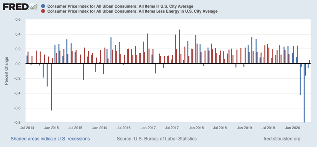
Note that in 2015 when gas prices collapsed, prices otherwise continued to increase, showing the underlying strength of the economy. But in March and April of this year, even prices outside of gas declined, showing underlying weakness. This is a typical recessionary scenario. May’s increase in prices ex-energy may be a good sign.
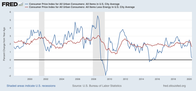
YoY inflation is now only +0.2%, while YoY inflation ex-energy is up +1.6%:
Last month I didn’t look at “real” inflation-adjusted wages. As it turns out, an important milestone was made - but was totally an artifact of the relative decimation of lower wage jobs.
“Real” inflation-adjusted wages for non-managerial employees rose to an all time high in April, finally surpassing the previous peak of January 1973:
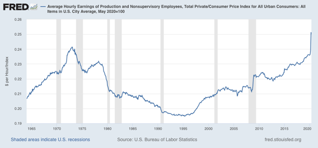
May declined -0.5% from the April peak. I suspect as more people are recalled to work, April will prove to have been a short-lived spike.
More importantly, here are “real” aggregate payrolls for all non-managerial employees YoY:
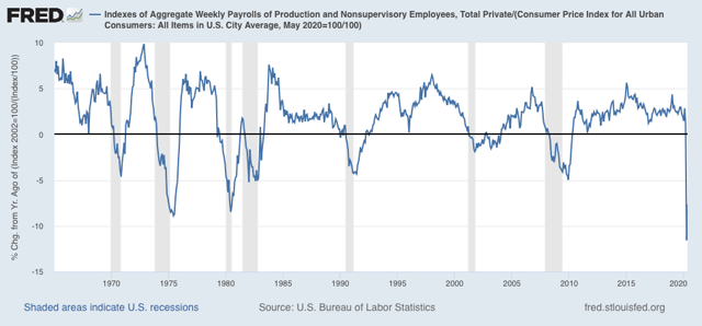
This is the worst drop in the entire history of this series.
That consumer prices steadied in May is a good sign. We will probably have to wait for the quarterly Employment Cost Index, which normalizes for the mix of jobs in the economy and won’t be released till the end of July, to find out what “really” has happened with wages during the pandemic.
Monday, June 8, 2020
Coronavirus update for June 8: declining trend in new infections has stopped
- by New Deal democrat
I haven’t updated the Coronavirus Dashboard in awhile. Last time I indicated I would do so if there was a significant change in trend.
Well, there has been. New infections are not declining anymore. In the last week, the 7 day average has increased slightly, and there has been only a 1% decline of the 7 day average in the past 2 weeks:
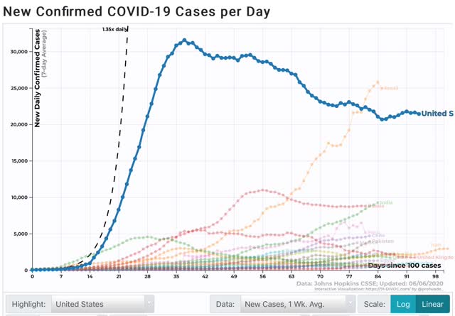
On Saturday, the 7 day average was 21.4k new infections, higher than the 21.0 cases of 10 days ago. Two weeks ago there were 21.7k new infections.
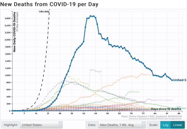
The 7 day moving average of deaths, which lags by 1 to 2 weeks, is still in decline, although I expect this to follow suit:
Because increased testing can be expected to find more cases, it might be argued that that is the cause of the recent reported increase in cases.
To check that, below I am comparing the 7 day average change in testing vs. the 7 day average change in new infections for each Wednesday and Saturday. In general between late April and late May we had a decline in reported new cases, even with a dramatic increase in testing. In the last two weeks the increase in new testing has abated somewhat, which we might expect to show an even steeper decline in new infections if the trend were continuing. But instead the level of new infections has turned around and increased:
To check that, below I am comparing the 7 day average change in testing vs. the 7 day average change in new infections for each Wednesday and Saturday. In general between late April and late May we had a decline in reported new cases, even with a dramatic increase in testing. In the last two weeks the increase in new testing has abated somewhat, which we might expect to show an even steeper decline in new infections if the trend were continuing. But instead the level of new infections has turned around and increased:
| Date | 1 week % Change Testing | 1 week % Change New infections | ||
|---|---|---|---|---|
| 4/18 | (-0.6) | (-5.2) | ||
| 4/22 | 20.6 | (-1.7) | ||
| 4/25 | 44.7 | 0.0 | ||
| 4/29 | 24.6 | (-2.0) | ||
| 5/2 | 9.4 | (-6.5) | ||
| 5/6 | 14.4 | (-5.3) | ||
| 5/9 | 15.9 | (-10.9) | ||
| 5/13 | 22.3 | (-14.4) | ||
| 5/16 | 25.0 | (-9.8) | ||
| 5/20 | 22.3 | 0.0 | ||
| 5/23 | 16.1 | (-2.2) | ||
| 5/27 | (-1.8) | (-8.7) | ||
| 5/30 | 0.7 | (-4.5) | ||
| 6/3 | 16.4 | 3.3 | ||
| 6/6 | 18.3 | 1.4 | ||
This suggests that the increase in new infections is signal and not noise, even if we can’t be sure that there’s been an “actual” increase vs. a leveling off.
The composition of States with the worst outbreaks has changed as well.
The Northeast Megalopolis from DC up through New Hampshire remained the hardest hit for deaths per capita:
| State | 1 week Deaths Per Million | |||
|---|---|---|---|---|
| MA | 10.7 | |||
| RI | 8.2 | |||
| NJ | 7.6 | |||
| IL | 6.0 | |||
| CT | 5.7 | |||
| MD | 5.5 | |||
| NH | 4.7 | |||
| PA | 4.4 | |||
| DE | 4.3 | |||
| DC | 4.3 | |||
| MS | 4.2 | |||
| NY | 4.2 | |||
Note that Mississippi had risen to #11.
When it comes new infections, however, the three States of the NYC metro area plus Pennsylvania have dropped out, while Southern, Great Plains, and Western States have all joined the list:
| State | 1 week Infections Per million | |||
|---|---|---|---|---|
| MA | 140.4 | |||
| MD | 129.2 | |||
| NE | 123.1 | |||
| AZ | 121.5 | |||
| DC | 111.7 | |||
| IA | 101.2 | |||
| UT | 100.9 | |||
| AR | 98.8 | |||
| VA | 96.8 | |||
| NC | 94.3 | |||
| IL | 89.9 | |||
| LA | 89.4 | |||
On a per capita basis, the MId-Atlantic from MD through NC is hard hit. But most noteworthy are the additions of NE, IA, AR, UT, and AZ.
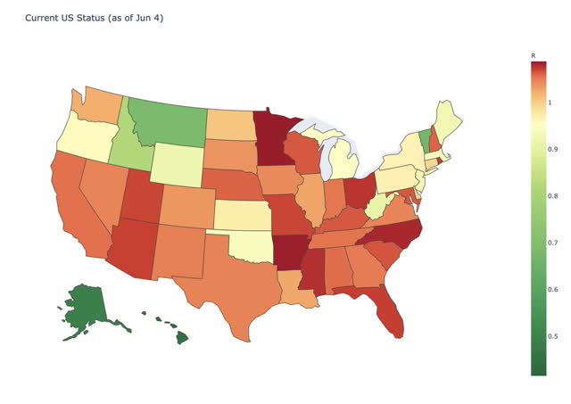
This is also shown in a graph of Reinfection status from several days ago (r less than 1 = good):
And this graph of the doubling rate of infections by county:
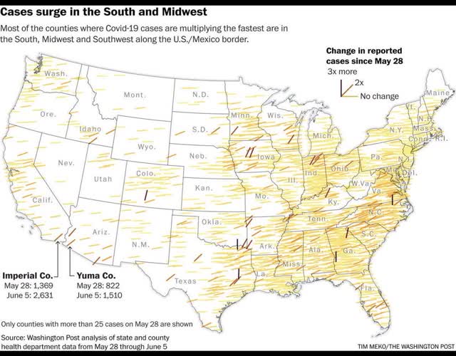
The interior South and some rural portions of the Midwest are now leading in outbreaks.
This, unfortunately, is in line with my forecast over the past month: that the population of the US as a whole lacks the political and social will to beat the coronavirus. As a result, the outbreak will continue to wax and wane as complacency alternates with fear generated by big new outbreaks. The massive protests we have seen over the past 10 days are only going to seed further outbreaks.
Saturday, June 6, 2020
Weekly Indicators for June 1 - 5 at Seeking Alpha
- by New Deal democrat
My Weekly indicators post is up at Seeking Alpha.
The interest rate-sensitive long leading indicators largely turned positive as soon as the coronavirus crisis hit. As lockdowns have eased, several of the short leading indicators have also now turned - or at least are a lot less awful.
If the easing up and/or the huge protests result in a surge of new coronavirus cases, that could certainly reverse itself. But for now, “less awful” is the trend.
As usual, clicking over and reading rewards me with a penny or two for the effort I put into the endeavor.
Friday, June 5, 2020
May jobs report: a welcome positive shock
- by New Deal democrat
HEADLINES:
- 2,509,000 million jobs added. This makes up about 12% of the 22.1 million job losses in March and April.
- U3 unemployment rate improved 1.4% to 13.3%, compared with the January low of 3.5%.
- U6 underemployment rate improved 1.6% to 21.2%, compared with the January low of 6.9%.
- March and April were both revised further downward, by -492,000 and 150,000 respectively, for a net of -642,000 more jobs lost compared with previous reports.
Leading employment indicators of a slowdown or recession
I am still highlighting these because of their leading nature for the economy overall. These were uniformly very positive:
- the average manufacturing workweek rose 0.8 hours from 38.1 to 38.9 hours. This is one of the 10 components of the LEI and will be a positive.
- Manufacturing jobs rose by 225,000. Manufacturing has still lost 1.145 million jobs in the past 3 months, or close to 10% of the total.
- construction jobs rose by 464,000. Even so, in the past 3 months -596,000 construction jobs have been lost, or about 8% of the total.
- Residential construction jobs, which are even more leading, rose by 65,600. Even so, in the past 3 months there have still been -58,800 lost jobs, or about 7% of the total.
- temporary jobs rose by 41,300. Since February, there have still been -852,800 jobs lost, or over 1/4 of all temporary help jobs.
- the number of people unemployed for 5 weeks or less declined to 3.875 million, compared with April’s total of 14.283 million. This is similar to the “less awful” readings of the weekly initial jobless claims.
- Professional and business employment rose by 127,000, which is still 2.156 million, or about 10% below its February peak.
Wages of non-managerial workers
- Average Hourly Earnings for Production and Nonsupervisory Personnel: declined $0.14 from $25.14 to $25.00, which is still a gain of over 3% in 2 months. This reflects that job losses were primarily among lower wage earners.
Aggregate hours and wages:
- the index of aggregate hours worked for non-managerial workers rose by 4.9%. In the past 3 months combined this has nevertheless fallen by about 10%.
- the index of aggregate payrolls for non-managerial workers rose by 4.4%. In the past 3 months combined this has nevertheless fallen by about 11%.
Other significant data:
- Full time jobs were responsible for 2.2 million of the gains.
- Part time jobs were responsible for 1.6 million of the gains.
- The number of job holders who were part time for economic reasons declined by 254,000 million to 10.633 million. This is still an increase since February of 6.315 million.
SUMMARY
This report was a positive shock. Rehiring in May outweighed the continuing and spreading layoffs. At first blush it appears this was primarily among the retail and leisure and hospitality sectors which were more than decimated in March and April.
A few sectors have recovered more than half of the jobs that were lost, but most have only regained 10% or 20% of their losses. Further, because average hourly wages have maintained over 80% of the increase in April - because lower wage jobs were primarily lost - this strongly suggests that the job recalls were relatively speaking tilted towards higher paying jobs as well.
Most importantly, aggregate payrolls are still down more than 10% from their recent peak. Unless a miracle happens and a huge majority of the job losses are reversed in the next 45 days, when the enhanced unemployment insurance passed by Congress runs out in July, there is going to be a major knock-on shock to the economy.
Thursday, June 4, 2020
Jobless claims: “less awful” trend mainly continues - for now
- by New Deal democrat
First of all, I have a new post up at Seeking Alpha. The monthly May data has started to come in, giving us our first comparable data after the coronavirus recession struck. In housing, vehicle sales, and manufacturing, the theme is “less awful.” As usual, clicking over and reading is hopefully educational for you, as well as putting a penny or two in my pocket.
Meanwhile, weekly initial and continuing jobless claims give us the most up-to-date snapshot of the continuing economic impacts of the coronavirus to the average worker. Eleven weeks after calamity first struck, the theme is the same: “less awful.”
First, here are initial jobless claims both seasonally adjusted (blue) and non- seasonally adjusted (red). The non-seasonally adjusted number is of added importance since seasonal adjustments should not have more than a trivial effect on the huge real numbers:
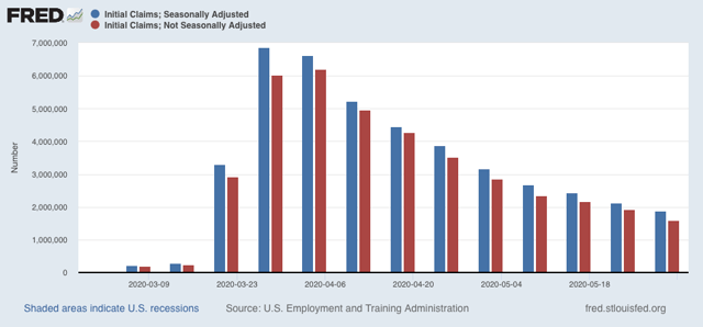
There were 1.603 million new claims, which after the seasonal adjustment became 1.877 million. This is a -249,000 decline from last week’s number, and the lowest so far since the virus struck.
Since we are a month after some States “reopened,” these new claims primarily represent spreading second-order impacts.
Unfortunately, the “less bad” trend did not occur in continuing claims, which lag one week behind. Both the non-seasonally adjusted number (red), and the less important seasonally adjusted number (blue) rose, by 437,000 and 649,000 respectively, although both remained substantially below their peaks of two weeks ago:
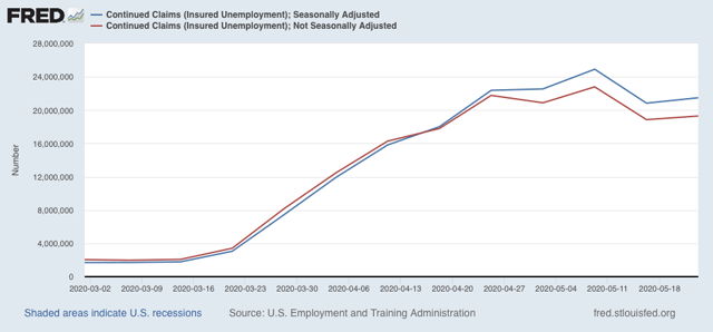
This tells us that, as of two weeks ago, the new damage outweighed callbacks to work.
Let’s be clear: all of these numbers are awful, Great Depression-scale readings. The “good” news is still that climbing back from recession bottoms always has to start with “less awful” news, and overall this is what we got in this week’s jobless claims report. By way of historical comparison, initial jobless claims peaked in late March 2009, a little over two months before that recession officially ended.
The big caveat: the virus does not care about States’ claiming that they are reopened. There is accumulating evidence that new infections have stopped declining on a nationwide basis, and both those and deaths have started to increase again slightly. So restrictions might need to be renewed. Also, given GOP opposition in the Senate, it appears that enhanced unemployment benefits are going to end next month. Since it is almost certain that the economy will still be very depressed at that point, a further huge wave of negative impacts seems increasingly likely.
Wednesday, June 3, 2020
Echoes and contrasts with 1968
- by New Deal democrat
As I mention from time to time, I am a fossil. I am old enough to remember 1968, when I was a politically precocious teenybopper. In the past week, I have read a number of commentaries wondering if this year is similar to that. In short: yes.
In 1968 it appeared that the world was spiraling out of control. The Vietnam war was at its height, with 300 soldiers killer every week. Protests against the war were also reaching a crescendo, one that reached its apex during the Democratic Convention in Chicago, which was later described as a “police riot” that, among other things, targeted journalists. That was just a few weeks after the Soviet Army rolled into Czechoslovakia to crush the “Prague Spring” of a progressive socialist government.
There were also race riots in medium and big US cities throughout the country. The police were called in to crack down on looting and vandalism, particularly following the assassinations of both Martin Luther King and Robert Kennedy.
While we don’t have a foreign war, we do have a pandemic that has uniquely been allowed to grow out of control in the US. We have China making moves in Hong Kong and the border with India. We have massive demonstrations, with some sporadic violence, following yet another death of a black man at the hands of heavy-handed police tactics. The President has called in the military against its own citizenry.
But there are also two important differences. The first is that the pervasive videoing of police tactics has caused what one writer is calling “The Great Awokening” among most white people, who have seen convincing evidence of racial profiling by police and worse, killings of African Americans by police for things as trivial as a boy having a toy gun in a park.
This “Great Awokening” is shown by two charts below. The first shows attitudes towards violence by vs. towards police:
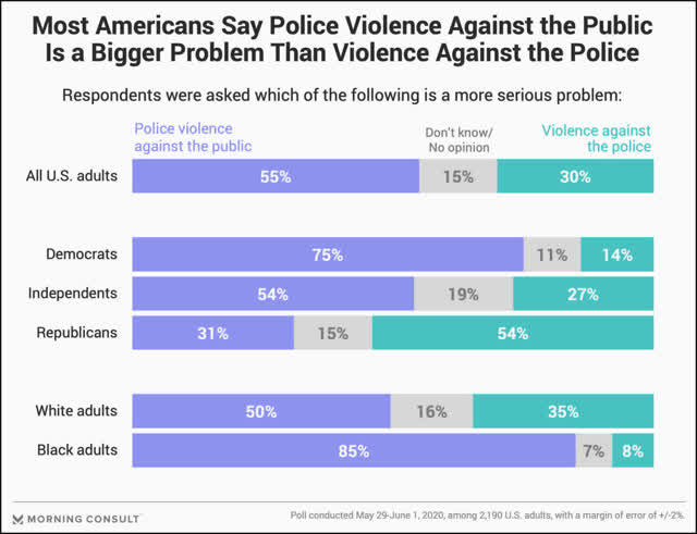
Even whites view violence *by* the police as a bigger problem than violence *towards* the police.
The second shows that the public does not approve of Trump’s handling of the protests in the past week (I’ve truncated the chart to take out views by employment and a few other items):
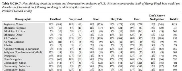
Only Evangelicals and rural areas show higher rates of approval (good, very good, and excellent) compared with disapproval (poor). Interesting, whites are not broken out separately.
The second contrast with 1968 is that the person calling for “law and order” is the incumbent. In 1968 the President, both Houses of Congress, most State governments and big cities were run by Democrats. Nixon, a Republican, was running against them. Now Trump and the GOP control the Presidency, Senate, and a majority of Statehouses. And when civil order breaks down, the public blames the incumbent party, not the insurgents.
I have no idea how everything will ultimately play out, but I do believe the images of the US military being called into action against peaceful demonstrators in Washington DC is going to leave a very sour taste. I do suspect that, like 1968, there will be a watershed passing of the political order of the old guard.
Tuesday, June 2, 2020
Coronavirus dashboard for June 2: the US has settled into a depressing status quo
- by New Deal democrat
The US seems to have settled into a status quo where it accepts 20,000 new coronavirus infections and 1,500 deaths each day. This is what I forecast about a month ago, as lockdown regimens were abandoned in much if not most of the country: periods of waxing and waning waves of infection because there simply isn’t the political or social willpower to “crush the curve.”
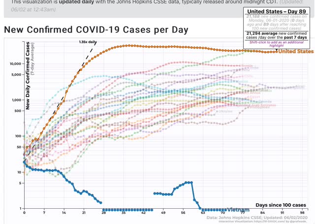
Meanwhile Vietnam, a developing country with a 90,000,000 population, which immediately went on a regimen of testing and tracing per the WHO recommendations, and has nearly universal wearing of masks, has not recorded a single coronavirus death. Below I show cases, because there are no deaths in Vietnam to show!:
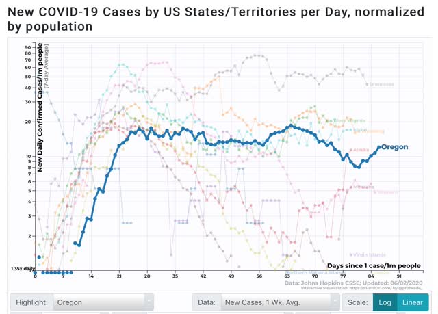
Domestically, it continues to be the case that only Oregon, with a population of about 4.5 million, in addition to several rural States and the island State of Hawaii, has “crushed the curve”:
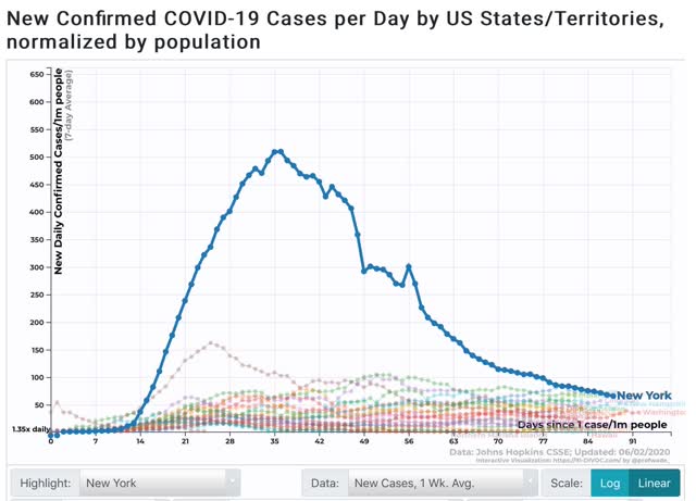
States that had early outbreaks, like NY, have seen dramatic reductions, but as the graph below shows, even with a -87% decline in new infections, NY still has more new infections even on a per capita basis than half of all the States, as shown in the below graph of new infections in the bottom 25 States plus NY:
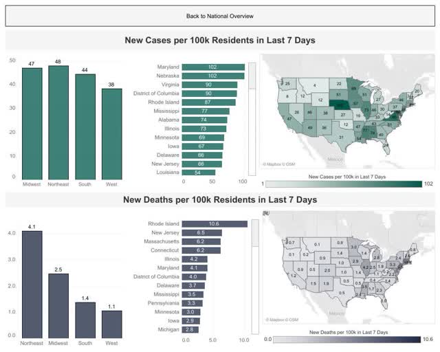
Here is a map showing new cases and deaths per capita for all 50 States, from Conor Kelly, who continues to do great graphic work:
Here is his graphic overview of deaths, new cases, testing, and the % of positive tests:
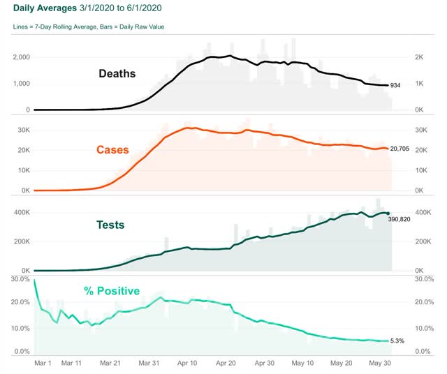
In the past 14 days, the 7 day average of new cases in the US has only declined by 1,624 cases, from 22,918/day to 21,294/day. Of that, 767 have been in NYS, in which they have declined from 2,045/day to 1,278/day.
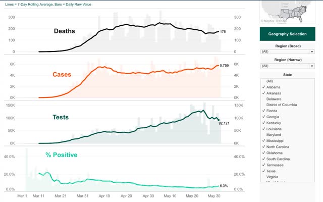
What about in States that have most egregiously ended restrictions? While the individual State data is noisy, and in some notorious cases (FL and GA) very unreliable, the below graph (again from Conor Kelly) for the Confederacy as a whole, shows that new cases started to increase as of April 28, while deaths have only increased after May 26, a 4 week lag:
Between some very bad social behavior over Memorial Day weekend and the civil unrest of the past week, I would expect new cases to increase in many areas in the next 14 days, and deaths to follow a week or two after that.
Unless a larger State like Washington, NJ or NY demonstrates by example that “crushing the curve” is possible in the US, I expect this waxing and waning around the status quo to continue until winter generally and specifically until at least next January 20.
Subscribe to:
Posts (Atom)