Saturday, October 19, 2019
Weekly Indicators for October 14 - 18 at Seeking Alpha
- by New Deal democrat
My Weekly Indicators post is up at Seeking Alpha. Although the economy, especially in the producer sector, is quite weak right now, the indicators in all time frames are, in the aggregate, positive.
As usual, clicking over and reading should bring you right up to the moment on the data, and rewards me a little bit for my efforts.


Friday, October 18, 2019
An important update on the yield curve
- by New Deal democrat
For the last 10 months, readers of the financial press have been bombarded with stories about the inverted yield curve, where (some) longer term interest rates are lower than shorter term interest rates. I track them too! But they are by no means my only forecasting tool.
In any event, in the past several months and weeks, the yield curve has resumed a much more normal configuration. So does that mean we are in the clear?
It depends which measure you are paying most attention to. Which has always been an important caveat, because the inversion of the yield curve has, with the exception of about one week several months ago, always been partial - i.e., at least one “infallible” indicator must have been wrong.
My “just the facts, ma’am” look at what the un-inversion of the yield curve has meant over the past 50 years was posted at Seeking Alpha.
As usual, clicking over and reading rewards me just a little bit for my efforts.
Thursday, October 17, 2019
Positive housing, initial claims, and Philly Fed outweigh negative industrial production
- by New Deal democrat
So, after a nearly empty week until now, there were four economic reports this morning. Three of them were good.
First, although overall housing starts and permits declined, single family permits, the most forward looking and least volatile of the metrics, were only 3000 off a new expansion high (red in the graph below, vs. multi-family permits):
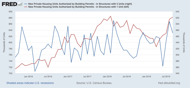
Housing’s rebound is the biggest single argument against a recession later next year.
Second, initial jobless claims continued at only 6.6% off their lowest level of the expansion:
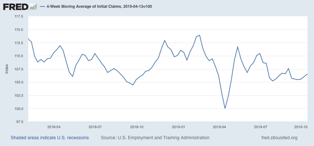
The one significant fly in the ointment is that the 4 week average of continuing claims, which is less volatile if less leading, was unchanged YoY:
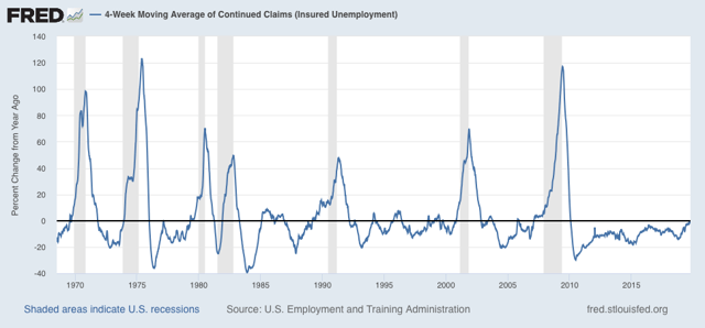
This has happened 15 times in the past 50+ years. Seven times it was a prelude to a recession; eight times it was a false positive, but signaled a slowdown.
Third, the Philadelphia region’s production continued to expand, and the new orders index actually improved further to +26.2. That’s *really* good, with the caveat that this series has been very volatile in the past.
Finally, industrial production declined, but the special factor here was the GM strike:
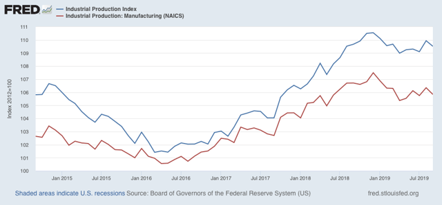
Still, both measures (overall and manufacturing) are significantly below their December peaks - but above their lows from earlier this year.
It is safe to say that in 2019 the US has been having another shallow industrial recession, but the consumer continues to power through.
Wednesday, October 16, 2019
Real retail sales decline slightly in September, but the consumer is still alright
- by New Deal democrat
Retail sales are one of my favorite indicators, because in real terms they can tell us so much about the present, near term forecast, and longer term forecast for the economy.
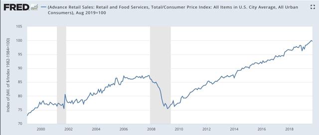
This morning retail sales for September were reported down -0.3%, while August, which was initially reported at +0.4%, was revised upward by another +0.2%, so the net decline was -0.1%. Since consumer inflation increased by only +0.1% over that two month period, real retail sales have risen +0.2% in the past two months. As a result, YoY real retail sales, which had been faltering earlier this year, are still up +2.3%.
Here is what the absolute trend looks like. Notice that this month’s decline barely registers and is well within the range of noise:
Others may use other deflators. I use overall CPI because:
1. I’ve been doing it this way for over 10 years.
2. This is the deflator used by FRED.
3. It has a 70+ year history.
4. Over that 70+ year history, it has an excellent record as a short leading indicator for employment and recessions. That’s the kind of track record I like.
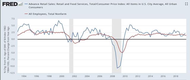
In terms of the short term forecast, although the relationship is noisy, real retail sales measured YoY tend to lead employment (red in the graphs below) by about 4 to 8 months. Here is that relationship, measured quarterly to cut down on noise, over the past 25 years:
Now here is the monthly close-up of the last five years. You can see that it is much noisier, but helps us pick out the turning points:
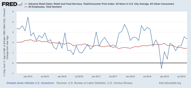
The recent peak in YoY employment gains followed the recent peak in real retail sales by roughly 6 months, and the downturn in real retail sales at the end of last year has already shown up in weakness in the employment numbers this year. Similarly I expect the improvement in retail sales to show up in an improvement in the employment numbers by about next spring.
Finally, real retail sales per capita is a long leading indicator. In particular it has turned down a full year before either of the past two recessions: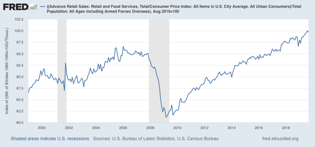
In the last 70 years, this measure has always turned negative YoY at least shortly before a recession has begun. That time lag increased to a full year as the US economy has become less centered on manufacturing. Although there have been some false positives, there are no false negatives. In other words, this is a very reliable positive indicator.
In the last 70 years, this measure has always turned negative YoY at least shortly before a recession has begun. That time lag increased to a full year as the US economy has become less centered on manufacturing. Although there have been some false positives, there are no false negatives. In other words, this is a very reliable positive indicator.
In short, it will take several more months of negative numbers for me to become concerned. As I wrote yesterday, the US consumer is still alright.
Tuesday, October 15, 2019
The consumer is still alright
- by New Deal democrat
Way back in 2007, I wrote an article at Daily Kos entitled “Are hard times near? The great decline in interest rates is ending,” in which I highlighted the importance of debt refinancing at lower interest rates as an important way that the working and middle classes had dealt with stagnating wages since 1980. Whenever that spigot was turned off, as well as the ability to cash in appreciating assets, was when a recession happened.
I wrote then that there was still room for one more refinancing. And that proved true, as mortgage rates in particular declined to yet lower new lows in 2012-13. When it comes to mortgage rates, they still have not made new lows in the 6 years since.
Especially since, like 2015-16, manufacturing has rolled over, but low mortgage rates are helping the housing market rebound again, this was a good time to update the framework I first wrote about in 2007, which I’ve come to call the “consumer nowcast.”
So, what does the consumer nowcast tell us about that 70% of the US economy? I updated this system in a post over at Seeking Alpha.
As usual, clicking over and reading helps reward me with a little pocket change for my efforts.
Sunday, October 13, 2019
Weekly Indicators for October 7 - 11 at Seeking Alpha
- by New Deal democrat
My Weekly Indicators post is up at Seeking Alpha.
The stars are aligning for the recovery from the present slowdown in the longer term. But in the meantime, the present and short term data is still soft.
As usual, clicking over and reading helps reward me a little bit for my efforts.
Friday, October 11, 2019
Real average and aggregate wages for September
- by New Deal democrat
Now that we have the September inflation reading, let’s take a look at real wage growth.
First of all, nominal average hourly wages in September increased +0.2%, while consumer prices were unchanged. As a result, after rounding, real average hourly wages for non-managerial personnel increased +0.1%. This translates into real wages of 97.7% of their all time high in January 1973:
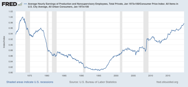
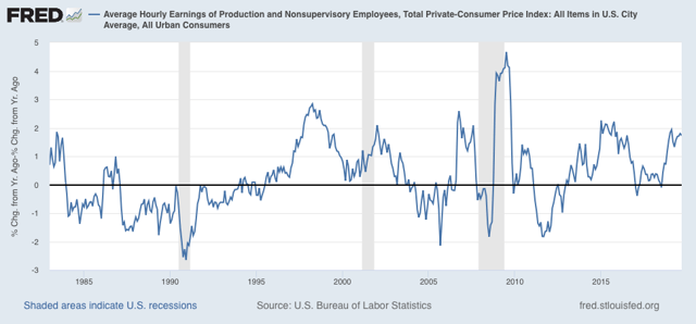
On a YoY basis, real average wages were up +1.7%, still below their recent peak growth of 1.9% YoY in February:
Aggregate hours and payrolls improved sharply in the past several months, so real aggregate wages - the total amount of real pay taken home by the middle and working classes - are up 30% from their October 2009 trough at the beginning of this expansion:
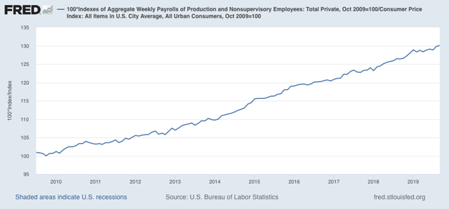
For total wage growth, this expansion remains in third place, behind the 1960s and 1990s, among all post-World War 2 expansions; while the *pace* of wage growth has been the slowest except for the 2000s expansion.
Thursday, October 10, 2019
Initial claims still positive, negative near term recession
- by New Deal democrat
I’ve been monitoring initial jobless claims closely for the past several months, to see if there are any signs of stress. This is because the long leading indicators were negative one year ago, and many - but not a majority - of the short leading indicators have recently turned negative as well. So I have been on “recession watch.” But no recession is going to begin unless and until layoffs increase.
To reiterate, my two thresholds are:
1. If the four week average on claims is more than 10% above its expansion low.
2. If the YoY% change in the monthly average turns higher.
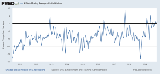
As of this week, initial claims continue to be very close to their expansion lows. The 4 week moving average of claims Is 213,500, only 12,500, or 6.1%, above the lowest reading of this expansion:
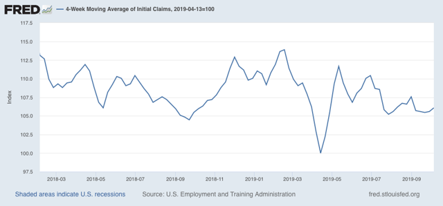
On a YoY% change basis, the 4 week average is exactly even with where it was one year ago:
On a YoY% change basis, the 4 week average is exactly even with where it was one year ago:
The most recent monthly reading, for September, like August, was slightly (+0.4%) above where it was in the full month of September 2018:
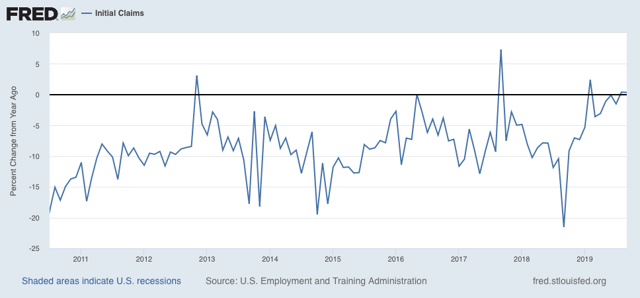
Note that this does satisfy the second prong of my metric above, but I’m not too concerned, because this is versus two of the very best monthly readings in the entire expansion.
The less volatile 4 week average of continuing claims is also running -0.4% below where it was a year ago:
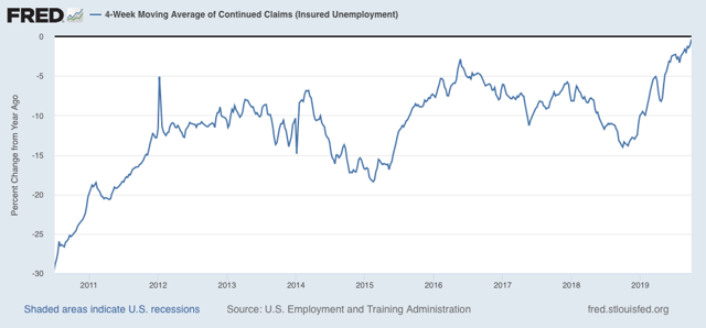
In short, there is simply no sign whatsoever of any stress in the jobs market that we could expect to see in the immediate months preceding a recession. The recession risk for Q4 of this year is rapidly receding.
Wednesday, October 9, 2019
August JOLTS report: nearly all employment measures now neutral
- by New Deal democrat
This morning’s JOLTS report for August showed a decline in all metrics m/m as well as a slowing trend overall.
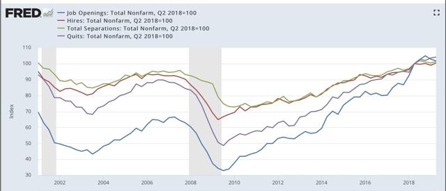
To review, because this series is only 20 years old, we only have one full business cycle to compare. During the 2000s expansion:
- Hires peaked first, from December 2004 through September 2005
- Quits peaked next, in September 2005
- Layoffs and Discharges peaked next, from October 2005 through September 2006
- Openings peaked last, in April 2007
as shown in the below graph (quarterly, normed to 100 as of May 2018):
Here is the close-up on the past five years (monthly):
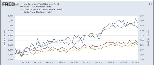
As you can see, in today’s report all four metrics declined. Job openings have completely rolled over, and both quits and total separations have essentially been stagnant for over a year. This is shown even better by displaying the YoY% changes in all four metrics:
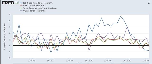
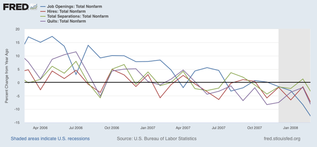
Only quits are in any significant sense above where they were a year ago. Hires and separations are flat. This is very similar to where we were at the end of the 2016 slowdown, but also to where we were in early 2007 before the Great Recession:
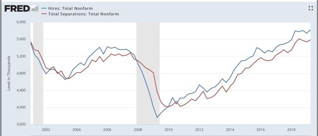
Next, here is the history of the “hiring leads firing” (actually, total separations) metric, first quarterly through Q2 of this year:
And now monthly for the past three years through August:
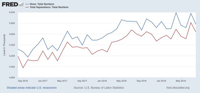
As is again apparent, both hires and fires have essentially gone sideways for over the last twelve months. It is possible this is just a pause, like 2016 — or it could be that both are at a turning point.
Finally, For completeness’ sake, below are total layoffs and discharges. Note that these turned up appreciably in the six months or so before the Great Recession. the silver lining today is that, just as with initial jobless claims, there is no sign of any weakness at this point:
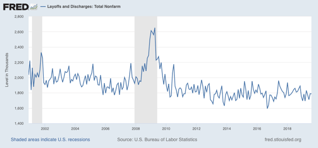
In summary, the main takeway is that deceleration in nearly all metrics has now reached neutral levels. We are hampered by the limited history of this report from reading too much more into it. But it is certainly *not* a “good” or “strong” report.
Tuesday, October 8, 2019
Scenes from the September jobs report
- by New Deal democrat
Yesterday I shared the best good news from the September jobs report released last Friday: there’s a good argument that the economy has reached “full employment,” although we could do even better if real wages improved more. Today let’s look at the bad news, which comes from examining the leading indicators for employment.
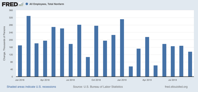
That there has been a jobs slowdown is by now well established. In the last 8 months, per the more reliable establishment report, 1,135,000 jobs have been added, an average of 142,000 per month, which If we subtract temporary census hiring of 26,000, becomes 139,000. And keep in mind that the number of jobs added between March 2018 and March 2019 is going to be reduced from roughly 210,000 to 167,000 per month:
Next, the three leading sectors of employment I track are temporary help (blue in the graph below), manufacturing (gold), and residential construction (red). Here’s what they look like compared with 2018, showing the slowdown this year:
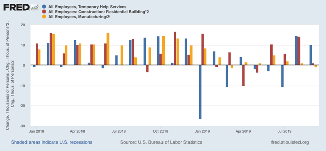
Don’t be fooled by the better-looking bars for August and September in temporary help. At I pointed out a few weeks ago, this year there have been almost relentless downward revisions in that number between the initial report and the final one two months later. That pattern held up for July and August’s revisions on Friday. Below I’ve listed the original number for the last three months on the left, followed by the first and then final revisions to the right:
JUL +2200 -7300* -10,500
AUG +15,400 +14,500*
AUG +15,400 +14,500*
SEP +10,200 —-
*1st revision only
*1st revision only
In other words, against the September gain you have to include the further 4,100 in losses for the prior two months. And I strongly suspect both August and September will have further downward revisions.
Further, because the average manufacturing workweek is down almost 1 full hour per week YoY (blue in the graph below), we should expect more actual losses in manufacturing jobs going forward:
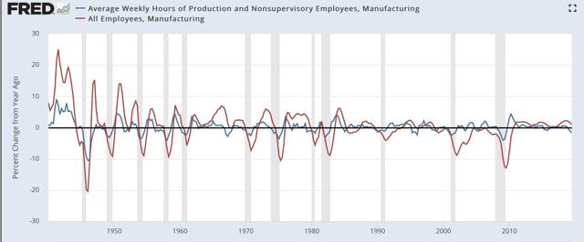
Before 1980, manufacturing jobs’ growth or decline typically followed hours by roughly 2 months. Since then, the time period has lengthened to more like 6 months.
Here’s the close-up look for the past several years:
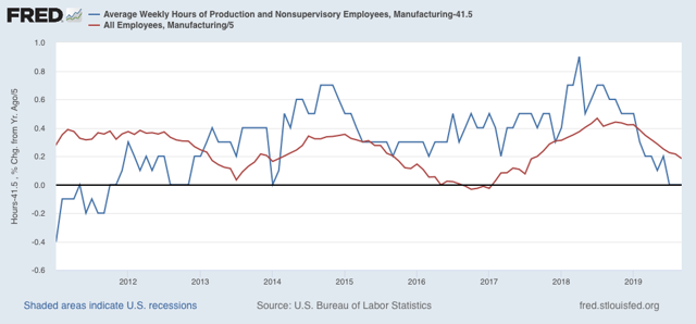
If a similar pattern is followed to what happened in 2016, by the end of next spring, we should expect *no* net YoY in manufacturing jobs, which means at minimum a decline of over -20,000 more jobs during roughly the next 8 months.
And, like temporary help, the revisions for manufacturing employment have all been downward for the past five months:
JAN +13 +17 [+4]
FEB. +4. +8. [+4]
MAR -6. -3. [+3]
APR +4. +3 (-1)
MAY +3 +2 (-1)
JUN +17 +10 (-7)
JUL +16 +4 (-12)
AUG +3 +2 (-1)*
SEP -2 —- —-
*1st revision only
This year so far only 46,000 manufacturing jobs have been added to the entire economy, compared with 188,000 in the first 9 months of 2018.
More broadly, there have been YoY losses in goods-producing jobs before all of the past 3 recessions, and going back 70 years, counting 12 recessions, in all but 3 there has been steep deceleration before and actual losses no later than two months into the recession:
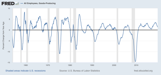
So far this year, only 65,000 jobs have been added in the entire goods-producing sector:
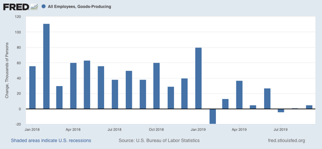
This is a paltry gain of 0.3%. A continuation of this trend for just 3 more months would be at very least consistent with a severe slowdown.
Even more broadly, although the household report has been very good for the past two months, the aggregate hours worked by all non-managerial personnel has not improved that much. Below is a graph of the q/q % change going back over 50 years. Only once, in 1966, has there been a decline for more than one quarter without a recession taking place shortly:
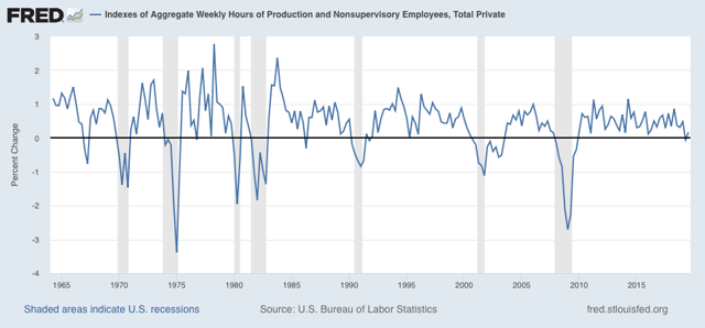
This figure did turn positive in Q3, but not by much.
Finally, let me turn to one forecast I made in the past month that didn’t quite pan out. I wrote then that “initial jobless claims have trended only slightly lower in the past 18 months, and are flat over the past 12. The unemployment rate has continued to trend slightly lower, but I expect that to end in the next several months, with no new lows, and more likely a drift sideways at 3.7% or even slightly higher to 3.8% or even 3.9%.”
Well, instead the unemployment rate dropped to 3.5% (blue in the graph below):
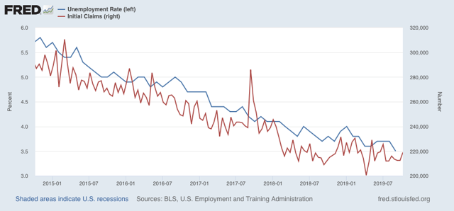
I am going to be stubborn here. I think the drop in the unemployment rate in September was a byproduct of a particularly good sample in the volatile household report. Unless initial claims turn significantly lower, I still expect the unemployment rate to move up 3.6% or 3.7% in the next few months.
The bottom line here is that the goods-producing portion of the US economy is probably in a shallow recession right now, and employment there has plateaued at best. The services portion, however, is still doing decently as reflected in the good numbers that have been posted by consumers.
Monday, October 7, 2019
Have we finally reached “full employment”?
- by New Deal democrat
As I noted on Friday, the household report - the one that tells us about unemployment, underemployment, and labor force participation - was particularly good. In fact, the last two months together have been so good that, at least by some measures, we may finally have arrived at “full employment.”
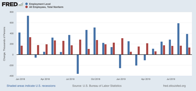
Let’s start with the basics. Gains in employment as measured by the household survey (blue in the graphs below), as opposed to the larger (and, yes, more reliable) payrolls survey (red), were 590,000 and 391,000 in the last two months, respectively. Those were the biggest gains in nearly a year:
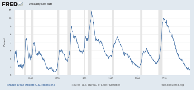
At 3.5%, that gave us the lowest unemployment rate in the past 65 years (except for a few months in 1968-69):
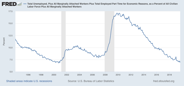
The U6 underemployment rate is also at its lowest level, save for one month, since the series began in 1994:
And even beyond that, when we add in those who aren’t even in the labor force, but say they want a job now, we are at the lowest level of all:
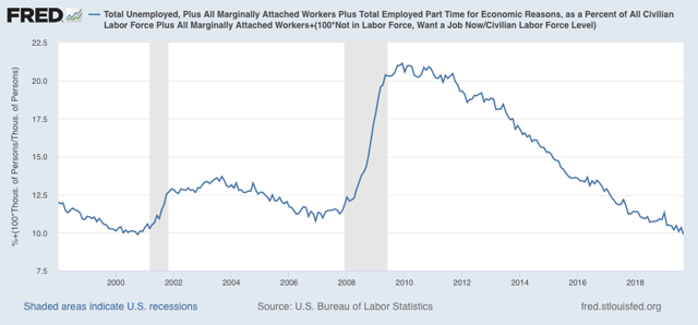
By all of the above measures, it certainly looks like we have finally reached “full employment.”
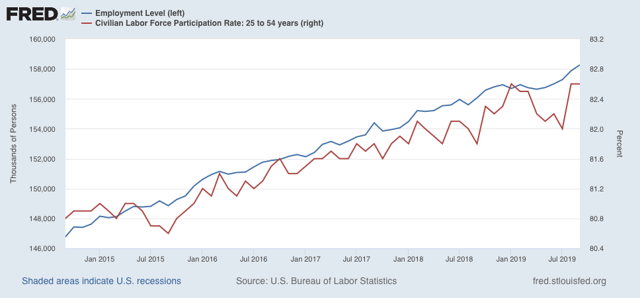
Further, participation in the labor force in the prime age group (red in the graph below) jumped by +0.6% from July, tying its highest rate of this expansion, at 82.6%:
In the below graph, both prime age labor force participation, and the prime age employment-population ratio of 80.1% are normed at the zero level, to show how the present level compares with earlier expansions (prior to 1987, the levels were never as high as presently):
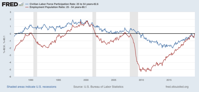
Prime age EPOP is within 0.2% of its highest level in both the 1980s and 2000s expansions. During the boom of the late 1990s, both were significantly higher. Only by that measure are we not now at “full employment.”
The late 1990s was the one time since the 1960s that real wage growth really boomed. I suspect real wages are the reason for both the recent improvement (due to big minimum wage increases in a number of states) and also why participation still lags the 1990s (because real wages haven’t improved enough to lure enough people out of continuing education, or to alter the trade-off of the cost of child care for others).
In summary, I think there is a good argument that we have reached “full employment,” but not “booming employment,” because wage growth is still tepid.
Sunday, October 6, 2019
A TV watching recommendation: “David Makes Man”
- by New Deal democrat
“Well, we all have a face
That we hide away forever
And we take them out
And show ourselves when everyone has gone”
- Billy Joel, “The Stranger”
“No one here is exactly what he appears.” - G’Kar, Babylon 5
“No one here is exactly what he appears.” - G’Kar, Babylon 5
“David Makes Man” is a loosely autobiographical coming of age drama created bt Terell Alvin McCraney, (executive produced in part by Oprah Winfrey) centered on the academically gifted 14 year old African American “David,” who lives in the projects of Homestead, Florida with his single mother and his little brother. His father, who he has never met, is a college professor with whom his mother, when a student, had a brief affair. During the day, he attends a magnet school where he is known at “DJ.” To the drug-dealing gang members at “the Ville,” as the housing project is known, he is “Dai”:

Those alternative names are a sign of the central theme of this drama. For, pace Billy Joel, David wears different faces that he takes out depending on the circumstances. Sometimes the alternative “Davids” appear physically - in fact, it isn’t entirely clear that David doesn’t suffer from dissociative disorder, a la “Mr. Robot.” His mentor is a drug dealer named “Sky” who shows up not only in the projects but also, oddly, along David’s bus ride to school, and urges him to betray his best friend at school, saying “the first kill is the hardest.” We learn Sky’s secret at the end of the pilot episode.
Between the abject poverty of David’s family - the electricity and the phones in their apartment have been turned off depending on which bill his mom has paid - and David’s need to overperform at school in order to get into the prep high school he desires, his life is a constant pressure cooker of tension, and at times David looks like he is about to physically explode. Several of the adults in his life note that he always pauses before he answers a question, and in a few scenes we actually see his internal mental gyrations as he wrestles with what information if any he should give out. And it is easy to see why: people make mistakes, and in the extremes of poverty, any mistake can have disastrous, even fatal, consequences.
There is another element in duality in the series as well: it isn’t clear at all whether David is a hero or an anti-hero. There are strong elements of both “Breaking Bad” and even “The Godfather” in David. He agrees to serve as a look-out for the drug dealers during the pilot, and later on, steals a scrip pad. And I wouldn’t trust him any more than I would trust Michael Corleone - he has the ability to straightforwardly and earnestly tell a blatant lie. Later in the season, there is even a scene between David and Sky’s son Raynan, one of the drug dealers, which recapitulates the scene in The Godfather where Michael rather than Sonny is shown to be the strategic master in the crime family. In short, it’s not clear at all which path David is going to ultimately choose.
But what I like the best about this series is how three-dimensional the characters are. As G’Kar warned in the 1990s science fiction series Babylon 5, nobody is exactly what they appear. For example, the drug dealers aren’t two dimensional bad guys, but fully realized personalities with humane and even tender sides. Raynan is jealous of the mentoring Sky did for David, but also tells David that he views him like the little brother he never had, and genuinely reaches out to help him. The toughest of the drug dealers, Shinobi, is revealed to have a big secret of his own, and later in the season we will see him reduced to shocked immobility in grief, as well as putting on a respectful, polite face in a discussion with an elderly white woman in a pharmacy’s waiting room. There is also a football lineman-sized drag queen who has taken in a 17 year old trans runaway, even though he could get charged with kidnaping, or worse.
Even the authority figures at school are conflicted. For example, his advanced placement teacher, played by Phylicia Rashad, saves David from a dream-ending suspension in the first episode, but never lets him know it, and in fact, treats him like dirt relentlessly to his face.
Then there’s his biracial friend, Seren, who lives in a dream suburban home, with his unbelievably bigoted and severe white mother and his successful black stepfather. It is a secret about his stepfather that triggers the fight between David and Seren at school in the opening of the pilot episode. Why that is we only find out clearly at the end.
It is in the context of betraying Seren that Sky tells David that “the first kill is the hardest,” meaning that the high school he wants to go to will probably only take one of the two of them. Ominously, Sky whispers that advice again into David’s ear at the end of the episode, suggesting that if not Seren, somebody else is going to figuratively if not literally be killed by David in pursuit of his ambition later on.
“Making man” I have learned, is slang for turning 18 years old. David faces a slew of decision points in his life, where he must ultimately choose which is going to be his “real” face. This is a richly textured drama that hooked me in the first 15 minutes I watched, and I unhesitatingly recommend it to you.
Episode 7 of the first season will be shown on the OWN network Wednesday night. Most prior episodes are available on demand, and the pilot episode can be streamed for free on YouTube.
———
UPDATE: There is lots of imagery in the series about David “coming from water.” That David’s image is reflected in a water puddle in the above poster is no accident. If you look carefully, you can see that what appears in the water is not an exact mirror image. There is a version where the entire reflection is shown, and an animated one where Sky appears and disappears. Here it is, and it is ominous:

This is an older David who is very much the successor to Sky. Of course, the more charitable interpretations is that it is just the stronger and more confident older self that David wants to be.
Saturday, October 5, 2019
Weekly Indicators for September 30 - October 4 at Seeking Alpha
- by New Deal democrat
My Weekly Indicators post is up at Seeking Alpha.
It’s pretty clear that manufacturing is in a recession right now. The economy as a whole isn’t because the consumer sector of the economy is still doing fairly well.
As usual, clicking over and reading should bring you up to the minute on the economy, and reward me a little bit for my efforts.
Friday, October 4, 2019
September jobs report: excellent in coincident and lagging sectors, cautionary in leading sectors
- by New Deal democrat
HEADLINES:
- +136,000 jobs added (+135,000 ex-Census)
- U3 unemployment rate declined -0.2% from 3.7% to 3.5% (NEW LOW)
- U6 underemployment rate declined -0.3% from 7.2% to 6.9% (NEW LOW)
Leading employment indicators of a slowdown or recession
I am highlighting these because many leading indicators overall strongly suggest that an employment slowdown is coming. The following more leading numbers in the report tell us about where the economy is likely to be a few months from now. These were mixed.
- the average manufacturing workweek declined -0.1 from 40.6 hours to 40.5 hours. This is one of the 10 components of the LEI and is negative.
- Manufacturing jobs declined by -2,000. YoY manufacturing is up 117,000, a deceleration from 2018’s pace.
- construction jobs rose by 7,000. YoY construction jobs are up 156,000, also a deceleration from summer 2018. Residential construction jobs, which are even more leading, rose by 500.
- temporary jobs rose by 10,200. (NOTE: July, which was originally reported at +10,500, is now shown at -2,200. August was revised down by -900 to +14,500).
- the number of people unemployed for 5 weeks or less declined by -339,000 from 2,207,000 to 1,868,000. (NEW EXPANSION LOW)
Wages and participation rates
Here are the headlines on wages and the broader measures of underemployment:
Here are the headlines on wages and the broader measures of underemployment:
- Not in Labor Force, but Want a Job Now: declined by -270,000 from 5.150 million to 4.880 million (NEW EXPANSION LOW)
- Part time for economic reasons: declined by -31,000 from 4.381 million to 4.350 million
- Employment/population ratio ages 25-54: rose +0.1% from 80.0% to 80.1%.
- Average Hourly Earnings for Production and Nonsupervisory Personnel: rose $.04 to $23.65, up +3.5% YoY. This is still a slight decline from the recent YoY% change peak. (Note: you may be reading different information about wages elsewhere. They are citing average wages for all private workers. I use wages for nonsupervisory personnel, to come closer to the situation for ordinary workers.)
Holding Trump accountable on manufacturing and mining jobs
Trump specifically campaigned on bringing back manufacturing and mining jobs. Is he keeping this promise?
Trump specifically campaigned on bringing back manufacturing and mining jobs. Is he keeping this promise?
- Manufacturing jobs rose an average of +9,750/month in the past year vs. the last seven years of Obama's presidency in which an average of +10,300 manufacturing jobs were added each month.
- Coal mining jobs rose 200, an average of 125 jobs/month in the past year vs. the last seven years of Obama's presidency in which an average of -300 jobs were lost each month
Other important coincident indicators help us paint a more complete picture of the present:
- Overtime was unchanged at 3.2 hours
- Professional and business employment (generally higher-paying jobs) rose by +34,000 and is up +437,000 YoY.
- the index of aggregate hours worked for non-managerial workers rose by 0.1%
- the index of aggregate payrolls for non-managerial workers rose by 0.3%
Other news included:
- the alternate jobs number contained in the more volatile household survey rose by 371,000 jobs. This represents an increase of 2,200,000 jobs YoY vs. 2,147,000 in the establishment survey.
- Government jobs rose by 22,000 (21,000 ex-census).
- the overall employment to population ratio for all ages 16 and up rose 0.1% to 61.0% m/m and is up 0.6% YoY.
- The labor force participation rate was unchanged at 63.2% and is up 0.5% YoY.
SUMMARY
This was a excellent report in almost all respects outside of the headline jobs number. New expansion lows were set for unemployment, underemployment, short term unemployment, and those who want a job now but have not looked. New expansion highs were set for prime age employment, participation, and aggregate hours and payrolls. Non-supervisory wages improved tepidly m/m, but growth remains at expansion highs YoY.
The only fly in the ointment, aside from the headline number, was as I expected in the leading sectors of the establishment survey. Manufacturing hours fell, as did manufacturing employment. Construction employment rose slightly, especially as to the most leading residential construction sector. And while temporary employment rose “strongly,” August was revised down slightly, and July, which was originally reported up 2,200, is now shown as a decline of -10,500.
In short, a great report in the coincident and lagging aspects, with some pronounced weakness in the leading aspects.
Thursday, October 3, 2019
September 2019 motor vehicle sales
- by New Deal democrat
Motor vehicle sales are a short leading indicator. In particular, on the consumer side, they have typically rolled over after housing but before consumer nondurables, so they are useful in gauging the health of the consumer.
More recently I’ve started tracking heavy truck sales as well. That’s because, in addition for being a proxy for the producer side of the economy, as the below graph shows, they are much less noisy that light vehicle sales, and susceptible to fewer false positives (note: measure is quarterly to cut down further on noise):
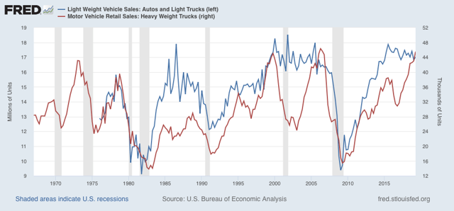
With the exception of 1969, heavy truck sales have always declined ~20% or more from peak prior to the onset of a recession. The only false positives are 1984-86, 1994-96, and 2015-16, all of which were pronounced slowdowns. As you can see, through Q2 these were growing.
Car and light truck sales have typically declined about 10% or more on a three month moving average basis before a recession hits, which would be below 16.5 million vehicles annualized, but there is lots more noise.
Zooming in on the past few years on a monthly basis, the below graphs norms September 2019’s sales levels (not yet shown on FRED) to 100:
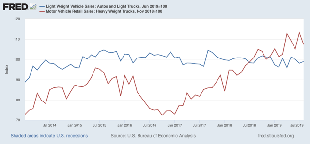
In September, 17.2 million light vehicles were sold on an annualized basis, down only about 5% from peak. But 41,800 heavy trucks were sold, a -11.6% decline from July’s record high.
Only one month, and not nearly enough to warrant any imminent recession concerns. But it’s worth noting that the one other time that truck sales declined sharply before auto sales was in the year prior to the 2001 producer-led recession. If heavy truck sales should fall by -15% or more, which would be to the 40,200 or fewer monthly, that would be a yellow flag. For now, considering the contraction shown in the ISM manufacturing index, heavy truck sales bear watching more closely.
Wednesday, October 2, 2019
Expect a weak report for the leading jobs sectors on Friday
- by New Deal democrat
September motor vehicle sales will be reported later today, after the domestic US manufacturers post their numbers. Sales of all other vehicles were down -13% YoY, but that is without seasonal adjustment including for Labor Day, so the seasonally adjusted sales might tell a completely different story.
In the meantime, with an eye towards Friday’s jobs report, let’s take a look at what is happening with temporary help services, one of the most leading components of employment.
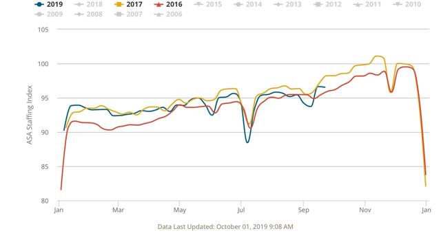
Every week I update the American Staffing Index, (from which site the first four graphs below are taken) which has a 14 year history and in that time has correlated pretty well with the final temp help employment numbers. This year it has turned increasingly negative, and this week had the most negative YoY reading so far, down -5.45% YoY for the single week, and off -4.9% YoY as a 4 week moving average:
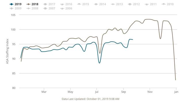
Maybe the best way to see how bad this is, is this non-seasonally adjusted look at the index’s entire history:
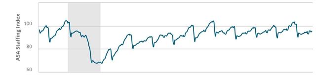
Note how the index typically rises over the course of the year until plunging right after the Christmas and New Year’s holidays — but this year has barely risen at all, the worst performance since its 2008 plunge during the Great Recession.
Let’s also compare this year with several other years during this expansion that have been relatively week. First, here’s 2016-17:
And here’s 2011-12:
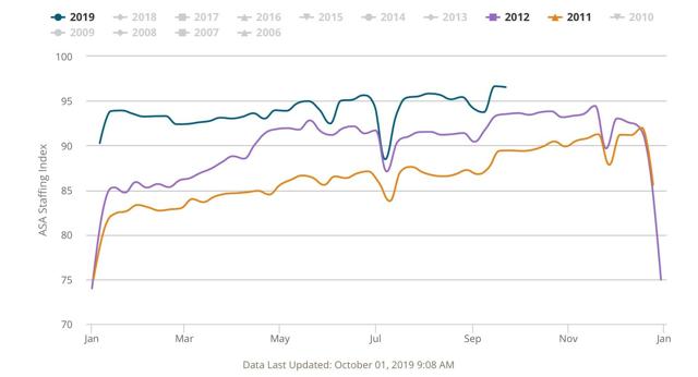
This year is a little weaker than 2011, and not quite as weak as mid-2012. It’s also pretty close to the middle portion of 2016 and the first 6 months of 2017.
Now let’s look at temporary jobs, averaged quarterly, from the jobs reports from 2011 to the present:
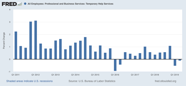
Although there will still gains, there was a big downshift in 2012, outright losses in early 2016, and continuing weakness, albeit with gains, through 2017. There have been losses in both Q1 and Q2 of this year.
As I reported a few weeks ago, the pattern has been for temp jobs to “surprisingly” increase in the initial jobs report, only to be revised significantly downward over the next two months. Last month August’s gain was initially reported at +15,400.
If Friday’s report runs true to form, there will be “surprising” gains in temp jobs, but a big downward revision to August’s number. I fully expect that the final, combined number for August and September will be negative.
The other two leading jobs sectors are residential construction and manufacturing. Residential construction has picked up, so that number is likely to be positive, but the ISM manufacturing report’s employment subindex showed contraction for the second month in a row.
The bottom line is, I expect continued weakness in the leading sectors of the jobs report on Friday.
Tuesday, October 1, 2019
Once again, two sharply contrasting reports to start the month
- by New Deal democrat
One month ago, I wrote that the first reports in September, construction spending and the ISM manufacturing index, showed two contrasting views of the economy. That was again the case today.
As in last month, residential construction spending increased for the month. Below I show it in comparison with single family permits:
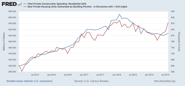
As in last month, residential construction spending increased for the month. Below I show it in comparison with single family permits:
Typically construction follows permits. In the past few years, it has been almost coincident with permits. In any event, this is more confirming evidence that in the important and leading housing sector, the decline that started in early 2018 has ended. This is positive news for the economy as a whole in 2020.
But once again the ISM manufacturing index was bad news, falling further below 50 from 49.1 in August to 47.8 in September. Just as badly, the leading new orders component, which one month ago had the worst reading since the Great Recession, at 47.2, barely improved this month to 47.3:
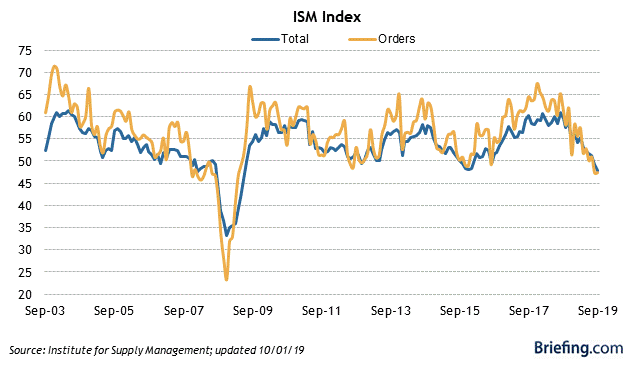
In the past it has typically taken at least two readings below 48 for the ISM manufacturing index to indicate recession. On the other hand, the new orders index is already at a level which has been consistent over the past 70 years with a recession in the very near future - although it is also consistent, as for example in 1966, with a slowdown only:
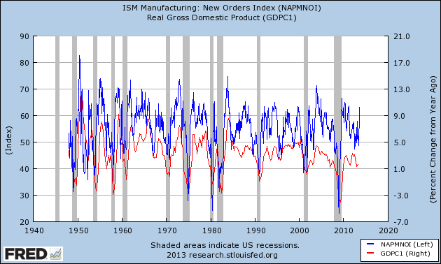
I should caution that the manufacturing sector in the economy is a smaller segment now than at any point since these series were started almost 75 years ago, so that a downturn there — and there certainly is a downturn there now — will have less repercussions than in the past. Which is a more long-winded way of saying that I think the economy as a whole is more likely to see a slowdown than an outright contraction.
Exactly as in one month ago, the reports, combined, suggest that in Friday’s jobs report there should be a little improvement in residential construction jobs, but suggest a decline in manufacturing jobs (last month there was a very slight increase) -- something that has been loudly telegraphed by the decline in the manufacturing work week in the past year.
Monday, September 30, 2019
Weekly Indicators for September 23 - 27 at Seeking Alpha
- by New Deal democrat
My Weekly Indicators post is up at Seeking Alpha.
If you’re wondering why it’s so late, it’s because SA pretty much shut down between Friday afternoon and this morning.
Anyway, recession risks are rapidly receding, at least through the 4th Quarter. As usual, clicking over and reading puts a little jingle in my pocket, as well as brining you up to the moment on the economy.
Friday, September 27, 2019
Personal spending shows consumers OK; durable goods shows producers still struggling
- by New Deal democrat
This morning’s reports on personal income and spending continue to show a consumer that is doing alright. Meanwhile durable goods orders continue to show a production sector that is struggling.
First, real personal income (red in the graph below) rose +0.4% in August, while real personal spending rose +0.1%. Since July spending (blue) was revised down -0.1%, the result was a wash:
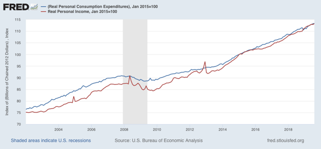
The rising trend remains intact.
In general, spending has slightly lagged income in the past few years. Thus the personal saving rate has increased:
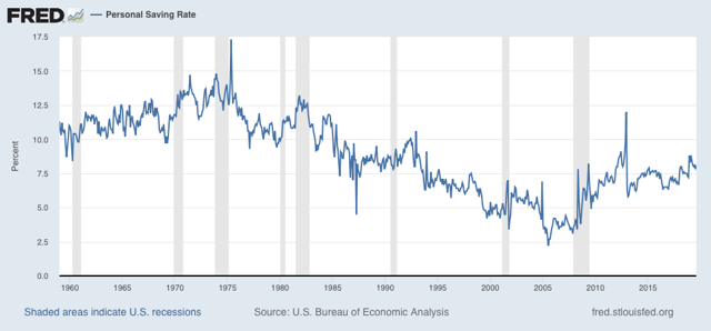
Overall the savings rate has increased since before the Great Recession, meaning that households are being more cautious with spending. This is a real change in the trend of declining savings that started in about 1980.
Meanwhile, durable goods orders for August (blue in the graph below) were up a slight +0.2%, while “core” durable goods orders (minus defense and Boeing)(red) declined -0.2%:
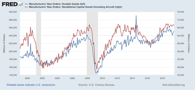
Because there are unique issues with the Boeing 737 Max, I think “core” orders are less helpful than usual. The bottom line is that durable goods orders remain in decline compared with the end of last year, similar to but not as bad as prior to the producer-led 2001 recession.
In short, the consumer continues to do OK. The weakness has been on the producer side, although not enough at this point to signal a recession.
Subscribe to:
Posts (Atom)