Saturday, May 18, 2019
Weekly Indicators for May 13 - 17 at Seeking Alpha
- by New Deal democrat
My Weekly Indicators post is up at Seeking Alpha.
The stock market’s “tariff tantrum” is driving down interest rates in bonds. We are in a time when government policy decisions - sometimes just passing tweets - are driving winners and losers in economic activity. And these can have immediate impact, disrupting the scheme of long leading -> short leading -> coincident indicators of the economy.
As usual, clicking over and reading helps reward me a tiny little bit for my efforts.


Friday, May 17, 2019
Initial jobless claims lead the unemployment rate: May 2019 update
- by New Deal democrat
Let’s take a look at a relationship I haven’t updated in awhile: initial jobless claims vs. the unemployment rate.
There used to be a site called “thumbcharts.com” that published a bunch of graphs, including one that showed that, measured on a 6 month rolling average basis, the change in initial jobless claims anticipated a similar move by the unemployment rate. Here’s one that I made use of about five years ago:
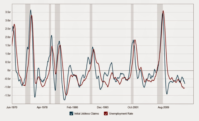
Certainly not perfect on a monthly basis, but over a longer timeframe, very persuasive.
Here’s what this looks like over the past 50+ years measured by their absolute levels:
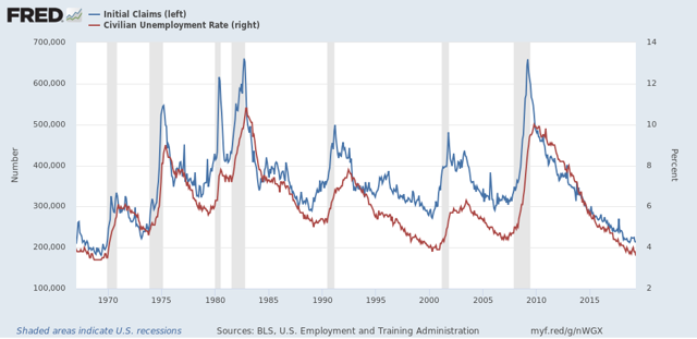
Again, it’s pretty clear that initial claims does lead the unemployment rate by several months with some variability.
Here’s a close-up of that metric over the past five years (with initial claims averaged monthly for comparability):
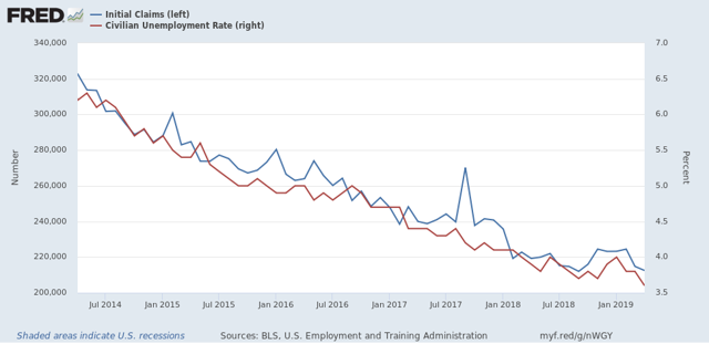
Interestingly, in the past year, the unemployment rate has moved in tandem with claims without any appreciable delay.
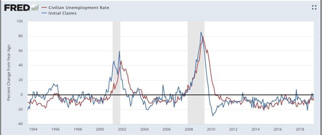
And here is the same data expressed as YoY% changes, first over the long term:
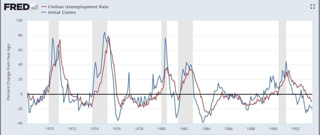
And now a close-up on the past six years:
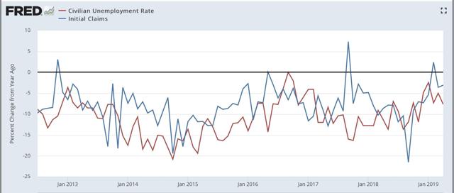
Again, lots of noise in any single month’s comparison, but averaged over a longer period of time, the leading/lagging relationship is pretty clear, and it is also pretty clear that the trend in the YoY% change in initial claims has been rising (i.e., is less positive) since last September.
With the exception of the three weeks right before Easter, initial claims have not declined significantly since February 2018. Leaving those aside, the biggest YoY% decline on a two week average basis was -3.5%. That suggests that the unemployment rate ought to be converging on about 3.8% (.965 x 4.0 = 3.86; .965 x 3.9 = 3.76). In any event, since initial claims have risen significantly in the four weeks since Easter, I do not expect the 3.6% unemployment rate to last, although I am not expecting it to rise above 3.9% anytime soon.
Thursday, May 16, 2019
April housing permits and starts: not nearly so rosy under the headlines
- by New Deal democrat
The headlines in this morning’s residential construction report were certainly positive: permits increased by 0.6% and starts by 5.7% m/m. I’ve been looking for a bottom in housing, based on lower mortgage rates, so this is good news because the bottom in overall permits and starts on a monthly basis may have been reached.
But the news was not nearly so positive underneath.
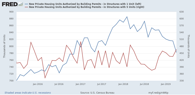
As I have repeated many times, single family permits are my favorite metric, because permits lead starts, and single family permits are the least volatile of any of the measures. Well, single family permits sank to a two and half year low, at 782,000. This is -11.7% off their February 2018 high:
The least that single family permits have fallen prior to a recession in the past 50+ years was prior to the 2001 recession, at -12.5%, so we are very close to that threshold.
The saving grace in this number is that permits for multi-family dwellings have increased at the same time. This is socially beneficial, because these are more affordable for households unable to afford single family housing, which had become very unaffordable up until a few months ago. It also ameliorates some of the negative economic impact of the decline in single family construction. By contrast, just prior to the 2001 recession, multi-unit construction declined by -34% as well.
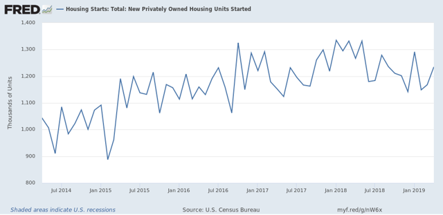
Next, housing starts are much more volatile than permits. And despite the great monthly improvement in starts, the three month moving average is also at a new 1+ year low:
Because starts represent actual economic activity, that this has continued to decline argues that the long leading effects of housing on the economy are going to continue to be negative for perhaps another year. And by the way, lest you think I am cherry-picking, the metrics above are the same ones I have been checking, month after month after month for years.
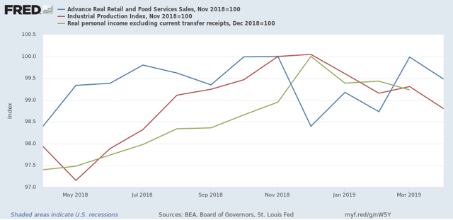
Finally, I’ve been watching construction employment as a leading sector of that metric. Employment has been the coincident indicator for the economy that has improved the most in the past half year. In fact, all three of the other four big coincident indicators remain below their highs of last November or December:
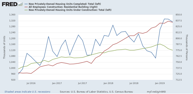
In the past, residential construction employment (red in the graph below) has usually started to decline within 6 months after the peak in the number of housing units under construction (green), and coincident with the peak in housing units completed (blue):
The number of units under construction peaked 4 months ago in January, and has declined ever since. Completed units peaked two months ago in March. Residential construction employment declined in April.
So this morning’s housing report is powerful evidence that we should expect to see continued declines in residential construction employment in jobs reports going forward.
Wednesday, May 15, 2019
April real retail sales turn negative, with both short and longer term implications
- by New Deal democrat
Retail sales are one of my favorite indicators, because in real terms they can tell us so much about the present, near term forecast, and longer term forecast for the economy.
This morning retail sales for April were down, -0.2%. Since consumer inflation increased by +0.3%, real retail sales fell by -0.5%, a poor result that nevertheless did not reverse the extremely strong March showing of +1.3% in real terms. Last month I noted that sales were still slightly below their peak of five months prior, and YoY real sales remained in a downshift. Needless to say, April’s result did not help matters.
Below are both the long term and short term graph of real retails sales:
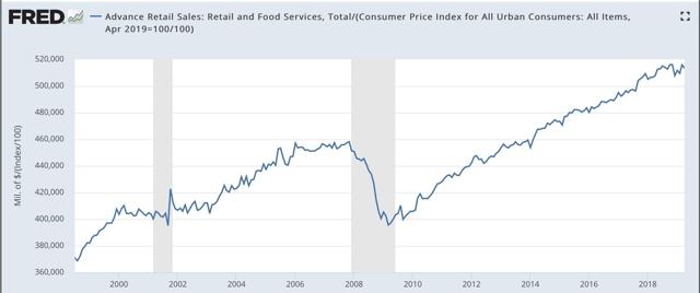
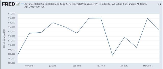
Note that real retail sales turned flat for about a year before both of the last two recessions. Since late last year we’ve hit the biggest soft patch since 2013. In fact, we’re only up about +0.2% total in the past 11 months. As revised, both of these last made new highs five months ago in last November.
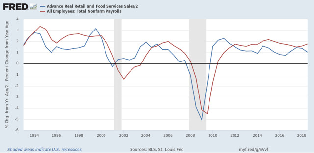
Next, although the relationship is noisy, because real retail sales measured YoY tend to lead employment (red in the graph below) by a number of months, here is that relationship for the past 25 years. Normally I show this quarterly, but this time I’d like to show it in 6 month intervals, that really shows the leading relationship:
Now here is the monthly close-up of the last six years. You can see that it is much noisier, but helps us pick out the turning points:
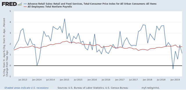
The lead times are somewhat variable, and notably most recently while sales roughed in mid-2016, employment did not similarly trough until a full 12 months later. We are currently 8 months into a big downshifting in YoY sales, so I still fully expect employment as measured in the monthly jobs report to slow down noticeably shortly.
The lead times are somewhat variable, and notably most recently while sales roughed in mid-2016, employment did not similarly trough until a full 12 months later. We are currently 8 months into a big downshifting in YoY sales, so I still fully expect employment as measured in the monthly jobs report to slow down noticeably shortly.
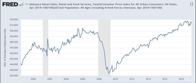
Finally, real retail sales per capita is a long leading indicator. In particular it has turned down a full year before either of the past two recessions:
Here is the close-up of the past 18 months:
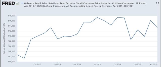
Measured per capita, real retail sales peaked 6 months ago, and are down compared with 11 months ago. Unless there are substantial upward revisions, or a good report next month, this metric is going negative YoY.
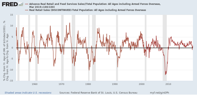
Why is that significant? Here are real retail sales per capita YoY, going all the way back to 1948:
In the last 70 years, this measure has always turned negative at least shortly before a recession has begun. There are no false negatives. While there are about a dozen false positives for a single negative month, there are only four false positives for consecutive negative readings — 1966, 1995, 2002, and early 2006. Recently there has only been one month - last December - where this was negative YoY, so this series bears close watching to see if it turns negative again, and for longer than one month.
To sum up, real retail sales for April weren’t just a weak coincident data point, bu they further point to weakness in the near term for employment gains, and are signaling negative for the long term depending on whether the poor readings remain durable for the next several months.
Tuesday, May 14, 2019
Consumer credit: both producer and consumer sides of the ledger show mortgage market OK, increasing stress for other loans
- by New Deal democrat
The New York Fed reported on household debt and credit this morning.
The good news is that there has been no increase in total delinquencies:
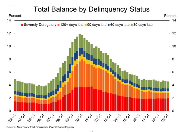
This is important because the amount of delinquencies would be expected to increase if we were close to getting into a recession.
The somewhat more bad news is that, if the *amount* of delinquencies has not risen, the *percentage* of vehicle and credit card loans that are seriously delinquent has risen:
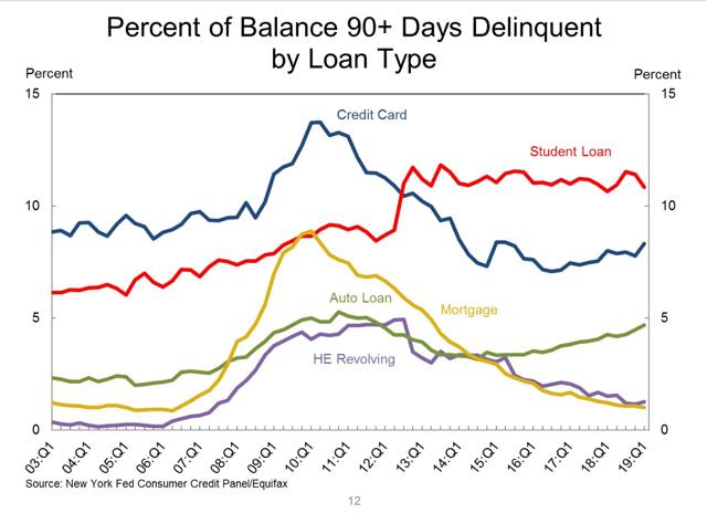
And the percent transitioning into serious delinquencies for credit card loans have also risen:
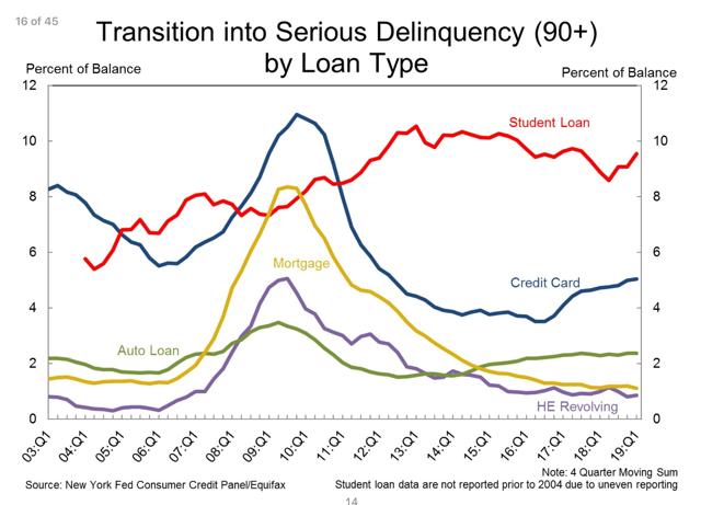
Note, however, that mortgage loan delinquencies remain at their lowest ever in the survey.
Meanwhile, last week the Fed issued its Senior Loan Officer Survey, which covers the creditor side of the ledger. That report showed that in Q1, mortgage lending got slightly looser, as did credit to firms, while outside of mortgages, banks tightened conditions for issuing consumer credit, and consumer demand for nearly all types of credit declined. My post on the Senior Loan Officer Survey is up at Seeking Alpha.
In short, from both the producer and consumer side of the ledger, the mortgage market is in good shape, with some signs of increasing stress, and tightening of conditions, for other types of loans.
Monday, May 13, 2019
We are probably close (~500,000) to “full employment”
- by New Deal democrat
From time to time over the past few years I have tried to estimate how far we were from “full employment,” by which I meant the average levels of the best year in each of the past two expansions. I also estimated how long it would take to get there given the then-current monthly gains in employment.
For example, two years ago I estimated that we needed to add another 2.5 million people, or 1.5% of the labor force, to the employment rolls in order to be at “full employment.” Last August, I updated the figure to a shortfall of about 0.8%, and estimated that, if employment trends held, we would get to “full employment” in about 9 to 12 months from then, which would be sometime between now and the end of summer.
Given the continuing very good jobs reports, I thought I’d take another look.
First, here is the U6 underemployment rate. This includes, most importantly, involuntary part-time workers. For us to be at full employment, this figure ought to be at its 1999-2000 and 2006-07 levels:
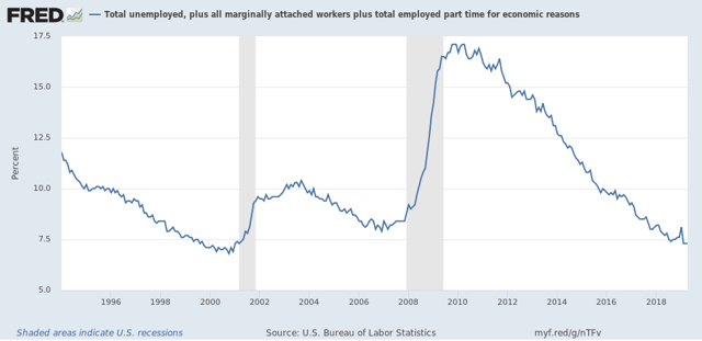
We have already surpassed the latter, and are only about 0.2% away from the former.
On top of that, there are also people who aren’t even in the labor force, because they haven’t looked for work, but tell the Census Bureau that they do want a job now. In the below graph, I’ve divided that by the civilian labor force to tell us what percentage over and above the labor force fit in that category:
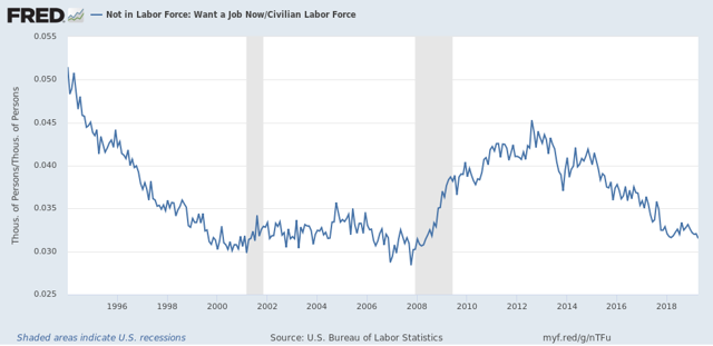
Currently these are equivalent to a little under 3.2% of the total labor force. At its best average levels in the last two expansions, this number was 3.0%, in other words, we are also about 0.2% away.
Put these two together and they add up to between 0.2% and 0.4% of the 170 million labor force, or in other words 340,000 to 680,000. If monthly employment gains continue to run about 100,000 over the number needed just to accommodate an increasing prime age population, that puts us about 7 months away. Meaning we should reach “full employment” by the end of this year.
This, by the way, has implications for wages, because the closer we approach to “full employment,” the more employers will have to raise wages to entice people who aren’t currently in the labor force to decide to enter it.
———-
P.S. Yes I know it is more complicated than that. In particular people seem to come off disability rolls and find employment if it is plentiful enough at decent pay:
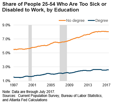
But at least some of that is probably reflected in the continuing elevated levels of underemployment and those who haven’t looked but have decided they now want a job. Also, I would expect that the prime age employment to population ratio will increase to over 80% as part of any further decrease in underemployment and job desirers who aren’t actively seeking employment.
Saturday, May 11, 2019
Weekly Indicators for May 6 - 10 at Seeking Alpha
- by New Deal democrat
My Weekly Indicators post is up at Seeking Alpha.
There was a classic “flight to quality” in long term bonds this past week, which drove their yields down. Which is a good thing for mortgage applications and housing.
As usual, clicking over and reading helps put a couple extra pennies in my pocket.
P.S. If you read carefully, you can see where autocorrect did me dirty in the last paragraph of the conclusion!
Friday, May 10, 2019
Gas prices fail to ignite overall inflation in April, but real wages flat so far for 2019
- by New Deal democrat
The consumer price index rose +0.3% in April, just as in March mainly as a result of a big monthly increase in gas prices. This is actually a surprisingly small increase because, as I pointed out last month, almost every time gas prices have increased by as much as they did — up 9% in March and 11% for April — consumer prices as a whole have gone up at least +0.4%. I’m showing just the last 10 years in the graph below (wages in blue, gas prices in red):
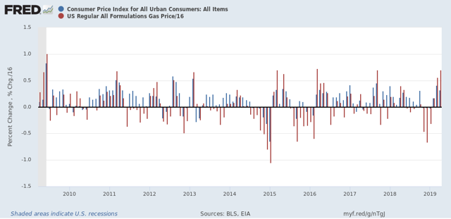
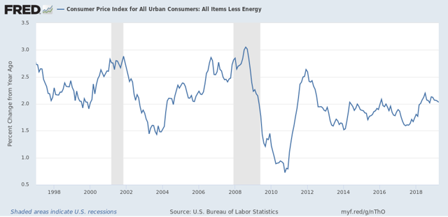
Ex-gas, consumer inflation ex-energy has been remarkably stable between 1.5% and 2.5% YoY ever since gas prices made their long term bottom in early 1999. The only big exceptions were in the year before each of the last two recessions:
Now let’s turn to wages. Nominally, wages for non-supervisory employees increased +0.3% in April, so after inflation they were flat, as they have been all this year so far:
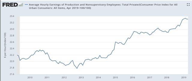
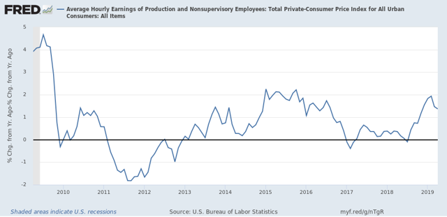
YoY non-supervisory wages nominally were up +3.4%. With YoY inflation rising to +2.0%, in real terms, real wages are only up +1.4%, a decline from their YoY high in February:
YoY non-supervisory wages nominally were up +3.4%. With YoY inflation rising to +2.0%, in real terms, real wages are only up +1.4%, a decline from their YoY high in February:
In the long view, real wages are still -3.1% below their January 1973 peak, and -0.1% below where they were in February:
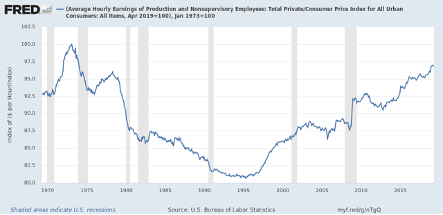
Finally, here are aggregate real wages. This tells us how much more American workers as a whole in real terms since the bottom just after the Great Recession. These improved to 28.9% above their low, but only tied with their January peak:
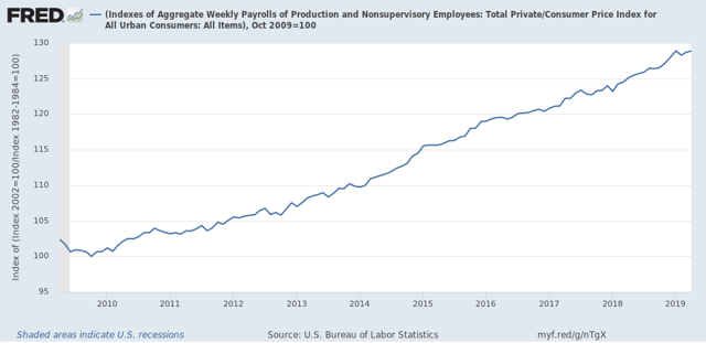
While in real terms American workers have made no progress so far this year, nevertheless it’s no surprise that in public opinion polls, Americans feel pretty good about the economy right now. Unemployment is lower than it has been in several decades. Underemployment is at least approaching its lows in the past 25 years. And wage growth, while subpar in historical terms, has improved to the point where it is not the kind of source of discontent it was in the first years of this expansion. I don’t expect this to change unless there is a further jump in gas prices, or else a significant tightening of consumer credit.
Thursday, May 9, 2019
Are initial jobless claims showing a re-assertion of an underlying weak economic trend?
- by New Deal democrat
I don’t normally comment on initial jobless claims, but I’m following them with particular interest at this point. Here’s why.
Last spring the long leading indicators were still at least weakly positive. I saw growth ahead through Q1 of this year, and getting questionable in Q2. By last summer, the enough long leading indicators were down that I called for a slowdown in the economy by midsummer of this year - I.e., about 2-3 months from now.
And then ... Trump’s incipient trade war, the government shutdown (the equivalent of 800,000 layoffs without pay, followed by mass-rehiring with pay about 60 days later), and an ill-timed Fed rate hike immediately after a partial inversion of the yield curve, got together and caused a mini-recession in production, sales, and income. This mini-recession spanned 1 month in Q4 of last year and the first two months of Q1 this year. So the quarterly GDP numbers for both quarters looked good, but the monthly and weekly data deteriorated sharply.
Once these distractions were over, most of the data rebounded. On top of that, Easter came very late this year, and it looks like there were some issues of unresolved seasonality.
So, instead of smooth but slowly decelerating sailing, we got a sudden braking followed by a re-acceleration. So most of the non-permabear punditry nowadays is close to singing “Happy Days are Here Again!”
So, either I’ve been wrong - always a possibility! - or else the underlying decelerating trend ought to start reasserting itself by now. And one big place it ought to start re-asserting itself is - wait for it! - initial jobless claims. Hence why I am paying particular attention to them.
Now that my lengthy introduction is over, let’s get to the data. First, here are weekly new jobless claims since late January of 2018:
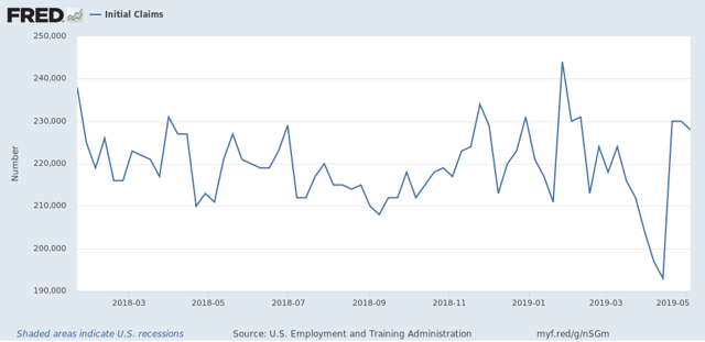
Notice that, with the exception of the three weeks just before Easter this year, they have been in a 210k to 235k range. The three weeks just before Easter broke through the trend to the downside: 204k, 197k. And 193k. The three since then have been at the top end of the trend: 230k, 230k, and 228k.
Here is what the 4 week moving average looks like over the same period:
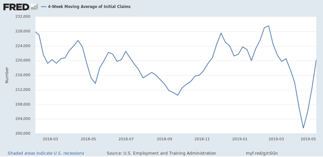
This helps show the trends: last summer’s mini-boom, the autumn and winter weakness, the post-shutdown through Easter rebound, and then the last 3 weeks’ weakness.
So, to smooth out the remaining Easter seasonality, if you average the two weeks just before and just after Easter, you get 212,500. If you expand that to the three weeks before and after Easter, you get 213,667.
Now let’s look at the YoY% change in the 4 week moving average:
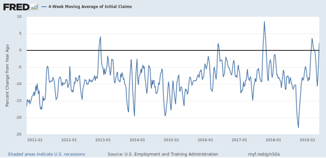
Notice that with the exception of the three week downward spike just before Easter, the recent YoY comparisons have been worse. The only comparable times were superstorm Sandy in 2012, the hurricanes of 2017, and briefly during the 2016 shallow Oil patch centered recession.
Unadjusted, the current 4 week average is 2.3% worse than one year ago. Averaging the four weeks around Easter makes it +0.5% worse. Averaging the current 6 weeks makes it -0.7% better. But whichever averaging we use, the YoY change is very weak compared with the last 9 years.
Before I go, let me cite two other items of data. The American Staffing Association’s Index of temp jobs deteriorated further on a YoY% basis this week:
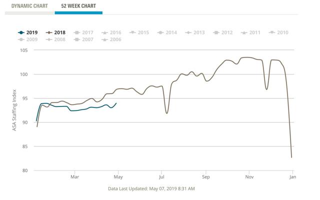
Either this index has been wrong, or the strong temp jobs number in the April jobs report was an outlier.
Finally, the recent new records in the stock market have been another source of “Happy Days are Here Again!” But if you step back and take a longer term view:
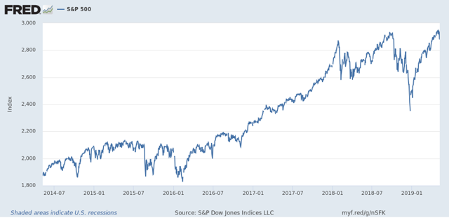
It looks much more like the market has gone sideways in about a 10% range since January of last year. As of yesterday’s close, the S&P 500 was only 0.2% above the January 2018 peak.
In short - at least as of this week! - it looks like the underlying weak economic trend is re-asserting itself.
Wednesday, May 8, 2019
Economic indicator death match! The yield curve vs. mortgage rates
- by New Deal democrat
This morning the 10 year vs. 3 month interest rate spread inverted again:
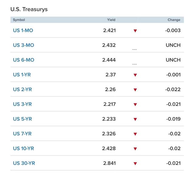
With the exception of the 30 year and spreads between 5 and 30 years, the entirety of the yield curve has inverted. And don’t forget, the intermediate term 2 year through 5 year spread has been inverted for nearly half a year!
Here’s a long-term view of the 10 year minus 3 month spread:
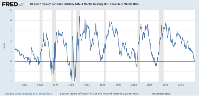
Here’s the thing: no matter which yield curve measure you choose, you still have to deal with the fact that it inverted in 1966 and 1998 (doesn’t show up in the above graph because it was only for a few days), and no recession followed within 24 months, although in the former case there was a substantial slowdown.
But since the inversion is because the 10 year has fallen so much, it is putting a bottom under the housing market. As of yesterday, mortgage rates have fallen back to 4.20%:
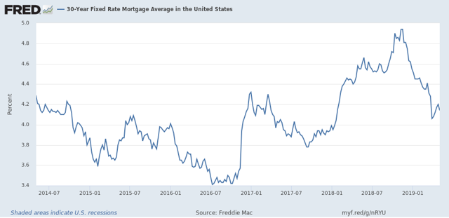
Mortgage applications are picking up again. This morning’s report shows them up 5% YoY. And that renewed housing activity should filter through into the wider economy by next year.
Bottom line: either the yield curve or the housing market are giving a false signal.
Tuesday, May 7, 2019
March JOLTS report: Hiring and discharges show signs of late cycle deceleration
- by New Deal democrat
The JOLTS report on labor is noteworthy and helpful because it breaks down the jobs market into a more granular look at hiring, firing, and voluntary quits. Its drawback is that the data only goes back less than 20 years, so from the point of view of looking at the economic cycle, it has to be taken with a large dose of salt.
With that disclaimer out of the way, today’s JOLTS report for March generally showed a slight backing off from their recent best readings of this expansion. All of the series are off their best levels, and three of the five noteworthy ones continued to decline:
- Quits declined slightly (less than -0.1%) and are -2% off their peak of two months ago.
- Hires declined slightly to about -4% off their October peak.
- Total separations rose declined to about -4% off their peak in last July.
- Job openings rose and are now down -2% from their November all time high, reversing February’s sharp decline.
- Layoffs and Discharges declined about -5% (a good thing) and remain about 7% above their September 2016 low, although well below their levels of most of the past 18 months.
Let's update where the report might tell us we are in the cycle.
First, below is a graph of the *rates* of hiring, quits, layoffs, and openings as a percentage of the labor force since the inception of the series (layoffs and discharges are inverted at the 3% level, so that higher readings show fewer layoffs than normal, and lower readings show more):
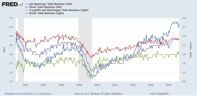
During the 2000s expansion:
- Hires peaked first, from December 2004 through September 2005
- Quits peaked next, in September 2005
- Layoffs and Discharges peaked next, from October 2005 through September 2006
- Openings peaked last, in April 2007
As of this report, hires and openings *possibly* show signs of having made a cyclical peak at this point, with quits steady and layoffs and separations at their best level of the cycle.
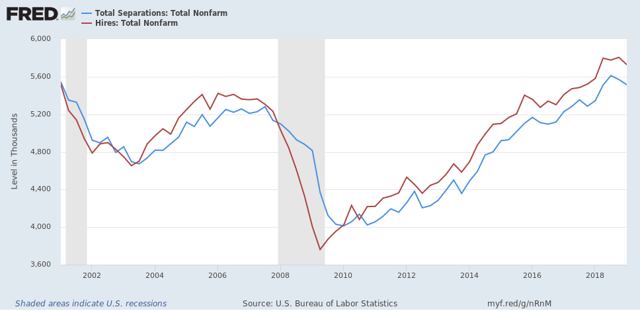
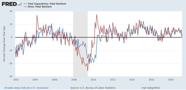
Next, here's an upd ate to the simple metric of "hiring leads firing," (actually, "total separations"). Here's the long term relationship since 2000 through Q1 of 2019:
Here is the monthly update for the past three years:
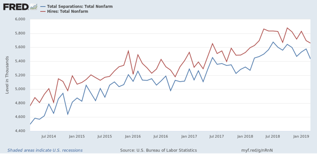 In the 2000s business cycle, hiring and then firing both turned down well in advance of the recession. Importantly, both may have made their cyclical peak last summer in and autumn. If so, that would be sin line with what happened during the 2000s expansion, when hires peaked first, but it is obviously too soon to know for sure.
Last month I wrote there was deceleration but no sign of a significant downturn. This month there is, and total separations are now negative YoY:
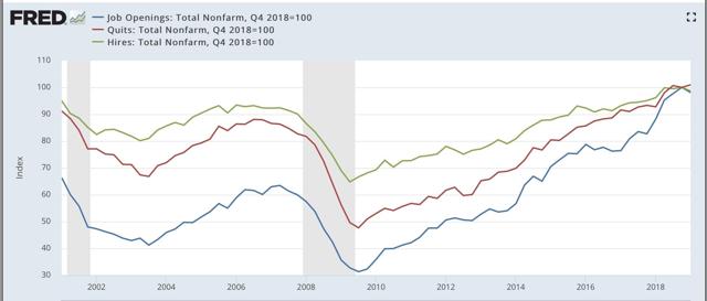
Finally, let's compare job openings with actual hires and quits. As you probably recall, I am not a fan of job openings as "hard data." They can reflect trolling for resumes, and presumably reflect a desire to hire at the wage the employer prefers. In the below graph, the *rate* of each activity is normed to 100 at its July 2018 value:
Now, here is a close-up of the last three years:
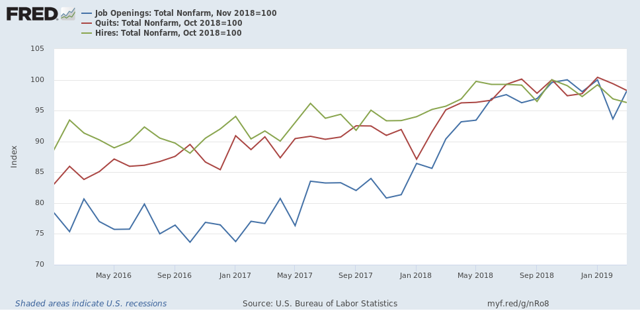
In 2018, my take was that employees have reacted to the employer taboo against raising wages by quitting at high rates to seek better jobs elsewhere. If the dam were finally breaking, we should see the hiring rate increase, and quit rate level off. That is not the case, as quits have continued to increase slightly, while hires have decreased slightly.
In summary, with the exception of the decline in layoffs and discharges, the March JOLTS report reflected some weakness. Further, if the pattern on the last cycle holds, then we may have begun to see the late cycle deceleration, in which case I will be watching to see if the quits rate begins to turn down as well.
Monday, May 6, 2019
Scenes from the April jobs report
- by New Deal democrat
The headline news in Friday’s employment report was excellent. But underneath those headlines, all is not well.
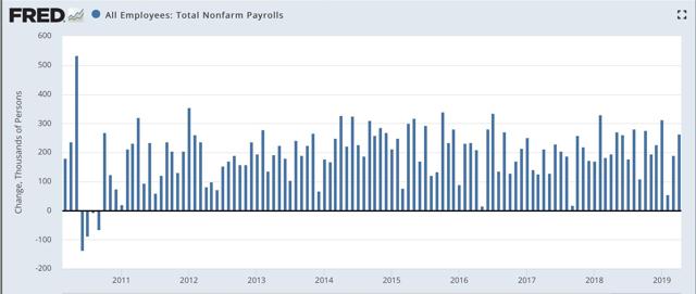
Let’s celebrate the excellent headlines first. Adding 263,000 jobs in April was one of the dozen best reports of this entire expansion:
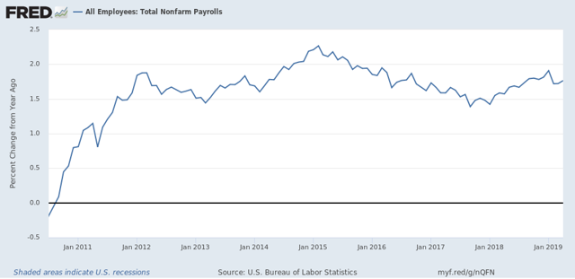
Next, here is the YoY% change in nonfarm payrolls, showing an uptick after the deceleration in the prior two months:
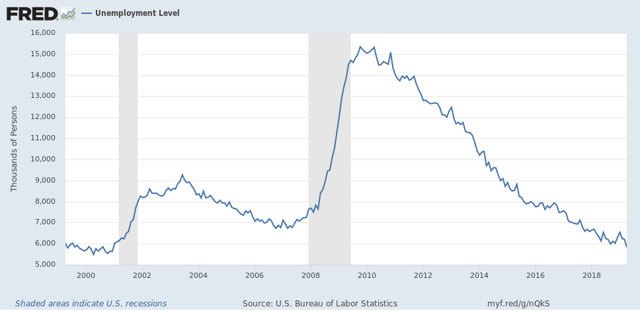
The total number of unemployed was at the lowest level in 20 years:
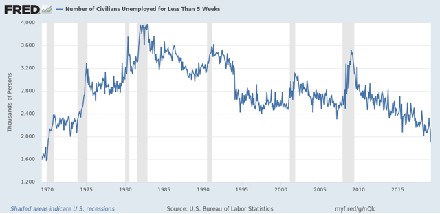
The number of short term unemployed people (less than 5 weeks) reached its lowest level in 49 years:
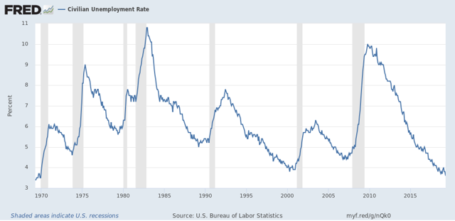
And the unemployment rate was the lowest in 50 years:
This is great news. But before you break out into a cheer of “Happy Days are Here Again!” Let’s look under the hood.
I’m going to start with the household survey, that gives us the unemployment rate. As was widely noted already Friday, both the labor force participation rate and the employment to population ratio for prime age 25-54 workers declined:
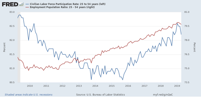
Had the participation rate simply remained at the level it was in March, the unemployment rate would have risen to 3.9% rather than declining to 3.6%.
And as I also already noted on Friday, when we measure by the household survey, only 63,000 more people are employed than half a year ago:
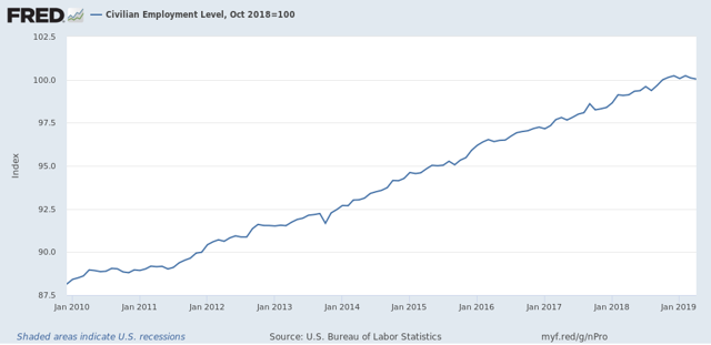
Sometimes this is a harbinger of things to come in the payrolls survey. Sometimes it is just noise.
In short, in the household survey, there were 103,000 fewer people who held jobs. There were also 387,000 fewer people who were unemployed. But there was a jump of 646,000 people who weren’t even in the labor force. This discrepancy will most likely resolve itself one way or the other in the next few months.
Now let’s turn to the employers’ payrolls survey, from which we get the headline jobs number. For the past few months, I have been forecasting a jobs slowdown. That has been based in part on the natural progression from long to short leading indicators to coincident indicators.
Further, even when the spread between short and long term bonds simply gets tight, historically employment growth has almost always faltered. And goods-producing employment - inclu ding manufacturing and construction jobs - *always* has.
So what I’m going to look at here is which sectors in the April report improved outright, and which either declined or showed deceleration. Because there’s an important difference.
Further, even when the spread between short and long term bonds simply gets tight, historically employment growth has almost always faltered. And goods-producing employment - inclu ding manufacturing and construction jobs - *always* has.
So what I’m going to look at here is which sectors in the April report improved outright, and which either declined or showed deceleration. Because there’s an important difference.
First, Jared Bernstein typically compares the 3-, 6-. And 12-month average in employment growth to show the trend. Here’s his graph:
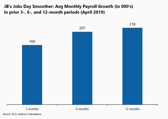
This shows a decline in the job growth trend overall. For this trend to continue next month, May’s number basically must be under 200,000.
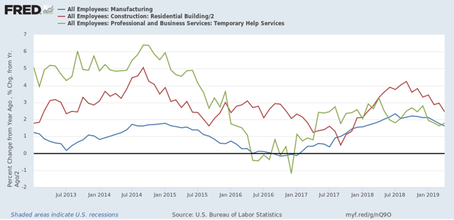
Next, just as I did last month, let’s break out the monthly gains or losses among manufacturing (blue), residential construction (red), and temporary jobs (green):
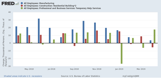
In the past four months, two of the three have faltered, with sharp deceleration in manufacturing and residential construction. Temporary jobs bucked the trend in April with the biggest gain in over twelve months. Since the American Staffing Association’s index of temporary jobs has been in a steepening YoY decline since January, I am anxious to see what happens next month with this number.
Here is the YoY look at the same three sectors, showing that all three have decelerated substantially - although none is negative YoY:
Here is the YoY look at the same three sectors, showing that all three have decelerated substantially - although none is negative YoY:
Next, here are goods-producing jobs (which include but are not limited to manufacturing and construction). At the beginning of March I wrote that I expected these to slow down to a rate of +7000/month. Here is what they look like since the jobs expansion began:
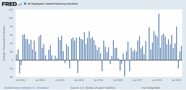
My forecast didn’t happen, at least not this month! But even with April’s 34,000 gain, the average of the past three months is +12,000, the lowest since mid-2017, and are three of the four lowest in the past twelve.
Here is the YoY look:
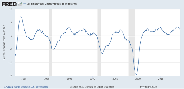
Again, we see deceleration, but certainly not a negative number. For there to be real trouble, I would expect this to fall to less than 1/2 of its recent best YoY% gain of 3.4%, in other words, 1.7% or less.
Again, we see deceleration, but certainly not a negative number. For there to be real trouble, I would expect this to fall to less than 1/2 of its recent best YoY% gain of 3.4%, in other words, 1.7% or less.
In contrast, the three sectors that contributed the most to April’s big payrolls number were professional and business jobs, education, and federal government employment.
What is important about those three is that they are definitely *not* leading sectors. Federal government employment, for example, frequently goes *up* during recessions:
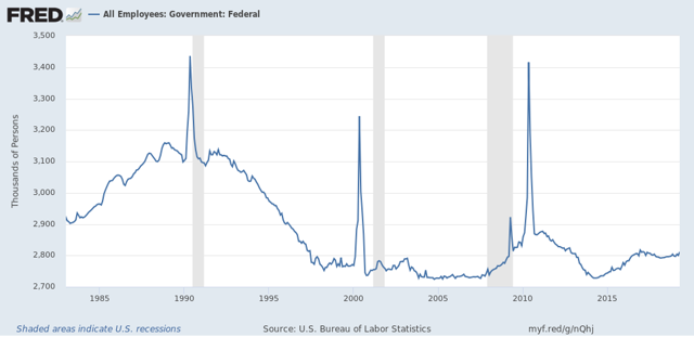
(Unfortunately, FRED doesn’t give me a way to separate out census employment, which is those huge spikes.)
And here is what professional jobs plus education look like as m/m% gains over the past 30 years:
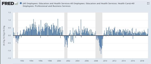
April was one of the 10 best gains of this entire expansion for these two sectors. But note that employment gains in these two sectors typically continues right up until one or two months before a recession, and in the case of 2001, a month or two after it began.
Finally, here’s look at nominal YoY wage growth for non-supervisory workers. (We don’t have inflation yet for April):
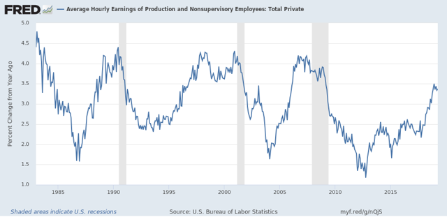
This has declined slightly since December. Since gas prices have headed higher, dragging. Inflation with them, workers’ real wage growth is decelerating as well.
In summary, the employment situation for April is that:
1. The headline jobs and unemployment numbers are excellent.
2. Higher paying professional and educational jobs led the way.
BUT
3. There was a significant drop off in labor market participation, without which the unemployment rate would have risen, not fallen.
4. The trend in total jobs is decelerating gains.
5. This trend is especially pronounced among several of the leading sectors, including manufacturing and residential construction jobs.
6. Meaning that the outsized gain was among more lagging job sectors.
7. Finally, wage growth is leveling off.
Subscribe to:
Posts (Atom)