- by New Deal democrat
I don’t normally comment on initial jobless claims, but I’m following them with particular interest at this point. Here’s why.
Last spring the long leading indicators were still at least weakly positive. I saw growth ahead through Q1 of this year, and getting questionable in Q2. By last summer, the enough long leading indicators were down that I called for a slowdown in the economy by midsummer of this year - I.e., about 2-3 months from now.
And then ... Trump’s incipient trade war, the government shutdown (the equivalent of 800,000 layoffs without pay, followed by mass-rehiring with pay about 60 days later), and an ill-timed Fed rate hike immediately after a partial inversion of the yield curve, got together and caused a mini-recession in production, sales, and income. This mini-recession spanned 1 month in Q4 of last year and the first two months of Q1 this year. So the quarterly GDP numbers for both quarters looked good, but the monthly and weekly data deteriorated sharply.
Once these distractions were over, most of the data rebounded. On top of that, Easter came very late this year, and it looks like there were some issues of unresolved seasonality.
So, instead of smooth but slowly decelerating sailing, we got a sudden braking followed by a re-acceleration. So most of the non-permabear punditry nowadays is close to singing “Happy Days are Here Again!”
So, either I’ve been wrong - always a possibility! - or else the underlying decelerating trend ought to start reasserting itself by now. And one big place it ought to start re-asserting itself is - wait for it! - initial jobless claims. Hence why I am paying particular attention to them.
Now that my lengthy introduction is over, let’s get to the data. First, here are weekly new jobless claims since late January of 2018:
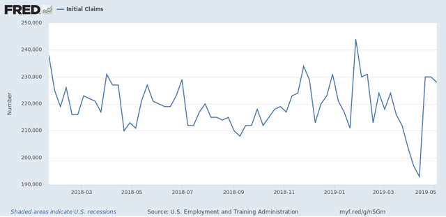
Notice that, with the exception of the three weeks just before Easter this year, they have been in a 210k to 235k range. The three weeks just before Easter broke through the trend to the downside: 204k, 197k. And 193k. The three since then have been at the top end of the trend: 230k, 230k, and 228k.
Here is what the 4 week moving average looks like over the same period:
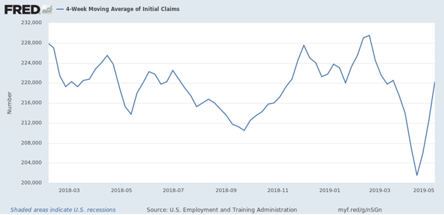
This helps show the trends: last summer’s mini-boom, the autumn and winter weakness, the post-shutdown through Easter rebound, and then the last 3 weeks’ weakness.
So, to smooth out the remaining Easter seasonality, if you average the two weeks just before and just after Easter, you get 212,500. If you expand that to the three weeks before and after Easter, you get 213,667.
Now let’s look at the YoY% change in the 4 week moving average:
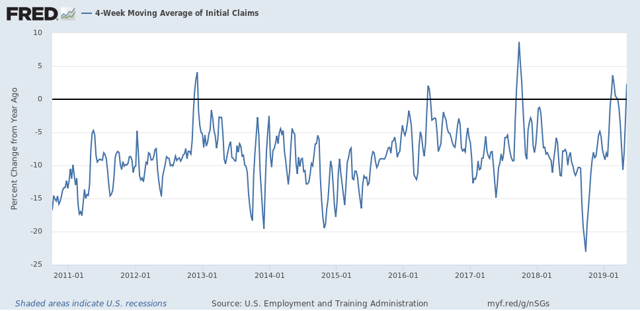
Notice that with the exception of the three week downward spike just before Easter, the recent YoY comparisons have been worse. The only comparable times were superstorm Sandy in 2012, the hurricanes of 2017, and briefly during the 2016 shallow Oil patch centered recession.
Unadjusted, the current 4 week average is 2.3% worse than one year ago. Averaging the four weeks around Easter makes it +0.5% worse. Averaging the current 6 weeks makes it -0.7% better. But whichever averaging we use, the YoY change is very weak compared with the last 9 years.
Before I go, let me cite two other items of data. The American Staffing Association’s Index of temp jobs deteriorated further on a YoY% basis this week:
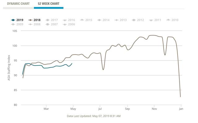
Either this index has been wrong, or the strong temp jobs number in the April jobs report was an outlier.
Finally, the recent new records in the stock market have been another source of “Happy Days are Here Again!” But if you step back and take a longer term view:
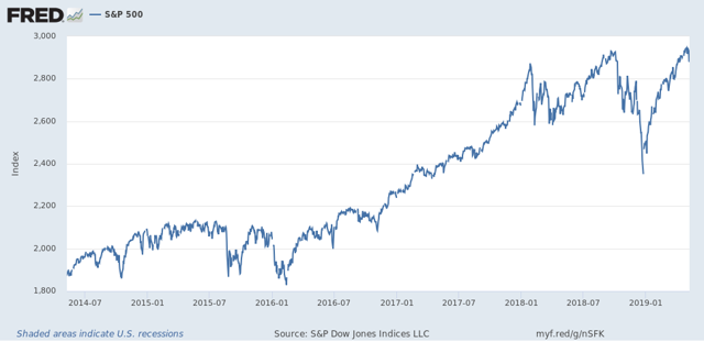
It looks much more like the market has gone sideways in about a 10% range since January of last year. As of yesterday’s close, the S&P 500 was only 0.2% above the January 2018 peak.
In short - at least as of this week! - it looks like the underlying weak economic trend is re-asserting itself.