Saturday, January 14, 2017
Weekly Indicators for January 9 - 13 at XE.com
- by New Deal democrat
My Weekly Indicators post is up at XE.com.
Short term indicators are almost uniformly positive. Meanwhile the "Trump election effect" is fading.


Friday, January 13, 2017
How close are we to "full employment"?
- by New Deal democrat
Paul Krugman ignited a small kerfluffle this week when he suggested that we are close enough to full employment that any fiscal stimulus would lead to "crowding out." Jared Bernstein disagreed.
I think Bernstein is correct. We aren't yet at full employment.
One way to look at this is to compare the UNemployment rate (U3) with the UNDERemployment rate (U6):

In the above graph, we see that in the last two expansions, the U6 rate was at its current 9.5% rate, when U3 was about 5.3%. In other words, our current situation is akin to what we had at 5.3% unemployment in the last two expansions -- not a recession rate to be sure, but not full employment either.
An even better way, I think, is to look at two perennially lackluster employment series: "Not in the Labor Force, but Want a Job Now" and "Part Time for Economic Reasons."
In the below graphs I show how they compare with the official unemployment rate during this expansion vs. the prior two expansions (the "part time" series only goes back to 1994).
Here is Not in Labor Force, but Want a Job Now:

During the best years of both expansions since 1994, about 4.6 million people +/-300,000, put themselves in this category. As of December 2016, this was at about 5.6 million people -- or 1 million over periods of full employment.
Here is Part Time for Economic Reasons:

During the best years of the 1990s expansion, a little over 3 million people put themselves in this category. During the weaker 2000s expansion, it was a little over 4 million. This too as of December 2016 stood at about 5.6 million people.
In other words, to get to the best years of even the weaker 2000s expansion, we would need 1 million people who want a job to enter the workforce, plus another 1.5 million part-timers to find full time employment.
As of last month, the civilian labor force was 159,640,000 people. Thus we need a little over 1.5% improvement in the employment situation (2.5 million of 160 million) to get to what constituted full employment in the last two expansions.
Thursday, January 12, 2017
Corporate profits lead stock prices, year-end 2016 update
-by New Deal democrat
Corporate profits, as a long leading indicator, tend to lead stock prices, which are a short leading indicator. I've updated this analysis through year-end 2016, This post is up at XE.com.
As an aside, I will post my forecast for the second half of 2017 once Q4 GDP, which will include the long leading indicators of private residential investment and proprietors' income, is reported in two weeks.
Wednesday, January 11, 2017
Gas prices set to drive inflation over Fed's target
- by New Deal democrat
In case you hadn't already noticed, that big decline in gas prices you saw at the pump has come to an end. At the moment gas prices are up about 20% YoY. Thus gas prices are one of my five graphs to watch in 2017.
Which means, this is a good time to revive a back-of-the-envelope calculation I used to do when gas prices of $4 would act as a choke collar on economic growth.
The calculation goes like this: core inflation has reliably run at +0.1% or +0.2% a month. Almost all of the variability in the remaining number is due to gas prices. Based on past experience, take the change in gas prices in any given month, divide it by 10, and add that to the underlying core inflation rate. That will give you the non-seasonally-adjusted inflation rate for any given month, +/-0.1%.
Here's what that looks like over the last year. Blue is the average change in gas prices in the month divided by 10, red the non-seasonally-adjusted inflation rate, and green the seasonally adjusted inflation rate:

Note that gas prices rose in December 2016, unlike December 2015. That suggests that December 2016 inflation, after seasonal adjustment, is likely to be about +0.2%. Since December 2015 was -0.3%, that will raise the YoY inflation rate from 1.7% to over 2%.
Since consumer inflation bottomed in February of last year, here's what consumer inflation looks like since then:

From February through November, consumer prices rose +1.9%. An additional +0.2% will make that +2.1% for 10 months -- above the Fed's 2% target. So unless we have a big miss in the next employment report, I expect the Fed to chase this inflation with a rate hike.
Tuesday, January 10, 2017
Taiwan Isn't Large Enough to Meaningfully Leverage Against China
China has a GDP of a little over 11 Trillion dollars while Taiwan's is 523 billion. China is over 20 times as large as Taiwan. It simply isn't large enough to leverage against China.
We see the same thing when we look at the most recent trade information from the Census Bureau:
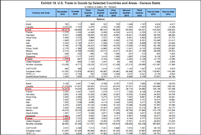
Our balance of trade with China is 22x larger than that with Taiwan (top panel). Our exports to China are 5x larger than those with Taiwan.
Trying to use Taiwan against China is a fool's errand from the start.
We see the same thing when we look at the most recent trade information from the Census Bureau:

Our balance of trade with China is 22x larger than that with Taiwan (top panel). Our exports to China are 5x larger than those with Taiwan.
Trying to use Taiwan against China is a fool's errand from the start.
Monday, January 9, 2017
Why John Taylor -- a Leading Candidate to Replace Yellen -- Shouldn't Be Fed President
From Bloomberg:
With just over a year remaining on Janet Yellen's current term as chair of the Federal Reserve, comments from three of her potential successors at this this weekend's annual American Economic Association meeting are noteworthy. Glenn Hubbard of Columbia University, along with Stanford University’s John Taylor and Kevin Warsh, are all seen by Fed watchers as potential future chairs should President-elect Donald Trump decide not to re-nominate Yellen. All three criticized the U.S. central bank for trying to do too much, and suggested interest rates would be higher if they were in charge.
There are two reasons Taylor should not lead the Fed:
1.) He is the leading proponent of having the Fed use mechanical rules to determine policy. Taylor authored the "Taylor Rule," an equation that he believes should completely govern the Fed's interest rate policy. The rule is very useful as a basis for policy discussion. Despite that benefit, Taylor's argument assumes his equation is infallible -- that it will always be correct in any circumstance. That assumption is incorrect; nothing, especially in economics, is that simple. There is always "another hand" that should offer policy guidance. And binding the Fed's hands would have prevented them from engaging in the extraordinary measures during and after the Great Recession.
2.) Taylor continually compared the Obama recovery to the Reagan recovery, an economic apples to oranges comparison. The Federal Reserve caused the recession preceding Reagan: They increased interest rates to wring inflation out of the economy -- a policy that worked brilliantly. Once rates started to move lower, the economy faced little to no structural headwind to naturally slow economic growth. Perhaps just as important, Reagan's tenure began just as the baby-boomers were beginning their peak earnings time in life. This started a long period when the labor force participation rate increased, adding additional stimulus to the economy.
Obama's recovery was preceded by an entirely different precursor: a debt-deflation recession and recovery. This is an entirely different economic scenario then that faced by Reagan and one that leads to a far slower recovery. In a post-debt deflation economy, consumers are burdened by debt values that, ins some cases, are higher than asset values, leading to slower spending as consumers allocate additional resources to paying down debt rather than other goods. The de-leveraging process can take years, acting as a slight to large drag on economic growth. And unlike Reagan, Obama faced a declining LFPR as the baby boomers started to retire, which also lowered GDP growth.
Taylor has yet to acknowledge either fact in his analysis. There are two possible reasons for his oversight. 1.) He is unaware of the difference between the recoveries. Given Taylor's stature, this is highly doubtful. But it this is the reason is is automatically disqualifying because it belies a profound ignorance of economic history. 2.) He is aware of the differences, but for political reasons refused to acknowledge them. This is the more likely reason. Taylor is a University of Chicago economist; he is inherently biased against government action and activist policy. However, if this is the reason, it is also disqualifying because it indicates he is more interested in political outcomes than positive economic outcomes.
With just over a year remaining on Janet Yellen's current term as chair of the Federal Reserve, comments from three of her potential successors at this this weekend's annual American Economic Association meeting are noteworthy. Glenn Hubbard of Columbia University, along with Stanford University’s John Taylor and Kevin Warsh, are all seen by Fed watchers as potential future chairs should President-elect Donald Trump decide not to re-nominate Yellen. All three criticized the U.S. central bank for trying to do too much, and suggested interest rates would be higher if they were in charge.
There are two reasons Taylor should not lead the Fed:
1.) He is the leading proponent of having the Fed use mechanical rules to determine policy. Taylor authored the "Taylor Rule," an equation that he believes should completely govern the Fed's interest rate policy. The rule is very useful as a basis for policy discussion. Despite that benefit, Taylor's argument assumes his equation is infallible -- that it will always be correct in any circumstance. That assumption is incorrect; nothing, especially in economics, is that simple. There is always "another hand" that should offer policy guidance. And binding the Fed's hands would have prevented them from engaging in the extraordinary measures during and after the Great Recession.
2.) Taylor continually compared the Obama recovery to the Reagan recovery, an economic apples to oranges comparison. The Federal Reserve caused the recession preceding Reagan: They increased interest rates to wring inflation out of the economy -- a policy that worked brilliantly. Once rates started to move lower, the economy faced little to no structural headwind to naturally slow economic growth. Perhaps just as important, Reagan's tenure began just as the baby-boomers were beginning their peak earnings time in life. This started a long period when the labor force participation rate increased, adding additional stimulus to the economy.
Obama's recovery was preceded by an entirely different precursor: a debt-deflation recession and recovery. This is an entirely different economic scenario then that faced by Reagan and one that leads to a far slower recovery. In a post-debt deflation economy, consumers are burdened by debt values that, ins some cases, are higher than asset values, leading to slower spending as consumers allocate additional resources to paying down debt rather than other goods. The de-leveraging process can take years, acting as a slight to large drag on economic growth. And unlike Reagan, Obama faced a declining LFPR as the baby boomers started to retire, which also lowered GDP growth.
Taylor has yet to acknowledge either fact in his analysis. There are two possible reasons for his oversight. 1.) He is unaware of the difference between the recoveries. Given Taylor's stature, this is highly doubtful. But it this is the reason is is automatically disqualifying because it belies a profound ignorance of economic history. 2.) He is aware of the differences, but for political reasons refused to acknowledge them. This is the more likely reason. Taylor is a University of Chicago economist; he is inherently biased against government action and activist policy. However, if this is the reason, it is also disqualifying because it indicates he is more interested in political outcomes than positive economic outcomes.
Five graphs for 2017: #1, real wages and real consumer spending
- by New Deal democrat
In the last week I have described 5 relationships that bear particular watching in 2017.
#5 is the price of gas.
#4 is the value of the US$
#3 is mortgage rates and residential construction
#2 is inflation and the Fed funds rate.
#2 is inflation and the Fed funds rate.
The overall theme is that 2017 is likely to be a rather typical year of late cycle inflation, possibly also featuring a trade war.
The number one graph I am looking at this year is how consumers are affected by, and deal with, this late cycle inflationary environment.
The number one graph I am looking at this year is how consumers are affected by, and deal with, this late cycle inflationary environment.
In the absence of special factors, like spouses entering the workforce in the 1980s, or the housing bubble of the early 2000s, when real wages stagnate, so does real consumer spending (as expressed by real retail sales per capita) with a bit of a lag (red).
Here is the long-term look through 2000 using the former retail sales series (first graph) and the new retail sales series which began in the early 1990s (second graph):


Here are the same two graphs expressed as a YoY%:


When not just one but both stagnate, that is a signal for an oncoming consumer recession.
During this entire expansion, nominal wages for nonsupervisory employees have not grown faster than 2.6% YoY. Since we are still adding jobs faster than the labor force is growing, there ought to be at least a little further improvement than that. But in the last 9 months alone consumer prices have increased by 1.9%, causing real wages to stagnate (blue in the graph below).
For 2017 I don't see any special factor at play, unless there is a tax cut that applies to middle and working class earners enough to boost spending.
So the #1 graph for 2017 is real wages and real conusmer spending:

Here is the same graph YoY:
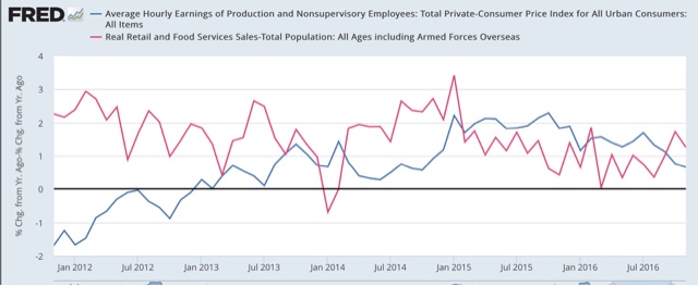
I will be following this to see whether real wages stagnate or decline, and if so, does real spending follow suit, laying the groundwork for the next recession.
Here is the same graph YoY:
I will be following this to see whether real wages stagnate or decline, and if so, does real spending follow suit, laying the groundwork for the next recession.
Sunday, January 8, 2017
Saturday, January 7, 2017
Weekly Indicators for January 2 - 6 at XE.com
- by New Deal democrat
My Weekly Indicators post is up at XE.com.
The indications for the first half of 2017 are really strong, but out on the horizon mortgage applications just turned negative.
Friday, January 6, 2017
December jobs report: a positive report to close Obama's Presidency
- by New Deal democrat
HEADLINES:
- +156,000 jobs added
- U3 unemployment rate up +0.1% from 4.6% to 4.7%
- U6 underemployment rate down -0.1% from 9.3% to 9.2%
Here are the headlines on wages and the chronic heightened underemployment:
Wages and participation rates
- Not in Labor Force, but Want a Job Now: down -176,000 from 5.876 million to 5.662 million
- Part time for economic reasons: down -64,000 from 5.662 million to 5.598 million
- Employment/population ratio ages 25-54: up +0.1% from 78.1% to 78.2%
- Average Weekly Earnings for Production and Nonsupervisory Personnel: up $.07 from $21.73 to $21.80, up +2.5% YoY. (Note: you may be reading different information about wages elsewhere. They are citing average wages for all private workers. I use wages for nonsupervisory personnel, to come closer to the situation for ordinary workers.)
October was revised downward by -7,000, but November was revised upward by +26,000, for a net change of +19,000.
The more leading numbers in the report tell us about where the economy is likely to be a few months from now. These were mainly positive.
- the average manufacturing workweek rose 0.1 from 40.6 to 40.7 hours. This is one of the 10 components of the LEI, and is a positive.
- construction jobs decreased by -3,000 YoY construction jobs are up +102,000.
- manufacturing jobs increased by +17,000, but are down -45,000 YoY
- temporary jobs decreased by -15,500.
- the number of people unemployed for 5 weeks or less decreased by -36,000 from 2,415,000 to 2,379,000. The post-recession low was set over 1 year ago at 2,095,000.
Other important coincident indicators help us paint a more complete picture of the present:
- Overtime rose +0.1 from 3.2 to 3.3 hours.
- Professional and business employment (generally higher- paying jobs) increased by +15,000 and are up 522,000 YoY.
- the index of aggregate hours worked in the economy rose by 0.2 from 105.8 to 106.0
- the index of aggregate payrolls rose by 0.7 from 131.0 to 103.7.
Other news included:
- the alternate jobs number contained in the more volatile household survey increased by +63,000 jobs. This represents an increase of 2,811,000 jobs YoY vs. 2,157,000 in the establishment survey.
- Government jobs rose by +12,000.
- the overall employment to population ratio for all ages 16 and up was unchanged at 59.7% m/m and is up +0.1% YoY.
- The labor force participation rate was unchanged at 62.7% and is also unchanged YoY (remember, this includes droves of retiring Bsoomers).
SUMMARY
This was a nearly uniformly positive report. While the headline unemployment rate rose slightly, and there were some downward revisions to last month's strongly positive household survey numbers, the broader underemployment rate continued its recent strong decline. Hours and wages increased.
As Barack Obama closes out his Presidency, his record on jobs (as a share of the prime working age population) and aggregate wage creation is nearly that of Ronald Reagan's. The weak points remain a participation rate for the working age population that never made it back more than 2/3's of the way to last 2007 high, and wages that never increased more than 2.6% YoY. Since wages gains YoY typically fall by about that percentage during recessions, I continue to fear that the next recession will include actual wage deflation, with the possibility of a wage/price deflationary spiral.
As Barack Obama closes out his Presidency, his record on jobs (as a share of the prime working age population) and aggregate wage creation is nearly that of Ronald Reagan's. The weak points remain a participation rate for the working age population that never made it back more than 2/3's of the way to last 2007 high, and wages that never increased more than 2.6% YoY. Since wages gains YoY typically fall by about that percentage during recessions, I continue to fear that the next recession will include actual wage deflation, with the possibility of a wage/price deflationary spiral.
Jazz Shaw, the Frank Burns of Policy Analysis, Once Again Demonstrates His Ineptitude
I grew up on MASH. During one episode, someone asks Hawkeye what Frank Burns knows on a topic. Hawkeye responded, "there's so little Frank knows, it's difficult to keep up with what he doesn't know."
That statement encapsulates Jazz Shaw of Hot Air in a nutshell. For several years now, he has sided with those who oppose a minimum wage hike, arguing that an increase in the minimum wage causes unemployment. This argument was neutered by Alan Kreuger in the early 1990s -- as anyone who pays attention to silly things like facts and data will tell you. The recent experience of Seattle and it's minimum wage increase confirmed Kreuger's analysis and rebutted Mr Shaw's position. However, Kreuger's literature and economic data have the added feature of being complex and nuanced, immediately placing it outside Mr. Shaw's intellectual capabilities. Rather than reevaluate his position, Mr. Shaw has done what most conservative bloggers do: stop writing about the topic on which reality has shown him to be wrong and move onto another topic.
Yesterday we had this beauty from Mr. Shaw:
We had a functional, if highly problematic health care system in this country before the Affordable Care Act was passed and we will still have one when it’s gone. Far more to the point, Obamacare did not “fix” the healthcare system in this country. It blew it up in several significant ways, not least of which was the exponential increases in premium costs and the large number of healthcare providers who wound up kicking out their satisfied patients because they wouldn’t accept Obamacare coverage.
As with all of Mr. Shaw's policy writing, data, facts and references are completely absent. Instead, he offers his position and, because it jibes with that of his readers, it goes unchallenged until now.
Let's first note that insurance premiums were a huge problem before the ACA. The following is from the Economic Policy Institute and Kaiser Family Health:


Insurance premiums increased at alarming rates before the ACA resulting in health care premiums taking an increasing percentage of median family income. As a matter of fact, premium increases were far lower after the ACA:

As for Mr. Shaw's contention that the pre-ACA health system was functional, we have this:
The Blue Cross Blue Shield Association released a widely publicized report last month that said new enrollees under ObamaCare had 22 percent higher medical costs than people who received coverage from employers.
.....
The Aetna CEO noted concerns about the “risk pool,” which refers to the balance of healthy and sick enrollees in a plan. The makeup of the ObamaCare risk pools has been sicker and costlier than insurers hoped.
One of the ACA's biggest problems is that far more sick people signed up than anticipated by insurers. This indicates that before the ACA, there was a very serious problem: people weren't going to the doctor. And the reason is simple: they lacked insurance.

For a long amount of time (~35 years) a significant percentage of Americans didn't have insurance. Therefore, they didn't get routine problems taken care of. When they finally got insurance, they had a lot of problems that had morphed into huge issues because they hadn't gotten them taken care of. This problem could have been avoided with broadened insurance coverage.
And if the U.S.' system was "the best: why did it cost so much more than other countries' health care?

I could go, but you get the point. As usual, Mr. Shaw cites no data nor evidence to back-up his primary assertion. This is standard for Mr. Shaw, because he lacks any formal training in policy analysis, economics or even basic logic. He does, however, excel at stupidity, which he routinely displays. He also clearly lacks a sense of shame, because someone who has been as consistently incorrect as Mr. Shaw usually has the good sense to shut up. He does not. So, we can expect to see more articles from him as he defends his new master, Mr. Trump.
Thursday, January 5, 2017
Five graphs for 2017: #2, inflation and the Fed funds rate
- by New Deal democrat
This is the fourth of five metrics I'll be paying particular attention to this year.
The first three are the "troika" of issues that could lay the basis for the next recession: higher gas prices (#5), a surge in the value of the US$ (#4), and higher interest rates (#3).
At least 2 of the above 3 metrics are connected to the inflation rate. For the last 16 years, the waxing and waning of consumer inflation has primarily been driven by gas prices. Further, the spike in interest rates appears to reflect a belief that the actions taken by the incoming Administration in Washington will be inflationary.
Against that backdrop, we have a Fed that officially has a "target" of 2% inflation, but in practice appears to treat 2% as a ceiling. It did not appear concerned at all by the nonexistent inflation of 2015, but since 2014 at least has been talking of calibrating interest rates to achieve a"gliding into" the 2% inflation target.
So graph #2 for 2017 is YoY CPI and the Fed Funds rate. Here it is for the last 50 years:

Typically the Fed has chased late cycle inflation higher.
Here's a close-up of the last 5 years:

If consumer inflation, driven by an increase in gas prices, goes over 2% in the next few months (which I consider likely), the Fed certainly sounds like it will chase it, and raise interest rates multiple times. If so, that will set the stage for the narrowing of the currently relatively steep yield curve.
[Note: since tomorrow is the jobs report, I will post the #1 graph next week.]
Wednesday, January 4, 2017
Five graphs for 2017: #3, interest rates vs. residential construction
- by New Deal democrat
For the last few years, I have picked out five metrics that particularly bear watching at the outset of the year. This year, there is a troika of factors that could bring about the next recession: a big increase in gas prices (#5 on this year's list), a surge in the US$ (#4), and -- today's installment -- a spike in interest rates
In 2013 as the result of the "taper tantrum," Treasury yields went from just under 1.5% to just over 3%. Mortgage rates rose similarly, leading to a near stall in the housing market. The pent-up demand from the large Millennial generation kept the market from an outright downturn.
In 2013 as the result of the "taper tantrum," Treasury yields went from just under 1.5% to just over 3%. Mortgage rates rose similarly, leading to a near stall in the housing market. The pent-up demand from the large Millennial generation kept the market from an outright downturn.
Since the US presidential election, Treasury yields similarly spiked, so far to a high of just over 2.6%. In response, finally this week, mortgage applications turned negative YoY.
So graph number 3 is mortgage rates (inverted) vs. residential construction (shown YoY below):

Although residential construction is a little less leading than permits, housing starts, or new home sales, it has the advantage of being a much less noisy series (shown in comparison with permits below):

Private residential construction has gone basically sideways since September 2015 (and thus is flat YoY in the first graph above), although post-Brexit there has been some improvement. I expect this series to continue to improve until sometime next spring when the post-election spike catches up with it.
The issue this year will be whether mortgage interest rates continue to rise, and if so, do they rise enough to cause an outright downturn in the housing market. That's what I'll watch in this graph.
Tuesday, January 3, 2017
Will Inflation Be the Story of 2017?
From Bloomberg:
While the ISM sub-indexes can be volatile, the jump in prices caught the eye of factory managers and analysts, with survey chairman Bradley Holcomb noting it was “clearly something to watch” at the beginning of the year. A broad-based increase in costs of inputs for production corroborates signs of higher consumer inflation. The personal consumption expenditures price index -- the Federal Reserve’s preferred gauge -- is up 1.4 percent on a year-over-year basis, the fastest gain since 2014.
Even with the increase in the ISM price index, it’s far below levels from times associated with rapid inflation. The gauge averaged a 73.7 reading in 1980, when the consumer-price index averaged a 13.6 percent rise. The ISM price index reached a post-recession high of 85.5 in 2011, coinciding with a post-recession high in crude oil and faster gains in the Fed’s preferred index.
From the Financial Times
Germany’s annual inflation rate has surged to its highest level in more than three years, defying economist forecasts to hit 1.7 per cent in December in a release that is likely to embolden German critics of stimulative monetary policy in the eurozone.
From Bloomberg:
A barrel of West Texas Intermediate traded above $55 this morning, the highest level for the contract since July 2015. The rise comes after local media in Kuwait reported that the country has cut output by 130,000 barrels a day, a sign that the OPEC deal to reduce production may be implemented successfully. In the U.S., drillers added rigs for the ninth week, boosting the number to the highest in about a year.
From Wednesday's Eurostate Release: note energy prices


While the ISM sub-indexes can be volatile, the jump in prices caught the eye of factory managers and analysts, with survey chairman Bradley Holcomb noting it was “clearly something to watch” at the beginning of the year. A broad-based increase in costs of inputs for production corroborates signs of higher consumer inflation. The personal consumption expenditures price index -- the Federal Reserve’s preferred gauge -- is up 1.4 percent on a year-over-year basis, the fastest gain since 2014.
Even with the increase in the ISM price index, it’s far below levels from times associated with rapid inflation. The gauge averaged a 73.7 reading in 1980, when the consumer-price index averaged a 13.6 percent rise. The ISM price index reached a post-recession high of 85.5 in 2011, coinciding with a post-recession high in crude oil and faster gains in the Fed’s preferred index.
From the Financial Times
Germany’s annual inflation rate has surged to its highest level in more than three years, defying economist forecasts to hit 1.7 per cent in December in a release that is likely to embolden German critics of stimulative monetary policy in the eurozone.
From Bloomberg:
A barrel of West Texas Intermediate traded above $55 this morning, the highest level for the contract since July 2015. The rise comes after local media in Kuwait reported that the country has cut output by 130,000 barrels a day, a sign that the OPEC deal to reduce production may be implemented successfully. In the U.S., drillers added rigs for the ninth week, boosting the number to the highest in about a year.
From Wednesday's Eurostate Release: note energy prices

Chart of the 5 and 10-year Breakeven Inflation Rates

1- year Chart of10 and 30-year CMTs

Fiive graphs for 2017: #4, the US$
- by New Deal democrat
This is the second of five graphs that bear watching in 2017.
The first was gas prices.
The second part of the troika that may lay the basis for the next recession is the US$. Almost 100 years ago, economist Irving Fisher identified the strength/weakness of the currency as being an indicator that led the economy by about 7 months (in the below paragraph, P' is the YoY change in prices, and T is the currency value):

In 2015 we saw how the surge in the US$ depressed commerce even as lower gas prices helped consumer spending. Since the US presidential election, the US$ has had a lesser surge (so far) based on fears that a trade war particularly with China may be in the offing. Typically negative effects have not been felt until the US$ is up at least 5% YoY against other currencies:

As of last week the US$ was up 5% globally, although not against major currencies.

Needless to say, if both gas prices and the US$ spike, unlike 2015 both consumers and producers will take a hit.
Monday, January 2, 2017
Five graphs for 2017: #5, gas prices
- by New Deal democrat
In the last couple of years, I have identified a few relationships that I thought were particularly worthy of being followed over the next 12 months. Usually these have been metrics that had been at near extremes, or showed signs of approaching a turning or inflection point.
The first such important metric for 2017 is gas prices, one of a troika that together may set the stage for the next recession.
After the "great recession," these quickly returned to nearly $4 per gallon for several years, acting like a "choke collar" on growth. Every time the economy looked like it was taking off, gas prices would rein in other consumer spending.
In 2014 gas prices fell precipitously, to as low as about $1.69 at the beginning of 2016. Throughout last year, it appeared gas prices (which tend to show lots of seasonality) were bottoming -- and they finally turned positive YoY late in the year, as shown in red in the graph below (actual prices per gallon are shown in blue):

Normally gas prices have had to increase 40% or more YoY to create any kind of "shock." As of now, they are only up about 15% YoY.
I'll be keeping tabs on this metric to see if prices go up near $4/gallon again, and if they are up more than 40% YoY.
An Absolute Must Read on Foreign Policy
From Politico. This article is the first I've seen (there, of course, may be others) that explains Putin's game. It's scary as hell, but one that we all should read.
Putin's Long Game
Putin's Long Game
Saturday, December 31, 2016
Weekly Indicators for December 26 - 30 at XE.com
- by New Deal democrat
My Weekly Indicators post is Up at XE.com.
Interest came down off recent highs to end the year.
See you again in 2017!
Friday, December 30, 2016
Marking my 2016 forecast to market
(Plus a pyrrhic political presidential prediction)
- by New Deal democrat
How did my economic forecast for2016, made one year ago, pan out? The result is Up at XE.com.
While it wasn't an economic forecast, I did use economic data to make a forecast the 2016 presidential election, that the candidate of the incumbent party would eke out a narrow victory.
Just before the election, my final personal forecast was
Clinton 49.5%
Trump 46.0%
Third parties 4.5%
According to the Cook Political Report, the final result was
Clinton 48.2%
Trump 46.1%
Third parties 5.7%
So my prediction was pretty darn close, but of no use whatsoever because of the state by state distribution of that result.
- by New Deal democrat
How did my economic forecast for2016, made one year ago, pan out? The result is Up at XE.com.
While it wasn't an economic forecast, I did use economic data to make a forecast the 2016 presidential election, that the candidate of the incumbent party would eke out a narrow victory.
Just before the election, my final personal forecast was
Clinton 49.5%
Trump 46.0%
Third parties 4.5%
According to the Cook Political Report, the final result was
Clinton 48.2%
Trump 46.1%
Third parties 5.7%
So my prediction was pretty darn close, but of no use whatsoever because of the state by state distribution of that result.
Subscribe to:
Posts (Atom)