Saturday, October 3, 2015
Weekly Indicators for Semptember 28 - October 2 at XE.com
- by New Deal democrat
My Weekly Indicator post is up at XE.com .
The consumer portion of the US economy continues to expand. The industrial portion, most exposed to global weakness, continues to be negative.


Friday, October 2, 2015
Told you so: weakening job growth edition
- by New Deal democrat
After averaging over 200,000 during 2014 and the first half of 2015, the last two months have featured job growth beginning with a "1." A surprise? Well . . .
Here's me on August 11, 2015, The Lbbor Market Conditioins Index as a Leading Indicator:
"As shown in the graph below, the [Labor Market Conditions Index] consistently leads the YoY% growth in jobs by 6 - 12 months, but YoY job growth (red) is a much smoother measure:

"....
"Since the LMCI does lead the much smoother YoY growth in jobs, it strongly suggests that YoY payroll growth is going to decline over the next 6 months or so. And that can only happen if those payroll numbers generally come in under 225,000, and probably even below 200,000 through next winter."
And here I am two days later, More Evidence we are past the midpoint for jobs growth:
"[U]nsurprisingly housing permits lead jobs growth as well:

"While a steep decline to a stall in housing, as happened in 2014, has not always led to a stall in jobs, usually it has led to at least some weakening, sometimes slight, sometimes very marked. Since the lead time varies between 6 to 18 months, we are about due for last year's weakness in housing to lead to some weakness in payrolls."
As I get to say from time to time, you are reading the right blog.
September jobs report: a downshift in the trend in employment growth
- by New Deal democrat
HEADLINES:
- 142,000 jobs added to the economy
- U3 unemployment rate unchanged at 5.1%
With the expansion firmly established, the focus has shifted to wages and the chronic heightened unemployment. Here's the headlines on those:
Wages and participation rates
- Not in Labor Force, but Want a Job Now: up 23,000 from 5.932 million to 5.935 million
- Part time for economic reasons: down -447,000 from 6.483 million to 6.036 million
- Employment/population ratio ages 25-54: unchanged at 77.2%
- Average Weekly Earnings for Production and Nonsupervisory Personnel: unchanged at $21.08 , up +1.9%YoY. (Note: you may be reading different information about wages elsewhere. They are citing average wages for all private workers. I use wages for nonsupervisory personnel, to come closer to the situation for ordinary workers.)
The more leading numbers in the report tell us about where the economy is likely to be a few months from now. These were negative.
- the average manufacturing workweek fell -0.2 hours from 41.8 hours to 41.6 hours. This is one of the 10 components of the LEI and so will affect it negatively.
- construction jobs increased.by 8,000. YoY construction jobs are up 199,000.
- manufacturing jobs decreased by -9,000, and are up 92,000 YoY.
- Professional and business employment (generally higher-paying jobs) increased by 31,000 and are up 604,000 YoY.
- temporary jobs - a leading indicator for jobs overall - rosse by 4,600.
- the number of people unemployed for 5 weeks or less - a better leading indicator than initial jobless claims - rose by 268,000 from 2,095,000 (the post-recession low) to 2.363,000.
Other important coincident indicators help us paint a more complete picture of the present:
- Overtime declined -0.2 hours from 3.3 hours to 3.1 hours.
- the index of aggregate hours worked in the economy declined by 0.2 from 104.0 to 103.8.
- The broad U-6 unemployment rate, that includes discouraged workers fell by -0.3% from 10.3% to 10.0%.
- the index of aggregate payrolls declined by -0.3% from 124.6 to 124.3 .
- the alternate jobs number contained in the more volatile household survey decreased by -236,000 jobs. This represents an increase of 2,193,000 jobs YoY vs. 2,708,000 in the establishment survey.
- Government jobs rose by 24,000.
- the overall employment to population ratio for all ages 16 and above fell -0.2% from 59.4% to 59.2%, and has risen by 0.2% YoY. The labor force participation rate also fell -0.2% from 62.6% to 62.4% and is down -0.5% YoY (remember, this incl udes droves of retiring Boomers).
SUMMARY:
Last month we had a "meh" headline jobs number with great internals. This month we had a "meh" headline number with poor internals. From a second month of sub-200,000 job growth to manufacturing hours to revisions of past months to declining e/p and labor force participation ratios to declining aggergate hours and payrolls, this was a poor report -- which basically took back last month's great report.
If you want a bright spot, it was the continued big decline in involuntary part time workers, which also drove down the U6 unemployment rate to 10.0%. Below this number is where I expect nominal wage growth to finally improve.
This decline in employment trend growth is something I have seen for a number of months, as last year's poor housing market feeds through the rest of the economy this year. This decline is also obviously about the continuing international deterioration feeding through the strong US$ to a shallow industrial recession (but a continuing consumer expansion) here.
Thursday, October 1, 2015
Watching the housing market python digest interest rates through sales, then prices, and then inventory
- by New Deal democrat
I have a new post showing trends in the housing market up at XE.com .
Right now is a good time to show how changes in intrest rates feed through first to sales, then prices, and finally inventory. It's the econo-geek version of watching a python digesting a meal.
Wednesday, September 30, 2015
Monday, September 28, 2015
Atrios publishes a misleading graph
- by New Deal democrat
I'm just never going to score well on the "plays well with other progressives" conduct rating. The use of misleading or dishonest, cherry-picked statistics sets me off, whether it is done by a right wing nut case or a left winger. Hell, my coblogger Bonddad has made a cottage industry of calling out John Hinderacker for that stuff.
Anyway, what got my blood boiling this morning was a post from Atrios, entitled "Recovery," making use of the following graph:

Originally I was going to call this dishonest, but I'll settle for "misleading."
To be sure, I don't dispute the overall point, which is that the wealthy have disproportionately gained during this 6+ year expansion, while wages for the middle/working classes have remained stagnant. Outside of Bernie Sanders, I know of no candidate for President seriously making an issue out of this.
So why am I so annoyed with Atrios? Because he chose the cheap shot with a misleading statistic rather than honest analysis.
The source of the above graph is Pavline Tcherneva of the Levy Institute. I have no beef with her whatsoever, and I had a perfectly civil and helpful exchange with her earlier this year.
But here is what the graph does. It measures the growth in incomes over *ENTIRE* previous expansions (measure from income peak to income peak), vs. the first 3 years of Obama's. The last bar in the graph indicates that it runs through 2012.
In other words, the graph compares one apple with a bunch of oranges. To be comparable, it should have compared the first three years of income growth in other expansions vs. Obama's. That's the first gripe.
But above and beyond that, it isn't even current, by a factor of nearly 3 years!
As it happens, since Tcherneva based her graph on the work of Emanuel Saez, and he has already published a preliminary update through 2014, I can show you what the distribution of income gains since the start of the expansion looks like more currently:

Through 2014, the wealthy had seen a share of income gains comparable with both the Clinton and Bush 2 expansions. The bottom 90% fared much better during the Clinton years than either Bush 2 or Obama. And of course, the Obama expansion isn't over yet.
BTW, Saez should be publishing his final 2014 report shortly. Since from Clinton peak to Bush 2 peak, the lower 90% only saw a 1% income gain, it should be interesting to see if that has was surpassed in 2014.
Sunday, September 27, 2015
Saturday, September 26, 2015
Weekly Indicators for Semptember 21 - 25 at XE.com
- by New Deal democrat
My Weekly Indicators post is up at XE.com. The forces of darkness are gathering, but they have not overthrown the day.
Friday, September 25, 2015
New home prices per square foot show affluent-centered market, not Bubble 2.0
- by New Deal democrat
The other day the Joint Center for Housing Studies, a privately funded think tank affiliated with Harvard, made something of a splash with a study showing that rents are increasingly unaffordable.
Since the study only went through 2014, and I've been covering "median asking rent" quarterly as the information is updated, I'm going to wait for the 3rd quarter data to be released next month before commenting.
But one important point about housing affordability has gone completely unnoticed: the narrow basis for price increases in single family homes.
Here is the graph from the study showing that the market for low-end housing has all but collapsed, and hasn't really recovered at all:

Put a slightly different way, it is primarily higher-end housing that is driving new single family home prices.
Just as importantly, the study includes a chart showing the number of square feet in the median new home built, in addition to the median price:

I'll come back to the information in this chart shortly.
In the last couple of years, there has been commentary in various quarters about the existence of a "second housing bubble." Here is a graph showing the median price of new houses (blue) and existing houses (red):

As an aside, I have repeated pointed out that prices follow sales. Thus the flatlining of sales in much of 2014 should show up by now. And here is the same graph showing YoY% changes in the prices of new and existing homes:

Averaged over the last 4 months, YoY prices for new houses have turned negative, while that of existing homes has paused.
But back to the main point. Here is the same graph of median prices, normed by usual weekly pay (the most stagnant of all of the measures of compensation):
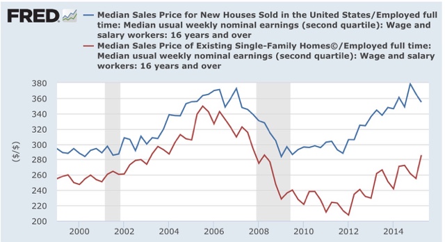
Real, compensation adjusted prices for existing homes are nowhere near where they were at the peak of the housing bubble, while those of new homes have returned and briefly exceeded that level.
Now let's turn back to the information in the chart from the Joint Housing Center study. The median price and median square footage information allows us to calculate the price of housing per square foot.
Let's show the median price (1st column), the median square footage (2nd), and price per square foot (3rd) at the peak of the housing bubble in 2005, and 5 years prior in 2000:
2005 $292,000 2227 $131.1
2000 $232,300 2057 $112.9
Now let's measure over an identical 5 year period from the bottom of the housing bust in 2009 through the latest data in 2014:
2014 $282,800 2414 $117.1
2009 $239,100 2103 $113.7
Prices rose by 16.1% per square foot in the 5 years leading up to the peak of the housing bubble. By contrast, in the last 5 years they have only risen 3%. Prices per square foot now are 12% lower than they were at the peak of the bubble.
In summary, the latest study by the Joint Housing Center tells us that new houses are currently being built primarily for the affluent. And in real terms, those prices are not anywhere close to their bubble peak. In other words, this is further evidence that there is no "housing bubble 2.0."
In the last couple of years, there has been commentary in various quarters about the existence of a "second housing bubble." Here is a graph showing the median price of new houses (blue) and existing houses (red):
As an aside, I have repeated pointed out that prices follow sales. Thus the flatlining of sales in much of 2014 should show up by now. And here is the same graph showing YoY% changes in the prices of new and existing homes:
Averaged over the last 4 months, YoY prices for new houses have turned negative, while that of existing homes has paused.
But back to the main point. Here is the same graph of median prices, normed by usual weekly pay (the most stagnant of all of the measures of compensation):
Real, compensation adjusted prices for existing homes are nowhere near where they were at the peak of the housing bubble, while those of new homes have returned and briefly exceeded that level.
Now let's turn back to the information in the chart from the Joint Housing Center study. The median price and median square footage information allows us to calculate the price of housing per square foot.
Let's show the median price (1st column), the median square footage (2nd), and price per square foot (3rd) at the peak of the housing bubble in 2005, and 5 years prior in 2000:
2005 $292,000 2227 $131.1
2000 $232,300 2057 $112.9
Now let's measure over an identical 5 year period from the bottom of the housing bust in 2009 through the latest data in 2014:
2014 $282,800 2414 $117.1
2009 $239,100 2103 $113.7
Prices rose by 16.1% per square foot in the 5 years leading up to the peak of the housing bubble. By contrast, in the last 5 years they have only risen 3%. Prices per square foot now are 12% lower than they were at the peak of the bubble.
In summary, the latest study by the Joint Housing Center tells us that new houses are currently being built primarily for the affluent. And in real terms, those prices are not anywhere close to their bubble peak. In other words, this is further evidence that there is no "housing bubble 2.0."
Tuesday, September 22, 2015
Warning signs in interest rates and the US$: a graphic look
- by New Deal democrat
I have a new post up at XE.com, picking up on the theme of my latest "Weekly Indicators" column, and showing graphically why interest rates have taken center stage.
Sunday, September 20, 2015
Housing permits: the surge reappears
- by New Deal democrat
On Thursday I wrote that I had a bone to pick with the Census Bureau because of some major unexplained revisions to housing permits that made a year of growth, including a huge spike in May and June disappear.
Here's the FRED chart showing that (permits in red):

Well, an hour and a half after my post, the FRED data was revised. Here's what it looks like now. I've kept the screenshot to show the time of revision:

Here is the bar graph of revisions of the last year's data. The first is from Thursday morning. The second is from Thursday afternoon:


I haven't seen any correction or other note on either the Census Bureau or the FRED site, so I don't know where it originated.
I'm gratified that the corrected information shows new highs in permits, and that August is still higher than any other month except for the May-June spike. Along with real retail sales per capita and real money supply, this is why I am increasingly confident that our economic expansion will continue through the third quarter of next year.
I just wish there would be more transparency when an error like this happens.
Saturday, September 19, 2015
Weekly Indicators for September 14 - 18 at XE.com
-by New Deal democrat
My Weekly Indicator post is up at XE.com. There was some fluctuation among the coincident indicators this week, but with the Fed decision, the reaction of interest rates takes center stage.
Friday, September 18, 2015
Some Friday good news: real retail sales and real aggregate wage growth
- by New Deal democrat
I have not been a happy camper here at Camp Bonddad this week. First, contrary to my expectation, the Census Bureau reported that real median household income actually *declined* by about -0.5% for the prime working age 25-54 cohort. The main reason, apparently, was a seemingly random increase in the percentage of non-family households, which disproportionately consist of low wage earners.
Then the same Census Bureau wreaked havoc with housing permits, perhaps the most important among long leading indicators. These went from making new highs several times in the second quarter, to no new high having occurred since 10 months ago. Did I mention, these are invaluable for looking at the economy 12+ months out? So, suddenly, we are only 2 months away from no new highs for a year. Awesome. Except, oh by the way, housing starts still show the improvement, as do the non-seasonally adjusted numbers, even after the latest revisions. Would it really be too much effort to supply us with an explanation?
So let me point out two things which *did* go right this week, courtesy of a -0.1% decline in CPI: real retail sales and real aggregate wages.
First of all, real retail sales made a new high:
Then the same Census Bureau wreaked havoc with housing permits, perhaps the most important among long leading indicators. These went from making new highs several times in the second quarter, to no new high having occurred since 10 months ago. Did I mention, these are invaluable for looking at the economy 12+ months out? So, suddenly, we are only 2 months away from no new highs for a year. Awesome. Except, oh by the way, housing starts still show the improvement, as do the non-seasonally adjusted numbers, even after the latest revisions. Would it really be too much effort to supply us with an explanation?
So let me point out two things which *did* go right this week, courtesy of a -0.1% decline in CPI: real retail sales and real aggregate wages.
First of all, real retail sales made a new high:

This bodes well for employment growth in the coming months, since consumer spending leads jobs. Since population increases by a little under +0.1% per month, this means real retail sales per capita, a long leading indicator, also made a new high in August.
Secondly, real aggregate wages also grew, bringing total growth over this economic expansion to +17.0%:

For comparison purposes, here is the Reagan expansion of the 1980s:

At this point (5 years, 9 months into the employment expansion) in the 1980s, real aggregate income was up +18.5%. Our present expansion isn't quite so good for aggregate real wages, but not too shabby either.
To bring this full circle, here is a regression of real aggregate wage growth vs. real median household income:

Note that this year was one of the two biggest outliers to the negative. Typically based on real aggregate wage growth we should have seen decent growth to real median household income.
Thursday, September 17, 2015
Housing permits: in which I have a bone to pick with the Census Bureau
- by New Deal democrat
When you make a revision of over 25% to one month's data, that turns a surge into a crater, but the non-seasonally adjusted data still shows a surge -- such that the YoY data, which ought to be unaffected by seasonal adjustments, is out of whack by 35% (!!!), don't you think you owe your readers an explanation?
Well, Census Bureau, I"m looking at you.
Here's what housing permits (red) and starts (blue) looked like one month ago:

Permits had spiked to over 1.3 million in June, which was due, we were told, to the expiration of a program in NYC that required permits to be issued no later than June 30.
Now here is the same graph updated with this morning's data:

The spike in seasonally adjusted permits is completely gone, replaced by a crater. This is no small revision. Rather, housing permits for June have just been revised down by 25% -- a full quarter of the total! That's one heckuva revision!
How unusual is this big a revision? Well, here's a comparison of the numbers through last month, with the revised numbers through this month:

Like I said, that's one heckuva revision!
OK, revisions happen. Fair enough. But notice that starts -- an actual, physical event -- still reflect a significant increase in the last few months. It's one thing if permits were never acted upon with actual starts, but here we have suddenly non-existent permits leading to actual starts!
What's more, the summer surge in permits still shows up in the revised non-seasonally adjusted data:

Since, presumably, the issue here is a seasonal adjustment, the discrepancy ought to disappear if we compare YoY data. Umm, not quite:

The wholesale deletion of the NYC permits has created a 30% discrepancy in the YoY comparisons of seasonally adjusted vs. non-seasonally adjusted data!
Considering housing permits is perhaps the single most important long leading indicator, and with the revisions this morning completely wiping out any progress since last fall, it seems to me that the Census Bureau has some explaining to do. I have looked in vain for any explanatory note in this morning's release. It's possible I missed it, of course, but at least one other blogger has confirmed to me that they did not see any such note either.
So excuse me, Census Bureau, but I have a bone to pick with you.
Wednesday, September 16, 2015
Census Bureau: mixed results for prime working age median income(UPDATED x 2)
- by New Deal democrat
Real life intrudes, so I can't do a detailed analysis now, but this morning the Census Burreau came out with their annual update on median household income for 2014.
The headline is that real median household income for all households decreased by -1.5% in 2014. But the number of people aged 35 - 54 decreased by about 150,000, while the number of households with people over 65 grew by about 900,000. Since median income for "over 65" households was only about $39,000, while prime working age median income was about $66,000, that significantly distorts the overall number.
Here are the numbers for the 3 prime age working decades:
25- 34 +1.8%
35-44 -2.9%
45-54 -1.3%
That is still a slight overall decline.
As I anticipated, the numbers are the year-long average, not year-end to year-end. Thus, for example, the calculated inflation rate was +1.5%, even though at year end 2014 the CPI was only up about +0.6% YoY.
Interestingly, a decline in real incomes for men working full time was more than the increase in real median income for women working full time:

I'll have more later once I am able to take a more detailed look. Overall this certainly looks like a disappointment.
UPDATE: According to Reuters:
Edward Welniak, chief of income statistics for the Census Bureau's housing and household economic branch, attributed the leveling of median income in part to a 1.2 million increase last year in non-family households, which typically have much lower income than family households.
"What we see there then is this increase in households at the lower end of the income distribution tended to hold down median household income," he told reporters.
Interesting.
UPDATE 2: Following up onthe Reuters article, I went back and, sure enough, real median income of al family households increased across the board. Nonfamily households, specifically those consisting of a man, are responsible for the entire decline:

I have no diea what is behind this anomalous increase in sincgle male householdss. My first guess would be young men moving out on their own, but age group 25-34 was one of the few to show an actual increas in income. Perhaps an increase in younger (i.e., under 25 men moving out of the basement?
Another important breakdown is income across the board including part-timers, vs. income of full-timers only. The median wage for male full-timers actually fell slightly, while that of full-time women workers rose slightly -- but not enough to overcome the deficit by men.
Even more interestingly, despite that, the real median income for all workers including part-timers rose:

In other words, the rise in incomes among wage-earners in 2014 is not being driven by raises, but rather by the conversion of part-timers to full-time work, and/or by the increase in hours worked by part-timers. This is important information. It explains why median weekly income has been flat to declining, while median hourly income has been increasing.
Subscribe to:
Posts (Atom)