Saturday, March 8, 2014
Weekly Indicators for March 3 - 7 at XE.com
- by New Deal democrat
This week's edition of Weekly Indicators is up at XE.com. Behind the decent February jobs report, a lot of the data is quite weak, if not actually negative.


Friday, March 7, 2014
February jobs report: surprisingly decent
- by New Deal democrat
In February 175,000 jobs were added to the US economy. The unemployment rate rose slightly, up 0.1% to 6.7% . December and January were both revised upward by a total of +25,000. Given the relatively poor data in a number of sectors that we have seen in the last couple of months, this was a surprisingly decent report - although there are a few cracks in the facade.
As usual, first, let's look at the more leading numbers in the report which tell us about where the economy is likely to be a few months from now. These were either positive or neutral.
- the average manufacturing workweek was unchanged at 40.7 hours (but is down 0.3 hours from several months ago). This is one of the 10 components of the LEI.
- construction jobs increased by 15,000. YoY 152,000 construction jobs have been added.
- manufacturing jobs rose by 6,000.
- temporary jobs - a leading indicator for jobs overall - increased by 24,400.
- the number of people unemployed for 5 weeks or less - a better leading indicator than initial jobless claims - fell to 2,373,000, the second lowest post-recession reading compared with December's 2,255,000 low.
Now here are some of the other important coincident indicators filling out our view of where we are now:
- The average workweek for all nonsupervisory workers declined by -0.2 hours from 33.5 hours to 33.3 hours.
- Overtime hours decreased from 3.4 hours to 3.3 hours.
- the index of aggregate hours worked in the economy fell by -0.4 from 106.8 to 106.4. This is -0.8 off its post-recession high set four months ago.
- The broad U-6 unemployment rate, that includes discouraged workers declined from 12.7% to 12.6%, a post-recession low.
- The workforce rose by 264,000. Part time jobs fell by -210,000.
- the alternate jobs number contained in the more volatile household survey increased by 42,000 jobs. The household survey jobs numbers had been lagging the establishment survey numbers, but as expected this difference has now been almost entirely made up, with the household survey showing a 1.8 million increase in jobs YoY.
- Government jobs actually rose by 13,000.
- December's poor jobs reading got slightly less poor, revised up from 75,000 to 84,000. January was revised up from 113,000 to 129,000. Upward revisions happen in expansions, so this is good.
- average hourly earnings increased $.09 to $24.31. The YoY change is +2.2%, meaning that YoY average real wages probably also rose in February, given the expected slight rise in consumer prices due to the weakening of the Oil choke collar.
- the employment to population ratio was steady at 58.8%, and has risen 0.2% YoY. The labor force participation rate also remained steady at 63.0%, and has declined -0.5% YoY.. The usual caveats about discouraged workers and Boomer retirements apply.
- the number of people who are not in the labor force but want a job now (the best measure of long time discouragement) fell by -751,000 from 6,842,000 to 6,091,000.
To reiterate, this was a surprisingly decent report, both in the headline and in most of the internals. But as indicated above, there are some cracks in the facade: the manufacturing workweek appears to have peaked, as has the number of aggregate hours worked in the economy. Further, although seasonality is supposed to be removed from these reports, typically since 2009 wintertime has produced the best reports, and this year the best that has been managed is this "average" report, so the YoY comparisons in growth are declining. Plus, the decline in real retail sales in the last couple of months argues for a softening in the labor market in the next few months.
So, all in all, positive, but with some cyclical worries.
Thursday, March 6, 2014
Wednesday, March 5, 2014
The cutoff in extended unemployment benefits by Congress wasn't just vile, it explains much of the economic weakness so far this year
- by New Deal democrat
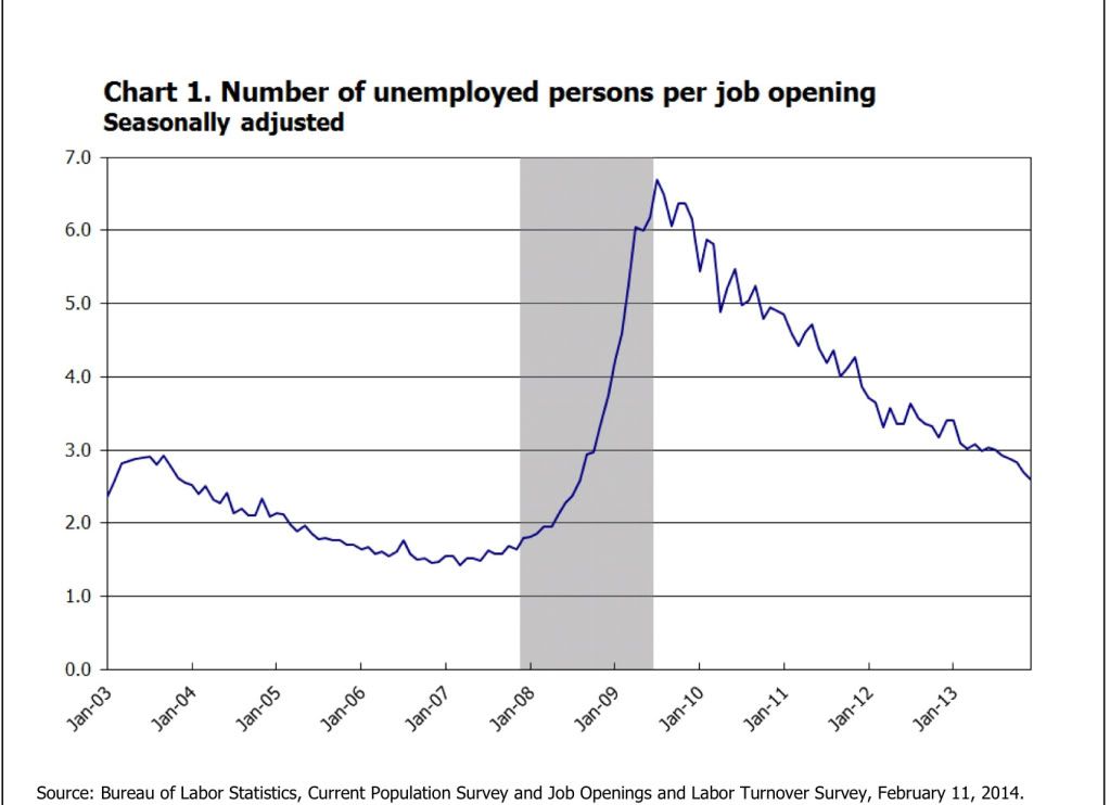
Before getting to the main subject of this post, let me say that I consider it an act of moral depravity to have cut off extended unemployment benefits when both unemployment and underemployment remain so high. Even if I were to accept the critique that such benefits create a "hammock" making certain people comfortable in their unemployment, the fact is that millions of the unemployed are *not* comfortable in their unemployment. There simply aren't enough jobs to absorb the millions of people who have looked for a job and cannot find one. That ought to be obvious from the fact that there are still nearly 3 unemployed people actively looking for work for every one job opening:
cutting off benefits to those people is an act of unconscionable cruelty, leading as it must to privation and maybe even homelessness for some.
But cutting off extended unemployment benefits at the beginning of this year wasn't just vile, it is actually harming the economy. It appears to be the primary additional factor beyond the unusually severe winter weather in the raft of relatively poor data we have seen so far this year.
To begin with, let's quantify the scope of the lost benefits:
Federal unemployment benefits that continue for 26 weeks after a person uses up the 26 weeks of state unemployment benefits ended Saturday, so now some 1.3 million people won’t be getting their $1,166 (on average) monthly check. By June, another 1.9 million will be cut off.
It is believed that another 600,000 or so lost benefits in February, which brings us to 2,000,000 people having lost unemployment benefits roughly equalling $1200 a month so far this year. Simple multiplication means a loss of $2.4 billion in spending ability per month, or $28.4 billion for the whole of 2014. It is ultimately estimated that about 4,000,000 people may be affected. That's a loss of $56.8 billion annually.
But it gets worse. Let's stick with just the 2,000,000 people affected so far. When a similar cutoff was being debated in 2011, the Department of Labor noted tha
- A study commissioned by the Labor Department under the Bush administration showed that for every dollar spent on unemployment benefits, two dollars are pumped back into the economy.
Applying the multiplier to the present situation gives $1200/mo * 2 million people * 12 months * 2 multiplier =$50-$60 billion loss in 2014.
With GDP running at $16 trillion in 2013, that translates into a -0.3% to -0.4% hit to GDP this year.
The Business Week article cited above indicates that a smaller, but similar multiplier of 1.55 was calculated by economist Mark Zandi of Moody's Analytics.
More recently the Congressional Budget Office estimated that:
the proposal would increase outlays relative to those under current law by nearly $26 billion—by about $19 billion in fiscal year 2014 and by $6.5 billion in fiscal year 2015. The net increase in deficits over the 2014–2023 period would amount to about $25 billion because the proposal would also boost revenues by $0.5 billion over that period.CBO estimates that extending emergency unemployment benefits would raise gross domestic product (GDP) and employment in 2014 relative to what would occur under current law. Recipients of the additional benefits would increase their spending on consumer goods and services. That increase in aggregate demand would encourage businesses to boost production and hire more workers than they otherwise would, particularly given the expected slack in the capital and labor markets.
However, those positive effects on output and employment in 2014 would be partially offset by ... [the belief that] in response to the extension of benefits, some unemployed workers who would be eligible for those benefits would reduce the intensity of their job search and remain unemployed longer—which would tend to decrease output and employment. CBO estimates that those negative effects would be modest, though, in 2014 because most of the jobs that would not be taken by some of the people receiving the additional benefits would instead be taken by some of the many people searching for work who would not be eligible for those benefits.
Combining the ... effects ..., CBO estimates that extending the current EUC program and other related expiring provisions until the end of 2014 would increase inflation-adjusted GDP by 0.2 percent and increase full-time-equivalent employment by 0.2 million in the fourth quarter of 2014. Those figures represent CBO’s central estimates .... The full ranges that CBO uses for those parameters suggest that, in the fourth quarter of calendar year 2014, GDP could be increased very slightly or by as much as 0.3 percent, and employment could be increased very slightly or by as much as 0.3 million.
It appears that the CBO did not address the spending multiplier issue, since its $26 billion estimate is close to the raw $28 billion estimate we obtained by simply multiplying the number of people affected by the average amount in monthly benefits received.
Even at a multiplier lower than 2, for example the 1.5 multiplier proposed by Mark Zandi, gives us a likely negative affect of GDP of about -0.3%.
Since almost 1/3 of all of the people who would be affected in all of 2014 were cut off in January, it is in the January and February consumer spending numbers that we would expect to see the biggest hit. And so far, that is indeed what we have seen.
For example, here is the 4 week moving average of same store sales going back to the end of the recession (h/t Bearnobull):
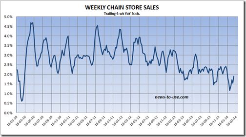
Note that the YoY% increase in spending since the turn of the year is the lowest during the entire period. For the last two weeks, including the week reported just yesterday, the ICSC same store sales index recorded YoY gains of only +1.4% and +1.5%, respectively, so the effect is continuing right up until the present.
Now here is a graph comparing real personal consumption expenditures (blue) and real retail sales (red). Since PCE's are the broader measure, and encompass "wants and needs" vs. the narrower measure of retail sales, which are more focused on "wants," this comparison tells us how confident or pinched consumers feel:
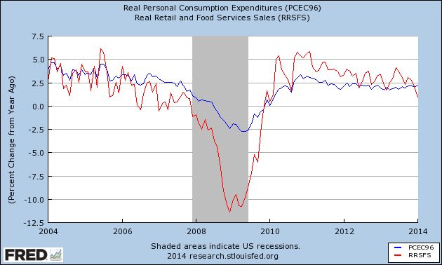
As I have previously shown, in every business cycle since World War 2, YoY retail sales have declined further than YoY PCE's prior to the onset of a recession. January 2014 marks the first month since the beginning of the 2009 economic expansion that YoY retail sales are significantly below YoY PCE's.
Real personal income minus transfer payments (such as food stamps and unemployment insurance) has also turned flat for the last several months:
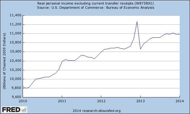
There has been much commentary that the relatively poor winter weather only explained part of the slump in much of the economic data these last several months. The sudden elimination of $1200 a month spending power to 2 million people since January first is an excellent candidate for explaining that slump.
So the cutoff in extended unemployment benefits isn't just vile, it is counterproductive as well.
A Quick Check of Where the Markets Are
With all of the political unrest over the last few days, let's take a look at the SPYs to see how the equity markets are reacting.

On the 5-minute, 5 day chart, we see three primary movements. The first is a two-day upswing on Feb. 27-28, which included a big move on the 28th. This was followed by Monday's gap lower. But looking more closely at Monday's price action, we see a morning sell-off followed by a decent rebound in the afternoon. Finally, yesterday prices gapped higher, recovering Monday's losses. Prices also closed near the high of the day.

On the 30-day chart, we see prices have an upward curve. Starting on Feb. 24, prices moved more sideways, consolidating gains. On this chart, the last two days of activity appear as more of a blip.

Finally on the daily chart we see the primary uptrend that started in late June 2013 is still firmly intact. Also note prices have moved through key resistance in their latest rally, with the sell-off showing prices simply moving to the 10 day EMA. But the underlying technicals are still solid: the MACD is rising and the CMF shows a strong inflow of money, especially yesterday.
On the 5-minute, 5 day chart, we see three primary movements. The first is a two-day upswing on Feb. 27-28, which included a big move on the 28th. This was followed by Monday's gap lower. But looking more closely at Monday's price action, we see a morning sell-off followed by a decent rebound in the afternoon. Finally, yesterday prices gapped higher, recovering Monday's losses. Prices also closed near the high of the day.
On the 30-day chart, we see prices have an upward curve. Starting on Feb. 24, prices moved more sideways, consolidating gains. On this chart, the last two days of activity appear as more of a blip.
Finally on the daily chart we see the primary uptrend that started in late June 2013 is still firmly intact. Also note prices have moved through key resistance in their latest rally, with the sell-off showing prices simply moving to the 10 day EMA. But the underlying technicals are still solid: the MACD is rising and the CMF shows a strong inflow of money, especially yesterday.
Tuesday, March 4, 2014
Paul Krugman agrees with me!
- by New Deal democrat
(about gas prices essentially determining the inflation rate).
Oh, yeah, and gas prices are cheaper than they were 1, 2, and now 3 years ago. I've got the full post up over at XE.com.
Monday, March 3, 2014
Junk Bonds Continue to Rally; Junk Spreads Continue to Narrow

The above chart of the junk bond ETF shows that investors are still reaching for yield. The above chart is still very bullish. Let's place that information into the following context:

Above is a graph of the CCC yield minus the 10-year CMT Treasury spread, which has been declining for the last 2 years.

The graph above places this data into a 2-year time frame.
Sunday, March 2, 2014
Saturday, March 1, 2014
Weekly Indicators for February 24 - 28 at XE.com
- by New Deal democrat
My Weekly Indicator column is up at XE.com.
Something more than the unusually cold winter weather may be behind the weakness in the data that we've seen since the first of the year, but I want to give the matter some more thought.
Friday, February 28, 2014
My housing bet with Calculated Risk: January 2014 results
- by New Deal democrat
As most readers know Bill McBride a/k/a Calculated Risk and I have a charitable bet about the direction of housing in 2014.
In his forecast for 2014 residential investment, CR said, "I expect growth for new home sales and housing starts in the 20% range in 2014 compared to 2013."
By contrast, several months ago, in a post at XE.com, I said that "If the typical past pattern is followed, we will shortly see permits running 100,000 less than one year previously."
By contrast, several months ago, in a post at XE.com, I said that "If the typical past pattern is followed, we will shortly see permits running 100,000 less than one year previously."
Here are the terms of our bet: If starts or sales are up at least 20% YoY in any month in 2014, I will make a $100 donation to the charity of Bill's choice, which he has designated as the Memorial Fund in honor of his late co-blogger, Tanta. If housing permits or starts are down 100,000 YoY at least once in 2014, he make a $100 donation to the charity of my choice, which is the Alzheimer's Association.
This morning the final monthly report on housing, pending home sales, was reported by the NAR. The index was up 0.1% m/m from December, but down -9.4 YoY:
This morning the final monthly report on housing, pending home sales, was reported by the NAR. The index was up 0.1% m/m from December, but down -9.4 YoY:
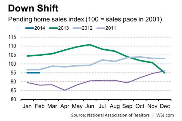
(graph from Wall Street Journal
So, with January 2014 in the books, how do we stand? Below are two graphs.
So, with January 2014 in the books, how do we stand? Below are two graphs.
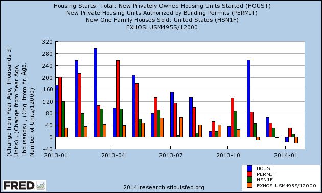
First, here is a graph of the change, in thousands, YoY of starts (blue), permits (red), new home sales (green), and existing home sales (orange) (note that the St. Louis FRED does not track pending home sales):
Next, here is the YoY% change in the same four statistics:
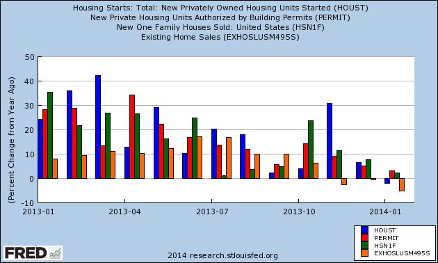
Both of these graphs show the clear deceleration in the housing market over the course of 2013, to the point where 3 of the 5 monthly reports have turned negative YoY. The strongest metric is new home sales, which while only up 2% YoY, in January rose to the highest level in over 5 years.
Bill's forecast of 20% annual growth will take a real reversal of momentum, although there are some individual months where there are some easy YoY comparisons. Obviously I am expecting some further deterioration, concentrated between now and mid-year.
Time will tell!
Thursday, February 27, 2014
Australian, European and Dow Jones ETFs Forming Short Term Tops on 30-Minutes Chart


Above are the 30-minute charts for the Dow Jones, Australian and European ETFs. All three have several common technical features. We see a rally from the sell-off in early February, followed by a leveling off of prices over the last few trading sessions. Also notice all three have a declining momentum picture as evidenced by the lower moves of each respective MACD.
Wednesday, February 26, 2014
Cattle ETF Rallying

Above is the daily chart of the cattle ETF. Since the beginning of February it has rallied a little over 10%, rising from 26.7 to ~29.7. In the last few trading sessions we've also seen a big spike in the CMF, indicating a strong net inflow into the ETF.
The big reason for the rally is the drought conditions in Australia and Brazil, as highlighted in this piece from the Financial Times.
New home sales hit best record in 5 years, but still show YoY deceleration
- by New Deal democrat
Housing bulls finally got a piece of good news this morning in the January new home sales report.
But the YoY% change is still close to the lowest in 2 years. I'll have more later at XE.com and I'll update this post with a link.
UPDATE: Here's the link to my extended discussion at XE.com.
Tuesday, February 25, 2014
Two US Indexes At Key Inflection Points
.png)
.png)
Monday, February 24, 2014
ECRI now claims we're in the longest recession since 1929-32
- by New Deal democrat
I haven't addressed the badly blown recession call by the formerly highly-regarded ECRI since its 2 year anniversary last September. I'm updating my commentary now because, as of February, ECRI's fictitious recession, which they claim started in July 2012, is 1 year and 8 months old. That makes it longer than 1973-74, longer than 1981-98, even longer than December 2007 - June 2009. In fact if their claim is to be believed, this is the longest recession since the "great contraction" of 1929-32.
Forget government statistics, which ECRI notes can be revised significantly. Private statistics which don't get revised like railroad traffic, truck tonnage, steel production, the ISM manufacturing and services indexes, temporary hiring and consumer purchasing as measured by the ICSC, Johnson Redbook, and Gallup, have all nearly relentlessly risen throughout this period.
ECRI's original mistake was a very human one: the interpretation of a downturn in their indexes. You may recall that they originally said that a recession was "unavoidable" even by concerted government action, and was imminent if it had not already begun, back in September 2011, just after the debt ceiling debacle. During that time almost all economic statistics dropped like a rock, as consumers and businesses froze while they waited to see whether the US government would actually default on its debts, and if not, what altered landscape any proposed "grand bargain" might bring about.
As a result, the ECRI Weekly Leading Index and Weekly Coincident Index, which had each been as high as about +7 early in 2011, and had already dipped to 0 in the WLI and about +4 in the WCI at the time the debt ceiling debacle began, dropped to about -7 and +3 by the time of their September recession call. He's a graph of both of the them for the year 2011:

ECRI simply misinterpreted the fallout from a transitory political crisis as an organic economic development.
By stubbornly refusing to admit error, they have undercut if not outright contradicted their own earlier thesis that the US economy was entering what they called "The Yo Yo Years." Their thesis was that GDP was not capable of meandering about 2% for very long. It would either spike into expansion or downward into recession. These Yo Yo expansions and recessions would happen with increasing frequency. Instead GDP has generally meandered at around 2% +/-1.5% for 3 years now.
And instead of more frequent, if brief, expansions and recessions, they are stuck trying to defend a recession call going on 3 years old, with a seies of ad hoc references to the declining data du jour.
Their most recent missive, in fact, appears to be a flat-out contradiction to a position they took only 2 years ago.
Earlier this month, in an article entitled "Failure to Launch," ECRI touted their Weekly Coincident Index again, showing that the change in their coincident index had dropped precipitously from the end of November until the end of January:

That's pretty straightforward. Everybody who follows economic data knows that such a deterioration has taken place.
The part that appears disingenuous, however, is the preceding part of the index, which shows the growth rate climbing throughout the rest of the year, and spending the 8 months between April and November almost entirely above 4%.
Now take a look at this graph of ECRI's coincident index that was supplied to Mike Shedlock a/k/a Mish in March 2012 (annotations are Mish's):

Here's the very specific claim that ECRI made at the time:
The latest USCI growth rate is 1.94% (which can be rounded off to 1.9%). In January 1996, it had dropped only to 2.06% (which can be rounded off to 2.1%). This was certainly not below current readings. Of course, no recession followed.
In 1998, the USCI growth came nowhere near current readings, so the question doesn’t arise. It wasn’t until January 2001 that it fell below 2%, and the recession began two months later.
.... If you look at all the occasions in the last 50-plus years when USCI growth fell to 2.0% or below ..., it is clear that recessions began around those dates....
In sum, it is precisely accurate to claim that y-o-y USCI growth has never dropped to current readings in the past 50-plus years without a recession ensuing.
Shedlock was properly incredulous at the claim that once the coincident index fell below 2 (to 1.94), the economy would inexorably slide into recession, whereas at 2.06 the economy would bounce back.
While ECRI has apparently taken its Weekly Coincident Index out of the public domain, we do have its monthly Coincident Index covering 2011 through 2013, showing that with the exception of 3 months in late 2012 and early 2013, the Coincident Index was above the allegedly critical "2" level:

And what the 2013 Weekly Coincident Index supplied by ECRI itself shows is that, to the contrary, all the time for the last year that ECRI has been claiming we are in recession, the Weekly Coincident Index was also well above that allegedly crucial "2" level.
In other words, ECRI's position now appears to be in blatant contradiction to the position they took in March 2012. The Coincident Index did not continue to fall, but instead at virtually all times thereafter has been higher -- just like after January 1996.
One final thing. It's pretty clear that one of the components of the Coincident Index is personal income. That's what explains the upward spike in December 2012, and the downward equivalent spike in January 2013. At the time of ECRI's "Failure to Launch" commentary, the YoY comparison was with the December 2102 upward spike. On March 3, January personal income will be reported, and the YoY comparison will now be with January 2013's downward spike. I confidently predict that ECRI will not publicly update its Weekly Coincident Index once that data is reported.
In summary, ECRI appears to have descended to the level of Zero Hedge in trying to salvage their reputation. Sad.
Subscribe to:
Posts (Atom)