Saturday, January 11, 2014
Weekly Indicators for January 6 - 10 at XE.com
- by New Deal democrat
This week's edition of Weekly Indicators is up at XE.com.
Real M2 continues to decelerate, and could turn into a negative indicator within the next several months. Consumer spending has also softened, although the Oil choke collar remains disengaged.


Friday, January 10, 2014
Unemployed and underemployed but want a job now
- by New Deal democrat
Here is the measure of people who aren't in the labor force because they aren't looking for a job, but say they "want a job now" (red) added to the unemployment rate (blue) and also (orange) added to the underemployment rate (green), current through this morning's employment report for December 2013:
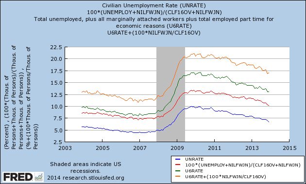
I believe this a far more accurate way to look at the issue, as compared with EPI's "missing workers" estimate.
The numbers aren't pretty now, but note that they also weren't very pretty even before the recession.
BIG Employment Miss
From the BLS:
The unemployment rate declined from 7.0 percent to 6.7 percent in December, while total nonfarm payroll employment edged up (+74,000), the U.S. Bureau of Labor Statistics reported today. Employment rose in retail trade and wholesale trade but was down in information.
This is in comparison to the AP job report that printed at 238,000.
Looking at the details, we see some very large holes in the jobs data.
Retail +55,000 (Remember, the data is seasonally adjusted, so this takes the holiday hiring season into account).
Professional employment increased 19,000 in comparison to a 2013 monthly average of 53,000
Other categories growth was equally paltry.
Also consider the following hours worked data:
The average workweek for all employees on private nonfarm payrolls edged down by 0.1 hour to 34.4 hours in December. The manufacturing workweek was unchanged, at 41.0 hours, and factory overtime edged up by 0.1 hour to 3.5 hours. The average workweek for production and nonsupervisory employees on private nonfarm payrolls edged down by 0.1 hour to 33.6 hours.
Finally, there is the issue of the drop in the unemployment rate, which went from 7%-6.7%. The reason is the drop in the civilian labor force from 155,284,000 to 154,937,000. Put another way, expect to hear more about "people running from the US labor market."
A final caveat from Bonddad: I've grown to give this monthly data point release less and less importance, instead focusing on the broader employment picture -- which is still miserable. However, from a practical side, this data point will move the markets because of the size of the miss and the fact it contradicts the "US economy is getting stronger" narrative we've been seeing over the last few months.
The unemployment rate declined from 7.0 percent to 6.7 percent in December, while total nonfarm payroll employment edged up (+74,000), the U.S. Bureau of Labor Statistics reported today. Employment rose in retail trade and wholesale trade but was down in information.
This is in comparison to the AP job report that printed at 238,000.
Looking at the details, we see some very large holes in the jobs data.
Retail +55,000 (Remember, the data is seasonally adjusted, so this takes the holiday hiring season into account).
Professional employment increased 19,000 in comparison to a 2013 monthly average of 53,000
Other categories growth was equally paltry.
Also consider the following hours worked data:
The average workweek for all employees on private nonfarm payrolls edged down by 0.1 hour to 34.4 hours in December. The manufacturing workweek was unchanged, at 41.0 hours, and factory overtime edged up by 0.1 hour to 3.5 hours. The average workweek for production and nonsupervisory employees on private nonfarm payrolls edged down by 0.1 hour to 33.6 hours.
Finally, there is the issue of the drop in the unemployment rate, which went from 7%-6.7%. The reason is the drop in the civilian labor force from 155,284,000 to 154,937,000. Put another way, expect to hear more about "people running from the US labor market."
A final caveat from Bonddad: I've grown to give this monthly data point release less and less importance, instead focusing on the broader employment picture -- which is still miserable. However, from a practical side, this data point will move the markets because of the size of the miss and the fact it contradicts the "US economy is getting stronger" narrative we've been seeing over the last few months.
Why I think EPI's "missing workers" claim is wrong, and maybe close to impossible
- by New Deal democrat
[Update: graphs and links now added.]
Today we will get the final employment report for 2013, and the alternative claims are already starting. For example, yesterday Naked Capitalsim is claiming that people over 65 are working more because they can't retire. Even though almost every aging Boomer will tell you that they'd like to work part time after 65 to keep mentally active and socially involved. And those who stayed the course with their 401k's since 2008 have more worth in them now than before the recession. And elderly life expectancy has improved dramatically in the last 30 years.
But the real issues are wages and the unemployment rate among working age adults.
Let me start by saying that the current rate remains unacceptably high, and Washington should have done far more (like a new WPA for infrastructure repairs, like Bonddad and I suggested four years ago!). But that doesn't excuse faulty methodology in service to a good cause.
And that's what brings me to the Economic Policy Institute's "missing workers" report", which claims to measure the "real" unemployment rate.This was introduced a few months ago, and has gotten a lot of attention on progressive blogs since. It purports to show that the number of "missing workers" who want a job but have dropped out of the labor force, has continued to increase, to as high as 6 million a few months ago. Unlike virtually every other measure of the unemployment rate, it has shown virtually no improvement in the last 3 years, as shown in their accompanying graph:
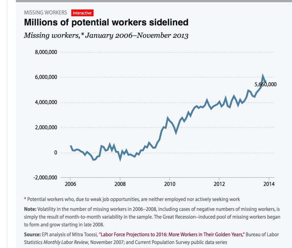
There are at least 2 major problems with their methodology. First of all, as I already described several weeks ago, the Census Bureau asks a question in the Household Survey each month designed to elicit exactly what the EPI says it is measuring; namely, those who are "Not in [the] Labor Force, [but] Want [a] Job Now," or series "NILFWJN." Even in the best of times, about 4.6 million people tell the Census Bureau that they fall into that category, as shown in the graph below where I have subtracted that number to norm it to approximately zero in 2006 and 2007, the same average number as the EPI graph [updated with this morning's information]:
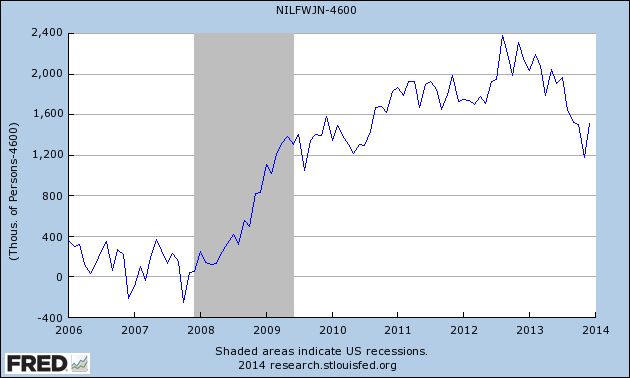
Both series follow a similar trajectory through 2011, but the official Census Bureaur data never shows an increase of more than 2.4 million, and declined to 1.2 million in November, whereas EPI shows a total of 6 million in October of this year.
The second problem with the EPI's methodology is that it makes use of the less accurate, more erratic employment number from the Household Survey, rather than the Nonfarm Payrolls employment number from the BLS, which has a much larger sample size. The issue here is that, since January 2012, the payrolls report shows that almost 4 million jobs have been added to the economy. The Household survey, however, shows only 2.8 million jobs added, a deficit of 1.2 million jobs.
Almost everyone concedes that the nonfarm payrolls employment number is more accurate. Further, most economists expect the more erratic Household Survey number of employed to resolve closer to the trend in the Payrolls report. Ordinarily, that's not a problem.
But because the EPI's "missing workers" methodology compares job growth against a target (projected civilian labor force from 2006), EPI essentially makes that entire 1.2 million difference part of the enhanced unemployment figure. To cut to the chase, if the EPI's report made use of the nonfarm payrolls number for employment, their alternate unemployment measure would have fallen by about an additional 1% in the last couple of years, and would be following a similar downward trajectory as virtually every other measure of unemployment.
In fact, if the nonfarm payrolls reports are accurate, then EPI's measure becomes virtually impossible. That's because, as shown in blue in the graph below, the population increase for those age 16 and over since the beginning of 2010, the bottom for employment in the Great Recession, is about 8 million. The Payrolls report shows 7 million jobs added, or about 87.5% of the entire working age population increase.
For so long as the statistics have been kept, the biggest percentage of the population age 16 and over that has been employed is about 64.5%, which applied to 8 million is 5.2 million:
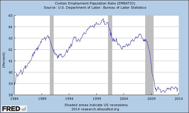
In other words, even under the most pessimistic scenario that can be concocted using the nonfarm payrolls number, the entire working age population plus about 2.0 million people have found jobs in the last 4 years, and 92% of the 4.3 million growth sonce January 2012, or about 1.2 million more thn the most pessimistic employment to populatioin reading. that is a -0.8% decline in the unemployment rate even before we take into account retiring Boomers, just in the last 22 months. But the EPI measure only reigsters a decline of -0.3%, including retiring Boomers.
Put another way, if the nonfarm payrolls numbers have been correct, the number of total unemployed including those so discouraged they stopped looking for owrk should have decreased by several million since the beginning of 2012.. And yet the EPI measure has the total number of missing unemployed workers rises almost relentlessly throughout that period, almost completely offsetting the number of officially unemployed workers. That's not just wrong, if the nonfarm payrolls report is correct, it's impossible.
Maybe EPI has good explanations for these issues. But without more, it is difficult to see why we shouldn't just accept the official Census Bureau report of those who say they aren't looking (and so aren't in the labor force), but want a job now. The number will be updated later this morning, and I'll have an updated graph that includes that measure for both the U-3 and U-6 (part time and marginally attached workers) metrics.
Wednesday, January 8, 2014
A rare stock market forecast for 2014
- by New Deal democrat
I have a new post up at XE.com, commenting on recent speculation about a stock market crash vs. a pullback due to valuations in 2014, based on YoY corporate profits in 2013.
Monday, January 6, 2014
2014 forecast: a year of deceleration
- by New Deal democrat
My method of foecasting is pretty simple. In fact, so simple, I call it the K.I.S.S. method. Even though the LEI is the statistic most denigrated by Wall Street forecasters, it has the inconvenient habit of being right more often than the highly-paid punditocracy, especially at turning points.
Since I'm not a highly paid Wall Street pundit, I simply rely upon the LEI for the short term, and the yield curve for the longer term with the caveat of watching out for deflation. The simple fact is, with one exception, if real M1, and real M2 (less 2.5%), are positive, and the yield curve 12 months ago was positive, the economy has always been in expansion. When real money supply is negative, and the yield curve was inverted 12 months ago, the economy has always been in contraction. The exception is that the yield curve does not help to project the economy 12-16 months later if the economy at that later date is in deflation - as it was in 1930-32 and late 2008 and early 2009.
In the few years I have also learned a lot about the methods of the late Prof. Geoffrey Moore, the founder of ECRI, so I also intergrate his findings about short and long leading indicators into my forecast.
Since I'm not a highly paid Wall Street pundit, I simply rely upon the LEI for the short term, and the yield curve for the longer term with the caveat of watching out for deflation. The simple fact is, with one exception, if real M1, and real M2 (less 2.5%), are positive, and the yield curve 12 months ago was positive, the economy has always been in expansion. When real money supply is negative, and the yield curve was inverted 12 months ago, the economy has always been in contraction. The exception is that the yield curve does not help to project the economy 12-16 months later if the economy at that later date is in deflation - as it was in 1930-32 and late 2008 and early 2009.
In the few years I have also learned a lot about the methods of the late Prof. Geoffrey Moore, the founder of ECRI, so I also intergrate his findings about short and long leading indicators into my forecast.
This year the forecast methods are consistent for the first 6 months: growth will continue. It is in the last half of the year, and particularly in the 4th quarter, that there is more difficulty.
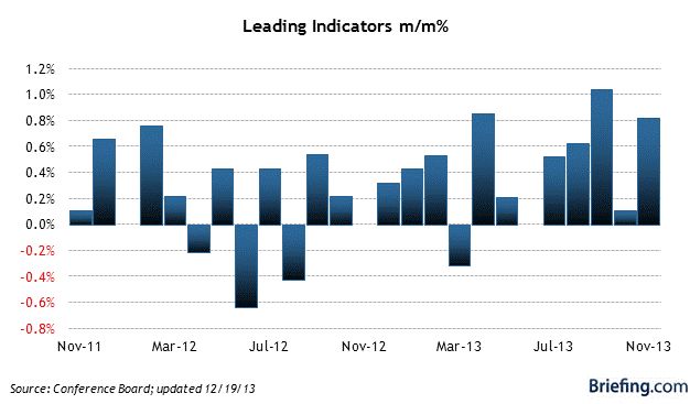
First of all, let’s look at two overlapping but different forecast algorithms with a time frame of approximately 6 months ahead: the Conference Board’s Index of Leading Indicators, and ECRI’s Weekly Leading Index.
Here is a graph of the LEI via Briefing.com
And here is ECRI’s WLI via Doug Short:
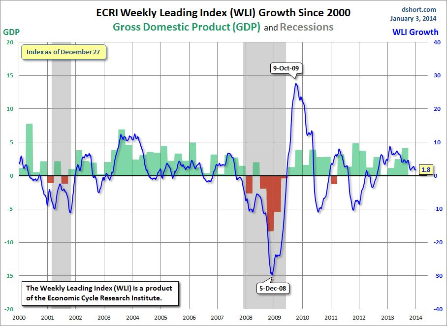
Both of these are forecasting continued growth over the next 6 months. In fact, the LEI has actually picked up strength in the last several months.
One big difference between the two measures is that the LEI uses housing permits and starts (actually a long indicator) as a component, while the WLI uses the Mortgage Bankers’ Association’s purchase mortgage application index as a component. After sideways movement for most of the year, housing permits unexpectedly rose strongly in October, and maintained that level in November. On the other hand, purchase mortgage activity has made new post-recession lows due to the increases in interest rates.
One other item worth noting is that there does not appear to be any big surge in gas prices (outside of the seasonal norm) forecast, so inflation should be kept in check, so there should be no “oil price shock” to the economy. Also, it appears that Washington
But the LEI and the WLI do not forecast more than about 8 months out. For that we need to look at the long leading indicators. There are two separate ways I look at this. First, when the yield curve and real money supply as measured by M1 and M2 are positive (+2.5% in the case of M2), the economy has always expanded one year later (provided there is no deflation), including during the pre-WW2 era that may be more applicable to today’s economy. By contrast, when both measures are negative, a recession has always ensued.
First of all, here is the yield curve, as measured by 10 year treasury rates minus 6 month treasury rates:
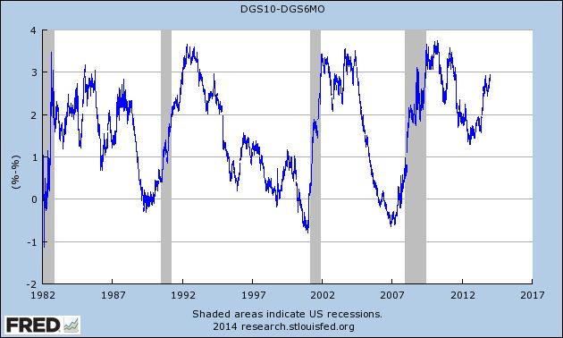
Note that these reliably inverted (i.e., the result was negative) a year or more before the onset of each of the last three recessions (and the same is true of prior post-WW2 recessions). As you can easily see, the yield curve has steepened considerably in the last 8 months, entirely due to the increase in yields for the 10 year Treasury note. Provided we do not expect deflation in the final part of this year, this should mean clear sailing.
Now let’s take a look at the 4 long leading indicators identified by Professor Geoffrey Moore and at least until recently, the components of ECRI’s “long leading index.” These are: corporate bond yields, inverted (blue), housing permits (red), corporate profits (green), and Real M2 (orange):
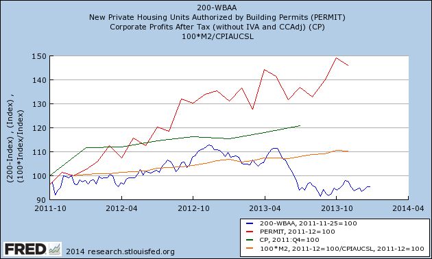
Three of the 4 of thee indicators are absolutely positive, but at the same time all 4 have decelerated, as highlighted in this next graph, which measures the YoY% change in the same items:
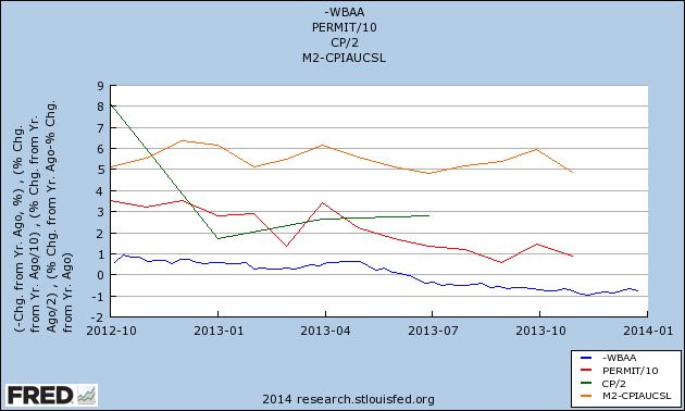
Interest rates for corporate bonds have increased, meaning that indicator has turned negative. If present trends continue, and based on the last 50 years of history, the odds are extremely good that they will, housing permits will turn negative at some point in the first half of this year. Similarly, if their current trend continues, real M2 will also fall below +2.5% (although I emphasize that I have no data helpful as to whether M2 will or won’t). Corporate profits are a total question mark, although we will begin to get an answer as Q4 earnings are reported over the next month or so.
Finally, here is a look at Real M1:
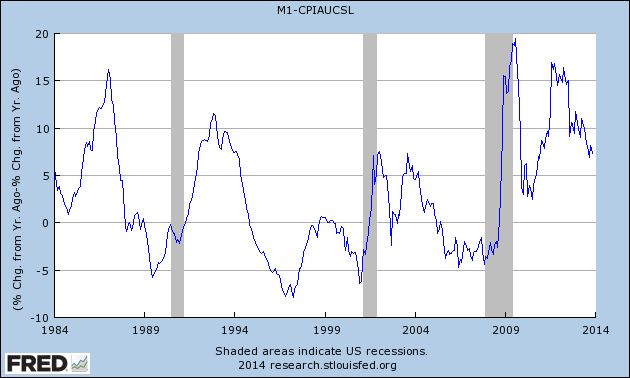
This too has been decelerating, although it remains very positive.
In conclusion, unless we expect deflation (and right now I don’t), there is every reason to view the long leading indicators, under either method, as being in agreement that the economic expansion will continue through the end of 2014.
On the other hand, the deceleration of most of the indicators, and also the deceleration of the WLI, cause me to believe that the second half will be considerably weaker than the first half. If the long leading indicators turn negative quickly enough and significantly enough, it is possible that we could enter into a recession in Q4. Before ruling that out, I want to see how 2013 Q4 corporate profits play out, as well as the next couple of months of housing and money supply data. But subject to that caveat – that there are mounting reasons to be concerned about 2015 – I look for continued positive readings in employment, wages, industrial production, and GDP through the year.
I can’t help noting that my contrast for decelerating growth is at odds with that of many luminaries, including Paul Krugman, Bill McBride a/k/a Calculated Risk, Muhammed el-Arian of PIMCO, and Menzie Chinn of Econbrowser. Morgan Stanley went so far as to call the economy “ready for launch.”
My critique of these optimistic calls is what I laid out at the outset of this article: all of these forecasts, to a greater or lesser extent, engage in coincident-trend-following. Morgan Stanley’s note, for example, cites the coincident indicator of freight transportation, as well as the short leading indicators of the ISM survey and capex spending. Several others take similar tacks.
And although I have great respect for both Bill McBride and, of course, Krgthulu, both of them rely on an acceleration of the housing recovery. For example, Krugman says, “housing is still moving forward.”
I always caution against using the present progressive tense without extreme care when it comes to economic data. What we know is that housing permits and starts made new highs in October, although permits pulled back slightly in November. We also know that the trend in 2013 was of decelerating growth, as I’ve set forth above. And nearly every other measure of housing, except for prices, has taken it on the chin. In addition to purchase mortgage applications, pending sales just went negative YoY.
I always caution against using the present progressive tense without extreme care when it comes to economic data. What we know is that housing permits and starts made new highs in October, although permits pulled back slightly in November. We also know that the trend in 2013 was of decelerating growth, as I’ve set forth above. And nearly every other measure of housing, except for prices, has taken it on the chin. In addition to purchase mortgage applications, pending sales just went negative YoY.
So, just as I was an outlier to the chorus of Doom beginning at the end of April 2009, I am afraid I am going to have to withhold my cheers now. My forecast is that 2014 will be a year of decelerating growth.
Upper 90s-100 Area Still Tough on Oil Prices

With the exception of the summer driving season (roughly late May - late September), oil prices have met with still resistance in the upper 1990s/100 price area.
Saturday, January 4, 2014
International Week in Review
Last week, the big news was from the manufacturing sector, which was the primary driver of most market activity. Here's a link.
Weekly Indicators for Dec.30 - Jan. 2 at XE.com
- by New Deal democrat
My Weekly Indicators column is up at XE.com. The coincident data looks good, but deceleration in the long leading indicators shows signs of spreading to short leading indicators.
Friday, January 3, 2014
Real money supply: significant deceleration, but still positiive
- by New Deal democrat
It won't be a surprise to anyone who reads my "Weekly Indicators" column that I have something of a bifurcated outlook for the economy. The short leading indicators have generally been very positive (and manufacturing got two excellent numbers in the past week), while the long leading indicators have cooled considerably -- but are still positive.
Real M2 is a perfect example of this issue. It was one of Prof. Moore's original 4 long leading indicators, and was part of the LEI for several decades before being dropped a couple of years ago.
Below is a graph of real M2 since 1980. The red line is at the level of +2.5% YoY:
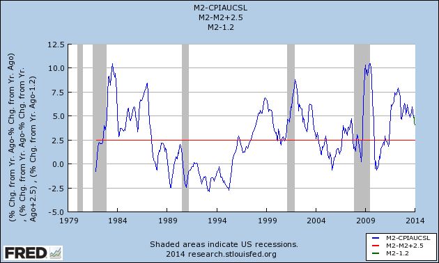
As you can see, on the one hand it has decelerated considerably from its peak about 2 1/2 years ago. As of yesterday's New York Fed report, for the week it is at about +4.3% YoY. Which, of course, is still comfortably above the +2.5% level below which, if it remains for a several quarter period, is necessary but not sufficient to signal an oncoming recession. In fact, it is probably above its average level for the last 30 years.
My gut feeling is that it will continue to decelerate. But it is just that: a gut feeling, and nothing on which to base any hard analysis.
Thursday, January 2, 2014
Calculated Risk and I have made a bet on housing's direction in 2014
- by New Deal democrat
Bill McBride, a/k/a The Nicest Blogger on the Internet, and I have almost always seen eye-to-eye on the matter of housing. Both of us thought that housing was in a bubble in 2005. Both of us thought in 2011 that housing prices would bottom in early 2012.
But we have totally different opinions about the direction of housing in 2014.
In his forecast for 2014 residential investment, CR says, "I expect growth for new home sales and housing starts in the 20% range in 2014 compared to 2013."
By contrast, several weeks ago, in a post at XE.com, I said that "If the typical past pattern is followed, we will shortly see permits running 100,000 less than one year previously."
This is quite a difference. Bill expects sales and starts to average about 1.150 million annualized this year. I expect that at some point permits and starts will sink under 900,000 annualized.
The difference is one in approach. Bill's post argues from the fundamentals:
demographics and household formation suggest starts will return to close to the 1.5 million per year average from 1959 through 2000. That means starts will come close to increasing 60% over the next few years from the 2013 level.From there he deduces his forecast of 20% this year.
While I agree with CR over the long term that demographics and pent-up demand are a tailwind behind the housing market, my argument stems from strong past correlations of increases in interest rates and decreases in housing demand. The graphs I posted in the XE.com article show 15 occasions in the last 50 years that interest rates have backed up by at least 1% YoY. On 12 of those occasions, housing permits fell by at least 100,000 shortly thereafter. Those are pretty good odds.
When one compares mortgage rates and housing permits, as in the below graph covering the last 40 years, the relationship is even stronger:
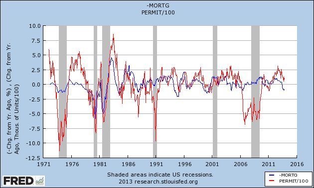
Of the 9 previous times in the last 40 years that mortgage rates have increased by 1% YoY, housing permits fell by at least 100,000 YoY on 8 of those occasions. The 9th time, briefly during the bubble year of 2004, was followed by a YoY decline of -65,000 permits in spring 2005.
My working principle is to look at the data in as dispassionate and detached manner as I can, and to default to the idea that "it's not different this time." Although permits have not even turned negative YoY at this point, their improvement has decelerated considerably since the low of interest rates in 2012.
So here are the terms of our bet: If starts or sales are up at least 20% YoY in any month in 2014, I will make a $100 donation to the charity of Bill's choice, which he has designated as the Memorial Fund in honor of his late co-blogger, Tanta. If housing permits or starts are down 100,000 YoY at least once in 2014, he make a $100 donation to the charity of my choice, which is the Alzheimer's Association.
Note that since our forecasts are not mirror images of one another, it is possible that both or us will win this bet. Or neither! And to be honest, since my forecast implies a weakening economy, probably with less hiring and wage growth, I hope I lose.
But I think this frames the biggest US economic issue of 2014 - will the rise in interest rates derail economic growth? - in a succinct manner.
Tuesday, December 31, 2013
Marking my forecast for 2013 to market
- by New Deal democrat
It's time to mark my 2013 forecast from back in January to market.
Here's what I said back in January about the first part of the year:
Here was my forecast for the second half of the year:for the next 3 to 6 months, the economy will continue to shamble along just barely avoiding recession. Thereafter all of the long leading indicators are suggesting further improvement
....
.... It appears that gas prices bottomed in December 2012 at the identical price they were in 2011. It is reasonable to expect that the Oil choke collar will engage by spring and remain engaged, with gas quite likely hitting $4 a gallon by summer.
So is the balance tipped towards expansion or contraction in the first part of the year?.... Congress and President Obama just threw a monkey wrench into the works, in the form of a 2% payroll tax increase on the first $110,000 of income. ... A new and significant drag has been added to consumer spending..... Frankly, I expect to see a significant pullback in consumer spending as a result of the decrease in disposable income within the next 3 months. Unless a further opportunity to refinance at even lower interest rates appears, that may be enough to tip us into a short term contraction at some point in the first 6 months of this year, specifically including one or more months of actual job losses beginning in March or April.
... the K.I.S.S. signal of a positive yield curve and positive M2 suggest that the economy continues to grow throughout 2013.My forecast for a cutback in consumer spending due to the reinstatement of an additional 2% withholding for Social Security, and a likely actual month or two of job losses as a result certainly did not occur. But then, just about everybody thought that consumers would pull back. It just goes to show that the American consumer is the world champion of their art!
.... the resurgence of the housing market, and the continuing accommodation in interest rates and monetary policy, look like they will come to the rescue again later in the year, provided Washington can avoid burdening the consumer with further austerity measures taking effect this year.
On the other hand, my forecast from January of a first half just shambling along, followed by stronger growth in the second half, and for the Oil choke collar to begin to loosen, was pretty much on target. First quarter GDP was just barely over 1% - which is usually consistent with a recession - but then improved to 2.5% in the second quarter, and 4.1% in the third quarter. Gas prices on average were down $0.10 for the entire year on a YoY basis. Industrial production, sales, payrolls, and wages all improved as the year went along.
Thanks for reading this year. I'll be back again with a 2014 forecast after New Year's!
Monday, December 30, 2013
The Important economic trends of 2013
- by New Deal democrat
I have a look back at 12 important economic trends of 2013 up at XE.com.
Before I post my 2014 forecast, I still need to rate my 2013 forecast.
Sunday, December 29, 2013
A thought for 2013: The Progressive Economic Case is still Equality, not Armageddon
- by New Deal democrat
Six years ago I posted an essay on Daily Kos entitled The Progressive Economic Case: Inequality,not Armageddon. On this final Sunday of 2013, I think it remains timely. I've posted it below in somewhat abridged from. To put it in context, two months previously in an essay called The Panic of 2008? I had said:
[E]very now and then it is prudent to be fearful. Not panic-stricken, but instilled with enough caution to focus on a serious problem, to check and double-check if one's house is truly in order.
Now appears to be such a time....
There is an excellent chance that the dominant issue of the 2008 election campaigns will not be Iraq nor Iran nor executive power nor immigation, It will be the economy, in the form of this "Panic. "
....Now here is my January 2008 essay:
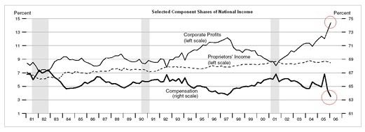
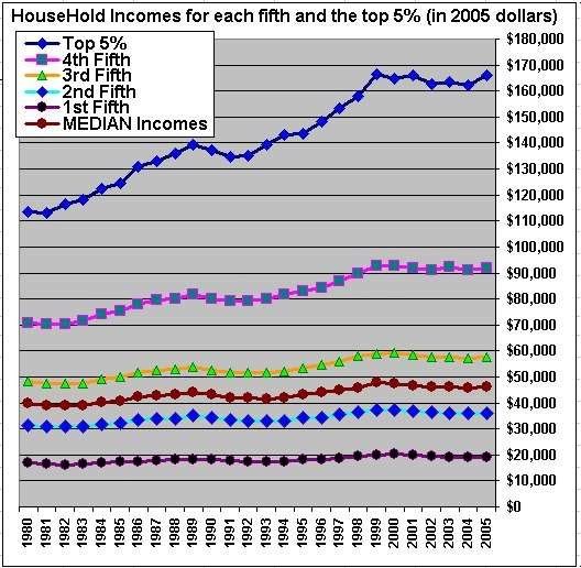
This is NOT the Great Depression II. Nor is this the stagflationary 1970s. It is going to unfold as some other Beast. Only the broad outlines of this Beast appear discernable now: it will likely feature (1) increasing import prices; (2) wage stagnation (that does not keep up with price inflation; (3) real asset deflation; and (4) possibly a Japan-style "liquidity trap."
Saturday, December 28, 2013
Weekly Indicators for December 23-27 at XE.com
- by New Deal democrat
Weekly Indicators is up at XE.com.
While the tone is still positive, relative weakness spread into more of the long leading indicators and into several shorter term indicators.
Weekly Indicators is up at XE.com.
While the tone is still positive, relative weakness spread into more of the long leading indicators and into several shorter term indicators.
Friday, December 27, 2013
OH NOES!!! So far in the year of Obamacare implementation, 100% of all net jobs created hae been pa- ... wait, what? ... FULL time jobs?!?!?
- by New Deal democrat
Remember how the implementation of Obamacare was killing full time jobs? Doomers, both right and left, were sure that full time jobs were evaporating this past summer.
In case you don't, here's an article from August in the McClatchy newspapers:
“Over the last six months, of the net job creation, 97 percent of that is part-time work,” said Keith Hall, a senior researcher at George Mason University’s Mercatus Center. “That is really remarkable.”This statistic was quickly seized upon by right wing bloggers as definitive proof that Obamacare was a colossal failure. Here's Ed Morrissey of Hot Air:
Hall is no ordinary academic. He ran the Bureau of Labor Statistics, the agency that puts out the monthly jobs report, from 2008 to 2012. ...
....
"There's something going on if such a large share of the hiring is part time," Hall said.
The July report only confirms that trend. Only 92,000 full-time jobs were created, while 172,000 part-time jobs got filled (not net numbers). The only major influence in 2013 that differs from the preceding three years of the recovery is the impending ObamaCare mandate on employers, which the Obama administration will try to postpone for a year. The data shows that businesses have already begun to react by minimizing their risk and costs through part-time employment, thanks to the perverse incentives set up by the ACA, and that this will continue as long as the mandate exists.Forbes' Chris Conover was even more dismissive:
Denialism may be too strong a term. But there seem to be a lot of people arguing that Obamacare has little or nothing to do with the rise in part-time employment. Some deny the rise is even happening, while others are content to deny that Obamacare is the culprit. Admittedly, it takes a little detective work, but if we systematically review the available empirical evidence in an even-handed fashion, the conclusion seems inescapable: Obamacare is accelerating a disturbing trend towards “a nation of part-timers"Needless to say, Zero Hedge was all over the story.
And left wing Doomers were just as certain of the fact as their right wing counterparts, if for different reasons, with one Daily Kos front-pager going so far as to call the questioning of the trend in a Marketwatch article "ridiculous."
Yours truly debunked these claims at the time, noting that:
... [E]ven though the household numbers are seasonally adjusted, it looks like there is some unaccounted seasonality still left in the numbers. ...[T]here has been a pattern ever since the recession whereby full time jobs ramp up through May, and then decline (or at least decelerate) through August, before rising again. In fact, through August of 2011, full time jobs were actually negative as measured from the first of the year.So, now that we are at the end of the year, with employment reports through November, has the alleged Obamacare disaster for full-time job creation persisted? Or has my critique, of unaccounted seasonality, been shown to be true?
....
When we do the actual apples to apples July to July comparison, lo and behold, not only is the full time job situation better than the part time job situation in 3 of 4 years, but in 2012 and 2013 the positive trend towards full time jobs is actually accelerating.
Here's the graph of both part-time (blue) and full-time (red) jobs, showing gains or losses since the end of 2012:
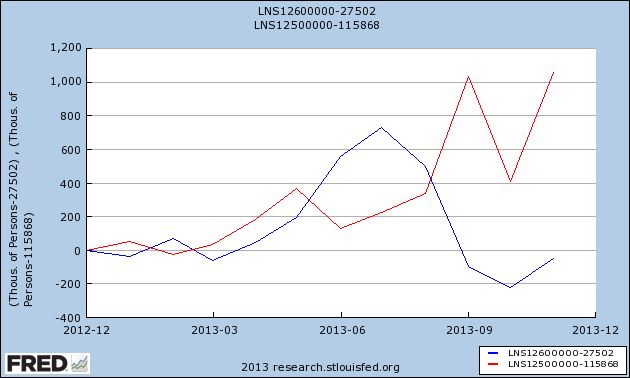
In 2013, 1,060,000 full-time jobs have been created, while part-time jobs have actually declined by -60,000.
And as for the broader claim that the recovery has "accelerated the trend towards a part-time nation," here's the same graph showing gains or losses since employment bottomed at the end of 2009:
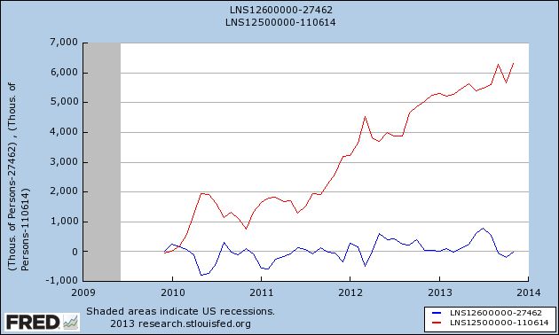
That's right. Four years into the recovery, and on net exactly minus -10,000 part time jobs have been "created", while full time jobs have increased by 6,314,000.
Oh.
That's probably why, for the last 3 months, when it comes to full time vs. part time jobs, there's been crickets from the Doomers.
And Zero Hedge has gone from treating the jobs report numbers as Gospel truth to calling it the "BLS random number generator."
I'm sure in 2014 Doomers will be back with selectively quoted statistics of the month. And I'll be here debunking all of them.
Thursday, December 26, 2013
Year-end posting
- by New Deal democrat
We've reached the end of the year, and data will be light until next Thursday. But I'm not done.
Tomorrow I'll be posting a scathing and sarcastic smackdown of one of 2013's most egregiously selective and stupid Doomer memes, that has - as usual - blown up in their faces.
Then on Monday or Tuesday I'll evaluate my 2013 forecast from January, and look back at the important economic trends from this past year.
Subscribe to:
Posts (Atom)