Wednesday, April 11, 2012

Corporate/Treasury Yield Curves and the Liquidity Overhang

Consider the following from Bloomberg:
Skepticism about the U.S. recovery, as well as signs Europe’s debt turmoil isn’t over, is enhancing demand for Treasuries. This may keep yields from surging even if Fed policy makers refrain from a third round of quantitative easing, and allow the Obama administration to finance a fourth deficit exceeding $1 trillion at near-record low costs.

“Investors are holding an overwhelming amount of cash in the system and chasing fewer securities, which has supported Treasuries,” said Dominic Konstam, global head of interest- rates research in New York at Deutsche Bank AG, one of 21 primary dealers that trade with the central bank, in an April 5 telephone interview.

The benchmark 10-year note yield was little changed at 2.06 percent at 6:43 a.m. New York time, from 2.05 percent on April 6, according to Bloomberg Bond Trader prices. The 2 percent security due February 2022 fell 1/32, or 31 cents per $1,000 face amount, to 99 14/32.

Treasuries lost 1.3 percent in the first quarter, according to the Bank of America Merrill Lynch Index, compared to a 13 percent return in the Standard & Poor’s 500 Index.

.....

Since the financial crisis the growth in the money supply in the U.S. has outstripped the rate of growth of the value of assets, leading to a “liquidity overhang,” according to Deutsche’s Konstam, causing investors to purchase bonds in order to put the cash to work.
First, consider this chart:


This is a chart of the YOY percentage change in M2 -- the largest monetary aggregate we have in the US.  M2 has been growing at strong levels, although the pace of growth has been slowing at the 10% level.  Finally, note we've seen the recent rate of YOY percentage change before -- in the 1980s, coming out of the 2000 recession and at the end of the last recession.  This tells us the rate of change -- while high --  is not one that will lead to financial ruin if managed properly.

As the Bloomberg article notes, this money has to go somewhere; hence the reason for the bid in the fixed income market.

Now consider this chart from the FRED system of the various corporate bond curves:


Notice  the junk bond market blew out in the 2H11 but is now back in line. We see some movement in the BBBs, but the AAA remain more or less the same.


The above chart shows the junk/AAA spread.  This one went to 8% at the beginning of October of last year, but has since tightened to about 5.25%.  However, it's not back to the lows see in the 1Q11.  As the chart below shows, most of the movement came in a junk bond market sell-off rather than a AAA market sell-off.


The above chart shows the AAA/BBB spread for the last year.  The BBBs sold off a bit, but it was hardly a blood bath sell-off.  Eyeballing the chart the worst part of the move was about 75 basis points.  The AAA curve barely budged beyond standard market noise.


The above chart shows the difference between BBBs and AAA over a single year.  Notice the widening in 4Q11 as traders became concerned about safety, thereby selling riskier assets (BBBs), leading to the spread widening. 


Finally, above is a chart of the 7-10 year corporate market versus the 7-10 year treasury market.   This really shows the movement in the corporate market, especially last year.  Also consider this comment/observation from the Financial Times:
Most UK-based fund managers consider government bonds the most overvalued asset class, according to a recent survey, indicating that the recent pressure on the sovereign bonds of several major economies could continue.

Almost four-fifths of fund managers surveyed in the quarterly Valuations Index, conducted by the CFA Society of the UK, said benchmark government bonds were overvalued relative to their fair value over the next year.
What does all of this tell us?

1.) The junk bond market took it in the teeth in the second half of last year.  This is to be expected; when traders get concerned about financial stability, risk assets are the first to go.  This explains the volatility in the market and the sell-off in the BBB market (which wasn't as severe as the junk bond market, but was still a sell-off) and the rock steady nature in the AAA market.

2.) We've seen a pretty good recovery in all markets over the last few months; junk bonds have come back in as has the BBB market.

3.) Government debt is probably overvalued at these levels.  But at the same time, with the high degree of uncertainty regarding the EU, there is a need for preservation of capital trade rather than a return on capital trade.

4.) AAA corporates had a decent bid throughout the financial fall-out from last year; they also have  pretty good bid now.

Why Do We Have Slow Loan Growth?

Consider the following quote from Fed President Lockhart's Speech, explaining why low interest rates are not leading to a boom in lending.


Here are some factors that have restrained the demand for bank credit.

Larger businesses are flush with cash as a result of strong cash flow generation. Corporations have aggressively controlled costs and exploited productivity gains. All this has added up to relatively weak commercial and industrial loan demand.

Smaller businesses haven't yet seen much revenue growth and remain cautious about borrowing given their perceived growth prospects. In addition, collateral values supporting small business borrowing haven't recovered, in many cases.

Households continue the process of deleveraging, and, as a consequence, consumer loan demand, broadly defined, has been soft. While there have been pockets of growth like auto loans, most categories have been pretty feeble. There are a number of reasons, including fear of job loss, lack of income growth to cover debt service, lost home equity value, repair of personal balance sheets, and impaired credit scores.

And as for the supply of bank credit, here are some factors that you bankers have been living.
  • Underwriting standards across all loan categories have been tightened as a result of the financial crisis and recession.
  • Some banks are capital-constrained and cannot grow their balance sheets even if there were stronger loan demand.
  • Many banks are reducing sector concentrations, most prominently commercial real estate. The mix of loan portfolios is being reconstituted.
  • And there is the factor of regulatory supervision. I understand there can be different perspectives on this one, but no one would argue with the view that lending to creditworthy borrowers is good for the borrowers, good for the economy, and good for banks. In some cases, the combination of intensified supervision and bank management's need to improve regulatory ratings has put the focus on dealing with problems and suppressed appetites for aggressive loan growth.
Now, consider the above in reference to this chart:


 The above chart shows the percentage of commercial and industrial loans (C and I; the lower, blue line) and real estate (the upper red line) as a percentage of total assets.  Now, I put this chart together from the FDIC's quarterly banking profile spreadsheet, so there is a visual bug: YOU HAVE TO READ THE DATA FROM RIGHT TO LEFT.  This means the most recent data is on the far left side of the chart (sorry, but that's the way the data is organized).

Now, the data goes back to 1984, so we get a decent slice of information.  Over that time, notice the blue line is decreasing, meaning the percentage of C and I loans to total assets has been decreasing over the same period.  In 1984, the number was around 15% and the current number is around 10%.  While 5% might not seem like alot, consider that total assets for the chart are $13.8 trillion, so 5% is a fair amount of money (roughly $690 billion).

Let's combine the above information with the following two data points from the speech:

1.) Large businesses aren't borrowing because they already have more than enough case to fund operations internally.

2.) Small businesses aren't borrowing money because of economic uncertainty

If banks are trying to trying to "re-balance" their loan portfolios, meaning fewer real estate loans and more C and I loans, they are running into a really big problem: very low demand.  Hence, the overall economic environment is making it extremely difficult for banks to change their loan portfolios, leading to very low lending growth.

Morning Market Analysis; The Sell-Off Continues

The sell-off continues


Yesterday's 5 minute chart shows prices falling consistently until 2:30 and then steadying out.  This is a classic sell-off pattern.  Notice how the 5-minute EMA became the resistance for any moves for the first 2/3-3/4 of the trading day.  Also note the volume acceleration right around noon.


The 30 minute chart shows the action of the last two days clearly.  Yesterday (9Apr) we see prices gap lower, but then rally a bit during the day.  Yesterday, we see prices sell off hard throughout the day. 


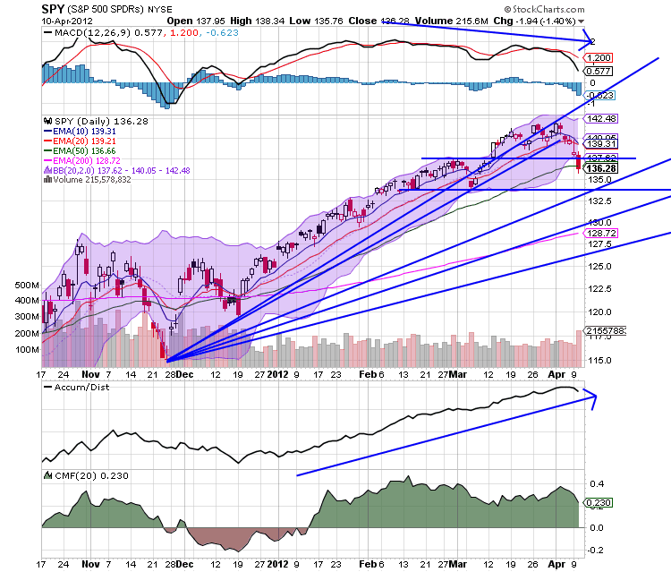
The daily chart shows that prices moved through key support yesterday in the 137.5 price area, along with the 50 day EMA.  The next price target is a little below 134.  Also note the increase in volume today.


The above chart has the Fib levels, with the nearest one being 132.  That would only be a fall of 7.17% from the high, so it wouldn't be a bear market, but instead a correction.


The Fib fans place the first level of support around the 133.5 area.

To people who read this blog, this sell-off should not be a surprise.  I've disliked this rally since the beginning, and reluctantly became a bull as prices continued to move higher (never fight the trend).  But the lack of movement in the Russell 2000 and transports has been a concern.  In addition, the fact the other major equity indexes through the world are all in come form of stall or correction was also a point of deep concern.


Tuesday, April 10, 2012

Bonddad Linkfest

  1. China reports a trade surplus for March (FT)
  2. Spanish Yields hit multi-month highs (FT)
  3. Brazil confronts the US over monetary policy (Martketwatch)
  4. US gas prices and inflation (Marketwatch)
  5. Will the US avoid a recession in 2012 pt.I (BB)
  6. Bank of Japan's statement (BOJ)
  7. Apocalypse later (The Money Illusion)
  8. The current economy (Econbrowser)
  9. The recovery according to Ed "we are not in a recession" Lazear (Econbrowser)

When the World Is Slowing Down, (You Make the Best of What's Still Around)

From the latest policy pronouncement from the Bank of Japan:
Overseas economies on the whole still have not emerged from a deceleration phase but U.S. economic conditions have continued to improve moderately and the sluggish European
economy has stopped deteriorating. Global financial markets have generally been stable
This really highlights the central problem faced by the US right now -- and, as a result, the world.  Fist, consider the following charts of annual GDP growth:


 From the top down:

1.) Brazil's annual GDP growth rate is moving consistently lower
2.) The US's growth rate has been stuck at low rates for the last three quarters
3.) The euro area growth rate is slowing
4 and 5) China's and India's annual GDP growth rate is slowing (remember; both have large populations that they are trying to grow out of poverty; their respective growth rates must be higher than the developed world to continue that quest)
6.) Russia's growth never really returned to strong growth rates after the recession.

So, the world's developed economic areas (the US and the EU) are all slowing.  The developing world is slowing to rates which are prohibitive for its desires to grow out of poverty.

In the above environment, how can the US grow at a strong rate?  While exports have helped the US to grow, slowing economies obviously demand less.  That means the US has to grow internally, which is less and less likely:
Consumers Are the Linchpin: The U.S. economy is being fueled these days by strong consumer spending, which increased in February by 0.8 percent, its best showing in seven months, after rising 0.4 percent in January. Retail sales rose 1.1 percent in February -- the fastest pace in five months -- while same-store sales advanced 4.7 percent. These numbers correlate with recent gains in consumer confidence and sentiment.

I don’t see this pace continuing. Personal-income growth continues to be weak -- up just 0.2 percent in February -- meaning this recent exuberant consumer spending is being fueled largely by increased debt and tapping of savings.

At the same time, pay per employee is rising slowly and continues to fall in real terms. So increased job growth remains the key to any increases in real household after-tax income, which declined in February for a second straight month and gained a mere 0.3 percent, compared with February 2011.


The verdict: big problems but no contraction (yet)

- by New Deal democrat

Over the last few weeks I have written a number of articles re-examining and updating my forecast from the beginning of this year, of slow growth in the first half (possibly even one negative quarter) but no recession, followed by stronger growth in the second half.

That examination revealed that there are very real and serious problems with consumer wages, income, and savings. Similarly there are problems with corporate profit growth. On the other hand, there are a slew of data series which almost always turn negative months before a recession begins -- and so far they are all positive.

The backdrop, from a year ago, is that housing, bonds, and Real M2 all turned negative towards the end of 2010 and bottomed in the first 1/3 of 2011. They have since all risen.


Since they are long leading indicators, however, the maximum negative correlation with the economy is right about now: 12-16 months later. Similarly, Prof. Hamilton has described that increases in gasoline prices feed through to maximum impact on the economy about 12 months later -- meaning we are right at the crescendo of impact from last year's increase. Coincident with those troughs, of the four coincident series signaling recessions, real income has turned slightly negative in the last few months, and industrial production has softened (although much of that can be blamed on utilities not needing to produce so much power during our non-winter winter). Real retail sales are still going strong, however, and even with March's surprise, so are payrolls.

On the positive side of the ledger is that in the past, ALL of the following data series, with rare exceptions, would have turned negative in the months previous to a recession. None have. Here's the list:

housing permits - up nearly 200,000 since January 2011
car sales - over 14 million on a seasonally adjusted annual basis for the last 2 months
initial jobless claims - continually making new 4 year lows
bond prices - reached an all time high a few months ago
real money supply M1 - never turned negative, up over 20& YoY late in 2011
stock prices - also at 4 year highs

Similarly, as to consumer spending, retail sales weaken seriously in comparison to personal consumption expenditures in the months before a recession. To the contrary, this ratio is at one of the highest rates in several decades. Additionally, consumer refinancing is enabling them to continue spending in the face of higher prices.

On the housing front, the Federal Reserve Bank's H8 report of real estate loans has turned up strongly in the last few months on a YoY growth basis, and indeed just turned absolutely positive last week.

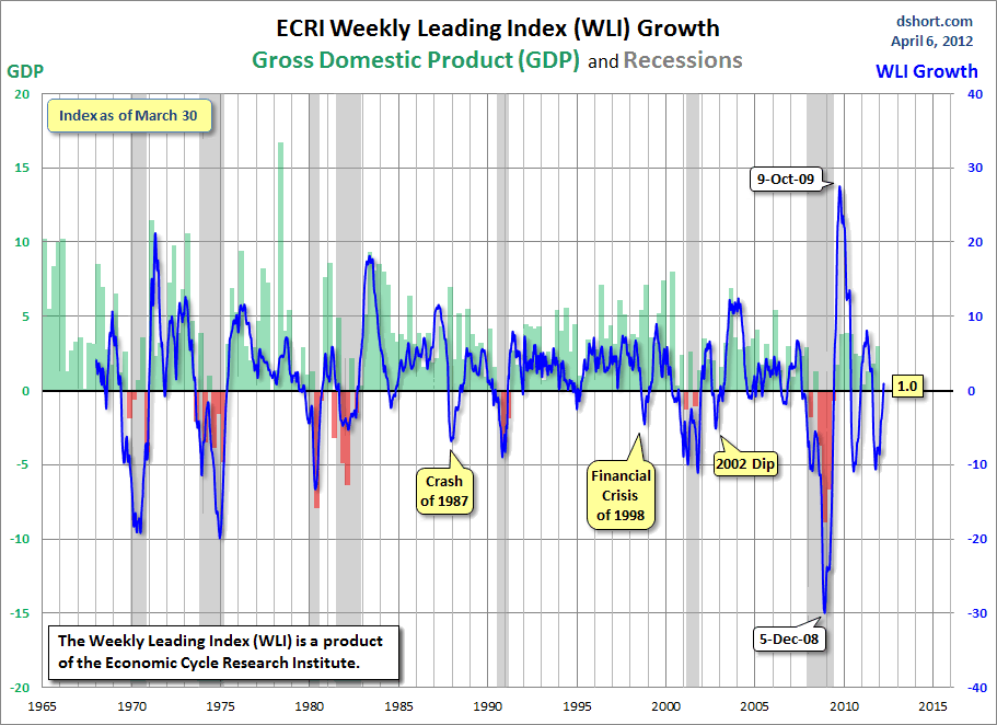
Finally, after a bout of serious weakness, ECRI's own WLI growth index has turned positive. This is what happens when recessions end, not when they begin, as shown in this graph (h/t Doug Short):


ECRI's own founder, Prof. Geoffrey Moore, said that the first signal of a recovery after a recession is when the growth rate hits +1.0. It has just done so. In fact, as shown in the graph above, not once in the last 50 years has a positive and improving reading been consistent with a recession.

On the negative side of the ledger, I've also pointed out a number of series are extremely weak and are consistent with actual contraction. Those include:

core durable goods - look like they are rolling over
ISM vendor deliveries - also have rolled over
real wages - have been negative for over a year
gas prices - need I say more
personal savings - consumers are closer to the point of exhaustion of accumulated savings since the recession
corporate profits after tax - 4th quarter 2011 profits were slightly less after taxes than Q3. These are a long leading indicator and portend weakness in the near future rather than the present.

I also discussed inflation-- should YoY commodity prices decline significantly below YoY consumer prices, that would be a strong sign of coincident weakness. We are just at the point where the two are crossing.

Further, as of last Friday, three leading employment indicators, after having been positive for several years, went negative in the March report:
temp hiring - turns negative well in advance of recessions. It fell, for the first time since the recovery begain in March.
average hours worked, mfg - at highs not seen since the tech boom, but fell last month.
employment vs. initial claims - the scatterplot analysis shows that hiring stops before significantly increased layoffs start, meaning that at the same level of initial jobless claims, monthly payrolls weaken dramatically. The March jobs report released on Friday was the first time such a scenario looked possible.
A couple of months will be needed to tell if these were weather-related anomalies or not.

A few additional notes:
Several long leading indicators bear special notice
real personal savings rate* - this is long leading indicator. It has not turned negative, but is almost at zero now. This portends weakness, but moreso in 2013 than at present.
Real M2 - this was under the point where it is consistent with recession up until 12 months ago. It still indicates weakness for another 3 to 6 months.

Finally, I've noted that extended periods of positive but very weak GDP growth are rare. In 1957 they resolved into recession. In 2002 they resolved into growth.

We continue to have the same old problems -- the housing market is turning, but with excruciating slowness, and the Oil choke collar kicks in every time it looks like the economy will attain escape velocity. Several longer term leading indicators -- corporate profit margins and the real personal savings rate -- suggest increasing weakness as we move into 2013.

At the same time, I see no way that the economy contracted in the first quarter, although growth may have been weaker than expected. Depending on whether the leading employment series remain negative, or if March was a weather-induced aberration, the immediate future may have continued growth or we might stall in this quarter (much as in the early part of last year).

Between the continued slow turn in the housing market, and continuing consumer refinancing, if gasoline again declines in the latter part of the year, I suspect that growth will once again pick up. All things considered, I see no reason to substantially change my forecast for the year of relative weakness now followed by relative strength later in the year.

Morning Market Analysis -- "Recoupling" Addition

As I mentioned yesterday, I've been concerned about the US markets:
My primary concern for the US markets has been the international markets.  Simply put, with other markets and economies slowing down, I've wondered how the US can continue rallying (see here, here, here and here).  Last week's action in the US markets indicates the US is coming under more pressure both from international markets and internal weakness.
Friday's jobs report appears to have been a big negative catalyst for the markets.


The big news is that the SPYs broke trend.  This is very important development; traders will be looking at it and placing more and more sell orders.


The QQQs also broke trend, although in a less severe way.  However,


The IWMs never really broke through resistance in a convincing way.  They have also dropped a bit, which is not good for the market.


The above three charts show three of the largest market sectors that have contributed to the rally -- consumer discretionary, financials and technology.  Notice all three have also broken trend, adding to the overall weakness.

Now the question becomes, what next?  Well, first of all, the US is the only major market that was was in the middle of a rally.  The Asian and Australian markets were meandering sideways with a slightly lower bias, as I pointed out last week.  The BRICs are all all correcting as well (see here and here).  In short, this is less about the US correcting and more about the US "recoupling" with the other markets that are already correcting.


Monday, April 9, 2012

Bonddad Linkfest

  1. China's CPI figures
  2. Higher inflation may limit China's options (BB)
  3. Russian central bank leaves rates unchanged (RCB)
  4. Emerging stocks fall to two month low (BB)
  5. Lower crop reserves may lead to higher food prices (BB)
  6. Demand (outside of Fed demand) for treasuries still high (BB)
  7. Midwest manufacturing is booming (Carpe Diem)  
  8. The empathy Gap (Krugman)

Can the US Drive World Growth, Redux: PCEs

Last week, I wrote the following regarding PCEs and the job market:
It's possible we could see the following: consumers continue to tap their savings and consumer credit to increase purchases.  But central to this is the need to continue to see improvement in the job market.  If the unemployment rate continues to drop, we will see a boost to consumer confidence, which will in turn lead to increased purchases.  However, a slowdown in the employment figure would be fatal, lowering confidence and limiting consumer purchases.
The employment report was obviously a disappointment from this perspective.  According to the BLS report, the establishment figures had been increasing close to 250,000 for the preceding three months, making the 120,000 headline number a clear disappointment.  But there were added data points that cause me great concern.
The average workweek for all employees on private nonfarm payrolls edged down by 0.1 hour to 34.5 hours in March. The manufacturing workweek fell  by 0.3 hour to 40.7 hours, and factory overtime was unchanged at 3.4 hours. The average workweek for production and nonsupervisory employees on private nonfarm payrolls was unchanged at 33.8 hours.


The above chart is from the BLS and shows that, while the index dropped last month, it is still in an uptrend.  But, the fact the index is still below pre-recession levels tells us we still have a long way to go to fix the job market.  It also tells us there may be a fair amount of slack in the current employment market which will allow companies to simply increase hours worked rather than hire new employees.  

However, there was some good news in the report about wages:
In March, average hourly earnings for all employees on private nonfarm payrolls rose by 5 cents, or 0.2 percent, to $23.39. Over the past 12 months, average hourly earnings have increased by 2.1 percent. In March, average hourly earnings of private-sector production and nonsupervisory employees rose by 3 cents, or 0.2 percent, to $19.68.

However, increasing wages don't add up to enough of an advance if we don't see an increase in hours worked, which is why the first data point is a problem. 


Overall, this is one report, which means you don't want to read too much into it.  As the Economists' blog notes:
I think it’s premature to say it's deja vu all over again. First, 120,000, while well below expectations, is still above the trend growth rate of less than 100,000 and better than what was recorded during the air pockets of 2010 and 2011. Second, some of the prior months’ gains were probably artificially bolstered by good weather; private estimates put the effect at as much as 75,000 to 100,000 jobs. While it’s difficult to be certain, some of March’s disappointment was probably payback. Construction, for example, shed 7,000 jobs.

Third, and most important, there is no sign in other data of a sudden deceleration in economic momentum. Weekly claims for unemployment insurance continue to edge lower, the purchasing managers index for manufacturing showed activity accelerated a tad in March (as did the jobs data: factory payrolls rose a healthy 37,000). Nor do the fundamentals look that bad; the rise in petrol prices to date is smaller than last year’s, and the re-eruption of Europe’s sovereign debt crisis is so far on a lesser scale than in either last year or the year before. State and local government austerity is exercising less of a drag; their payrolls were little changed in March.

The third point (or second paragraph) is really the good news; other data points are still overall
 positive.  

However, remember, the rest of the world is slowing.  As the Australian Central Bank recently noted in its policy statement:

Recent information is consistent with the expectation that the world economy will grow at a below-trend pace this year, but does not suggest that a deep downturn is occurring. Several countries in Europe will record very weak outcomes, but the US economy is continuing a moderate expansion. Growth in China has moderated, as was intended, and is likely to remain at a more measured and sustainable pace in the future. Conditions around other parts of Asia softened in 2011, partly due to natural disasters, but are not showing signs of further deterioration. Some moderation in inflation has allowed policymakers in the region to ease monetary policies somewhat. Commodity prices declined for a few months last year and are noticeably off their peaks, but have been relatively stable for a while now, at quite high levels. Australia’s terms of trade have peaked, though they remain high.
The European environment is also weaker than previously thought.   In short, the macro environment is such that the US must lead and it must lead from internally generated growth.

A closer look at the jobs report: showrooming, weather, and a worrying deviation from trend

- by New Deal democrat

I've had a chance to dig deeper into Friday's punk jobs report, spurred on by Dean Baker (who says it was mainly due to the weather) and Scott Grannis (who says it isn't nearly as poor as it looks), in contrast to my initial impression that "showrooming" (i.e., using local retails stores as the showroom for online purchases) might be the primary culprit.

My conclusion: while I hope Scott Grannis is right, there has been a worrying deviation from trend. Some of that deviation is from a leading component of the trend. The remainder seems about equally split between the effects of our non-winter winter, and an increase in showrooming probably partly in response to high gasoline prices.

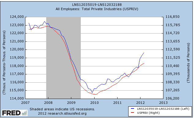
First, let's note Scott Grannis's point. The household report continues to suggest a much stronger private sector than the establishment report. The establishment report shows a gain of 1.450 million jobs in the private sector in the last 8 months, or about 180,000 a month. By contrast, the household report shows a gain of 3 million jobs during that period, for an average gain of 375,000 a month. Here's the graph of private job growth in the household survey (blue, left scale) vs. the establishment survey (red, right scale) for the last 5 years:


There is evidence that the household survey leads the establishment survey at turning points. On the other hand, the household survey is noisier. Time will tell.

Now let's turn to the establishment report. Dean Baker chides observers for failing to take into account the weather:

In the winter months we usually get some serious snowstorms in the Northeast and Midwest. This means construction sights get shutdown and project starts are delayed. People will be less likely to go out to restaurants when the streets are covered with snow or its below zero. The same applies to shopping at the mall or buying a new car. If the weather is really bad factories will shut down because they can't get necessary supplies.

None of this happened this winter which meant that job growth was better in the winter months than would ordinarily be the case. But if we didn't get the winter weakness that we expect, then we won't see the same spring bounce that we usually get.

People were hired in January or February who would not ordinarily be hired until March or April. Similarly, people who bought their car in the winter months will not be buying another one in the spring.

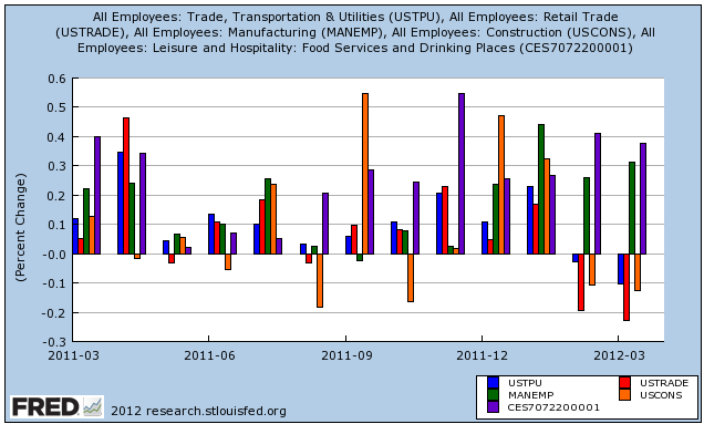
The data adds credence to Dean's point, but only in part. Here's a graph of the industry groups he refers to -- construction (orange), restaurants (purple), retail (red), auto dealers (orange), and transportation (blue):


Construction lost 7000 jobs in March vs. gaining 18,000 in January, manufacturing gained 37,000 in March vs. 52,000 in January, and auto dealers gained 700 in March vs. 5,700 in January. On the other hand, Food and Service actually gained more jobs in March (+37,000) than in January (+26,000). In other words, while the retailers in the strip mall may have taken a hit, the restaurant next door didn't. That can't be explained by the weather.

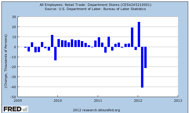
Losses in retail jobs, while large in the aggregate (-33,800):


don't entirely support Dean Baker's analysis, however.

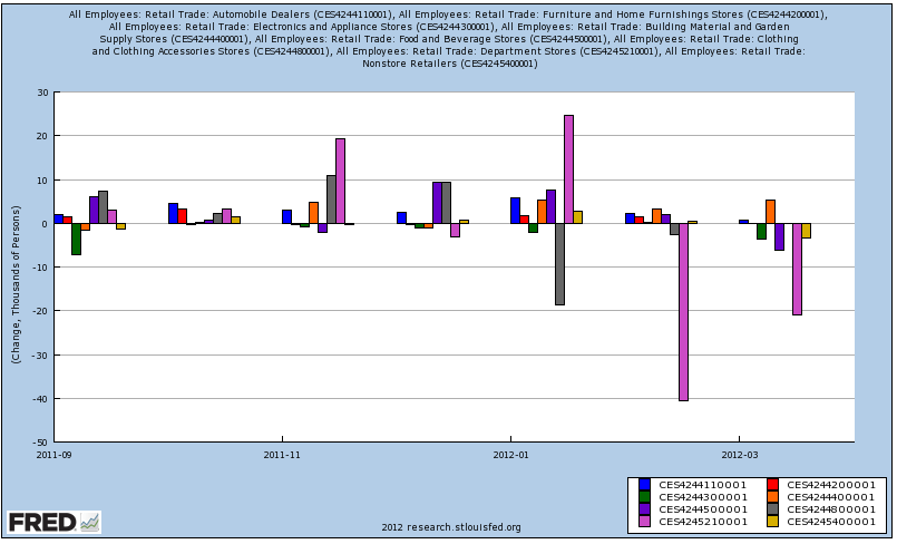
Losses were concentrated in department stores (pink), with smaller losses at electronic stores (green), grocery stores (purple), and online retailers (beige). There was reduced growth in auto dealers (blue) and home furnishings (red). In contrast, there was increased growth at lawn and garden centers (orange), and clothing stores (gray). If the weather were the decisive factor, we would have seen similar declines in building supply, clothing, and garden center stores, as well as restaurants (see first graph above, purple). We didn't:


That the declines in retailing were concentrated in department and electronics stores suggests that consumers have increased their practice of showrooming. A local store may be visited, but the purchase is made online for a lower price. It is very likely this is one strategy adopted by especially younger consumers to minimize gasoline usage. For example, it has been reported that 52% of holiday shoppers engaged in showrooming. Items as mundane as cosmetics are now being repeat-purchased online. In other words, those retail businesses most vulnerable to showrooming took by far the biggest hit.

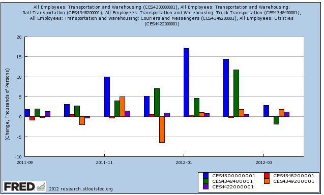
Next, let's turn to transportation (blue) and utilities (purple) employment. Despite the fact that railroads (red) are hauling much less coal than usual, due to a weather-related drop in demand from utilities, neither of those industries took an employment hit:


Weather probably did play a role here, as an unusual number of truckers (green) were hired in February, after which there was an actual decline in March. Finally, remember the hubbub about the surge in employment of couriers (orange) from the December report? It's been completely revised away..

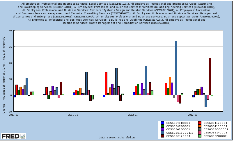
Finally, let's look at professional and business services. These only added +31,000 jobs in March, well below February's +79,000 and similar advances in December and January. While legal (blue), accounting (red), architectural and engineering (green), programming (orange), and technical consulting (purple) services all hired less, the biggest factor by far was in employment services(blue-gray) (half of which are temporary services), which fell -14,200 in March after a 67,000 gain in February :


In fact, I've had to divide the change in employment services by two just to show the other changes in services. Employment service losses account for virtually all of the decline in growth, and half of that is in the leading sector of temporary jobs.

To summarize, while weather played a big role in the March miss compared with January and February, it may not be the BLS's seasonal adjustment at fault so much as miscalculations by the businesses themselves. When the increased business failed to pick up further, they stopped hiring temporarily (hence the employment services decline), and laid off some employees depending on how big a miss -- where the biggest miss was due to showrooming. If so, the weather related effects should only persist through April, while showrooming is probably here to stay for the duration of high gas prices.

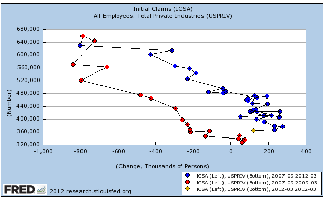
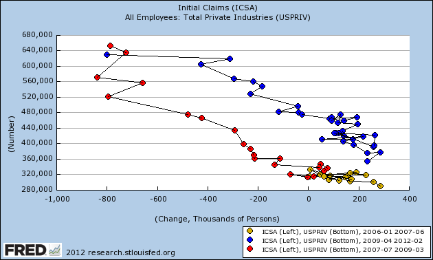
That leads me to the final point. March's employment report is a break in trend in the relationship between job losses and job hires. Here is an update of my scatterplot graph showing the relationship between initial jobless claims and private sector job changes.


Going into the last recession, as is typical, hiring stops before significant layoffs begin. In the recovery, hiring in recovering sectors start before overall layoffs end. March's report moves us in the direction of the pre-recessionary pattern. That the two leading indicators in the jobs report -- manufacturing hours and temporary jobs -- both declined, adds further weight to the concern. Thus March's jobs report must be regarded as a yellow caution flag concerning the sustainability of the recovery.

Morning Markets

To reiterate my view on the markets

My primary concern for the US markets has been the international markets.  Simply put, with other markets and economies slowing down, I've wondered how the US can continue rallying (see here, here, here and here).  Last week's action in the US markets indicates the US is coming under more pressure both from international markets and internal weakness.


Both the QQQs and SPYs are either right at critical support (the QQQs) or just beyond it (the SPYs).  Put another way, both markets are one bad trading day away from moving through very important trend lines.  Also note the declining momentum for both charts; the QQQs have given a sell signal and the SPYs have been showing declining momentum for the last few months.  However, note the rising A/D  for both, indicating more money is coming into the market.


As I've noted before, the IWMs are the problem child of the market; while the QQQs and SPYs were rallying, the IWMs were stuck in a rut, unable to advance.


The Treasury ETFs all share the same characteristics.  After selling off in reaction to the Fed minutes release, they have all since rallied back to key levels.  Prior to the sell-off, one of my concerns (and  others) was that the treasury market was taking money away from the equity market.  The sell-off gave us hope that that situation was reversing.  However, the rally over the last few weeks indicates the safety play may be returning to the market.  This will take money away from the equity markets, preventing their rally.

Saturday, April 7, 2012

Weekly Indicators: April fool's got delayed 5 days edition

- by New Deal democrat

This past week's monthly data releases were dominated by yesterday's nonfarm payrolls report, which read like a bad April fool's joke delayed by 5 days. The commentary a month ago was how there were no weak spots in the report and the economy was hitting on all cylinders. Four weeks later and it reads like the engine has seized. Auto sales were great, but slightly below February. Factory orders, ISM manufacturing, and ISM services all improved. Residential construction spending held up, but nonresidential spending declined.

The high frequency weekly indicators do not give any hint of oncoming weakness. Let's start with the employment related data, to compare with the monthly report:

The Department of Labor reported Initial jobless claims of 357,000 last week, a new post-recession low in the revised series. The four week average declined by 3250 to 361,750, also the lowest revised number in 4 years. There will be one more week where the new seasonal revisions will increase the number compared with the former adjustments before turning lower.

The American Staffing Association Index held steady at 89. It is well above last year's level and almost equal to its 2007 level.

The Daily Treasury Statement shows that for the 20 day period ending 5 days into April, $151.8 B has been collected in withholding taxes vs. $144.2 B a year ago, for an increase of $7.6 B or +5.3% YoY.

In summary, none of the weekly employment indicators show any sign of weakness, and to the contrary, show more strength.

Sales also remained positive.

The ICSC reported that same store sales for the week ending March 31 rose +3.8% for the week and also rose +4.2% YoY. Johnson Redbook reported a 4.6% YoY gain. The 14 day average of Gallup daily consumer spending at $76 remains near the highest spring reading since the recession, and is also up about 20% YoY.

The energy choke collar remains engaged:

Gasoline prices are about 7% higher than one year ago while usage continues to be much lower: Oil was steady at $103.31. Gas at the pump rose another $.02 to $3.94. Gasoline in particular is significantly above the point where it can be expected to exert a constricting influence on the economy. Gasoline usage, at 8572 M gallons vs. 8906 M a year ago, was off -3.8% YoY. The 4 week moving average was down only -0.8% YoY. The decline in gas usage began one year ago, so the YoY comparisons are getting easier. Still, these usage numbers do not show any increase in stress.

Turning to housing, the Mortgage Bankers' Association reported that the seasonally adjusted Purchase Index increased +7.2% from the prior week, and was more than 2% higher YoY. The Refinance Index decreased another -1.4% from the previous week, reflecting higher rates and a pause before the new government refinancing assistance program starts.

YoY weekly median asking house prices from 54 metropolitan areas at Housing Tracker were up +4.1% from a year ago. Asking prices in this index have now been up YoY for 4 straight months. This week another asking price index, Trulia, premiered, adjusting prices for the mix of properties on the market. This index is seasonally adjusted, and it also bottomed in December and has risen even since. As to sale prices, CoreLogic reported that YoY declines in non-foreclosures had slowed to -0.8%. Foreclosures were significantly worse. This raises the interesting possibility of a bifurcated market in house prices depending on foreclosure status.

Real estate loans from the FRB's H8 report, turned outright positive YoY for the first time since the recession in the week of March 31. On a monthly basis, they were flat YoY. These were identified by Prof. Geoffrey Moore, the founder of ECRI, as a leading indicator for this market.

Rail traffic remained negative but with the same explanation.

The American Association of Railroads reported mixed weekly rail traffic for the week ending March 31, 2012, with U.S. railroads originating 286,962 carloads, down 6.2 percent compared with the same week last year. Intermodal volume for the week totaled 242,772 trailers and containers, up 3.6 percent compared with the same week last year. The entire decline in carloads is still due to coal shipments which were off -18.2%. Railfax's graph of YoY traffic by types remains in a positive trend on a YoY basis.

Bond prices and credit spreads both rose :

Weekly BAA commercial bond rates fell +.09% t0 5.25%. Yields on 10 year treasury bonds fell .10% to 2.22%. The credit spread between the two, which had a 52 week maximum difference of 3.34% in October, rose by .01% to 3.03%.

Money supply, however, was flat to negative on a weekly and monthly basis:

M1 rose +0.7% last week, but was lower by -0.2% month over month. On a YoY basis it rose +16.8%, so Real M1 is up 14.1%. YoY. M2 rose +0.4% for the week, and also +0.2% month over month. Its YoY advance fell to +9.4%, so Real M2 was up 6.1%. The YoY comparisons are becoming tighter (although still historically high), and have generally stalled on a weekly and monthly basis for the last couple of months, which is becoming noteworthy.

Turning now to high frequency indicators for the global economy:

The TED spread fell back .01 to 0.40. This index remians slightly below its 2010 peak, generally steady for the last two months, and has declined from its 3 year peak of 3 months ago. The one month LIBOR remained at 0.241. It is well below its 12 month peak set 3 months ago, remains below its 2010 peak, and has returned to its typical background reading of the last 3 years.

The Baltic Dry Index fell 2 to 928. It has risen 278 from its 52 week low, but is still well off its October 52 week high of 2173. The Harpex Shipping Index also fell 1 to 395 in the last week, up 20 from its 52 week low.

Finally, the JoC ECRI industrial commodities index rose slightly for the week to 124.26. This indicator probably forecasts the global economy much better than it does the US economy.

With the sole exception of the decline in rail traffic, due to utilities needing less coal for energy generation in turn due to the unusual weather, none of the high frequency indicators are giving any warning of any imminent turn in the economy. The Oil choke collar remains engaged, but generally the data suggests smooth sailing ahead. More than anything else, the comparatively poor jobs report strongly indicates something is going on with retail stores. Is everybody becoming Amazon's showroom?

Have a nice weekend.

Friday, April 6, 2012

Weekend Weimar, Beagle and Pit Bull

It's that time of the week. As I mentioned yesterday, I'm cutting out early for the weekend (actually, I've already left).  Think about anything except the markets. I'll be back on Monday; NDD will do the weekly stats this weekend. Until then ....


March employment report: outlier or pre-recession?

- by New Deal democrat

Well, this was an unpleasant surprise. A few days ago I wrote that if the trend of initial jobless claims compared with payrolls from the last 3 years held, we should expect a report of about +250,000 jobs. That was considerably above the consensus. Instead, as you know by now, we only got +120,000.

In that same post I wrote:
[I]f we were on the cusp of entering an economic contraction, new jobs offered would decline before layoffs increased, meaning the new entries on the scatterplot would shift substantially to the left. Should March come in under 200,000 ..., and should February also be revised down under 200,000, that would be a bad omen.
Although February's report was actually revised up to +240,000, this month's report is what I would expect to see in the months leading up to a recession, per the scattershot graph comparing initial claims to payrolls (note this does not include this morning's data):


Today's report is well to the left of what the trend, just like the months as teh last recovery waned in 2007 (shown in yellow and also the first six of the series shown in red) before the onset of that recession.

The manufacturing workweek, an element of the Index of Leading Economic Indicators, declined 0.3 hours to 40.7. That is a large decline and is consistent with manufacturing rolling over from weakness. Another leading part of the report, temporary jobs, also declined by 7,500 (completely contrary to the ASA survey's strong increase).

The punk report was based on weakness throughout the service economy, but especially two areas. Comparing January with March, retail jobs went from +24,900 to -33,800. Professional and business services went from +79,000 to +31,000. Those two areas alone are responsible for 106,000 in the shortfall in job creation.

The index of Aggregate hours worked in the economy, [which were revised higher for February, fell 0.2 from 96.0 to 95.8 -- NDD note. This original line is in error.] did increase 0.1%, in line with actual payrolls. This is a notable coincident indicator consulted by the NBER.

The general workweek declined by 0.1 hour to 34.5. Overtime was unchanged. Hourly earnings rose $0.05 to $23.39, a 0.2% increase.

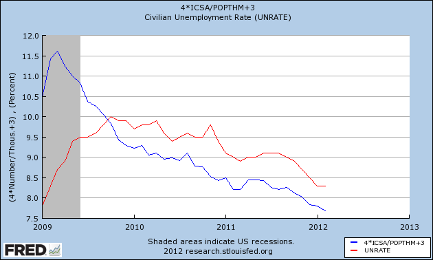
The only relatively bright spot was the unemployment rate, which did fall from 8.3% to 8.2%, as predicted from the initial jobless claims data, since that leads the unemployment rate (note the graph below does not include this morning's data):


The broad U6 unemployment rate fell from 14.9% to 14.5%. Some of this was due to the -0.1% decline in the employment to population ratio. Since the unemployment rate is a lagging indicator, this isn't terribly heartening.

It may be that some job growth was pulled forward due to the non-winter winter, but between the declining leading indicators in the report, and the break in trend with initial claims, this report has to be regarded as a serious piece of evidence that high gas prices, wages that have not kept up with inflation, and weaker manufacturing growth are finally extracting a toll.

Thursday, April 5, 2012

Hey Doomers! Check out Gallup's employment report!!!

- by New Deal democrat

Remember the big hubbub last month about how Gallup's unemployment survey showed a big month over month increase, so the February employment report was going to be awful?

Well, check out what Gallup's employment report said today:
U.S. unemployment, as measured by Gallup without seasonal adjustment, declined to 8.4% in March from 9.1% in February, while Gallup's seasonally adjusted rate fell to 8.1% from 8.6% in February.
....
Gallup trends show the U.S. unemployment rate declining dramatically over the past year.
....
Gallup's seasonally adjusted unemployment rate was essentially unchanged at 8.5% in mid-March from 8.6% in February, but then fell to 8.1% for all of March
Contrast that with the much smaller decline in March of last year:
Unemployment, as measured by Gallup without seasonal adjustment, was 10.0% in March -- down from 10.2% in mid-March and 10.3% at the end of February.

That's a 0.7% unadjusted month over month decline this year vs. a 0.3% month over month decline last year. And a full 1.9% lower year over year.

Given how important the Gallup report was for the Doomers last month, I'm sure they'll be all over highlighting it again this month.

Right?

How helping the middle class helps the economy

- by New Deal democrat

Henry Ford famously said that he wanted to pay his workers enough so that they could afford his cars. The wisdom of that statement, I submit, is borne out by the graph of the real personal savings rate I posted this morning. Here it is again:


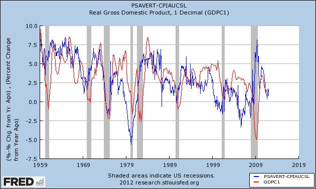
The point is that the real personal savings rate leads GDP by 1 to 2 years, and has consistently since World War 2. Although not shown above, consumer savings skyrocketed after the nadir of the Depression in 1933, and continued through World War 2. When the GI's came home, there was an enormous pool of savings set to power the post-War boom. Notice, however, that the real personal savings rate has generally declined since the 1960s. After briefly recovering in the early 1980s, the almost inexorable trend since has been downward -- and the trend of declining peaks in GDP has followed.

With the "Great Recession" the savings rate again briefly surged. GDP rose, but not nearly so much, as households focused on refinancing debt at lower interest rates, paying it down, paying it off, or simply defaulting. The result has been that households in the aggregate are in their best shape in 30 years to begin both saving and spending more, as shown in this graph of household debt levels I have been updating every quarter for several years. It is only current through December 2011. The next update, covering the first quarter already ended, will come in June:


Lakshman Achuthan of ECRI has said for several years that we are in a pattern of more frequent and deeper recessions, as GDP growth trends downward over the decades. I do not believe that is inevitable. In fact I contend it is the natural result of policies that have redistributed wealth upward from the middle class.

Study after study has shown that the share of income going to labor vs. owners and financiers has declined relentlessly for over a generation. As less income has accrued to the middle and working classes, they have had less and less savings to fall back on. What the graph of the leading relationship of the real personal savings rate to GDP above shows is that a result of this policy-driven transfer of wealth, the overall growth rate of the economy has suffered for nearly 3 decades.

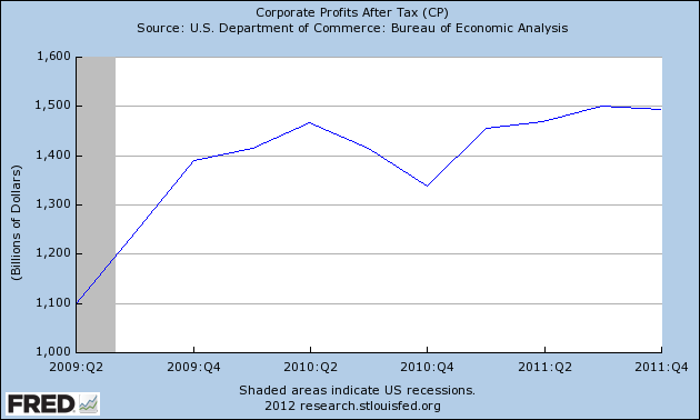
And the closer we come to the point where transfering wealth upward from the middle class becomes akin to squeezing blood out of a stone, the less ability there is even for corporations to generate greater profits. This is the graph of corporate profits after tax since the recession bottom:


Corporate profits at their post-recession peak have been 10% higher than their prior peak, but the increase shows signs of being short-lived.

The alternative to the type of economy predicted by Laksham Achuthan, in which the majority of consumers have reduced savings to spend, corporate profits stall, and growth is lackluster for a long time, is to implement policies that favor a greater share of income winding up in the savings of the middle class. Henry Ford would know that in the long-term, this even favors the well-being of the 1%.