Tuesday, March 27, 2012

Morning Market Analysis


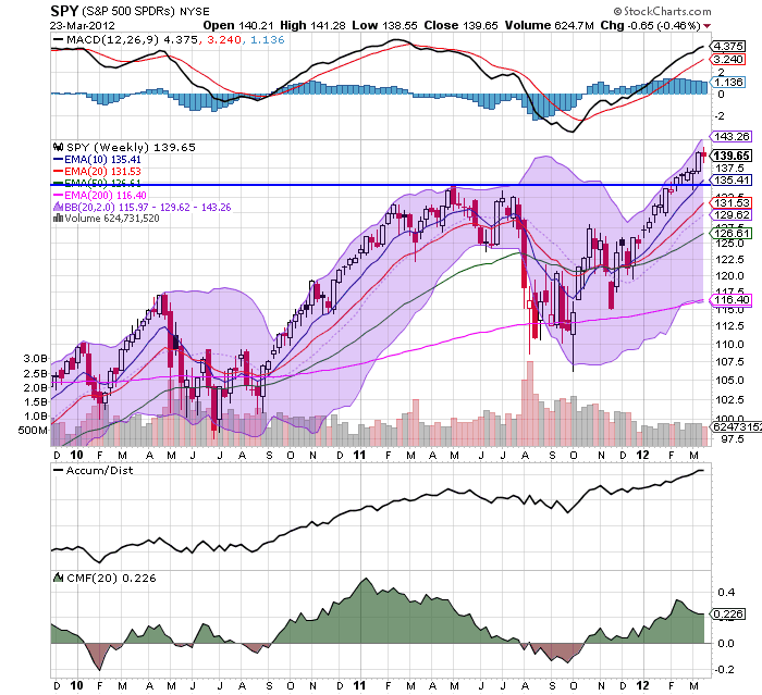
Let's start with the equity markets, where we see prices breaking through resistance, with the IWMs moving through the 82.6 level, the QQQs moving through 67.50 and the SPYs moving through 141.5.  All three are also showing rising A/D lines, along with positive CMF readings, telling us that people are moving into the market.


The weekly SPY chart shows that we're now gunning for the 143 area.  A move through there would be a post-recovery high and a very important market milestone. 


The QQQs are also showing a very strong weekly reading.  Prices are now at a post recovery high, with strong fundamentals.


The weekly GLD markets is still right at support.  The shorter EMAs are neutral -- the 10 and 20 day EMAs are moving sideways while the 50 week EMA is slightly bullish.  However, momentum is dropping, the A/D line is moving sideways and the CMF is beginning to print negative.

Dr. Ed uses the gold market as a proxy for runaway government spending/uncertainty/inflation.  I think that's a pretty good use of this commodity's chart, which of course leads to some interesting questions.  Why is gold weak now?  Are traders less uncertain?  Do they fear inflation less?  In short- - why is the GLD ETF trading at support right now?

Monday, March 26, 2012

Bonddad Linkfest

  1. India's economy; losing its magic (Free Exchange)
  2. German confidence rises (Bloomberg)
  3. New homes sales down; prices up (Marketwatch)
  4. Promoting the Economic Rebound (WaPo)
  5. Colleges are getting more competitive (CNN)
  6. EU Dryness concerns analysts (Agrimoney)
  7. Australian rain to help crop yields (Agrimoney)
  8. Chinese soft landing still a problem for exporters (BB)
  9. Bernake's speech on the labor market (FRB)
  10. Indian corruption scandal (Beyond BRICs)

In Response to Mish's Criticism of Bernanke's Gold Standard Arguments; Or, Why the Gold Standard Is A Really Bad Idea

A long time ago, I read Mish on a regular basis.  His analysis was great; it was in-depth and well argued.  However, he has been slowly losing credibility with me over the last few years as he has become more of a political writer than economic.  The final nail for me is his latest article, "Ben Bernanke: Inflationist Jackass, Devoid of Common Sense, and Clueless About Trade, Debt, History, and Gold." 

In a recent lecture, Bernanke explained why the gold standard is a bad idea.  He did so in a very convincing way, as highlighted by Joe Weisenthal and agreed to by Professor Brad DeLong.  (for background on this issue, please read Monetary Theory and Bretton Woods by Filippo Cesarano).  I would also encourage you to read Mr. Weisenthal's article. However, let me address Mish's love of the gold standard, or, more precisely, the fact he's never addressed the fundamental problems with the gold standard as expressed in the following identity:

MV = PQ

Where M=the money supply (gold), V=velocity, P=price and Q = physical volume of all goods produced.  In a gold based monetary system, the above equation explains how balance of payment equilibrium is achieved.  As a country runs a trade deficit, M decreases.  In order for the identity to maintain balance something must decrease on the other side of the equation.  This is usually prices (P), which in turn makes the country's goods more competitive in international trade, thereby leading to equilibrium once again being achieved.  Sounds simple, right?

Not really, as there are several problems.  Like most economic models, this one assumes that prices move freely; or, put another way, prices are not sticky.  This is hardly the case in the real world, where prices can remain at unrealistic levels for some time.  This makes the adjustment mechanism anything but instantaneous.  Secondly, "classical economists took the volume of final output to be fixed at the full employment level in the long run." (International Economics by Robert Carbaugh, Kindle Reference 6753-55).  Considering the US economy has been operating far below the full employment level for the last three years (as have a fair number of other economies), this "magic equation" wouldn't apply very well to the current situation.  In addition, a decrease in the money supply created by a trade deficit leads to an increase in the cost of money -- namely, interest rates.  While these should theoretically make the deficit country a more attractive place to send money (thereby lowering the trade deficit), higher interest rates will also slow economic growth in the deficit running country, making it less attractive from a foreign investment position. This slows the correction process even more.  There is also the issue that the gold standard does not survive war spending, which is what led to it's fall in the first place after WWI.  Finally, there is the issue that no one can futz with the system -- that is, there can be no government intervention in the currency markets for this to work.  Raise you hand if you think that will last longer than a few years in the current environment; I have a bridge to sell you.

In reality, the golden age of the gold standard only lasted about 30 years from the end of the 1800s to WWI.  Several countries tried to get back on the gold standard after WWI but to little avail (as an aside, Britain tried to get back on the gold standard.  However, Churchill set the conversion rate too high, a policy move critiqued by Keynes).  All of this led to the Bretton Woods agreement after WWII. 

Let me add three other points.

From Mish:
Weisenthal: The gold standard ends up linking everyone's currencies.

Mish: So what? Look what happened after Nixon closed the gold window. We have had nothing but problems, temporarily masked over by printing more money until things blew sky high, culminating in bank bailouts at taxpayer expense, and those on fixed income crucified in the wake.
Actually, being that inter-lnked means all economies rise and fall together, preventing one economy from taking a different approach to a problem and helping to prevent an economic free fall from occurring.  For example, during the last recession both China and Germany engaged in stimulus spending, which essentially saved both economies and helped to avert disaster for the world as a whole.  Had we all been inter-linked, that couldn't have happened.  I should also add that this level of currency inter-linking is a big problem in Europe right now -- a situation which Mish has written about extensively.
Weisenthal: [A gold standard] creates deflation, as William Jennings Bryan noted. The meaning of the "cross of gold" speech: Because farmers had debts fixed in gold, loss of pricing power in commodities killed them.

Mish: Hello Joe. Please tell me how many in this country would not like to see lower prices at the gas pump, lower prices on food, lower rent prices, lower prices on clothes? The fact of the matter is price deflation is a good thing. The only reason why it seems otherwise is debt in deflation is harder to pay back. That is not a problem with deflation, that is a problem of banks foolishly lending more money than can possibly be paid back. Fractional reserve lending is the culprit.
Deflation does not mean just lower prices; it also means unemployment, caused by a deflationary spiral that goes like this: demand drops, leading to lower production, leading to lay-offs, leading to lower demand ... you get the idea.   The Great Depression is the classic example of this phenomena. 
Weisenthal: The economy was far more volatile under the gold standard (all the depressions and recessions back in the pre-Fed days).

Mish: Really? On what planet? Did the collapse in the housing bubble affect your ability to reason? Except for cases like Weimar, Mississippi Bubble, and for that matter all bubbles, gold provided stability. The bubbles (and the subsequent collapses) were caused by fractional reserve lending, not the gold standard.
Actually, Mish, on this planet.  An inquiring mind would seek out a book such as A Brief History of Panics,  which shows that in the 1800s there was nearly a panic every 10 years.  As professor James Hamilton pointed out:
The graph below records the behavior of short-term interest rates over 1857 to 1937. Over much of this period, the U.S. maintained a fixed dollar price for an ounce of gold, and prior to 1913 (indicated by a vertical line on the graph) there was no Federal Reserve System. The pre-Fed era was characterized by frequent episodes such as the Panic of 1857, Panic of 1873, Panic of 1893, Panic of 1896, and Panic of 1907 in which even the safest borrowers would suddenly find themselves needing to pay a very high rate of interest. Those events were associated with significant financial failures and business contraction. After establishment of the Federal Reserve, the U.S. short-term interest rate became much more stable and exhibited none of the sudden spiking behavior that used to be so common

...

The pre-Fed financial panics were also accompanied by long contractions in overall economic activity, as indicated by the NBER dates for economic recessions noted in the graph below. Although of course we still had recessions after the Federal Reserve was established in 1913, they tended to be less frequent and shorter in duration.
Here is the accompanying chart:


In short, the gold standard argument doesn't hold up after a modicum of scrutiny.  Frankly, the old Mish wouldn't have bought an argument this shallow.  However, the new and greatly unimproved Mish clearly has.  While I'm sure his numerous acolytes will nod their heads in agreement at the simplistic "gold standards are the magic panacea to all your ills" argument, I lament the loss of a great critical mind and hope for the day when he returns.


Morning Market Analysis


The 30 minute chart of the SPYs really highlights last week's price action.  Prices rallied on Monday, but spent the last four days of the week consolidating, eventually trading between the 50% and 38% Fib levels on Thursday and Friday.   This chart has strong support at the 138 and 139 areas, with resistance in the 141/141.25 area.


 The weekly price charts gives us a good idea for the overall trend of the market right now.  Prices are still in an uptrend after breaking through resistance at the 135 level.  The EMAs are bullishly aligned (shorter above longer, all moving higher) and the secondary technicals (MACD, A/D and CMF) are signaling a continued move higher.  The logical price target for a pullback (which we have to keep in mind given the underlying fundamental situation) is the 135 price level, which is only about 3% below current price levels.


The treasury market has rebounded from its recent sell-off.  Reactions such as this are typical of a rapid movement in a particular direction, as traders think the market is either overbought or oversold.  Prices here have several areas of natural upside resistance: the Fibonacci levels and the EMAs. The decreasing volume over the last few days indicates we're probably nearing the end of the rebound.


The 30 minute IEF chart shows two important points, the first of which is the price rebound from last week.  Notice that after gapping higher at the open, prices didn't follow-through during the day.  This shows the overall weakness of the counter-rally, as traders did not keep the momentum going throughout the trading day.  In addition, the entire pattern that started on March 14 could be interpreted as a rounding bottom formation, which is a bottoming formation.

So, basically last week we see a counter-reaction to the bond market sell-off and equity market rally.  As always, this leads to the following question: is this simply a shorter time frame, counter move, or is it the end of the counter-move and the start of a new trend?

Obviously, it's too early to give a definitive answer.  However, last week's counter-reaction was the result of fundamental developments -- a slowdown in the EU, slower growth in China and weaker home sales in the US.  In addition -- as I'll show tomorrow -- the weekly charts for the developing markets are all showing a sell-off, indicating further weakness.  Like most situations, the real answer is, "let's see what the data says this week." 

Sunday, March 25, 2012

A Dick Cheney aside

- by New Deal democrat

Upon hearing of Dick Cheney's secret heart transplant, am I the only one who conjured up the image of an unwilling live donor, strapped down in terror to an adjoining gurney?

A blogging journey

- by New Deal democrat

It's been about 7 years since the pixels of my nom de blog, New Deal democrat, made their appearance. At the time, I needed a handle to log onto Daily Kos. Since I am a big fan of FDR and his New Deal, especially after reading Arthur Schlesinger's three-volume history, and couldn't come up with anything particularly clever, I chose "New Deal democrat." I was surprised that it wasn't already taken, which to me speaks volumes about the modern Democratic Party.

Although I blogged and commented about some general political issues, I quickly gravitated towards economic history and finally, simple economic reporting. As I saw it, the truth has a progressive bias. Simply report the truth well enough and the progressive platform will follow naturally. In an undeveloped or developed economy, left to its own devices without any counterweight, inevitably the rich will get richer and the other classes, poorer.

Further, economics as it is typically taught in college and even in graduate school is like learning to read blueprints for an exquisite castle in the air. No matter how eloquent the math, the assumptions completely undercut its legitimacy. Additionally, the criteria for optimization are incredibly conservative. If a small band of plutocrats have 99% of the wealth in the status quo, then that is accepted as optimal, and any improvement in everybody else's position must come from new growth. And the equations never admit of participants dying from privation - like cartoon characters they are assumed to spring back to life every new day. Otherwise the optimal economy would be the one in which most participants survive until the end of the period measured, and you know what that means ....

Anyway, I decided that progressives could use somebody spelling out as neutrally as possible what was going on deep down in the weeds of the economy. As 2007 progressed, I saw the economic reckoning at hand. Here's a very brief sample from August of that year:
Why we are "rhyming"

If we are at the beginning of the first full-fledged (but slow-motion) "bust" the economy has seen in 70 years, then we are "rhyming" with 1929.
One day before the Great Recession officially began, I wrote The Panic of 2008?, saying:
This is NOT the Great Depression II. Nor is this the stagflationary 1970s. It is going to unfold as some other Beast. Only the broad outlines of this Beast appear discernable now: it will likely feature (1) increasing import prices; (2) wage stagnation (that does not keep up with price inflation); (3) real asset deflation; and (4) possibly a Japan-style "liquidity trap."
Check, check, check, and check.

Once the Beast showed itself and the Panic came to pass, I began to look for the bottom of the cliff. Most of you know the story there, so I won't rehash that entire episode, but here's just one cite from early May 2009:
This week's decline increases the likelihood that the recession is very close to bottoming to more than 50%.
One limitation of a politically partisan blog is that economic reporting is, relatively speaking, not a popular topic. I was invited to blog at the Economic Populist by Rob Oak, and I posted most of my material there in 2008 and 2009. While Rob has a noble cause, it is clear to me that popular recommendations for what gets highlighted is a prescription for the most extreme views to prevail. In late 2009, as the Bonddad wars reached a crescendo, he invited me to co-blog over here.

My typical post at Daily Kos took hours of research, was really wonky, and sank into the depths with 30 or 40 comments and 100 or 200 reads. Meanwhile I thought my co-blogger, Bonddad, could post his grocery bill and get on the Rec list! My reasons for leaving are quite different from his. One thing Bonddad and I agree on is that one nasty reply feels about the same as 10 plaudits. Since my wonky posts very rarely made the Rec list, there was no critical mass of supporters, and I was under no obligation to put a lot of effort into a post, only to see it mainly attacked in comments by retarded killer bees.

Nowadays in any given day only about 2 or 3 posts at Daily Kos have 2000 readers. Most pieces are derivative, regurgitating yesterday's punditry, in the format of "Pundit/politician says: '[copy-and-paste].'" By contrast, in the last year this blog has seen its readership grow, and more often than not my posts are picked up by Business Insider and/or Seeking Alpha, meaning that my typical readership has grown to and past 2000 reads. And the quality of the reads is generally very good. I also want to thank Bill McBride a/k/a Calculated Risk, Barry Ritholtz, Joe Weisenthal, Jeff Miller, Abnormal Returns, Real Clear Markets, and others for referring readers to my work.

So I am very comfortable with where I am now. I thank all of the readers and commenters (even if I don't have time to reply, be assured I do read them). I will continue to strive to dig down into the economic data and report as neutrally as I can what is going on now and what the near future is likely to be.

Saturday, March 24, 2012

Weekly Indicators: more evidence of a turning point in housing edition

- by New Deal democrat

The monthly data releases this week were mainly about housing. Permits, an important long leading indicator, rose to a 3 year high. Starts were flat, as were existing home sales. New single family home sales also rose slightly. February leading indicators rose .7, although January was revised down from .4 to .2. The Conference Board's official measure indicates we should be going through a rough patch right now, but growth should reassert itself going into late spring and summer.

Turning to the high frequency weekly indicators , let's start with housing, in which a number of indicators add to the mounting evidence that we are at a turning point:

The Mortgage Bankers' Association reported that the seasonally adjusted Purchase Index decreased -1.0% from the prior week, and was -1.9% lower YoY. The Refinance Index decreased -4.1% from the previous week, reflecting higher rates. Because the MBA's index was substituted for the Federal Reserve Bank's weekly H8 report of real estate loans in ECRI's WLI, I've begun comparing the two to see if there are some important differences. There are. This week for the first time in nearly three years real estate loans held at commercial banks were flat (technically, -0.02%) rather than negative on a YoY basis. The seasonally adjusted data has turned up sharply since its possible bottom in December 2011.

YoY weekly median asking house prices from 54 metropolitan areas at Housing Tracker were up +3.6% from a year ago. This number peaked at over +4% in February. It remains at odds with the Case-Shiller reports of worsening YoY declines in price for comparable sales. On the other hand, Housing Tracker's reversal of direction was supported this week by the Census Bureau's report on new home sales and by the NAR's report on existing home sales, both of which showed YoY increases in price, and by FHFA's January home sales report, which showed only a -0.8% decline YoY. Typically non-seasonally adjusted home sales prices peak in about June, so we should see in the next 14 weeks which one of the two metrics is going to turn.

Employment related indicators were all positive:

The Department of Labor reported that Initial jobless claims fell 3,000 to 348,000 last week, the lowest initial report in 4 years. The four week average declined by 500 to 355,000.

The Daily Treasury Statement showed that for the first 16 days of March, $131.7 B was collected vs. $128.6 B a year ago. In the last 20 reporting days, $162.2 B was collected vs. $157.9 B for the equivalent 20 day period in 2011, an increase of 2.7%.

The American Staffing Association Index rose by one to 88. It remains midway above its 2011 level and below its 2007 level and has begun to rise seasonally as expected.

Sales turned more strongly positive.

The ICSC reported that same store sales for the week ending March 17 rose +0.9% w/w, and also rose only +3.3% YoY. Johnson Redbook reported a 3.6% YoY gain. This week was the best week in over a month. The 14 day average of Gallup daily consumer spending rose to its highest springtime level in 4 years, after having been briefly negative YoY at the beginning of this month. Shoppertrak's data for the beginning of the month was also belatedly reported as off -3.4% YoY.

Money supply was generally positive:

M1 rose +0.4% last week, but was lower by -0.2% month over month. On a YoY basis it rose to +17.9%, so Real M1 is up 15.1%. YoY. M2 was up +0.1% for the week, and also up +0.2% month over month. Its YoY advance rose slightly to +9.9%, so Real M2 was up 7.1%. Real money supply indicators continue slightly less strongly positive on a YoY basis, although not so much as in previous months, and have generally stalled in the last couple of months.

Bond prices and credit spreads both fell:

Weekly BAA commercial bond rates rose +.17% t0 5.28%. Yields on 10 year treasury bonds rose +.21% to 2.21%. The credit spread between the two, which had a 52 week maximum difference of 3.34% in October, declined another .04 to 3.07%. As I have previously said, narrowing credit spreads are not at all what I would expect to see if we were going into a recession, and are a major reason why ECRI's WLI growth index is on the verge of turning positive.

Rail traffic remained negative but with the same explanation.

The American Association of Railroads reported a -11,100 car decline in weekly rail traffic YoY for the week ending March 17, 2012, for a decline of -2.2% YoY. Intermodal traffic was up 4500 carloads, or +2.0%, but other carloads decreased -15,500, or -5.3% YoY. The entire decline in carloads is still due to coal shipments which were off -19,500 carloads or -14.7%. Railfax's graph of YoY traffic by types remains in a positive trend but deteriorated this week.

The energy choke collar remains engaged:

Gasoline prices are about 8.7% higher than one year ago while usage continues to be much lower: Oil was slightly lower at $106.87. Gas at the pump rose another $.04 to $3.87. Both of these are significantly above the point where they can be expected to exert a constricting influence on the economy. Gasoline usage, at 8379 M gallons vs. 9074 M a year ago, was off -7.7%. The 4 week moving average is off -7.8%. The 4 week average is off sufficiently both from a year ago, and from its YoY readings from the last 6 months, to be a yellow flag warning of further economic weakness.

Turning now to high frequency indicators for the global economy:

The TED spread rose .01 to 0.400. This index remians slightly below its 2010 peak, generally steady for the last 5 weeks, and has declined from its 3 year peak of 3 months ago. The one month LIBOR declined .001 to 0.241. It is well below its 12 month peak set 3 months ago, remains below its 2010 peak, and has returned to its typical background reading of the last 3 years.

The Baltic Dry Index at 908 was up 34 from 874 one week ago, and up 258 from its 52 week low, although still well off its October 52 week high of 2173. The Harpex Shipping Index was up 7 from 386 to 393 in the last week, up 18 from its 52 week low. Please remember that these two indexes are influenced by supply as well as demand, and have generally been in a secular decline due to oversupply of ships for over half a decade. The Harpex index concentrates on container ships, and led at recent tops and lagged at troughs. The BDI concentrates on bulk shipments such as coal and grain, and lagged more at the top but turned up first at the 2009 trough.

Finally, the JoC ECRI industrial commodities index fell from 126.06 to 125.74 I have added this report as an indicator for the global economy, which ought to suggest a severe limitation I helieve it has as a barometer of the US economy alone.

While gasoline prices remain an ongoing concern, and while decreased mining, shipping, and usage of coal (probably due to the non-winter winter) will exert a negative influence on Q1 GDP, the remaining indicators were virtually all positive this week. There is no sign whatsoever of any imminent economic contraction. To the contrary, that almost all housing and real estate data has turned flat or is rising slightly is a very good sign for the economy going forward. We'll see what happens with construction spending and the Case-Shiller indexes this coming week.

Have a good weekend.

Friday, March 23, 2012

Weekend Weimar, Beagle and Pit Bull

It's that time of the week. Don't think about the market for the next few days. I'll be back on Monday, NDD will have the weekly numbers tomorrow. Until then ....


1955: Industrial Production


The above FRED chart shows that industrial production grew throughout the year.  We see production increase in the first quarter, sow its rise in the second and third, and then continue to rise in the fourth.

The above chart from the ERP shows that both durable, minerals and non-durable manufacturing contributed to the rise.


Steel production rose for most of the year, while auto production saw a mid-year dip and a tailing off at year end.

The annual report of the Federal Reserve explains the industrial production situation like this:


Essentially, industrial production was the beneficiary of consumer demand.  As the US consumer wanted more and more "stuff" the industrial sector obliged with products.
Reversal of fortune: now Gallup's daily spending is near post recession highs

-by New Deal democrat

Less than two weeks ago I wrote that Gallup's YoY consumer spending had turned negative for over a week. This is their daily tracking poll, and it was one of the very few times since the trough of the recession that it was negative on a YoY basis (since it is not seasonally adjusted, this is the only way to track it).

I said at the time that I didn't want to over-sell the data, and that's fortunate because it looks like I unintentionally bottom-ticked it! Since then, not only has it turned around, but as of the last two days is close to the highest it has been, ex-Christmas season, since January 2009, at $75. The only other times it has been this high are two weeks last July and August, and one week in June 2010. It is now $10 higher on a 14-day rolling average than it was last year at this same time. ICSC and Johnson Redbook seem to be showing the same rebound as Gallup does, as of last week.

I wouldn't entirely write off the negative data from two weeks ago, though. Not only did it coincide with ICSC same store sales only being up +1.7% YoY, but we now know that Shoppertrak's same store report was actually negative by a whopping -3.4% YoY that week as well.

In any event, the battle between consumers and high gas prices continues.

Morning Market Analysis


The above 60 minute charts show that prices have been consolidating for the last 5 days.  All have broken short-term trend lines.  The QQQs are moving sideways while the IWMs and SPYs are moving lower, with the IWMs' at the 61.8% Fib level and SPYs approaching it.


The above chart show the SPYs and QQQs are still in an uptrend, but the IWMs have yet to break through resistance.  This is a bit troubling, as a strong rally higher should include the Russell 2000. 

In addition,


The transports are in the same position technically, as the IWMs -- they haven't moved through resistance established in early February.

Part of the reason for the last few days of equity market action is the rebound rally in the treasury market -- yields are attracting some investors to move back into the market.  However, as I pointed out yesterday, foreign equity markets in the BRIC areas are consolidating or moving lower.  In addition, there is concern about European Growth after the release the EU Markit manufacturing and service sector statistics.


Thursday, March 22, 2012

1955: Investment

This post is part of the Bonddad economic history project. The purpose of this is to go back through the US' economic history, year by year, to see what happened and why it happened.
In 1955, investments occurred on a variety of fronts.  The first quarter saw a huge increased in private inventories, while equipment and software contributed to the second and third quarter growth.  Inventories and business investment was largely responsible for investment growth in the fourth quarter.


The above chart from the Economic Report to the President shows the importance of a variety of construction to overall growth.  Industrial capacity was hitting its maximum, which required businesses to increase structural investment.  The housing boom was underway, leading to the increase in residential investment.


The above chart puts the early-mid 1950s construction boom into perspective.  Notice the incredible ramping up we see in 1954 in the residential area, but also how a variety of sectors contributed to overall growth. 


The above chart shows that real estate mortgages grew strongly for the four years of 1952-1055, but great an an especially strong rate in the 1955.

The Federal Reserve explained the mortgage market situation like this:


The overall state of business investment was explained like this in the ERP:


Does lackluster YoY GDP growth always worsen into recession?

- by New Deal democrat

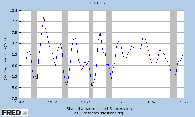
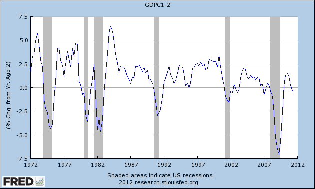
This post continues the re-examination of my January forecast. It has been contended that whenever YoY GDP growth declines below 2%, a recession inevitably follows. We have had real GDP growth under 2% YoY for 3 quarters now, therefore we are on the cusp of another recession. Is that true?

In a word, no.

Below are two graphs covering the entire period from 1947 to the present, showing real GDP on a YoY basis, minus 2%. Thus any period of real GDP growth under 2% is converted into a negative number. First, here's 1947 to 1972:


Now, here's 1977 to the present:


Notice the following:
- (1) in 1953, there was one YoY period that came in very slightly under 2%, and yet did not lead to a recession.
- (2) in 1996, there was a near miss, where GDP came in just barely above 2%, and yet there was no recession.
- (3) with the sole exception of 1956, at no time was there more than one quarter of growth under 2% before a recession.
- (4) otherwise, there was only one quarter of GDP growth under 2% before the recession began - in 1980 and 2007.
- (5) in 2002-03, there were four of five quarters in a row that featured YoY GDP growth under 2%. Not only did no recession follow, what did immediately follow was the strongest growth of the decade.

In short, there have been two periods previous to the present of growth meandering above and below the level of 2% GDP for substantial periods of time. On one of those occasions, a recession followed. In the other, it did not. Otherwise, growth either resolved very quickly into a recession after no more than one quarter of growth under 2%, or else stronger growth immediately resumed.

At least one forecasting firm, referring to a coincident index rather than GDP per se, responded to an email from a reader of Mish's blog in relevant part as follows:


If you look at all the occasions in the last 50-plus years when [ ] growth fell to 2.0% or below (marked in red), it is clear that recessions began around those dates (obviously, we don’t include the occasions when [ ] growth had risen through 2.0% following the recessions [before falling back below 2%]).
[my emphasis]

It is important to realize that the bolded language above reflects a purely subjective judgment. In 2002, nobody knew if we were "following a recession" or not. In fact, there was very serious commentary at the time arguing that we were indeed in danger of a double-dip. For example, here's the subtitle and lede paragraph from a CNN Money article on March 31, 2003, entitled "Is this the Second Dip?":


Recent economic numbers show contraction has already begun.

Investors may not have to worry about whether the economy might plunge back into recession for much longer. Increasingly, it looks as though the plunge has already begun.
In short, only in retrospect did we know that we were "following a recession."

ECRI's Coincident Index follows a similar pattern and has the same issue. The YoY change in their index has only fallen below 2.0% for one month - January of this year - before rebounding to 2.4% in February. By contrast, after the 2001 recession ended, it meandered below 2% YoY for 24 months before finally resolving higher.

Today in 2012, are we still "following a recession" or not? The difference between now and 9 years ago is that we are 2 years+ rather than 1 year+ following the trough of the last recession, and intervening growth was stronger now than then. Any forecast that makes the judgment to set aside the 2002 data on that basis is necessarily making a judgment call, and is therefore subjective.

So, with current real YoY GDP meandering just below the 2% level, is an imminent recession a certainty? Post-WW2 data contrasting 1956 vs. 2002 indicates, to the contrary, that it a coin-flip.

Disposing of the garbage from the King Report and Art Cashin

- by New Deal democrat

I dislike cherry-picking data. It almost always means that the writer started with a conclusion and reasoned backward to find support.

There is some particularly egregious cherry-picked garbage that started with the King Report; namely, that December 2011 through February 2012 non-seasonally adjusted data showed that we have lost 1.8 million jobs. Therefore, presumably, the jobs picture is actually quite bleak. This then got repeated by Art Cashin on CNBC.

Our former co-blogger Invictus eviscerated this claim over at Barry Ritholtz' Big Picture. For the record, beginning with December 2000, here is the December through February change in the non-seasonally adjusted payrolls survey:

2001 -2212
2002 -2402
2003 -2273
2004 -2050
2005 -1880
2006 -1728
2007 -2105
2008 -2519
2009 -3939
2010 -2432
2011 -2037
2012 -1801

Note that once we strip out the seasonal adjustments, the last two months of job data have been the best bar once in the last 12 years.

Apparently undeterred, when called on it, instead of just admitting he goofed (nobody's perfect after all), Cashin doubled down, claiming that he was simply following Lakshman Achuthan's lead in not accepting seasonal adjustments since the recession and looking at YoY data.

In the first place, Achuthan's rejoinder to my critism of ECRI's recent recession call defense - that recent seasonal adjustments following the 2008 recession may be overstating wintertime growth - besides being cherry-picking itself, since ECRI apparently has not historically primarily relied on this mode of measurement, overstates the conclusion that should be drawn. If we're not sure we can trust seasonal adjustments, and they conflict with YoY data, that does NOT mean we should accept the YoY data as the more reliable picture of the present condition. It means that WE DON'T KNOW which way of looking at the data is more accurate in depicting the present condition.

But let's accept Achuthan's criticism, and accept YoY nonfarm payrolls each February since 2000 as presenting the truer picture. Here's the result, again derived directly from the UN-seasonally adjusted data:

2001 1670
2002 -2028
2003 -409
2004 316
2005 2219
2006 2692
2007 1754
2008 715
2009 -5042
2010 -3568
2011 1402
2012 2016

On a YoY basis, the last 12 months have seen the 3rd best job growth in the last 12 years.

There is not a shred of credibility in the claim made by the King Report, the original Cashin claim, or the revised Cashin claim. Rather than repeating the claims at other business sites, it's time to throw out the garbage.

Morning Market Analysis


Let's start with the treasury market, where we've seen a sell-off across the curve.  From a technical perspective, what's important with these charts is the degree of overall technical damage.  All the shorter EMAs are now moving lower; the MACD's are negative, money is flowing out and the Bollinger bands are widening, indicating increased trading volatility.  Expect a rebound into the respective Fib level of the 10 day EMA as a rebound trade, followed by either a technical consolidation or more lower.

Yesterday, I noted the Chinese market should be cause for concern.  Let's look at two other developing markets.


The Indian market is consolidating, and has been since the end of February.  On the good side, we see in increased volume flow.  However, the shorter EMAs are negative and the MACD is declining.  Also note the prices are consolidating around the 200 day EMA, which is the delineation between bull and bear market.


The Brazilian market has broken through resistance, but its overall momentum has stalled.  Prices are drifitng lower, although their move lower is very disciplined.


The Russian market is very similar to the Brazilian market.  It's broken through resistance, by is now consolidating right around the 200 day EMA.

The lack of upward momentum in the BRIC markets leads to the question; can the US markets -- which are in a decent rally -- continue to move higher, or will the lack of upward move in these markets pull the US down?


Wednesday, March 21, 2012

1955: PCEs


The chart above shows the percentage contributions that PCEs contributed to GDP growth and the contribution of various PCE sub-categories to overall growth.  Notice the large increase in durables in the first two quarters of the year.  This number decreased a bit in the third quarter and went negative in the fourth.  Non-durables contributed in the second and fourth quarters while services picked-up in the third and fourth.

The above chart shows the importance of pent-up consumer demand.  As the US moved into the heart of the 1950s expansions, jobs were plentiful, leading  to more income.  This in turn led to people buying more things.  The table below really shows the growth:


The above chart shows the relationship between disposable personal income and PCEs.  DPI increased strongly in the year, largely thanks to collective bargaining agreements with various unions throughout the year. The low rate of unemployment also helped.  From the Economic Report to the President, 1955:


Notice the durables goods rose a bit, but remained at a lower percentage of total PCEs. This is the natural development of the economy becoming more centered around the home.  As people moved into more and more houses, they wanted more and more non-durable goods (clothes, etc...) and services (repairmen etc..).  This is one of the primary reasons why housing is so important to an economic expansion -- it creates a tremendous number of ancillary benefits.

The Economic Report to the President Explained it thusly:


The above two charts show that consumer credit was an important part of the expansion.  The top chart shows the importance of mortgage credit outstanding, along with the government's promotion of home ownership as a policy goal.  The lower chart shows other consumer credit, and also shows a tremendous amount of growth.