Monday, July 6, 2009

Just "Shoot" Me Part II

This is from Invictus

Those who may have followed my work over at Blah3.com for the past few years know that I have the utmost respect for ex-Merrill Lynch economist David Rosenberg. The reasons are twofold – Rosie always calls it as he sees it and he peels the onion many layers – not just one or two – to expose data and trends that aren’t apparent to the casual analyst or economist (the analogy’s a good one, since what he uncovers often does make me cry). Therein lies Rosie’s true genius. You can expect that I will continue to make reference to his outstanding work as I participate here with Bonddad.

His recent work continues that pattern, and much of what appears below is based on some of Rosie’s recent writings.

First, let’s look at a stat that has gotten widespread attention (not a lot of sleuthing required to uncover this one): the savings rate (as percent of Personal Disposable Income).


The repair of Americans’ balance sheets (following unprecedented wealth destruction via stock market and real estate declines) is going to require ongoing increases in the savings rate. This trend is underway, and will continue for some time to come.

In addition to replenishing their diminished savings, Americans seem to have concluded that, at least for the time being, less debt is better than more debt, as this chart attests:


(Data: St. Louis Fed, Series TDSP)
While Americans are saving and paying down debt, it appears they will likely be spending less. Here is a graph of Personal Consumption Expenditures (PCE) on a year-over-year percentage basis:


Year-over-year PCE has gone negative for the first time ever.

So consumers are truly hunkering down, saving more and spending less. If they are to spend more at some point (and not just tread water on essentials), either incomes will likely have to rise or balance sheets will have to be sufficiently repaired through continued savings. (Those who argue that the government should similarly tighten its belt always seem at a loss to explain how the economy will grow if no one – consumers, states, municipalities, federal government – is spending money, but that’s another story, I guess.)

So how does income look? Here is one component of BEA’s Personal Income release – Line 3 of Table 2.6, Wage and Salary Disbursements (shown in YoY Pct change):


The bottom line is that wage deflation is no longer something to be feared down the road – it’s here right now.

Well, you ask, if wages and salaries aren’t rising (which they aren’t), is there a component of Personal Income that is rising? Yes, there is – it’s Government Transfer Receipts (shown as a Pct of Income):


Wages and salaries going down. Government transfer receipts going up. Is this a recipe for renewed consumer spending growth? Are the people who are earning less going to be spending more? Are people who are receiving assistance from the government going to be using said assistance for discretionary purposes? I think the answer to all three questions is a resounding “no.”

Perhaps the most interesting piece of work Rosie produced recently was an analysis of how many unemployed individuals we currently have for each job opening. Rosie looked at the Job Openings and Labor Turnover Survey (JOLTS) data from the BLS and the number of unemployed (also via the BLS). Here’s what that ratio looks like:


Rosie refers to this as “The Truest Picture of Excess Labor Supply,” and it’s hard to argue with that description. The Household Survey reports about 14 million unemployed, and the JOLTS reports about 2.5 million current job openings. Scary stuff.

There are many secular – not cyclical – cross-currents rippling through the United States right now. Much of what is happening is going to have long-lasting effects on what our economy looks like (see the July 5th NY Times for a story titled “Say Hello To Underachieving,” a cautionary tale about how even summer internships have dried up).

I mentioned previously that I hope to do some work on how our demographics will continue to have a negative influence on what our economy looks like going forward. Stay tuned for more on that.

Market Mondays

Welcome back from a long weekend. I wish I had better news. However, the market looks poised for a correction. Consider the following:


The MACD has been falling as the SPYs made new highs. That is never a good technical development. And, notice the SPYs are in a clear head and shoulders trading pattern -- and that we are in the middle of the right shoulder.


Also note that as the market made new highs the on balance volume didn't increase at all. That tells is that the new highs were made on less than strong volume.

Consider these charts of the other large averages:


On both charts the MACD was declining as the markets were making new highs. These types of technical divergences tell us the probability of a lower market is pretty high.

According to Stockcharts performance analysis, the two best performing market sectors over the last half year were the XLBs and XLKs. Consider these charts:


Like all the major averages, the XLBs have seen a declining MACD. In addition, we also have a declining RSI.


And the XLKs also have (you guessed it) a declining MACD.

There are a lot of big technical divergenses in the market right now -- not only in the averages but in the biggest moving sectors of the year. That tells us the probability of trouble ahead it pretty high.

Saturday, July 4, 2009

The State of the Economy, Independence Day 2009 (II. and III.)


- by New Deal democrat
In this "Big Picture" look at the economy as of Independence Day 2009, I argue that:

1. Right now, production and consumption in the economy are stabilizing, but job losses and unemployment continue to accumulate at an alarming level, with wages perilously poised to enter deflation soon if matters don't turn around quickly.

2. Three out of the five long term imbalances in the economy have made great strides toward an improved equilibrium, completing most of the necessary adjustment. On of the other two is improving temporarily, but probably not in the long term yet. The final one is as bad or worse than before the Recession began.

3. Despite much bad current news, and in particular the poor jobs report on Friday, Leading Economic Indicators will most likely have their third month in a row of substantial gains for June when reported later this month, suggesting that the Recession will bottom around Labor Day, give or take 2 months. A second long-established and highly-regarded private source suggests recovery is imminent, while a Third suggests renewed weakness.

4. The biggest threat to the beginning of GDP growth and a decrease in the misery of average Americans is the "Fifty Little Hoovers" of balanced state budgets, and in particular the disaster that is California. There is one specific policy that I believe the Obama Administration should enact and implement immediately.


Parts I and IV of this series can be read at The Economic Populist

II. The Recession is at least bringing about the necessary readjustment in 3 of the 5 long-term economic imbalances

We are going through a very painful period. But at very least there is the silver lining that usual market forces are working to rectify some very long-term unsustainable imbalances about which many have warned for several decades.

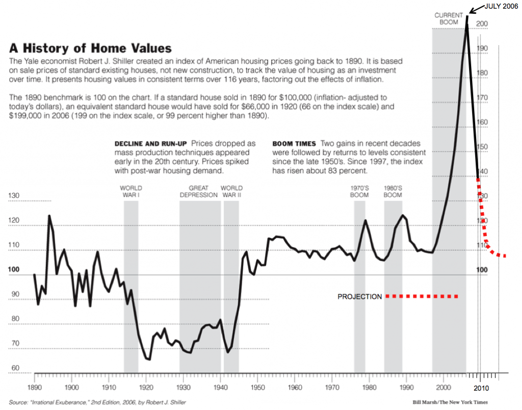
1. Housing prices are returning to their normal long-term equilibrium as indicated in this update graph covering 100+ years of home prices (h/t Stever Barry via Barry Ritholtz):

Affordability metrics have never been more favorable. The "Housing Affordability Index divides the price of the median house with that of a regular 20% down mortgage available to a household with the median income):

As Bonddad says, "Housing is Nowhere Near a Bottom" at least in price, but the bust is working through the problem.

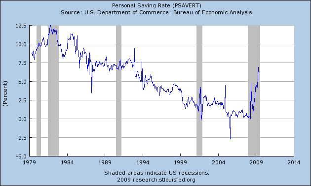
2. The mirror image for the declines of consumption graphed in Part I above is the household savings rate. This had been at 0% during the last few years, but has abruptly increased to nearly 7% as of last month:

This is about 3/4 of the way to the normal, pre-bubble rate of 8%-9%. There is undoubtedly some further rebalancing to go, but most of the adjustment here has already been made by consumers. This bodes well for a pick-up of consumption if it is sustained and if consumers gain more confidence about the future.

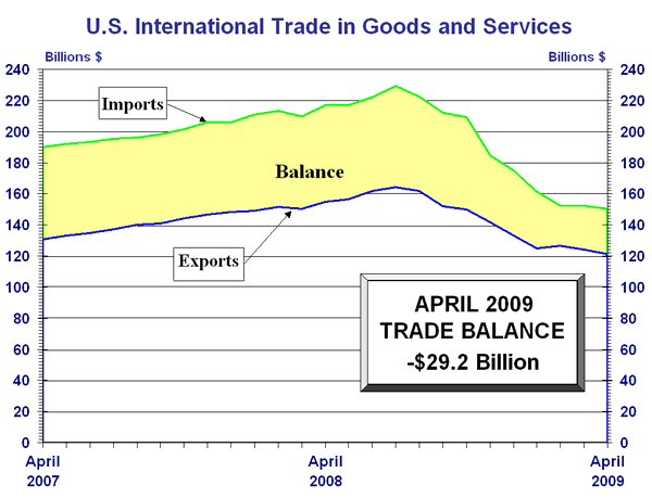
3. The trade deficit has shrunk dramatically. The two biggest imbalances in the deficit have been Oil and China. Both of these still exist, but both have shrunk, as shown by this graph:

Of all of the deficits, the trade deficit is the one that is most crucial, as it acts as a drain on the entire US economy, transfering wealth from us to China and Petrosheikhdoms. Much more needs to be done here, but at least market forces are working the way they are supposed to.

If the above three imbalances are shrinking, two others are problematical, and one of them has been exacerbated in a way that is dangerous to our future if not properly addressed as soon as circumstances permit:

4. In 2006 the Congressional Budget Office reported record disparity in incomes:
Typically in a recession, the stock and housing portfolios of the wealthy have been hard hit, temporarily reducing that inequality as shown in the below graph showing the effects of the 2001 recession:

There is every reason to believe that the same reduction has taken place in this recession -- a dreary reduction of inequality solely because wealth across the board has declined, but relatively moreso for the wealthiest -- but as recent record payouts at Goldman Sachs demonstrate, CEO and financial sector pay continues to be a blight of inequity on our society.


5. Finally, the deficit and the national debt have exploded.

While this may be a temporary necessity as a response to near-depression like circumstances, we are running out of room, as the Chinese attempts to relegate the dollar to former reserve currency status are showing. If all of the stimulus and bailout money goes to waste, or to Wall Street, we will have spent our way into a long-term spiral of Latin American style decline. Paul Krugman has argued that it is important not to return to balanced budgets too soon, but certainly once the danger has passed, this must be a very high priority. If it is not done, the next 30 years will likely see a slow inexorable climb in interest rates choking off any meaningful economic growth.


III. Despite the continued gloomy employment and unemployment data, Leading Economic Indicators still look poised for expansion

The Index of Leading Economic Indicators, with a 5 decade history, was formerly kept by the Commerce Department until its computation and makeup was outsourced to the Conference Board about a decade ago. The 10 indicators, with the weights given each indicator, are as follows:

- real money supply (35%)
- average weekly manufacturing hours (25%)
- interest rate spread (10%)
- manufacturers' new orders for consumer goods (8%)
- supplier deliveries (7%)
- stock prices (4%)
- consumer expectations (3%)
- building permits (3%)
- average weekly initial claims for unemployment insurance (inverted) (3%)
- manufacturers' new orders for durable goods (2%)

In April and May, the LEI surged more than 1% a month, coming within striking distance of breaking even year over year.
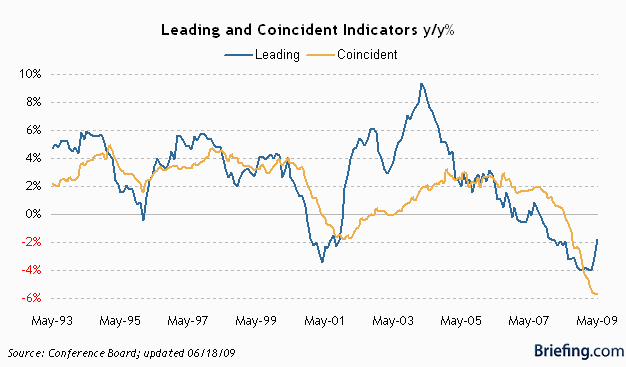
Although June's number won't be reported for several more weeks, we already know what by weight over 90% of the above will be! Real money supply was very strong at the end of last year, and generally has continued to grow slowly as the Fed continues to re-liquify (or re-solvenc-fy) the banking system. We won't know for sure until June's inflation report is in, but most likely this will be slightly positive. Given the uncertainty, I will count this as a neutral. Average weekly manufacturing hours, which had been dropping like a lead weight earlier this year, as reported above in Part I have stabilized and actually went up slightly in June. The yield curve is even more strongly positive than before, due to the backup in long term rates while short term rates are still essentially 0%. Manufacturers' new orders for non-consumer goods increased significantly as of the last report (which will actually revise May's report higher). Supplier deliveries as measured by the ISM continued to increase slightly. Stock prices (over the last 90 days) are still up, although not as strongly as last month. Consumer expectations about the future as measured by the U. of Michigan sentiment survey have gone sideways, decreasing slightly in June. Average initial claims for unemployment insurance were basically flat for the month, but the June average was a slight decline since May (fewer new claims is good). Manufacturers' new orders for durable goods were reported as surprisingly and sharply higher a couple of weeks ago (which should also revise May's report higher).

By weight, that's 55% positive, 35% neutral, and 7% negative. (Building permits, at 3%, haven't been reported). If I had to guess, right now it looks like June's LEI will be reported at ~ +0.8%. That will be three straight months of positive LEI, the traditional signal that GDP growth is very near at hand. If LEI simply go sideways for the next couple of months, the very bad readings of July and August 2008 will be replaced and year-over-year LEI will be positive. For that reason I believe that it remains the most likely outcome that the Recession will officially have hit bottom at about Labor Day (give or take a couple of months).

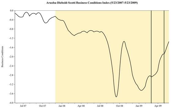
There are two other Indeces of future business condition indicators. On of them, the Economic Cycle Research Institute, has a history and database of over 100 years (meaning their reports cover the Great Depression and other deflationary busts before it). Here is their most recent report, as of last week:

A gauge of future U.S. economic growth stood unchanged in the latest week but its yearly growth rate climbed to an almost two-year high, reaffirming hopes that the grips of deep recession are loosening, a research group said on Friday.

The Economic Cycle Research Institute['s] ... annualized growth rate, which finally entered positive territory last week, spiked to just under a two-year high of 4.0 percent from its previous rate of 2.1 percent.

It was the growth rate gauge's highest yearly reading since the week ended Aug. 3, 2007, when it stood at 4.3 percent, bringing a solid end to its 22-month stretch in the red.

The other report, from the Philadelphia Fed, ijs a mixed leading/coincident index meant to reflect on-the-ground business conditions. This index was sharply revised, not just for the last week or month, but almost 4 months (which doesn't really make it "leading" anymore) based primarily on the July payroll data:

Here is how it looked as of Friday:
Per the Philly Fed, the Friday payroll number was entirely responsible for the downturn at the end.

Here is how it looked only a week before:
Needless to say, Friday's jobs report and the continuing new jobless claims are weighing heavy on this index. It is impossible to imagine any upturn beginning with 600,000 new unemployment claims week after week and 400,000 job losses a month. Which brings us to the concluding Part IV of this series.

Thursday, July 2, 2009

Weekend Weimaer and Beagle

The markets are closed tomorrow and I'm on vacation in New Orleans. I and the rest of the crew will be back on Monday. Until then -- have a safe weekend.

Oh yeah -- I'm using another computer so I don't have pictures of the kids for you.

Just "Shoot" Me

This post is from Invictus

David Rosenberg, ex of Merrill Lynch, now of Gluskin Sheff, really crystallized what the “green shoot” crowd is missing in his daily memo of June 29 (all emphasis mine):

Most pundits who crow about green shoots and about an inventory restocking in the third quarter giving way towards some sustainable economic expansion live in the old paradigm. They don’t realize, for whatever reason, that the deflationary aftershocks that follow a post-bubble credit collapse typically last for 5 to 10 years. Businesses understand better than the typical Wall Street or Bay Street economist and strategist that everything from order books, to output, to staffing have to now be restructured to adequately reflect a permanently lower level of leverage in the economy.

He followed that up with this comment on the 30th:

I still find that most sell-side analysts live in the old paradigm of a classic manufacturing inventory cycle as opposed to a deleveraging credit contraction cycle, which typically takes years to resolve in terms of transitioning to the next sustainable expansion and bull market. Many economists are excited because auto sales seem on the verge of testing 10 million units, on an annual rate, when replacement demand is closer to 12 million — nobody is making money at that level of auto sales.

Rosenberg is making a key point: This is not the type of recession we have become accustomed to in the post-war era, and consequently will not play out as others have. Compounding that fact – and on a topic I hope to explore further soon – our demographics, frankly, suck. The “baby-boom” generation – those born between 1946 and 1964, the “pig in the python” – now has a median age of around 52 and is not in a position to consume as they did in the 2001 recession (median age: 44) or the 1990 recession (median age: 33). This is why all the hoopla over the last ISM print –“Every time it’s passed ~42 on the upside, recessions have ended” – is misguided.

Okay. Having gotten that out of the way, I want to focus a bit on the “green shoots” – those tidbits of data indicating a slower rate of descent – versus the reality of what the National Bureau of Economic Research’s Business Cycle Dating Committee actually look at.

In its most recent recession announcement (Dec. 2008), the NBER laid out – very specifically – some of the metrics they look at, where they’re found, and in some instances how they’re calculated. So, without further ado, here’s what they are and what they look like (commentary follows):


FRB index B50001


BEA Table 1.1.6, line 1


BEA Table 1.10, line 1, divided by BEA Table 1.1.9, line 1


BEA Table 2.6, line 1 less line 14, both deflated by a monthly interpolation of BEA Table 1.1.9, line 1 (Note: I used a different method of deflation – the NBER’s “interpolation” is cumbersome – that is used by the St. Louis Fed, and I spoke to one of their reps prior to doing the calculation.)


BLS Series CES0000000001


BLS Series LNS12000000


Census series tbtsla, adjusted, total business, deflated by monthly interpolation of BEA Table 1.1.9, line 1 (Note: This was also deflated differently, but in keeping with the St. Louis Fed’s work.)


AWHI, though not specifically mentioned by the NBER, is watched closely by BCDC member professor Jeff Frankel. He has written about it several times at his blog. (Hours typically precede bodies, both to the upside and to the downside.)

In a nutshell, one metric – Personal Income less Transfer Payments (adjusted for inflation) – is flatlining. Not rising, just flatlining. That’s it. So, for all the “green shoots” and “less bad” releases we’ve seen of late, I don’t see much in the world of NBER data that’s cause for celebration. The NBER is interested in peaks and troughs, not flatlines. Until we start seeing some clear signs of troughs (i.e. metrics actually improve and don’t just flatline), I’m dubious of any claims that the recession has ended.

Today's Market


Click for a larger image

This is something I've been wondering/observing about for the last few weeks. Is the market forming a head and shoulders top? As the chart shows, there's a pretty clear left shoulder and head on the chart now. All we need is the right side.

If you think about it, this patter would make a bit of sense right now. We're had a really strong rally and are now topping. However the market is also waiting to see if the forthcoming economic news is strong enough to warrant a further move higher. Hence we get a sideways market which would fit in with the head and shoulders pattern.

Wednesday, July 1, 2009

Today's Market

I'm in the air to New Orleans and will post this in the morning.

Challenger Job-Cuts Report Shows Better Numbers

From CNN.Money:

The pace of U.S. job losses has significantly slowed, according to a report released Wednesday.

Outplacement firm Challenger, Gray & Christmas Inc. reported that the number of job cuts announced in June fell for the fifth straight month, after reaching a seven-year high in January.

Challenger said job cut announcements by U.S. employers totaled 74,393 in June, a 33% decline from May. It was the lowest total since March 2008 and 9% lower than the number of job cuts announced in the same month a year ago, according to Challenger.

"This recent drop-off may be indicative of an overall downward trend in layoff activity," said John Challenger, chief executive officer of Challenger, Gray & Christmas said in a statement.


Here's the chart:


This is a chart that first caught my eye about two months ago. It indicates the worst of the initial unemployment claims is probably behind us for now.

Chicago PMI Mixed

Click for a larger image


Here is a link to the report

The main issue is the the indexes appear to be in a three month range for the last three months. This is after increased in February and March. Also note that some of these numbers are the highest since last fall. However, it's also important to remember these numbers are rising from very low levels.

Janet Yellen on Inflation

From a recent speech:

Let me now turn to an issue that has lately garnered a great deal of attention—inflation. Just a short time ago, most economists were casting a wary eye on the risk of deflation—that is that prices might drop, perhaps falling into a downward spiral that would squeeze the life out of the economy. Now, though, all I hear about is the danger of an outbreak of high inflation.

I’ll put my cards on the table right away. I think the predominant risk is that inflation will be too low, not too high, over the next several years. I take 2 percent as a reasonable benchmark for the rate of inflation that is most compatible with the Fed’s dual mandate of price stability and maximum employment. This is also the figure that a majority of FOMC members cited as their long-run forecast for inflation, according to the minutes of the committee’s April meeting.

First of all, this very weak economy is, if anything, putting downward pressure on wages and prices. We have already seen a noticeable slowdown in wage growth and reports of wage cuts have become increasingly prevalent—a sign of the sacrifices that some workers are making to keep their employers afloat and preserve their jobs. Businesses are also cutting prices and profit margins to boost sales. Core inflation—a measure that excludes volatile food and energy prices—has drifted down below 2 percent. With unemployment already substantial and likely to rise further, the downward pressure on wages and prices should continue and could intensify. For these reasons, I expect core inflation will dip to about 1 percent over the next year and remain below 2 percent for several years.

If the economy fails to recover soon, it is conceivable that this very low inflation could turn into outright deflation. Worse still, if deflation were to intensify, we could find ourselves in a devastating spiral in which prices fall at an ever-faster pace and economic activity sinks more and more. But I don’t view this as likely. The vigorous policy actions of the Fed and other central banks, combined with sizable fiscal stimulus here and abroad, have sent a clear message that deflation won’t be tolerated. Based on measures of inflation expectations, the public appears confident that the Fed will adopt policies that will maintain a low, positive rate of inflation. Evidently, the credibility that the Fed and other central banks have built over the past few decades in bringing inflation down has spilled over into a belief that we won’t allow inflation to get too low either. This does not mean that a short episode of deflation couldn’t occur, but it makes a prolonged and devastating deflationary spiral less likely.

None of what I just said will satisfy those who worry about inflation. Indeed, if you listen to popular business news channels, you might hear a drumbeat of concern that the Fed could let inflation get too high. Those who hold this view point to the rise in Treasury yields and commodity prices this year as signs that runaway inflation is on the horizon. They muster three arguments. The first is that the Fed has pumped up the money supply and expanded its balance sheet to fund its financial rescue programs, potentially igniting inflation. The second is that the Fed runs the risk of repeating the errors of the 1970s by focusing on mistaken views of economic slack rather than rising prices. The third is that large fiscal budget deficits will create higher inflation. I take all of these concerns very seriously and will address each in turn.

First, I’ll talk about the Fed’s balance sheet. As I discussed earlier, the Fed has taken a number of strong steps to avert a financial and economic meltdown, and to support the flow of credit. These policies have caused the assets on the Fed’s balance sheet to more than double, from under $900 billion at the start of the recession to over $2 trillion now. This expansion is largely financed by increases in bank reserves, that is, surplus cash that banks deposit with us. Some worry that the Fed’s balance sheet expansion is pumping money into the economy and will be inflationary. But, as I will explain in a moment, we have the tools needed to tighten policy and head off future inflation. There is also some concern that the Fed could be trapped by conflicting goals if, at some point, a growing economy requires a higher federal funds rate, before credit markets are fully healed. Finally, some worry that the Fed may lack the political will to tighten policy when the time comes.

I will be the first to say that it is always difficult to get monetary policy just right. But the Fed’s analytical prowess is top-notch and our forecasting record is second to none. The FOMC is committed to price stability and has a solid track record in achieving it. With respect to our tool kit, we certainly have the means to unwind the stimulus when the time is right. Many of the special programs we developed to provide emergency credit to the financial system are already tapering off as market conditions improve. Many of the assets that we have accumulated during the crisis, such as Treasury and mortgage-backed agency securities, have ready markets. And the Fed can push up the federal funds rate by raising the rate of interest that we pay to banks on the reserve balances they have on deposit with us—authority that was granted to us by Congress last year. An increase in the interest rate on reserves will induce banks to lend money to us rather than to other banks and borrowers, thereby pushing up the federal funds rate and other rates charged to private borrowers throughout the economy. The ability to pay interest on reserves is an important tool because, as I mentioned, it’s conceivable that, even if the economy rebounds nicely, the credit crunch might not be fully behind us and some financial markets might still need Fed support. This tool will enable us to tighten credit conditions even though our balance sheet wouldn’t shrink.

Let me turn to the second concern, that we could have a rerun of the stagflation of the 1970s. Some economists have argued that the Fed misjudged how low the unemployment rate could go without igniting inflation and, as a result, lowered the federal funds rate too far for too long, an overly accommodative stance that contributed to runaway prices. 6 This is an issue we have studied in great depth, looking at a wide range of data sources and using a variety of techniques to estimate slack in labor and product markets. Not surprisingly, these estimates vary. But they all plainly show that labor and product markets are currently operating well below the levels that would trigger inflation. We must beware of overconfidence that we have too precise a handle on these questions. But, to me, the evidence is clear that the economy has substantial slack and we are far from the kinds of unemployment rates that would make inflation a danger.

The third concern is that big federal budget deficits might eventually be inflationary. In my years of teaching at Berkeley, I regularly lectured on the relationship between fiscal deficits and inflation. A glance at history shows that many countries with massive structural deficits and without an independent central bank turned to the printing press to pay off their debts. That’s a recipe for high inflation and, in some cases, hyperinflation.

But I don’t believe the United States faces that threat. Looking back in history, runaway fiscal deficits have often been accompanied by high inflation. 7 But, since World War II, such a relationship has only held in developing countries. 8 In countries with advanced financial systems and histories of low inflation, no such connection is found.

Wednesday Commodities Round-Up

Click on all images for a larger image


While the weekly chart is still in an uptrend, prices are right at longer-term support. However, the MACD and RSI are still rising. Also note the EMA picture is jumbled -- while all are heading lower the main issue is there is a great deal of congestion suggesting a fair amount of confusing about where traders want to send the market.


The daily chart shows a major correction that is moving the market lower. Notice the MACD and RSI are both moving lower in a big way. Also note the 10 day EMA has crossed below the 50 and the 20 is about to do the same. That tells us their is a pretty high probability of the market moving lower.


Industrial metals are still in a rally -- the MACD and RSI are still rising. Also note the 10 and 20 day EWA are moving higher and are providing technical support for the rally. Finally, prices are consolidating right below the 50 day EMA.


This chart shows that prices are still in a solid uptrend as evidenced by the very bullish EMA pictire -- all the EMAs are moving higher and the shorter EMAs are above the longer EMAs. Prices are currently consolidating in a triangle pattern.

Tuesday, June 30, 2009

Today's Markets

This is really interesting.


Prices moved into the 20 day SMA and bounced lower. However


Prices are using the 20 day EMA for technical support. Interesting....

Case Shiller Drops


Click for a larger image

There is a lot of "excitement" regarding the upward movement of the graph. Notice this is the first upward move in quite sometime. And -- most importantly -- it's only one month. As a result it's important to not get carried away. It's good news, but it is only one data point in a long series of data that move in the other direction. In addition consider this chart:


Click for a larger image.

I encircled the cities that had a 10% or less year over year price decline. Notice there aren't that many of them. That's an important point here. When that number is larger -- say 10 -- then I'll get excited.

Consumer Confidence Drops


From the Bonference Board:


Consumers' appraisal of present-day conditions was less favorable in June. Those claiming business conditions are "good" decreased to 8.0 percent from 8.8 percent, while those saying conditions are "bad" increased to 45.6 percent from 44.5 percent. Consumers’ assessment of the labor market was also less favorable. Those stating jobs are "hard to get" increased to 44.8 percent from 43.9 percent. Those saying jobs are "plentiful" decreased to 4.5 percent from 5.8 percent.

Consumers' short-term outlook also waned in June. Consumers anticipating an improvement in business conditions over the next six months decreased to 21.2 percent from 22.5 percent, while those expecting conditions will worsen increased to 20.2 percent from 18.0 percent in May.

The job outlook was also more pessimistic. Those anticipating more jobs in the months ahead decreased to 17.4 percent from 19.3 percent, while those anticipating fewer jobs increased to 27.3 percent from 25.6 percent. The proportion of consumers expecting an increase in their incomes declined to 9.8 percent from 10.8 percent.

Notice that within the various sub-categories we have a slight movement from positive to negative. But the move is slight (at least so far). If we have another 2-3 months of data then I'll be concerned. But a reading of the data indicates this is a slight shift as opposed to a majov move.

A Closer Look At Personal Consumption Expenditures


Notice the following on the above chart:

1.) PCEs fell out of bed last year -- notice the high month over month and year over year drops.

2.) This year PCEs have returned to more "normal" month over month increases.

3.) The year over year number appears to be bottoming.

This is the same pattern retail sales have displayed. Consumers stopped spending last year and have now returned to the market in a more limited manner.

Treasury Tuesdays

Click on all images for a larger image


The Treasury market continues to rebound. Notice that prices have been rising since roughly mid-June. Also note that prices are above the 10 and 20 day EMA and are just below the 50. Also note the 10 day EMA is about to cross over the 20 day EMA -- another bullish signal. In addition,


The MACD is rising as is


The on balance volume -- indicating more people are moving into this security.

Monday, June 29, 2009

Today's Markets


Yes the markets are moving higher. However, notice the lack of volume over the last two days. That's does not bode well for a stronger move higher.


The daily charts shows two interesting points.

1.) Most of the price moves came at the beginning of the session.

2.) There was a heavy volume surge in the last 10 minutes of trading that didn't move the market higher.

An Economic Chicken And Egg Story

I really wish we could all wake up tomorrow (or today which would be better) and see headlines like "the economy is returning to 4% growth and unemployment is at 5%". Unfortunately that is not going to happen. In economics certain things usually happen before other things. To that end, below is a discussion about when jobs will come back.

Let's start with the conclusion of a Fed letter from the San Francisco Federal Reserve:

What does all this mean for the course of the labor market? We combine data on involuntary part-time workers with the standard unemployment rate to arrive at an alternative measure of labor underutilization. We plot this measure in Figure 3, which shows that the labor market has considerably more slack than the official unemployment rate indicates. The figure extends this labor underutilization measure using the Blue Chip consensus forecast for the unemployment rate as a benchmark and then adding a share of involuntary part-time workers based on the proportion of workers in that category to the unemployed during the current recession. This projection indicates that the level of labor market slack would be higher by the end of 2009 than experienced at any other time in the post-World War II period, implying a longer and slower recovery path for the unemployment rate. This suggests that, more than in previous recessions, when the economy rebounds, employers will tap into their existing workforces rather than hire new workers. This could substantially slow the recovery of the outflow rate and put upward pressure on future unemployment rates.


Here's the translation: there are a lot of people out of work and -- just as importantly -- a lot of people who are underutilized. That means that when the economy ramps up there are a ton of people who need work. That means it's going to take awhile for the unemployment rate to come back down.

At this point it makes sense to highlight a current argument about terminology -- what do you call the period between a return to positive GDP growth and the drop in umemployment? Is that really a recovery or another economic period that we need a new name for? Personally, I call it a recovery although I more than understand that others will understandably differ with that analysis. At this point it's a judgment call.

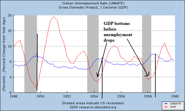
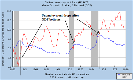
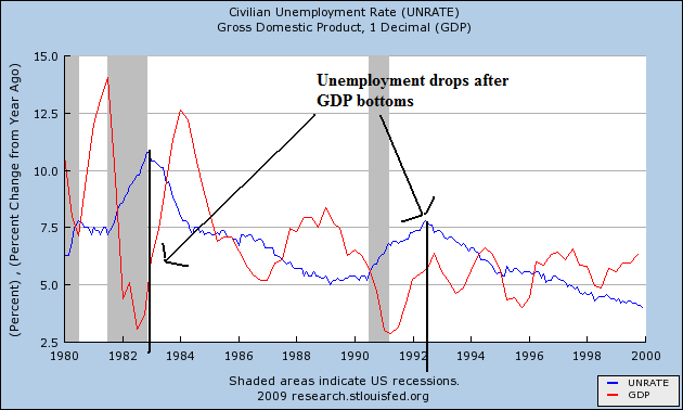
However, let's look at a simple economic fact. GDP has to turn positive in order for unemployment to start dropping. Below are three graphs from the St. Louis Federal Reserve. They show two data points: the yeare over year percentage change in GDP and the unemployment rate. With all recoveries save one (the one after the end of WWII) GDP has bottomed before unemployment started to drop. Notice that in the 1950s the length of time was fairly long. This difference contracted in the 1970s but returned in the 1980s and beyond. However, regardless of the length of time, it's important to note we need positive GDP growth before we start to think about a lowering unemployment.


This is one reason why the leading indicators are so important -- they occur before a recovery starts. And that's why the last two months of very positive news in that arena is so important:

The Conference Board LEI for the U.S. increased sharply for the second consecutive month in May. In addition, the strengths among its components continued to exceed the weaknesses this month. Vendor performance, the interest rate spread, real money supply, stock prices, consumer expectations, and building permits contributed positively to the index, more than offsetting the negative contributions from weekly hours and initial unemployment claims. The index rose 1.2 percent (a 2.4 percent annual rate) between November 2008 and May 2009, the first time the index has increased over a six-month period since July 2007, and the strengths among the leading indicators have become balanced with the weaknesses during this period.


Ideally what happens is the leading indicators increase, GDP turns positive and then unemployment drops. Now -- when unemployment drops is a big issue. But history tells us it drops after GDP turns positive. So, let's hope we see some growth soon.