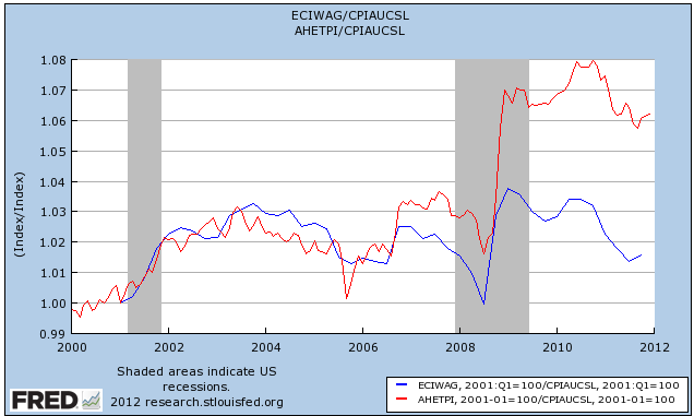
A week ago I published a surprising graph that showed that average (i.e., mean) wages for nonsupervisory workers had gone up almost 15% since 1995, even after adjusting for inflaiton. Here it is again
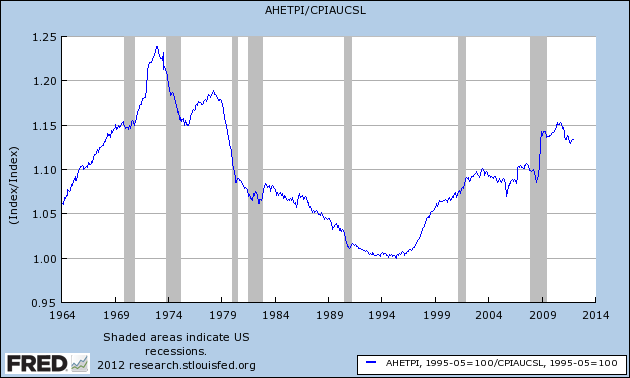
Since owners and managers are not included in the statistic, you can't just lay it off on the 99% vs. the 1%. Among the questions were, what has happened to the median (50th percentile) as opposed to mean wage? And what happens when we divide the workforce into quintiles by income?
It turns out it makes a lot of difference. [Note: special thanks to my co-blogger SilverOz for producing the below graphs]
To begin with, here is median income for the middle quintile since 1995 -- the low point of the graph above:
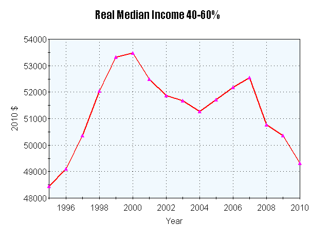
Measured at the median, there has been only about a 2% increase remaining as of 2010.
As you move up the income scale, things get better. Here's the quintile including the more affluent part of the middle class:
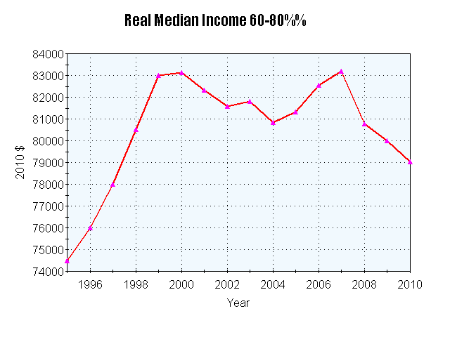
Even after the "great recession," this slice of the population is earning about 5% more than they were in real terms in 1995.
At the top end, the comparison is even more favorable:
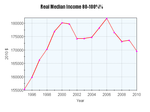
This group is still about 10% ahead of where they were in real terms in 1995.
At the other end of the pay scale, the lower income working class is actually earning about 1% less than they were in 1995:
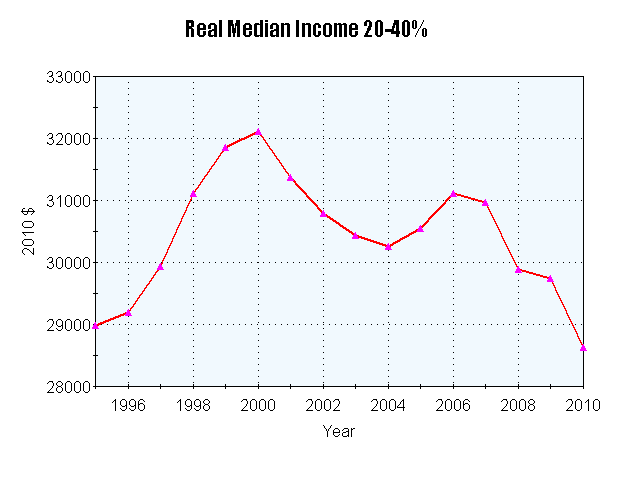
And for the poor and working poor, the compaison is even worse. They are earning 7% less than they were in 1995:
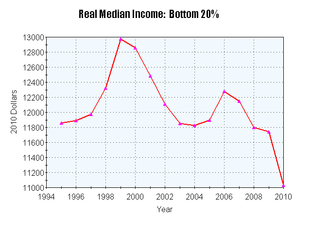
Measured from 1995 through 2010, the +$4500 increase in the affluent middle class and the $15,000 increase for the upper middle class and top income earners overwhelm the -$400 loss of the lower working class and the -$900 of the poor and working poor. This accounts for the difference between the average real wage and the median real wage.
It's also interesting to not that the tech boom of the late 1990s really was a rising tide that lifted all boats, whereas the Bush expansion was limited to the more affluent two quintiles. Since then, the great recession and its aftermath have affected the incomes of the highest and lowest quintiles the most.