- by New Deal democrat
Here are some graphs regarding initial jobless claims that I haven't updated in awhile.
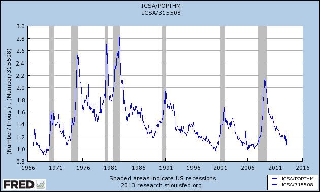
First of all, here are population adjusted initial jobless claims (i.e., jobless claims as a percent of the overall population. 300,000 claims vs. a 300 million population is something quite different than 300,000 claims vs. a 150 million population):

Initial claims normed by population are now among their best readings at any point in the last 40 years.
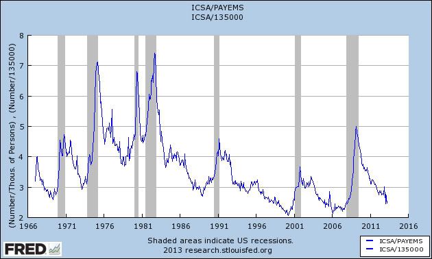
From time to time, I'll see comments elsewhere that initial jobless claims are only low because "there's nobody left to lay off." There's a little bit of validity to that criticism -- but only a little bit. Here are initial claims as a percentage of total nonfarm payrolls:

Not quite as positive as population-adjusted claims, but still well within the range of normal economic expansions.
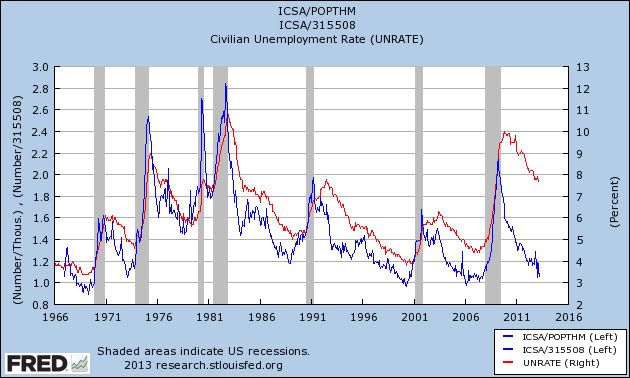
Next, as I've pointed out a number of times in the past, population adjusted initial claims tend to lead the unemployment rate. Here's the long term version of that relationship:

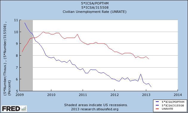
Here's the same data, starting in 2009. In 2009, the relationship blew out, but beginning in 2010, the relationship began to reassert itself, and initial claims tend to be leading the direction of the unemployment rate by a month or two:

This suggests we may see another tick down in the unemployment rate shortly.
Finally, recall that in each of the last two years, we've had a significant decline in the number of initial jobless claims in the first quarter, only to see a dramatic increase in the second quarter (red in the graph below):

This may be just coincidence, or an artifact of seasonality, or possibly related to the springtime increase in the price of gasoline. In any event, beginning in a week or two, I'll be watching to see if the pattern reasserts itself.