- by New Deal democrat
Following my post last week about how reports of income declilnes do not mesh with reports of wage stagnation or slight growth, I have done a lot more research. The research aren't finished, and is way too lengthy for one post. So let me just start by focusing on wages.
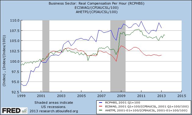
One thing I noted last week is that we have at least three separate economic data series to track wages: average wages, median wages, and wages per unit production hour. The first graph tracks all three, adjusted for inflation using the CPI as necessary. Average hourly wages are in green, median wages from the employment cost index are in red, and unit labor production cost are in blue. Since the quarterly index of median wages only started in Q1 2000, I have normed the indexes to 100 at that time:

As you can see, average wages have risen fitfully, mainly having to do with the price of gas (more on that below). Median real wages have essentially been flat for 10 years. This is certainly not what I would call good, given all the productivity gains during that same period. You need consumers to have the money to buy, before real growth in selling picks up as well.
But none of the above three series uses tax return data. In response to my critique of his work, David Cay Johnston pointed to analyses of tax returns as supporting his general thesis of contraction.
While we don't have access to individual tax returns, as Berkeley economists Piketty and Saez did, we DO have access to the Daily Treasury Statement of withholding taxes paid. These can give us a very good, if imperfect picture of how those below the 90th percentile are doing. That's because withholding taxes are capped at an amount, adjusted for inflation, that is at about the 83rd percentile of income. Since the top 10%+ of wage earners do not pay any proportionate increase in withholding taxes, the change in taxes paid from withholding for Social Security and Medicare should capture about 5/6 of any change in average wages for those in the bottom 83%. It isn't perfect since a wage-earner can enter or drop out of the maximum withholding category, but if anything this should magnify the effect of wage loss during the great recession.
To give an example, if all of the wage gains went to the top 10%, then withholding taxes would increase by at most (and actuallym, less than) by the rate of the CPI. Contrarily, if tax withholding increases by more than the CPi, it must be coming from the bottom 83% of wage-earners.
In the table below, I am excluding 2011 and 2012 due to the temporary 2% decrease in the tax withholding rate. This does not affect the comparisons among the other years at all, however:
| Withholding payments | 2006 | 2007 | 2008 | 2009 | 2010 | 2013 |
|---|---|---|---|---|---|---|
| Q2 total | 395.7 | 422.1 | 433.2 | 393.1 | 410.6 | 476.5 |
| CPI adjusted | 449.4 | 468.7 | 470.1 | 418.9 | 433.3 | 476.5 |
| + #employed adjusted | 448.4 | 461.8 | 463.8 | 433.6 | 451.3 | 476.5 |
The first row above shows the raw numbers for second calendar quarter (April through June) withholding taxes paid for each year. The second column adjusts for inflation using the CPI, giving the "real" number. Finally, because there is a change in the number of people earning wages during any given time period, and we want to measure average wages for those actually employed, the third column adjusts by nonfarm payrolls using the total number of such employees from May of each year.
In short, the table above shows that wages, after a decline during the worst of the great recession and its aftermath, have improved again to new, real, highs, by about the same percentage as shown in the average hourly wage series. While the data from tax withholding can't give us median wages, that publicly available income tax information confirms the three other data series on wages indicates to me that they are reliable. Average real wages for the bottom 83% have risen slightly. Median real wages, as far as we can tell, have been stagnant since before the great recessin.
I want to show one other graph, because this shows how the generally increasing price of gasoline between 1999 and 2011 acted on real wages. Here are averge wages and median wages, this time deflated by CPI ex energy:

You can see that unlike the first graph above, if we leave out gasoline, average wages continued to rise up intil 2011, and median wages stayed almost completely flat for mose of the last decade. This tells us that the price of gasoline is largely responsible for whatever increase or decrease has occurred in real wages over that time. Big increases such as in 2008 and 2011 show up as signficant decreases in real wages in the first graph. Big decreases in late 2006 and late 2009 show up as significant increases in real wages. The price of gas has remained within a range of about $3.25 to $4.00 a gallon since 2011, and real wages have varied slightly accordingly, yet another peice of evidence of how the "Oil choke collar" has acted as a governor on the economy.