On Friday I showed that the trend of increasing jobs reports was intact, when one bears in mind that for 12 of the last 13 months, the final revision was on average about +50,000 higher than the initial report. Even after the yearly benchmark changes that was still true for 9 of the twelve months of 2010.
Today let me update 5 graphs that I have been running over the last few months in some cases, and for over a year in others, to show some "big picture" correlations with the jobs report. All of these show data that has reliably led the jobs picture by weeks (the first graph) or months (the next two), or has led the unemployment rate by months (the last two).
First of all, here is the scatter graph of initial jobless claims (left) and monthly jobs gained/lost (bottom) for the last two years. Blue is all private jobs, red includes government jobs as well (except I have excluded the March through August 2010 period which was distorted by census hiring and firing):
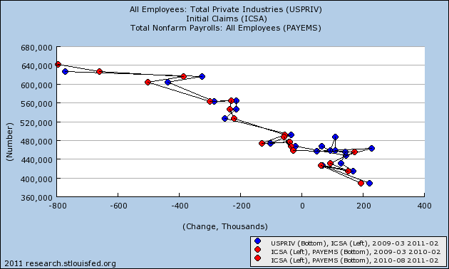
As you can see, there is a nearly linear relationship. So long as initial claims continue under 400,000, we should expect robust monthly jobs reports (with a very big +/-125,000 variance, however). It is also important to note that we have been shedding government jobs for the entire two year period, without any "double-dip." While laying off government workers now is insane policy, and will be a drag on the economy, it is safe to say that it alone will not be enough now or during this summer to cause a renewed recession.
Next, let's look at jobs vs. GDP. This is a series I have been running for well over a year. Despite the complaints that GDP does not measure the happiness of Main Street, the fact remains that it is an excellent way to predict YoY jobs over the next 6-12 months. Subtract 2% from the YoY percentage growth of GDP, and you will be very close to the YoY% of jobs growth a few months later. Here is that graph now:
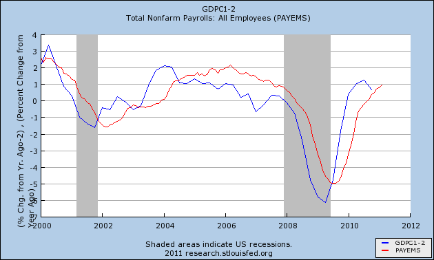
As you can see, it remains an excellent predictive tool.
Third, let's look at real retail sales vs. jobs. This is another series I have been running for well over a year. It is updated monthly, and so gives earlier signals of turning points than GDP. While it remains an excellent tool for the direction of YoY job growth, it has not performed so well in the last year:
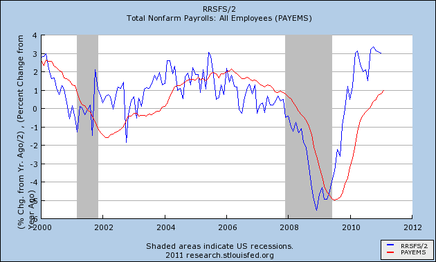
My suspicion is that it is not performing so well this time around because the retail sales do not include those sales associated with new home sales and home improvements, compared with other recoveries. Nevertheless, if real retail sales continue to predict 3% annual job growth for an extended time, I expect job growth to trend in that direction.
In summary, the above graphs strongly suggest that we will continue to see jobs reports that at very least keep up with population growth in the coming three to six months.
Now let's look at two graphs comparing initial jobless claims with the unemployment rate. First, courtesy of Thumbcharts, is a graph comparing the average of the last last 6 months of initial claims (blue) and the unemployment rate (red) over the same period, with the equivalent 6 months the year before. With the exception of the double-dip 1980-1982 recessions, this has an excellent track record.
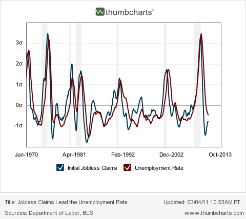
As the readings from last August and September disappear, the initial claims average will continue to decline YoY, and this predicts that there will continue to be a substantially lower unemployment rate than the same period a year ago. While this might not mean further decline in the unemployment rate from here, it very strongly argues against any significant increase back above 9% in that rate.
Finally, let's look at initial jobless claims as a percentage of the population vs. the unemployment rate. This is the graph I began running about 3 months ago when I was totally surprised by the close and long-lasting fit (although there has been a slight drift upward over the long term in the unemployment rate vs. claims):
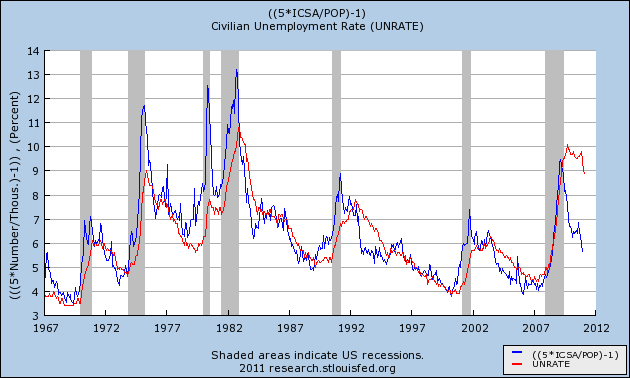
This graph argued 3 months ago that the unemployment rate was far too high compared with initial claims. Since then the unemployment rate has declined 0.9%!!! As population-adjusted initial claims has consistently led the unemployment rate for almost 50 years, this graph suggests that further declines in the unemployment rate in the coming months are likely. If so, the dramatic drop in the unemployment rate could be the surprise economic story of 2011.
The question remains, however, how much of the decline in the unemployment rate is an unalloyed good and how much has to do with participants dropping out of the work force. I will get down into the weeds on that subject in my next post.
Now let's look at two graphs comparing initial jobless claims with the unemployment rate. First, courtesy of Thumbcharts, is a graph comparing the average of the last last 6 months of initial claims (blue) and the unemployment rate (red) over the same period, with the equivalent 6 months the year before. With the exception of the double-dip 1980-1982 recessions, this has an excellent track record.

As the readings from last August and September disappear, the initial claims average will continue to decline YoY, and this predicts that there will continue to be a substantially lower unemployment rate than the same period a year ago. While this might not mean further decline in the unemployment rate from here, it very strongly argues against any significant increase back above 9% in that rate.
Finally, let's look at initial jobless claims as a percentage of the population vs. the unemployment rate. This is the graph I began running about 3 months ago when I was totally surprised by the close and long-lasting fit (although there has been a slight drift upward over the long term in the unemployment rate vs. claims):

This graph argued 3 months ago that the unemployment rate was far too high compared with initial claims. Since then the unemployment rate has declined 0.9%!!! As population-adjusted initial claims has consistently led the unemployment rate for almost 50 years, this graph suggests that further declines in the unemployment rate in the coming months are likely. If so, the dramatic drop in the unemployment rate could be the surprise economic story of 2011.
The question remains, however, how much of the decline in the unemployment rate is an unalloyed good and how much has to do with participants dropping out of the work force. I will get down into the weeds on that subject in my next post.
P.S. One note of final emphasis: I'm not just running the above graphs because of their performance in the past. Not infrequently in the last couple of years at DK I would get comments on the order of, "Pretty graphs. But they have nothing to do with reality. Everything sucks, and it's going to get worse." And yet, the "pretty graphs," which are just easy to digest representations of complex data, showing how A has relentlessly led to B over a very long time, have prevailed. If the pretty graphs kept kicking my ass, I would seriously reconsider my position. In summary, they still lead now, and are giving us a good look at what we should expect from the monthly jobs reports in the next few months.