Well, Mish is at it again. This time he suggests that the LEI would probably have been positive throughout the Great Depression, because of its reliance in large part on monetary indicators. In response to my posting of the September LEI, Silver Oz raised a similar issue in comments, of whether the LEI's are failing to take account for the panicky deflationary aspects of the recession, and thus overstating their positive impact.
On the flip side, I have very little doubt that the reason the ECRI's long term indicator bottomed and began to turn positive after November 2008, is that is one year after the yield curve turned significantly positive. It is most likely that they also rely on some "real interest rate" calculation in their long term index.
As it happens, I already researched these indicators, so I can provide an answer to Mish's query.
First of all, let's recapitulate what the Conference Board's LEI consists of. The 10 indicators, with the weights given each indicator, are as follows:
- real money supply (35%)
- average weekly manufacturing hours (25%)
- interest rate spread (10%)
- manufacturers' new orders for consumer goods (8%)
- supplier deliveries (7%)
- stock prices (4%)
- consumer expectations (3%)
- building permits (3%)
- average weekly initial claims for unemployment insurance (inverted) (3%)
- manufacturers' new orders for durable goods (2%)
Of the above, can we stipulate that average manufacturing hours, new orders, supplier deliveries, and new claims for insurance benefits would be relentlessly negative throughout the Great Contraction of 1928-32? After all, Mish's comment is about the yield curve and monetary portions of the index as well as the stock market, presumably.
We also know about housing starts, although that data is annual. Here it is, declining precipitously from before the onset of the Great Depression through 1933.
| Year | Nonfarm housing starts | 2009 equivalent |
|---|---|---|
| 1920 | 247 | 699 |
| 1921 | 449 | 1236 |
| 1922 | 716 | 1953 |
| 1923 | 371 | 994 |
| 1924 | 893 | 2350 |
| 1925 | 937 | 2423 |
| 1926 | 849 | 2177 |
| 1927 | 810 | 2042 |
| 1928 | 753 | 1867 |
| 1929 | 509 | 1252 |
| 1930 | 330 | 805 |
| 1931 | 254 | 615 |
| 1932 | 134 | 322 |
| 1933 | 93 | 221 |
| 1934 | 126 | 300 |
| 1935 | 221 | 522 |
| 1936 | 319 | 748 |
| 1937 | 336 | 781 |
| 1938 | 406 | 937 |
| 1939 | 515 | 1179 |
| 1940 | 602 | 1368 |
At some point in 1933, housing starts bottomed. So building permits were presumably also negative throughout the 1929-32 period, except possibly at the very end.
What about the stock market? We know what a graph of that, measured by the DJIA looks like, courtesy of dshort. It is safe to say that, with a few exceptions, the three month measure of the stock index would be down except for brief periods in about December 1929, spring 1930, and September and December 1931.
So the bottom line is, if the LEI would be positive, with few exceptions it is going to have to be because of blowout yield curve and monetary conditions.
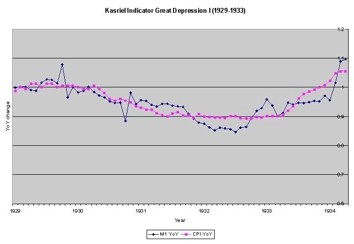
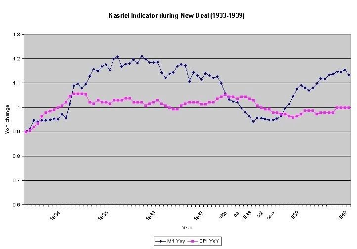
Well, here is real M1 from Milton Friedman's classic, "Monetary History of the United States." The graphs are cruddy basic Excel, but the information is accurate. As you can see, during the Great Contraction of 1929-32, real monetary supply was negative:

[blue is M1 YoY; red is CPI]
The exception is the period from October 1930-October 1931 and the end of 1932 (the latter of which would make it a correct LEI, since the Great Depression bottomed in March-April 1933). Real money supply was positive during the FDR New Deal expansion, and negative again during the 1937-38 recession.

Not a bad record at all.
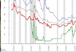
Finally, we come to the yield curve. Courtesy of Ned Davis research, as reposted by Theroxylandr, here is what the yield curve looked like in the late 1920s-1930s period:

[short term rates in green, long term bond rates in red]
I have been able to create a more specific graph by making use of the New York Fed's money rates (in blue) vs. long term rates (in green):

Here indeed we see a limitation of the yield curve. The curve had inverted in the deflation of 1928 (the Death Signal that was only repeated in 2007 since), but with the exception of late 1931 when the Fed disastrously raised rates, was positive beginning in mid 1930 in a fashion similar to today throughout the rest of the Great Contraction.
In short, during the entire period of the Great Contraction of 1929-32, the ONLY time that all three monetary/financial elements of the LEI would have been positive, would have been in September 1931.
Money supply and the yield curve would both have been positive from October 1930-October 1931. Based on how the LEI is presently calculated, those two elements would have been evaluated at about a combined +0.4 each month. The declining stock market would have subtracted 0.1 or 0.2 each of the months (aside from September 1931). Housing would have subtracted another 0.1 or so. So long as the other six indicators, which we have stipulated would have been negative throughout, would have subtracted at least 0.3 each month, then the LEI would have been relentlessly negative throughout the Great Depression until -- appropriately -- close to the end.
Note that any increase in LEI during the 1929-32 period would have been on just a few indicators, meaning the "diffusion index" of the ten LEI's would have been consistently negative. Contrast that with this year, in which 8 or 9 of the LEI's have turned positive on a 6 month basis.
It is worth restating that the yield curve is not as good an indicator during deflation -- which means that it is possible that the Conference Board is overstating its positivity now -- but when the rate of deflation itself turns positive (i.e., deflation lessens), as it did in 1933, that is a powerful indicator in the presence of a positive yield curve and positive real money supply growth, that a deflationary recession is ending. That also happened this past summer, correctly signaling that the "Great Recession" was ending.
UPDATE (Special bonus swipe at Calculated Risk): CR has a post and graph up now about the JOLTS survey. The "jobs openings" part is at an all-time low ("all-time" dating from 2000). He says that can't be a good sign.
Let me call your attention to the earlier part of the graph, becuase it does include the "jobless recovery" from the 2001 recession. See the point where the yellow line (job openings) hits bottom. Now look down to the month. It's August 2003. Exactly at the unemployment bottom. From there on until this recession, it was all up, up, up.
Now CR is as nice a guy on blogs as there is. But while the JOLTS survey isn't "good news", the "job openings" part of the data appears to be about as much of a lagging indicator as you could find.