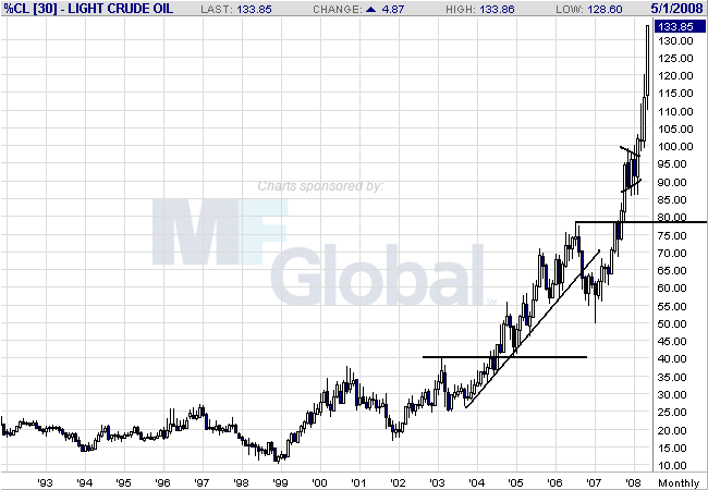
Above is a monthly chart. Notice that prices are rising from a base established over 10 years. Here's an old trader's adage for you (which you probably don't want to hear right now). The longer the base, the stronger the run. Also note how prices have continually broken through resistance.

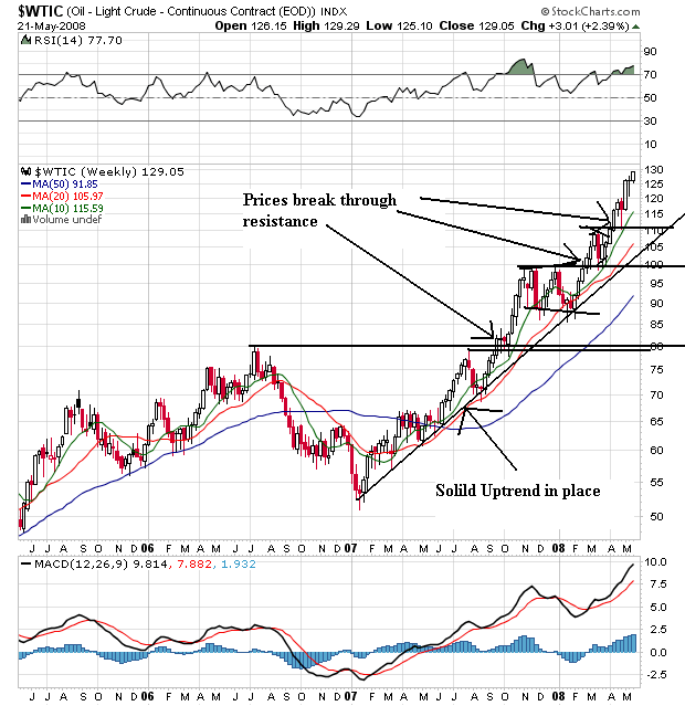
On the weekly chart, notice the following:
-- Prices have continually moved through resistance
-- There is a strong rally in place that started at the beginning of 2007
-- As prices have risen they have taken time to consolidate gains before moving higher

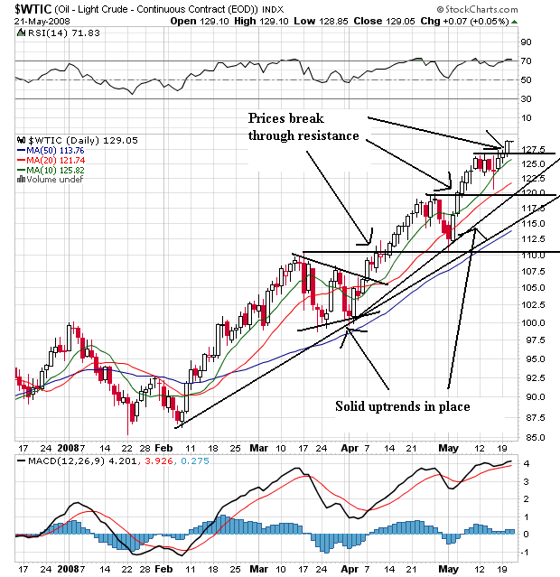
On the daily chart, notice the following:
-- Prices are above the SMAs
-- The shorter SMAs are above the longer SMAs
-- All the SMAs are moving higher
-- There are two solid uptrends in place; one that started in February and one that started in April
When you combine all of these charts you get the following:
-- A strong multi-year chart that shows a rally from a multi-year base
-- A weekly chart with an uptrend that started at the beginning of 2007
-- A daily chart with the most bullish price and SMA arrangement possible