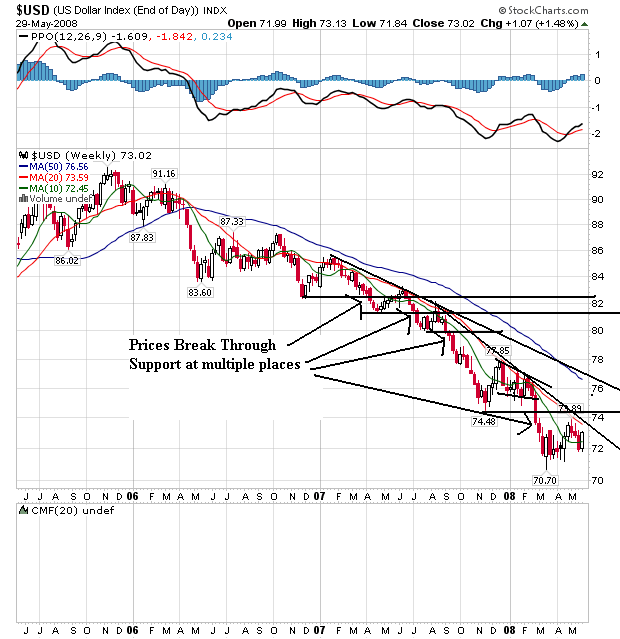
On the weekly dollar chart, notice that prices have been falling through support areas for the better part of two years. Also note the 20 and 50 week SMA are both heading lower, although the 10 day SMA is leveling out. Also note prices and the 10 day SMA are tangled up. But the 20 week SMA has privided strong upside resistance for the last year and a half.
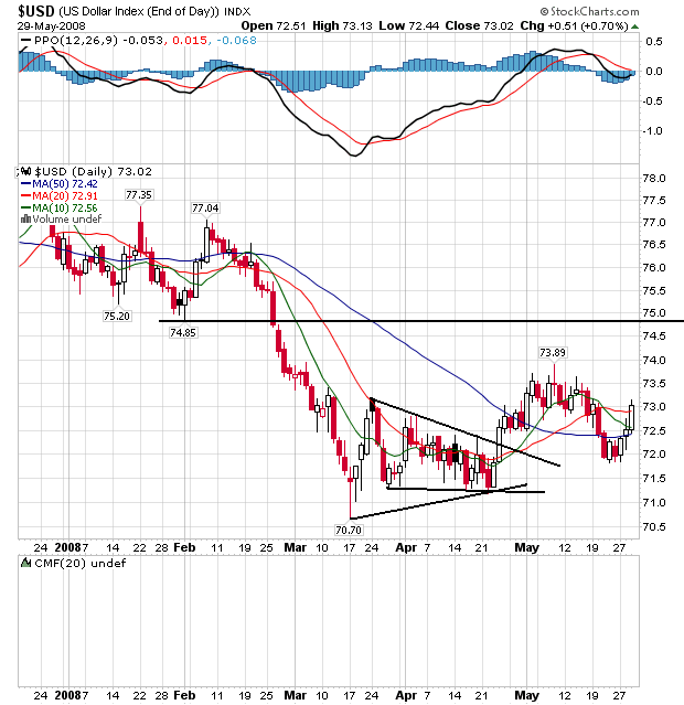
On the daily chart, notice the following:
-- Prices and the SMAs are bundled in a very tight range, indicating indecision.
-- The 50 week SMA is about to turn positive.
-- Prices have broken through all the SMAs and may be headed higher.
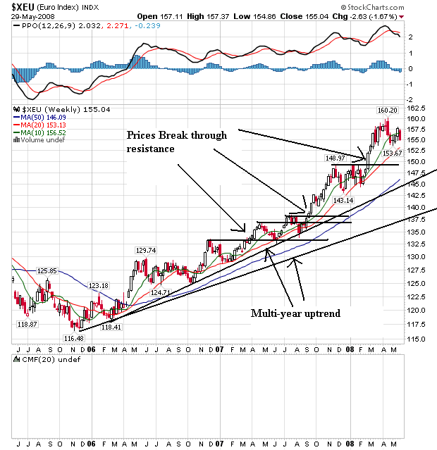
On the euro's weekly chart, notice it's the mirror image of the dollar chart. The euro has been rising for the better part of two years right now. Prices have continually broken through upside resistance to make new highs. Also notice the SMAs are all moving higher with the shorter SMAs above the longer. This is a bullish chart.
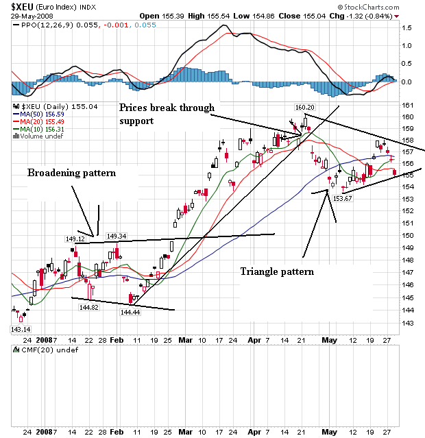
On the daily chart, notice the euro formed a broadened bottom from mid-January to the end of February, rallied until the end of April and has since been forming a triangle consolidation pattern. Also notice that prices and the SMAs are bunched together, indicating a lot of indecision on the part of traders regarding where to send the euro next.
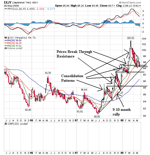
On the weekly yen chart, notice that prices have been sharply rising since the end of last summer. Prices moved through resistance on several occasions, but then fell back usually in pennant patterns. Note the 10 week SMAs has turned lower and is about to cross the 20 week SMA. Also note that prices are right below the 20 week SMA and recently fell through this important technical indicator.
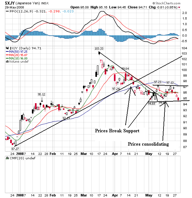
On the daily chart, notice that prices rallied from the beginning of the year until the beginning of April. Then prices fell until the beginning of May when they started to move sideways. Also notice that prices and the SMAs are bunched together right now, indicating a lack of direction.