U.S. bond yields hit a five-year high, with the yield on the benchmark 10-year Treasury note rising to nearly 5.25%, driving up the cost of everything from $150,000 home mortgages to $20 billion leveraged buyouts and threatening to slow the nation's economic growth.
Investors continued to dump Treasurys yesterday -- as they have for more than a week -- amid worries about rising inflation abroad and concerns that foreigners might curb their purchases of U.S. bonds, which have been an important source of support for the market.
......
Rising interest rates raise the monthly payments of homeowners with adjustable-rate mortgages and make it more costly for them to refinance to a fixed rate. They could also put the brakes on the corporate buyout boom, which has been financed by cheap debt and has helped to drive the stock market higher in recent years.
Yesterday, the 10-year note closed at 5.249%, just above last year's peak rate and slightly below the recent high set in May 2002 of 5.259%. The note's price, which moves in the opposite direction of the yield, was 94 8/32, down 27/32, or $8.4375 for each $1,000 invested. The price of the 30-year bond was 91 1/32, down 1 20/32, pushing its yield up to 5.356%, the highest since June 2004.
In less than four weeks, the yield on the 10-year note has climbed from just 4.7%, a huge jump for bond yields. In the past, such sharp moves have led to big losses for hedge funds and other investors who rely heavily on borrowed funds.
There's a lot here to take in.
1.) I don't see this as a huge problem for the buy-out boom. I wouldn't worry about that until yields hit 5.75% or so.
2.) However, the mortgage implications are huge. Credit standards have already tightened. At a time when inventories are at absolute all-time time highs we now have the market naturally slowing demand. I'm sure the mortgage banking industry is cursing this development.
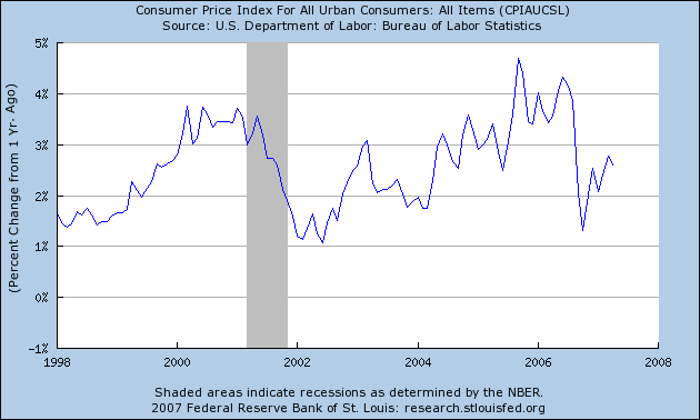
3.) There's been a lot of talk about inflation lately. So, let's take a look at the official BLS inflation numbers. Here's a chart of the Y/Y percent change in the overall inflation level including food and energy.

There was a big run-up from 2004 to early/mid 2006, but then there was a drop thanks to a drop in oil prices. However, it looks like the Y/Y change is once again moving up which should give us reasons for concern.
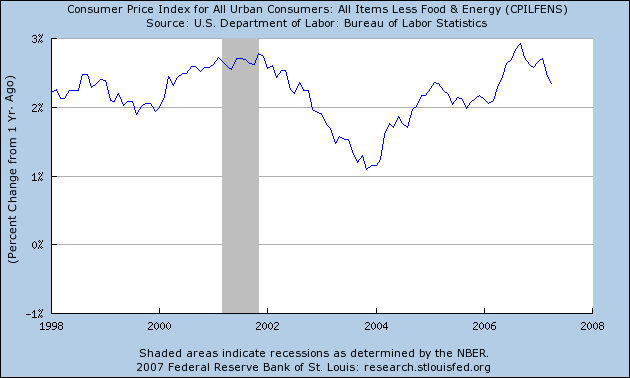
Here's a chart of the Y/Y percent change in core inflation:

Remember that with this chart the Fed is trying to see if higher food and energy prices are bleeding over into other areas of the economy.
The Fed has an unofficial target of 1%-2%, so we're above the Fed's comfort zone here. Also note this number has been coming down since about mid-2006. The Fed has been stating that inflation should moderate as the economy slows and it appears this has in fact been happening. While the core rate is above what the Fed wants, it's still manageable.
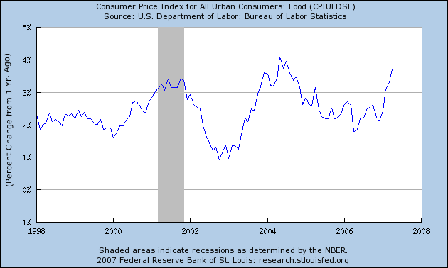
Here's the Y/Y percent change chart of food prices:

Corn is an important base element in the US food industry. It's used as a raw material (DUH!) but also as a feed stock for livestock. Let's call this the "ethanol chart", because what we're seeing here is the effects of the national ethanol policy. As the number of uses of corn has increased we have not seen a proportionate increase in the supply of corn. When demand increases faster than supply, prices increase. This is what we're seeing now.
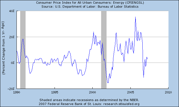
Here's the Y/Y percent change in energy prices.

Notice the big dip last year when Goldman Sachs lowered the percentage of gasoline in their energy index. However, we're once again seeing this number increase.
The financial press has done a disservice to the investing public by focusing a bit too much on the core number and not enough on the overall number. While that number is OK, it could be better. And that is what investors are concerned about right now from the inflation front.