Saturday, March 22, 2025

Weekly Indicators for March 17 - 21 at Seeking Alpha


 - by New Deal democrat

My “Weekly Indicators” post is up at Seeking Alpha.

The biggest change this week, as I wrote yesterday, was the sharp decline in two of the regions Feds’ new orders indexes. But, also as indicated, consumper spending remains strong - at least so far.

As usual, clicking over and reading will bring you up to the virtual moment as to the state of the colony, and reward me with a penny or two for my effort in collecting and collating the data.

Friday, March 21, 2025

Regional new orders deteriorate; sales still lead inventories


 - by New Deal democrat


No significant new economic news today, so let me follow up on Wednesday’s post about production and sales.

The high frequency indicator I follow on the manufacturing side is the new orders components of the manufacturing indexes published each month by five of the regional Feds. As I wrote Wednesday, these had flipped from contraction into relatively strong expansion at year’s end.

With the reports this week by the New York and Philadelphia Feds, the situation has reversed. Here is their current status:


The regional average is more volatile than the ISM manufacturing index, but usually correctly forecasts its month-over-month direction. The ISM report for February already showed new orders retreating into contraction, so this suggests a further retreat next month. The three remaining regional Feds will report over the next 10 days.

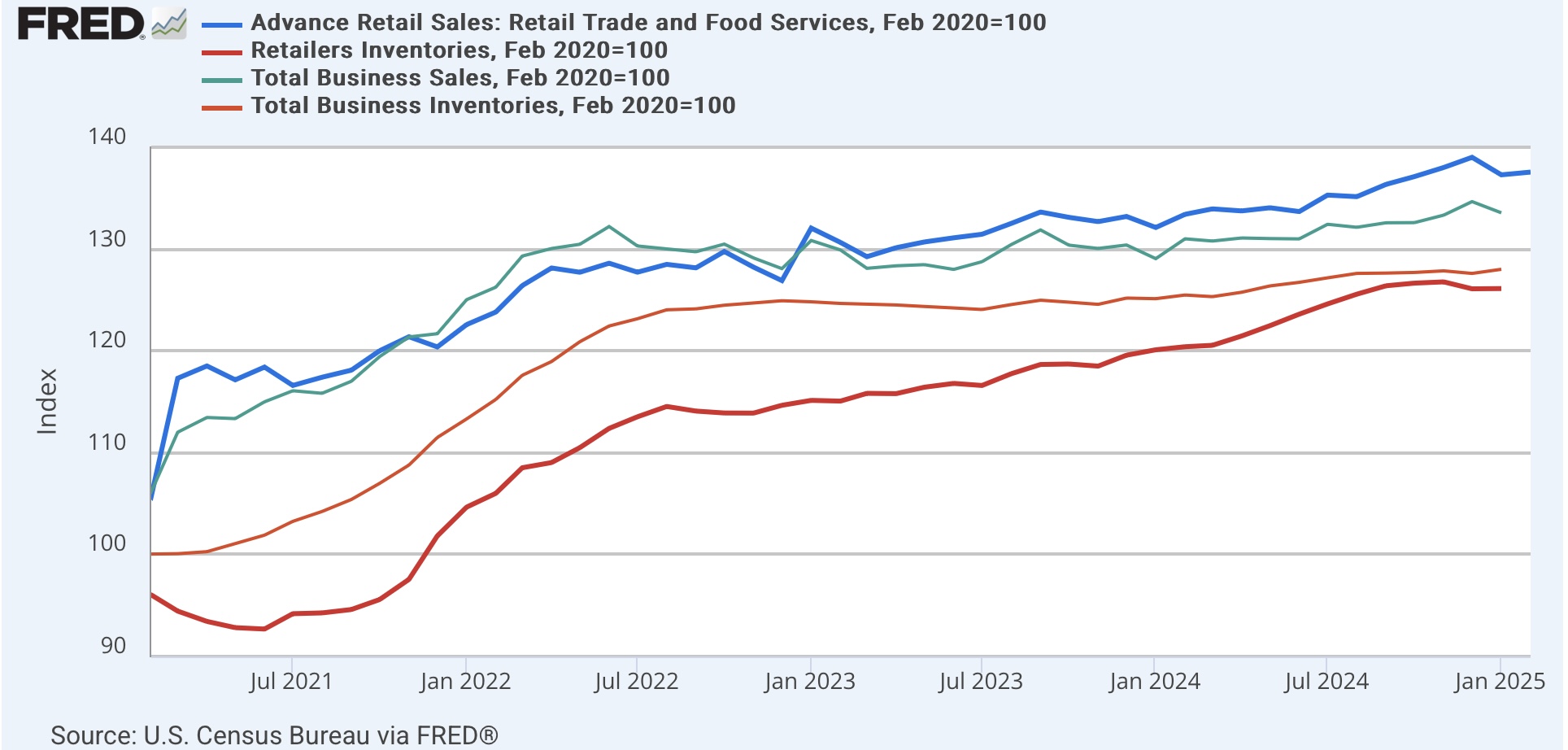
On Wednesday I also reiterated that production typically responded to changes in sales, rather than anticipating them, pointing out that sales typically turn higher or lower before inventories do.

Since we had the report for retail sales earlier this week, here is the update of retail sales (dark blue, thick line) and total business sales (light blue, thin) vs. retail inventories (dark red, thick line) and total inventories (light red, thin) through February:


The leading/lagging relationship is easier to see on a YoY% basis:


In 2022 and 2023, the YoY change in inventories lagged sales by roughly 6 months.  The relative bigger incrrease in retail inventories in late 2024 may be an exception to the rule, but is likely just noise, especially since total business inventories did not confirm that big increase.

One thing that has distinguished slowdowns in growth from actual recessions in the past several decades has been how quickly businesses can adjust their inventories to a decline in sales. The “just in time” system allowed for quicker responses. To the extent the current situation is driven by tariff and other policy uncertainties, businesses may not be able to be so nimble.

Thursday, March 20, 2025

Jobless claims suggest continued sluggish growth


 - by New Deal democrat


Let’s take our weekly look at initial claims, the first indicator that should show stress in any rising unemployment scenario.


Last week initial jobless claims rose 2,000 to 223,000, and the four week average rose 750 to 227,000. With the typical one week delay, continuing claims rose 33,000 to 1.892 million:


On the more important YoY basis for forecasting purposes, initial claims were up 5.2%, the four week average was up 7.2%, and continuing claims were up 5.4%:


These are all neutral readings, indicating continued slow growth in the economy.

Finally, since initial claims have a very long history of leading the unemployment rate, here is our update of that:


With initial and initial+continuing claims both up roughly 5% YoY, that suggests that in the next few months the unemployment rate should tend towards a reading of 4.1%, which is last year’s 3.8%*1.05, and was also the unemployment rate in February. So for the moment, there is no additional upward pressure on unemployment.

Wednesday, March 19, 2025

Policy uncertainty, business investment, and consumer spending


 - by New Deal democrat


There’s no significant new economic news today, so let’s take a look at something of a topic du jour.


In case you haven’t seen it elsewhere, “economic policy uncertainty” has spiked to a level never seen before aside from the moment the pandemic hit and caused lockdowns in March 2020:


This has been seen as increasing the odds of a recession, perhaps immediately.

So I decided to explore two facets of this possibility:
(1) is there any evidence of any immediate downturn in hard business or consumer data?
(2) in prior episodes of major spikes in such uncertainty, have business investment and/or consumer spending responded immediately, with a delay, or has there been no correlation?

As to the first aspect, as you know I track high frequency data and report on it each week. Although I don’t have a graph to show you, in terms of business investment I do track the new orders components of the five monthly regional Fed manufacturing surveys.

After languishing for most of two years, at the end of December the average was -5, indicating slight contraction. At the end of January the average had risen to +6 on the back of particularly strong NY and Philly regional reports, and at the end of February it had only changed -1 to +5. So far only the NY Fed has updated for March, but it has shown a significant decline of -26.3, which has taken the average of the index to -1, i.e., generally neither expanding nor declining. This is too weak a reed to cite for any significant change of direction. At very least the other regional Feds’ reports will have to come in before it can be suggested with any probity that business investment has begun to decline.

As for consumer behavior, every week Redbook updates same store spending. Here i do have a graph, and here is what it looks like for the past three years:


As of last week, spending was up 5.7% YoY. For the last four weeks, it has averaged 6.1%. In short, there is no discernible wavering in consumer spending as of the latest data.

Now let’s look at past history.

To track the response of business investment, I looked at manufacturers’ new orders, both in total (red in the graphs below) and for durable goods (gold), compared with policy uncertainty (inverted, /10 for scale). First is the long term historical view. It is averaged quarterly because the month to month variation is far too noisy to see any pattern:


There is no discernible pattern when the changes are very minor. But when we look on a YoY basis quarterly, you can see that significant changes in policy uncertainty lead new orders for goods by an average of 2 to 3 quarters. The effect is far less noisy as to total orders than it is for durable goods orders. This is not to say, by the way, that the former *causes* the latter. It is simply to say that, whatever the reason for the former, changes in the latter do appear to occur, but with a significant lag.

Now here is a monthly close-up post pandemic:


You can see that policy uncertainty went from very good readings to neutral as of the beginning of 2022. New orders followed with roughly a twelve month lag. As of the most recent data for new orders as of January, there has been no significant change.

Next let’s look at the same comparison, using real retail sales (red) and real personal spending on goods (g0ld) as our proxies for the consumer. Again the historical look is quarterly to cut down on noise:


The consumer response appears much more coincidental to episodes giving rise to more uncertainty, lagging on average only one quarter and sometimes not at all.

Now here is the post-pandemic view:


There has been no discernible reaction so far.

Finally, below is a graph of policy uncertainty compared with *both* manufacturers total new orders (gold) as well as real retail sales (red):


This makes it easier to see that usually (but not always!) the consumer reaction has come first, before the reaction by manufacturers. This is of a piece with the idea that sales lead production and inventories (something I have shown in the past), as manufacturers react to increased or decreased demand, rather than anticipating it.

This time could always be different. In particular, the motor vehicle industry has been heavily integrated across national lines in North America. The turning off of that spigot may very well have immediate and dramatic effects. But I think the takeaway here is to continue to keep an eye on the high frequency investment and spending data, with the expectation that the consumer spending data is likely to show a significant repsonse first.

Tuesday, March 18, 2025

Two cheers for a great February industrial production report! With a gigantic *


 - by New Deal democrat


Two cheers for the very good industrial production report for Feburary! Total production increased 0.7%, and manufacturing production increased 0.9% to the highest level in over two years:


But the biggest news is that the headline number wasn’t just the best since the pandemic: it was the highest number of all time since the index was first reported over 100 years ago:


The reason total production did even better than manufacturing was all about utilities, which in January and February were 5% higher than any previous month ever:


So why only two cheers and not three? 

Industrial production is a coincident indicator. It was the King of Coincident Indicators, but has faded in importance since the turn of the Millennium, as other sectors of the economy have become more important.

And the best leading indicator for industrial production is new orders. I track this weekly via the Regional Fed reports, which showed marked increases in the past several months, and even more significantly via the ISM manufacturing index, the most recent graph of which, showing new orders in gold, is below:


New orders spiked in December and January to the best levels in nearly three years, but then fell back into contraction in February.

And there is a very likely reason for that: front-running tariffs. If I expect input costs to increase sharply due to the imposition of tariffs, I am going to complete as much production ahead of time as I can.

We won’t know for at least another month whether that has indeed been the case. But it is a gigantic *, and a reason for withholding the final, third, cheer.

February housing construction rangebound, but at recessionary or near-recessionary levels


 - by New Deal democrat


As usual, the month’s important housing data starts out with construction. 


For a quick refresher, I follow this because housing typically leads the rest of the economy by a year or more. After the very leading, but very noisy and heavily revised new home sales (which will be reported next week), permits turn first. Single family permits in particular are the least noisy of all the housing indicators. Next, with a month or two delay, come starts, which are also much noisier and work best as a three month average. Among the most important data, next - with a significant delay - comes housing units under construction, which is the actual total economic activity. Finally - again frequently with another significant delay - comes employment in housing construction, which is part of the monthly employment report. And mortgage rates lead all of the above.

Last month I noted that new home sales have been rangebound for the last two years, which suggested that permits would likely continue to be the same. And in February they were, as permits declined a slight -17,000 on an annualized basis to 1.456 million. Single family permits (red, right scale below) declined only -2,000 to 992,000. Starts (light blue) on the other hand rose 156,000 annualized to 1.501 million. Their three month average rose to 1.459 million, the highest in exactly 12 months:


It is possible, as with so much other post-pandemic data, that there is some unresolved seasonality, because as you can see the December-February period was also the 12 month peak for starts one year ago. Most likely we are seeing a noisy recapitulation of the slight improvement in permits since last summer, but still as with single family home sales, within a narrow range.

In the past 18 months, I have paid much more attention to housing units under construction (gold in the graph below), the “real” measure of economic activity in housing. Throughout late 2022 and all of 2023, it levitated at near record levels. It then precipitously declined, and as of February it is down -14.8% from its peak:


For the last number of months, I have suggested that this number would likely stabilize soon. It took longer than I thought, and with a deeper decline than I thought, but it appears that since November it has indeed stabilized at a level of roughly -15% below peak.

This is significant for recession forecasting purposes. Below I show units under construction YoY (red, left scale) and in absolute terms (blue, right scale):


On the one hand, on a YoY basis units under construction have never declined so strongly without a recession occurring in the near future. But the typical decline from peak has been much more than -15%, often being -35% or more, although recessions have occurred with only a-10% or so decline.

The last shoe I would expect to drop significantly before a recession is the number of jobs in homebuilding (blue in the graph below):


Like units under construction before them, housing employment has levitated for the past year, even rising to ever new levels. As you can see from the last 1980s, sometimes this has persisted for several years before the downturn. I am not expecting it to persist for much longer now. A -10% or so downturn in this type of employment has typically been the recession onset marker.

Finally, here is an updated graph of the YoY change in mortgage rates (*10 for scale, inverted), together with the YoY% change in total (light red) and single family (dark red) permits:


Mortgage rates dipped from 7% to 6.2% in late summer, shown as the nearly 10% improvement (blue) in the graph above. So far permits are nearly unchanged YoY. Some at least temporary improvement in their YoY comparisons seems likely, but since mortgage rates have recently risen back close to 7%, permits and starts are more likely generally to continue in their recent range.

The conclusion: this month’s housing construction report showed more of the same rangebound data. That’s “good” in that it is not worsening, but we can expect employment to finally follow the rest of the data down sometime soon. That would confirm that the housing sector is recessionary.

Monday, March 17, 2025

Real retail sales show a significant downdraft, but still expansionary


 - by New Deal democrat


Let me start out this month with a historical review of why I have always paid so much attention to real retail sales.

Going back almost 80 years, real retail sales have always turned down in advance of a recession, and they have almost always turned negative YoY simultaneously or close thereto with the onset of recessions. Here’s their record prior to the Great Recession:


With the exceptions of 1952, 1966, and a couple of months in the 1980s, this was a flawless indicator.

Here is the record of the updated version from the 1990s until the pandemic. For reasons I’ll explore more fully below, I also include real sales using CPI ex-shelter (light blue, narrow) and real personal consumption of goods (red):


Again, a flawless record, with the exception of a few oddball one month outliers. Real sales ex-shelter and real spending on goods have similar records.
 
There is also a demonstrated 50+ year history that consumption leads jobs.  It is the change in demand revealed by sales which leads employers to add or subtract workers.  And real retail sales have traditionally been an excellent measure of consumption. Here’s the modern record from the 1990s until the pandemic:


So I have a nearly flawless short leading indicator of the economy, and also a noisy but leading indicator for employment as well.

With that into, this morning’s read for February retail sales was a disappointment. In nominal terms, sales increased 0.2%. But because consumer inflation also increased 0.2% in February, real sales were unchanged. Ordinarily this would not be a particularly negative result, but January’s measure, which already was a negative -0.9% nominally, was revised further downward to -1.2%. That’s a significant downdraft. But it is also at variance with the result using CPI ex-shelter and real spending on goods. In particular, when we exclude shelter prices from CPI, although there has been a genuine downturn in the past two months, real sales remain above all levels except for last autumn:


Note that I have started including ex-shelter real sales in the last few months because house prices have had such an outsized distorting effect on the shelter component of CPI since the pandemic.

Now let’s update the YoY figures since the pandemic.

Following the pandemic stimulus, real retail sales as an indicator completely failed, likely partly because consumers had stuffed themselves on goods purchases with their stimulus funds, and turned to spending on services instead. And partly because house prices as measured by “owners equivalent rent” distorted CPI to the upside, the unit of comparison was unusually unrepresentative. 

That being said, we are now three years out from the stimulus, and shelter prices are less distorting now than in the past several years, so I expect the historical relationship to gradually re-assert itself.

And YoY, even with the downdraft of the past two months, YoY real retail sales are higher by 0.3%. Excluding shelter, they are up 1.1%:


Neither measure is recessionary. 

Finally, because as I noted above, consumption leads employment, per the above paradigm, let’s plug in the latest real sales and consumption data and compare it with the latest jobs trend:


The two series have been coming much closer to being in sync. Keep in mind that based on the most recent QCEW updates, I anticipate further downward revisions to last year’s jobs data. Still, while the forecast remains for positive employment reports, the suggestion is that there is likely to be continued deceleration.

Saturday, March 15, 2025

Weekly Indicators for March 10 - 14 at Seeking Alpha


 - by New Deal democrat


My “Weekly Indicators” post is up at Seeking Alpha.

Despite the steep sell-off and rebound in the stock market this week, the underlying “hard data” indicators about money, spending, and transportation were all steady and almost all positive. The sell-off was about sentiment due to the uncertainty brought about by the Administration’s “policies” in Washington.

As usual, clicking over and reading will bring you up to the virtual moment as to the state of the econony, and bring me a penny or two for my efforts.

Friday, March 14, 2025

The Quick and Dirty forecasting model now says . . .


 - by New Deal democrat


No important economic data today, but since yesterday was an exciting day at the horse track, with the S&P 500 officially entering 10% “correction” territory, let’s update the quick and dirty forecasting model.


As an aside, 10% corrections typically happen about once a year. They are typically driven by some unexpected mini-crisis (e.g., a bank blowup), creating a panic. At about the 10% sell off level, a regulatory agency like the SEC, Treasury, or the Fed steps in and takes steps to resolve the situation. The mini-crisis passes, and stock prices quickly make up their losses, resulting in a “V” shape in the charts.

But this sell-off has been prompted mainly by T—-p’s personal economic predilection for tariffs, and his strategy of always escalating. There is no regulatory agency that can step in and resolve this issue. Which, needless to say, very much worries Wall Street, and is why the sell off started in real time as T—-p was making another tariff announcement.

The net result is that the S&P 500, which was up 40% YoY in the week just before the Presidential Election, is now only up 7.2% (blue in the graph below). And as I reported yesterday, the four week average of initial claims is higher by 8.3% (red, inverted):


The model simply requires that both stocks and initial claims to be negative YoY. Since my initial claims forecast requires claims to be higher by at least 10% YoY for even a yellow caution flag, the above graph is normed so that the 10% higher YoY level shows as 0.

The quick and dirty model is not forecasting recession at these levels, but it is closer than it has been in several years, and needless to say, the trajectory is not favorable.

Here is what the S&P 500 looks like on an absolute basis:


To turn negative YoY in the next few weeks, the S&P 500 would have to sell off by about another 4% to the 5250 level. A few more tariff escalations and retaliation by our (now former?) Allies might do the trick.

Thursday, March 13, 2025

Producer prices may show first inflationary effects of tariff wars


 - by New Deal democrat


I typically do not pay much attention to producer prices. Sometimes they do lead consumer prices, but since the turn of the Millennium more often they have been coincident. But with the onset of tariff wars, they may set off some of the first alarm bells.


And that may have been the case as of February’s report, released this morning. While final demand prices were unchanged, commodity prices increased 1.0% in the month alone. Combined with January, commodity prices have already risen 2.5% this year, the biggest two month increase since spring of 2022:


The YoY graphs show similar inflationary pressures apparently beginning to build:


On a YoY basis, commodity prices are higher by 1.9%, and final demand prices by 3.2%. Note that commodity prices include gas and oil, and are typically much more volatile than final demand producer prices. 

Getting into trade wars with the rest of the world, with escalating retaliatory tariffs, plus taking a chainsaw to employment in federal agencies and their counterparty contractors: what could possibly go wrong?

Jobless claims: no longer “steady as she goes,” but no yellow flag either


 - by New Deal democrat


Initial jobless claims last week declined -2,000 to 220,000, while the four week average increased 1,500 to 226,000. With the typical one week delay, continued claims declined -27,000 to 1.870 million:


On the YoY basis more important for forecasting purposes, initial claims were up 4.2%, and the four week moving average was up 8.3%. Continued claims were up 3.7%:


These are “neutral” readings. While they indicate some weakness, they do not indicate recession.

State level data from one week ago indicated that while layoffs from federal government jobs are having a pronounced local effect in the Washington DC metro area, they are only increasing the weekly totals by about 2,000:

In DC itself, claims were up 853 YoY to 1405, an increase of 154.5%. 
In MD, claims were up 238 to 2,585, an increase of 10.5%.
And in VA, claims were up 707 to 2,881, an increase of 35.4%.

For all three jurisdictions, claims were up 1,798, and increase of 35.4%.

It is actually surprising that there has been no greater effect in these numbers.

Finally, here’s an update of what initial + continuing claims imply for the unemployment rate in the immediate months ahead:


Because the graph indicates YoY% changes, the proper calculation is 3.9% unemployment one year ago increasing by roughly 5% (i.e., 3.9*1.05), suggesting unemployment, which was 4.1% in February continues in that range.

In any event, while it isn’t quite “steady as she goes” anymore, it’s not yellow flag territory either.

Wednesday, March 12, 2025

February CPI: a very good report, with even the chronic “problem children” getting “less bad”


 - by New Deal democrat


Let me cut right to the chase: the February consumer inflation report was actually very good. It wasn’t just that the headline and core numbers only went up 0.2% for the month, or that the YoY gains in each decelerated. Let me let you in on a little secret: one of the first things I do when the report comes out is scour the categories for any “problem children,” which I arbitrarily define as a category where there has been more than 4% inflation YoY.

This month, outside of the two most lagging suspects, shelter and transportation services, there were none outside of some really obscure small components, like men’s suits. And even in the case of the two remaining problem children, both decelerated, especially on a YoY basis.

So let’s get to the graphs.

First, here are the headline (blue), core (red), and ex-shelter (gold) YoY% numbers:


On a YoY basis, headline prices were up 2.8%, core was up 3.1%, and ex-shelter prices were up 2.0%. The YoY headline number was the lowest in 4 years outside of the soft patch late last year. The core number was the lowest in almost 4 years period. 

Interestingly, CPI less shelter jumped 0.5% in February. This might give me cause for concern, but when I looked back at the monthly data for the past 10 years, the February readings in this metric have typically been among the highest of the year, suggesting unresolved seasonality issues. Here’s the relevant graph (I know, squiggles, but trust me many of the big jumps have been in February):


Now let’s turn to the chronically big problem child: shelter. This increased 0.3% for the month, tied for the 2nd lowest monthly increase in the past 2.5 years. And on a YoY basis, at +4.2%, it was the lowest in over 3 years. The below graph breaks it down into its Owners Equivalent Rent (red) and rent of primary residence (blue) components on a monthly basis:


You can see that the downtrend remains intact. And the same is true when we look at it YoY:


At 4.4% for OER and 4.1% for actual rent, both are at 3 year lows. Although I won’t bother with the graph today, since this series lags actual house prices, I continue to expect slow disinflation winding up somewhere around the 3.5% range within the next 12 months. This is buttressed by the most recent updates for new rent prices, which continue to be flat YoY.

The news is also “less bad” for the other, even more lagging problem child, transportation services. This is primarily motor vehicle insurance and repairs, which go up in price after the price of vehicles and vehicle parts go up. For the month, it was unchanged, and on a YoY basis, it was up “only” 6.0%, nevertheless the best reading in 3 years:


Cleaning up a few other points, the former problem child of vehicle prices continues its normalization process. New car prices were unchanged for the month and actually *down* -0.3% YoY, while used car prices increased a sharp 0.9% for the month, but are only up 0.8% YoY:


Note the above graph norms both to 100 just before the pandemic. Since that time new car prices are up 20%, and used car prices up 33%. This is a lingering after effect of the shortage of new cars in the first several years after the pandemic due to the inability to produce computer chips in sufficient volume. Although I won’t bother with the graph today, keep in mind that average hourly wages are up 28.5% since the outset of the pandemic as well, so only used vehicles are higher in “real” terms since then.

And what about gas prices? CPI for energy increased 0.2% for the month, and is *down* -0.3% YoY:


No upward pressure there at all for the moment.

To sum up, as I said at the beginning of this note: this was a very good report. There were only two, lagging, continued problem children, and their contributions were lessening. As has been the case for the past 2 years, take out shelter and consumer inflation has not been a problem at all.

Finally, let’s see what that does for “real” wages and payrolls.

“Real” wages for nonsupervisory workers rose 0.1% in February, and were 1.3% higher YoY. The bad news is that they have been stagnant since October:


“Real” aggregate payrolls for nonsupervisory workers rose 0.2% in February (blue, right scale), but they remain slightly below their all time high set in December. Nevertheless they remain higher YoY by 2.3% (red, left scale), in line with their increasing trend over the past 24 months:


With the exception of the pandemic, and the 1970 recession, they have always peaked a number of months before the onset of recession. I will only be concerned if this series fails to exceed its December peak for several more months.