Saturday, August 17, 2024

Weekly Indicators for August 12 - 16 at Seeking Alpha


 - by New Deal democrat


My “Weekly Indicators” post is up at Seeking Alpha.

With the bond market anticipating Fed rate cuts ahead, it has already lowered mortgage rates somewhat on its own. That has led to a jump in new applications, and to an even bigger spike in refinancing.

As usual, clicking over and reading will bring you up to the virtual moment as to the economic data, and reward me a little bit for my efforts in organizing it for you.

Friday, August 16, 2024

But for Beryl, housing construction would have warranted hoisting a yellow caution flag for recession


 - by New Deal democrat


The effects of Hurricane Beryl had just enough of an effect on home building in July to cause me not to hoist a yellow recession caution flag in this important leading sector. While the hurricane had no significant effect on permits, it likely did have an effect on starts and on units under construction, as I’ll go into further below.


Let’s start with the overall view. Starts (blue in the graph below), which are noisier and slightly lag permits, declined -6.8% in July, while total permits (gold) declined -4.0%. by contrast, the least noisy, most leading single family permits (red, right scale) declined a mere -0.1%:


Comparing single family with multi family permits, the former as above declined -1,000, while the latter (gray), which is much noisier, declined -58,000:


Still, multi-family permits show signs of stabilization, as the current reading is higher than both April’s and May’s, and the three month average rose very slightly (+333 units).

But units under construction is the measure of real economic activity in this sector. While it is not so leading as permits and starts, it has always turned down, typically by more than -10% (often -30% or more) before a recession begins. I’ll spare you the long term graph this month, but here is the graph of the last five years comparing total permits (blue, right scale) with housing units under construction (red):


There had been a long time after single family construction turned down while multi-unit construction continued to increase and then plateaued. But this year both have declined:


Indeed, the total decline in housing units under construction this month surpassed the -10% cutoff level necessary for a yellow caution flag as to recession, as they are now down -10.1%:


But as I wrote at the outset, Hurricane Beryl apparently did affect these numbers. We can estimate its impact by deducting the number of permits, starts, and units under construction in the South Census Region from the nationwide total. Here’s what we get when we do so. In the chart below, the first number is the nation total as above, and the number in parentheses is the number excluding the South Census Region:

Permits: -4.0%. (-3.7%)
Starts: -6.8%. (+1.7%)
Under construction: -1.6%. (-1.0%)

While Beryl likely had little effect on permits, it most likely did have a sizeable impact on housing starts and also to some extent units under construction.

Had housing units under construction declined only -1.0% instead of -1.6% for the month, the total decline from peak would have been -9.5% rather than -10.1%.

In other words, except for Beryl, there is a very good chance that the -10% threshold would not have been crossed.

Further, because mortgage rates in the last two weeks have been at 12 month lows, and close to their lowest levels in two years:


we can expect permits to rise in the next several months, followed by starts.

That the most leading metric, single family permits, as well as mult-family permits, appear to be stabilizing, plus the likely effect of lower mortgage rates, plus the probable effect of Beryl on units under construction, together cause me to believe that raising the yellow caution flag for housing would be premature based on this month’s report. It’s very close, but I don’t think we’ve crossed the threshold yet, and there are still good reasons to believe we may not cross it at all.

Thursday, August 15, 2024

Industrial production: negative number, important negative revisions


 - by New Deal democrat


In the past, industrial production has been the King of Coincident Indicators, since its peaks and troughs tended to coincide almost exactly with the onset and endings of recessions. That weighting has faded somewhat since the accession of China to the world trading system in 1999 an the wholesale flight of US manufacturing to Asia, generating several false recession signals, most notably in 2015-16. But it is still an  important coincident measure in the economy. 

This month was one of those times where revisions made all the difference. Last month I headlined my note by pointing out that both manufacturing and total industrial production were reported near 10 year highs. But this morning both of those numbers were revised down significantly, and this month was reported down -0.3% for manufacturing and -0.6% for total production (graph normed to 100 as of pre-pandemic high water mark):


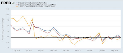
As a result, both series, which had climbed into positive YoY territory, are now back down slightly:


In the above graph, I’ve also added the updated YoY real retail sales YoY data (gold), which shows that both the production and real sales numbers have been flat to trending slightly downward since the end of the last pandemic stimulus over two years ago, with production following sales, as per usual, with a few months’ delay.

Earlier this month I noted that construction is now the pre-eminent element holding up the goods-producing sector of the economy. That’s important because once the goods-producing sector as a whole turns down, the economy as a while typically follows shortly thereafter.

Tomorrow we will get the report on housing, including housing units under construction. If that metric continues to decline, that spells trouble for construction as a whole.

Real retail sales the highest so far this year, but still negative YoY


 - by New Deal democrat


The second point of economic data released this morning, retail sales, were also positive.


On a nominal basis, retail sales in July rose 1.0%. After adjusting for inflation, they rose 0.8% to the highest level so far this year. The below graph norms both real retail sales (dark blue) and the similar measure of real personal consumption of goods (light blue) to 100 as of just before the pandemic:


Since the end of the pandemic stimulus in spring 2022, real retail sales have been trending generally flat to slightly declining, while real personal consumption expenditures on goods have continued to increase.

On a YoY basis, however, real retail sales are still negative at -0.3%, which while also the second best reading this year, remains problematic:


That’s becuase, although I won’t bother with the graph, a negative YoY comparison in real retail sales over the past 75 years has usually meant recession. Obviously that wasn’t the case in 2022 and 2023, but at some point the historical relationship is likely to be valid again.

Finally, since real sales are a good if noisy short leading indicator for employment, here is the above YoY graph adding YoY payroll gains (red):


This forecasts continued weak job reports in the range of 75,000 to under 200,000 in the month immediately ahead.

Two months ago I concluded that , especially in view of the relatively poor numbers since the start of this year, real retail sales had to be regarded as raising a caution flag for the economy. Last month I concluded by saying “The yellow caution flag is up,” especially in conjunction with the negative ISM manufacturing and non-manufacturing numbers. The reversal in the latter to positive this month takes some pressure off, but the longer real retail sales go without posting a positive YoY number, the more concerned I will be.

Jobless claims still a positive, even with some lingering Beryl after-effects in Texas


 - by New Deal democrat


Last week I pointed out that the YoY increases in initial and continuing claims appeared to be all about Texas in the wake of Beryl. This week there was good news even with some continued Beryl effects in Texas.


Initial claims declined -7,000 to 227,000 for the week, while the 4 week average declined -4,500 to 236,500. Continuing claims with the typical one week delay declined -7,000 to 1.864 million:


There was even better news on the more important YoY comparisons. There, initial claims were down -8.5%, and the four week average down -3.2%. Continuing claimswere up 3.4% YoY, but this is the best YoY comparison except for one week in the past 1 1/2 years:


The news is all the better because there was still a Beryl effect in Texas, where unadjusted claims were 18.5 thousand, roughly a 2.5 thousand increase from typical summer levels last year. In other words, ex-Texas claims were down even more YoY.

Here is the updated “Sahm rule” comparison. This has not been working this year, as the unemployment rate has continued to increase even as initial and continuing jobless claims have leveled off or are lower YoY. This points to new immigrants not finding work as the root cause for the increase:


In short, the hypothesis that this summer’s increase in initial and continuing jobless claims was unresolved post-pandemic seasonaility continues to be sustained. As of right now, claims remain positives for the near term future economy.

Wednesday, August 14, 2024

For July, “ The index for shelter … accounti[ed] for nearly 90 percent of the [otherwise sleepy] monthly increase”


 - by New Deal democrat


The CPI for July continued all of the trends I have been writing about for the past year or more:
 - Headline and core CPI continue to slowly decelerate. 
 - energy inflation is non-existent
 - shelter inflation remains very elevated but continues to declerate, following house prices.
 - all prices except for shelter coming in near or below the Fed’s 2% target
 - there are a few other problem children that don’t amount to too much

So let’s take these in order.

Both headline and core inflation rose 0.2% for the month. On a YoY basis the former is up 2.9% YoY (blue) and the latter is up 3.2% YoY (red):


Both of these are at their lowest YoY levels since 2021.

Now let’s add in CPI less shelter (gold), which was unchanged for the month, and is only up 1.8% YoY:


CPI less shelter has been 2.3% YoY or less for the past 15 months.

In other words, for the Fed, the only reason not to treat inflation as well within its target zone is shelter.

Shelter (including actual rent, up 0.5%, and imputed rent of owned residences, up 0.4%) (red) increased 0.4% for the month, and is still up 5.1% YoY - which is still lower than at any time in the past two years. It continues to decelerate as forecast by the sharp previous deceleration in home prices (as measured by the FHFA index, blue):


At its current pace, shelter inflation will not have decelerated into the Fed’s target range for about 12 more months.

Energy inflation was nonexistent in July, and prices were only up 1.0% YoY:


The former problem children of new (red) and used (blue) vehicle prices declined -0.2% and -2.3% for the month, are are down -1.0% and -10.3% YoY respectively (shown as the change since right before the pandemic, below):


The remaining problem children remain food away from home, up 0.2%, electricity, up 0.1%, and transportation services including vehicle maintenance, repair, and insurance, up 0.4%. On a YoY basis they remain up 4.1%, 4.9%, and 8.8% respectively:


To reiterate what I have previously pointed out, the last item is a typical delayed reaction to the previous big increase in vehicle prices.

Although I won’t bother with a graph this month, I have previously pointed out that wages have grown at about the same rate as vehicle prices, so in “real” terms they are not that much of a problem any more. The Census Bureau’s own release summarizes my view, to wit: “the index for shelter … account[ed] for nearly 90 percent of the monthly increase in the all items index.”

If 2% inflation is a target and not a ceiling, the Fed has really had all the ammunition it has need for months. With the further YoY deceleration in July, it has even more. Unless there is an upside blowout surprise in August employment and wages, the real debate is likely to be whether the Fed cuts interest rates 0.25% or 0.5% at its September meeting.

Tuesday, August 13, 2024

Motor vehicle sales and recession: current status


 - by New Deal democrat


In the paradigm popularized by Prof. Edward Leamer 20 years ago, motor vehicle sales are the 2nd domino to fall, after housing, in the procession of sectors that turn down prior to recessions.


I haven’t updated this in awhile, so let’s take a look.

As an initial matter, the cycle in this sector was particularly hard hit by supply chain kinks during the pandemic, as electronic parts in particular were not produced at nearly a fast enough rate to allow full-scale production. This was a major reason why the prices of motor vehicles rose 20% since just before the pandemic by 2023:


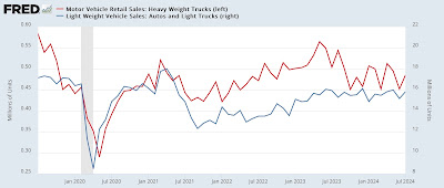
Turning to history, I’ve noted many times before that sales of heavy trucks (red, left scale) tend to turn down first, and much less noisily, than passenger vehicle sales (blue, right scale) before recessions:


In general, sales of heavy weight vehicle must turn down at least -10% on a consistent basis to be consistent with an oncoming recession. The below graph captures the essence of this by measuring the YoY% change in both passenger and heavy truck sales, averaged quarterly to reduce noise, and adding 10% so that the dividing point shows at the zero line:


Sometimes both light vehicle and truck sales are down -10% before recessions, and sometimes heavy truck sales are down much more while passenger vehicle sales are treading water.

For our present situation, here is the post-pandemic close up on absolute numbers:


Truck sales did decline over -10% last year, coincident to the bankruptcy of a major hauler, Yellow Truck. Passenger vehicle sales are still holding steady.

Now here is the YoY% look, monthly, again adding 10% so that the crucial cutoff appears at the zero line:


Heavy truck sales have flirted with the -10% level for the last 10 months. If they remain at their current level for several more months, the YoY comparison will be unchanged. Passenger vehicle sale remain steady.

The bottom line is that motor vehicle sales have not given, and are not now giving, any recession signal.

Producer prices remain tame


 - by New Deal democrat


Producer prices for final demand (blue) rose 0.1% in July, while upstream raw commodity prices (red) rose 0.7%, close to their highest monthly increases in the past two years:


In the larger pre-pandemic scheme of things, the one month rise in commodity prices is not a matter of concern at this point.

On a YoY basis, final demand producer prices are up 2.2%, while raw commodity prices are up 1.5%:


Like all other prices except for imputed shelter costs, this is well within the Fed’s target range. We’ll see how this pans out for consumer prices tomorrow.

Sunday, August 11, 2024

Weekly Indicators for August 5 - 9 at Seeking Alpha


 - by New Deal democrat


My “Weekly Indicators” post is up, a day later than usual, at Seeking Alpha.


While there was some excitement at the racetrack Monday as stocks just missed making a new 3 month low by a hair, the more exciting news by the end of Friday was that mortgage rates made a new 12 month low, and mortgage refinancing is showing signs of life again.

As usual, clicking over and reading will bring you up to the virtual moment as to the state of the economy, and reward me a little bit for the effort I put into the work.

Friday, August 9, 2024

Residential building construction and spending sound a warning for goods-producing employment


 - by New Deal democrat


The final data point from last week that I wanted to catch up on was construction spending, and especially residential construction spending.


As reported last week, in June total nominal spending declined -0.3% in June, but is higher 6.2% YoY. The more leading residential sector also showed a -0.4% decline, and is higher by 7.3% YoY:


Since producer prices for construction materials declined another -0.1% in May and are down -2.5% YoY, “real” total construction declined -0.2%, while residential construction spending declined -0.3%:


Finally, the Inflation Reduction Act, which conferred favorable tax benefits for “restoring,” led to a sharp increase in manufacturing construction spending, which rose only 0.1% for the month - its slowest rate of increase in nine months - to another new record:


Which means it decelerated to a “mere” 19.1% increase YoY. Only one month’s data, of course, but it may mean that the surge is plateauing.

Finally, let me tie this in to the discussion of leading employment metrics from the Establishment jobs survey I wrote about on Wednesday. Recall that recessions typically don’t happen until after both manufacturing and residential construction jobs, and more generally goods-producing jobs, have turned down. 

As of July, manufacturing jobs are treading water, but construction jobs, and in particular residential construction jobs, were still increasing, as were goods-producing jobs as a whole.

But there is good reason to believe that residential construction jobs will also turn down at some point in the next 6 months.

Here is the historical look at all employees in residential construction (blue), residential construction spending (red), and total building units under construction (black) from the inception of the first two series:


Notice that for the limited history that we do have, building units under construction and nominal residential construction spending have tended to peak simultaneously or close thereto. By contrast, the number of employees in building construction has not peaked until 6-12 months later (presumably, it takes a few months for employers to understand that the Boom is over, and to start laying off their crews).

By the end of last year, residential construction spending and the number of building units under construction both had clearly peaked. The number of building units under construction is now down almost -9%. 

Unless there is a sudden turnaround caused by lower mortgage rates, which hasn’t happened on any significant basis as of the present, we should expect layoffs in the residential building trades to start happening within the next few months. That might also cause a peak in goods-producing jobs, which would put employment on a very short term pre-recession footing.

Yet another reason why the Fed has waited too long to start lowering interest rates, and why they should not hesitate to make a 50 basis point cut in September.

Thursday, August 8, 2024

Initial jobless claims, ex Hurricane Beryl distortions, remain very positive


 - by New Deal democrat


Officially reported initial jobless claims declined -17,000 to 233,000 last week. The four week moving average rose 750 to 240,750. With the typical one week delay, continuing claims rose 6,000 to 1.875 million, the highest number since November 17, 2021:


On the more important YoY basis, initial claims were down -9.7%, while the 4 week average was nigher by 0.3%. Continuing claims were higher by 5.8%, up by more than their recent range but still well below their YoY readings from several months ago and last year:


Because this is the first week of August, I’ll dispense with my usual note about the unemployment rate and the “Sahm rule.”

Instead, there’s a more important point to discuss: the impact of Hurricane Beryl, which made landfall in Texas on July 8, on jobless claims in July.

Up until then, my “unresolved seasonality” hypothesis was working very well. But after that, claims were indeed higher YoY.

Well, Ernie Tedeschi had a good point last Friday in his discussion of the jobs report. While the BLS downplayed any impact by Hurricane Beryl, it looks like it did play a role in depressing hours worked:


That got me wondering whether it had also shown up in jobless claims. Because first you employer says we don’t need you this week, because we don’t have power. Then it puts you on temporary layoff.

After Hurricane Sandy a decade ago, and several Nor’easters and wildfires since, I created a workaround by subtracting the State(s) affected by the weather event, and looked at jobless claims including all the other States. This data is not seasonally adjusted, so you then have to apply the weekly seasonal adjustment to get the important result.

And indeed when you subtract Texas, YoY jobless claims (red in the graph below) are still lower than they were last July:


In July 2023, initial claims in Texas, not seasonally adjusted, averaged about 16,000. This year, beginning with the week of July 13, they spiked as high as 32,000 during the week of July 20. The next week they fell to just over 25,000, and this week [not yet updated on the FRED graph] they declined again to a little over 20,000:


When we take the YoY increase in Texas out of the total, NSA initial claims were about 207,600 during the week of July 27, and 199,000 this week. The seasonal adjustment for both weeks is roughly +15%.  When we then apply that seasonal adjustment, we get 240,000 initial claims last week, and 228,000 this week.

What this means is that initial claims ex-Texas remained lower during all but one week in July, and were lower still this week. In other words, when we take out the Beryl-related distortions, initial jobless claims have remained lower YoY, in line with the unresolved post-pandemic seasonality hypothesis.

Last year initial claims declined sharply as August progressed, to under 220,000. So the ultimate test of my hypothesis for the increase we have been seeing this summer will take place over the next 4-5 weeks.

But for now, importantly, initial jobless claims are not forecasting a recession at all, but rather continued growth.

UPDATE: The same is true for continuing claims. These spiked in TX by 20,000 one week after initial claims did (note: most current state data is only through July 20):


Because these are not seasonally adjusted, here’s what the YoY numbers look like (blue in graph below is TX; red is all States ex-TX):


When we take out the TX spike, continued claims were only 1.891 million NSA for the week of July 20. Applying the seasonal adjustment of .966% gives us 1.805 million ex-hurricane distortions, only 1.7% higher than the same week last year - the best YoY reading all this year for continuing claims.

Wednesday, August 7, 2024

Why the leading elements of the Establishment Survey in the jobs report still forecast expansion


 - by New Deal democrat


Continuing my catching up this week, let’s take a look in some further detail about why I didn’t think Friday’s jobs report portended recession - at least, not yet.


As I always point out, the jobs report does contain some leading numbers. These are generally employment in more cyclical industries that, when they turn down, start the cascade into the broader economy. Generally speaking, these are all goods-producing industries, and specifically manufacturing and construction. Usually I also include temporary help, but that has clearly been undergoing some structural changes, so I am temporarily discounting that.

Anyway, here is a closer look.

First, here are goods producing jobs (gold) vs. manufacturing jobs (blue) back in the post-WW2 era:


During this time, manufacturing was a much bigger slice of the goods-producing pie, so it is not surprising that the two lines look very similar. Except for the recession caused by the oil embargo (1974) and the Fed-engineered recession of 1981-82, caused by the sudden reversal and sharp increase in rates by Paul Volcker, these always started declining before jobs generally started to decline.

Next, here is the era including when residential construction jobs (red) were specifically broken out:


Note that these have relatively speaking become a larger slice of the pie, as a larger population needs more residences built. They too have always turned down (except for the pandemic) before the overall jobs number have turned.

Finally, here is the post-pandemic close-up:


Manufacturing employment has stalled, but has not in any meaningful sense turned down. Residential construction employment and goods-producing employment generally have continued to rise.

Historically, even more leading than the number of manufacturing jobs (red) has been the average work week in manufacturing (blue). In fact, it is one of the 10 “official” leading indicators in that Index. The below two graphs show the leading relationship on a YoY basis:


Here is the post-pandemic close-up:


There were significant YoY declines in 2022 into early 2023, but the YoY comparison has stabilized this year. This suggests that manufacturing employment is not poised to decline significantly in the months ahead.

Here is the absolute number of weekly hours in manufacturing worked historically:


I include this because the situation changed after 1982, with employees typically working more overtime. It has usually taken not just a decline, but a decline all the way to 40.5 hours before a recesion has begun. Except for last winter, we have remained above that line.

For completeness’ sake, here is temporary employment:


This has been almost relentlessly declining for over two years. There is pretty clearly something structural rather than cyclical going on here.

Finally, short term unemployment (blue in the graph below) was historically one of the leading components of the index, before it was replace by initial claims (red):


You can see that they follow similar trajectories, although initial claims are considerably less noisy.

Here is the post-pandemic look:


both have increased in recent months, with the former starting before the latter. Again, I suspect this has to do with recent immigrants being unable to find jobs, and thus not applying for unemployment.

To conclude, not everything is positive, but the two negative elements both have special considerations. The bulk of the leading data from the Establishment Survey of the jobs report is still forecasting economic expansion in the next few months.


Tuesday, August 6, 2024

Credit conditions in Q2 improved, and are typical of an economy having come *out* of a recession, not going in to one


 - by New Deal democrat


The Senior Loan Officer Survey, the premier quarterly measure of the loose- or tight-ness of bank lending, was published yesterday for Q2. And since lending conditions are a long leading indicator for the economy, and several of the metrics contained in this release have a good and lengthy track record, let’s take a look.


And to cut to the chase, the news is positive.

The first measure that has a lengthy and accurate historical record is the percentage of banks tightening or loosening criteria for making commercial and industrial loans. This is one of those data series where a positive number is negative, as it means more banks tightening than loosening. A negative number means more banks are loosening conditions.

Although the data for lending to both large and small firms was negative, it was less negative than at any point in the last two years, with on net only 8% of banks tightening:


Going back 30+ years, this is typically what we see 2 to 4 quarters *after* a recession has ended, not going in to one.

The second measure is the percentage of banks reporting strong demand for commercial and industrial loans. This is divided into large and small banks, and large and small firms, giving us four series. And in this case, positive means positive for the economy as well. In the graph below, the two series for large firms are in light and dark rend, the two fo small firms are in light and dark blue:


Although the graph looks a little like spaghetti, the trend in the past 6 quarters is clear. The percentage of banks reporting weakening demand got smaller and smaller, until finally this past quarter on net the data was positive, with the percent of large banks reporting stronger demand was higher by 10%+, and the percent of smaller banks reporting weaker demand dwindled to under 10%, for an unweighted average of +4%. Across all four divisions, the numbers are the best since Q3 of 2022.

Again, this is very much what we see just after having come *out* of recessions rather than going into one.

By no means are all of the long leading indicators so sanguine; in particular real money supply and the yield curve are still negative. But credit conditions are improving.