Friday, April 5, 2024

March jobs report: almost uniformly positive, making a “soft landing” the default 2024 scenario


 - by New Deal democrat


In the past few months, my focus has been on whether jobs gains are most consistent with a “soft landing,” i.e., no further deterioration, or whether deceleration is ongoing; and more specifically: 

  • Whether there is further deceleration in jobs gains compared with the last 6 month average, vs. a “soft landing” stabilization.
  • Whether the unemployment rate is neutral or decreasing; or whether there is further weakness. The recent excellent reports in initial claims suggested this rate would decline. After a contra-trend jump last month, this month the unemployment rate did decline.
  • Based on the leading relationship of the quits rate to average hourly earnings, whether YoY wage growth would continue to decline slightly. It did continue to decline to a new post-pandemic low - but still above 4%.

In other words, all three focus points were as expected or better. Here’s my in depth synopsis.


HEADLINES:
  • 303,000 jobs added. Private sector jobs increased 232,000. Government jobs increased by 71,000. 
  •  January was revised upward, while February was revised downward, by 27,000 and -5,000 respectively, for a net of 22,000. The pattern from nearly every month in the past year, has been a steady drumbeat of downward revisions, so this mixed result is a slight positive.
  • The alternate, and more volatile measure in the household report, showed a 498,000 increase. Still, on a YoY basis, in this series only 642,000 jobs, or 0.4%, have been gained. This is tied with last month for the lowest since the pandemic lockdowns.
  • The U3 unemployment rate declined -0.1% to 3.8%, down from last month’s 2 year high.
  • The U6 underemployment rate was unchanged at 7.3%, 0.8% above its low of December 2022.
  • Further out on the spectrum, those who are not in the labor force but want a job now declined -229,000 to 5.443 million, vs. its post-pandemic low of 4.925 million set 12 months ago.

Leading employment indicators of a slowdown or recession

These are leading sectors for the economy overall, and help us gauge how much the post-pandemic employment boom is shading towards a downturn. These were almost all either positive or neutral:
  • the average manufacturing workweek, one of the 10 components of the Index of Leading Indicators, increased 0.1 hours to 40.7 hours, but is still down -0.8 hours from its February 2022 peak of 41.5 hours.
  • Manufacturing jobs were unchanged.
  • Within that sector, motor vehicle manufacturing jobs rose by 900. 
  • Construction jobs increased by a strong 39,000.
  • Truck driving increased 5,100.
  • Residential construction jobs, which are even more leading, rose by 5,500 to a new post-pandemic high.
  • Goods jobs as a whole rose 42,000 to another new expansion high. These should decline before any recession occurs.
  • Temporary jobs, which have generally been declining late 2022, fell by another 1,300, and are down about -420,000 since their peak in March 2022.
  • the number of people unemployed for 5 weeks or fewer declined -137,000 to 2,189,000.

Wages of non-managerial workers
  • Average Hourly Earnings for Production and Nonsupervisory Personnel increased $.07, or +0.2%, to $29.79, a YoY gain of +4.2%. This is the lowest YoY gain since June 2021, vs. its post-pandemic peak of 7.0% YoY in March 2022.

Aggregate hours and wages: 
  • the index of aggregate hours worked for non-managerial workers increased 0.5%. This metric is now up 1.7% YoY.
  •  the index of aggregate payrolls for non-managerial workers rose 0.7%, and is now up a very strong 6.1% YoY. This is 2.9% above the most recent YoY inflation rate. This is powerful evidence that average working families continue to see gains in “real” spending money.

Other significant data:
  • Leisure and hospitality jobs, which were the most hard-hit during the pandemic, rose another 49,000. Both leisure and hospitality and its sub sector of food and drink establishment jobs, which gained 28,300 this month, have now completely recovered from their steep pandemic downturn. As a result, I will henceforward discontinue this comparison.
  • Professional and business employment increased another meager 7,000. These tend to be well-paying jobs. This series had generally been declining since last May, but in the last 4 months has resumed its increase.
  • The employment population ratio rose 0.2% to 60.3%, vs. 61.1% in February 2020.
  • The Labor Force Participation Rate also rose 0.2% to 62.7%, vs. 63.4% in February 2020.


SUMMARY

This month’s report hit on nearly all cylinders, with both the Household and Establishment Surveys participating. About the only negative was the continued poor YoY performance in the Household Survey, which number is close to recessionary (but it’s the only one), as well as the punk professional and service sector gains, and the continued slide in temporary help services.

By contrast, almost all of the leading metrics in the survey were positive, or in one case neutral. Aggregate payrolls also increased sharply again, and both the E/P ratio and the LFPR participated in the advances. Manufacturing at least held steady, and construction continues its surprising strong gains in both the residential and nonresidential sub-sectors. The unemployment rate declined as anticipated by the recent jobless claims reports. The three month average of job gains was the highest in the past 12 months, firmly halting the recent decelerating trend. Even average hourly wages for nonsupervisory personnel, which continued to decelerate YoY, remain high nominally, and probably were close to unchanged for the month.

In sum, this month’s report was very much consistent with a “soft landing” scenario, which must be regarded as the default outcome at this point.

Thursday, April 4, 2024

Decline in continuing claims, stability in initial claims suggest downward pressure on the unemployment rate


 - by New Deal democrat


Initial claims in the last week rose 9,000 to 221,000, while the four week moving average increased 2,750 to 214,250. With the usual one week lag, continuing claims declined 19,000 to 1.791 million:


On the more important YoY% basis for forecasting purposes, initial claims are up 2.3%, while the four week average is down -4.5%. Continuing claims are still up, by 5.1%:


The important takeaways are that the four week average is still giving a positive signal, while the YoY% change in continuing claims is the lowest increase since the beginning of March 2023. The net is a slightly positive continuing signal for economic expansion.

With tomorrow’s jobs report, including the unemployment rate, we’ll get the “official” monthly update to the Sahm rule. Since initial (and continuing) claims both lead the unemployment rate, here’s that updated forecast.

On a monthly basis, initial claims were down -6.0% for March. Continuing claims were higher by 6.7%. This suggests downward pressure on YoY comparisons in the unemployment rate in the next few months:


On an absolute basis, initial claims are down significantly since last summer, while continuing claims have been stable. This likewise suggests either downward pressure on the unemployment rate to 3.7% or even 3.6%, or at worst stability at 3.9%:


The forecast is that the Sahm recession rule is not going to be triggered in the months ahead. Additionally, per my posts earlier this wee, tomorrow I expect to see a continued decelerating trend in YoY wage growth. 

Wednesday, April 3, 2024

Does consumer sentiment correlate with the real economy?


 - by New Deal democrat

No big economic news today, so let me update a correlation with information from last Friday’s personal income data. To wit, is consumer sentiment about the economy tied to any real metric? With a lot of noise, it does appear to be correlated.

The University of Michigan has been measuring consumer sentiment for over half a century. The last 45 years are available on FRED. The below graph compares this with real disposable personal income per capita. Basically, what we are looking for is, if people have more (or less) money to spend on things other than necessities, is their feeling about the economy better (or worse)?

Both data sets, but especially consumer sentiment, are very noisy on a monthly basis, so the below graph averages both over a quarter:


While there is certainly not a 1 to 1 relationship, and the YoY% change in real disposable income can vary widely with tax law changes, but over the longer term it is pretty clear that both move in the same direction, and more or less at the same turning points.

Now here is the same information zoomed in over the past 5 years through the end of the 4th quarter of last year:


Again, far from a 1 to 1 relationship, but (aside from the stimulus quarters) both have moved generally in the same direction at the same time.

Finally, let’s take the last 10 years and show the same data monthly:


I wanted to include this last graph for two reasons. First, it does show the increasing partisanship of consumer sentiment, with a notable tick up right after Trump’s election at the end of 2016, and with the exception of the 2021 stimulus months, a huge decline after Biden took office in 2021. Second, it picks up the substantial increase in the last two months. Under the circumstances, it should be no surprise that Biden’s poll numbers have recently improved.

Tuesday, April 2, 2024

February JOLTS report: soft landing-ish? - except for a noisy jump in layoffs


 - by New Deal democrat


The JOLTS report for February showed stabilization or slight improvement to all but one of its components, generally suggesting, well, stabilization in the overall jobs market.

Starting with the monthly changes, job openings (blue in the graph below), a soft statistic that is polluted by imaginary, permanent, and trolling listings, increased 8,000 from a sharply downwardly revised January number to 8.756 million, over -100,000 lower than where we thought we were in January. Actual hires (red) rose 120,000 from a slightly upwardly revised January to 5.818 million. Voluntary quits (gold) rose 38,000 to 3.484 million from a slightly downwardly revised January. In the below graph, they are all normed to a level of 100 as of just before the pandemic:


All of these are slightly off their lows from the last quarter of 2023. Perhaps most significantly, while quits are 0.7% higher than they were at the beginning of 2020, actual hires are still -3.0% below the level they were at just before the pandemic hit.

Meanwhile, for the month layoffs and discharges (blue in the graph below) rose sharply, by 128,000 to an 11 month high of 1.724 million:


This is out of sync with the recent decline in more timely, and leading, weekly initial jobless claims (red, right scale). This is likely just noise, but it certainly helps explain last month’s jump in the unemployment rate.

For a more historical perspective, the below graph norms the rates of hires, quits, and layoffs and discharges to 100 as of this month’s readings, and shows their record in the 20 years before the pandemic:


This shows that actual hires and quits remain at levels better than at any time in the 20 years prior to the pandemic except for 2018-19. And layoffs and discharges are lower than almost any time during that pre-pandemic period. 

Finally, I have noted for a number of months now, since the quits rate (blue in the graph below, right scale) tends to lead average hourly earnings (red), it is worth noting that although the quits rate did not decline in February, it remans at its lowest level in 6 years, thus suggesting that the trend of deceleration is continuing:


This implies that average hourly earnings, which tied its post-pandemic low on a YoY basis in February, will likely decelerate further in coming months, if not necessarily this Friday.

Monday, April 1, 2024

Monthly data starts out with slightly positive news in manufacturing, slightly negative in construction


 - by New Deal democrat


As usual, the new month’s data starts out with information on manufacturing and construction. To repeat what I have said often recently, these are the two sectors I am paying particular attention to for forecasting purposes this year.


The ISM manufacturing index has been a good leading indicator in that sector for 75 years. The difference over time, especially the last 20 years, is that manufacturing makes up a smaller share of the total US economy. As a result, even though it had been in contraction for the last 16 months, to levels that before 2000 would always have meant recession, that didn’t happen in 2023.

Notice I said “had been.” Because in March, for the first time since late 2022 the total index rose above its equipoise point of 50, to 50.3. Additionally, for the second time in three months the more leading new orders index surpassed that level, to 51.4:


Even though this data is just barely expansionary, it is probably the best news from the manufacturing sector in over a year. 

Turning to construction, for the second month in a row total construction spending (dark blue) declined, by -0.3% in February, from their all-time nominal high in December. On the other hand, the more leading residential construction component (light blue), rose 0.7% nominally, to an all-time high:


Adjusted for inflation in construction materials (red bar in the graph below), which rose 0.9% in February, however, both total and residential construction spending declined in real terms for the second month in a row:


This isn’t enough yet to call a change to a downtrend, but it does at least suggest the uptrend may have ended.
 
Taken together, we have slightly positive news in manufacturing and slightly negative news in construction to start the month. 

Saturday, March 30, 2024

Weekly Indicators for March 25 - 29 at Seeking Alpha


 - by New Deal democrat


My “Weekly Indicators” post is up at Seeking Alpha.


After several weeks of flirting with full recovery, the remaining regional Fed’s weighed in with their monthly manufacturing indexes, and they all went in the tank again. On the bright side, payroll tax withholding has had its best month in the fiscal year so far.

As usual, clicking over and reading will bring you up to the virtual moment with the economic data, and reward me a little bit for my efforts in organizing it for you.

Friday, March 29, 2024

Real personal income and spending: if last month was “Goldilocks”, this month was close to “anti-Goldilocks”


 - by New Deal democrat


Personal income and spending has become one of the two most important monthly reports I follow, because it nets out the impacts of higher interest rates and abating inflation due to the unlinking of the supply chain. To repeat, the big question this year is whether the contractionary effects of Fed tightening have just been delayed until this year, or whether the fact that there have been no rate hikes since last summer mean that the expansion will strengthen.

Because real personal spending on services for the past 50 years has generally risen even during recessions, the more leading components of this report have to do with spending on goods. Additionally, there are several components that form part of the NBER’s “official” toolkit for determining when and whether a recession has begun, including real spending minus government transfers, and real total business sales.

In February, nominally income rose 0.3%, while nominal spending rose a sharp 0.8%. Prices as measured by the PCE deflator increased 0.3% for the month, meaning that in real terms income were unchanged and spending (after rounding) rose 0.4%. Since just before the pandemic real incomes are up 7.0%, and spending is up 10.7% (NOTE: Data in all graphs below except for YoY comparisons, and the personal saving rate, is normed to 100 as of just before the pandemic):


On a YoY basis, the PCE price index is up 2.5%, just above January’s three year low of 2.4%. In the previous 16 months, the YoY measure had been declining at the rate of 0.25%/month, suggesting that it would hit the Fed’s 2.0% target this spring:


This month’s slight increase is probably just noise due to rounding, as the monthly change in the YoY rate was only 0.02%.

As I indicated above, for the past 50+ years, real spending on services has generally increased even during recessions. It is real spending on goods which declines. Last month real services spending rose 0.6%, while real goods spending rose 0.1%:


As per form, real services spending has risen consistently since the pandemic, while goods spending has been somewhat of a mirror image of gas prices, which peaked in June 2022.


Real durable goods spending tends to turn before non-durable goods spending. The former rose 1.2% for the month, reversing about half of January’s very sharp decline, while the latter declined -0.6% for the second such drop in a row:


Durable goods spending had been very much affected over the past several years by the shortage of new vehicle inventory, which has largely abated as 2023 progressed.

Another important metric for the near future of the economy is the personal savings rate. In February it declined -0.5% from an upwardly revised January’s rate of 4.1% to 3.6%. This longer term look shows how the present compares with the all time low rate of 1.4% in 2005:


On the positive side, the declining trend in this rate since last May indicates a lot of consumer confidence. But on the negative side it remains close to the all time low readings of 2005-07, indicating vulnerability to an adverse shock. One of my forecasting models uses such a shock as a recession warning indicator. In any event, there is no such shock indicated at the moment.

Also as indicated above, the NBER pays particular attention to several other aspects of this release. Real income excluding government transfers (like the 2020 and 2021 stimulus payments) declined -0.1% for the month, the first such decline since November 2022:


This has been something of a mirror image of gas prices, which not coincidentally have been rising sharply in recent weeks.

Finally, the deflator in this morning’s report is used to calculate real manufacturing and trade sales (with a one month delay), another metric relied upon by the NBER. This declined sharply for January, by -1.4%, more than reversing December’s downwardly revised 0.7% increase:


I described last month’s report as being pretty close to “Goldilocks.” Well, this morning’s report for February was something of “anti-Goldilocks.” Real spending on durable goods is off peak for the second month in a row. Inflation YoY did not decelerate further. Real business sales also declined sharply. Spending rose - the most significant continued positive in the report - because consumers went into their savings. 

While, as I noted above, it could just be noise, there is some evidence of a real slowing in YoY spending on goods in general and durable goods in particular:


As this has historically been the first sign of consumer distress, it will need to be watched extra carefully.

Thursday, March 28, 2024

Initial claims remain somnolent, while continuing claims pop slightly


 - by New Deal democrat


The divergence in the trends between initial and continuing claims continued this week, as the former continued their somnolent good news, while the latter had a slightly disconcerting pop.

Initial claims declined -2,000 to 210,000, and the four week average declined -750 to 211,000. On the other hand, with the usual one week delay, continuing claims rose 24,000 to 1.819 million:


The first two are in the same range they have been in for the past 4 to 6 months, while continuing claims are at their highest number but for 2 weeks in the past two years.

On the more important YoY basis for forecasting purposes, initial claims are down -9.5%, and the four week average is down -7.0%, the best YoY comparison in the past 12 months. Continuing claims are up 7.2%, but this is the second lowest YoY comparison in the past 12 months:

.

Now let’s update the forecast of the Sahm rule. With last month’s 2 year high in the unemployment rate, I’ve been wondering whether, because unemployment includes both new and existing job losses, it followed continuing claims more than initial claims (although initial claims leads both). The historical graphs, which I posted two weeks ago so I won’t repeat now, indicated that continuing claims also lead the unemployment rate, although with much less of a lead time.

With that in mind, here is this week’s update of the post-pandemic record for the past two years on a monthly YoY% basis (unemployment rate YoY shown in red):


Since on a monthly basis so far initial claims are significantly lower YoY, and continuing claims a little over 7% higher, I expect the unemployment rate to be either unchanged or slightly higher YoY in the next several months. This would take it back down to the 3.7% area.

Here’s the same comparison on an absolute rather than YoY basis:


This similarly suggests a slight decline in the unemployment rate to 3.7% or 3.8%. Since the lowest three month average of the unemployment rate in the past 12 months was 3.5%, it would take an increase to 4.0% averaged over three months to trigger the Sahm rule. Both initial and continuing claims indicate that is not going to happen in the immediate future.

Wednesday, March 27, 2024

A detailed look at manufacturing, and an update on frieght


 - by New Deal democrat


As I wrote on Monday, the big question for this year is whether the recessionary effects of the Fed rate hikes have just been delayed, or whether, because the rate hikes have stopped, so has the headwind they normally produce. Watching manufacturing and construction, especially housing construction, is what I expect to supply the answer.


On Monday I focused on housing construction and sales. Since there’s no big economic news today, let’s take a more detailed look at manufacturing.

There are three manufacturing metrics that are “official” components of the index of Leading Economic Indicators: the ISM manufacturing new orders subindex, average weekly hours of manufacturing workers, and capital goods new orders. Note that since manufacturing makes up less of the US economy than it did in the 20th century, it takes a steeper downturn in these components to be consistent with a recession than it used to.

Let’s start with the ISM manufacturing index and its new orders component, which were last updated at the beginning of this month:


These are in a definite uptrend, although neither has definitively broken above the dividing line of 50 which separates expansion from contraction.

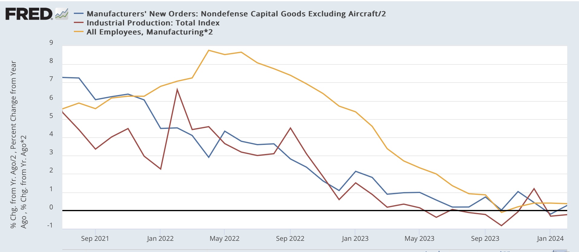
Next, let’s compare capital goods new orders, which were reported yesterday for February (dark blue), with industrial production (red), a premier coincident indicator, and also manufacturing employment from the payrolls survey (gold), all YoY for easier comparison. First, here’s the historical look:


Note that capital goods orders are very noisy (one reason I typically don’t highlight them), and did not turn negative in advance of the Great Recession. Nevertheless, they generally do turn in advance of industrial production, which typically turns in advance of manufacturing employment.

A similar dynamic has existed since the pandemic:


YoY gains in new capital goods orders decelerated first, followed by industrial production, followed last by manufacturing employment. The two first metrics are generally flat YoY, and manufacturing employment is only slightly positive.

Now let’s compare the average manufacturing workweek (black) with capital goods orders, both again YoY and first historically:


The average manufacturing workweek is even more leading than capital goods orders, turning first, but is even more noisy, and over-sensitive to the downside. That is, sharp declines in manufacturing hours always happen before recessions, but a downturn in hours frequently does not presage a recession at all.

Here’s the post-pandemic look at these two metrics:


Hours turned negative first, and if anything are getting “less bad” in recent months, while capital goods new orders, as already indicated, are essentially flat YoY.

Put the data together, and you get a relatively mild manufacturing recession in 2023, which appears to be recovering this year, as the ISM new orders index and the manufacturing workweek are trending higher (if not positive yet), while capital goods orders and production are flat. Manufacturing employment growth -the least leading metric - appears still to be decelerating. 

Before I conclude, let’s take a brief updated look at transportation. Remember, the theory is that everything that is produced must be shipped to market. So to confirm a trend, both should be moving in the same direction.

Here is the Freight Transportation Index through January (dark blue), the noisier and more negatively biased Cass Transportation Index (light blue), compared with heavy weight truck sales which has been an excellent leading indicator (red):


In February, preliminarily there was a steep drop in excess of -3.5% in the Freight Transportation Index, but it has not been updated at FRED, possibly because at least one component (air freight) was withheld pending further seasonal adjustments.

There was a steep drop off in all of these metrics late last year following the Yellow Freight bankruptcy. The Cass Index and truck sales may be showing the beginning of a recovery from that, although the data is too noisy to say anything definitive.

One final note: we’ll bet a detailed updated look at the spending side of construction and production via the personal spending report this Friday.

Tuesday, March 26, 2024

Repeat home sales price declined slightly in January; expect deceleration in the CPI measures of shelter to continue


 - by New Deal democrat


As I noted again yesterday, house prices lag home sales, which in turn lag mortgage rates. Yesterday we got the final February reading on sales. This morning we got the final January read on prices, for repeat sales of existing homes.

Last week’s report on existing home sales showed a sharp increase in February, a repeat of the seasonally adjusted sharp increase last February, which was almost completely taken back over the next two months. YoY sales remained down by over 3%, but the median price of an existing home remained higher by 5.7% - very much *unlike* new homes, where sales have firmed, but price remain almost 20% down from their peak.

This morning the FHFA purchase only price index through January declined -0.1% on a seasonally adjusted monthly basis, while the YoY gain decelerated from 6.6% to 6.3% YoY. Meanwhile the Case Shiller National index declined -0.4% for the month of January on a seasonally adjusted basis, but accelerated from 5.1% to 6.1% YoY. Since the FHFA index (dark blue) has frequently led the Case-Shiller index (light blue) at turning points by a month or two, I put more weight on that Index.

But first, here’s what the monthly numbers look like for the past five years:


Next, here is the long term graph of both of them below, compared with the CPI for shelter (red, *2.5 for scale) shows that the YoY gain particularly in the FHFA index is actually similar to gains during the majority of the past 25 years outside of recessions:


Here’s the close-up view of the last five years, better to show the current trend in both prices and shelter inflation:


For the next seven months the comparisons will be against an average 0.7% increase per month in 2023. Because house price indexes have shown a demonstrated lead over shelter costs as measured in the CPI, if present trends continue, as these YoY comparisons drop out, the YoY deceleration in OER in the CPI index should continue towards its more typical rate of between 2.5% to 4% YoY in the ten years before the pandemic. How soon it gets there will have a lot to do with when the Fed might begin to lower interest rates. 

Monday, March 25, 2024

As mortgage rates remain rangebound, so do new home sales


 - by New Deal democrat


Let’s begin this post by putting why I am watching new home sales in context.

The economy was kept out of recession last year, despite aggressive Fed rate hikes, in large part by commodity price deflation, much or most of which was triggered by the un-kinking of supply chains after the pandemic. That gale force economic tailwind is gone, but the Fed rate hikes remain. So the big question for this year is whether the effects of the Fed rate hikes have just been delayed, or whether, because the rate hikes have stopped, so has the headwind they normally produce. Watching manufacturing and construction, especially housing construction, is what I expect to supply the answer.

So, to the data, starting with my usual caveat: while new home sales (blue in the graphs below) are the most leading of the housing metrics, they are noisy and heavily revised. There was little this month, as January was only revised higher by 3,000 to 664,000. February gave back -2,000 of that, coming in at 662,000 annualized. In the below graph I also show th slightly less leading but much less noisy single family permits (red, right scale):


Before I discuss this graph a little further, let’s compare sales with the even more leading metric of mortgage rates. Both are shown YoY (rates inverted, and *100 for scale):


Except for the distortion created by the pandemic shutdowns in spring 2020 and the YoY comparisons in spring 2021, we see that new home sales have almost simultaneously followed the trajectory of mortgage rates: the higher the mortgage rate YoY, the lower new home sales YoY. Because mortgage rates remain slightly elevated compared with one year ago, the progress YoY in new home sales has almost completely stopped. As a result, I expect single family permits to follow the more noisy downward trend in month over month comparisons in sales in the immediate future.

In other words, so long as mortgage rates remain in the 6%-7% range, I expect new housing sales and construction to stall out as well, but not to decline significantly either.

Finally, as I always reiterate, prices lag sales. So here’s the YoY update on median prices (red), which are not seasonally adjusted (red) compared with YoY sales:


Again, aside from the spring 2020 and 2021 YoY distortions due to the pandemic lockdowns, we see that prices followed sales higher, and then in 2023 followed sales lower. We will probably continue see negative YoY comparisons in prices for a few months more before they follow sales back higher YoY probably by late this year.

But the big takeaway remains that, generally speaking, I am not expecting much in the way of big moves in new home sales or prices until there is a significant change in mortgage rates.

Saturday, March 23, 2024

Weekly Indicators for March 18 - 22 at Seeking Alpha


 - by New Deal democrat


My “Weekly Indicators” post is up at Seeking Alpha.

With interest rates having come down from their highs of five months ago, I anticipated that the shorter leading indicators might follow suit and improve. This week, there was some more evidence that they have.

As usual, clicking over and reading should bring you up to the virtual moment as to the important indicators for the economy, and will reward me with a little pocket change.

Friday, March 22, 2024

Signs of a thaw in the frozen existing homes market, but a very long way to go


 - by New Deal democrat


There’s no big economic news today, but yesterday existing home sales were released. While they have historically constituted up to 90% of the entire market, they have much less economic impact than new home sales, which involve all sorts of construction activity, followed by landscaping, furnishings, and other sales.


Since the Fed started raising rates two years ago, the two markets have gone in entirely different directions, since existing homeowners are largely trapped by new or refinanced mortgages in the 3% range, while builders of new homes can make all sorts of accommodations to entice buyers even with mortgage rates near 7%.

As a result, the existing home market for all intents and purposes froze. Yesterday’s report on existing home sales showed that there is a little thawing going on - but hold the pom poms for now.

The seasonally adjusted annual pace of existing home sales rose 38,000 to 438,000 in February, vs, 4,530,000 one year ago. But as the comparison with non-seasonally adjusted data shows, February is typically one of the slowest sales months of the year. Thus a relatively small change - caused by, say, unusually accommodating winter weather - can make a big difference in the seasonally adjusted rate:


When we step back and look at the data for the past 5 years, we can see that there was a similar jump in February of last year as well, that made for the highest seasonally adjusted total for the entire year:


As usual, take one month’s seasonally adjusted data, especially during winter months, with an extra grain of salt.

That being said, there are signs of some improvement in the market, as both total active listings (blue) and new listings (red) housing inventory has been higher YoY for the past four months:


For new listings, this is the first sustained uptick in three years.

But if this is a thaw, it is only the beginning of the thaw, as we can see when we look at the absolute levels rather than the YoY changes (note separate scales):


The first thing to point out is that this data is not seasonally adjusted. Typically listings bottom in December or January, and improve until mid year. So we need to compare this February with February in previous years.

Before the pandemic, total active listings in February averaged just over 1 million units. New listings averaged about 425,000 for the month. After the pandemic struck, both really plunged, with active listings in February bottoming at 347,000 in 2022, while new listings in February bottomed at 305,000 last year. In February this year, active listings totaled 665,000 and new listings totaled 339,000.

In other words, while there are definitely signs of improvement, the existing home market has a long ways - as in, about 400,000 more monthly active listings and 100,000 new monthly listings - to go.