Friday, February 16, 2024

Housing construction essentially stable in January


 - by New Deal democrat


I’m on the road, so I need to keep this brief, but fortunately I can give you the essence of this most important housing report with little difficulty.


Mortgage rates have declined about 1% from their peak during the autumn, and are about equal to where they were one year ago:


As a result, we should expect some improvement in the housing market from its worst levels. And that’s what we got.

Housing permits declined 1.5% for the month, but are about average compared with the past 10 months. The more significant single family permits increased 1.6% to their highest level in over 18 months. The much more noisy starts decreased a sharp -14.8% for the month, to a level equivalent to their worst in the past year:


Because starts lag permits slightly, I do not think this decline presages a trend, but rather is mainly noise.

Housing units under construction, which are a measure of the “actual” economic activity in the new home market, declined -0.4%, but are only down -2.2% from their peak one year ago. Single family units declined -9,000, but multi family units increased 5,000:


To signify a likely recession, units under construction would have to decline at least -10%, and needless to say, we’re not there. With permits having increased off their bottom, I am not expecting such a 10% decline in construction to materialize. 

Retail sales faceplant; industrial production continues 16 month streak of weakness


- by New Deal democrat


Let’s take a look at two the big short leading and coincident indicators that were reported yesterday, respectively real retail sales and inducatrial production.

Retail sales can be volatile monthly, and about once in a typical year they either faceplant or unexpectedly soar. Yesterday we got the facelpalnt.

Retail sales declined nominally -0.8% in January. Because consumer prices rose 0.3%, in real terms sales declined -1.1%:


This is the lowest level in 10 months. It’s important to note that January sales, on a non-seasonally adjusted basis, are always awful, and while this year was even poorer than last year, it was better than in the years before the pandemic hit. So the seasonal adjustment may be a little askew due to pandemic-era comparisons.

On a YoY basis real retail sales (blue) are down -0.8%. Below I also show real personal consumption of goods (gold) and nonfarm payrolls (red), since the former two although noisy tend to forecast the trend in jobs:


If this were to persist, usually in the past is has meant recession (but not in the last 18 months!) - and note the unusual big divergence between the sales and consumption measures (for now!), which will probably resolve.

Meanwhile industrial production, one of the most important coincident indicators, also declined, by -0.1%, and is down -0.9% from its September 2022 peak. Manufacturing production declined sharply, down -0.5%, and is now -2.1% below its October 2022 peak:


This is the lowest reading for manufacturing production since the beginning of 2023.

On a YoY basis, total production is unchanged, and manufacturing is down -0.8%:


In the modern era since China’s accession to normal trading status in 2000, the 2023 downturn was not quite as negative as the 2015-16 downturn, which did not lead to a recession, although it was definitely as soft spot. 

While we did not get a recession in 2023, it is nonetheless true that both manufacturing and housing did decline from their respective peaks after the Fed began raising rates, and have not recovered them yet.

I am treating these reports as “more of the same” weakness for manufacturing, and a one-off volatile downward number for sales unless it is confirmed by further weakness for at least one more month.

Thursday, February 15, 2024

Initial claims remain positive


 - by New Deal democrat


Initial jobless claims declined this week -8,000 to 212,000. The four week average rose 5,750 to 218,250. With the typical one week lag, continuing claims rose 30,000 to 1.865 million:


On the more important (for forecasting purposes) YoY basis, initial claims are down -1.9%. The four week average is up 5.4%. Continuing claims are up 10.3%:


Initial claims indicate continued expansions. Continuing claims would be a significant issue if supported by initial claims, but this is their lowest YoY increase in eleven months. 

While the last several weeks of initial claims are higher than in January, they remain very low by historical standards, and continue to suggest that the unemployment rate will stay steady or decline in the next few months:


These remain good reports.

Wednesday, February 14, 2024

The long leading forecast for 2024 at Seeking Alpha


 - by New Deal democrat


A couple of times a year I update my long leading forecast. With the latest GDP and Senior Loan Officer Survey data, there is enough to take a look at what the next 12 months probably have in store.


This article is up at Seeking Alpha. 

Tuesday, February 13, 2024

January 2024 consumer inflation: still a tug of war between gas and housing


 - by New Deal democrat


As it has been for going on two years, consumer inflation has boiled down to a contest of strength between energy (mainly gasoline), which peaked in June 2022 and roughed in June 2023, and housing, which peaked in early 2023 and has been gradually disinflating since.


The headlines, as you presumably already know, are that total inflation rose 0.3% in January, and 3.1% YoY, while core inflation (less food and energy) rose 0.4% for the month and 3.9% YoY.

To spare you a bunch of graphs, here is the Census Bureau’s spreadsheet. Go down the column at the far right and it is easy to see where the remaining problem areas are:


The only sectors still up over 4% YoY are food away from home, transport services (mainly repairs and insurance), and - still - housing. The former problem areas of new and used vehicle prices are only up 0.7% and down -3.5% YoY respectively. Here’s what the first two remaining problem children look like YoY:


Inflation in food away from home is still gradually disinflating, although it is still running about 2% above its YoY rate before the pandemic. Transportation services, however, have stopped decelerating for over half a year. Some of this may be due to the reputed consolidation in the auto repair industry, where the remaining players have more pricing power. Some is undoubtedly also due to the fact that there is still a 5-10 million vehicle “hole” in cumulative new vehicle production since the pandemic hit, meaning there are many more older vehicles on the road, and those vehicles need increasing repairs.

To show the effects of the tug of war between energy and housing, below are the YoY% increases in headline inflation (which has been bouncing around between 3.1% and 3.7% for over half a year, core inflation, which has been very gradually trending downward, energy (now down -4.6% YoY, /3 for scale), and CPI ex-shelter, which is up only 1.5% YoY:


Once again, the only *real* inflation problem boils down to shelter.

Because an issue has been made by a few people about whether series like the Apartment List National Rent Index have been giving a true leading reading, here is the latest on that metric:


And here are the monthly% (blue, right scale) and YoY% (red, left scale) changes in the CPI for rent of primary residence:


Before the pandemic, monthly changes in rent typically were in the +0.2% to +0.4% range. Monthly rent just entered that range again, at 0.4%, in January. Similarly, YoY rents typically increased about 3.5%. In January, they were still at 6.1%, but the decelerating trend is very much intact. There is every reason to expect this decelerating trend to continue, and if it does so for the next nine months at the rate it has in the past nine months, YoY rent in the CPI will be about 3.4% - right in the middle of its pre-pandemic range.

Finally, here is this month’s update of the graph comparing house prices as measured by the FHFA Index (/2.5 for scale) with CPI for shelter; first, the long term historical view:


And here is the pandemic era close-up:


Although house prices have resumed increasing in the past half year, the pace of those increases is in line with their pre-pandemic trend. Which is to say that, although the pace of deceleration has itself decelerated, downward pressure is continuing on the CPI shelter index. And although CPI for shelter increased 0.6% in January, and is still up 6.1% YoY, that remains its lowest YoY increase since July 2022.

In other words, if there are no unpleasant surprises awaiting in the months ahead as to gas prices, we can expect headline inflation to continue to be fairly stable, and shelter to continue disinflating, leading to gradually lower core inflation readings as well.

Monday, February 12, 2024

Aggregate payrolls vs. total withholding taxes paid: which one has been telling the truer tale?


 - by New Deal democrat


The drought in new data continues for today. So I wanted to take a further look at the two measures of total payrolls I discussed on Friday, one of which has been of some concern. One is total aggregate payrolls, which is part of the Establishment survey portion of the jobs report each month, and the other is total tax withholding, which is the actual aggregate number reported daily by the Department of the Treasury.


Since these measure similar things - total payrolls and the taxes withheld from total payrolls - with the exception of tax law changes and updated bracketing, they should tell similar stories. And normally for the past 20+ years, they have.

To cut to the chase, here is the YoY% change in aggregate payrolls for all private jobs (blue), which started to be kept in 2007, and aggregate nonsupervisory payrolls (red):


And here is Matt Trivisonno’s long term graph of the YoY% change in the full 365 day increments of withheld taxes, covering the same period except for the last 90 days:


By and large, the two tell similar stories, although tax withholding has been somewhat more volatile. Aggregate payrolls generally varied between +4% to +6% YoY during the end of the 1990s expansion and the two expansions afterward. In the 2021-22 Boom, they peaked at just under +20% YoY. Meanwhile tax withholding varied between +2% and +9% during the previous expansions, but averaged in the +4% to 6% range. In early 2022, they were higher by more than 20% YoY.

For most of 2023 they were more seriously out of synch. Aggregate payrolls gradually decelerated from +7.5% YoY to 5% as of last month. Meanwhile tax withholding decelerated sharply from a similar 7.5% level to only about 1% as of mid-November. 

Because this is public data updated daily by Treasury, it is easy enough to get updated numbers for year end 2023 and through January of this year. Using the same formula, we can see there has been a rebound, as for all of 2023 and for the 12 months ending in January 2024  tax withholding payments were up 3.2%.

This is still significantly less than the +5% in the jobs report last month. Since much of the discrepancy happened during earlier months of 2023, the comprehensive QCEW report for last July through September, which totals 97% of all firms, and which will be published one week from this Wednesday, should give us much more visibility into whether the monthly jobs report numbers from the Establishment survey have been too optimistic or not.

Saturday, February 10, 2024

Weekly Indicators for February 5 - 9 at Seeking Alpha


 - by New Deal democrat


My Weekly Indicators post is up at Seeking Alpha.


Most notable is that two of the long leading indicators - interest rates and corporate profits - have turned from very negative to at very least neutral, increasingly suggesting better economic news ahead.

As usual, clicking over and reading will bring you up to the virtual moment as to the economy, and reward me a little bit for my efforts.

Friday, February 9, 2024

And now for something completely different: portents of DOOOM


 - by New Deal democrat


The lion’s share of the employment news recently has been very good. But not all of it. In particular, several of the annual revisions to the Household jobs Survey, and several other measures of employment and unemployment have been downright gloomy.


Since I haven’t discussed them at any length, I thought I would collect them all here.

First, there’s been a marked divergence between the Establishment jobs survey (red in the graph below) and the smaller, noisier Household survey (blue) ever since March of 2022. In the latter, about half of all the growth in jobholding was recorded in the two months of December 2022 and January 2023. For the entire 21 month period, jobholding has only increased by 1.9%, far below the payroll employment pace:


Some of this has to do with the annual revision, which is entirely included in the January number each year, rather than revising each of the past 12 months. For example, without the population revision, the month over month gain between December and January this year would have been +239,000 rather than -31,000.

But that issue disappears when we measure YoY% changes, and in the Household survey, jobholding is only up 0.6% YoY in January. The below graph subtracts that to show January at the 0 level, to easily compare earlier times when the YoY growth has been the same:


With the exception of single months during 1996 and 2013, YoY jobholding growth has never been this slow since the 1950s without occurring shortly before or after a recession.

My suspicion is that the current downward spike will prove to be like the two above, but there is other, similar information that gives me pause.

Both the Establishment and Household survey numbers are estimates based on sampling. By contrast, the QCEW survey, which is released quarterly with a 6 month lag, is not a survey but rather the actual number of jobs gained or lost based on employer tax withholding, which must be reported to the government, and includes about 97% of all establishments. The most recent update, for Q2 2023, was reported in early December. Here it is, shown in comparison to both the Estabslishment and *adjusted* Household job numbers (via Menzie Chinn at Econbrowser):


Like the Household survey, the QCEW showed a nearly complete pause in job growth in 2022 after Q1, although it increased more strongly in the first half of 2023. We won’t get the Q3 update until the end of this month, but for Q2 of last year it was up 2.2% YoY vs. the Establishment jobs gain which averaged 2.5%.

And further reason to worry that the Household survey may have been giving a better but more pessimistic reading on jobs growth comes from withholding tax payments. Again, these are not surveys but rather the total amount of income tax withheld for all employees nationwide. 

Matt Trivisonno of the Daily Jobs Update has been updating the YoY changes for the full 365 days compared with the previous 365 days the year before, updated every workday. Here’s what his long term graph (minus the last 90 days) shows:


In October and early November of last year, tax withholding payments for the previous 365 days were only averaging about 0.75% more than they were for the 365 day period ending in early November 2022. With the exception of the year following the 2018 tax law changes, and the 2002-03 near “double-dip” recession, since the beginning of the Millennium this has only occurred during recessions.

Similarly, the State of California’s Treasury Department updates its withholding tax payment information once or twice a month. At the end of January, they showed that December’s payrments were only 1% higher than in 2022, and January’s were -1% *lower:*


And the Department of the Treasury updates their income statement daily. While I can’t show you a graph, their Statement for January 31 of this year shows $1,122.1 Billion withholding tax payments collected since the beginning of the fiscal year on October 1 vs. $1,112.6 Billion collected over the same 4 month period the year before, an increase of only 0.9%.

While there may be other issues going on, e.g., a decline in the aggregate $ amount of stock options exercised, or the effect of a 7% increase in tax brackets due to inflation, this 0.9% is a paltry gain, even if we were to treat it as indexed to inflation rather than nominal.

In addition to the above issues with employment gains, there are several components of un- and under-employment which are contrary to the dominant narrative.

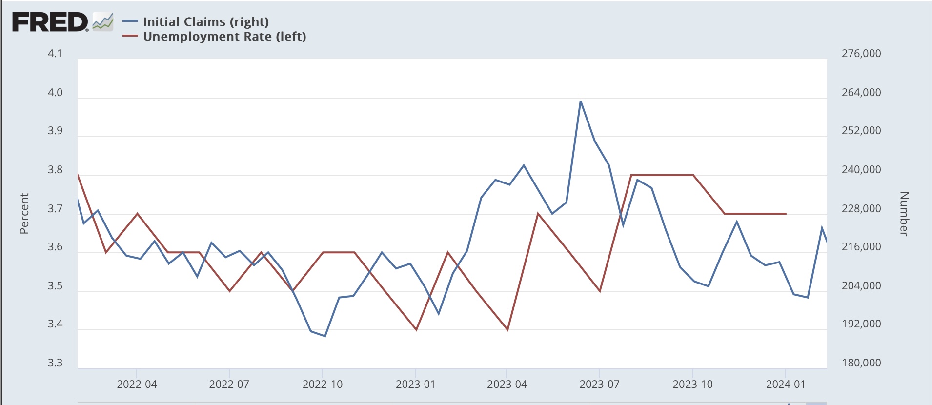
Every Thursday recently I have been pointing out that continuing employment claims (dark blue in the graph below) are running at a higher YoY% rate (presently about 11% higher YoY) vs. the better YoY comparisons in initial claims (light blue), the 4 week average of which is only about 5% higher (note - graph ends at 2019 to avoid the huge spike during the pandemic; both series subtract their current YoY comparison so that it shows at the 0 line):


Contra the story with initial claims, continuing claims have only been 10% or more higher YoY in the past 60 years when a recession is beginning.

A similar story is told when we compare the U6 underemployment rate (dark blue below) to the U3 unemployment rate (light blue). While the latter is at the same level it was a year ago, the U6 rate is 0.5% higher (again, graph subtracts this to show both current levels at the 0 line for easier historical comparison):


With the exception of the 2002-03 near “double-dip” recession scare, the U6 rate has only had this increase since its inception 30 years ago at the onset of recessions.

To reiterate: all of the above data runs counter to most of the jobs-related data I track, in addition to the very positive income, spending, and much improved real sales data that dominate the economy. But all of them - especially the tax withholding and QCEW data - are worth keeping an eye on, to see if they continue to suggest that the economy is weaker than the most popular survey series have been showing.

Thursday, February 8, 2024

Initial jobless claims confirmatory of continued expansion


 - by New Deal democrat


Initial claims continue at their very low level, declining -9,000 to 218,000 last week.  The four week moving average rose 3,750 to 212,250. With the usual one week lag, continuing claims declined -23,000 to 1.871 million:


For forecasting purposes the YoY% change is more important. YoY weekly claims are down -0.9%, the 4 week moving average up 4.4%, and continuing claims up 10.8%:


Both weekly and the four week average of claims are well within the range of forecasting continued expansion. While continuing claims are elevated, and in the past few months sparked some speculation that they signified recession, and taken by themselves, they would, initial claims always precede them. Instead, continuing claims - as usual - have followed initial claims, and are nar their lowest YoY gains in the past year.

The last full month of initial claims, for January, continues to suggest that if anything, the unemployment rate will decline in coming months:


The first week of February data is confirmatory. The Sahm rule is not going to be triggered in the near future.

Wednesday, February 7, 2024

Scenes from the January jobs report: revisions changed the picture in the Establishment Survey


 - by New Deal democrat


Last Friday’s jobs report contained a number of annual revisions which change what the trend line for the last year looks like. Particularly the extent to which there has been continued deceleration, or even a downturn, in a number of significant statistics in the Establishment Survey.


In the below graphs, the original numbers are in blue, the revised numbers in red.

First, in December the YoY% change in jobs created had trended down to +1.7%. With revisions, that increased to 2.0%, and in January it was 1.9%. In the past 6 months, to the extent there has been further deceleration, it has only been from July’s 2.1%:


A similar increase happened to average hourly earnings for nonsupervisory workers. In December the YoY% change was reported as 4.3%. With revisions, it became 4.6%. January saw an increase to 4.8%, almost equal to the YoY% change last August:


A particular weak spot in job creation has been in the higher paying sector of professional and business employment. This had shown an outright decline ever since last spring. There were downward revisions for the earlier months of 2023, and a renewed uptrend in the last two months instead:


While YoY job creation in this sector is still a relatively meager 0.9% (not shown), it is not so poor as the 0.5% which in the past had only happened during recessions.

The revisions weren’t all positive. Aggregate hours of nonsupervisory workers was revised downward for the past 20 months:


Aggregate hours as revised are no better now than they were last August.

But the combination of higher hourly pay and fewer hours meant there was no effect on aggregate payrolls for nonsupervisory workers:


Since this last measure - aggregate payrolls - adjusted for inflation has not changed, the most important coincident indicator of expansion vs. recession remains quite positive.

Tuesday, February 6, 2024

The Senior Loan Officer Survey makes an important turn


  - by New Deal democrat


The Senior Loan Officer jSurvey is a long leading indicator, telling us about credit conditions that typically turn worse a year or more before the economy turns down, and improve just at the economy is ready to turn up.


The one downside is that the information is only reported Quarterly, and with a one a one month lag. Which is a way of saying that data for Q4 of last year was only reported yesterday.

And yesterday’s report was pretty important. Because, for the first time in several years, it was almost entirely positive.

There are two series that have a long enough record to give us a lot of information. The first is whether banks are tightening or loosening standards. Since tightening is shown as an increase, this is one of those series where higher means worse. In Q4, more banks tightened than loosened standards, the percentage of banks so doing decreased sharpl:


This is what happens coming out a reecssions.

The second series, demand for commercial and industrial loans, is almost as positive (and confusingly, in this one higher does mean better. Two of of three measures also showed improvement:


Again, demand has decreased, but not nearly as sharply as before, and this is typically what has happened coming out of recessions.

It has been a long time since the long leading indicators have turned up. But led by interest rates, it appears that has begun to happen.

Monday, February 5, 2024

Travelin’ Man


 - by New Deal democrat


I’m on the road today, so no post. Fortunately, the data is light, so no big deal.

I’ll be back tomorrow, discussing some important revisions in the latest payrolls report. This week I’ll also comment on the updated long leading indicators, including from the recent GDP release as well as the Senior Loan Officer Survey.

Saturday, February 3, 2024

Weekly Indicators for January 29 - February 2 at Seeking Alpha


 - by New Deal democrat


My “Weekly Indicators” post is up at Seeking Alpha.

One week ago many of the high frequency indicators hit an “air pocket.” This week some - but not all! - resolved.

At present there is one of the more anomalous situations I have observed. Most of the data is not just positive, but frequently strongly so. On the other hand, there is a nagging minority of data which is near or flat-out recessionary, some of which (like income tax withholding) is hard to dismiss.

To get the full rundown, click on over and read. It will also reward me a little bit for my efforts in laying the data out for you in an organized format.

Friday, February 2, 2024

January jobs report: a very strong report, but with pockets of significant weakness


 - by New Deal democrat


As per usual, the Establishment and Household portions of the jobs report gave somewhat different impressions, complicated by annual revisions to each. In general, not only was January excellent of the Establishment report, but  most months in the past year were revised upward as well. The Household report mainly was “meh,” neither particularly improving nor declining. Finally, aggregate hours and payrolls were a little concerning.


My focus remains on whether jobs gains are most consistent with a “soft landing,” i.e., no further deterioration, or whether deceleration is ongoing; and more specifically: 
  • Whether there is further deceleration in jobs gains compared with the last 6 month average (Needless to say, the answer to this was a resounding “NO!”)
  • Whether the unemployment rate is neutral or decreasing; or whether there is further weakness; (As expected from the information from initial claims, there was no further weakness) and
  • Based on the leading relationship of the quits rate to average hourly earnings, weather YoY wage growth continues to decline slightly (To the contrary, it rebounded).

Here’s my in depth synopsis.


HEADLINES:
  • 353,000 jobs added. On a YoY basis, jobs rounded to up 1.9%. Due to the annual revisions, this is now tied for the lowest YoY% gain since March 2021. 
  • Both November and December were revised upward, by 9,000 and 117,000 respectively, for a total of 126,000. Almost every month last year, there was a steady drumbeat of downward revisions. This has been all but wiped away by the annual revisions, in which 9 of the last 12 months were revised higher.
  • Private sector jobs increased 317,000. Government jobs increased by 36,000.
  • The alternate, and more volatile measure in the household report, declined by -451,000 before taking into account the annual revisions. After doing so, the month over month change would have been +239,000.  More importantly, the YoY% gain in this report - which avoids issues with seasonal adjustment - declined sharply to +0.6%, the lowest since the pandemic lockdowns.
  • The U3 unemployment rate remained at 3.7%.
  • The U6 underemployment rate increased +0.1% to 7.2%, 0.7% above its low of December 2022.
  • Further out on the spectrum, those who are not in the labor force but want a job now increased 122,000 to 5.793 million, its highest level since September 2022, vs. its post-pandemic low of 4.925 million set last March

Leading employment indicators of a slowdown or recession

These are leading sectors for the economy overall, and help us gauge how much the post-pandemic employment boom is shading towards a downturn.  With one exception, these were positive.:
  • the average manufacturing workweek, one of the 10 components of the Index of Leading Indicators, declined sharply, by another -0.3 hours to 40.0, down -1.5 hours from its February 2022 peak of 41.5 hours, and the lowest level since June 2020.
  • Manufacturing jobs rose 23,000.
  • Within that sector, motor vehicle manufacturing jobs rose 3,100. 
  • Construction jobs increased by 11,000.
  • Residential construction jobs, which are even more leading, rose by 2,500. This is a yet another new post-pandemic high.
  • Goods jobs as a whole rose 11,000 to another new expansion high. These should decline before any recession occurs. After revisions, these are up 1.2% YoY, the lowest growth since early in the pandemic, but which is nevertheless average compared with most of the last 40 years.
  • Temporary jobs, which have generally been declining late 2022, rose by 3,900, and are down about -250,000 since their peak in March 2022.
  • the number of people unemployed for 5 weeks or fewer declined -51,000 to 2,140,000.

Wages of non-managerial workers
  • Average Hourly Earnings for Production and Nonsupervisory Personnel increased $.13, or +0.4%, to $29.66, a YoY gain of +4.8%. The last 3 months have seen the previous deceleration in this metric stop.

Aggregate hours and wages: 
  • the index of aggregate hours worked for non-managerial workers fell -0.2% to the lowest level in 5 months, and after revisions is only up 0.2% YoY, the lowest since March 2021.
  •  the index of aggregate payrolls for non-managerial workers rose 0.2%, and decelerated to being up 5.0% YoY. This is still 1.7% above the most recent YoY inflation rate. In the last 3 months, inflation has only averaged 0.1% monthly, so this may be a positive in real terms as well.

Other significant data:
  • Leisure and hospitality jobs, which were the most hard-hit during the pandemic, rose another 11,000, which is only -75,000, or -0.4% below their pre-pandemic peak.
  • Within the leisure and hospitality sector, food and drink establishments rose 4,600,. This sector has completely recovered from its pandemic downturn. 
  • Professional and business employment increased 74,000. These tend to be well-paying jobs, This series had been declining since last May, but after revisions, the last 2 months have both made new record highs.
  • The employment population ratio increased +0.1% to 60.2%, vs. 61.1% in February 2020.
  • The Labor Force Participation Rate was unchanged at 62.5%, vs. 63.4% in February 2020.


SUMMARY

This month’s report was complicated by extensive revisions to the Establishment side, and population adjustments to the Household side. In general, the Establishment numbers were revised downward in the early part of last year, but upward in almost all months ever since. With these revisions, almost all of the monthly deceleration which I discussed monthly last year has disappeared, although it remains on a YoY basis - but the YoY level of growth is presently to 1.9%, which historically has been perfectly normal.

As noted above, almost all of the leading (and coincident) job sectors showed gains, a number to new post-pandemic highs. Nonsupervisory wage gains appear to have leveled off (i.e., have stopped decelerating) on a real, inflation-adjusted basis.

There were some negatives. The manufacturing workweek is practically screaming “recession” in that sector. In fact, this is a decline typical at the bottom of recessions. Additionally, aggregate hours declined, and aggregate real payrolls *may* have stalled. Also, the U6 underemployment rate increased again. This series only has a 30 year history, but during that history, the level of increase we have seen has only happened early in recessions.

Overall, I interpret this as a very strong report, but with pockets of significant weakness.

Thursday, February 1, 2024

New month’s data starts out with leading indicators in both manufacturing and construction indicating expansion


 - by New Deal democrat


As usual, the new month’s data starts out with information on manufacturing and construction.


The ISM manufacturing index has been a good leading indicator in that sector for 75 years. The difference over time, especially the last 20 years, is that manufacturing makes up a smaller share of the total US economy.

With that caveat, after almost 18 months in contraction, the most leading new orders subindex in the ISM report rose from 47.0 to 52.5. Since any reading above 50 indicates expansion, this is welcome news (although I hasten to add that it is diametrically opposed to the poor regional Fed manufacturing readings for January). The Index as a whole rose from 47.1 to 49.1, still showing very slight contraction, but nevertheless a 1+ year high:


This is (relatively) good news for the manufacturing sector.

Construction spending continued its strong improvement. Total spending (light blue below) rose 0.9% in December, and the more leading residential construction sector (dark blue) increased 1.4%, both to new all-time (nominal) highs:


Since producer prices for construction materials rose 0.6% in December (red), this indicates real growth of 0.8% in residential construction spending, a strong showing.

The bottom line is that this is good news in both leading goods-producing sectors to start out the month.

Continuing claims near 2+ year high; likely the effect of Silicon Valley layoffs


 - by New Deal democrat


Initial claims rose by 9,000 to a three month high of 224,000 last week. The four week moving average also rose 5,350 to 207,750. With the usual one week lag, however, continuing claims rose sharply, by 70,000, to 1.898 million, close to a 2+ year high:


On the more important YoY% change basis, initial claims were up 12.6%, while the four week average was up 4.1%, and continuing claims were up 14.3%:


Although the one week average superficially would be a cause for concern, this comparison is against nearly all time lows set late in January 2023, as shown in the first graph above. In February 2023 claims rose to the 215-230,000 level, so we would need to see claims rise to roughly 240,000 or more for this to be a real concern.

There had been some commentary a few months ago about the elevated YoY level of continuing claims. They certainly do suggest that some people are having trouble finding new employment. In this regard, periodically I check the California Department of Revenue for their analysis of income tax withholding payments. For January, they indicated a YoY decline of -1%.

Such a decline typically means an outright decline in nonfarm payrolls, in this case, for the State. We know that the explosive growth in Silicon Valley early in the pandemic has very much faded, with layoffs being in vogue. It seems likely that this is the source for both the decline in CA withholding tax payments, and the stubborn increase in continuing claims, as this one sector may well be in a recession.

But updating the Sahm Rule analysis, January as a whole showed a continuing decline in initial claims  from last spring and summer’s more elevated levels:


and since claims lead the unemployment rate, this suggests that in tomorrow’s report, as well as the next few months, unemployment is very unlikely to increase above 3.8%, and is more likely to decline towards 3.6% or even 3.5%.

A comment on median vs. mean, and job-stratified wage growth


 - by New Deal democrat


Before today’s avalanche of data, I wanted to comment briefly on the Employment Cost Index for Q4 that was reported yesterday.


This index has the advantage of weighting for type of employment. If low wage workers gain a disproportionate number of jobs, that will tend to hold down *average* wages. But the ECI hold the weighting of low, medium, and high wage jobs constant, so that it tells us how much pay for the *same job* varies from quarter to quarter. And because it is a median vs. average measure, it isn’t skewed by disproportionate gains at the very high end.

The quarter over quarter change in the ECI is shown in red in the graph below, since the peak in wage growth in 2021, compared with average nonsupervisory wage growth (light blue) and average total private wage growth (dark blue):


All three show deceleration, and all three are currently between 4.0% and 4.5% growth YoY, as shown in the graph below:


Note that average hourly wages spiked during the pandemic lockdown period, when low wage service workers were very disproportionately laid off. When they were rehired in 2021, and seemingly every retail business had a “help wanted” sign on their front window or roadside sign, average hourly wages for lower income, nonsupervisory workers spiked far more than other wages. By contrast, the wage paid for *the same work* was not affected by the pandemic layoffs, but did increase sharply as the unemployment rate fell to historical lows.

This “game of reverse musical chairs,” as I have called it over the past couple of years, has pretty much come to an end, and more typical wage growth for an expansion has ensued. 

Tomorrow both average wage measures will be updated for January as part of the jobs report. I anticipate further deceleration.

Wednesday, January 31, 2024

December JOLTS report: while hiring has weakened, firing (and quitting) continue to show a strong labor market


 - by New Deal democrat


Yesterday’s JOLTS report for December showed a labor market that, while decelerating, remains relatively strong.


Let me start with layoffs and discharges, which increased by 85,000 to 1.616 million (blue in the graph below). This is nevertheless about average for the past year, and as usual mirrors the pattern in initial jobless claims (red):


Meanwhile, job openings (blue in the graph below), a soft statistic that is polluted by imaginary, permanent, and trolling listings, increased 101,000 to 9.026 million. Actual hires (red) increased 97,000 to 5.621 million. Voluntary quits (gold) declined -132,000 to 3.392 million. In the below graph, they are all normed to a level of 100 as of just before the pandemic:


Interestingly, while job openings are still 29% higher than just before the pandemic, both hires (-6.3%) and quits (-2.8%) are lower than that level. So is the jobs market actually weak?

Not really. 

To show you why, the below graph norms the rates of hires, quits, and layoffs and discharges to the zero line as of the average of their most recent readings, and shows you their record in the 20 years before the pandemic:


Layoffs and discharges are lower now than at any time before the pandemic. Voluntary quits are higher than at any point before the pandemic except for 3 years (2000 and 2018-19). Only hires are relatively weak, lower now than at about 60% of all years since the series began.

More often than not, hiring slows down before firing picks up. As a share of the available labor, hiring has indeed slowed down - to a slightly less than average level. But both voluntary quits as well as layoffs and discharges continue to show a very strong labor market.

ADDENDUM: Since the quits rate tends to lead average hourly earnings, I wanted to add that. The quits rate remained even compared with November, at the lowest rate since the pandemic. This implies that average hourly earnings, which will be updated as part of Friday’s employment report, will decelerate further: