Saturday, April 22, 2023

Weekly Indicators for April 17 - 21 at Seeking Alpha


 - by New Deal democrat

My Weekly Indicators post is up at Seeking Alpha.

There’s more *extremely* slow deterioration in some coincident indicators of recession, but at the same time, the downturn has been telegraphed for so long that some leading indicators are on the verge of turning bullish again.

As usual, clicking over and reading will bring you up to the virtual moment on all of the cross currents, and reward me a little bit for my efforts.

Friday, April 21, 2023

The economic tailwind from last autumn’s declining gas prices is probably over


 - by New Deal democrat


On Wednesday I discussed how gas prices, with an assist from higher stock prices leading to stock options being cashed in, was the primary reason why the coincident indicators hadn’t rolled over yet.


I wanted to explore that a little more: was the boost from lower gas prices going to allow for a “soft landing,” or a “modified limited rolling recession,” if you will? Or was the boost ending, where we could expect the other factors driving the economy to take precedence? Let me look at this two ways.

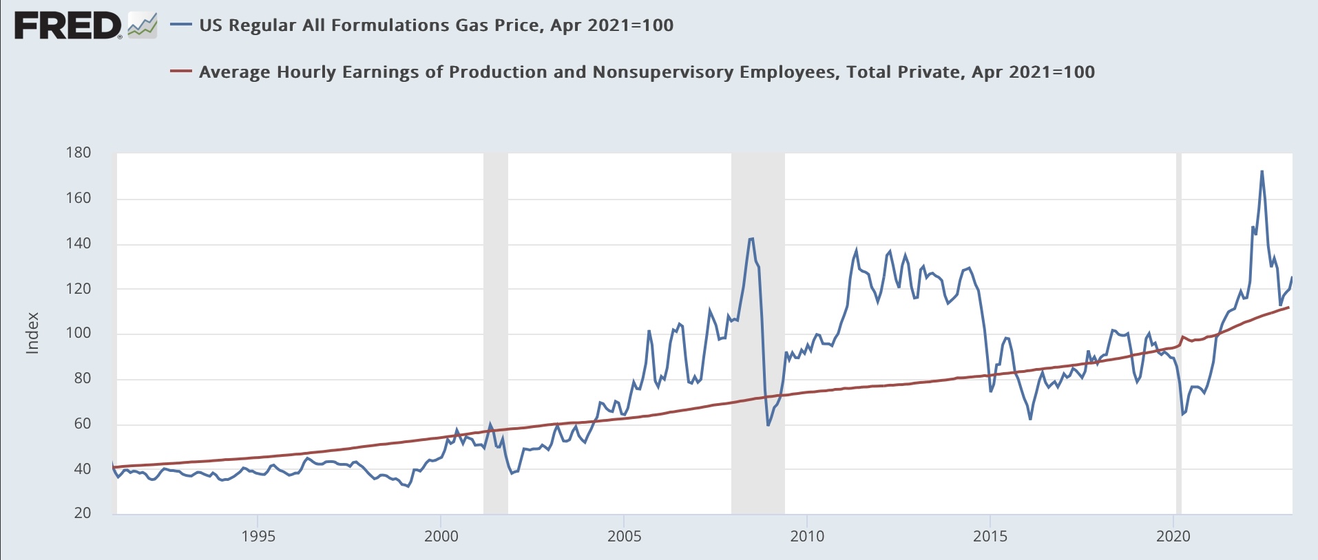
First, gas at the pump has to be funded by wages. So one way to measure the impact of gas prices on consumers is to compare the two. In order to take the effects of Russia’s invasion of Ukraine out of the picture, in the below graph I have normed both gas prices and non-managerial wages to 100 as of April 2 years ago. Here is the long-term graph:


We can see the periods of really cheap gas prices at the end of the 1990s, and during both recent recessions, as well as the big downturn in 2014-15. More recently, we can see that the run-down in prices in the second half of last year took us about to the historical norm. Since the beginning of this year, prices have turned “relatively” expensive, without engaging an actual “choke collar” on the economy, as they did in the first part of last year.

Here’s another look at the same data, this time dividing gas prices by hourly wages:


The stress caused by the Russian invasion of Ukraine is over, but the tailwind of the downturn in prices thereafter has ended as well.

Second, it’s been suggested that whenever gas prices hit a certain level of GDP, that has been enough to trigger a recession. I show that below by dividing gas prices by nominal GDP, and norming the data to 100 as of Q4 2007, the last time an oil price spike helped spark a recession:


Note at the far left how the impact of the invasion of Kuwait by Iraq in 1990 helped trigger that recession as well.

Last year’s run-up didn’t quite hit the 100 threshold, peaking at 90. This was enough to crimp GDP without actually causing a recession. By the end of Q4 that had entirely receded. We’ll find out about Q1 next week.

Let’s look at this same data on a YoY basis. Below I show the YoY% change, inverted, of gas prices averaged quarterly (so that a decrease in price shows as an increase, e.g.), together with YoY nominal GDP (*5 for scale):


Basically this shows that “the remedy for high (low) prices is high (low) prices.” Big run-ups in prices create GDP slowdowns about 1 year later, and big run-downs in prices an increase in YoY GDP a year later (but of course it’s not monocausal, e.g., the tech boom of the late 1990s and the shallow industrial recession of 2015-16 were not particularly in tune with gas prices).

This graph suggests that the effects of the big run-up in gas prices early last year have not yet fully been felt, and that the effects of the run-down in prices thereafter will probably show up by next year.

The bottom line for now is that gas prices probably were part of the GDP slowdown in the first 2 Quarters of last year, and probably a part of the rebound thereafter, up into Q1 of this year. But the tailwind is probably over beginning this Quarter. In other words, I expect the effects of other aspects of the economy to increase in salience beginning with this Quarter’s data.


Thursday, April 20, 2023

Jobless claims continue to warrant yellow caution flag, while continuing claims shade closer to crimson


 - by New Deal democrat


Initial claims (blue in the graph below) continued their recent track into recession caution territory this week, as they rose 5,000 to 245,000, 12.9% higher YoY and the 5th time in the last 7 weeks that claims have been 240,000 or above. The last time they were at this level was in January 2022. 


The more important 4 week moving average (red) declined -250 to 239,750, 10.6% higher than 1 year ago. This is the 4th week in a row that the YoY% change has been above 10%, but it has not yet crossed the 12.5% threshold that historically has been a recession warning. On an absolute basis, except for 2 of the 4 previous weeks, the highest it had been at this level was also January 2022.

Finally, continuing claims (gold) rose 61,000 to 1,865,000, 22.1% above their level one year ago, and the highest since November 2021:


Here is the YoY% change, which is more important at the moment:


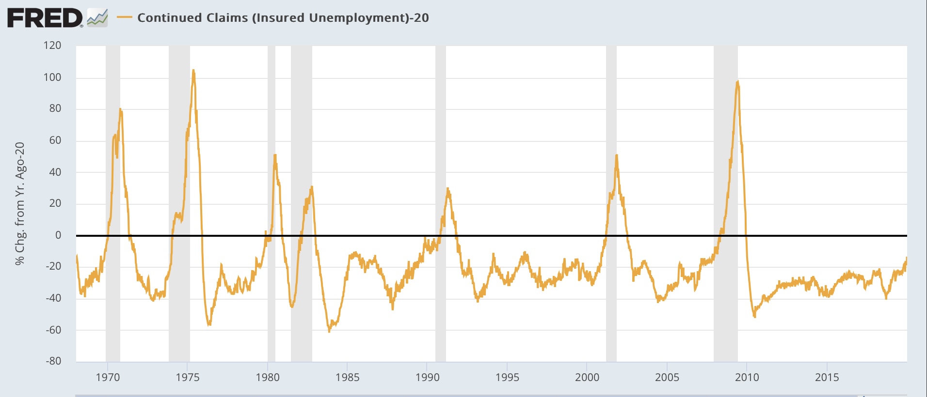
The increase in continuing claims appears especially significant. Historically, continuing claims have lagged, and have not been higher YoY by 20% or more until after a recession had already started (below graph subtracts 20% so that a YoY 20% increase shows at the zero line):


The only two exceptions prior to the pandemic were 2 weeks in November and December 1979, just before the January start of the 1980 recession, and 1 week in November 1989, 8 months before the onset of the July 1990 recession. 

Parenthetically, it is important to note that the massive seasonal revisions which were announced 2 weeks ago did not significantly affect the YoY comparisons. 

For forecasting purposes, this metric continues to warrant a yellow but not red flag. But if continuing claims are over 20% for even one more week, that yellow will shade closer to orange or even crimson.

Wednesday, April 19, 2023

Coincident indicators hold on, mainly due to improvement in gas prices YoY


 - by New Deal democrat


I’ve been paying particular attention lately to the coincident indicators, because the leading indicators have telegraphed a recession for about half a year - so why isn’t it here yet???

A good representation of coincident indicators remaining positive is the Weekly Economic Index of the NY Fed:


It looked on track to turn negative at the beginning of the year, but has not deteriorated any further since. Can we isolate where the strength has been coming from?

Yes we can. The NY Fed helpfully tells us that the index is an amalgamation of 10 data series, 8 of which are in the public realm, and all 8 of which I have been keeping track of for the past 10 years in my “Weekly Indicators” posts. The 8 are: initial jobless claims, continuing claims, the American Staffing Index, gas usage, Redbook consumer spending, Rail traffic, tax withholding payments, and steel production.

So, which of these are now or at least have recently been positive?

Most importantly, gas usage. As I’ve noted a number of times, gas prices declining from $5 last June to $3 in December can do a world of good to economic statistics. Unsurprisingly, gas usage was at its worst YoY last summer, and turned positive this winter:


With gas prices still roughly $0.50 less than they were last year at this time, usage has improved to about 5% better YoY.

A second series which has improved considerably, and more surprisingly, is tax withholding payments. Here’s a graph through the beginning of April provided by the CA Department of Taxation, which is similar to tax withholding payments for the nation as a whole:


Tax payments declined considerably YoY in the last few months of 2022, but then stabilized beginning in January. The CA Department of Taxation had attributed the decline to the failure of stock options to vest (and so be cashed in) as 2022 progressed, due to the stock market decline. Stocks bottomed in October and have been in a positive trend since, so likely stock options have been more attractively priced this year. So their explanation makes sense.

For the record, for the first 11 days of April, withholding tax payments are ahead by about 7% compared with last year, $149.4 Billion (11 days in) vs. $140.0 Billion last year.

One other series, which had been looking better YoY, has deteriorated in April: steel production. This had been down over 10% last year, before improving earlier this year and actually turning positive YoY in March. But now it is back down about -5% YoY:


A second deteriorating series is staffing. This was positive but increasingly less so last autumn, then turned neutral, and solidly negative beginning in February:


The index is now down -7% YoY. I consider it more of a leading than coincident indicator, since it correlates with temporary help in the payrolls report, which typically turns down well before jobs as a whole.

Finally, consumer spending as measured by Redbook, which had been up over 15% last summer, has been almost consistently deteriorating since then, and as of the last reading this week was only up 1.1% YoY:


This series is on track to turn negative YoY in the next month, if the trend holds.

As a whole, the coincident data continues to deteriorate. It has been helped considerably by lower gas prices, with a big assist from increasing stock prices. I do not think this will last long, but we’ll see.

Tuesday, April 18, 2023

New housing construction appears to have bottomed; but expect further declines in construction employment ahead


 - by New Deal democrat


For the past few months, I’ve noted that new home sales, which while very volatile frequently are the first metric to signal a change in trend, appeared to have bottomed by early last autumn. This morning’s report on housing permits and starts appears to have confirmed that signal. 

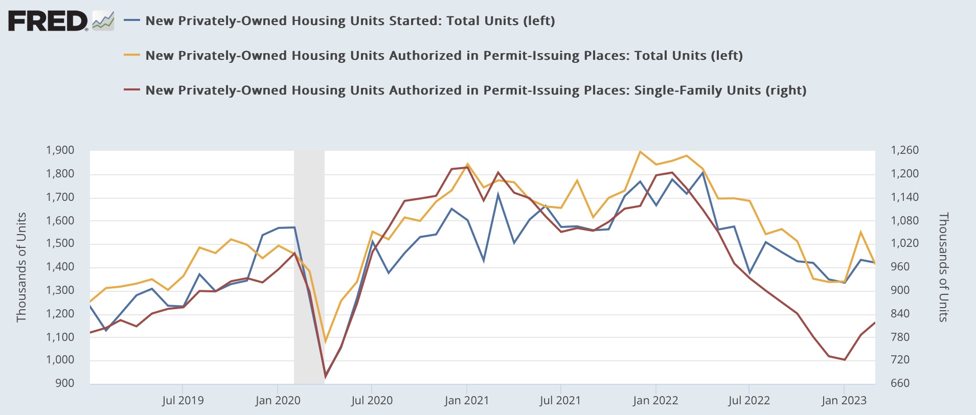
While total housing permits (gold in the graph below) declined -137,000 on a seasonally adjusted annual rate from last month, they remained higher than their November-January lows by about 75,000. Starts (blue), which are noisier and tend to lag a month or so, also declined -12,000, but remained 86,000 higher than their January low. Most importantly, single family permits (red, right scale) which are the least volatile measure of the three, rose 32,000, for the second straight monthly increase, and are now almost 100,000 above their January low:


It is very likely that the bottom for the housing sales market is in. Remember that sales follow interest rates, and in particular mortgage rates, which peaked last October and November. Below is a the latest update of the graph comparing the YoY change in mortgage rates (blue, inverted, *10 for scale)  with the YoY% change in both total and single family permits:


This is all good news, despite the monthly declines in total permits and starts.

The one important piece of bad news is that total housing units under construction declined again (blue in the graphs below), and are now -2.2% below their October peak. As I’ve noted monthly for awhile now, this is the metric that shows the actual total economic activity of the housing market, so it shows that housing is now detracting from GDP. Further, once construction turns down, shortly thereafter so does construction employment (red). Here is the historical view until the pandemic:


Now here is the last year, with both metrics normed to 100 as of their peak months:


Nonfarm payrolls has been the main coincident indicator holding up the economy, and construction employment is one of the leading sectors of the jobs market overall. This morning’s report tells us to expect further declines in that jobs sector.


Monday, April 17, 2023

Two “fundamental” indicators for the American middle/working class and the economy


 - by New Deal democrat


This week is a little light on data, except for housing permits and starts (Tuesday) and existing home sales (Thursday), so let me catch up on a few other indicators.

In particular, two of my favorite indicators are based on “fundamentals.” Basically, how much the average American is earning, and how much they are spending. Needless to say, we want both of them to be increasing. That’s because, as I have often said, consumption leads employment. If Americans are cutting back on spending, then cutbacks in employment will soon follow.

Because consumption leads, let’s start with spending, i.e., real retail sales YoY. This data series goes back 75 years. And it has been very reliable. Here’s the graph:


Leaving aside the pandemic, real retail sales has *always* turned negative YoY within about 6 months before the onset of a recession, except for two times in the 1950s where it turned negative YoY 4 and 5 months into the recession.

There have been some false positives (13 in total), where negative monthly YoY readings were not associated with a recession, but a majority of those were never worse than -1.0% YoY (the exceptions being 1951-52, 1956, 1966-67, 1987, and 2002). Further, a majority of the 13 times only lasted for 1 month, and only 3 have lasted for longer than 2 months in a row (1951-52, 1966-67, and 2002). 

In short, even a 1 month negative YoY reading is a yellow flag that a recession might be near, and if it goes on longer than 2 months with at least one negative reading of more than -1.0%, almost certainly a recession has either just started or will within the next few months.

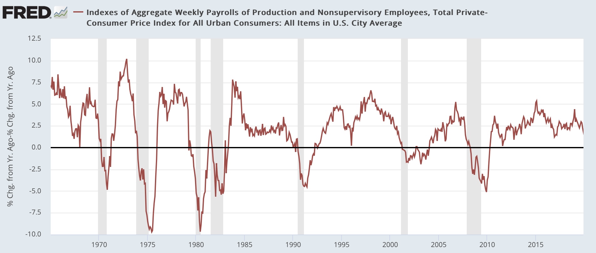
Now let’s turn to employment, in the form of real aggregate payrolls for non-supervisory employees. In other words, in real terms the total pay that the American working/middle class is taking home. This has a 60 year track record, and has also been very reliable:


There have been *no* false positives, ie., where the indicator signaled but there was no recession. There have been 5 times when the indicator did not turn negative until several months into a recession: 1970 (4 months), 1974 (3 months), 1981 (3 months), 2001 (1 month), and 2008 (5 months). But with the exception of 1981, in the other 4 episodes this metric was in a clear and severe downtrend during those months.

Now let’s see what both look like together in the 50+ years both were in existence prior to the pandemic:


What this shows is that, if both of these two indicators are positive, you could be sure that you are not in a recession. With the sole exception of one month in late 2002, if both are negative you could be sure that you are either just before, during, or coming out of a recession. And frequently real retail sales had turned negative a few months before real aggregate payrolls.

Now let’s look at the past 18 months:


Real retail sales have been negative YoY for 7 of the past 13 months. I have discounted the negatives from last spring, because they were in contrast with.the spring stimulus spending spree of 2021. But 4 of the past 5 months have also been negative, and last month (March) by -1.9%.  Putting both indicators together, with the exception of 1966-67 and arguably the near double-dip of late 2002, there has never been a time in the past 60 years where a downturn this big for this duration has not meant a recession.

Most importantly, at the moment real aggregate payrolls are still positive, and they are not declining. Because, for reasons I discussed last week, I expect consumer inflation to only be about +3.2% YoY after June, for aggregate real payrolls to turn negative, there will have to be a pronounced slowdown in either hours, or jobs, or wage growth, or a combination of the three.

Saturday, April 15, 2023

Weekly Indicators for April 10 -14 at Seeking Alpha


 - by New Deal democrat


My ‘Weekly Indicators’ post is up at Seeking Alpha.


The slow drip-drip-drip of deceleration generally continues. Perhaps most significantly, YoY consumer spending as measured by Redbook sank to a new post-pandemic lockdown low of only +1.5%. But other coincident indicators in particular, like tax withholding, appear resilient.

As usual, clicking over and reading will bring you up to the virtual moment as to the economy, and reward me a little bit for my efforts.

Friday, April 14, 2023

Real manufacturing and trade sales probably rose to a new record high in February; may have declined in March


 - by New Deal democrat


Real manufacturing and trade sales is one of the 4 monthly coincident indicators most monitored by the NBER to determine whether the economy is in expansion or recession. Because the reporting of this series lags badly (by 2 months), I have developed several placeholders to estimate it on a more timely basis.


The first back of the envelope method is a simple averaging of industrial production and real retail sales. The latter is about 1/3rd of the actual measure of real business sales, and the former is a proxy for manufacturers and wholesalers sales (what it leaves out is manufacturers’ inventories and the wholesalers’ portion). It isn’t that accurate on a month to month basis, but generally gets the trend right.

Since this morning both real retail sales and industrial production were reported for March, we have our first estimate of March real business sales, suggesting they more likely than not declined, at an estimate of -0.6%. Note that February is also estimated to have declined -0.4% by this method:


The second method, which has been much more accurate on a monthly basis (generally coming in within +/-0.3%) as well as the trend, is to take total business sales (which were reported this morning) and to apply a simple average deflator of the PPI for commodities, intermediate, and finished goods as well as the CPI. Since total sales declined very slightly on a nominal basis (less than -0.1%) for February, but the average deflator was negative, this suggests that real manufacturing and trade sales actually increased in February by +0.2%:


If this holds, it will mean that this important coincident indicator made another new high in February:


But as per the first estimating method above, may have declined in March.

Positive revisions make for a good March industrial production report


 - by New Deal democrat


If retail sales for March were bad, industrial production (blue in the graph below) was at very least mixed to the upside. Total production increased +0.4%, and on top of that February was revised higher by +0.2%, and January was revised higher by +0.5%.

The not so good news is that while manufacturing (red) was also revised higher by +0.5% for February, it was all taken back by a -0.5% decline in March:


With these revisions and additions, industrial production is still -0.5% below its September peak (a big improvement from last month’s original -1.8%), while manufacturing production (red) is -1.2% below its peak from last October, also an improvement from the original -2.0% last month.


In both 2016 and 2019 there were bigger declines than even as measured one month ago without there being a recession, because manufacturing has shrunk so much as a percentage of the overall economy. Still, this remains one of the 4 main coincident indicators relied on by the NBER, and more often than not in the past its peak has meant the cycle peak as well.

Once the February nominal manufacturing sales data for February is reported later this morning, I will make estimates of that important coincident indicator in real terms as well.

March real retail sales lay an egg, suggest downturn in nonfarm payrolls by the end of summer


 - by New Deal democrat 


After a quiet early part of the week, today we get a deluge of data: retail sales and industrial production for March, and total business sales for February. Because real total business sales are one of the 4 big coincident indicators tracked by the NBER, and because retail sales are about 1/3rd of the total, and industrial production helps us estimate the rest, after the data comes out I can give estimates of the *real,* not just nominal, values for both February and March.


But first, retail sales . . . Which laid an egg, as they do once or twice a year.

In this case nominal retail sales declined -1.0% for the month. Because consumer prices increased less than 0.1% in March, real retail sales also were down -1.0%. Combined with a -0.6% decline in February, real retail sales have taken back close to 2/3’s of the big January gain, and are down -3.0% from their March 2021 peak:


YoY real retail sales are down -1.9%, the biggest decline since the pandemic lockdown. As I write nearly every month, they are a noisy but time-tested short leading indicator (/2) for jobs. Here is the updated look at that comparison:


YoY nonfarm payrolls have declined about 1/3rd, from +4% to +2.7% in the past 6 months. At this rate they will have declined by more than 1/2 of that +4% in 3 or 4 months, which by my rule of thumb means it is likely there will be a seasonally adjusted actual decline in monthly payrolls by the end of this summer.

UPDATE: Checking the historical record all the way back to 1948, a YoY decline in real retail sales of -1.9%, our current value, has *always* occurred at the outset of or during a recession with the only exceptions of 1951-52, and the months of September 1987 and October 2002.

Thursday, April 13, 2023

Initial claims continue to warrant yellow caution flag


 - by New Deal democrat


Initial jobless claims last week rose 11,000 to 239,000. The more important 4 week average rose 2,250 to 240,000. Continuing claims, with a one week delay, decreased 13,000 to 1,823,000:


At this juncture the YoY change is more important, because increases of more than 10%, especially in the 4 week average, or monthly, are a yellow caution flag for recession, and an increase of more than 12.5% which persists for at least 2 months is a red flag recession warning. 

And on a YoY basis, while the one week number is only up 7.7%, for the month of March (blue)they were up 11.0%. For the first 2 weeks of April (not shown) they are up 8.3% YoY so far. The 4 week average is up 11.1%. Continuing claims, which lag, are up 13.8%%:


Because of the 4 week average and the monthly YoY increase for March, a yellow caution flag remains warranted. It will take further increases into the 240’s that persist into May for the data to warrant a red flag recession warning.


Wednesday, April 12, 2023

Properly measured, consumer inflation is only about 3.0% YoY, and the economy has experience DEflation since last June


 - by New Deal democrat


One month ago, I “officially” took the position that inflation had been conquered, and that, properly measured, the economy had actually been experiencing deflation since last June. This morning’s report only confirmed that position.

The primary reason, as I have been pounding on for almost 18 months, is that the shelter component of official inflation, which is 1/3rd of the total, and 40% of the “core” measure, badly lags the real data - as in, by a year or more.

Before we get into all that, let’s look at the headlines, with the monthly and YoY rates of change:

Total CPI up 0.1% m/m and 5.0% YoY
Core CPI up 0.4% m/m and 5.6% YoY
Owners Equivalent Rent up 0.5% m/m and 8.0% YoY
CPI less shelter up +0.2% and 3.4% YoY
Energy down -3.5% m/m and -6.4% YoY
Food unchanged m/m and 8.5% YoY
New cars up 0.4% m/m and 6.1% YoY

Core inflation is being driven by Owners’ Equivalent rent (shelter) and new cars. Total inflation is also being driven by food. But because shelter is such a large component of the aggregate, even including new cars and food leaves consumer inflation at a YoY rate that ought to be in the Fed’s comfort zone.

 So let’s start with an updated long term YoY graph of the big culprit, Owner’s Equivalent Rent (red), which increased another 0.5% in February, with the FHFA house price index (blue, /2 for scale), which has been declining since last June and stood at 5.2% as of its last reading for January:


Here are the last 3 years for the close-up look:


The *relatively* good news s that OER appears to be leveling out, right on schedule about one year after house prices. If the FHFA index has continued to decline in the 2 months since then, it is only up about 2.3% YoY currently, vs. 8.0% for OER. If the FHFA index were substituted for OER, then total YoY CPI for March would only be 3.1%. Core inflation, which ex-shelter is up 3.5%, would only be up 3.0% if the FHFA house price index were substituted for OER.

There is no reason for the Fed to be raising rates if properly measured total CPI is increasing only 3.1% YoY, and core CPI is up only 3.0% YoY.

But it gets even worse, because last June, when house prices peaked and gas prices reached $5/gallon, was an inflection point. So the below graph norms total and core inflation as well as CPI less shelter, to 100 as of that month. Here’s what inflation since then looks like:


Total inflation is up 2.4% in the last 9 months, or at an annual rate of 3.2%.
Core inflation us up 3.8% in the last 9 months, for an annual rate of 5.1%.
 Consumer prices ex-shelter are in *deflation,* down -0.2% in the past 9 months, for an annual rate of -0.3%.

Because the FHFA house price index is down -0.6% in the 7 months since June through January, if it were projected forward through March, it would be down -0.8% in the past 9 months.

In other words, consumer prices ex-shelter, plus shelter properly measured, indicates that the economy has been in outright *deflation* over the past 9 months.

And yet the Fed is still contemplating further rate hikes. 

Tuesday, April 11, 2023

Scenes from the March employment report 2: unemployment recession indicators


 - by New Deal democrat


A reminder: I may be offline for the next couple of days. In the meantime, yesterday I looked at the 5 leading indicators contained in the employment report, and summarized how they either signal recession now or within the next 3 to 6 months.


Today I want to focus on unemployment and underemployment. Economist Gloria Sahm’s Rule, namely that when the 3-month average unemployment rate rises a half percentage point above the low of the prior 12 months, the economy is in recession, or is about to be, is sufficient to indicate the onset of a recession, but is not necessary. Recessions in the past have started with even a 0.1% increase.

So, let’s look at some indicators which give us quicker signals. 

1. Initial jobless claims lead the unemployment rate

This is something I have written and updated numerous times in the past decade. Initial jobless claims are one of the 10 items in the Index of Leading Indicators, and as shown below, have a 50+ year track record of turning both higher and lower before the unemployment rate does:


Here is the update for the past two years:


The relationship shows up even better when we compare the YoY% change in both up until the pandemic (note this means a % of a % in the case of the unemployment rate, so an increase from 4% to 8% would be a 100% increase):


Usually, but not always, the unemployment rate has been higher YoY by the time a recession begins.

Here is the YoY update for the past two years:


In March, initial claims finally did turn higher YoY, and the unemployment rate is on track to do so as well within the next several months. As I’ve indicated a number of times in the past year, my “red flag” marker is initial claims, on a monthly basis, being 12.5% higher for two months in a row. We’re not quite there yet.

2. Permanent job losers

This series began in 1994, so we only have about a 30 year history. But it does seem to be a good marker for weakness in the job market, as shown below measured 2 ways: its absolute level (blue), and YoY% change (red):


While there have been several brief false positives, notably 1996, where the 3 month trend is higher YoY, it has usually meant a recession is near. 

There is a similar series of total job losers that goes all the way back to 1967. Here’s what that looks like YoY (blue) compared with the newer, permanent job losers series (red):


With the noted exceptions of 1974 and 1981, the older series has also turned higher YoY prior to all other recessions.

Here is a close-up of the past 2 years:


These metrics - as well as initial claims, discussed above - have just hoisted a yellow flag. If next month’s report is also higher YoY, that would merit a red flag, indicating a recession is very close, perhaps imminent.

Monday, April 10, 2023

Scenes from the March employment report 1: leading sector indicators


 - by New Deal democrat


There’s no significant economic news this week until Wednesday’s CPI report, and as a side note, I might be offline for a day or two later this week. In the meantime, today and tomorrow let’s take a look at some of the important information from last Friday’s employment report.


Today, I’m taking a look at the leading employment sectors and several other leading components of the report.

To recapitulate from my monthly updates, there are 5 leading indicators in the report:
1. The manufacturing work week (which is 1 of the 10 components of the Index of Leading Indicators).
2. Manufacturing employment.
3. Construction (especially residential construction) employment.
4. Temporary help
5. The number of unemployed less than 5 weeks (this series is similar to, but noisier than, initial claims - but the data starts years earlier, so there is a longer record).

Here are the first 4 series all normed to 100 as of their highest month:


Both the manufacturing work week and temporary help employment have been down for over a year. Manufacturing employment has declined very slightly (-1,000) in each of the past two months. Finally, residential construction employment, which had been increasing as the number of housing units under construction also did, also appears to have peaked in January.

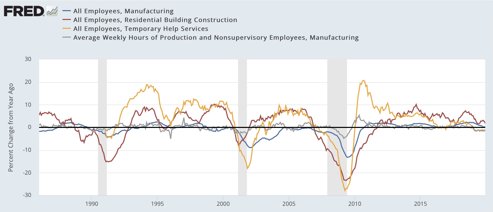
Because each individual sector has waxed and waned with great variation in past cycles, below I show them YoY for the past 40 years leading up to the pandemic:


A marker of all of the recessions in the past 40 years prior to the pandemic is that all 4 turned negative prior to each recession, with the sole exception that the manufacturing work week was flat YoY prior to the 2008 recession. When even 2 of the 4 were positive YoY, there was no recession.

Here is the same graph for the past 12 months:


Temporary help and the manufacturing work week are negative. Manufacturing and residential construction employment are decelerating, but still positive. If their current paces of deceleration were to continue, residential construction employment is on track to turn negative in 3 months; manufacturing employment in 8.

Finally, the number of persons who have been unemployed for less than 5 weeks decreased slightly in March, but at 2.722 million, is at a level higher than all but 4 months in the past 2 years:


Here is the historical track record of this indicator, averaged quarterly YoY for 70 years prior to the pandemic:


While it is indeed noisy, it has turned higher YoY in the quarter of, and almost always prior to, the onset of recessions.

Here is the quarterly YoY view since Q4 of 2020:


The only reason it was not higher YoY in Q1 of this year is the comparison with the extremely weak month of January 2022 which was included in the average.

To summarize: all 5 of the leading components contained in the jobs report have turned down (or in the case of short term unemployment, up) from their best levels. Several are already at levels consistent with recession. The remaining ones are on track to signal recession within 3 to 6 months.

Tomorrow: unemployment indicators

Saturday, April 8, 2023

Weekly Indicators for April 3 - 7 at Seeking Alpha


 - by New Deal democrat


My Weekly Indicators post is up at Seeking Alpha

Probably unsurprisingly, the big news this week was the effect of the revisions to the initial jobless claims data, and also the turning down of several sectors in the monthly jobs report.

Anyway, as usual clicking over and reading will bring you up to the virtual moment as to the data, and reward me a little bit for my efforts in putting it all together.

Friday, April 7, 2023

March jobs report: leading sectors turn down in a pre-recessionary, but still quite positive, report


 - by New Deal democrat


Unsurprisingly, my focus on this report, like the last few reports, was on whether residential construction jobs turned negative or not, whether manufacturing and temporary jobs continued on their downward trajectory, and whether the deceleration in job growth would be apparent.

Some of the deceleration or decline occurred, particularly in the sectors which lead the market overall, while other metrics held steady or even improved, consistent with a still very tight market.

Here’s my in depth synopsis.


HEADLINES:
  • 236,000 jobs added, the lowest number since December 2020. Private sector jobs increased 189,000, also the lowest since December 2020. Government jobs increased by 47,000. The three month moving average of growth declined 1,000 to 345,000. 
  • The alternate, and more volatile measure in the household report rose by 577,000 jobs. The above household number factors into the unemployment and underemployment rates below.
  • U3 unemployment rate declined -0.1% to 3.5%.
  • U6 underemployment rate also declined -0.1% to 6.7%.
  • January was revised downward by -32,000, and February was revised upward by 15,000, for a net decrease of -17,000 jobs compared with previous reports. 

Leading employment indicators of a slowdown or recession

These are leading sectors for the economy overall, and help us gauge how much the post-pandemic employment boom is shading towards a downturn.  These were mixed, but the overall tenor was neutral to negative:
  • the average manufacturing workweek, one of the 10 components of the Index of Leading Indicators, declined was unchanged at 40.7, down -0.9 hours from February peak last year of 41.6 hours.
  • Manufacturing jobs declined by -1,000.
  • Construction jobs declined for the first time since January 2022, by -9,000.
  • Residential construction jobs, which are even more leading, increased by only 800, but last month’s gain of 1,200 was revised to a loss of -2,400, suggesting January may have been the peak for this sector.
  • Temporary jobs, which have generally been declining late last year, resumed that decline, by -10,700.
  • the number of people unemployed for 5 weeks or less declined -17,000 to 2,272,000.

Wages of non-managerial workers
  • Average Hourly Earnings for Production and Nonsupervisory Personnel increased $.09, or +0.3%, to $28.50, a YoY gain of 5.1%, the lowest YoY gain since July of 2021.

Aggregate hours and wages: 
  • the index of aggregate hours worked for non-managerial workers rose 0.2%.
  •  the index of aggregate payrolls for non-managerial workers rose 0.4%, but continued its deceleration to 7.2% YoY, the lowest since March 2021, although still more than 1% higher YoY than inflation as of the last reading.

Other significant data:
  • Leisure and hospitality jobs, which were the most hard-hit during the pandemic, rose 72,000, only -368,000, or -2.2% below their pre-pandemic peak.
  • Within the leisure and hospitality sector, food and drink establishments added 50,300 jobs, and are now only -75,000, or -0.6% below their pre-pandemic peak. 
  • Professional and business employment rose 39,000. This series has also been decelerating consistently, and is now up 2.3% YoY, the lowest increase since March 2021.
  • The Labor Force Participation Rate increased 0.1% to 62.6%, vs. 63.4% in February 2020.
  • The number of job holders who were part time for economic reasons rose 35,000.
  • Those not in the labor force at all, but who want a job now, declined -178,000 to 4.925 million, its lowest level since December 2019.


SUMMARY

As it is so often, this report had a somewhat bifurcated nature. It remained solid in terms of absolute job growth. Further, in general the numbers derived from the Household Survey were very good. But most of the leading internals in the Establishment report were negative.

Let me highlight the leading negatives. All 3 leading sectors of the jobs market have turned down: manufacturing, construction, and temporary jobs. Also, while the manufacturing workweek was unchanged this month, it is at a level which in the past has been consistent with a recession. The drumbeat of negative revisions to prior reports has also resumed. This is solidly pre-recessionary.

But let’s not overlook the positives in the Household Survey. Both the unemployment and underemployment rates declined, and participation increased. Jobs are obviously still easy to get, as those out of the labor force who nevertheless want a job declined to a 3+ year low, and indeed except for 2019, the lowest number since 2008. And while aggregate payroll growth is decelerating, it is still growing at a rate higher than inflation.

To sum up: pre-recessionary, but we aren’t at the recession yet.