Saturday, November 5, 2022

Weekly Indicators for October 31 - November 4 at Seeking Alpha


 - by New Deal democrat

My Weekly Indicators post is up at Seeking Alpha.

Data doesn’t move relentlessly in one direction, and this week there was some improvement in some of the indicators I follow.

As usual, clicking over and reading will bring you up to the virtual economic moment, and reward me a little bit for my efforts.

Friday, November 4, 2022

October jobs report: late cycle deceleration and deterioration


 - by New Deal democrat

With the sharp increases in interest rates, and the complete stalling of real consumer spending measured YoY, since early this year I have expected employment to follow suit, decelerating over time to a stall. And the three month average in employment gains since February decelerated from over 500,000 to 372,000 through September. Because jobless claims, which have risen from their June lows, lead the unemployment rate, I have also expected that to stop declining, and indeed to rise a little.

Both of those were borne out in today’s employment report for October. The three month average of job growth declined to 289,000, and the unemployment rate rose 0.2% to 3.7%.

Here’s my in depth synopsis.

HEADLINES:
  • 261,000 jobs added. Private sector jobs increased 233,000. Government jobs increased by 28,000. 
  • The alternate, and more volatile measure in the household report *delined* by -328,000 jobs. The above household number factors into the unemployment and underemployment rates below.
  • U3 unemployment rate rose 0.2% to 3.7%.
  • U6 underemployment rate rose 0.1% to 6.8%.
  • Those not in the labor force at all, but who want a job now, declined -117,000 to 5.717 million, compared with 4.996 million in February 2020.
  • Those on temporary layoff increased 89,000 to 847,000.
  • Permanent job losers rose 60,000 to 1,241,000.
  • August was revised downward by -23,000, while September was revised upward by 52,000, for a net increase of 29,000 jobs compared with previous reports.
Leading employment indicators of a slowdown or recession

These are leading sectors for the economy overall, and will help us gauge whether the strong rebound from the pandemic will continue.  These were mainly positive:
  • the average manufacturing workweek, one of the 10 components of the Index of Leading Indicators, was unchanged at 41.1 hours.
  • Manufacturing jobs increased 32,000, and are at a level higher than before the pandemic.
  • Construction jobs increased 1,000, also at a level higher than before the pandemic. 
  • Residential construction jobs, which are even more leading, rose by 2,400.
  • Temporary jobs rose by 11,800. Since the beginning of the pandemic, over 300,000 such jobs have been gained.
  • the number of people unemployed for 5 weeks or less increased by 57,000 to 2,211,000, about 90,000 above its pre-pandemic level.

Wages of non-managerial workers
  • Average Hourly Earnings for Production and Nonsupervisory Personnel rose $0.09 to $27.86, which is a 5.5% YoY gain, a further decline of -0.3% from last month and its 6.7% peak at the beginning of this year.

Aggregate hours and wages:
  • the index of aggregate hours worked for non-managerial workers increased 0.2% which is above its level just before the pandemic.
  •  the index of aggregate payrolls for non-managerial workers rose by 0.4%, and is up 8.9% YoY. This metric has been decelerating nominally almost consistently for the past 16 months.  Compared with inflation through September, it is up only 0.5% YoY (recessions typically start when it crosses zero).

Other significant data:
  • Leisure and hospitality jobs, which were the most hard-hit during the pandemic, rose 35,000, but are still about -6.5% below their pre-pandemic peak.
  • Within the leisure and hospitality sector, food and drink establishments added 6,000 jobs, but are still -4.6% below their pre-pandemic peak. 
  • Professional and business employment increased by 39,000, over 1,000,000 above its pre-pandemic peak.
  • Full time jobs decreased -433,000 in the household report.
  • Part time jobs increased 164,000 in the household report.
  • The number of job holders who were part time for economic reasons declined -186,000 to 3,577,000.
  • The Labor Force Participation Rate declined -0.1% to 62.2%, vs. 63.4% in February 2020.

SUMMARY

The establishment component of this report was decent, while the household component was poor, even recessionary.

To start with the bad news, in the household report over 300,000 jobs were lost. Worse, the losses were in full time jobs, only made up partially by gains in part time jobs. Since this feeds into the unemployment and underemployment rates, both of those rose. Both the labor force participation rate and the employment to population ratio declined.

By contrast, in absolute terms the household report was pretty good. There were widespread job gains, including in the leading sectors. That manufacturing jobs and hours held up was particularly good. In general the leading components of the report remained positive. Wage gains for non-supervisory workers remain strong, although they continue to decelerate on a YoY basis.

I am particularly watching real aggregate payrolls as a recession marker. These probably remained positive, but I suspect they decelerated further, under 1% this month, but for that we’ll have to wait for the inflation report.

All in all, a late cycle decelerating report, with a household component that may be a harbinger of worse to come.

Thursday, November 3, 2022

The Fed appears determined to cause a Volcker-like recession


 - by New Deal democrat

Yesterday the Fed raised rates another 0.75%. In the past 8 months, the Fed has raised rates a total of 3.75%. This is one of the steepest increases in interest rates ever, only exceeded by the pace of the two 1970s oil shocks (1974 and 1979) and Volcker’s inflation jihad of 1981, as shown in the below graph of the YoY% change in the Fed funds rate. Note yesterday’s increase does not yet show on the graph, so I have subtracted 3.75% to show the current rate as 0:


How does that compare historically? In the 1970s, the Fed reacted to inflation rates as high as 12.2% (November 1974) and 14.6% (April and May 1980) by hiking rates from 3.3% to 13.0% in the 2.5 years between February 1972 and July 1974, and from 10.0% to 19.1% in the 2 years and 2 months between April 1979 and June 1981, paces of 4 to 4.5% annually, peaking at 5.9% YoY in 1973 and 10.0% in July 1981:


This year peaked at 9.0% in June. As noted above, in 8 months the Fed has already hiked rates 3.75%, a pace of over 5.5% annually:


With the exception of Volcker’s 1981 jihad, this is equal to the steepest pace of Fed rate hikes in history.

We already know the general economic backdrop for this, but I want to focus on two points.

First, the pace of wage hikes, while high by historical standards, has already slowed in the past several months. Via Wolf Street, here is a graph from yesterday’s  ADP National Employment Report for October, comparing YoY wage increases for job stayers (7.7%) vs. job changers (15.2%):


This is the game of reverse musical chairs I’ve been describing for nearly a year. With so many job openings, changing jobs for higher pay has been a lucrative decision.

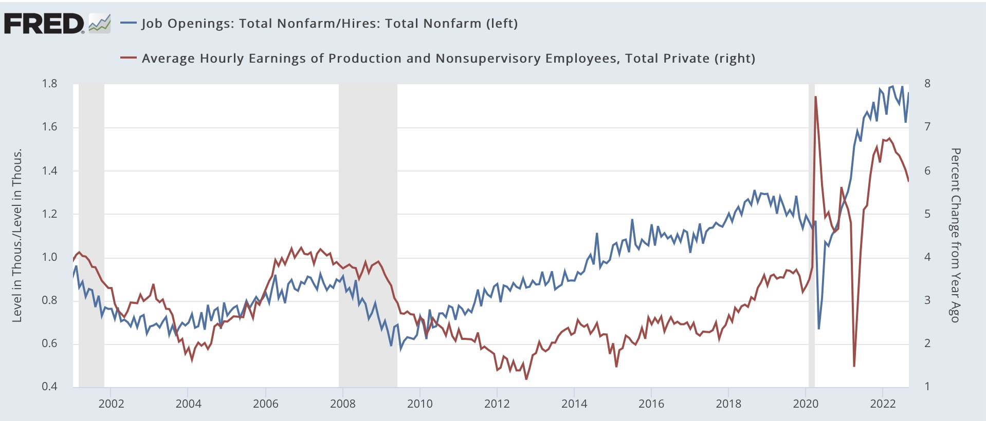
And here is a graph showing the ratio of job openings to actual hires from the JOLTS report (blue) vs. the YoY% change of non-supervisory wages (red):


Generally speaking, wages lag job tightness. Only *after* the ratio of job openings to actual hires has risen or fallen has the pace of wage hikes similarly increased or descreased. The exception has been the past few months, where the pace of wage increases slowed before job openings significantly turned down.

Next, here is the graph I ran a couple of weeks ago as to house prices, showing that, while the YoY% change in house prices is still high by historical standards, both of the big indexes have shown steep deceleration in the past few months (and indeed, on a seasonally adjusted monthly basis have actually turned down):


Finally, here are gas prices for the past year:


In other words, three of the big sources of inflation - house prices, wages, and gas prices - are already moving in the right direction, i.e., decelerating, although in absolute terms they have still incrreased sharply YoY.

For historical comparison, as I wrote several months ago, this is very similar to the immediate post-WW2 Boom of 1946-48, which featured inflation peaking at almost 20% per year (including a similar increase in house prices, and wages). The Fed did *absolutely nothing!* There was a 10 month relatively shallow recession (-1.7% decline in real GDP) in 1948-49:


With that in mind, and since Fed rate hikes operate with a lag, you might expect that the Fed would have signaled a “wait and see” attitude as to whether rate hikes that have already happened would continue to bring inflation down.

But that’s not at all what the Fed, and Chairman Powell, said. Here’s a quote from the official rate hike statement:

 The Committee anticipates that ongoing increases in the target range will be appropriate in order to attain a stance of monetary policy that is sufficiently restrictive to return inflation to 2 percent over time. In determining the pace of future increases in the target range….”

And here are a few quotes from Powell’s subsequent press conference:

“We have to raise to the level that is sufficiently restrictive to bring inflation to 2% target over time. We put that into our post-meeting statement. Because that really does become the important question now, how far to go.

“We think there is some ground to cover before we meet that test. That’s why we say that ongoing rate increases will be appropriate. As I mentioned, incoming data between the meetings, both the strong labor market report but particularly the CPI report, suggest to me that we may move to higher levels than we thought at the September meeting. That level is very uncertain, though. I would say we’re going to find it over time.

“As we move more into restrictive territory, the question of speed becomes less important than the second and third questions. That’s why I’ve said it’s appropriate to slow the pace of increases. So that time is coming. And it may come as soon as the next meeting or the one after that. No decision has been made. It is likely we’ll have a discussion about this at the next meeting.”

And…

“Let me say this, it is very premature to be thinking about pausing. When they hear ‘lags,’ they think about a pause. It’s very premature in my view to be thinking about or talking about pausing our rate hikes. We have a ways to go. We need ongoing rate hikes to get to that level of restrictive.”

And …

“I would also say it’s premature to discuss pausing. It’s not something that we’re thinking about. That’s really not a conversation to be had now. We have a ways to go.”


Far from taking a wait and see attitude, Powell bluntly said that the Fed was going to continue to hike, and might continue to hike at similar 0.75% increases in future meetings.

So let’s take a look at what happened in response to the huge Fed interest rate increases in the 1970s and early 1980s:


There were two 18 month long recessions, with declines of -3.1% (1974) and -2.6% (1982) in real GDP.

Since Powell apparently intends to match Volcker, that is my template for the recession that lies ahead.


Jobless claims: steady as she goes


 - by New Deal democrat

[ Special programming note: yesterday’s Fed action, and more important the statements made afterward, merit special attention. I will put up a special post on that later today.]

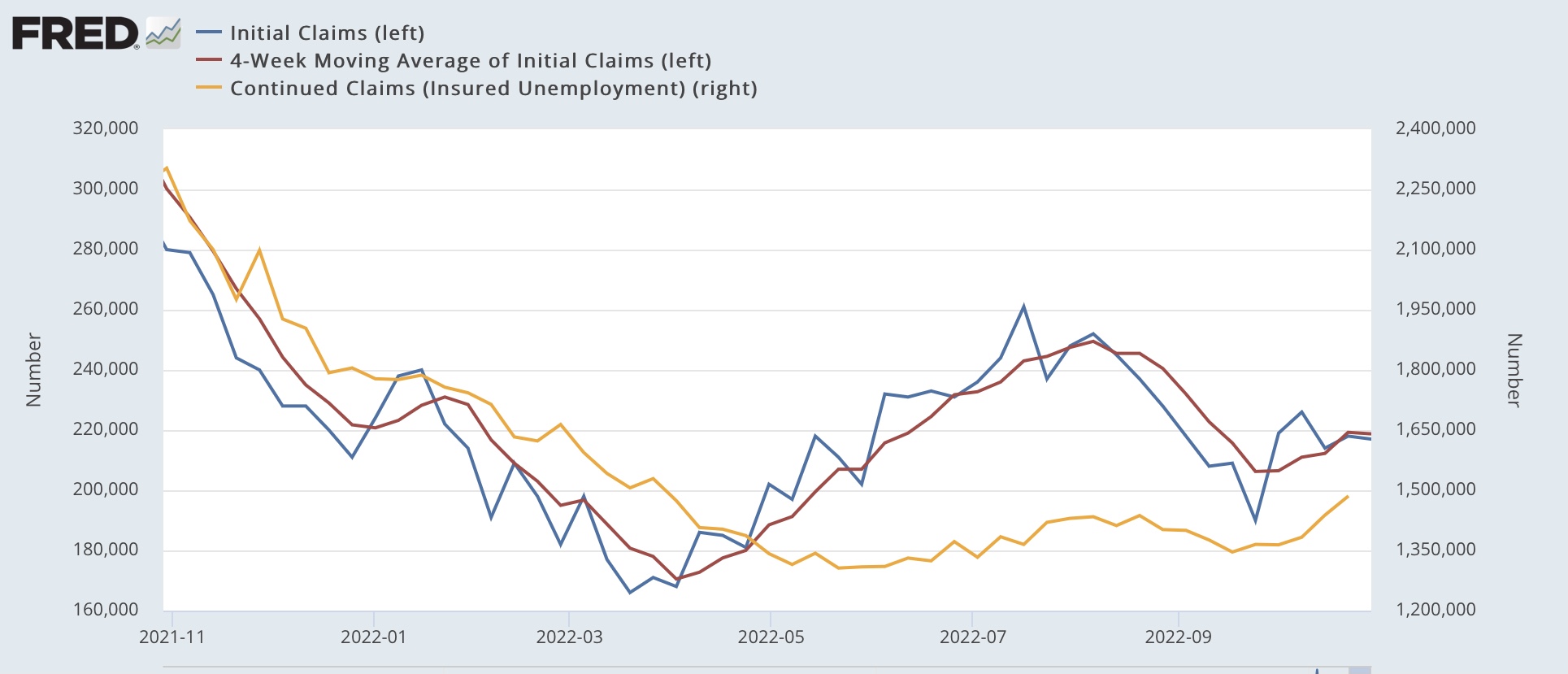
Initial jobless claims remained at their recent low level, down -1,000 from one week ago to 217,000. The 4 week average declined -500 to 218,750. Continuing claims, which lag slightly, rose 47,500 to a 7 month high of 1,485,000:


The recent upturn and downturn in jobless claims looks bigger in this graph than it has in the past two years, but it is all because the big numbers of 2020 and earlier n 2021 have disappeared from this 1 year timeframe. At any point in the past half century, jobless claims on the order of 300,000/week (as they were 1 year ago) would have been considered very good indeed.

So, this remains good news. Very few people are getting laid off.

There are a few implications for tomorrow’s jobs report, so let’s briefly update those.

First, jobless claims lead the unemployment rate by several months. Here are the 4 week average of jobless claims (red) vs the unemployment rate (blue) for the past two years:


I expect that the 3.5% unemployment rate recorded in July and September will likely be the low for this expansion, although so far there is no reason to expect any big increase.

Second, consumption leads employment. Here is a graph updated through last month’s data for real retail sales (blue, /2 for scale) and monthly % of job gains (red):


Average YoY job gains monthly have been slowly decreasing this year. Except for the big positive outlier in July (+537,000 jobs), since March they have trended down from +398,000 jobs to +263,000 in September. While any given month’s number can be volatile, the trend in consumption strongly suggests that this decreasing trend in job gains will continue tomorrow’s report for October.

Wednesday, November 2, 2022

September JOLTS report: despite the increase in openings, the decelerating trend in the game of reverse musical chairs remains intact


 - by New Deal democrat

In 2021 and earlier this year, the jobs market was typified by a game of reverse musical chairs in which there were more chairs (available jobs) than players (job seekers). As a result, employers had to increase wages in order to attract workers to their openings. But since this left other jobs vacant, those employers had to increase wages as well, to keep pace. I have been watching this year for the end of that game of reverse musical chairs.


Last month I wrote that the August report was evidence that “the game is entering its closing phases, at least for this cycle.”

I will go into further detail below, but to summarize, in the current expansion:
  • Hires peaked third, in February 2022
  • Quits peaked first, in November 2021
  • Layoffs and Discharges made a trough second, in December 2021
  • Openings peaked last, in March 2022

The commentary I have read about yesterday’s report focused on the fact that job openings rose again, bemoaning that this would give the Fed more ammunition to raise rates. We’ll find out what the Fed does later today, but as I wrote yesterday the trend in job openings remains downward (blue in the graph below). So does the trend in monthly hires (red). Note the pre-pandemic trend of openings peaking about a year before both of the last recessions, and hires peaking well in advance of the Great Recession:


Since March, openings have averaged a decline of roughly 200,000 per month. I suspect the last two months, which averaged a decline of 300,000 per month, are indicative of
acceleration of that trend. Last month I wrote that, at their average decline since March openings “will return to their pre-pandemic level by next April.” The increase this month makes that less likely, but still not out of the question.

In fact, while openings increased, actual hires declined further, in line with their trend.

Voluntary quits, which are an important measure of employee confidence in finding another job, also declined by -2.9% for the month, and were virtually unchanged compared with their recent low two months ago. In other words the declining trend is intact there as well:


Note quits also peaked well in advance of the Great Recession, and had turned flat for over a year before the pandemic hit.

The story is the same for total separations, which declined to a 16 month low:


Like quits, total layoffs and separations had already turned down before the Great Recession, and were flat before the pandemic hit:


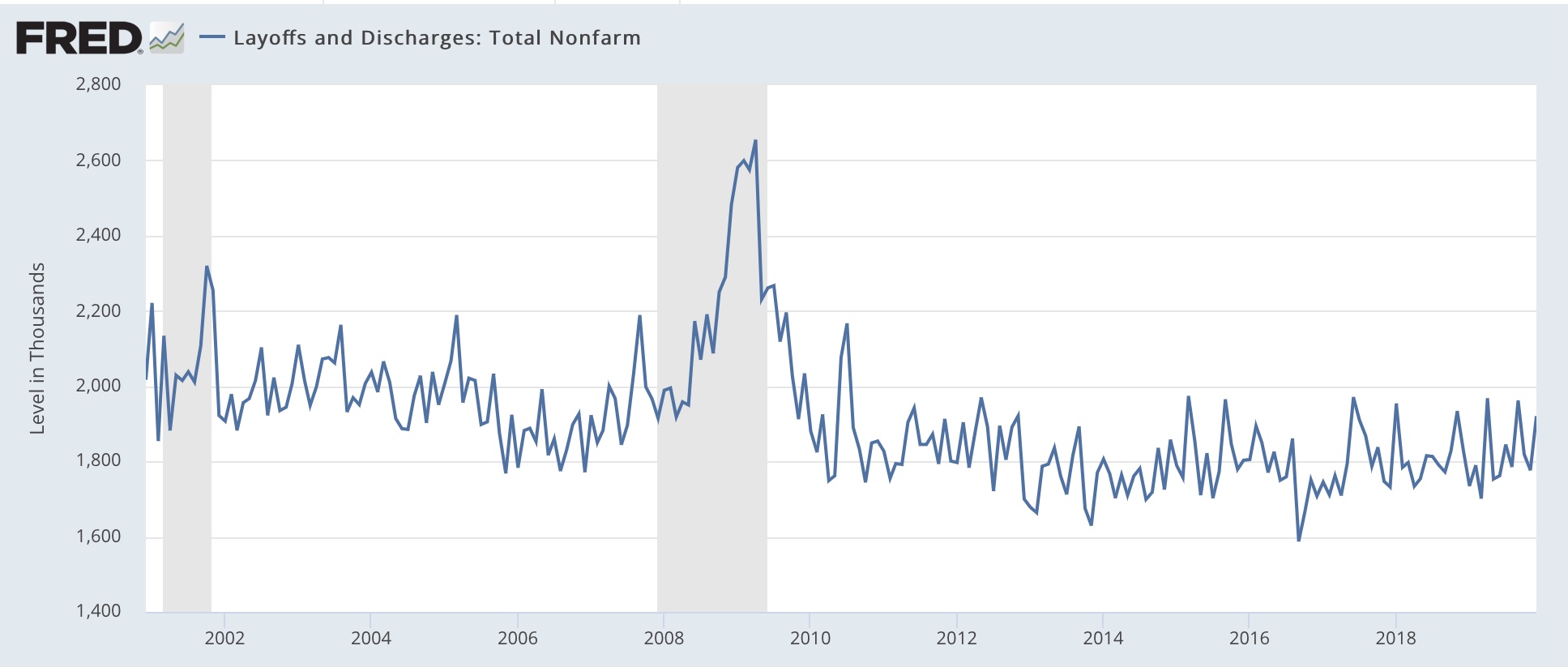
Finally, layoffs and discharges did decrease to a 5 month low, but remain significantly above their December 2021:


Layoffs and discharges troughed well before both of the last two recessions as well:


To summarize their 20+ year history, with the exception of hires, which peaked early - in December 2004 through September 2005 - prior to the Great Recession, but continued to increase right up until the pandemic hit in February 2020; all the other series peaked (or in the case of layoffs and discharges, made a trough) well in advance of the next downturns.

Despite the increase in openings, the September JOLTS report is entirely consistent with  pre-recession decelerating trends being firmly intact. The game of reverse musical chairs is slowing down. The question is, how quickly it will actually end, and reverse.


Tuesday, November 1, 2022

Manufacturing, construction, and job openings all show an economy under stress


 - by New Deal democrat

As usual, we begin another month with important manufacturing and construction data. Additionally, the JOLTS report for September was also released.


The ISM manufacturing index has a very long and reliable history. Going back almost 75 years, the new orders index has always fallen below 50 within 6 months before a recession, and in three cases did not actually cross the line until the first month of the recession itself - although the recession did not begin until after the total index fell below 50, and in fact usually below 48.

In September the overall index declined once again to 50.2 - the lowest reading since May 2020), while the more leading new orders index, which has been in slight contraction beginning in June, rose from its September low of 47.1 to 49.2:


This remains consistent with readings right before the onset of the Great Recession, but also with several slowdowns that did not quite turn into recessions.

Meanwhile construction spending, both in total and residential, rose slightly nominally, although both are below their July and May peaks, respectively:


Interestingly, adjusting for the cost of construction materials, both have risen significantly since the beginning of this year:


Here is a comparison of residential construction spending (blue) with houses under construction from the permits and starts report (red):


The two have tended to move in tandem for the past 20 years. The former has peaked, while the latter appears to be in the process of peaking now. Since construction and its attendant spending is the “real” economic activity of new housing, a decline in the two is a negative sign for the economy going forward.

Finally, although I’ll write a more comprehensive update on the JOLTS report tomorrow, the most important news is in job openings, which improved this month, but only because last month’s were revised even lower. The sharp downward trend remains clear:


All three of these reports show an economy under stress, although not yet in recession.


Monday, October 31, 2022

While I was away . . . Personal income and spending for September


 - by New Deal democrat

Real personal spending increased +0.3% in September, while real income increased less than 0.1%, rounding to unchanged:


Since May 2021, after the last round of pandemic stimulus expired, real spending is up 3.3%; but real income is down -2.0%:


Real personal spending had stalled in late spring and summer, but in the last two months - aided by revisions - has increased significantly. Similarly, real personal income had been declining almost relentlessly since spring 2021, but after revisions in the last three months has rebounded by 0.7%.

As a byproduct, the personal saving rate declined -0.3% during the month to 3.1%, its lowest in the past 15 years except for June (graph subtracts -3.1% so that current value shows as 0):


As with so much other data, the recent decline in gas prices has improved consumers’ lots significantly.

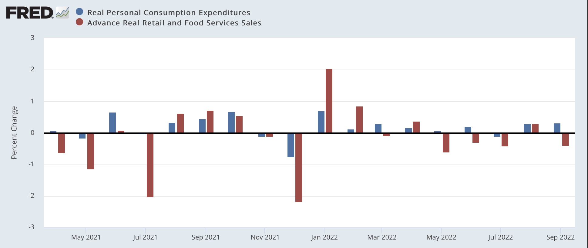
Finally, here’s a comparison of real personal spending and real retail sales, essentially two side of the same coin. In the last few months there has been some commentary that spending has switched from goods (represented more in retail sales) to services (represented relatively more in spending). The monthly comparisons seem to bear this out:


Real retail sales have declined in every month since April except for August, while as indicated above real spending has rebounded in the past several months.

In summary, consumer spending is holding up, but with very little in the way of a savings cushion, leaving consumers very vulnerable to any further shock.


Saturday, October 29, 2022

Weekly Indicators for October 24 - 28 at Seeking Alpha


 - by New Deal democrat


My Weekly Indicators Post is up at Seeking Alpha.


Slowly even more indicators are deteriorating in several timeframes.

As usual, clicking over and reading will bring you up to date on the economy, and bring me a little reward for my efforts.

Thursday, October 27, 2022

Q3 GDP: good news for now, bad news for the future


 - by New Deal democrat

I have to keep this note brief, since I am on the road.


As you presumably already know, real GDP was positive for the Third Quarter, up 2.6% at an annual rate:


Subject to revisions in the next several months of course, but for the moment, this puts to rest ideas that the US economy was in a recession earlier this year, since the decline was very shallow and not across all important indicators.

The news on the leading components of GDP was mixed. 

Proprietors’ income, a proxy for corporate profits, which won’t be reported for another month, were up 1.5% (blue in the graph below). The “official” leading metric uses unit labor costs as a deflator, which we also don’t know yet. But if ULC are in line with the past several quarters (red), real proprietors’ income was probably flat:


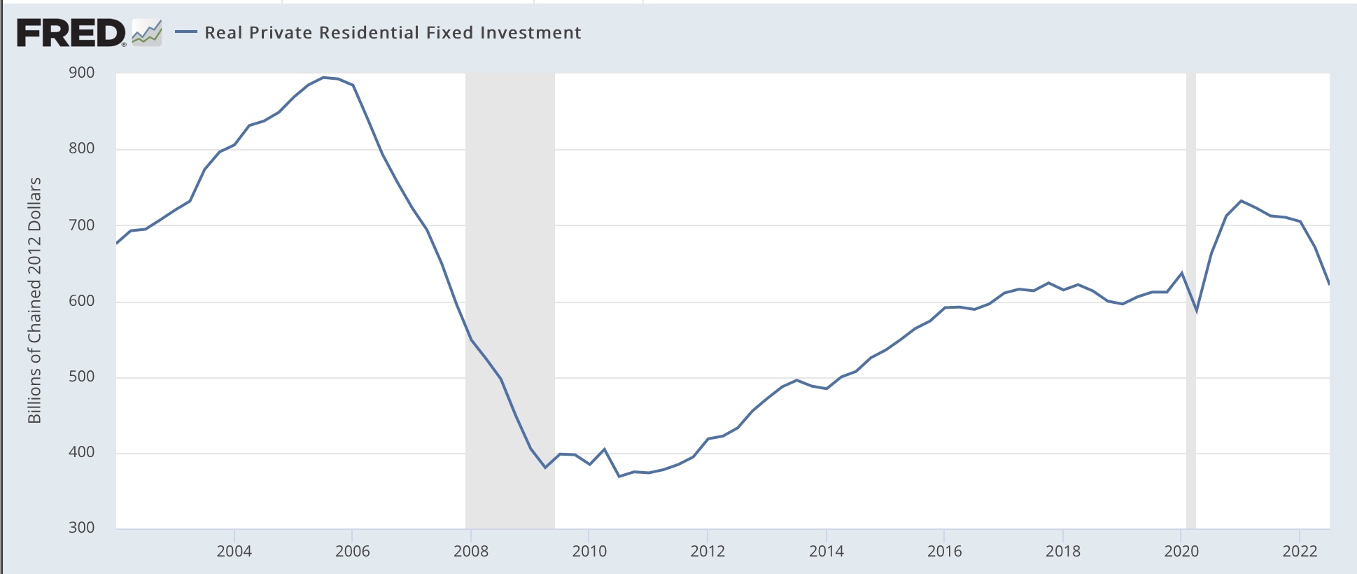
Finally, real private residential investment, the was housing is included in GDP, took a bad hit:


Housing is just about screaming “incoming recession!” at this point. 

So: good news for the present, bad news for the near future.

While I’m at it, here’s this week’s update on jobless claims:


No big move here. No real deterioration, but no improvement either.

Wednesday, October 26, 2022

The Treasury yield curve has now almost totally inverted


 - by New Deal democrat

One of the few leading indicators not flashing red for recession has been the short end of the Treasury yield curve, which has been relentlessly positive - until now.


While the 10 year minus 2 year Treasury spread has been negative for months, the 10 year minus 3 month had remained positive. But twice in the last two weeks the 3 month Treasury has yielded more than the 10 year Treasury:


The highest yielding Treasury is the 1 year maturity. Further, the 6 month Treasury is now yielding more than the 2 year. In other words, almost the entire Treasury yield curve is now inverted:


The curve remains positive from the Fed funds rate out till 1 year. That’s the only part of the curve that hasn’t inverted yet.

That leaves about the only major indicator that hasn’t rolled over yet is corporate profits, which have been more or less flat, but haven’t really turned down.


Tuesday, October 25, 2022

The tide has now turned as to house prices


 - by New Deal democrat

Last month I wrote that the FHFA showed evidence that house prices had peaked, and that “since the FHFA has a tendency to turn slightly ahead of the Case Shiller index, this strongly suggests that a sharp deceleration in the Case Shiller index YoY will start within a month or two.” 


That was borne out in this morning’s reports for August house prices.

The FHFA purchase only index, which is seasonally adjusted, indicated that house prices declined -0.7% in August, after a -0.6% decline in July, which is a total -1.3% decline from its peak two months ago in June. The index remains higher by 11.9% YoY.

Meanwhile the Case Shiller national index declined -1.1% in August - but is not seasonally adjusted, so the YoY% change is the only good comparison. This was up 13.0%. My rule of thumb for non-seasonally adjusted data is that it has peaked when the YoY% change is less than 1/2 of its maximum. In the case of the Case Shiller index, which peaked at 20.8% YoY in March, this suggests that the index is perhaps one month from peaking. But since we know that the seasonally adjusted FHFA index has peaked, most likely my rule of thumb is off by a couple of months, and the Case Shiller index has peaked as well.

Here is the graph of the YoY trends:


As I have written many times in the past decade, first sales peak, then prices peak with a lag. That is what has happened this year.

The question now is, how far down do house prices go? In the 2007-11 bust, house prices fell a little over -20%. But in the smaller 1990-91 downturn, prices only declined about -3%. 

The run-up in prices this time has been very similar to that during the 2000’s housing bubble, but lending practices were much less lax - meaning there should be far fewer foreclosures than during the housing bust. Those foreclosures - forced sales - helped drive prices lower, as the markets were flooded involuntarily with houses for sale. This time around, it is more likely that “underwater” homeowners, whose houses are no longer worth what they paid for them, will not suffer foreclosure, but rather will be frozen in place, unable to sell.

I have seen guesstimates of a -5% to -10% decline in house prices in this downturn, and that is a reasonable first dart-throw, although my guesstimate would be at the -10% end of that range. That’s because the Fed seems hell-bent on causing a sharp recession, and that recession will bring lots of joblessness, which in turn will mean more people unable to make mortgage payments, and so suffering foreclosure.

Anyway, the bottom line is that as to house prices, the tide has now turned.

Monday, October 24, 2022

When will housing construction turn down? A fuller consideration


 - by New Deal democrat

No important economic news today. Also I am traveling this week, so there might be some light posting, as in, I might skip a day or two. But I very much want to see what is happening with house prices, which will be updated tomorrow in the FHFA and Case Shiller indexes, and Wednesday as part of the new home sales release.

In the meantime, after I posted about housing permits, starts, and construction last week, I decided to take a closer look at that issue, because I was troubled by the “permitted but not started” statistic, which has continued at near record levels. Housing starts are down just as much as permits. If units not yet started were a supply chain issue, starts should have continued near peak until it was cleared. Obviously they haven’t which suggests there is some other explanation.

Units under construction follow starts almost like clockwork:


In the past, within about 6 months after starts peak, units under construction do as well. We’re now 6 months out past the 3 month average peak (Feb-Apr), and construction has continued to rise. There probably is some supply chain tightness left, because as you can see above, this is the biggest disconnect ever.

But “units permitted but not started” has not historically followed a reliable pattern. Sometimes it peaks simultaneously with starts, sometimes with a considerable delay:


So that suggests something else is going on, and the most likely candidate is cancellations after the permit is issued but before construction begins.

And, helpfully, in small print at the very bottom of the Permits and Starts release there is the following note:

“These data represent the number of housing units authorized in all months up to and including the last day of the reporting period and not started as of that date without regard to the months of original permit issuance. Cancelled, abandoned, expired, and revoked permits are excluded”

And relatedly there’s a similar note in the New Home Sales release:

“If the respondent reports that the unit has been sold, the survey does not follow up in subsequent months to find out if it is still sold or if the sale was cancelled. The house is removed from the "for sale" inventory and counted as sold for that month. If the house it is not yet started or under construction, it will be followed up until completion and then it will be dropped from the survey.

“Since we discontinue asking about the sale of the house after we collect a sale date, we never know if the sales contract is cancelled or if the house is ever resold….

“As a result of our methodology, if conditions are worsening in the marketplace and cancellations are high, sales would be temporarily overestimated.” 


A couple of months ago there were several articles about increasing cancellations; for example, here and here.

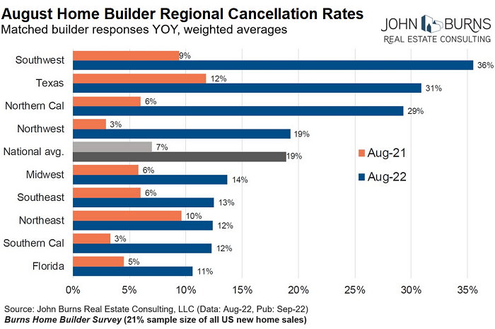
And last week, via Rick Palacios Jr., Director of Research at John Burns research consulting, nationwide, the cancellation rate in August jumped to 19%, the highest in years, up from 17.6% in July:


And for September, according to Redfin, they really soared:


So I think we have our answer as to why “units permitted but not started” remains so high. A very high number of people are backing out of deals before construction is started.

But that doesn’t resolve the issue of the delay in the peak in construction, and how quickly - or not - a recession happens afterward. I suspect whether a recession happens sooner vs. later depends upon how much mortgage rates have risen, and how much they continue to rise after the peak in construction. There’s no good way to show this, but here’s the graph anyway:


My suspicion is that units under construction will fall off relatively quickly, because the Fed rate hikes this year have been so abrupt (I won’t show the graph, but in the past week, mortgage rates have risen *even further, to 7.38%! - this is going to absolutely kill housing), and the more they hike from here on in, the quicker the recession will hit.

At this point there are only two classic long leading indicators of recession that haven’t rolled over: the short end of the yield curve between 3 months and 2 years; and corporate profits, which are flat but not declining significantly yet. Everything else in that time frame has been negative for half a year or more already.