Saturday, January 16, 2021

Weekly Indicators for January 11 - 15 at Seeking Alpha


 - by New Deal democrat

My Weekly Indicators post is up at Seeking Alpha.

While initial jobless claims have continued to worsen, there is no sign of a generalized downturn in the coincident data, and the upturn in long term interest rates isn’t enough to change their fundamental positive impact on the economy.

As usual, clicking over and reading is rewarding just a little bit for me, and brings you up to the virtual moment as to what is happening in the economy.

Friday, January 15, 2021

Good news (industrial production) and bad news (retail sales)


 - by New Deal democrat

This morning’s two reports on industrial production and retail sales for December were a case of good news and bad news.

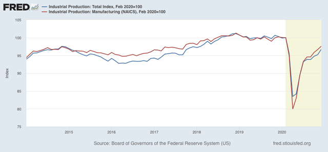
Let’s do the good news first. Industrial production, the King of Coincident Indicators, rose 1.6% in December. The manufacturing component rose 1.0%. Needless to say, these are a strongly positive numbers. As a result, overall production is only -3.3% below its February level, while manufacturing is only down -2.4% since February:


Manufacturing has consistently been one of the biggest bright spots in the economy ever since April. 

Now on to the bad news.

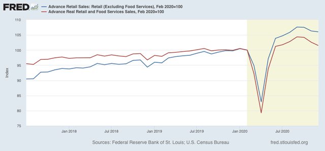
Nominal retail sales declined -1.0% in December. Excluding the food services sector which has been especially hard hit by the pandemic and lockdowns, sales were nevertheless down -0.3%. Total sales are down -2.7% since September; excluding food sales they are still down -1.5%:


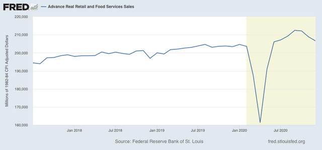
In real terms, retail sales declined -1.0%, and are down -2.7% since September:


The silver lining is that this type of decline doesn’t necessarily mean a steep decline back into recession lows. Similar declines happened several times during the last expansion. And they are still up 1.5% since February.

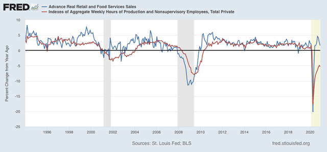
As I have pointed out many times, consumption leads employment. It’s even a better match for aggregate hours worked in the economy, as shown in the long term graph below:

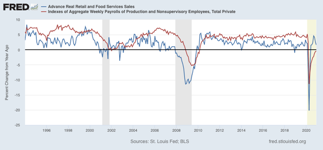
And here’s what it looks like YoY compared with aggregate payrolls:


Last month I wrote that “I continue to expect employment to continue to rise - with a lag, and quite possibly a pause during this winter as the pandemic continues to rage - to match the level of sales.” Well, we certainly got the “pause” in December’s employment report, and if we get more initial jobless claims reports like yesterday’s, a further downturn. But I still expect employment to rise to meet sales once the winter surge in cases and shutdowns of outdoor activities including dining both abate.

Thursday, January 14, 2021

Jobless claims highest in three months - but seasonality still playing a huge role


 - by New Deal democrat

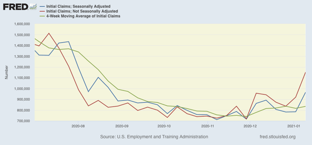
On a unadjusted basis, new jobless claims rose by 231,335 to 1,151,015. Seasonally adjusted claims also rose by 181,000 to 965,000. The 4 week moving average rose by 18,250 to 834,250.

Here is the close up since the end of July (these numbers were in the range of 5 to 7 million at their worst in early April): 

There is now a 2+ month trend of YoY% increases in initial claims. Further, by rising to over 900,000, seasonally adjusted claims hit one of my two markers for a fundamental change of trend. But the 4 week average, which is still under 850,000, did not.

For the last couple of months, I have been cautioning that the holiday season plays havoc with seasonality even in normal years, let alone a year when the pandemic is causing changes in weekly numbers by an order of magnitude. That was especially so this week. Typically in the weeks after Christmas and New Years’, claims go up by 25,000 to 50,000 on an unadjusted basis. This year claims went up by up to 10x as much.

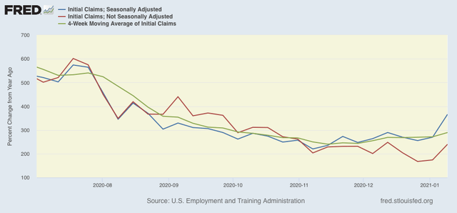
But when we look at the YoY% change in all of the above metrics, which washes out those outsized seasonal affects, the picture is not nearly so negative:

While weekly seasonally adjusted claims have risen 366% - a YoY comparison last seen in August, non-seasonally adjusted weekly claims, and the 4 week average are still in the YoY range they were in October, at +240% and +290% respectively. In fact the non-seasonal trend looks more sideways than increasing.

In other words, this was one bad week of data, but we are clearly above November lows, but nothing awful (or at least, not materially *more* awful than before) has happened yet.


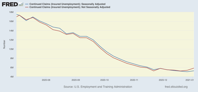
Turning to seasonally and non-seasonally adjusted continuing claims, which historically lag initial claims typically by a few weeks to several months, the former rose by 199,000 to 5,271,000, and the latter rose by 474,180 to 5,856,230:


Because these lag initial claims, I have suspected that we would see an upward reversal, and it appears to have arrived.

Finally, as I usually note, a reminder that both initial and continued claims remain at or above their worst levels from the Great Recession.

Bottom line: renewed partial lockdowns and increased consumer caution due to the out of control pandemic have caused increased layoffs. Should we get another week like this one in the next couple of weeks, that will probably mark the decisive break of trend. At the same time, it isn’t quite as bad as I would have thought several months ago. Further, since I expect Biden to tackle COVID as his very first priority (even before prosecutions for the January 6 putsch attempt), hopefully we will see the worst within 4 to 8 weeks.

Wednesday, January 13, 2021

December inflation: real aggregate wages fall as real average wages rise due to compositional effects


 - by New Deal democrat

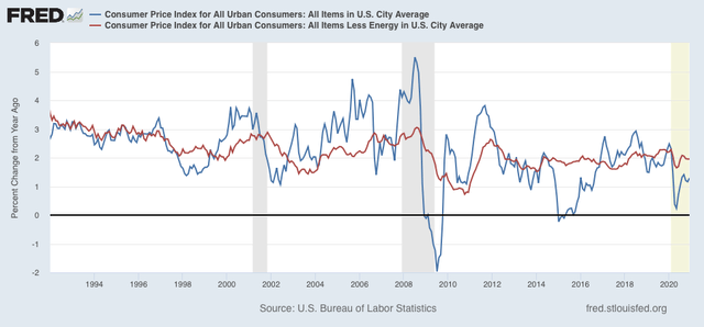
Consumer inflation typically rises as expansions continue, and declines once recessions start. Once a recovery begins, inflation typically steadies again. While the pandemic has affected both consumer demand and the supply chain, overall the paradigm should still apply. With that in mind, let’s take a look at December’s report.

For the past 40 years, recessions had typically happened when CPI less energy costs (red) had risen to close to or over 3%/year. As of this month that number is exactly 2%: 


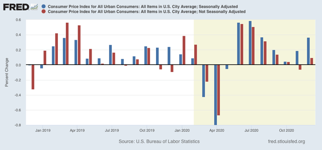
In other words, there is no troublesome price pressure outside of the pandemic. Because pandemic affects are probably influencing seasonality, I also show non-seasonally adjusted inflation below (red):


Typically inflation increases in the first few months of the year, and abates in the latter part. The unusual 0.4% seasonally adjusted increase for December appears to have been primarily driven by a 0.3% increase in food prices. I expect that price pressure to pass in the next few months.

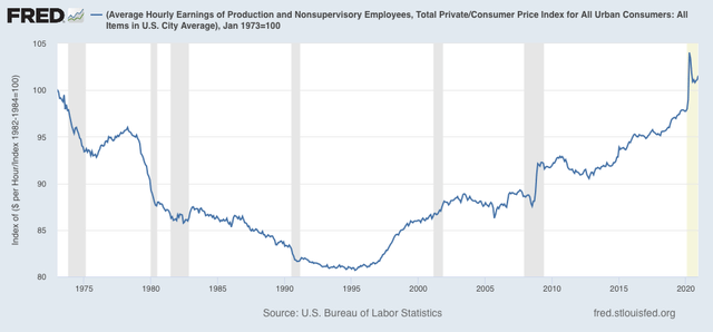
Now let’s take a look at how inflation has affected real wages. Because wages are “stickier” than prices, typically as recessions beat down prices (or at least price increases), in real terms wages rise, either during or just after a recession. That has been the case for the coronavirus recession as well. It is the “real” buying power of wages among those still securely employed during a recession that is one of the engines that usually restarts growth. 

Also as a result, real hourly wages for non-supervisory workers have exceeded their previous 1973 peak by 1.6%:


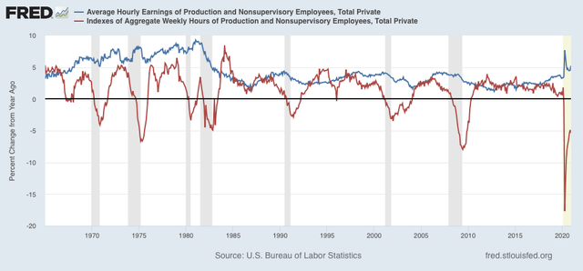
Finally, one of the most telling metrics of the overall health of the middle/working class is that of real aggregate wages. After declining -13.8% from February through April, they recovered to -3.1% below their peak in November, before declining -0.2% last month. Here is comparison of the YoY changes in average (blue) vs. aggregate (red) wages, showing the outsized upward skew in average wages vs. the huge hit to aggregate wages - even bigger than during the Great Recession:


While average wages have risen by over 5% in the past year - the best showing since the inflationary 1970s - this is due to compositional effects, as the pandemic has resulted in outsized layoffs to lower paid service workers. 
 

What we want to see is the red line above zero, and the blue line at least not declining further. All of this is at the mercy of the course of the pandemic. 

Tuesday, January 12, 2021

November JOLTS report shows renewed impact of pandemic, partial lockdowns


 - by New Deal democrat

This morning’s JOLTS report for November (remember - a month in which there were total job gains) showed a jobs market recovery that at least paused due to the increasing effects of the out of control pandemic. Hires were up (good), while quits were unchanged, openings declined (bad) and layoffs and discharges rose (bad).

While the JOLTS data is a deep dive into the dynamics of the labor market, since it only dates from 2001, there are only 2 previous recoveries with which to compare the present. Nevertheless it is worthwhile to make the comparison.

In the two past recoveries:
  • first, layoffs declined
  • second, hiring rose
  • third, job openings rose and voluntary quits increased, close to simultaneously

Let’s examine each of those in turn. In each case, I break out 2001-19 in a first graph and then this year in a second.

What appears below is that, although there has been some variation, the year 2020 through November recapitulated the pattern from the last two early recoveries: the first two data series to turn - layoffs and hires - have indeed turned, while the last two - job openings and voluntary quits - have appeared to bottom but have had a much less dramatic rise. With increased pandemic restrictions and consumer caution, several renewed negative readings in November, but not enough to significantly change the trend.

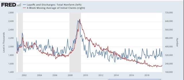
This first graph compares layoffs and discharges (blue) with the 4 week average of initial jobless claims (red) prior to this recession, for reasons of scale since March and April would be “off the charts”:


You can see that, by the end of the recessions, layoffs were already declining, and continued to decline steeply over the next 3-8 months before reaching a “normal” expansion level. The turning point coincides exactly with the much less volatile, but more slowly declining, level of initial jobless claims.

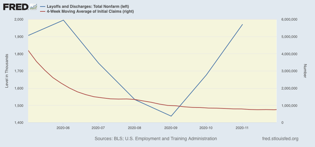
The same had been the case this year up until October. Layoffs and discharges already declined to their “normal” level in May, while initial jobless claims peaked one to two months later, and continued to decline (slowly) through November. We already know, however, that the rise in JOLTS layoffs in November and December absolutely showed up  in initial jobless claims in December: 


The continued rise in layoffs in December suggests that initial claims will continue elevated over their November lows through this month.

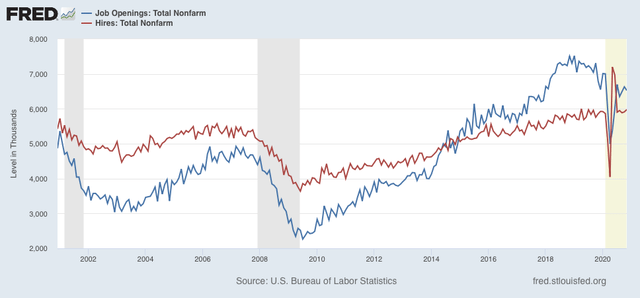
Next, here is the entire historical relationship between hires (red) and job openings (blue) through 2020:


In the past two recoveries, actual hires started to increase one to two months before job openings.

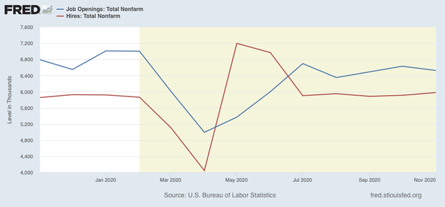
Both made troughs in April, but hires have rebounded more sharply ever since May compared with job openings, although both have essentially leveled off at those levels, and openings slightly declined in November and may even have a slightly declining trend:


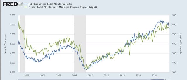
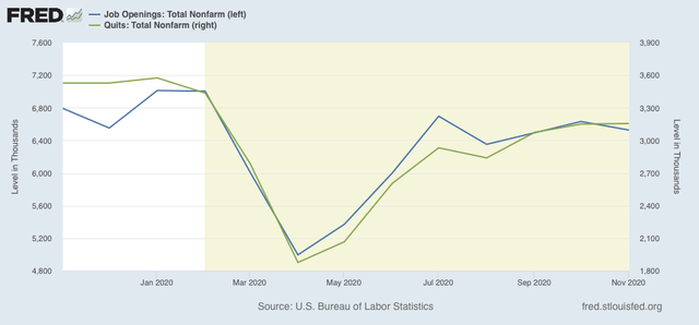
Next, here are quits (green) vs. job openings (blue): 


In the past two recoveries, openings started to rise slightly before quits made a bottom. After that, both rose more or less together (suggesting it is openings that leads to the increase in voluntary quits).

This year, both made a trough in April. Since then, openings appears to have continued to slightly led quits, with both flattening out in the past several months:


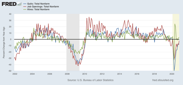
Because seasonal adjustments might not be giving us a true picture because of the enormous moves during this pandemic year, here are job openings (blue), hires (red), and voluntary quits (green), measured YoY without seasonal adjustments for the entirety of the series up through the present:


We can see that, even taking out the seasonal adjustments, hires rebounded first following the 2001 and 2008-09 recessions. Quits and openings moved generally in tandem with a slight lag. The same pattern generally appeared in 2020, with quits perhaps slightly lagging.

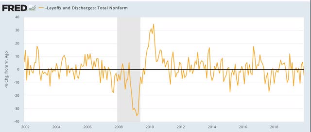
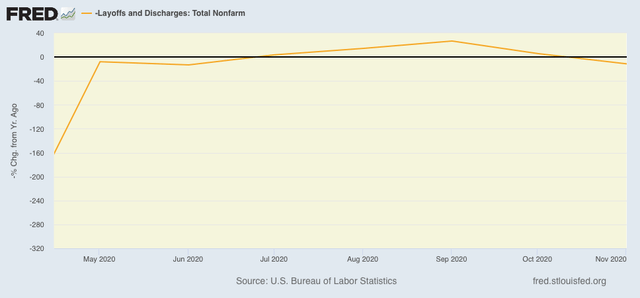
Finally, I have broken out layoffs and discharges separately below, because the their level in April and May of this year would obliterate all other variations (note: inverted so that fewer layoffs shows as positive):


This metric returned to normal almost immediately after both of the past two recessions, and did so again by July of this year. But its gain decelerated in October, and turned negative YoY in November (which, since the line is inverted, means higher total layoffs and discharges:


To sum up:

1. The JOLTS report continues to show a pattern generally consistent with the past 2 recoveries, with layoffs having returned to normal levels, then hiring having increased, and finally quits and openings increasing as well; but

2. We are seeing the results of the out of control pandemic in the increasing layoffs and separations in November, likely due to renewed partial lockdowns and increasingly cautious consumer behavior as well as consumers pulling back on “al fresco” activities in the cold winter weather.

Monday, January 11, 2021

Scenes from the December jobs report


 - by New Deal democrat

Friday’s December jobs report saw the first decline in employment since the lockdowns of March and April. Let’s take a closer look.


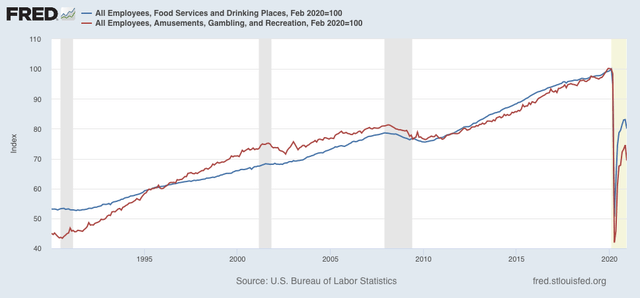
As I pointed out Friday, the losses were concentrated in the food and dining (restaurant) and amusement and recreation sectors, both of which are shown below normalized to 100 as of February:


The two sectors are down 20% and 30% from their February peaks.

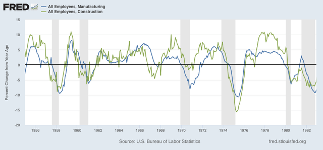
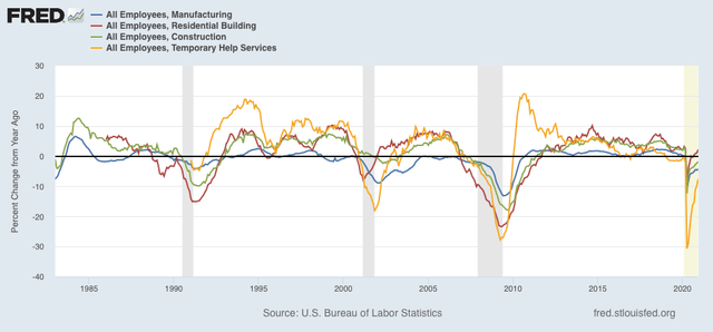
By contrast, the leading job sectors of manufacturing, residential and overall construction, and temporary help positions all continued with gains, and are close to if not completely recovered from their pandemic losses. Below I show these YoY in two time periods for easier comparison (note two of the series did not begin until the 1980s).

1955-1982:


1983 - present:


This is one of the many signs pointing to a strong rebound in the overall economy once the pandemic is brought under control.

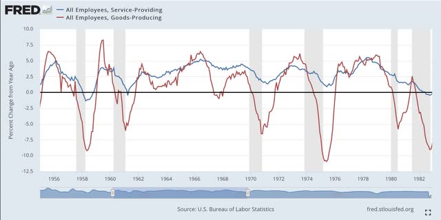
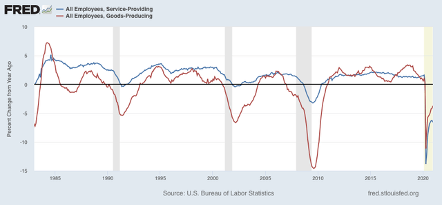
Another important way to look at employment is via the differential impact of the pandemic on the goods-producing vs. service-providing sectors of the economy. Below are the YoY% changes also broken down into two time periods for easier comparison.

1955-1982:


1983 - present:


Up until the Great Recession, the goods-producing sector always bore the brunt of layoffs. In fact the worst YoY losses in service jobs was 1.4% in 1949 and 1.3% in 1958, respectively. In 2009, by contrast, the worst losses were 3.2%. Last year, there were 13.8% losses in April, improving to their “best” reading of 6.3% losses in November.

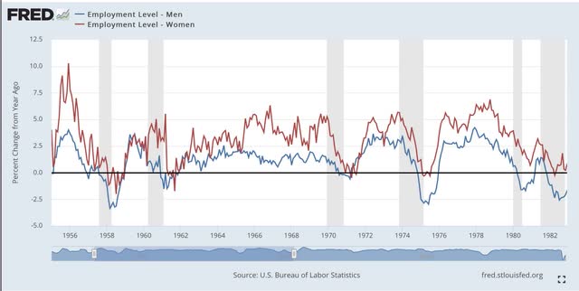
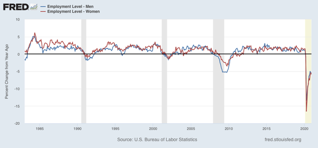
Finally here are the breakdowns in YoY job gains and losses between men (blue) and women (red), divided into the same two time periods:


Because women have disproportionately been employed in the lower paying service sectors, they did not suffer layoffs *relatively* as bad as men during recessions prior to the turn of the Millennium. This got worse during the Great Recession, and in this pandemic recession they have been hit the worst of all historically.

Programming note


 - by New Deal democrat

Four year ago I wrote a valedictory piece about the Obama Administration, and separately wrote of my fears of what the Trump Administration would wreak.


Needless to say, especially in light of events of the past week, I intend to do the same retrospective as to Trump and the current state of the GOP and the Republic. Much of what I have to say is in agreement with disparate threads I have read on twitter, but I want to weave those strands together into one cohesive piece. Hint: I keep thinking about old episodes of Supernanny, where a toddler’s behavior was allowed to get worse and worse without consequence. The longer it went on, the more forceful and resolute the parents’ response ultimately had to be.

Hopefully this will be a long-form piece next Sunday.

Saturday, January 9, 2021

Weekly Indicators for January 4 - 8 at Seeking Alpha


 - by New Deal democrat

My Weekly Indicators post is up at Seeking Alpha.

Although yesterday’s employment report was negative, there is still no sign of any broad-based downturn in the broader economy. Rather, losses appear contained to the dining and entertainment sectors.

As usual, clicking over and reading should bring you up to the moment, and brings me a tiny jingle in my pocket.

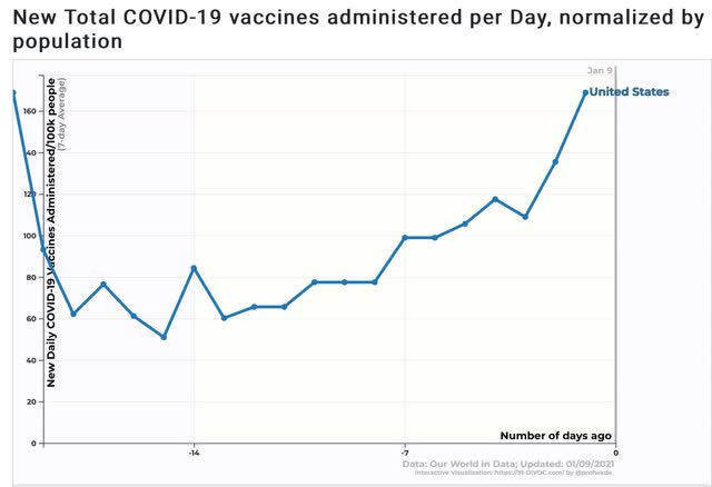
Also ... in the conclusion, I make reference to the improvement in the daily average of people being vaccinated against COVID-19. Here is the graph with the information I am referring to:

Friday, January 8, 2021

December jobs report: I told you so - jobs actually declined in December; BUT employment primed for takeoff once pandemic abates


 - by New Deal democrat

Important: There was a huge amount of seasonality in this report. This is common for December, but the issue was greatly exacerbated because of the outsized impact of the pandemic. Take the large changes in some of the data with many grains of salt.

I have been warning for almost 4 weeks that the December employment report might have a negative number. It did. At the same time, the internals are not nearly so bad as the headline.

HEADLINES:
  • -140,000 million jobs lost, 95,000 of which were in the private sector and 55,000 were in government. Comparatively, there were 22.1 million job losses in March and April. The alternate, and more volatile measure in the household report indicated a gain of 21,000 jobs, which factors into the unemployment and underemployment rates below.
  • U3 unemployment rate was unchanged at 6.7%, compared with the January low of 3.5%.
  • U6 underemployment rate fell -0.3% from 12.0% to 11.7%, compared with the January low of 6.9%.
  • Those on temporary layoff increased 277,000 to 3,039,000.
  • Permanent job losers decreased by -348,000 to 3,370,000.
  • October was revised upward by 44,000. November was also revised upward by 95,000 respectively, for a net gain of 135,000 jobs compared with previous reports.
Leading employment indicators of a slowdown or recession

I am still highlighting these because of their leading nature for the economy overall.  These were generally positive: 
  • the average manufacturing workweek was unchanged at 40.2 hours. This is one of the 10 components of the LEI.
  • Manufacturing jobs increased by 38,000. Manufacturing has still lost -543,000  jobs in the past 10 months, or -4.2% of the total. About 60% of the total loss of 10.6% has been regained.
  • Construction jobs increased by 51,000. Even so, in the past 10 months -226,000 construction jobs have been lost, -30% of the total. About 80% of the worst loss of 15.2% loss has been regained.
  • Residential construction jobs, which are even more leading, rose by 8,900. Since February there have now been actual job *gains,* to the tune of 6,400 jobs, to a new 10 year+ high.
  • temporary jobs rose by 67,600. Since February, there have still been -213,500 jobs lost, or -7.3% of all temporary help jobs.
  • the number of people unemployed for 5 weeks or less rose by 849,000 to  million, compared with April’s total of 14.283 million.
  • Professional and business employment rose by 161,000, which is still -858,000, or about 4% below its February peak.

Wages of non-managerial workers
  • Average Hourly Earnings for Production and Nonsupervisory Personnel: rose $0.20 from $24.89 to $25.09, which is a gain of 5.2%(!) in the 10 months since the pandemic began. As with last March and April, these gains reflect that job losses occurred primarily among lower wage earners, who since May had been disproportionately recalled to work.

Aggregate hours and wages:
  • the index of aggregate hours worked for non-managerial workers declined by -0.1%. In the past 10 months combined this has nevertheless fallen by about  -6%.
  •  the index of aggregate payrolls for non-managerial workers rose by 0.7%. In the past 10 months combined this has nevertheless fallen by about -1.6%. Still, about 90% of the loss from February to April has been made back up.

Other significant data:
  • Full time jobs gained 397,000 in the household report.
  • Part time jobs declined -471,000 in the household report.
  • The number of job holders who were part time for economic reasons decreased by -332,000 to 4.891 million. This is still an increase since February of 1,772,000.

SUMMARY

While the headline was a negative number, this was almost entirely due to huge declines of -372,000 in food and beverage establishments, and another -92,000 in amusement and recreation. Private education lost -63,000, and there were also sizable losses in local and state government.

In contrast, all of the leading job groups showed equally sizable gains, and residential construction employment made a new decade-plus high. Among leading employment indicators, only the increase in short term unemployment was a negative.

Full time jobs also showed gains, while part time jobs showed losses. Aggregate and average payrolls also rose sharply. While the average hourly wage increase can be put down to the heavily skewed nature of the new job losses, the aggregate increase which includes the total from all jobs, is a big positive, probably reflecting some annual raises.

This is an absolutely poor report as to current conditions, particularly 10 months into the pandemic. On the other hand, the leading sectors once again show that the economy - including employment - is primed for takeoff once the pandemic is brought under control.

Thursday, January 7, 2021

Jobless claims start 2021 continuing flat to increasing trend; negative December jobs number increasingly likely


 - by New Deal democrat

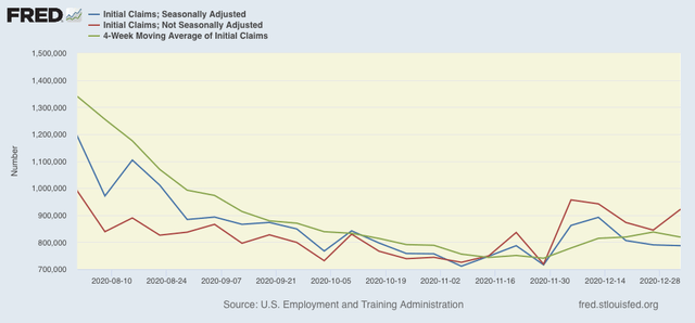
On a unadjusted basis, new jobless claims rose by 77,400 to 922,072. Seasonally adjusted claims declined by 3,000 to 787,000. The 4 week moving average declined by 18,750 to 818,750. All of these are above their recent lows. 

Here is the close up since the end of July (these numbers were in the range of 5 to 7 million at their worst in early April): 

At the same time, neither of these has hit my established markers of renewed upward trend of seasonally adjusted new claims rising to over 900,000 and the 4 week average to over 850,000.

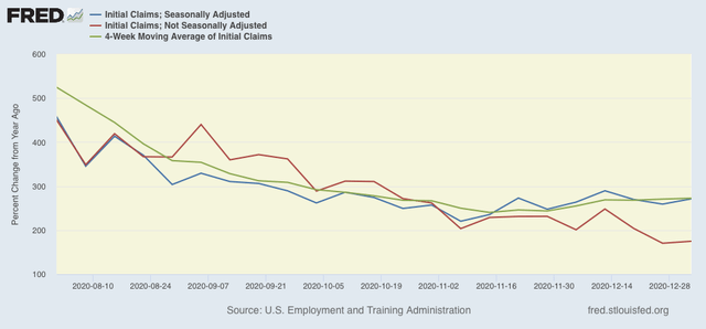
Because of the huge distortions caused by the pandemic in seasonally adjusted numbers, and because we are at a time of year when seasonality causes the most distortions in any event, here are the YoY changes in all of the above metrics:

There is now an 8 week trend in the seasonally adjusted data of YoY% increases, and a less pronounced upward trend for the past 6 weeks in the 4 week average. Interestingly, the YoY trend for unadjusted claims - especially important in this case - has continued to decline. 

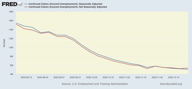
Both seasonally and non-seasonally adjusted continuing claims, which historically lag initial claims typically by a few weeks to several months, on the other hand, remain in a slightly downward or flat trend. Seasonally adjusted continuing claims declined again by 126,000 to a yet another new pandemic low of 5,072,000. On an unadjusted basis, they rose by 145,844 to 5,382,459, over 100,000 above their recent pandemic low:

Because these lag initial claims, I continue to suspect we will see an upward reversal in the next few weeks. 

Both initial and continued claims remain at or above their worst levels from the Great Recession.

Finally, tomorrow we will get the December jobs report. For the last 3 weeks, I have been warning that it is likely to be the weakest since April, very likely under a 200,000 gain, and quite possibly and actual loss. Yesterday the ADP reported that by their calculations, there was indeed an actual decline in jobs in December. We’ll see shortly.

Wednesday, January 6, 2021

Coronavirus dashboard for January 6, 2021: new infections vastly outpacing vaccinations


 - by New Deal democrat

Total confirmed COVID-19 infections: 21,046,195*

Infections last 7 days average: 219,253
Total deaths: 357,258
Deaths last 7 days average: 2,670
Total vaccinations: 4,836,489

*A study just released, based on random blood samples, suggests that as many as 50,000,000 Americans may have already been infected. Because some of the positive tests may be based on exposure to other coronaviruses, I do not think the number is that high. But my own guess is that the “true” number might be about 30,000,000, or 1 in every 11 Americans.

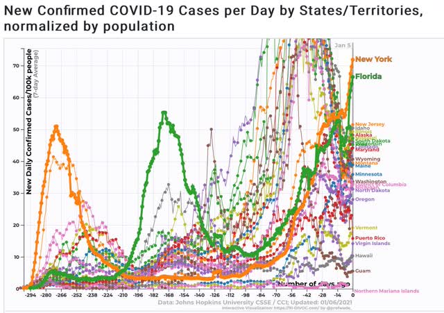
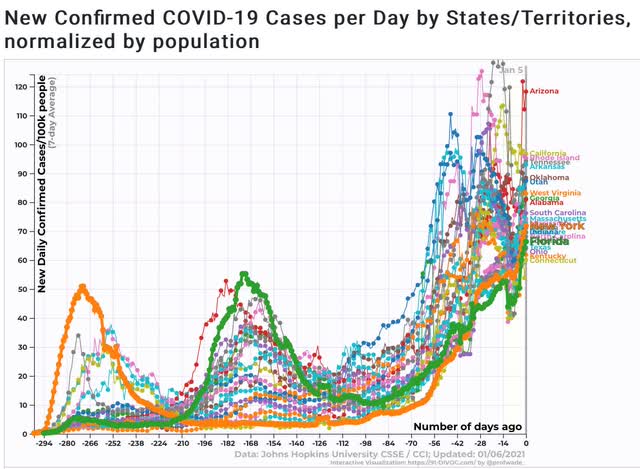
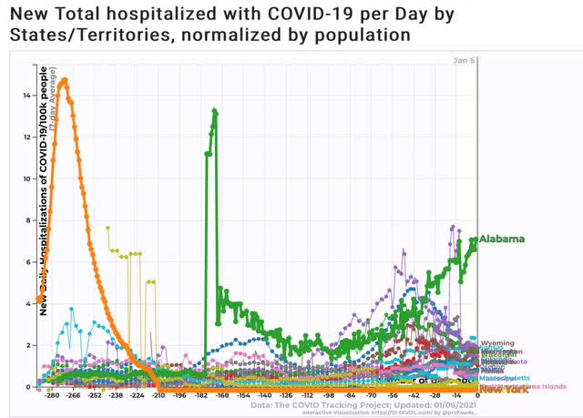
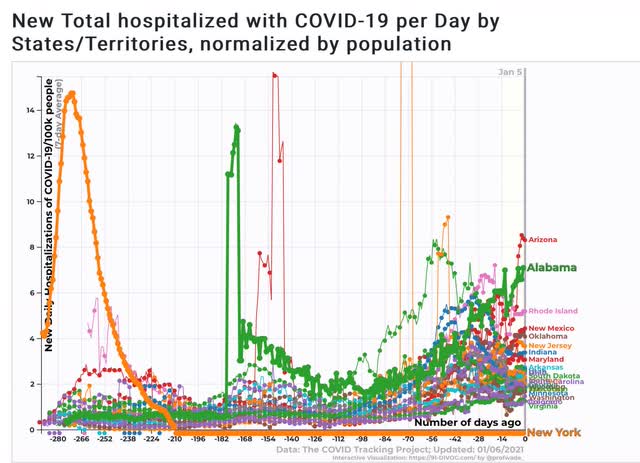
Today I want to focus on comparing this winter’s breakout with last spring’s and summer’s, by comparing the top and bottom 25 States with the “poster children” for each of the past breakouts.

Seven day average of new infections
Bottom 25


Top 25


Not only do *all* of the top 25 now exceed the infection rate of the 2 poster children for the previous breakouts, but many of the bottom 25 are in the same ballpark as well. Among the 50 States, only Vermont and Hawaii have some semblance of control.

Seven day average of hospitalizations
Bottom 25


Top 25


So far, only about 6 of the States have hospitalization rates equivalent to those of the past 2 outbreaks. But because hospitalizations lag infections by about 2 weeks, we can expect over half of all the States to have hospitalization rates at or near emergency conditions by the time Biden becomes President on the 20th.

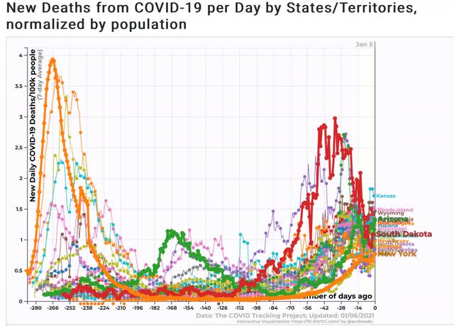
Seven day average of deaths
Bottom 25


Top 25


Many States are already showing a rate of deaths that is roughly half of that of the peak during the summer outbreak. About a dozen have already exceeded it. Note the inclusion of South Dakota as a recent prior peak - it wasn’t broken out separately for infections or deaths because, in view of subsequent data, it doesn’t stand out there. In other words, if deaths follow a similar trajectory, by Valentine’s Day we should expect to see a death rate for most States on par with South Dakota’s recent experience, and roughly 2/3’s of that of NY and NJ during the early spring outbreak. 

This is utterly ghastly, and it is already “baked in the cake.”

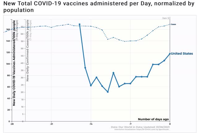
Finally, here is the 7 day rate of new infections (finer line) vs. 7 day rate of vaccinations (heavier line)(note separate scales):


New infections so far are completely outrunning vaccinations, by close to a 4:1 pace.  Less than 175,000 vaccinations are taking place daily as of the most recent data point. We need to get that up to 1,000,000 per day if not more just in order to have the population vaccinated by the end of 2021.

Tuesday, January 5, 2021

December ISM manufacturing index: manufacturing, like housing, is “on fire”


 - by New Deal democrat

Data for December 2020 started out this morning with the ISM manufacturing index.


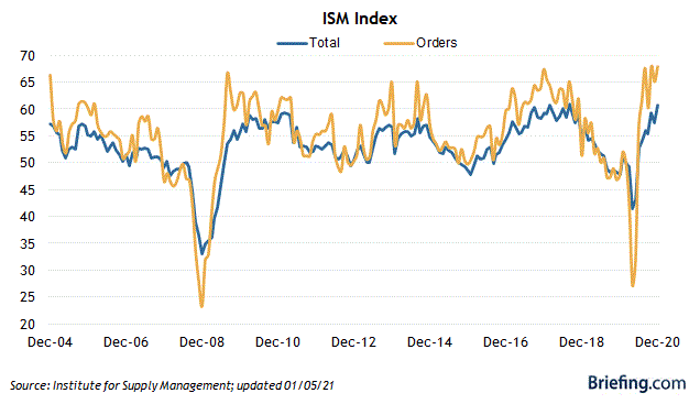
The bottom line is: it was excellent. The overall reading, at 60.7, was only 0.1 below its 20 year peak of 60.8 in 2018. The even more leading new orders subindex rose to 67.9, also equivalent to its 20 year highs:


There has been some deceleration in the positive readings from the Regional Fed manufacturing indexes. But it is nowhere evident in this report.

Simply put, manufacturing along with housing, are both “on fire.” This is one more piece of evidence that the economy is ready to soar once it is no longer held back by the pandemic.

Monday, January 4, 2021

November construction spending confirms building surge


 - by New Deal democrat


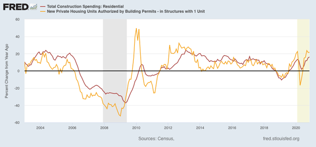
One of my consistent themes in the past few months has been how the housing market is priming the economy for strong growth in 2021 as soon as the pandemic is brought under control. In that vein, November construction spending surged, confirming what we have already been seeing in housing permits and starts.


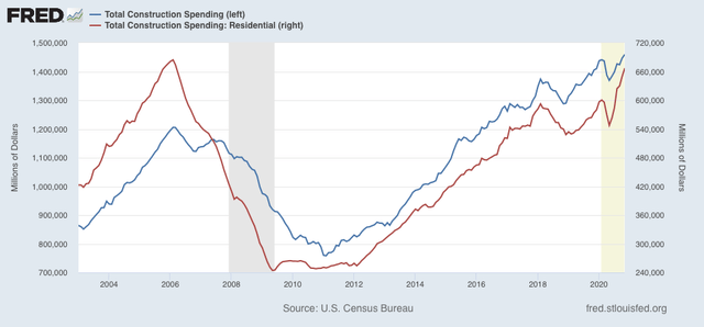
First of all, here are both total and residential construction spending for the past 15+ years:


Note that in raw, non-inflation-adjusted terms, both are close to their all-time highs, and definitely at 10+ year highs.

Of the two, residential construction is the more important because it is more leading, indicator. Commercial and government construction, which are included in the total, relatively speaking lag.

Because permits have to be taken out before construction can begin, typically these lead construction spending (although in fairness that really hasn’t been true in the past 2 years). Below I show the YoY% change in both, which helps take care of the fact that residential construction spending isn’t adjusted for inflation:


With the exception of the brief lockdown periods last March and April, residential construction spending is increasing at a pace equivalent to its best in the past 5 years, just as permits have done even better.

Saturday, January 2, 2021

Weekly Indicators for Dece3mber 28 - January 1 at Seeking Alpha


 - by New Deal democrat


My Weekly Indicators post is up at Seeking Alpha.


In a sparse data environment, it continues to stand out how surprisingly well - under the circumstances - the economy is doing, and how primed it is to really take off once the pandemic is brought under control.

As usual, clicking over and reading brings you up to the virtual moment, and puts a penny or two in my pocket.

Friday, January 1, 2021

Happy New Year 2021!


 - by New Deal democrat

Wishing all of my readers a happy, healthy, and better 2021!

I started writing online 17 years ago, and have been here over a decade. This past year was easily the worst of all of them, and at least tied with 1968 if not worse for the worst year historically of my entire life.

The pandemic upended everything, so this year for the first time in a long time there’s no point in taking a look back to see how the year-ago economic forecast panned out, and only limited value in a new forecast even now, although I agree with Paul Krugman that once the pandemic has been brought under control, the economy looks likely to spring back strongly.

In the meantime, here is one last chuckle about 2020, The Year From Hell - in this ad from match.com, literally!


Thursday, December 31, 2020

Final jobless claims of 2020 continue to show lack of progress


 - by New Deal democrat

New jobless claims declined for the second week in a row this week, but are still significantly above their recent pandemic lows, while continuing claims, seasonally adjusted, once again made a new pandemic low. There is a sizable but by no means certain likelihood that December’s jobs number will be negative.

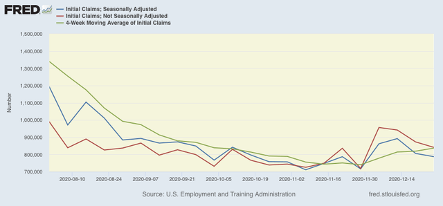
On a unadjusted basis, new jobless claims declined by 31,736 to 841,111. Seasonally adjusted claims also declined by 19,000 to 787,000. The 4 week moving average, however, rose again by 17,750 to 836,750. All of these are above their recent lows. 

Here is the close up since the end of July (for comparison, remember that these numbers were in the range of 5 to 7 million at their worst in early April): 


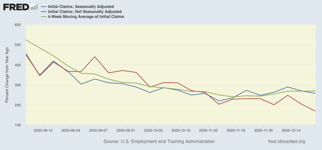
Because of the huge distortions caused by the pandemic in seasonally adjusted numbers, and because we are at a time of year when seasonality causes the most distortions in any event, here are the YoY changes in all of the above metrics:


There is now a 7 week trend in the seasonally adjusted data of YoY% increases, while the trend has been rising slowly for the unadjusted data. I still won’t be sure about a renewed upward trend unless and until seasonally adjusted new claims rise over 900,000 and the 4 week average over 850,000, which would take both out of the range they have been in over the past 4 months. We’re not quite there yet.

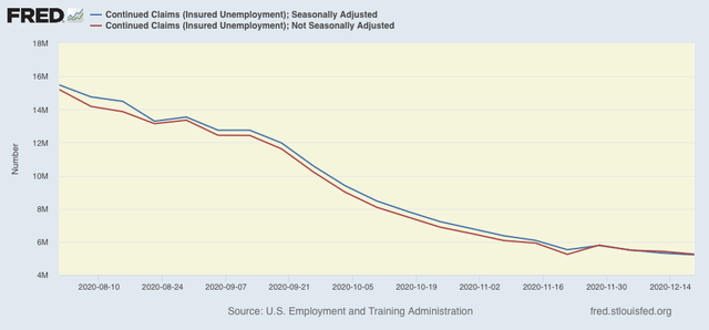
The story is different with both seasonally and non-seasonally adjusted continuing claims, which historically lag initial claims typically by a few weeks to several months. Seasonally adjusted continuing claims declined again by 103,000 to a new pandemic low of 5,219,000. On an unadjusted basis, they declined by 171,035 to 5,258,073, still about 10,000 above their recent pandemic low:


Because these lag initial claims, I continue to suspect we will see an upward reversal in the next few weeks.

Both initial and continued claims remain at or above their worst levels from the Great Recession.

Finally, for the month of December new jobless claims were about 95,000, or 13%, higher than in November. That much of a spike has only happened 4 times previously in the past 50 years outside of a recession - in March 1967, April 1979, September 2005, and October 2013. On 3 of those 4 occasions, either that month’s or the following month’s jobs report showed actual job *losses.* In the exception, 2005, September showed only a 68,000 gain. As I have written for the past 2 weeks, because we are in uncharted territory all I really feel comfortable saying is that I suspect that the December jobs report is going to be the weakest since May.  A negative number is very possible, and if there is a positive number, it looks likely to be well under 200,000.  

This winter looks like it will be uniquely bleak. If there is a bright side, it is that George Harrison’s “Here Comes the Sun” is likely to be equally uniquely appropriate for the coming vaccination spring.

Tuesday, December 29, 2020

Coronavirus dashboard for December 29: a final look back at the pandemic disaster in 2020


 - by New Deal democrat

Total US confirmed cases: 19,132,726*
Average cases last 7 days: 184,005
Total US deaths: 333,118
Average deaths last 7 days: 2,207 

Total vaccinated: 2,127,143 (per CDC via Bloomberg)

*Because many asymptomatic people probably never get tests, actual cases are probably more like 26 million, or about 8% of the US population

Source: COVID Tracking Project

The good news is, we finally have started the process of vaccination, and 1% of the population should be vaccinated by the end of this week. The bad news is, at the current rate, it would take over 4 years to vaccinate everyone in the US. I do expect this to ramp up, both as more States get more efficient at administering the vaccine, and because the Biden Administration will be much more activist and competent at ramping up production and improving the supply chain.

As we end 2020, let’s take a look at total infections and deaths per capita so far.

Here are infections and deaths for the US as a whole (note separate scales):
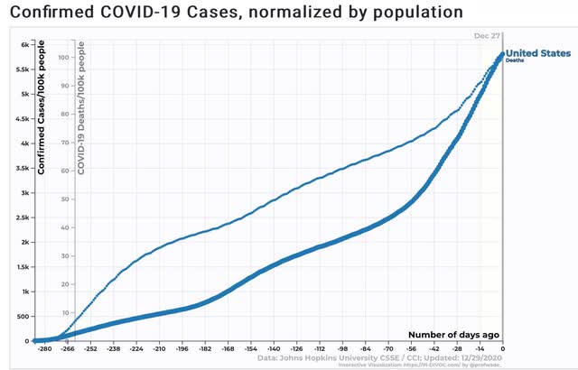

Roughly 1 in 16 Americans has had a *confirmed* infection; 1 in 1000 Americans has died from COVID this year.

Here are total infections by State:
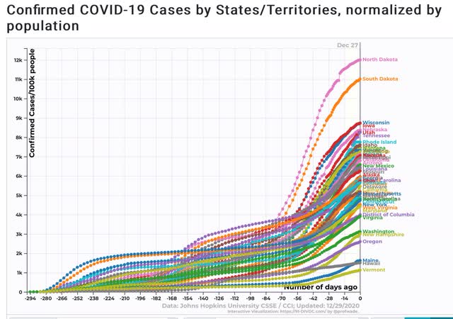

12% of North Dakotans and 11% of South Dakotans have had *confirmed* infections. Between 8% and 9% of the total population of Wisconsin, Iowa, Nebraska, Utah, and Tennessee have also had *confirmed* infections.

At the other end of the distribution, only about 1% to 2% of the populations of Maine, Hawaii, and Vermont have been infected. That is a success story.

Here are total deaths by State:
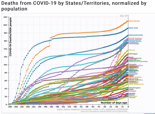

New Jersey and New York, which had horrible outbreaks early, still lead the pack, with about 1 in every 500 residents having died of the disease this year. About one in 600-700 of the entire populations of Massachusetts, North and South Dakota, Connecticut, Rhode Island, Louisiana, and Mississippi  have also died of the disease. 

Maine, Vermont, Alaska, and Hawaii have the best record, with only 2 deaths per 10,000 population. 

Looking at the 7 day average rate of infections shows that the wave that began in early November utterly dwarfs the two prior waves, with North Dakota having the worst result of any State:
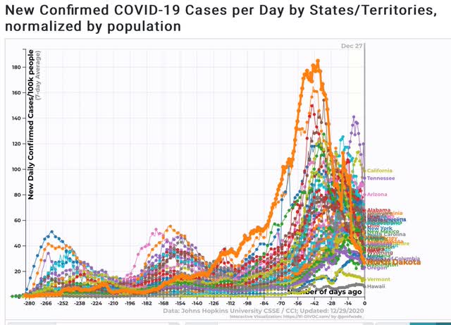

Note that North Dakotans were apparently sufficiently terrified that their infection rate is now one of the 10 lowest in the entire country!

The 7 day average of deaths shows that the initial outbreak in the NYC metro area remains the most lethal:
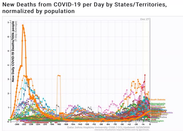

Although Iowa and South Dakota’s recent spikes are in the same ballpark.
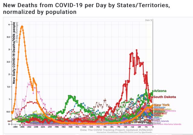
I expect the recent horrific rates of infections and deaths to continue throughout the winter, although there will be alternating waves of panic and complacency, depending on the recent experience of each State. Between vaccinations, warmer weather, and a competent new Administration in Washington I expect a real subsidence to finally begin by about late March or early April.