Saturday, November 21, 2020

Weekly Indicators for November 16 - 20 at Seeking Alpha


 - by New Deal democrat


My Weekly Indicators post is up at Seeking Alpha.


Nothing definitive yet - after all weekly data is going to be noisy - but there is some indication that the recovery in coincident conditions in the economy have ceased to make progress, and maybe even have begun to reverse, probably due to the pandemic being out of control, and new restrictions put in place in some States as a result.


As usual, clicking over and reading should bring you right up to the moment, and reward me with a penny or two for the effort I put in to bring you this report.

Friday, November 20, 2020

Coronavirus dashboard for November 20: North Dakota “leads” the world


 - by New Deal democrat

Total US infections: 11,715,316*

Average last 7 days: 165,029/day (new record high = 1 out of every 2000 Americans infected per day!)

Total US deaths: 252,535
Average last 7 days: 1,335/day

Source: COVID Tracking Project

*confirmed cases only: I suspect the total number is on the order of 17 million, or 5% of the total US population (other estimates are much higher).

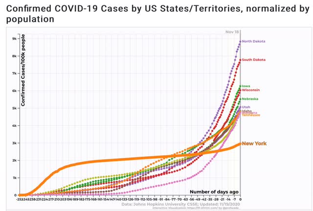
Just how ghastly is the situation in the northern Great Plains and Mountain States? So bad that if North Dakota were a country, it would be “leading” the world in infections and new deaths per capita, and rapidly approaching “leading” the world in total deaths per capita.

Here are the “top 10” US States for total confirmed infections (plus New York for comparison purposes):


Almost 9% of the entire population of North Dakota has had a *confirmed* infection. In about another week, that should be over 10% (and probably is already including infections that have not been confirmed).

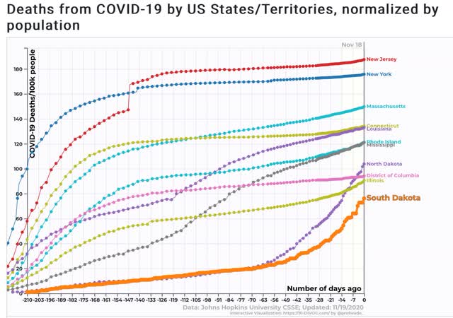
Further, while New Jersey still has had the most deaths per capita due to the early outbreak, North and South Dakota are rapidly catching up, and likely will be approaching the total numbers of New York and New Jersey within about 2 weeks:


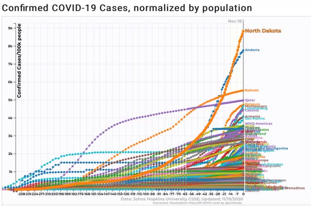
Even worse, here’s what North Dakota’s total confirmed infections per capita look like in comparison with every country in the entire world:


North Dakota “leads” the world.

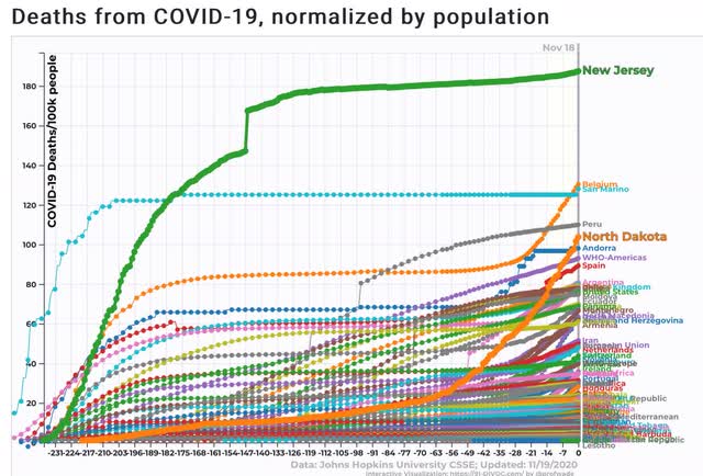
And here is what North Dakota and New Jersey look like compared with the rest of the world in total deaths per capita:


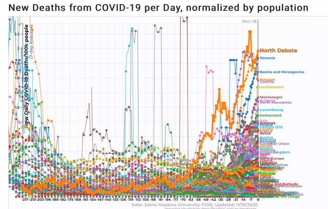
The only reason North Dakota might not take the “lead” in the world for deaths is that Belgium is having nearly as bad a new out of control outbreak, and will probably get there first.

But in terms of *new* deaths per day over the past week, North Dakota already “leads” the world:


As I remarked to several friends last weekend, never have I seen a society as a whole abjectly fail the “marshmallow test.” All because “libertarianism” in deep red States means doing exactly what I want and can get away with, the effects on everybody else be damned.

Thursday, November 19, 2020

Jobless claims: the beginning of a pandemic reversal?


 - by New Deal democrat

This week’s new jobless claims rose from last week’s pandemic lows, while continued jobless claims again declined to new pandemic lows.

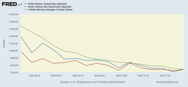
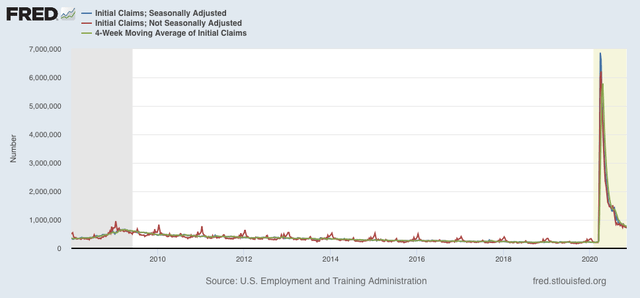
On a unadjusted basis, new jobless claims rose by 18,264 to 743,460. Seasonally adjusted claims rose by 31,000 to 742,000. The 4 week moving average, however, declined by 13,750 to 742,000. Here is the close up since the end of July (for comparison, remember that these numbers were in the range of 5 to 7 million at their worst in early April): 


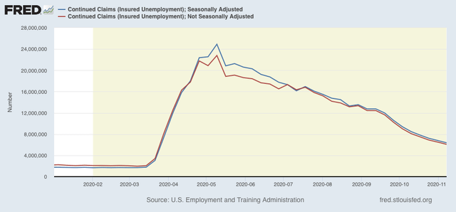
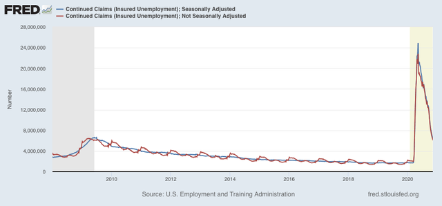
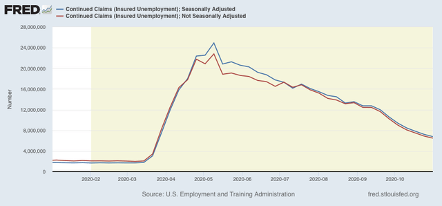
Unadjusted continuing claims (which lag initial claims typically by a few weeks to several months) declined by 419,670 to 6,081,402. With seasonal adjustment they declined by 429,000 to 6,372,000, both new pandemic lows:


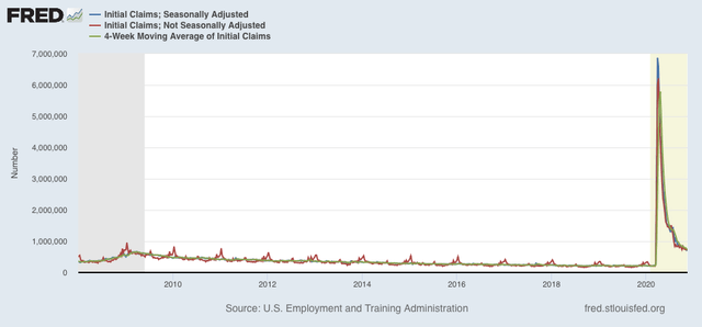
New jobless claims have declined about 88% (unadjusted) or 90% (seasonally adjusted)  from their March and April pandemic highs. But the seasonally adjusted numbers are still about 100,000 higher than their worst readings of the Great Recession:


Meanwhile, continued claims are about 71.5% (unadjusted) to 75% (seasonally adjusted) below their May pandemic highs:


After 7 months, at last both of these are slightly lower than their worst levels of the Great Recession (faint praise, I know).

Whether one week ago will mark an interim low, due to the pandemic spiraling out of control again in most of the country, or just noise in a continued very slow decline, is impossible to know. But I do suspect, if a reversal hasn’t already started to happen, it will within the next few weeks, especially as State governments are reluctantly placing renewed restrictions on social business activity.

Wednesday, November 18, 2020

Housing permits and starts: more evidence for a powerful economic liftoff in 2021


 - by New Deal democrat

This morning yet another leading indicator showed that the economy is revving to move ahead strongly, and is only being held back by the pandemic (and the horrible “response” by Trump).


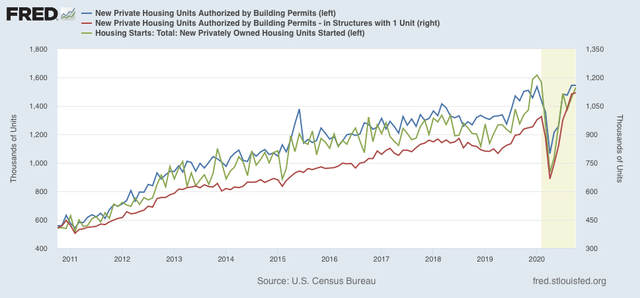
Total (blue in the graph below) and single family (red) housing permits both made yet another 10 year + highs, while housing starts (green), which typically follow a month or two later, also improved. Here’s the longer term look:


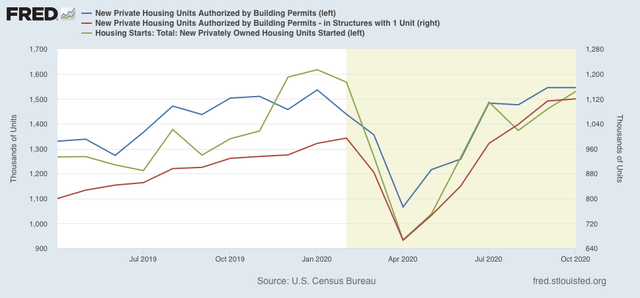
Focusing on the last 18 months shows that only starts have failed to make a new high:


This adds to the evidence that a competent, focused Federal response to the pandemic by the incoming Biden Administration next year, plus the availability of vaccines by about summertime should result in a very strong economy at that point.

Tuesday, November 17, 2020

Economy still expanding, but with retail consumption outpacing production


 - by New Deal democrat

This morning saw two important releases of October data: industrial production and retail sales. Both showed continued strength.

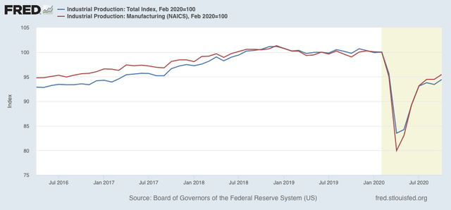
Industrial production is the King of Coincident Indicators, and more than any other metric typically shows whether the overall economy is expanding or contraction. In October it  increased by 1.1%, while manufacturing production increased 1.0%. The overall number more than reversed last month’s decline, while past manufacturing numbers were revised higher. In the below graph I’ve normed both to 100 as of February to show the pandemic impact:


Note that their actual peaks were in November and December 2018, respectively. After declining about 20% at their April troughs, both are now only about 5% below their February peaks. Still, the pace over the last 3 months has averaged less than a 1% increase per month, so it would take about 6 more months at this rate simply to equal the series’ pre-pandemic levels.

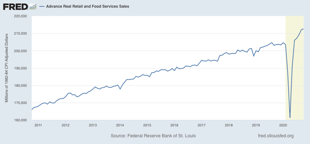
Retail sales were reported up +0.3%. After adjusting for inflation, which was just slightly above 0, real retail sales were up +0.2%. Despite the pandemic, sales have continued to set new all time records:


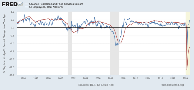
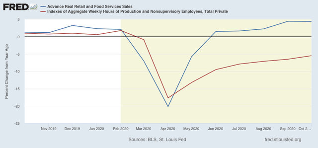
As I have said many times in the past, historically consumption has slightly led employment by several months, albeit with a lot of noise. It has almost universally done so for the entire 70+ year history that both measures have been kept. Basically, demand for goods and services drives hiring to fulfill that demand (or at least to an increase in hours employed) typically within a few months later. Here’s the latest update (YoY retail sales /2 for scale):


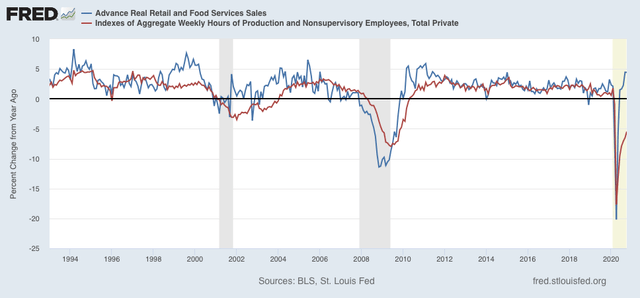
And consumption as measured by retail sales has had an even closer relationship with aggregate hours:


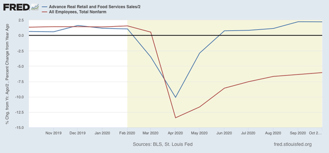
Here is a close-up on the past year for each:

Because sales have not just recovered, but on a YoY basis have continued to accelerate, I expect employment and hours worked to continue to show gains for the next several  months, despite the pandemic, unless partial or total closures are ordered by State governments.

These two important measures show an economy still in expansion, but with retail consumption outpacing manufacturing production.

Monday, November 16, 2020

Coronavirus Dashboard for November 16: raging out of control


 - by New Deal democrat


Total US infections: 11,036,935*

Average last 7 days: 148,725/day (new record high)
Total US deaths: 246,214
Average last 7 days: 1,103/day

Source: COVID Tracking Project

*confirmed cases only: I suspect the total number is on the order of 16 million, or close to 5% of the total US population.

Back in August, when summer’s 2nd wave of new infections was near its peak, I devised my own rating system as to how each State was doing, as follows:

Deep Red (general alarm out-of-control fire): 200+ infections per million, 5+ deaths per million.
Red (3 alarm fire): 100-200 infections, 2-5 deaths
Orange (2 alarm fire): 60-100 infections, 1-2 deaths
Yellow (1 alarm fire):40-60 infections, 0.5-1 deaths
Blue (smoldering/1 alarm fire): 20-40 infections, 0.2-0.5 deaths
Green (embers): 0-20 infections,  0-0.2 deaths

As to infections, most of the States (33) were in the “Red” or “Orange” categories.

At the high extreme, there were 5 States in the “Deep Red” category for infections: MS, ND, GA, TN, and AL.

At the other end of the scale, there were 6 States in the “Yellow” range: OR, DE, CO, WV, PA, and MA
There were only 3 in the “Blue” range: CT, NJ, and NY
There were another 3 in the “Green” range: ME, NH, VT

By contrast, how bad is the situation now? Only 4 States would *NOT* be in the “Deep Red” category: VA, ME, VT, and WI, plus DC, Puerto Rico, the Virgin Islands, and the Northern Mariana Island. Of those, only Hawaii and the two territorial island chains would be less than “Red”:
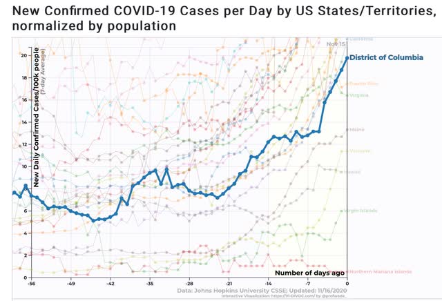

It is so bad that nearly 10% of the entire populations of North and South Dakota have already had *confirmed* infections, with several other States not far behind:
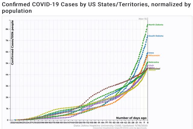

They, along with the other hardest hit States, look like they are recklessly heading towards “herd immunity,” probably by the end of the winter, with death rates in excess of 1% of the entire States’ populations by then.

As to deaths, in August most of the States (33) were also in the “Red” or “Orange” categories. 8 States were in the worst, “Deep Red” category: MS, LA, GA, TX, NV, FL, AZ, and SC.

At the other end of the scale, there were only 4 States in the “Yellow” range: KS, HI, CO, and NH
Another 4 were in the “Blue” category: NY, NJ, ME, and CT
One - VT - was “Green.”

By contrast, 16 States are currently in the “Deep Red” category: ND, SC, WI, MT, WY, IL, NM, IA, MN, WV, TN, MI, ID, IN, NE, and MO:
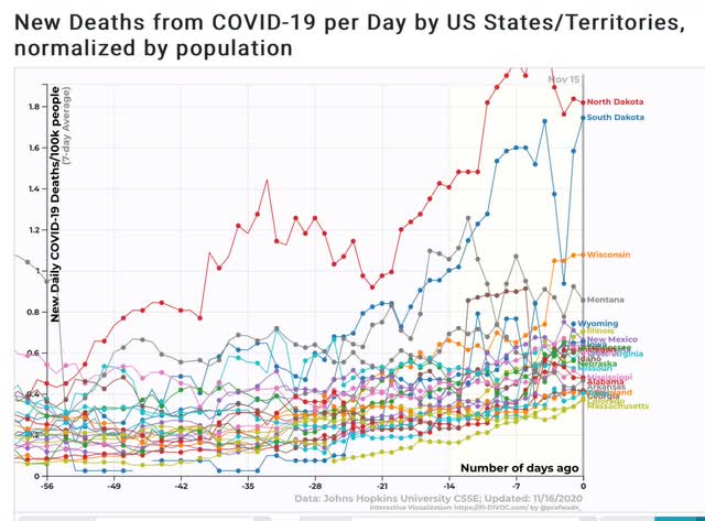

At the other end, Only NY is in the “Yellow” category.
Only HI and VT are in the “Blue” category.
And only the two island territories of the Virgin and Northern Mariana Islands are in the “Green” category:
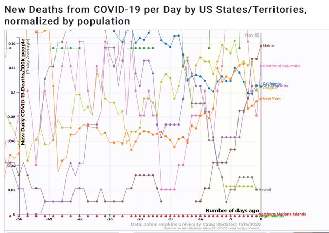

Keep in mind that deaths follow confirmed infections by 4 weeks or more, so there is every likelihood that many more States are going to move into the “Deep Red” category shortly.

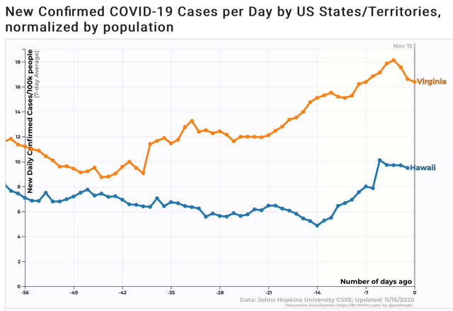
In fact, I could only find 2 States - VA and HI - where currently there is not a big upswing in cases or deaths:
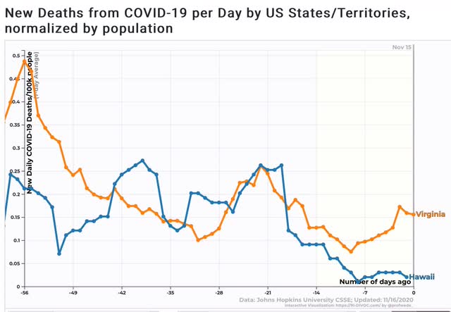


All the other States, including NY, ME, and VT, are showing rapidly increasing cases.

Against all of this horrendous failure, the only other “good” news, as was widely reported this morning, is that a 2nd vaccine, with a 94% success rate at preventing infections, and without the necessity for heroic precautions in transport and storage, is on the verge of approval.

Hopefully the generally responsible States of the Northeast and West Coast will take the necessary heroic steps to keep their populations safe until the vaccine(s) arrive next spring or summer.

Democrats: the “less unpopular” party


 - by New Deal democrat

No economic news today. I hope to put up an updated Coronavirus Dashboard (hint: it’s pretty unremittingly awful) later.
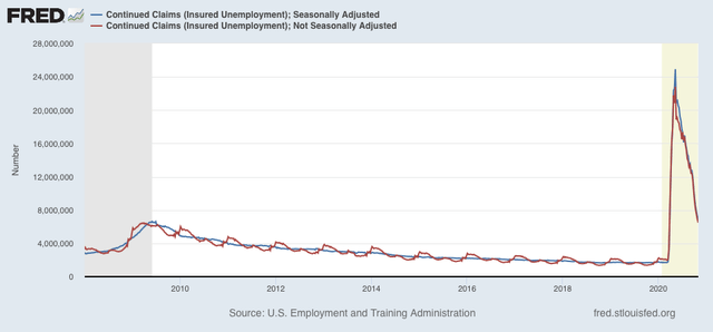

In the meantime, I wanted to add a postscript to yesterday’s post about the Democrats’ problem obtaining a durable electoral majority.

It occurred to me after I put up yesterday’s piece that the essence of what I wanted to say in response to the meme that “Democrats have won 7 of the last 8 popular votes” is that, while Democrats may be “more popular than” the GOP, on an absolute scale the truthful statement is this:

“Democrats are *less UNpopular* than the GOP.”

Here’s why. If you average the popular votes that the two parties have gotten beginning with 1996 you get the following:

Democrats: 49.9% 
GOP: 46.5%

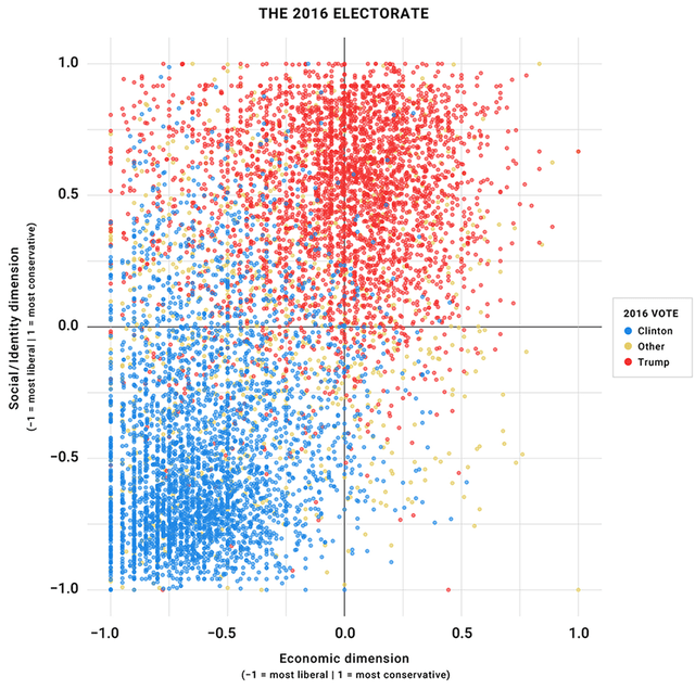
The simple fact is that in the past 6 elections going back 24 years more people have voted *against* the Democratic nominee than have voted for the nominee.  In other words, in an absolute sense the Democratic nominees have been *unpopular,* if by the slightest of margins. There’s simply no way to build a durable electoral majority on that basis.

Ultimately the reason is that the Democratic “brand” is “socially liberal, economically moderate,” while the US electorate as a whole is socially moderate and economically progressive, as shown in the scattergraph below:


The path forward is to embrace, and pass, some simple economic fixes (like raising the minimum wage and ending the abuse of salaries, in addition to making affordable healthcare universal) that materially improve - and are *seen* to materially improve - average Americans’ lives, while allowing for some flexibility on issues that people perceive as ones of morality (and hence are hard to compromise about) in such a way that nobody’s ox gets gored too much.

Sunday, November 15, 2020

The Democrats’ problem in the Senate, explained


- by New Deal democrat

One of the memes that I have read quite a few times in the past week is that the Democrats have won 7 of the last 8 Presidential elections, and that the institutions of electoral government discriminate against them. 


A review of the actual results of the last 8 elections does not quite support that assertion. In only 4 of those 8 elections has either party mustered a majority of voters; in the other 4 the victor won by a plurality. This to my mind betrays a fundamental disaffection (relatively speaking) for the choices given the electorate.

Here are the raw numbers:

Year      Dem.    GOP
1992.    43.0%.  37.4%
1996.    49.2%.  40.7%
2000.    48.4%.  47.9%
2004.    48.3%.  50.7%
2008.    52.9%.  45.7%
2012.    51.1%.  47.2%
2016.    48.2%.  46.1%
2020.*   51.0%.  47.3%

Only in 2004, 2008, 2012, and 2020 did the winner get more than 50% of the vote. The Democratic share has actually been remarkably stable since 1992, varying between 48.2% in 2016 to 52.9% in 2008. The GOP share has been much more volatile, varying between 40.7% in 1996 and 50.7% in 2004.

The bottom line is that in the past 24 years the Democratic brand of economic moderation and social liberalism has been only slightly more popular than the  GOP’s increasingly extreme brand of White Christian blood and soil hegemony.

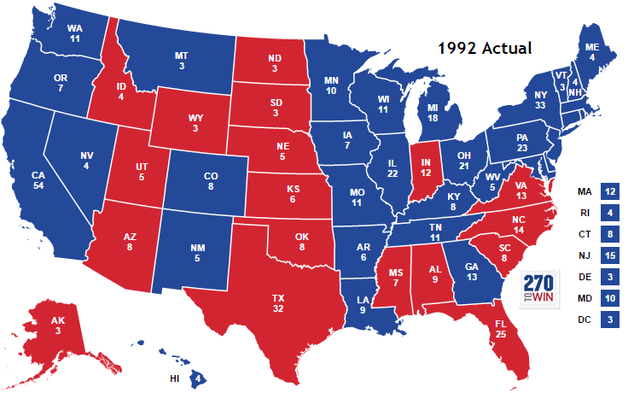
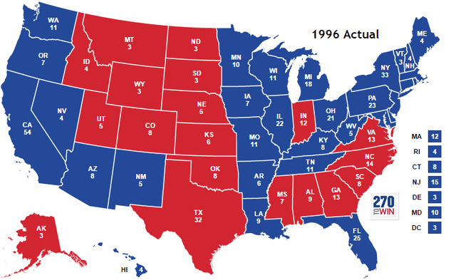
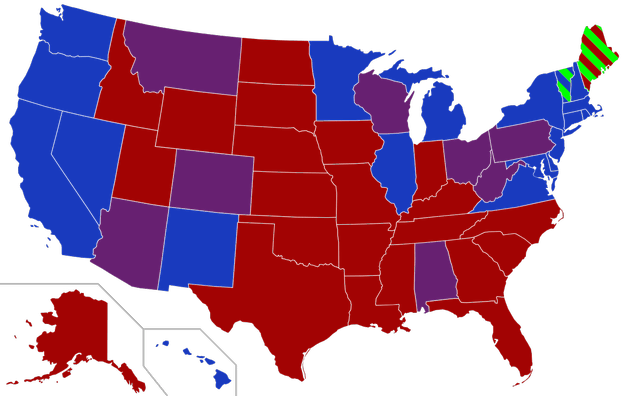
This has led to the Democrats’ problems in obtaining a Senate majority.  The first two maps below show the Electoral College vote in 1992 and 1996:


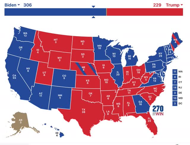
Contrast that with the electoral college vote this year:


In the past 30 years, there have been slight changes in the West (CO turning reliably Democrat, joined this year by AZ), but a wholesale obliteration of the Democratic cause in the Mississsippi valley, as States all the way from LA to OH, WV, and IA turned GOP.

Seven of those States - LA, AR, MO, IA, TN, WV, and OH - frequently if not always seated Democratic Senators. That is all gone now.

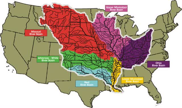
And the trend in the GOP-ization of the Mississippi Valley continued this year. First, let me show you a map of the Valley:

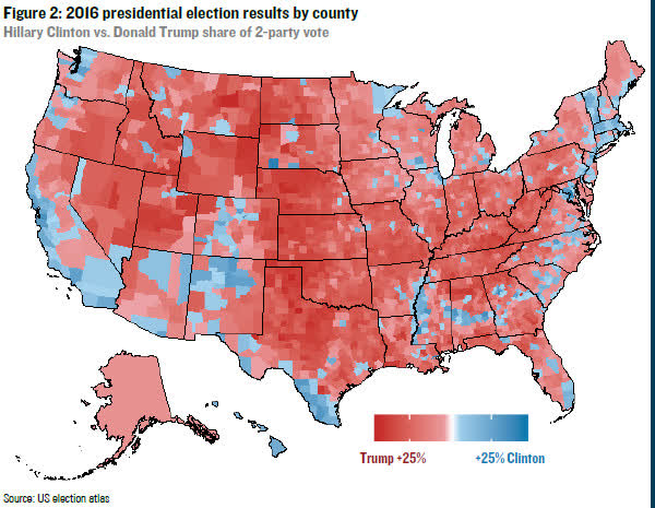
Next, here is a map showing the 2016 results in the Presidential race:


Note that the area of increased voting for the GOP overlays pretty well with the geographical Mississippi Valley. That only intensified in 2020.
 
In large part, I suspect this simply reflects the dying out of the Greatest Generation, which remembered the programs that the Democrats of the 1930s and 1940s had enacted to make their lives better; and their replacement by younger generations which know the Democrats mainly as the party of civil rights for minorities.

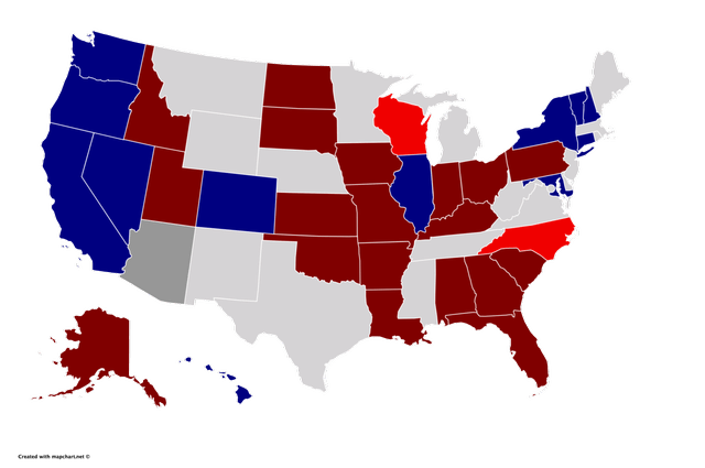
Now let me show you the map of the party composition of the Senate after the 2018 elections:


Since then, CO and AZ have completed flipping blue, while MS flipped back red. 44 States have Senators who completely align with their Presidential votes. 3 - ME, PA, and WI - have a GOP Senator despite voting Democratic in the 2020 Presidential election. 3 others - WV, OH, and MT - have Democratic Senators despite voting GOP in the 2020 election.

Biden won 24 States, Trump 26. And there is the problem.

In order to form a functioning governing majority, the Democratic Party must find a way to reliably bring several more States into the fold, while maintaining their somewhat tenuous grip on the “blue wall.” A year ago I addressed this issue, and little has changed since.
 
There are 4 Sunbelt States “on the cusp:” NC, GA, FL, and TX.
There are 6 “Exurban bleedovers:” ME (Boston), SC (Charlotte), KS (Kansas City), NE, IA (Omaha), and WV PIttsburgh and Washington DC).

What Stacy Abrams has done in Georgia needs to be implemented in all 10 of those States. There are 6 GOP-held Senate seats in those States, plus PA and WI, coming up for election in 2022:


That is where efforts need to be focused next.

Saturday, November 14, 2020

Weekly Indicators for November 9 - 13 at Seeking Alpha


 - by New Deal democrat

My Weekly Indicators post is up at Seeking Alpha.

With Joe Biden assuming the Presidency on January 20, and a announcement of a successful vaccine by Pfizer that should be available by next spring or summer, the short and long leading indicators should once again be giving their usual signals for next year. And we have a pretty good idea what that means....

As usual, clicking over and reading should bring you virtually up to the moment about the economy, and also reward me a little bit for my efforts.

Friday, November 13, 2020

Lack of inflation in September consistent with weak demand; real wages increase, but will the pandemic derail the gains?


 - by New Deal democrat

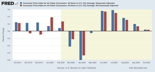
Consumer prices were unchanged in October, both on a seasonally adjusted and unadjusted basis:


But while the lack of inflation is good news in isolation, the last two months can also be viewed as a sign of economic weakness - lack of demand - from a recession.

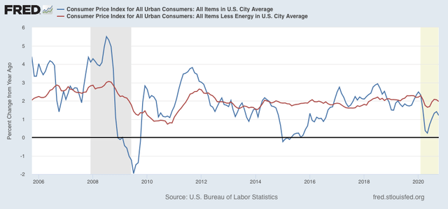
Digging a little deeper, for the past 40 years, recessions had typically happened when CPI less energy costs (red) had risen to close to or over 3%/year. We are nowhere near that now (last 15 years shown in graph):


Again,  note that the YoY% change in inflation has decelerated since the outset of the pandemic, potentially another sign of weakness.

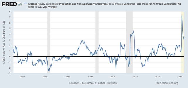
On the bright side, because wages are “stickier” than prices, typically as recessions beat down prices (or at least price increases), in real terms wages rise. That has been the case for the coronavirus recession as well:


It is the “real” buying power of wages among those still securely employed during a recession that is one of the engines that usually restarts growth.

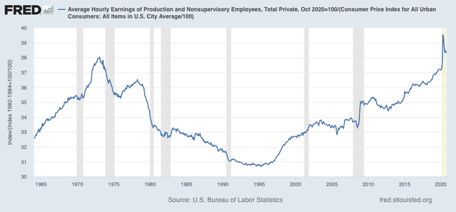
Also as a result, as I’ve noted for the past several months, real hourly wages for non-supervisory workers have finally exceeded their previous 1973 peak, although part of that has been the asymmetric loss of jobs among some of the lower paid occupations:


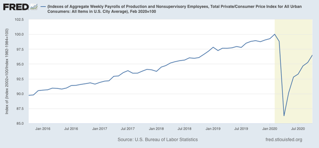
Finally, one of the most telling metrics of the overall health of the middle/working class is that of real aggregate wages. After declining -13.8% from February through April, they have now recovered to a point -3.5% below their peak, approximately at the same level as they were in autumn 2018:


If the rate of gains over the past 4 months were to continue - a *very* open question - aggregate real wages would exceed their February level in about 6 months.

Of course, this data like almost all other economic data, remains at the mercy of the course of the pandemic - which is basically out of control in much of the US. It is also very much subject to the public policy that has been stalled in Washington for the past half a year, and is going to continue to be stalled until at least January 20.

Thursday, November 12, 2020

New and continued jobless claims: best week of the pandemic; can it survive a new emergency?


 - by New Deal democrat

This week’s new and continued jobless claims, both seasonally adjusted and unadjusted, declined to new pandemic lows - but at levels roughly equivalent to their worst readings during the Great Recession.

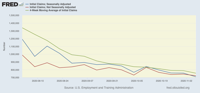
On a unadjusted basis, new jobless claims declined by 20,799 to 723,105. Seasonally adjusted claims declined by 48,000 to 709,000. The 4 week moving average also declined by 33,250 to 755,250. Here is the close up since the end of July (for comparison, remember that these numbers were in the range of 5 to 7 million at their worst in early April): 


Unadjusted continuing claims (which lag initial claims typically by a few weeks to several months) declined by 402,298 to 6,486,000. With seasonal adjustment they declined by 436,000 to 6,786,000, both also new pandemic lows:


New jobless claims have declined almost 90% from their March and April pandemic highs! But the seasonally adjusted numbers are still about 50,000 to 100,000 higher than their worst readings of the Great Recession:


Meanwhile, continued claims are about 72.5% below their May pandemic highs:


But these are also 150,000 (adjusted, weekly) and 35,000  (adjusted, 4 week average) higher than their worst levels of the Great Recession.

Directionally this week was very good news, but on an absolute level the level of layoffs continues to be very bad - just nowhere near like it was 7 months ago. This is a part of the slow continued improvement in most of the “weekly indicators” I update each Saturday.  

As the pandemic is once again out of control in the majority of the country, and near emergency levels in parts of the upper Midwest and Mountain States, with no signs of new infections abating at this point, I have to think this is going to reverse, and reverse badly. But it hasn’t yet.

Wednesday, November 11, 2020

Semptember JOLTS report shows jobs recovery has been real - but will it continue?


 - by New Deal democrat

Yesterday’s JOLTS report for September showed a jobs market that continues to be, ever so slowly, on the mend. Openings and quits were up (good), and layoffs and discharges were down (also good). The only negative was that hires actually declined, although slightly.

We are far enough  past the worst of the pandemic jobs losses that it is worthwhile to compare the state of the various JOLTS components with the 2 previous recoveries from recession bottoms in the series’ histories (this because the JOLTS data only dates from 2001. 

In the two past recoveries:
  • first, layoffs declined
  • second, hiring rose
  • third, job openings rose and voluntary quits increased, close to simultaneously

Let’s examine each of those in turn. In each case, I break out 2001-19 in a first graph and then this year in a second.

What appears below is that, although there has been some variation, the past several months have recapitulated the pattern from the last two early recoveries: the first two data series to turn - layoffs and hires - have indeed turned, while the last two - job openings and voluntary quits - have appeared to bottom but have had a much less dramatic rise.

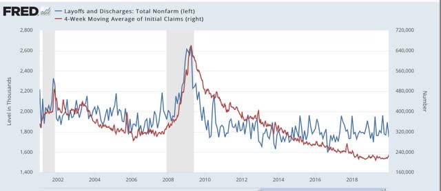
This first graph compares layoffs and discharges (blue) with the 4 week average of initial jobless claims (red):


You can see that, by the end of the recessions, layoffs were already declining, and continued to decline steeply over the next 3-8 months before reaching a “normal” expansion level. The turning point coincides exactly with the much less volatile, but more slowly declining, level of initial jobless claims.

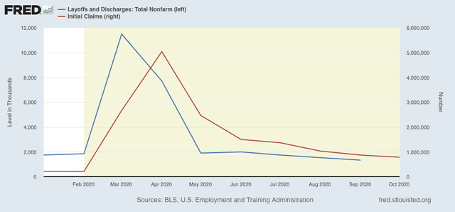
The same has been the case this year, as layoffs and discharges already declined to their “normal” level in May, while initial jobless claims peaked one to two months later, and have been declining (slowly) ever since - a pattern that continued in September.

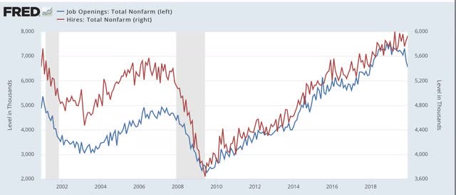
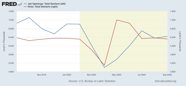
Next, here are hires (red) and job openings (blue):


In the past two recoveries, actual hires started to increase one to two months before job openings.

This year, both made troughs in April, but hires rebounded sharply in May and June compared with job openings:


Since then both have essentially leveled off.


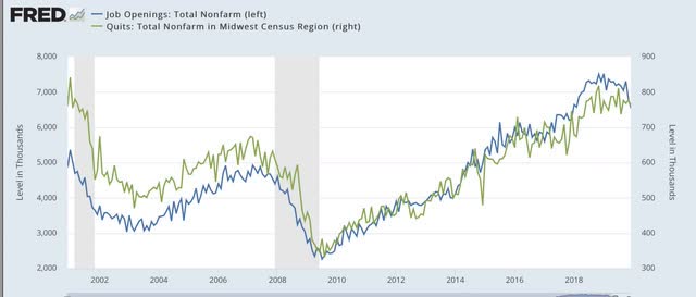
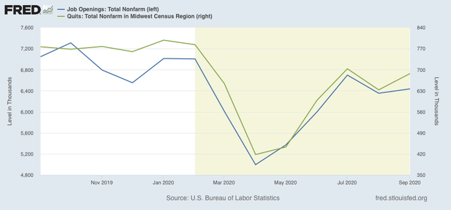
Next, here are quits (green) vs. job openings (blue): 


In the past two recoveries, actual hiring started to rise slightly before quits made a bottom. After that, both rose more or less together (suggesting it is openings that leads to the increase in voluntary quits).

This year, both have moved together, both making a trough in April, and rising   equivalently since:


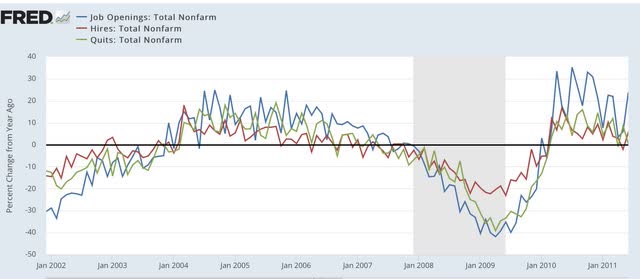
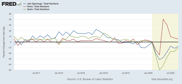
Finally, because seasonal adjustments might not be giving us a true picture because of the enormous moves during this pandemic year, here are job openings (blue), hires (red), and voluntary quits (green), measured YoY without seasonal adjustments for the recoveries after the 2001 and 2007-09 recessions:


Nte that, even taking out the seasonal adjustments, hires rebounded first following the 2001 and 2008-09 recessions. Quits and openings have moved generally in tandem with a slight lag.

The same pattern appears this year:


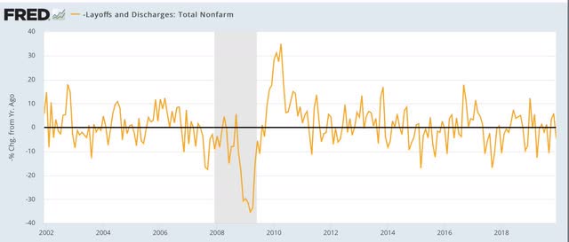
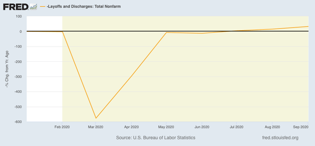
I have broken out layoffs and discharges separately below, because the their level in April and May of this year would obliterate all other variations (note: inverted so that fewer layoffs shows as positive):


This metric returned to normal almost immediately after both of the past two recessions, and did so again by July of this year, and is improving slightly measured YoY.

In short, the JOLTS report shows that the recovery in the jobs market from the pandemic lows is real, and as of September was continuing. 

With the pandemic largely once again out of control, and approaching emergency levels in many parts of the country, it is an open question to say the least whether this will continue. I have to think that responsible State governments are going to reinstitute lockdowns for at least long enough to bring the pandemic back under some semblance of control.