Saturday, February 1, 2020
Weekly Indicators for January 27 - 31 at Seeking Alpha
- by New Deal democrat
My Weekly Indicator post is up at Seeking Alpha.
Due to panic (warranted or not) about a coronavirus, the yield curve almost completely inverted by close of business Friday.
As usual, clicking over and reading puts a penny or two in my pocket, and should bring you right up to the moment on the economy.


Friday, January 31, 2020
December 2019 real personal income and spending
- by New Deal democrat
Real personal income and spending are both coincident indicators. They don’t tell us where the economy is going, but they do give us a snapshot of how ordinary Americans are doing.
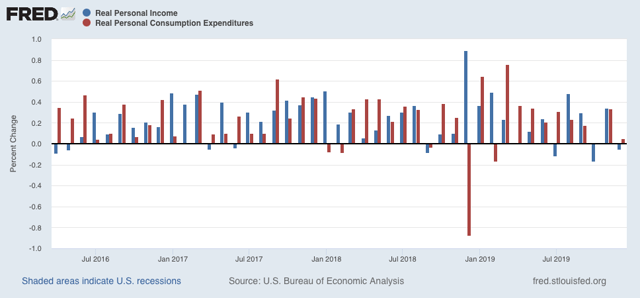
In December, real income declined by less than -0.1%. Real spending rose by less than +0.1%:
Real personal spending excluding government transfer payments is one of the four indicators used by the NBER to determine if the economy is in recession or not. In December this was flat. Overall in 2019 there was a slow uptrend:
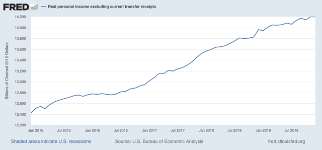
This is one indication that as of one month ago the economy was not in a recession.
Thursday, January 30, 2020
Live-blogging the Fifteenth Amendment: January 27, 1869 (1)
- by New Deal democrat
I have gotten a little behind in this project. Congressional activity picked up considerably in the last week of January 1869.
Rep. Charles A.Eldridge (D-Wisconsin) addressed a civil rights bill by Massachusetts Representative Buckalew under the 14th Amendment as well as the proposed 15th Amendment:
I have not the vanity to suppose that anything I say will cause them to hesitate or consider. Party ends must be accomplished, party purposes must be carried out even though it should revolutionize the Government, overthrow the Constitution, and destroy the Republic.
....
Hamilton on the same subject in No. 59 of the Federalist ... [said], ’Suppose an Article had been introduced into the Constitution empowering the United States to regulate the elections for the particular States, would any men have hesitated to condemn it, both as an unwarranted imposition of power and as a premeditated engine for the destruction of State governments?’
In those days no man would have hesitated to condemn it. The Constitution could never have been adopted if it had contained the grant of power to Congress to determine the qualification of voters for officers of the States. Such a work is left for these days of revolution and usurpation — to the mad fanatics who for particular ends would destroy our Republic of States.
....
The power to determine the qualifications of electors was, in the States conferred ... by the people of the States.... All the powers of the Federal Government come up from the States and people, and it never had and never can have the rightful authority to exercise any power not granted in and by the Constitution. The exercise of any other is rank usurpation.
[I]t seems to me that this bill and resolution for the amendment of the Constitution ... for the evils which exist in his judgment with reference to the persons who ought to exercise the right to suffrage, is a filo de se [crime of suicide]. If the power exists in the Federal government to pass this bill, ... then I admit that Congress has the right to control the whole question of suffrage and the qualification of electors of all officers ....
....
Sir, I do not think the gentleman from Massachusetts gave a proper consideration to the fourteenth amendment, as it is called. I will not consider the question of whether this amendment is part of the Constitution; for myself I do not believe that it is....____________________
Source: Congressional Globe, 40th Congress, Third Seeking, pp. 642-45
What is remarkable about this speech is that Eldridge is not just addressing the Civil Rights bill proposed by Buckalew, but also claims that the even Constitutional amendments are invalid to alter Federal vs. State powers. He considers the power of suffrage in the States to be beyond the control of any proposed revisions to the Constitution itself. Even Chief Justice Roberts, who in the Shelby County case found a right of States to be treated equally in all legislation out in the Constitutional ether, did not go this far.
Mixed signals in Q4 2019 GDP
- by New Deal democrat
This morning’s Q4 2019 GDP gave us mixed signals. As per my usual practice, I am less interested in what happened in the rear view mirror, which was an annualized gain of +2.1%, than what the number tells us about what lies ahead.
The two forward-looking components of GDP are (1) private fixed residential investment, and (2) corporate profits. Both of these are long leading indicators, i.e., giving us an idea about where the overall economy will be a year or more out from here.
In that regard, the news was mixed.
Private residential fixed investment increased +1.4% q/q. This is in keeping with the rebound in housing construction that we have seen in the monthly data since last spring. Note that residential investment as a share of GDP increased in both nominal (blue) and real (red) terms:
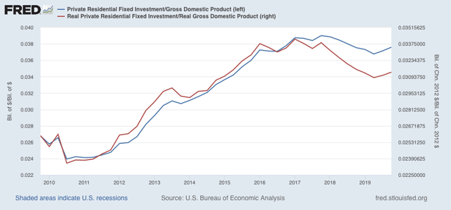
Private residential fixed investment increased +1.4% q/q. This is in keeping with the rebound in housing construction that we have seen in the monthly data since last spring. Note that residential investment as a share of GDP increased in both nominal (blue) and real (red) terms:
Meanwhile, while corporate profits won’t be reported until the final revision in GDP two months from now, proprietors’ income was. While it does not always move in the same direction as corporate profits, and sometimes lags, it a good placeholder. Here the news was negative, as nominally proprietors’ income rose a mere +0.2% q/q:
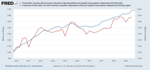
Since the GDP price deflator rose +0.4% during the quarter, the “real” measure declined slightly.
In sum, one long leading indicators increased, and one decreased. So, while in the rear view mirror, there was no recession in Q4 2019, there is more evidence of at best a stall in the producer side of the economy.
In sum, one long leading indicators increased, and one decreased. So, while in the rear view mirror, there was no recession in Q4 2019, there is more evidence of at best a stall in the producer side of the economy.
Wednesday, January 29, 2020
My “official” first half forecast for 2020
- by New Deal democrat
My short term 6 month forecast has been posted at Seeking Alpha.
As usual, clicking over and reading should be educational for you, and puts un poco dinero in my pocket.
Tuesday, January 28, 2020
More on house prices
- by New Deal democrat
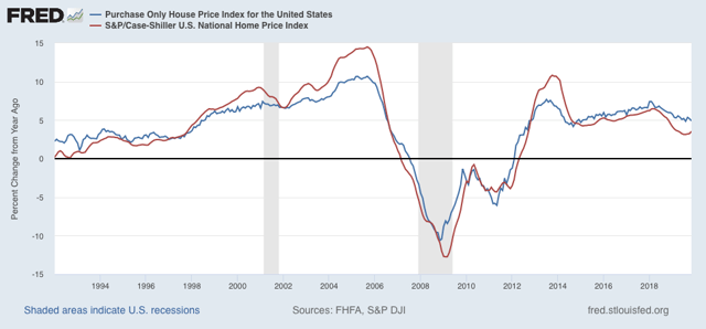
The Case Shiller housing indexes for the three month period ending in November were reported this morning. The YoY% change in the national index increased to 3.5% from 3.2% last month (red in graph below). This is in line with the FHFA purchase price index (blue), and continues the slight acceleration in each from a trough in August:
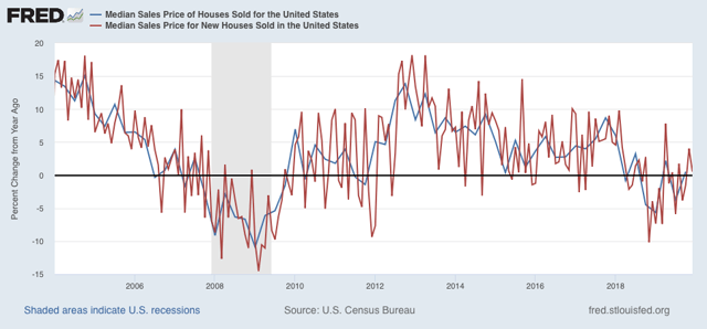
As I mentioned yesterday, the YoY% change in new home prices has also started to rebound (red in the graph below), as does the change in total home prices (blue):
That price appreciation has begun to rebound is not a surprise, as they follow permits (blue in the graph below) with a lag:
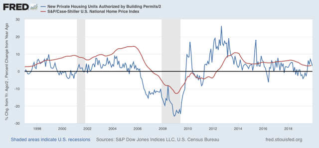
So long as permits, sales, and starts continue to increase, we can expect further acceleration in price growth - which is already running ahead of wage growth.
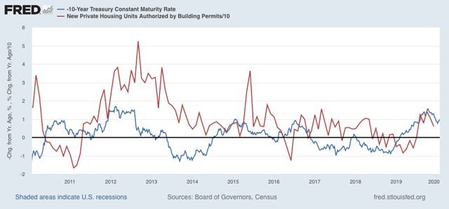
Permits, in turn, follow interest rates. Since interest rates are lower than they were a year ago (inverted, blue, in the graph below), it looks like permits will continue to increase for awhile:
Permits, in turn, follow interest rates. Since interest rates are lower than they were a year ago (inverted, blue, in the graph below), it looks like permits will continue to increase for awhile:
Monday, January 27, 2020
Is the “housing choke collar” kicking in?
- by New Deal democrat
This morning’s December new home sales report raises the question: is the “housing choke collar” kicking in?
The idea of a “housing choke collar” is that house prices are at such a high multiple of the average household’s ability to pay that even with lower interest rates, there is not much room for the housing market to withstand housing price increases.
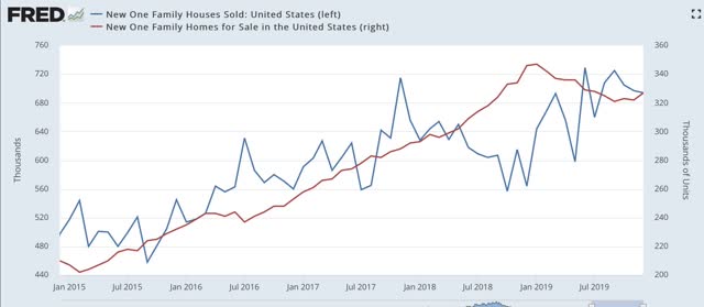
First, to the data: new home sales declined slightly from a downwardly revised November. This data series is very volatile, and heavily revised, but it remains the case that there has been no new high established since last 6 months (blue) (inventory is in red):
In the long term view, note that new home sales have peaked well before the beginning of recessions. Inventory has reliably followed, and with the exception of the shallow 1970 and 2001 recessions, continued to decline throughout the next downturn:
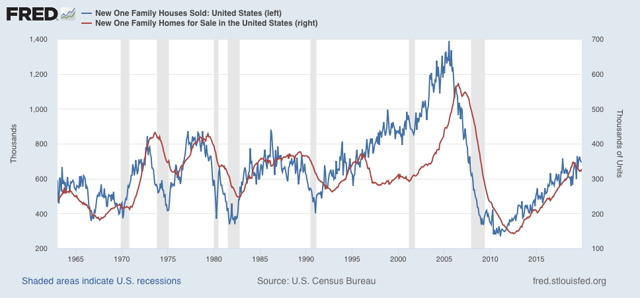
That inventory turned up slightly in December therefore suggests (slightly) that housing is not on a recession trajectory. Also remember that last week housing permits made a new expansion high (sales do typically peak or trough even before permits, but as pointed out above, are much more volatile).
That brings us to median new home prices, which increased sharply, and have been on a pronounced uptrend in the past few months (blue):
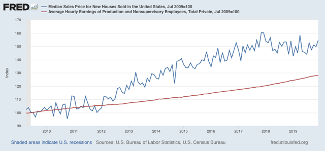
The red line represents average hourly wages for non-supervisory personnel. It’s pretty easy to see that, after declining relative to wages in 2018, prices are now outpacing wage growth again.
Remember that last week we saw that existing home prices had increased by more than 9% in 2019.
If I am right, then there is very limited upside for sales growth. Since sales lead prices, new home sales may be telling us that we are reaching the limit of affordability without even lower mortgage interest rates.
Sunday, January 26, 2020
Weekly Indicators for January 20 - 24 at Seeking Alpha
- by New Deal democrat
I neglected to post this yesterday....
My Weekly Indicators post is up at Seeking Alpha. The forecasts remain as they have been recently, but there are several developments in the long leading range.
As usual, clicking over and reading brings you fully up to date, and rewards me a little bit for my efforts.
Friday, January 24, 2020
The producer vs. consumer sectors of the economy: a comparison
- by New Deal democrat
I have a post up at Seeking Alpha, comparing current conditions on the producer side of the economy vs. the consumer side.
As usual, clicking over and reading should bring you up to date on the “nowcast,” and helps put a $ or two in my pocket.
Thursday, January 23, 2020
On the road
- by New Deal democrat
Today is a traveling day, so no detailed posting.
This morning’s initial jobless claims were in line with the range over the past two years. There has been virtually no change YoY. This negatives any imminent recession fears.
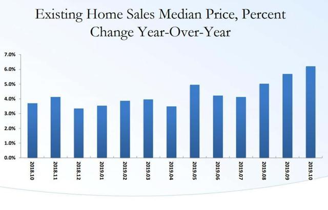
Yesterday’s existing home sales, though touted as “the best in nearly two years,” just continue the baseline that this metric has been in since late 2015, with the exception of the 2018 decline. Of more interest is that (1) inventory is at a cycle low, and - not coincidentally - YoY price increases, up 7.8%, show a continuing acceleration:
A few months ago I offered up the idea that housing now had its own “choke collar,” where prices were bumping up against the limit of what buyers in the aggregate could afford, even with lower interest rates. We’ll get much more information on whether that is the case when new home sales and prices are reported next week.
Wednesday, January 22, 2020
Why negative transportation indexes don’t support a recession call
- by New Deal democrat
Every month for at least the past half year there is a spate of bearish economic commentary that relies upon one or both of two metrics: AAR rail carloads and/or the Cass Freight Index.
I have a post up at Seeking Alpha showing why the first measure is not a representative slice of transport as a whole, and the second has a history of being very volatile and with a slew of negative readings in the teeth of continuing expansions.
As usual, clicking on the link and reading helps reward me with a $ or two for my efforts.
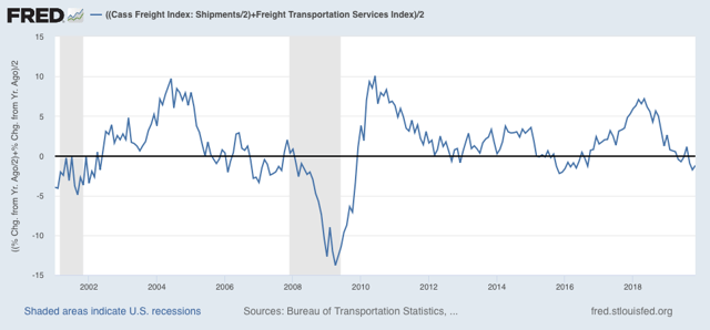
Addendum: after I put together and posted the article, I came up with the idea of averaging the Cass Freight Index and the Dept. of Transportation’s Freight Index after adjusting for the former’s volatility (shown below). It gives us an even less noisy overview of the transportation sector, although it still does go negative during slowdowns without there being a recession. In any event, none of the current negative readings are sufficiently below zero to accord with recessionary readings over the indexes’ short history:
Tuesday, January 21, 2020
Catching up: November JOLTS report
- by New Deal democrat
Let me catch up on some data I didn’t examine last week: the November JOLTS report.
It decomposes the jobs numbers into a number of metrics, but is less than 20 years old, so only covers one full business cycle, so is of limited forecasting use.
To reiterate, here is the order in which the JOLTS series peaked during the 2000s expansion:
- Hires peaked first, from December 2004 through September 2005
- Quits peaked next, in September 2005
- Layoffs and Discharges peaked next, from October 2005 through September 2006
- Openings peaked last, in April 2007
So to start, here are YoY hires and quits for the entirety of the series, measured YoY:
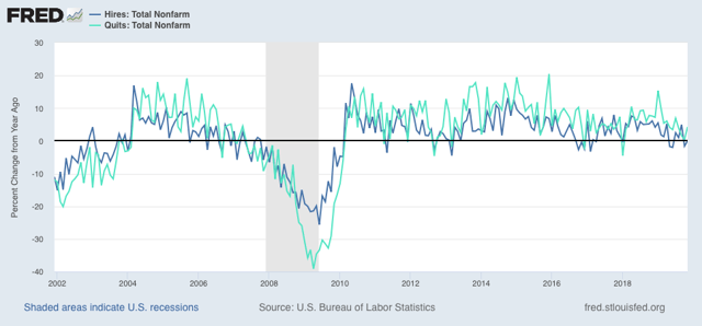
Hires has turned negative for some months in the past year, while quits remain positive YoY.
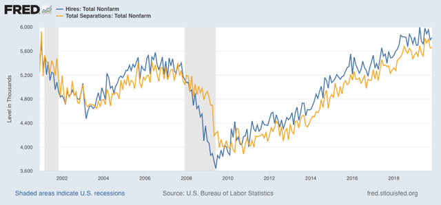
Next, as I have often said, hiring leads firing (actually, total separations). Here’s what that looks like for the entire series, first measured absolutely:
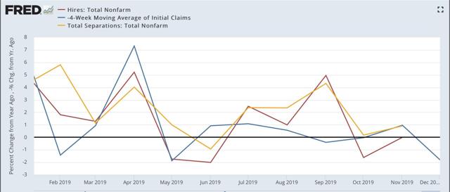
And here is the YoY change, plus the 4 week average of initial jobless claims (inverted) in red:
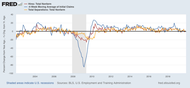
These aren’t as negative as prior to the 2007 recession, as compared in the two graphs below:
Present:
2007:
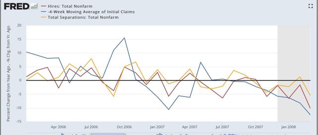
In 2007, both hires and initial jobless claims (inverted) were negative by as much as -5% YoY. In 2019, they’ve only been negative by about -2% at the worst.
The biggest difference between this cycle and the last has been in job openings, which I consider “soft data.” But because the difference is noteworthy, here it is, again shown YoY:
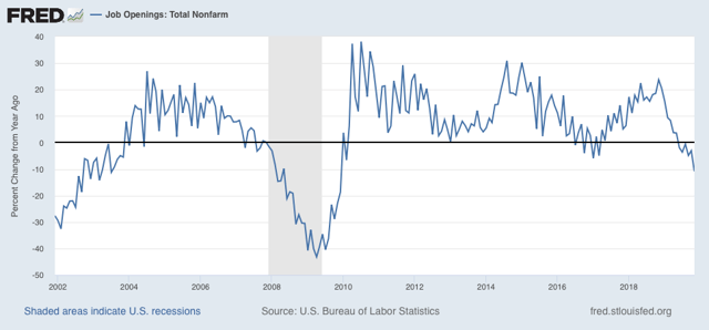
This series is consistent with its 2008 recessionary readings.
Again, analyzing with lots of caution, my take remains: slowdown, not recession at this point.
Monday, January 20, 2020
For MLK Day: unemployment by race
- by New Deal democrat
In observance of Martin Luther King’s birthday, almost all US markets are closed and there is no economic data.
So on this day let’s see the extent to which economic opportunity in several neutral metrics has improved since the passage of the Civil Rights Acts in the 1960s.
Here in unemployment for African Americans (blue) vs. whites (red) since the former began to be measured in 1972 (white unemployment had been measured since the 1950s - interesting that black unemployment wasn’t even deemed worthy of being separately measured before the 1970s!):
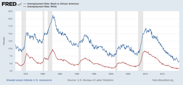
Unemployment for whites made a 50 year low at 3.1% earlier in 2019. It was only lower, at 3.0%, in 1969 (not shown). African American unemployment made its all time low, at 5.4%, in August of last year.
To get a clearer picture how the two measures compare, here are two other ways to look at the same data.
First, here is the % by which the black unemployment rate has exceeded the white unemployment rate:
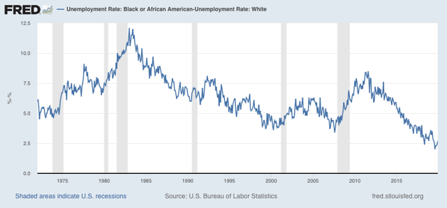
At the worst of the 1970s and 1980s, while white unemployment was bad, black unemployment exceeded it by over 10%! There has been general improvement in each expansion since, with black unemployment exceeding white unemployment by only 2% by last year.
Another good way to look at this is the black unemployment rate as a multiple of that for whites:
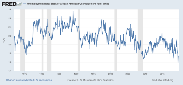
At its worst, black unemployment was more than 2.6x that of whites. The multiple has gradually improved so that last year it was only 1.6x that of whites.
The bottom line here is: progress over the past 50 years, but still a long way to go. At their rates of improvement over the past 40 years, the former measure will reach parity in about another 30 years; but at its historical rate of improvement the latter multiple would require about another 80 years.
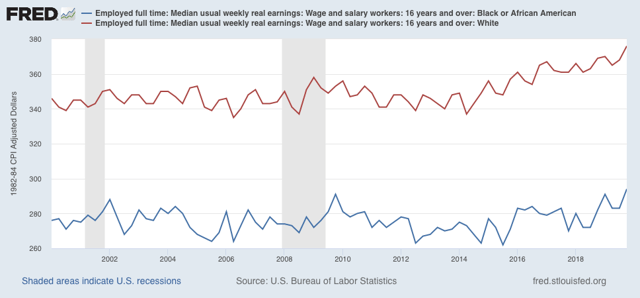
Finally, when it comes to wages, these have only been measured since 2000, and there is still roughly a 25% gap in average weekly wages:
Saturday, January 18, 2020
Weekly Indicators for January 13 - 17 at Seeking Alpha
- by New Deal democrat
My Weekly Indicators post is up at Seeking Alpha.
The short term forecast has been volatile recently - and was again this week.
As usual, clicking over and reading rewards me a little bit for the effort I put in.
Friday, January 17, 2020
Housing BOOM! 2
- by New Deal democrat
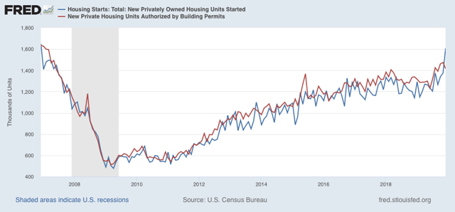
Housing is a very important long leading indicator, and it reflects both the consumer and producer sides of the economy. And this morning, at least in terms of starts, it hit a grand slam.
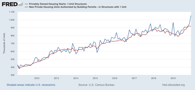
Total housing starts were 1.608 million units annualized, the highest number since the end of 2006. The less volatile and slightly more leading permits declined slightly to 1.416 million units annualized, but the three month average of each made new expansion highs:
The story is the same with the less volatile single family starts and permits:
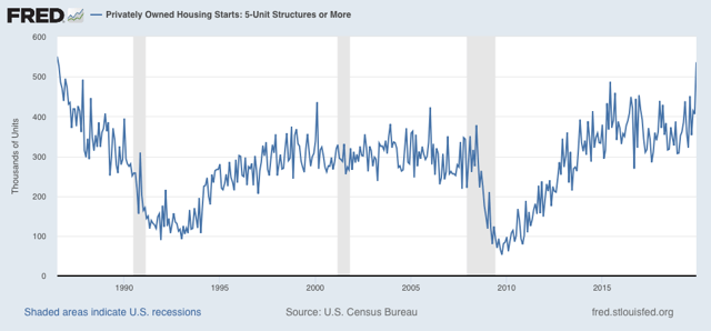
Finally, one point of difference I have had with That Other Blogger who writes about housing is that, because multi-unit housing, especially for younger buyers, can be something of a “substitution good” where single family house prices are beyond reach, I have suspected that multi-unit housing had not yet made its high for the cycle. And in terms of starts, that’s what this morning showed (permits made a huge spike high about 5 years ago the month a special housing program in NYC expired). Not only that, but multi-unit starts made a nearly 25 year high last month:
Lower mortgage rates have done what I expected them to do. It is an important reason why I expect the overall economy to improve later this year. And it is a *very* big argument against the producer slowdown turning into a full-blown recession.
UPDATE: We also got December industrial production this morning, down -0.3%. Industrial production is the King of Coincident Indicators. Here’s what it looks like since July 2014:
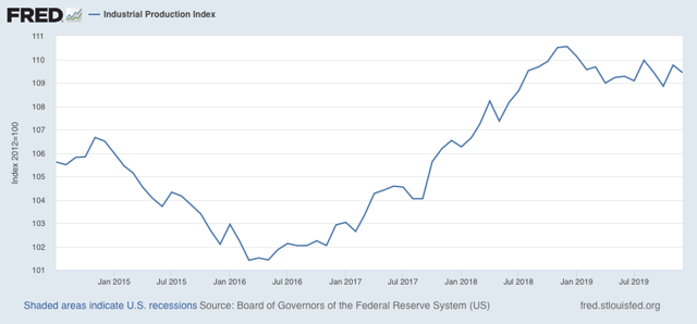
Note that, while it is down (in fact it is down -1.0% YoY), it hasn’t gotten any worse since last spring. And it isn’t down nearly as much as it was during the 2015-16 shallow industrial recession. This is one more brick in the wall of slowdown vs. recession.
UPDATE: We also got December industrial production this morning, down -0.3%. Industrial production is the King of Coincident Indicators. Here’s what it looks like since July 2014:
Note that, while it is down (in fact it is down -1.0% YoY), it hasn’t gotten any worse since last spring. And it isn’t down nearly as much as it was during the 2015-16 shallow industrial recession. This is one more brick in the wall of slowdown vs. recession.
Thursday, January 16, 2020
The consumer is (probably) still alright: initial jobless claims and retail sales
- by New Deal democrat
While the producer side of the US economy is almost certainly in a shallow recession, the consumer side has been holding up pretty well. That was confirmed in two important releases this morning.
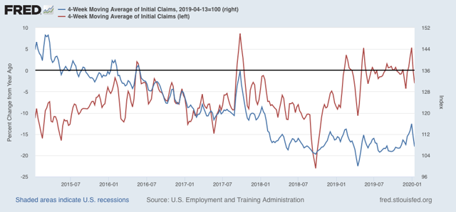
First, initial jobless claims declined to 204,000, one of the lowest numbers during this entire expansion. As a result, the 4 week average, at 216,250 is only about 7% higher than its lowest point during that time, and the first two weeks of January, at 209,000, are more than -10% lower than the January average last year. In short, both of my metrics for rating jobless claims have flipped back to positive. Here are both metrics, with the YoY measure in red, left scale, with the measure normed from the April bottom at 100 on the right scale:
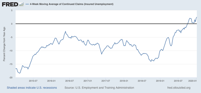
Only continuing claims, less leading but less noisy, continue to flash yellow: the 4 week average, at 1,755.5 million, is 2.5% higher than one year ago (I would need a reading of 5% higher or more YoY for this to flash red):
Second, nominal retail sales increased by +0.3% in December, and November was revised slightly higher to +0.3% as well. Since consumer inflation averaged a little less during those two months, real retail sales increased +0.1%. On a per capita basis, they were flat.
Here are both measures, normed to 100 as of their most recent peak in August:
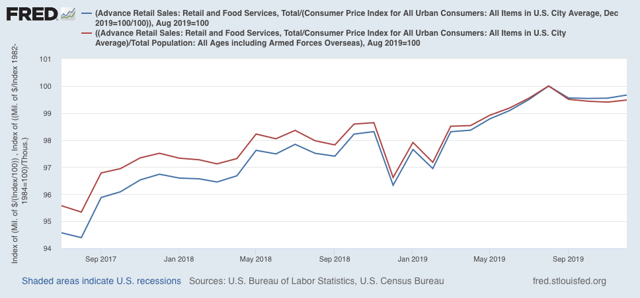
We’ve had similar periods of flatness previously during this expansion, for example late 2018 as shown in the above graph. It would take two more months of readings below the August peak for me to flip this to neutral. For now it remains a weak positive.
The bottom line is that, while there is some flatness, there are no signs of the consumer actually rolling over. Without that, a shallow downturn on the producer side is not enough to tip the whole economy into recession.
Wednesday, January 15, 2020
Producer sales not keeping up with producer price inputs
- by New Deal democrat
Not much economic news today, and I normally don’t spend time on the producer price index, but considering the shallow producer recession and whether it will get deeper or not, as it happens the PPI does play into one metric.
Below is a YoY graph of *nominal* manufacturing + wholesale sales (blue) since the inception of the series 25+ years ago vs. the PPI for all commodities (red):
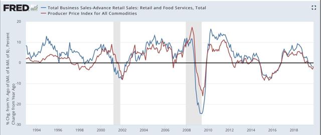
There have only been three times that commodity prices have outpaced producer sales for longer than 2 months during that whole period: late 2002 when economists were worried about a “double dip” recession after 2001, and leading into and during the 1991 and 2008 recessions.
In other words, when commodity price increases outpace sales increases, the producer side of the economy is in trouble.
Now here are the last 20 months including December producer prices:
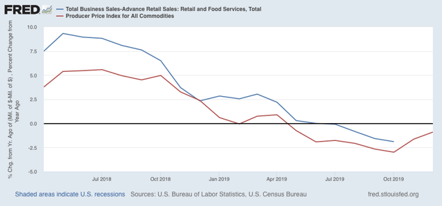
We’ll get manufacturing and wholesale sales for *November* tomorrow. But the obvious point is, unless we get significantly better sales numbers than we got one year ago (and November and December 2018 stunk, so it’s certainly possible!), producer sales won’t have kept pace with producer prices, yet another sign after poor ISM manufacturing and YoY heavy truck sales readings, that the producer side recession has taken hold.
Tomorrow will also give us retail sales, the gold standard for the consumer sector, so stay tuned.
Tuesday, January 14, 2020
Real wages declined slightly in Q4 2019; nearly flat since last January
- by New Deal democrat
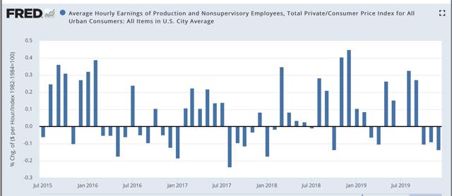
In December consumer inflation was +0.2%. Since in last Friday’s jobs report average hourly earnings also increased +0.1%, real average hourly earnings declined slightly:
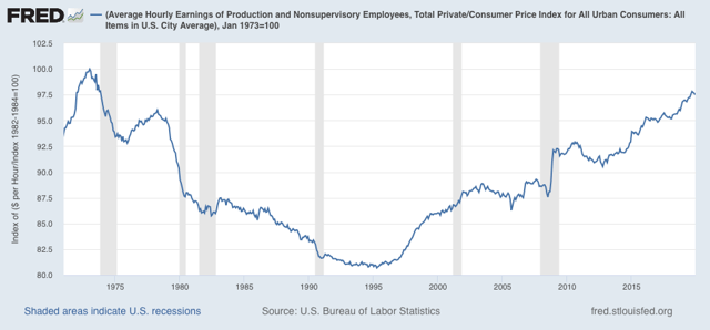
In a longer term perspective, this means that real wages also declined from 97.8% to 97.5% of their all time high in January 1973:
The YoY measure of real average wages also declined sharply from +1.6% to +0.7%:
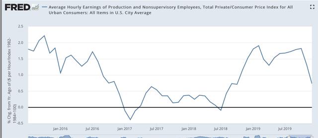
[Note however that this is subject to the same quirks as I discussed yesterday in terms of YoY nominal wage growth for December, so a rebound in January would hardly be a surprise]
Aggregate hours and payrolls improved significantly between July and September, but have declined slightly in the three months since, so real aggregate wages - the total amount of real pay taken home by the middle and working classes - have declined from 30.4% to 30.0% above their October 2009 trough at the beginning of this expansion:
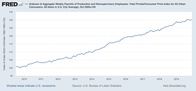
Real aggregate wage gains have only been +0.8% in the past 11 months. As with so much other data, this is on the cusp of warranting at least a yellow flag. I’ll have more to say once retail sales are reported later this week.
Monday, January 13, 2020
Scenes from the December jobs report: leading jobs sectors and wages
- by New Deal democrat
Let’s take a more detailed look at last Friday’s December jobs report.
First, as usual for the past few months, let’s look at the more leading jobs sectors. This month, let’s also take a more detailed look at wage growth and why it may have suddenly decelerated.
As an initial note, revisions going back to late 2017 are going to be available next month, and preliminarily it was already indicated that these will be strongly negative to the tune of several hundreds of thousands overall. In short, as weak as some of the numbers look now, they are likely to be even weaker when we see them next month.
Here is this month’s update to the three leading sectors of employment that I have been tracking: temporary help (blue in the graph below), manufacturing (gold), and residential construction (red). Here’s what they look like compared with 2018, showing the slowdown this year (remember that the GM strike is responsible for the big swings in manufacturing in October and November):
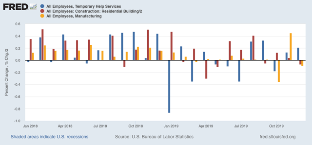
In November, residential construction had looked like it had rebounded from its losses earlier this year, more confirmation of the rebound in the long leading housing sector - but that was revised away this month!
Temporary help had seemed to defy the gloomy weekly statistics that have been worsening this year in the American Staffing Association report - except that, month after month for 12 months, there has been a consistent pattern of downward revisions. Below are the original number for the last six months on the left, followed by the first and then final revisions to the right:
JUL +2200 -7300* -10,500 (Net -12,700)
AUG +15,400 +14,500 +9500 (Net -5900)
SEP +10,200 +20,100 +9900 (Net -300)
OCT -8100 +3800 -5400 (Net +2700)
NOV +4800 +4000* (Net -800)
DEC +6400
*1st revision only
A similar pattern has emerged for manufacturing employment (initial and final numbers only):
APR +4. +3 (-1)
MAY +3 +2 (-1)
JUN +17 +10 (-7)
JUL +16 +4 (-12)
AUG +3 +2 (-1)
SEP -2 +2 (+4)
OCT -36 -45 (-9)
NOV +54 (+4)*
DEC -12
*1st revision only
Here are the same three sectors but measured YoY for the past 30+ years:
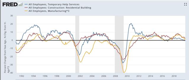
Note that all three turned negative months before either of the past two recessions (the manufacturing and residential construction jobs series existed before then; they were both negative YoY before the 1991 recession as well). Only temporary help is negative YoY right now.
Next, the average manufacturing workweek is now down a full 1.0 hour per week YoY from its peak. Although I only show data from 1983 onward below, going back 70 years there have only been 2 occasions where such a decline lasted longer than one month without a recession happening (1953 and 1966). In the modern era shown, only in 1985 and 1995 for one month apiece were there 1 hour declines without a recession following. A look at the YoY% change in manufacturing hours for the past 35 years also shows that such losses have *always* led to actual YoY losses in manufacturing jobs:
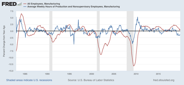
In short, in 2019, manufacturing only added 46,000 jobs, or less than +0.4%, and we should expect more and significant actual losses in manufacturing jobs going forward.
More broadly, only 176,000 jobs were added in the entire goods-producing sector all year (and 80,000 of those were in last January):
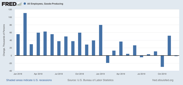
There were YoY losses in goods-producing jobs before all of the past 3 recessions, and going back 70 years, counting 12 recessions, in all but 3 there has been steep deceleration before and actual losses no later than two months into the recession, with only 2 false positives (1966 and 1985). Thus the current situation is consistent with at very least a severe slowdown.
Now let’s turn to wages. December’s nominal growth of +$.02 per hour, or less than +0.1%, was one of the weakest readings in the past 7 years:
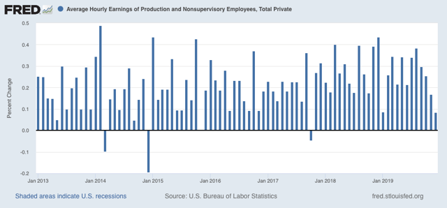
As a result, nominal YoY wage growth for non-managerial workers declined sharply to +3.0% from a peak of +3.6% only two months ago:
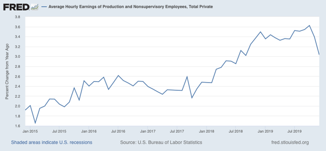
This has already received a lot of attention since Friday, but let me call your attention to two points. The first is that, as you can see from the first graph above, there is something of an anomaly in that not only did December replace an exceptionally strong reading from December 2018, but January 2019’s wage gains were also very week. In other words, if we get a decent number next month, the YoY% change will rebound significantly.
Secondly, there seems to be something of an inverse relationship in the short term (I.e., over a year or less) between big gains/declines in labor force participation and wage growth. Here’s what the two look like, averaged quarterly to cut down on noise, for the past 35 years:
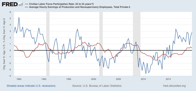
While *cyclically* the two move in the same direction, with a significant lag between participation and wage growth (wage growth being a long lagging economic indicator), over the shorter term we can see where a big decline in participation coincides with or precedes with a few month delay a stabilization in wage growth, while a big increase in participation coincides with or precedes with a few month delay a halt or decline in wage growth. It’s possible this is due to the mix of jobs being different, if lower-paying jobs grow more than other job categories. It may also be that the increased competition for jobs due to more participants acts to suppress wage growth.
In any event, we had a surge in participation in the latter part of last year, and so it is not a big surprise that there would at least be a pause in wage growth.
Sunday, January 12, 2020
The 2020 Electoral College playing field expands for Democrats
- by New Deal democrat
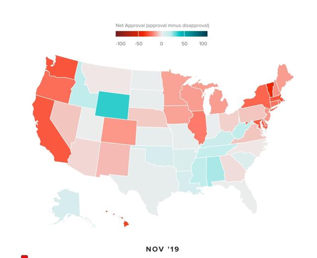
Polling firm Morning Consult has an interactive graph measuring Trump approval by State for each month since January 2016. You can visit it here.
Anyway, while there is obviously some variation from month to month, the latest two months shown below in chronological order, November and December, show - in shades from light pink to red - all of those States that the Democratic candidate has the most decent chance of carrying:
November:
December:
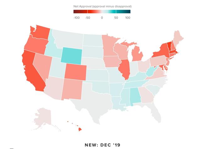
Most of the States are obvious, but in addition to several known battlegrounds: Arizona and North Carolina in particular; there are a few States that you wouldn’t expect: Alaska, Montana, Nebraska, Iowa, and Georgia. Note also that Ohio has returned to the Democratic fold. The only negative surprise is that Florida remains pretty elusive (although for a few months in the past it has shown net disapproval).
I suspect that the impact of tariffs is the reason for the western States in the list above showing net disapproval. If the Democratic nominee pledges to take action to resolve the trade wars, it seems like there is an opening.
Just for comparison, here is the map of total votes by party in Congressional races for each State in 2018:
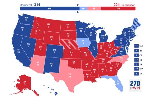
As I’ve pointed out before, in North Carolina really about 52% of all votes were cast for Democrats, so that ought to be shown in blue. But we’ve seen a further expansion of the playing field in 2019.
Subscribe to:
Posts (Atom)