Saturday, May 12, 2018
Weekly Indicators for May 7 - 11 at XE.com
- by New Deal democrat
My Weekly Indicators post is up at XE.com. The general situation with regard to interest rates continues to deteriorate ever so slightly towards being negative.


Friday, May 11, 2018
Real wages and unemployment update: April 2018
- by New Deal democrat
Now that we have the inflation numbers for April, let's update the wage situation for ordinary Americans.
Real wages YoY are only up +0.2%:

More significantly, they are still down -0.3% from their most recent high 9 months ago:

They are also only up +0.2% for the entire last 2 years and 2 months.
Increased consumption by ordinary Americans isn't up because they are making more in real terms. Rather, it is because they are working slightly (on average about +0.1) more hours; saving less of their paycheck (down from 3.9% to 3.1% in the last 12 months); and because more people are employed (discussed below).
Real *aggregate* wages tell us how much more in total average Americans are earning. This is up +24.9% since its post-recession bottom in October 2009:

Here's how that compares with other economic expansions over the last half century:

Aggregate wages in this expansion have risen for 102 months so far. At a total of +24.9%, this expansion is behind only the 1960s and 1990s. But on average aggregate wages have only grown .24% per month, still in second to last place just ahead of the 2000s expansion and slightly behind the 1980s.
I expect aggregate wage growth to decelerate sharply before the onset of the next recession. It hasn't happened yet:

Turning from wages to unemployment, weekly initial jobless claims tend to lead the unemployment rate by several months. Just to change things up a little bit, the below graph shows this comparison with the U6 underemployment rate:

Initial jobless claims have been making new 45+ year lows several times in the last 6 weeks, so the decline in the unemployment rate to a new multi-decade low last month was not a surprise, as shown in this close-up of the last 8 years:

The decline in the unemployment rate in the April jobs report has been criticized as being due solely to a decline in the number of people in the labor force. It's worth noting that if that decline had only been about 30,000 less, the unemployment rate still would have declined, albeit only by -0.1% rather than -0.2%.
Generally speaking, at the moment the economic condition of the American working and middle class is better than it has been in nearly 20 years. But this is mainly due to the low unemployment rate and paltry rate of layoffs, and the steep decline in gas prices between 2014-16 which resulted in "real" wage growth, rather than any significant wage gains.
Thursday, May 10, 2018
Gimme credit: two long leading indicators trend in opposing directions
- by New Deal democrat
The Senior Loan Officer Survey for Q1 was reported on Tuesday.
Meanwhile, this morning's April CPI allows us to update real M1.
This post is up at XE.com.
Wednesday, May 9, 2018
Two real economic consequences of the Trump presidency
- by New Deal democrat
Next week we will be 1/3 of the way through Trump's Presidential term. Last year I used to point out that it was really still Obama's economy, as the GOP had failed to pass, nor Trump commence, any economic policy of consequence.
That is no longer the case.
In late December the GOP Congress passed and Trump signed their huge giveaway for the wealthy. Yesterday, Trump pulled out of the Iran nuclear deal. Both of these are going to have significant consequences for average Americans.
First, Trump's election caused interest rates to spike. Wall Street guessed that there would be lots more business spending, meaning a stronger economy with higher inflation. As nothing much happened in 2017, interest rates settled back down somewhat. But then in late December the tax bill was passed, and shortly thereafter interest rates spiked to five year highs:

As I write this, 10 year Treasury yields are back over 3%. More importantly, mortgage rates are also at 5 year highs:

This is about 1.2% higher than just before the Presidential election. On at $300,000 house, that translates to $3600 a year in additional interest.
Second, as I write this Oil prices are over $71/barrel. This is a 3 year high:

Oil prices have recovered about half of their steep 2014 decline.
Prices for gas at the pump are following:

Nationwide gas prices are averaging about $2.80 a gallon at the moment. Since it takes several weeks for oil prices to feed through into gas prices, prices at the pump are likely to exceed $3 a gallon shortly. That is the sort of thing that consumers notice.
Certainly much of the increase in oil and gas prices is part of the typical commodity cycle, in which "the remedy for low (high) gas prices, is low (high) gas prices." But the recent increase is at least partly a reaction to the likely consequences of further destabilization in the middle east.
So, Trump's Presidency is beginning to have real consequences for ordinary Americans. The markets believe that the effects are stagflationary, i.e., leading to both increased inflation and decreased demand.
Tuesday, May 8, 2018
March JOLTS report: powerful further evidence of a taboo against rasing wages
- by New Deal democrat
The March JOLTS report this morning is powerful further evidence that raising wages (or training new workers) has become a taboo.
Just about everyone thinks that, faced with a worker shortage, "rational" employers will offer higher wages to fill the empty skilled positions. This in turn will draw more marginal potential workers into open unskilled positions.
That's the theory, anyway.
What is really happening -- as so breathtakingly shown this morning -- is that by and large employers will refuse to raise wages, and then complain about their unfilled job openings.
As Exhibit "A," I give you job openings (blue) vs. actual hires (red) in this morning's report:
Just about everyone thinks that, faced with a worker shortage, "rational" employers will offer higher wages to fill the empty skilled positions. This in turn will draw more marginal potential workers into open unskilled positions.
That's the theory, anyway.
What is really happening -- as so breathtakingly shown this morning -- is that by and large employers will refuse to raise wages, and then complain about their unfilled job openings.
As Exhibit "A," I give you job openings (blue) vs. actual hires (red) in this morning's report:

As a refresher, unlike the jobs report, which tabulates the net gain or loss of hiring over firing, the JOLTS report breaks the labor market down into openings, hirings, firings, quits, and total separations.
Not only has hiring been flat for the last 10 months, but it was higher than today's level in November 2015, January 2016, and January 2017. Meanwhile job openings have skyrocketed by 20% since January 2017, and 25% since the end of 2015!
This can only be considered a "skills mismatch" for the wages you want to pay, and if you refuse to train workers without existing matching skills.
Incidentally, Paul Krugman may be ready to embrace the idea of a taboo against raising wages, although for now he is plumping for the "employers are afraid of getting stuck with a highly paid workforce when the next recession comes" hypothesis. The problem with that particular hypothesis, though, is that such skittish employers -- a lot of them anyway -- won't bother to post new job openings, since they know they would need to raise wages to fill them. The big spike in openings in this morning's report suggests instead that employers are refusing to get the message.
Turning to other noteworthy items in the report, as a general rule, historically hiring leads firing. While the one big shortcoming of this report is that it has only covered one full business cycle, during that time hires have peaked and troughed before separations. This is manifest when we compare hiring (red) and total separations (blue) on a quarterly basis as it existed through the end of the third quarter of 2017:

Here is the monthly data through this morning's report for the last several years:

The updated graph shows hiring last making a peak in October 2017. Meanwhile separations actually peaked before then, in July of last year, with a clear downtrend since, another significant revision since last month. *if* both have made their expansion highs, needless to say that would be important.
Further, in the previous cycle, after hires stagnated, shortly thereafter involuntary separations began to rise, even as quits continued to rise for a short period of time as well:

[Note: above graph show quarterly data to smooth out noise]
Here are voluntary quits vs. layoffs and discharges on a monthly basis for the last 2 years:

If hiring and total separations have indeed peaked for this cycle, based on the last cycle I would expect quits to continue to improve for a short while -- and they have -- before also beginning to decline. As a counterpoint to that, separations have approached their bottom, a very good sign.
And indeed, I don't even see a yellow flag until hires and separations go negative YoY, as they did before well before the last recession, which they haven't yet:

Two months from now when the YoY comparisons get much harder, if we haven't established any new highs in hires and total separations, and they are at or below zero -- which is a real possibility -- then we may have confirmation of a late-cycle trend.
Monday, May 7, 2018
The simple jobs and interest rates model generates a yellow flag
- by New Deal democrat
Several months ago, I started toying with a simple model of interest rates and job growth.* Based on the historical evidence, I suggested that:
1. a YoY increase in the Fed funds rate equal to the YoY% change in job growth has in the past almost infallibly been correlated with a recession within roughly 12 months.

2. the YoY change in the Fed funds rate (inverted in the graph below) also does a very good job forecasting the *rate* of YoY change in payrolls 12 to 24 months out.

One shortfall of that model is that there are two "false negatives" in the low interest rate environment of the 1950s, during which the YoY increases in interest rates by the Fed were relatively modest, and did not exceed the YoY change in payrolls until after the recessions had already begun.
A variation on the model is that, since the 1950s, the simple rise in the Fed funds rate from its low near the beginning of an expansion, has always exceed the YoY% change in job growth *before* the onset of all of the subsequent recessions. This variation has limited value as a "yellow flag," strongly cautioning that there is a heightened probability of a recession is within 18 months, with the "red flag" suggesting the near certainty of a recession within 12 months only if/when the YoY increase in interest rates exceeds the (decelerating) YoY% growth in jobs.
With YoY employment growth at 1.6%, and the YoY change in the Fed funds rate of 0.75%, there is no "red flag" warning:

But because the total increase in the Fed funds rate during this expansion has been 1.7%, the "yellow flag" has been activated:

Further, because the Fed funds rate has been hiked by 0.75% in the last year, that suggests that a further YoY% decline in payrolls growth is already "baked in the cake" over the next 12-24 months, to a level of roughly +0.8% YoY:

That suggests that if the Fed makes 3 more 0.25% interest rate hikes in the next year, the "red flag" will be triggered at some point in that 12-24 month window.
----------
*N.B. This is only one of a number of forecasting metrics I use. The most important is the long/short leading indicator method based on the work of Prof. Geoffrey Moore and Prof. Edward Leamer. This is supplemented by the much more timely but volatile "Weekly Indicators" method. I also have a fundamentals-based forecast based on consumer behavior, and a less-organized corporate model as well.
Saturday, May 5, 2018
Weekly Indicators for April 30 - May 4 at XE.com
- by New Deal democrat
My Weekly Indicators post is up at XE.com.
Oil prices have risen to the point where, when they filter through to gas prices at the pump, are likely to be noticed by consumers.
Friday, May 4, 2018
April jobs report: excellent in almost all respects
- by New Deal democrat
HEADLINES:
- +164,000 jobs added
- U3 unemployment rate fell -0.2% from 4.1% to 3.9%
- U6 underemployment rate fell -0.2.% from 8.0% to 7.8%
Here are the headlines on wages and the chronic heightened underemployment:
Wages and participation rates
- Not in Labor Force, but Want a Job Now: up +19,000 from 5.096 million to 5.115 million
- Part time for economic reasons: down -34,000 from 5.019 million to 4.985 million
- Employment/population ratio ages 25-54: unchanged at 79.2%
- Average Weekly Earnings for Production and Nonsupervisory Personnel: rose $.05 from $22.46 to $22.51, up +2.6% YoY. (Note: you may be reading different information about wages elsewhere. They are citing average wages for all private workers. I use wages for nonsupervisory personnel, to come closer to the situation for ordinary workers.)
Holding Trump accountable on manufacturing and mining jobs
Trump specifically campaigned on bringing back manufacturing and mining jobs. Is he keeping this promise?
Trump specifically campaigned on bringing back manufacturing and mining jobs. Is he keeping this promise?
- Manufacturing jobs up +24,000 for an average of 12,000/month in the past year vs. the last seven years of Obama's presidency in which an average of 10,300 manufacturing jobs were added each month.
- Coal mining jobs up +700 for an average of 100/month vs. the last seven years of Obama's presidency in which an average of -300 jobs were lost each month
The more leading numbers in the report tell us about where the economy is likely to be a few months from now. These were positive.
- the average manufacturing workweek rose +0.2 hours from 40.9 hours to 41.1 hours. This is one of the 10 components of the LEI.
- construction jobs increased by +17,000. YoY construction jobs are up +257,000.
- temporary jobs increased by +10,300.
- the number of people unemployed for 5 weeks or less decreased by -172,000 from 2,287,000 to 2,115,000. The post-recession low was set over two years ago at 2,095,000.
Other important coincident indicators help us paint a more complete picture of the present:
- Overtime rose +0.1 hours from 3.6 hours to 3.7 hours.
- Professional and business employment (generally higher-paying jobs) rose by +54,000 and is up +518,000 YoY.
- the index of aggregate hours worked in the economy rose by 0.5%.
- the index of aggregate payrolls rose by 1.1%.
Other news included:
- the alternate jobs number contained in the more volatile household survey increased by +3,000 (!) jobs. This represents an increase of 2,020,000 jobs YoY vs. 2,280,000 in the establishment survey.
- Government jobs fell by -4,000.
- the overall employment to population ratio for all ages 16 and up declined -0.1% to 60.3 m/m and is up +0.1% YoY.
- The labor force participation rate declined -0.1% to 62.8 m/m and is down -0.1% YoY
SUMMARY
All of the good news I expected in last month's employment report (but was probably negated by the weather) showed up in this month's report. In particular, both the unemployment and underemployment rates declined to new expansion lows. Aggregate hours and payrolls also improved strongly, and hourly wages for nonsupervisory workers tied their expansion high at +2.6% YoY. Involuntary part time employment also fell further, while employment in all significant services and industries rose.
About the only flies in the ointment were the pathetically weak +3,000 improvement in the very volatile household number, the declines in both the employment-population ratio and the labor force participation rate, and the slight decline in YoY payroll growth (consistent with my expectation that this will restart its late cycle slow fade).
But, all in all, an excellent report.
About the only flies in the ointment were the pathetically weak +3,000 improvement in the very volatile household number, the declines in both the employment-population ratio and the labor force participation rate, and the slight decline in YoY payroll growth (consistent with my expectation that this will restart its late cycle slow fade).
But, all in all, an excellent report.
Thursday, May 3, 2018
Gimme shelter Q1 2018 update: rents and house prices all at or near new extremes
- by New Deal democrat
_____________________
So, here are the three relationships I'll look at again in this post
In order to generate the "real cost" of buying a house, the best way is to compare the median household income with the median house price.

The good news is that Sentier Research published monthly estimates based on the Household Survey into 2017. The bad news is that they discontinued this service a year ago.


If house prices have risen to new highs several times since the turn of the Millennium, so have apartment rents -- almost relentlessly.


With that in mind, let's take a look at the monthly cost of living in a house. The below graph shows the median monthly mortgage payment for a house (blue) compared with median household income (red). Median monthly mortgage payment is calculated by using the median house price and the 30 year mortgage rate for each quarter, and consulting an amortization table using those values. This is done by showing the percentage of median monthly income (1/12 of the annual) that one month's mortgage payment consituted (note: I am assuming a 10% down payment, with 90% mortgaged to be consistent. Using a different down payment does not change the shape of the comparison at all, only the nominal values)::

Last year, when I first posted this metric, the monthly payment for the median house wasn't extreme at all, but rather very moderate in terms of the long term range.
In our final comparative graph, let's see how median monthly rent compares with median monthly mortgage payment:

The overall trend in the last 30 years has been that monthly mortgage payments have fallen from over 3 times median rent to about 1.5 time median rent now. Put another way, even at the peak of the housing bubble, the monthly carrying cost of a house was about 2.3 times the median cost of renting an apartment. At the bottom of the bust, that fell to 1.4 times the cost to rent. For the last five years, monthly mortgage payments have hovered near 1.5 times the median asking rent.
What is particularly noteworthy is that *even with* the recent big increase in mortgage payments, rents have also increased so much so that the 1.5 ratio still holds.
CONCLUDING REMARKS
By comparing the "real" cost of housing to renting, both in terms of down payments and monthly mortgage payments, we can make sense of some of the biggest trends in the market for shelter.
[Special thanks to Mike KImel for preparing the customized comparative graphs used in this article.]
This post is a comprehensive update as to the cost of new and existing homes vs. renting, all measured compared with median household income. As such it is epistolary in length. So here is the TL:DR version:
- as a multiple of median household income, new home prices are at an extreme beyond even the peak of the housing bubble, while existing home prices are about 5% under theirs
- but unlike then, when apartment vacancies were high and rents cheap, now rents are *also* at an extreme as compared with median household income
- even with their recent increase, interest rates are still lower now than during the housing bubble, so the median monthly mortgage payment adjusted for median household income is even still about 10% less than it was at the peak of the housing bubble
- if the trends of rising prices and interest rates continue, at some point they will overcome the demographic tailwind of the large Millennial generation having reached typical home-buying age. At that point there may be another deflationary bust
Half a year ago I wrote a long post discussing "the real cost of shelter," by which I meant not just the downpayment on a house, but the monthly carrying cost for a mortgage, and comparing both of those with median rent.
That comparison showed that, while the "real" cost of a house downpayment was at a new high, the "real" cost of median asking rent was even higher. By contrast, the monthly carrying cost of a mortgage was quite moderate. This meant that, if a buyer could find a way to put together a downpayment, home-owning was a bargain compared to renting.
As I'll show below, six months of price and interest rate increases later, there is even more stress on both homebuyers and renters.
By way of a quick recap, I wrote six months ago that I had never seen a discussion of the relationship between the relative cost of homeownership vs. renting, particularly as a function of the household budget. The choice (or ability) to live in the residence one desires isn't a matter of its cost by itself, but also the relative cost of the type of residence. What is the cost of a house compared with the cost of an apartment? How expensive are each of them compared with a household's income? If both are too expensive, maybe the choice is made to live with mom and dad as an extended family.
So, here are the three relationships I'll look at again in this post
1. the "real cost" of a downpayment on a house.
2. the "real cost of renting
3. the "real monthly carrying cost" of a mortgage
The best metric for calculating these "real" costs on a household is median household income
1. The "real cost" of a downpayment on a house
3. the "real monthly carrying cost" of a mortgage
The best metric for calculating these "real" costs on a household is median household income
1. The "real cost" of a downpayment on a house
In order to generate the "real cost" of buying a house, the best way is to compare the median household income with the median house price.
One drawback is that the Census Bureau only publishes median household income annually in September -- so there is as much as a 21 month lag. Here's what the most recent data -- through 2016! -- looks like:
The renewed good news is that the website Political Calculations has picked up the mantle and continued to estimate the monthly change in median household income. Here's what that looks like as of their most recent update through February:
After I engaged in some correspondence with them, last week they updated their metric on "real" house prices making use of their monthly median household income estimates (NOTE: here nominal values are used for both median income and median prices):
While they use new home sales for their median house prices, we get the same result if we use the FHFA house price index:
Meanwhile, the median price for an existing home, which peaked at $230,000 in summer 2005, has continued to appreciate at nearly 6% a year this year:
If that pace continues, by this summer the median price will be about $280,000, 22% above the bubble peak. Since nominal median household income has increased about 25% over that same period of time, they will be only aabout $7500, or about 3% below their "real" bubble peak.
In short, no matter how you measure, in real terms house prices are at or near their most expensive ever, even including the peak of the housing bubble.
So, why haven't home sales rolled over? Part of the reason is the demographic tailwind I discussed last week. Because Millennials of peak first-home-buying age now number about 15% more than the Gen Xers of 2005, a build-up that has grown year after year for the last decade, it presumably takes even more financial stress to overcome that tailwind.
But there are two other reasons why home sales haven't turned negative yet: the relative (un)attactiveness of renting, and the monthly carrying cost of mortgage payments. Let's look at each of them in turn.
2. The "real cost" of renting
Here is the median asking monthly rent for an apartment in the US since 1995 (note: the series goes back to 1988):
Here is the median asking monthly rent for an apartment in the US since 1995 (note: the series goes back to 1988):
In 1988 the median rent averged $343 per month. In the first quarter of this year it was $954.
Now, here is what it looks like in comparison with median household income:
Now, here is what it looks like in comparison with median household income:
If house prices have risen to new highs several times since the turn of the Millennium, so have apartment rents -- almost relentlessly.
In percentage terms, in 1988, the median rent for an apartment was 14.5% of median household income. That rose to slightly over 16% in the mid 1990s before falling to the series' low of 13.7% in 2000. It had risen to a record 18.4% of median household income in the 2nd quarter of 2017, the last available data when I first published this piece.
Since then, the situation has only gotten worse. In Q3 median asking rent was 18.7% of median household income. In Q4 it was 18.6%. And in the first quarter of 2018 it rose to 19.3%!
Note, by the way, that even if we make use of the metric of "rent of primary residence" from the monthly CPI report, which I think has been underestimating rent increases (because both Zumper and Rent Cafe, two private measures, are much more in accord with the surge in "median asking rent"), we see that rent increases have outpaced median household income, which over the same period of time has risen about 220% nominally:
So one very big difference between the present situation and that at the peak of the housing bubble is that renting was a *much* more attractive option 12 years ago than it is at present.
3. The "real monthly carrying cost" of a mortgage
A second big difference between the present and the housing bubble is that mortgage interest rates generally ranged between 5.5% and 7% then, but quickly fell below 5% in this expansion, all the way to a low of 3.3% in 2013:
A second big difference between the present and the housing bubble is that mortgage interest rates generally ranged between 5.5% and 7% then, but quickly fell below 5% in this expansion, all the way to a low of 3.3% in 2013:
Recently they have risen significantly.
With that in mind, let's take a look at the monthly cost of living in a house. The below graph shows the median monthly mortgage payment for a house (blue) compared with median household income (red). Median monthly mortgage payment is calculated by using the median house price and the 30 year mortgage rate for each quarter, and consulting an amortization table using those values. This is done by showing the percentage of median monthly income (1/12 of the annual) that one month's mortgage payment consituted (note: I am assuming a 10% down payment, with 90% mortgaged to be consistent. Using a different down payment does not change the shape of the comparison at all, only the nominal values)::
Last year, when I first posted this metric, the monthly payment for the median house wasn't extreme at all, but rather very moderate in terms of the long term range.
- Going back to 1988, the median mortgage payment was slightly over 40% of median monthly household income.
- This fell back under 28% at the end of 1998 before rising to 32% in 2000.
- After falling briefly, at the peak of the housing bubble in 2005 it had risen to 31.4%, and actually reached a secondary peak in Q2 of 2006 of just over 35% of median monthly income.
- At the bottom of the bust at the end of 2011 it made a new low of 23%.
- As of Q2 of last year, the median monthly mortgage payment was still less than 24% of median household income.
- BUT, with the increase in both house prices of over 5% YoY, and the increase in mortgage interest rates to 4.28% as of Q1 2018, that has now risen to 29.5%
Mortgage payments for new buyers in 2018 and not nearly so moderate as they had been earlier in this expansion. But they are not yet at the extremes they were in 2005 and 2006.
4. Comparing rent and mortgage payments
In our final comparative graph, let's see how median monthly rent compares with median monthly mortgage payment:
The overall trend in the last 30 years has been that monthly mortgage payments have fallen from over 3 times median rent to about 1.5 time median rent now. Put another way, even at the peak of the housing bubble, the monthly carrying cost of a house was about 2.3 times the median cost of renting an apartment. At the bottom of the bust, that fell to 1.4 times the cost to rent. For the last five years, monthly mortgage payments have hovered near 1.5 times the median asking rent.
What is particularly noteworthy is that *even with* the recent big increase in mortgage payments, rents have also increased so much so that the 1.5 ratio still holds.
CONCLUDING REMARKS
By comparing the "real" cost of housing to renting, both in terms of down payments and monthly mortgage payments, we can make sense of some of the biggest trends in the market for shelter.
Record down payments are keeping an increasing number of prospective buyers, especially first time buyers, shut out of the market for buying a house. An enormous number are living in apartments instead. This explains both the multi-decade lows in the homeownership rate as well as the recent 30 year lows in the apartment vacancy rates, as a disproportionate number of adults are forced out of home ownership and into apartment dwelling.
But even with the recent increase in mortgage payments, in relative terms they are still lower than they were at the peak of the housing bubble, and a relative bargain compared with their historical multiple of rental payments. In short, if one can get past the down payment, home ownership still looks like the better choice.
Along with the demographic tailwind, the *relative* inexpensiveness of monthly mortgage payments vs. rental payments goes a long way towards explaining why single family home construction has continued to increase in the face of higher mortgage rates.
That being said, with increasing financial stress showing up across the board in the costs of both buying and renting, we can only expect to see even more involuntary extended family households and involuntary unrelated housemates. Further, *if* interest rates and housing costs increase much further -- most importantly, if home builders continue to focus on only the most expensive segment of the market -- at some point they will overwhelm the increased numbers of home-buying age Millennials who have been buoying up the market. Sales will turn down, followed by home values, leading to another deflationary bust.
[Special thanks to Mike KImel for preparing the customized comparative graphs used in this article.]
Wednesday, May 2, 2018
Residential construction, ISM new orders, vehicle sales show decelerating growth
- by New Deal democrat
Yesterday and today we got a bunch of leading economic data for both March and April. Last month the short term news was good, while the longer term construction spending data portended a slowdown (but not a downturn). Let's take an updated look.
Residential construction spending
To recap, in terms of their order in leading the economy, the housing data I track runs in this order:
- new home sales (but these are very volatile and heavily revised, so the signal to noise ratio is low)
- permits (much less volatile)
- single family permits (even less volatile - signal to noise ratio is high)
- housing starts (more volatile than permits, but have the advantage of being "hard" economic activity)
- residential construction spending (the least volatile of all of the data, even though less leading)
- residential fixed investment (part of quarterly GDP, so the last reported)
There is also the weekly mortgage applications report, which has just made new highs for the expansion, and which recently has tracked new home sales better than the other series, but has had compositional issues in the past.
Residential spending declined significantly in March, but only taking back outsized gains in the several previous months:

Next, here are the two least volatile series, single family permits (red) vs. inflation-adjusted private residential construction spending (blue), measured YoY% q/q for the last 15 years:

You can see the relative advantages of each. Single family permits are more leading, but somewhat more noisy, while residential construction spending is not noisy at all, but follows a few months after permits.
That there has been a recent slowdown in growth becomes more apparent when we look at the m/m percent change in nominal construction spending focused on the last several years:

As of March, both single family permits and private residential construction spending have increased by about 5% YoY. While we had slowdowns even more than this in 1994, 1996, and 2010 without recessions following, actual downturns in 1999 and 2006-07 did presage the recessions.
ISM manufacturing new orders
The ISM index has a 70 year history of being a good short leading indicator, and in particular the new orders subindex. In April it remained very strong, backing off just a bit from March's reading (h/t Briefing.com):

At the same time, in the last two months it has declined from the torrid levels of last autumn and winter.
April motor vehicle sales
Because GM is no longer reporting on a monthly basis, this metric must be taken with large grains of salt. The best way to get around the issue would be to measure vehicle sales ex-GM, and compare with sales ex-GM last month and one year ago. Instead, the services appear to be estimating GM's sales at anywhere between flat and -8% (!!!). This is a recipe for missing a change of trend.
With that very big caveat, April sales were reported at over 17 million:

Sales tend to plateau for long periods of time during expansions. At this point it is quite clear that there has been a slight decline in trend since late 2016, akin to the slight declilne we say in 2006.
The bottom line is that, while manufacturing production should remain strong over the next few months, as with so much other data the slowdown in residential construction growth and vehicle sales are markers of a late cycle slowdown in growth, without any imminent danger of an outright downturn.
Tuesday, May 1, 2018
A change of seasons in the financial markets? May Day update
- by New Deal democrat
An era of generally rising bond yields is more likely than not starting, changing the way that the stock and bond markets relate to one another, a point I made after the spike in bond yields in January caused a correction in the stock market.
Have the last few months strengthened or weakened that case? I update my observations over at XE.com.
Monday, April 30, 2018
March 2018 personal income and spending
- by New Deal democrat
Programming note: I've been working on a mega-post about housing, that is now complete except for a few graphs. So, please excuse the brevity otherwise.
March 2018 real personal income and spending were both positive. So far, so good.
The personal saving rate fell slightly:

Again, this is consistent with a late cycle dynamic where consumers are more stretched than they were earlier in the expansion.
Real personal spending continues to outstrip real retail sales (quarterly to reduce noise, through Q1 in the graph below):

This is also a typical late cycle dynamic (a relationship that holds for 10 of the last 11 expansions). But since neither shows signs of significant declines, there is no imminent danger of a downturn.
As has been the case for the last several years.
Saturday, April 28, 2018
Weekly Indicators for April 23 - 27 at XE.com
- by New Deal democrat
My Weekly Indicators post is up at XE.com.
A number of indicators which had been positive have either now turned neutral or are on the cusp of turning neutral.
Friday, April 27, 2018
Q1 2018 GDP downshifts slightly; long leading indicators mixed
- by New Deal democrat
This morning's preliminary reading of Q1 2018 GDP at +2.3%, down from the previous quarter's +2.9%, was generally in line with forecasts. As usual, my attention is focused less on where we *are* than where we *will be* in the months and quarters ahead.
There are two leading components of the GDP report: real private residential investment and corporate profits. Because the latter will not be released until the second or third revision of the report, I make use of proprietors' income as a more timely if less reliable placeholder.
So let's take a look at each.
Real private residential fixed investment was flat (blue). Measured by the more precise method of its share of the GDP as a whole (red), residential investment actually declined:
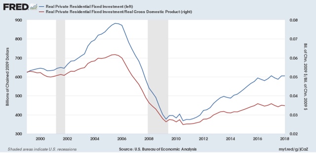
According to Prof. Edward Leamer, this typically peaks about 7 quarters before the onset of a recession. As it has not made a new high since four quarters ago, and must be considered a signficant leading indicator of recession at this point.
Proprietors' income, on the other hand, rose again in the first quarter. The below graph compares it with the less timely but more accurate corporate profits:

Remember that the big decline in corporate profits in Q4 of last year had to do with accounting for repatriation of overseas earnings in the recent tax bill, so right now proprietors income is probably giving us the more accurate, positive, signal.
While the economy is very likely to continue to grow through 2018, together this most recent data suggests a more questionable picture heading in 2019. In particular, this is the first important housing metric to roll over to negative.
This confirms a note I made when discussing Q4 2017 GDP three months ago, At that time I indicated that I wasn't expecting any big positive breakout. This goes back to the relative flatness or restrained growth in housing. The below two graphs show the leading relationship between housing permits (using the less volatile single family measure) and GDP broken up into two roughly 30 year periods:


Since the YoY% change in permits for 2015-17 was roughly 10% (divided by 4 for purposes of scale in the above graphs shows a number of ~2.5%), I wrote that a continued roughly 2.5% YoY growth of GDP for the next few quarters is a reasonable projection.
One final very positive note: the employment cost index was also reported this morning, at a strong +0.8% q/q. It was up +2.7% YoY, the highest rate in almost 10 years:

[Note: I'll update with a better graph when available]
UPDATE: And, here's the better graph, showing the YoY% change for the life of the series:

There are two particularly good things about this: (1) it is a median metric; and (2) unlike other wage measures, it tracks pay for the same job over time. This tells us that the growth in pay for doing the same job has begun to rise significantly (UPDATE: and is clearly in an uptrend), a big plus in what has otherwise been a mediocre wage picture.
Subscribe to:
Posts (Atom)