Saturday, February 17, 2018
Weekly Indicators for February 12 - 16 at XE.com
- by New Deal democrat
My Weekly Indicators post is up at XE.com.
Weakness is several coincident indicators has persisted, and this week spread to tax withholding, which has fallen off a cliff.


Friday, February 16, 2018
Housing permits and industrial production: a brief note
- by New Deal democrat
I'll take a more detailed look next week once new home sales are reported, but for now a quick update on housing starts and permits.
This month it is pretty simple: all three metrics I look at -- permits, single family permits, and the three month average of housing starts -- all made new record highs for the expansion.
This is an excellent report.
But haven't interest rates gone up to 4 year highs, you say? If interest rates are the single biggest determinant in housing, why didn't permits go down?
A similar phenomenon happened after the "taper tantrum" of 2013, and also in the late 1960s as Boomers entered the market. In the first few months after interest rates started to rise, permits and starts rose strongly! This is probably because potential buyers panicked and decided to "lock in" their purchases before they were priced out of the market.
So I expect several more months of strength, even if higher interest rates persist. On the other hand, if they do persist, I expect a slowdown in the housing market by about late spring.
Turning to industrial production, I'm not particularly worried about January's decline. In the first place, it was mainly oil, not manufacturing -- although manufacturing was flat:

Also, in the last few years January has seemed to be a particularly volatile month, due to the vagaries of winter weather.
On the other hand, in my "weekly indictors" column, I have noted the anomalous mixed or negative data from steel and rail (carloads, not intermodal) in the last month or so. While I don't think the coincident tail wags the leading dog, probably that weak weekly data should have provoked more notice as to its implications for production.
Bonddad blog's 10,000th post!
- by New Deal democrat
According to Blogger, that last post about real retail sales was the 10,000th post on the Bonddad blog.
Thanks to all of our readers over the years! This isn't the biggest or most successful economics blog, but it does have an influential readership, which has been growing in the last year or two.
And now, let the nerdiness go onward!
A detailed update on real retail sales
- by New Deal democrat
I consider real retail sales to be one of the most useful barometers of the health of the consumer economy, including the near term jobs outlook.
I haven't posted a detailed look at this metric for awhile. I have a current update over at XE.com
Thursday, February 15, 2018
Why I'm worried about the decline in real wages
- by New Deal democrat
This is a follow-up to my post yesterday concerning the decline in real average and aggregate wages. Why should the data from just one month cause me to warn that "This is Bad?"
To show you, let's decompose the data into CPI and nominal aggregate wages, shown in the below two graphs, the first of which covers the inflationary era of the 1960s and 1970s, and the second covers the disinflationary era since:


In the year prior to at least 5 (arguably 6) of the last 7 recessions, BOTH nominal aggregate wage growth was decelerating (1980 and arguably 1969 being the exceptions) and consumer inflation was increasing (1980 and arguably 2007 being the exceptions). The 1981 recession was caused by the Fed very aggressively raising rates, and in the other two instances the pattern held, but with much less of a lead.
Note that a very good coincident marker for the onset of a recession, within about 3 months, has been the point at which the trends intersect. i.e., where YoY consumer inflation increases to the level of decelerating aggregate payrolls.
Note further that in the last 18 months YoY consumer inflation has generally been increasing. Meanwhile there are some slight signs of deceleration in aggregate payrolls, highlighted by this past month.
So now let's subtract YoY inflation from YoY aggregate payroll growth:

When the relative growth in payrolls decreases by 50% from its high (e.g., from 4% to 2%), that is a good marker for the onset of at very least a slowdown (e.g., 1966, 1984, 2016). EVERY SINGLE TIME the line has crossed zero it has indicated the onset of recession.
In the last 6 months, this line has been declining again, from 3% to 2%.
Since the inflation rate is more than anything determined by the price of gas, and I see no reason to expect a decline in that, and further we know that deceleration in YoY payrolls growth is a very regular feature of later expansions, so I see no reason for that to reverse (unless if for some reason the new leadership at the Fed decides to reduce interest rates).
So, there's nothing imminent, but I am seeing what looks like the beginning of the trend that will ultimately end in a recession, maybe in 18 to 24 months. That's what has me concerned.
Wednesday, February 14, 2018
This is bad: real wages *declined* in January; may be rolling over
- by New Deal democrat
Consumer prices rose +0.5% in January. That in itself isn't bad news, as they rose an equal +0.5% one year ago, so the YoY inflation rate remains at +2.1% (so if 2% really is a target rather than a ceiling, it should not give the Fed any cause for alarm).
But that much vaunted wage hike in the January jobs report has entirely disappeared, and not just for non-managerial workers, but for the average of all workers including managers. In fact in January real wages declined.
And the trend is a little worrying.
To begin with, real wages declined -0.3% for ordinary workers, and they are now down -0.8% from their July peak:

On a YoY basis, real wages are only up +0.3%:

Even worse, they are only up +0.1% from January 2016!
Note that even when we include managers, real wages fell in January, and are -0.5% below where they were in July:

Another metric that I think is very important is aggregate real payrolls for non-managerial workers. This tells us how much money, in real terms, the middle and working class are earning.
After rising strongly in 2014 and 2015, it decelerated in 2016 and even more in 2017:

Note that, in the aggregate, real wages declined for the middle and working class in January, and they are back at the level they were 7 months ago.
On a YoY basis, real aggregate payrolls rose 2%:

This is undoubtedly why we have seen the personal saving rate decline over the last 6 months:

Also this morning, although Fred hasn't update the graphs yet, real retail sales declined -0.8%, putting that figure at a three month low.
All in all, this is bad news, not just for the month, but in terms of a stalling trend that may even have rolled over, both in terms of worker wages, and possibly even in terms of real retail sales per capita, a long leading indicator of recession.
Tuesday, February 13, 2018
Memo to younger readers: in an era of rising interest rates, deficits DO matter very much
- by New Deal democrat
If you are under about 45 years of age, the odds are that you agree with one statement made by Dick Cheney: that "Reagan proved that deficits don't matter."
As I mention from time to time, I am a fossil. I remember the "guns and butter" inflation of the late 1960s (Google is your friend) and the stagflationary 1970s.
Here is a graph of the interest yield on the 10 year bond from 1981 through 2013:

In an era of declining interest rates, deficits don't matter -- or at least very little.
Suppose the national debt runs up from $20 Trillion to $25 Trillion while at the same time interest rates decline from 4% to 3%. In that situation annual interest due on the debt goes from $800 Billion to $750 Billion -- an actual decline of $50 Billion a year. That can cover a multitude of sins.
Now here is a graph of the interest yield on the 10 year bond from 1961 through 1980:

In an era of increasing interest rates, deficits DO matter very much.
Suppose in that era the national debt runs up from $20 Trillion to $25 Trillion while at the same time interest rates rise from 3% to 4%. In that situation annual interest due on the debt goes from $600 Billion to $1 Trillion -- an increase of $400 Billion a year. That's $400 Billion that can't be spent on infrastructure or social or insurance programs.
Even if interest rates remain relatively stable as they have for the last five years:

Then the annual interest due in our example rises from $600 Billion to $750 Billion -- a deadweight loss of $150 Billion per year.
Now look at those three graphs again. I would say that the odds of a further decline in interest rates of any significance is close to zero. So the choices are whether interest rates over the next decade or two go sideways from here, or rise.
Since I am a fossil, I may not live to see it. But, dear reader, if you are 45 years old or younger, it is high time you disabuse yourself of the "wisdom" of Dick Cheney.
Monday, February 12, 2018
Interest rates: no shift in the economic weather yet
I wanted to make two comments about what has been happening recently with interest rates, a short term look and a long term look.
Today let's discuss the short term.
Since September, long term Treasury interest rates have risen from roughly 2.1% to 2.8%. The two year Treasury yield has risen from roughly 1.3% to 2.1% -- which means that for the first time in years, the 2 year Treasury is giving you more in interest than the dividend yield from holding the S&P 500. So, not only will interest rates presumably slow the economy, in terms of income they are now a *relative* bargain compared with holding a wide index of stocks.
Now, I don't pretend to know where interest rates will go from here over the short term. Whether long rates rise over 3% or fall back under 2.5%, I don't know. But let's assume that over the short term they stay roughly where they are now.
An upward spike in interest rates has happened twice in this expansion. Most recently, rates spiked from under 1.5% in mid-2016 (thank you Brexit!) to 2.6% following the US presidential election (blue in the graph below). Here's what happened with housing permits (red) and real GDP (green) in the year following that spike:

Permits stalled for most of 2017 before turning up, while GDP also paused before continuing to advance.
Next, in 2013 we had the "taper tantrum," during which long term interest rates rose from 1.6% to just over 3.0%, before fading to about 2.2% by the end of the next year. Short term rates stayed just above zero. Here's the same graph showing what happened in 2014:

Permits slowed but never completely stalled, while real GDP did turn slightly negative in Q1 2014 before continuing to advance.
So far, interest rates have not broken out the type of range that led to brief slowdowns, but not a downturn, in the economy.
The closest analogue, I suspect, is the late 1960s, where housing specifically and the economy gemerally were undergirded by the tailwind of demand from the burgeoning Boomer generation. There, it took a 2% increase from 4.5% to nearly 6.5% in interest rates before housing, and then the economy, began to roll over:

So, unless rates rise above 3.25% at minimum, I suspect we are going to be OK in nearer term.
Saturday, February 10, 2018
Weekly Indicators for February 5 - 9 at XE.com
- by New Deal democrat
My Weekly Indicators post is up at XE.com.
Even with their 10% correction, stock prices melted up so much in the last few months that they have not even made a new three month low. Since that is my predetermined marker -- taking emotion out of the process -- for measuring whether stocks are a near term positive or not, they remain a positive!
Friday, February 9, 2018
Fraying at the edges? *relative* underemployment increases
- by New Deal democrat
This is a post I've been meaning to put up all week (after all, this week was going to be very slow on data and news, right?).
As the expansion gets more and more mature, the *relative* performance of certain measures of improvement become more interesting. One of those is the comparison between U3 unemployment, and the broader U6 underemployment measure.
While we only have about 25 years of data, so caution is warranted, generally speaking, during that time as the expansion has improved, an increasing number of the more marginally employable find jobs. As a result, U6 declines faster than U3. Later on, as the expansion begins to wane, U6 underemployment has weakened first:

Another way of looking at this is to subtract the U3 unemployment figure from that of the broader U6 measure:

Note that in both the 1990s and 2000s, this remainder started to rise before U3 itself bottomed.
More important for the present, note that this remainder of U6-U3 has risen slightly in the last 2 months, as the unemployment rate has held steady and the underemployment rate has risen by 0.2%.
Yet another way to look at this is to chart the YoY change in this remainder:

Note the slight weakening in this metric as well.
It might just be noise, but on the other hand it could be an early sign of weakness starting in the job market. If so, that doesn't mean a recession is near, as in the next 3 to 6 months. But it bears continued watching.
Once more into a the market abyss
- by New Deal democrat
So the stock market is down 10% as of this writing, which takes us all the way back to --- three months ago!
Really? This is what you're worried about?
A little context. Here's a graph of the S&P 500, normed to 100 as of September 1, 2017:
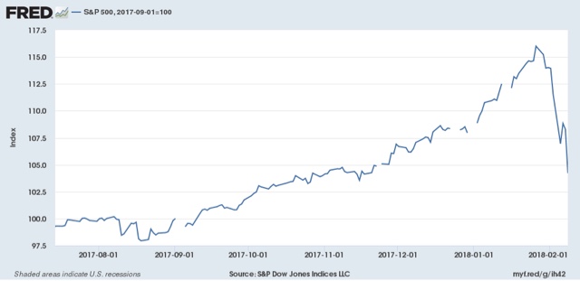
The market went up 16% in 5 months, or +.75% each and every week. That translates into an annual rate of +48%! A 48% annual gain coming out of a recession isn't a big deal. Coming 9 years into a bull market, that, dear reader, is a blowoff.
Even if you figure that corporate profits were going to be up 5% YoY this year, and even if you figure that the recent tax cut for corporations was going to add 10% to that -- well, the market added all of that in already, didn't it?
And now that froth has been poured off.
To reiterate, the vast majority of other leading indicators, both long and short, are inconsistent with a recession starting in the next 3 to six months. Just this week, the Senior Loan Officer Survey, the JOLTS report, and initial jobless claims all pointed to continued expansion. As did last week's ISM manufacturing new orders numbers, as do the regional Fed reports, as do mortgage applications, as do the recent monthly housing reports.
If the vast majority of data says we're not heading into recession, then it is very, very unlikely that this correction is going to turn into something long-lasting.
In the last few days, I've gotten pushback that good leading indicators are bad, because they must be close in time to a bottom. Nonsense!
Let me introduce you to Lee Adler at the Wall Street Examiner, who wrote:
Record low claims are the patina of policy success .... These record claims represent a bubble that was born out of and is joined at the hip with the financial engineering bubble that has been metastasizing in the US economy for a generation.Just one problem: this quote comes from November 2015, when initial jobless claims were averaging 270,000 per week.
See the problem?
In my opinion, If you are middle or working class, and you have some money in the market via a 401k or similar, and you can't stand a 10% downturn, then you shouldn't be in the market at all, but rather devote that money to a cash-type of portfolio that allows you to sleep at night and not worry about your future. One rule of thumb I set for myself way back 25 years ago when I first got interested in this stuff, is what I called "the Turtle Method," as in turtle vs. hare. That rule of thumb was that, for every month's expenses I had saved, I could invest 1% of my assets. So if I had 10 months of savings, I could invest 10% of my total assets. That way I could sleep at night.
Bottom line: there are a lot of major problems in this country right now. How the economy is doing isn't one of them, and that is very unlikely to change in the next 3-6 months.
Bottom line: there are a lot of major problems in this country right now. How the economy is doing isn't one of them, and that is very unlikely to change in the next 3-6 months.
Thursday, February 8, 2018
Credit got looser in Q4 2017
- by New Deal democrat
There are times the economy is boring. Ok, ok, especially boring. To the point where I don't have much to say.
This isn't one of those times. I have stuff worked out in my brain or in the early drafting stages to last over a week. Like an important point of data in last week's jobs report I meant to post earlier this week, but haven't written because thank you stock market!
Anyway, I knew the Senior Loan Officer Survey was coming out, which I track because it is a long leading indicator, but I hadn't read anything.
Turns out there was a good reason for the silence. It was the opposite of DOOOOMMM!!!
So here is my take, up at XE.com.
Jobless claims make another record low
- by New Deal democrat
One reason not to get excited about the last week's stock market swoon is that it isn't being confirmed by any other short term leading indicators. Most significantly, jobless claims.
The 4 week moving average of new jobless claims has fallen below 225,000. This is yet another 40 year record low. In fact, with the exception of six weeks in the early 1970s, it's a new 50 year low.
And adjusted for population growth, it is a new all-time low.
As a practical matter, virtually nobody is getting laid off. This is not an economy that is about to roll over.
Wednesday, February 7, 2018
December JOLTS report continues good news
- by New Deal democrat
For the last several years, I kept banging away at the fact that "job openings" are soft data that can simply reflect that companies are trolling for resumes, or looking for the perfect, cheap candidate (good luck with that!). Since I've made my point, let's confine ourselves to the hard data of hiring, firing, quits and layoffs.
Last month I noted that, especially averaged quarterly, the JOLTS report tracks the employment report closely. Since that has picked up in the last few months, I wrote that
it's a fair bet that when the December JOLTS report is released in one month, it too will be weaker, just as was the December jobs report.Was it?
Historically, hiring leads firing. While the one big shortcoming of this report is that it has only covered one full business cycle, during that time hires have peaked and troughed before separations:

Here's what that looks like over the last 24 months:

Last month I wrote:
With hiring up, I expect the level of separations to also increase (note some of these are voluntary) in the next few months as well.
That wasn't the case specifically m/m this month, but I still anticipate that total separations (including voluntary quits, which did go up in December) to follow.
Further, in the previous cycle, after hires stagnated, shortly thereafter involuntary separations began to rise, even as quits continued to rise for a short period of time as well:

Further, in the previous cycle, after hires stagnated, shortly thereafter involuntary separations began to rise, even as quits continued to rise for a short period of time as well:

[Note: above graphs show quarterly data to smooth out noise]
Here are voluntary quits vs. layoffs and discharges on a monthly basis for the last 24 months:

Last month I wrote:
With hiring increasing again, if the pattern from the last decade holds, I would expect quits to improve somewhat as well.
That did happen in this month's report. As in the last business cycle, quits are still rising, and involuntary separations remain off their bottom, although the good news is that they have fallen in the last several months.
Bottom line: this was a good report. At the same time, it remains consistent with being late in the cycle. Since hiring leads firing, what I am looking for next is at what point dies hiring stagnate, and will quits follow?
Errr, ahem . . .
- by New Deal democrat
Me, yesterday at 9 a.m. eastern time:
So my best guess is that we will see a climax in panic -- maybe at 9:35 this morning! -- with roughly a 10% decline, and then nervous bouncing along that bottom for the next several weeks.
Just sayin'.
Tuesday, February 6, 2018
A comment about the markets for the average reader
- by New Deal democrat
This is a post aimed at the generally Progressive audience of this blog who followed us over from way back in our days at Daily Kos, rather than the financially sophisticated audience who have picked us up since (but of course everybody is welcome to read and appreciate!).
Anyway, at times like this over 10 years ago Bonddad used to write posts like "A comment about the markets" for the DK audience, explaining the "significance" of the market action. So in that tradition ....
First of all, don't base any investing decision on advice from anyone you read online -- including me. If you are concerned enough, go talk to a registered financial professional. In particular, at times like this, the Doomers are going to come out of the woodwork, especially at places like Daily Kos. It got to the point that in years past, I used to use the "Pied Piper of Doom" at DK as a contrary indicator. I once even called the bottom of a market selloff similar to the present one *in real time* based on his panicky post.
That being said. here's my take based on over 25 years of watching the markets closely, and seeing this kind of selloff maybe 20 times. Moves of 3% or more a day are based on emotion, either euphoria (less likely) or panic (more likely!), or more recently, "algorithms gone wild!" (think of the "flash crash." That is a very bad basis on which to make a decision about your money.
Because I am a nerd, and I always show you graphs, here's a three-pack to put this in perspective. First, here is the entire 1990s, the second half of the biggest bull market in history:

Looks like a pretty relentless move up, doesn't it?
Well, about once a year, some sort of panic would set in. There would be about a 10% selloff, including some panicky days like yesterday, Doomish analysts would come out in droves on CNBC, and at about the 10% mark, a famous maven like Elaine Gharzarelli, would had correctly foretold the 1987 crash, would come on and say something like that her "crash warning" for a 25% drop had been activated. And at almost exactly that moment, the markets would bottom.
Here, for example, is 1996:

Usually the bottom would actually be at about -9.8% or -9.9%. Why? Because big players would have programs set to buy at 10% off. To be sure to get in, other big players would get in front of the move just before the 10% level -- and so it would never actually arrive.
These annual -10% spikes were typically heralded by some change in the market "story," on the order of an increase in inflation or fears of renewed Fed tightening. But they didn't fundamentally alter the economy, and so the 10% was recovered typically within a few months, as it was in 1996.
The worst such move happened in 1998 during the Asian Currency Crisis, when an early hedge fund called "Long Term Capital Management" went bust. The former was a significant concern, because southeast Asian economies looked set to roll over. The latter sparked fears of a wider financial meltdown. Here's what that downturn looked like:

The Fed stepped in, arranging for the debt to be mopped up, and it was off to the final blowoff top!
The common thread here is, that in almost all cases, these selloffs in retrospect look like V-shaped spikes, as the fundamental underlying economy reasserts itself.
The exceptions, obviously, were 1929 and 2008, where the underlying economy was really fragile, and subject to a debt-deflation vicious cycle.
As I wrote as recently as last week, the "long leading indicators" for the economy do not forecast any fundamental downturn this year. Interest rates haven't spiked that much, housing data just made new highs within the last several months, and credit is still ample. The stock market, by contrast, is a "short leading indicator," forecasting only a few months ahead. Why should I expect a short leading indicator to lead the long leading indicators?
So my best guess is that we will see a climax in panic -- maybe at 9:35 this morning! -- with roughly a 10% decline, and then nervous bouncing along that bottom for the next several weeks.
If you are an average worker, and don't own stocks (including in your 401k), you should do what you should always be doing: observing how things are going at your employer. Has there been a weakening of orders or customers? If yes, prepare for possible layoffs. If no, there's no reason to think this market downturn is going to change that.
Even if you do have securities in, e.g., your 401k, how did you feel about stocks a few months back when they were at this level? Were you satisfied? If so, why should you feel differently now? Some of the worst financial moves I have witnessed were people who sold in the panic of 2008, and never bought back. But if you are losing sleep now, imagine how you will feel in the face of a genuine 25% pullback, say, in the next recession. That means you should go turn to a financial professional and have a plan that you can sleep with.
In short: don't get emotional about this selloff. Give it the ol' fish-eye. Make and stick with a long-term plan.
And, to repeat, don't make financial moves based on what you read from some dude or gal online, and that includes me. I am not a certified financial planner, and I am not trying to give you financial advice to buy or sell.
---
P.S. One thing which could cause more turmoil within a few days is if there is another government hutdown, and it lasts a lot longer than the last one. All the signs are that the GOP in the House intends to continue to pass "shrot term" fixes, with long term goodies that they want, and blackmail the D's with the release of one hostage at a time (and I don't think the Dremeres are ever going to be released). So far the marekts are downplaying any big fallout.
Monday, February 5, 2018
Why I'm not impressed by January's 2.9% YoY wage growth
- by New Deal democrat
I wanted to follow up on why I dissented Friday from the near-consensus take that workers finally got a nice raise, with many citing hikes in the minimum wage. As you may recall, the YoY% change in the average hourly earnings of all employees rose 2.9% as of January.
That was the story in, for example, Marketwatch:
Average hourly wages jumped 9 cents, or 0.3%, to $26.74, according to the Bureau of Labor Statistics. That means wages have increased 2.9% over the last year — the biggest gain since the end of the Great Recession in June 2009.The federal minimum wage is $7.25 an hour and hasn’t increased since 2009. But many states and municipalities enacted laws to raise the wage this year.
Even progressive sources like The American Prospect touted the number, under the headline, "The Proof is in: Minimum Wage Hikes Work":
{A]verage hourly earnings for private-sector workers increased by 0.34 percent this month, and 2.9 percent over the past year.Wage levels have struggled to gain traction in recent years, even as the labor market has tightened. But for labor economists and workers alike, these most recent increases could be a sign that wages might finally be on the upswing, thanks to progressive state policies. In the new year, 18 states across the country—from Florida to Maine, and from Washington state to Michigan—hiked their minimum wages, bringing $5 billion in additional pay to 4.5 million workers, according to the Economic Policy Institute.
The reason I dissented is that the YoY% increase for nonsupervisory workers was only 2.4% -- right in the range it has been for over a year. As Jared Bernstein, who called the number "A Nice Wage Pop," pointed out:
There were some weak spots in the report. Wage growth for the lower-paid 80% of the workforce that have production or non-managerial jobs was up only 2.4%, implying that faster wage growth last month mostly benefited higher-paid workers.
Both types of workers are literally from the same survey -- i.e., the one measure is a subset of participants in the whole survey. So if minimum wage hikes were responsible for the big YoY increase, we should see it in their hourly wages.
In January's case, we don't.
Since nonsupervisory workers account for about 80% of all workers (h/t Bill McBride), we can back them out of the total figure, and calculate the YoY% increase in wages for managers.
Here's what the monthly percentage increase in hourly wages looks like for January:

While regular workers saw nominal wages go up a little under 0.2% per hour, their bosses saw wages go up 0.8% per hour!
Here's what the YoY% rate looks like:

It looks like bosses got, on average, a 2% bonus over and above their regular January wage, bonuses which were not shared with workers. And these are nominal numbers, so if consumer prices wewnt up 0.2% in January (we don't know yet), workers got nothing, while their bosses got a nice pop.
That's why I dissent.
Fly, Iggles, fly!
- by New Deal democrat
Congratulations to the Philadelphia Eagles on their first ever Super Bowl victory!
Yes, Philly sports fans have a boorish reputation, but they are fiercely devoted to their teams. They have been long suffering in frustration as the Eagles tempted them many times before. over the last half century, coming close under Dick Vermeil, Andy Reid, and also the likes of Buddy Ryan and even Chip Kelly in his first season.
Last night they refused to succumb to the Patriots, with a bunch of gutsy and very effective offensive calls, satisfying millions nationwide who were rooting for the underdogs and/or hate the Patriots dynasty. So congratulations today!
And one last thing:

What's the matter with North Dakota?!?
Saturday, February 3, 2018
Weekly Indicators for January 29 - February 2 at XE.com
- by New Deal democrat
My Weekly Indicators post is up at XE.com.
Not surprisingly, stocks and bonds took center stage this week.
Friday, February 2, 2018
January jobs report: good headline growth, mostly negative internals. UPDATE: THE BOSSES GAVE THEMSELVES A RAISE
- by New Deal democrat
HEADLINES:
- +200,000 jobs added
- U3 unemployment rate unchanged at 4.1%
- U6 underemployment rate rose 0.1% from 8.1% to 8.2%
Here are the headlines on wages and the chronic heightened underemployment:
Wages and participation rates
- Not in Labor Force, but Want a Job Now: declined -137,000 from 5.308 million to 5.171 million
- Part time for economic reasons: rose +74,000 from 4.915 million to 4.989 million
- Employment/population ratio ages 25-54: fell -0.1% from 79.1% to 79.0%
- Average Weekly Earnings for Production and Nonsupervisory Personnel: rose +$.0.03 from $22.31 to $22.34, up +2.4% YoY. (Note: you may be reading different information about wages elsewhere. They are citing average wages for all private workers. I use wages for nonsupervisory personnel, to come closer to the situation for ordinary workers.)
Holding Trump accountable on manufacturing and mining jobs
Trump specifically campaigned on bringing back manufacturing and mining jobs. Is he keeping this promise?
Trump specifically campaigned on bringing back manufacturing and mining jobs. Is he keeping this promise?
- Manufacturing jobs rose by +15,000 for an average of +17,300 a month vs. the last seven years of Obama's presidency in which an average of 10,300 manufacturing jobs were added each month.
- Coal mining jobs increased by 100 for an average of -46 a month vs. the last seven years of Obama's presidency in which an average of -300 jobs were lost each month
The more leading numbers in the report tell us about where the economy is likely to be a few months from now. These were mixed.
- the average manufacturing workweek fell -0.2 hour from 40.8 hours to 40.6 hours. This is one of the 10 components of the LEI.
- construction jobs increased by 36,000. YoY construction jobs are up +226,000.
- temporary jobs increased by +1,800.
- the number of people unemployed for 5 weeks or less increased by +45,000 from 2,235,000 to 2,280,000. The post-recession low was set over two years ago at 2,095,000.
Other important coincident indicators help us paint a more complete picture of the present:
- Overtime was unchanged at 3.5 hours.
- Professional and business employment (generally higher- paying jobs) increased by +23,000 and is up +448,000 YoY.
- the index of aggregate hours worked in the economy rose by +0.2%.
- the index of aggregate payrolls rose by +0.4% .
Other news included:
- the alternate jobs number contained in the more volatile household survey increased by +409,000 jobs. This represents an increase of 2,354,000 jobs YoY vs. 2,114,000 in the establishment survey.
- Government jobs rose by 4,000.
- the overall employment to population ratio for all ages 16 and up is unchanged at 60. m/m and is up + 0.2% YoY.
- The labor force participation rate is unchanged at 62.7 m/m and is down -0.2% YoY at 62.7%
SUMMARY
This was a very mixed report. The headline jobs number was very good, but most of the internals were flat to negative, including an uptick in the underemployment rate, a decline in the manufacturing workweek, and a decline in prime age labor participation. Short term unemployment also increased slightly.
And of course, wage growth for non-managerial personnel continued to be somnolent.
So while we have a recent increase in employment growth, most of the other measures are either tepid or are fraying a little bit around the edges.
UPDATE: I see where the main item in most other discussions in this report is "the big jump in wages!
Ummm, not so fast. The "big raise" of 2.9% YoY is for ALL employees, including the bosses. The number for workers who aren't managers, as I report above, is a tepid 2.4%, right about where it has been for several years. So it workers got 2.4% YoY, but workers plus bosses got 2.9% YoY, then that means the bosses gave themselves big fat raises that have not been shared with the line workers.
I'm not impressed.
UPDATE: I see where the main item in most other discussions in this report is "the big jump in wages!
Ummm, not so fast. The "big raise" of 2.9% YoY is for ALL employees, including the bosses. The number for workers who aren't managers, as I report above, is a tepid 2.4%, right about where it has been for several years. So it workers got 2.4% YoY, but workers plus bosses got 2.9% YoY, then that means the bosses gave themselves big fat raises that have not been shared with the line workers.
I'm not impressed.
Subscribe to:
Posts (Atom)